Exercise: Picture charades

This first exercise asked me to visually represent the title of a TV show, book or film. I really enjoyed this, I could have spent hours coming up with new ones. It was interesting to connect the visual with the spoken or written word. In some cases adding two visual ideas together was all that was needed as in example 1, in other cases some additional text was needed to clarify the image.

I have put the answers at the end so you can have a guess. They was successful on the three people I showed them to.

1
2

3

4

5

6

  1. The Godfather
  2. Blade Runner
  3. Back to the Future
  4. No Country for Old Men
  5. Star Wars
  6. Rocky

Assignment 1

Introducing yourself

This first assignment serves as an introduction to my tutor.

I was asked to design 3 postcards that say something about my interest in design and my wider cultural influences and interests. I started by making a spider diagram of the things I enjoy and how they might be represented visually.

I decided to focus on the action figures, guitar effects pedals and movies.
I thought that if someone loves something it becomes obsessive, so repetition felt like a good approach, I also wanted the postcards to be part of a series, so a common visual theme would be needed to weave through the different subjects. I did some loose sketches, I decided that a grid layout would help unify the postcards and I would put them at an angle as this felt more interesting after a small sketch.


I started to make the repeating elements in Adobe Illustrator, I chose to work in gray scale, the approach was to be able to easily select different elements to adapt them later. The action figures in particular would need to be easily modified to create the variants. I created three main templates and added the details later.

I wanted to use an Icon or badge, The I heart NY Icon seemed to be a good idea, I used the retro looking cooper style font, its friendly round and informal and it felt like the right choice. This also helped to carry the common thread through the postcards, I even used a dark version for the reverse of the postcard.


Exercise: Working to a brief

The brief should cover:

• What are you being asked to do

• What the client wants the work you are doing to achieve

• Who your target audience is

• Where and how it will be reproduced

• Whether there are any restrictions as to colours you can use

• Whether you need to incorporate illustrations, photographs or diagrams and who will supply these

• The timescales – when they want to see the initial ideas, the proofs, when the artwork goes to print and when the finished job is distributed

• There may be a budget you need to work to, particularly if you are buying print as well.

Brief 1

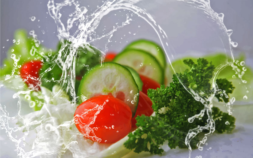
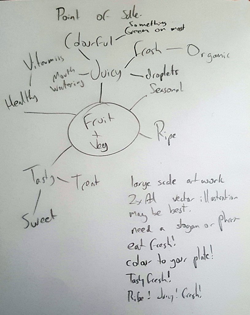
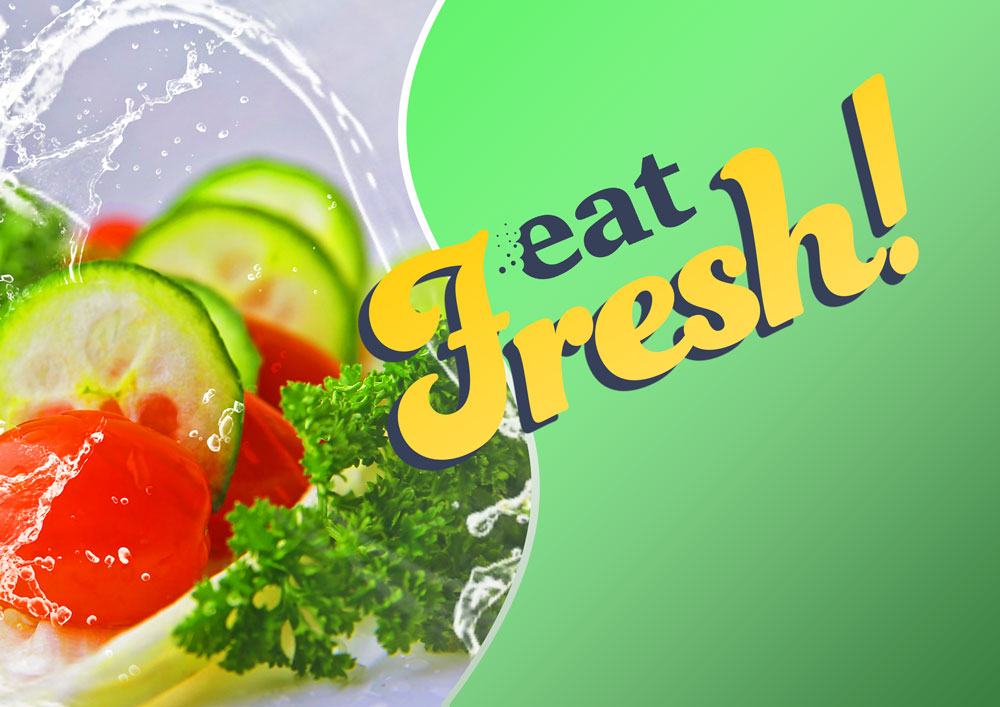
Create packaging for Quaker’s new ‘Chilled Creamy Oats’ product for young women looking for a truly delicious healthy snack. The target audience is young women juggling many jobs and priorities everyday. They like to eat well but also love treats and hate feeling hungry. They like the idea of oats for their natural goodness but find the idea of eating them bland and unappealing.

• What are you being asked to do?

Design appealing packaging for healthy breakfast cereal, to be effective I will need to research trends ion health food and possibly unhealthy food to eliminate any undesirable outcomes, for example fast food is often brightly coloured, healthy food tends to be more natural and unsaturated hues. i would also research appealing packaging aimed at women, the organic cosmetic industry could be a good source.

• How will the client will judge a successful outcome to the brief?

A successful outcome for the client would be a unique packaging that appeals to its target market, in this case health conscious young women.

• What are the keywords?

  • Young women
  • delicious
  • healthy
  • busy lifestyle
  • stop hunger
  • snack/ treat food
  • The opposite of bland and unappealing, so exciting and enticing.

Brief 2

Most of us have experienced a long rail journey – we witness the dramatic contrasts of the changing landscape, the inter-connections at various points along the way; various people embark and disembark; the dynamic is ever- changing… finally we reach our destination. This brief challenges you to take a metaphorical journey on the theme of connections. Explore the theme as broadly as possible and take us on a journey that might link, amongst other things – people, events, philosophies, theories, objects, movements, inventions, history, literature, etc. Your journey is only limited by your own imagination and the quality of your research – surprise us with the juxtaposition of your selected themes but be sure to communicate to the viewer the ‘connectedness’ of the thinking within your design. Define your market, and how you will target it.

• What are you being asked to do?

represent visually a metaphorical journey, a chain of events or outcomes with a message or narrative. I would need to research a subject and its key defining moments. I would also need to look at interesting ways others have used infographics, booklets etc to convey information. I would also need to decide on a target audience and design within their limitations and or requirements.

• How will the client will judge a successful outcome to the brief?

A visually and mentally stimulating final result that is useful to the defined market.

• What are the keywords?

  • interconnections
  • ever changing dynamic
  • Explore
  • journey
  • communicate
  • connectedness

Brief 3

To raise awareness of the risks of underage drinking and contribute towards a cultural change in society’s attitude towards alcohol. The purpose of the Department for Children, OCA Graphic Design 35 Schools and Families is to make this the best place in the world for children and young people to grow up… to make children and young people happy and healthy and help them stay on track. With a core proposition of ‘Alcohol leaves you (or your children) vulnerable’, the campaign will urge parents to talk to their children before they consider drinking, to help avoid vulnerable situations. The messages to young people will get them to think about the effects of drinking. Creative ideas should use the campaign identity ‘Why let drink decide?’ to extend the campaign’s reach and specifically target young people aged between 13 and 16. We are open to ideas about the media or format you think is most appropriate to reach the target audience.

• What are you being asked to do?

Create visuals and communicate a public safety message around the pitfalls of alcohol abuse and how this affects children. The media or format should be broadcast across channels, magazine, public space focused posters, such as school, youth organisations and clubs. this could extend to an online presence such as youtube ads and web banners to target age appropriate audiences or places that sell alcohol online that an adults would also see.

• How will the client will judge a successful outcome to the brief?

The best possible outcome for the the client, the department of children, would be to lower the number of alcohol related abuse cases for children and their parents/guardians. This would need to be calculated over a long time period, maybe 6-months to a year and its impact would also be affected by how much drive there is for the campaign, the frequency it is viewed and overall duration of the campaign.

• What are the keywords?

  • risks
  • drinking (alcohol)
  • happy and healthy
  • Alcohol leaves you (or your children) vulnerable
  • Why let drink decide?

I feel that the most difficult of these three briefs will be the metaphorical journey, It is by far the loosest of the three, it seems appealing as it is very open and allows for a lot of creativity but I suspect the lack of constraints and parameters would mean a lot more thought and groundwork would be needed. This feels like it would be the biggest and most time consuming to bring to fruition. I imagine getting the brief signed off wouldn’t be easy as well, it would have to be communicated quite clearly to the client, they would also need to relate to the brief and find the message/subject of the journey useful to the end user, this may mean if it isn’t clear concise, and relevant enough the idea may be rejected, I think this brief would need some more definition from the client in its earliest stages.

The alcohol awareness campaign would be the most morally awarding, Its challenges would be to produce a campaign that works across multiple platforms, it would need to be memorable and impactful, maybe even shocking. I think it would be fairly straightforward to sign off the wording and then the imagery. The boundaries for this would be clearer than the previously mentioned brief, informative and sensational but age appropriate. These constraints wont make things easier but would help to define and focus a concludable result.

The most desirable of the three briefs to me would be the Oats packaging, it’s a very clear brief, with hard and defined parameters, it would be researched against other competitors and ideas would be eliminated or emulated depending on the clients wishes. It would offer a good amount of creativity, colour choices imagery, typefaces etc and it would be seen by a lot of people.

All three briefs are quite different and would all potentially push someones skills beyond their normal limits.

Research Point : Collected Items

I have collected things that I believed would be good reference for quite some time, these are nearly always digital, and 90% off the time I store/find them on Pinterest.

The kind of things I keep usually fall into several categories,

  • images I find Interesting
  • Images which show the latest trend or style in design/illustration
  • Images I can learn from, such as anatomy, technical images, diagrams or a step by step process
  • Anything relevant to a project, I will often make a private board and look at relevant images to see how they approached s similar topic.

The good patr about keeping things on pintrest is its available remotely, as lomng as you have a device and an internet connecion you can view your referecne materials.

The Bad side is that you end up with so much, it is a skill itself just to keep these organised and easy to navigate.

Exercise: Book cover design

This exercise asked me to design a series of book covers for the work of H.G . Wells, I am well aware of his work and have seen many of his stories as films, often with an updated more contemporary setting, such as the Tom Cruise war of the worlds, I didn’t want those tom influence my choices too much, I will try to rely on descriptions from the actual texts rather than the interpretation of others.
I started off with a mind map/spider diagram to get a feel for H.G. Wells, from that I made some key observations.

  • Highly regarded author
  • Classics
  • I would like to use old but fresh imagery
  • Victorian- Edwardian time period
  • More known for science fiction but not exclusively

As he was a highly regarded author and this was to be a series I imagined his name would be more prominent than a standard novel. I didn’t want it to be too large and domineering, but I did think this could be a nice way to have a thread running through the whole book series.
As it was a classic book series I wanted some sort of prestige and sophistication to the books. As the author was alive during Victorian -Edwardian period I thought a pattern and some type reminisce of the art nouveau would be a good place to explore, partnered with a flat almost minimal approach. This book series would need to be specific to the author and not they individual style of his work as while I knew him more for science fiction the exercise literature did state that this genre was not the only one he explored.

I used pintrest to research some visuals, particularly around minimal book covers, old book cover designs and the patterns of William Morris.

* * *

As this was to be a series I wanted to explore some interesting, structured layouts. I tried shapes and even making some from the authors initials.

Once I had a page of layouts I looked for ways to add the key areas, the authors name, book title and the imagery. One shape lent itself nicely to shape some text, and another felt like it had a strong solid structure, I ended up combing elements from those two to make the final layout.

I wanted to make my own tiled pattern, I liked the idea of using leaves and the authors initials to make a fine repeating pattern to be used in the non active areas of the cover, I was hoping this would provide a “frame” for the key areas, add texture and some style with a victorian feel. I also found a font in adobe fonts that would fit the theme nicely.

I made the layout in illustrator, I googled popular book sizes and worked with a 6″ x 9″ format, once I was happy with the layout I made the repeating pattern, scaled it to size and set it to be transparent so the underlying colour would tint it, I wanted this template to be easy to edit for the other books in the range so I put some thought in the most efficient way to do that, I also added all the titles in and sized them together, this way I was sure I wouldn’t hit any obstacles later on with type size or layout.

Imagery
I made some loose sketches for the images I wanted to add to the circular window in the centre of the books, I googled the descriptions of the key items from the books such as the tripods, the time machine and the invisible man. I tried to keep my focus on these descriptions rather than the visual information I had gathered from films. I did have some reference imagery for a barbers chair but apart from that i managed to get what I had in my head into the sketches.

I tried some different approaches, I liked the 3/4 angle, it was more interesting, the minimal lines I didn’t feel would have as much impact.

I was sure I wanted a large clock, the chair didn’t have a very clear stamp head on, I looked at old Victorian barber chairs in profile and sketched that down, I added some valves/light bulbs and gears for a mechanical feel.

Again the profile angle seemed to be more descriptive and added a bit of drama as it walks across the book, the user safe and undetected.

I worked over these sketches in adobe illustrator, all keeping to the circular placeholder but with a view to allow some of the image to extend outside the circular border.

Colour choices
The colour choices, I wanted to have an old feel, I stayed away from bright colours, leaning towards dark or pale tones and hues. I tried to apply some logic to my colour choices. For the invisible man I chose the violet colour as ultra violet light is invisible, so it seemed to fit nicely. The deep red for the time machine cover came from the red leather I imagined on the barber style chair, or other Victorian leather furniture. I chose green for the War of the Worlds was because it is often associated with aliens and martians, for example, little green men.

The Invisible Man
The Time Machine
The War of the Worlds

Overall I was happy with the outcome, I felt that I had stayed within the parameters set by the brief and by myself, it has a timeless classic feel, with the Victorian patterns, typeface and colour choices, a fresh minimal approach to imagery and it celebrates the author with his name being a main feature of the cover / book series.

Exercise: Visualising your ideas

This exercise asked me to consider the different ways I could produce a folded leaflet, it called for me to be creative in its delivery and to physically try out some approaches.

To get a good understand of the different available and widely used folds I googled some different fold types, some are very simple others more complicated. I was able to rule a few out by doing this.

paper folds

I have four sections of text with approx 120 words in each section. I used a lorum ipsum generator to visualise roughly what 120 words would look like.

Lorem ipsum dolor sit amet, consectetur adipiscing elit. Nam luctus nisl nec tortor aliquam, rutrum finibus elit consequat. In condimentum, diam quis porttitor ullamcorper, est eros pretium tellus, non facilisis elit libero non massa. Etiam consectetur semper sem, in fermentum sapien lacinia vel. Fusce sem lorem, pretium accumsan sagittis et, fermentum vel purus. Suspendisse nulla tortor, ornare id elit eu, tristique bibendum leo. Cras quis condimentum libero. Praesent quis velit at sapien volutpat mollis sit amet quis lorem. Mauris feugiat augue at magna tempus, at dignissim sem mattis.

Maecenas elementum massa eget viverra eleifend. Morbi eget augue facilisis lacus consequat luctus. Fusce tristique sit amet urna ac varius. Curabitur hendrerit justo a lorem ultricies elementum. Donec pulvinar enim efficitur lacus.

Thats a fair amount of type for a leaflet, as there will be four of those. sections. The way that information is structured and displayed is going to be a key factor if we want the leaflet to be successful. With that in mind I fetched some paper to experiment with how the user might open a word heavy leaflet.

The obvious choices were the four section layouts, this would accommodate the four blocks of text nicely. this would be the least creative solution though, I quite liked the idea of the user being engaged with the unfolding, maybe delivering a part of the message in small suspenseful chunks, urging the user on to unfold the next section. Im also assuming here that printing costs are not an issue, double side printing, die cuts etc.

I started to wonder if there was a creative way that I could ensure the recipient of the leaflet wouldn’t just take it and throw it away, I thought about maybe a map to the communal garden, a free giveaway or an activity might be a good way to ensure the leaflet is looked at and not thrown away immediately. I then thought the leaflet could be folded as an origami flower, this could be kept or re distributed to someone else to fold, spreading the message. Origami can be quite complicated, even the simple flowers are hard to fold, I would need to find something that was simple enough to unfold/refold without affecting creases affecting legibility.

Most origami seems to be on square paper, the simplest tutorial wasn’t the nicest looking flower but it did make for a more interesting than square or rectangular shape, it was easy to fold and unfold and refold as below.

I had several abandoned attempts that I thought was just impractical and too complicated, I wanted the end result to be easy t unfold and to ideally be refoldable to pass on to someone else.

These attempts were abandoned, they was too complex to be practical

I added in some details, to see how it might work directly to the paper prototype. This helped to show what sides of the folded paper would be visible and the boundaries I was working with.

I don’t think the task asked for me to produce a finished product but I added in some colour and some loose messages to get a feel for it.

A colour mock up
when unfolded the dead space could be utilised for info such as contact number and a map. The small body of text could be a shorter intro or summary which could reference to turn over for the more detailed text.
The blocks of type, 4 x 120 words

I really saw the benefit of this exercise, to feel how the end product would work in hand was a big help, the actual aesthetics and design of the leaflet isn’t quite what I’d choose, but I didn’t want to invest too much time in that aspect of the task. There is many ways you could complete this task but having that prototype in your hand to help the decision process was really helpful.

Research point: How do you approach being self-critical?

I do try to see weaknesses in my skills, I see great value in being self critical and improving. This has to be self motivated.
I compare my efforts to others, I find it helpful to critique the work of others, that way I see what they do that I don’t like to ensure I don’t do it myself.

I have a few friends that would be honest about my work, and have always welcomed the feedback, I don’t always agree with feedback, sometimes it can feel they have misunderstood what I was trying to do and I haven’t quite managed to carry out the task as per my intentions. This in itself can motivate a change, this is a positive action.

Sometimes friends/ family will offer praise, this sometimes can feel insincere, people with an emotional connection wont always be comfortable telling you their real opinion and what they think, so these criticism can often be easily dismissed even if they was sincere.

A fellow creatives opinion means something different, they have a different understanding of the process and view it from a different angle.

I believe all criticism is useful, providing you do something with it, and that will always be self motivated. They say the hardest person to please should be yourself, I think this is true but if I had to re write that message It would be,
If your efforts fall short be content and understand them, they was the best you could do, but know that next time you can do better having understood why you fell short. Thats not as catchy though.

Exercise: Too much or not enough information

This exercise asked for me to design two posters for an upcoming event, this could be a jumble sale, a local gig, concert or play, an exhibition or sporting fixture. Due to coronavirus there is not a lot happening at the moment, I googled local events and it took me to a listing for the London wildlife trust, they are asking for donations to protect rare insects, they have used a banner saying “Protect chalk grassland for rare species before it’s too late” this seemed like a good direction for the project albeit outside the suggested parameters as it offered a lot of information on the subject.

I did a few quick thumbnails to test how I might lay this out.

The above image is the minimal version, broken down simply I have;

  • An eye catching image
  • A contrasting short title
  • A small amount of text to explain the title
  • The URL for the site for donations and more info
  • the organisations logo

In this version I have;

  • The same image but smaller to accommodate the type
  • A longer title
  • 3 areas of text to qualify the titles message
  • The URL for the site for donations and more info
  • the organisations logo

Structurally both images are similar, I feel an image is necessary as is a title, both offer context to each other and draw the viewers eye. once the viewer is engaged they will be happy reading a small amount which leads them to an action , in this case visiting the website to either learn more or male a donation. The logo as long as it is memorable acts as a signpost so the viewer knows they are at the correct place.

I asked my partner which one she liked best, she actually liked the second version with all the extra information, I asked why and she said that one has more to learn from as there is more text. I think context is definitely a variable here. as a poster then the first one is best the second is more of a flyer or leaflet, this may not have been obvious when I presented the two options.

Research point: Software

In terms of software, I am mostly familiar with the adobe creative suite. I have used;

  • Photoshop
  • Illustrator
  • InDesign
  • Dreamweaver
  • Animate
  • Premier

For desktop publishing I would choose inDesign, it has the best text editing tools and ideal for layouts for anything from flyers to books.

Photoshop and illustrator are stronger at photo editing and producing vector imagery respectively, these used in conjunction with inDesign would make a perfect combination for producing for example a pamphlet or an illustrated book.

The difference between photoshop and illustrator is the way they produce the graphics, illustrator is vector software and photoshop is pixel based, although photoshop does offer some vector tools, the output is normally pixel based such as jpegs, pdfs etc.

Vector graphics are becoming more common on web, the idea being that regardless of size displayed they will always be clear, they are also useful in printed work, especially icons and logos which are easier to scale up and down with no distortion.

There is no perfect software that does everything exceptionally well so having a suite is a good option.

Exercise: Point of sale display

This exercise asked me to design point of sale for a local green grocer, it needs to be highly visible so it catches the eye of the passers by through the window as the viewer makes his way to the other shops in the area.

The final reproduction size will be 2 x A1 landscape, and it states that my art work will need to be produced at a smaller size.
Ideally where food is concerned I feel good quality photography, with expert lighting water droplets etc would work best, drawings can work if they can capture what people love about food. if I was aiming this at children I would maybe take it into a cartoon vegetable direction, this would cut down on anything technical, and i would love to draw a muscley carrot flexing his muscle next to a round tomato.

The challenge of using photographs here will be resolution, a vector drawing would be sharper and more accurate, and not constrained by resolution. A photograph would need to have been taken with a camera with a high resolution, this area of photography/design isn’t so familiar with me, but as I understand there is methods to push the boundaries of useable resolution, for example the photos printed on vinyl for large lorries and vans look fine from a distance, so I will research this further to see whats needed to use photos at this large scale.

The rules on large scale printing seem to be mainly based on viewing distance, in this case our POS wont be viewed up close, a good quality camera with a high resolution would take a photo that could scale up the image without having too much of an impact.

Adobe also have a feature in photoshop that increases the resolution, I have read that this gives good results, this would be another option to use photographs.

I have also read another method where by photographs are vectorised, this can change the appearance of the the original photograph but when viewed from afar still has a photographic quality.

This image has been vectorised
These are the paths that have been created from the result of vector tracing

I think given the results of my research I am happy to consider photography for this POS, it would be the best way to accurately represent the quality and freshness. I wouldn’t expect to see food portrayed as a cad drawing for example at a fast food restaurant, and I have never seen a cook book where they have used drawings, although I am told they exist.

To offset the imagery we will need some fresh text, this is where we can add some character to our image. I wrote some ideas down from the spider diagram I had made earlier. I decided to use “Eat Fresh!”

I sketched out some possible ways I could use the text, I tried to spot any shapes or patterns in the text that might be relevant to eating fresh food.
I liked the bite idea and explored that over several of the sketches. the “f”. and “h” open and close the word fresh, these letters are tall and made a little cradle shape for the word eat, i liked the version where the “e” in eat was bitten into it was the most subtle of the bites and thought this was lively and energetic.

Next I would have to find a font that had a similar energy to it, a brush style or some over decorative font. Adobe have a good range of fonts and they are organised by style so I went there and found a font called funkydori for the word “fresh” for “eat” I used a simpler font called charter, Using a layer, mask I brushed out the shape of a bite mark and added some crumbs as it felt a little bare, vegetables don’t crumble but it seemed to sell the bite mark a little better.

In terms of colours I recognised in my notes that most fruit and vegetables have something green on them, be it the remains of a stem or stalk or leafy material. The colour green is very clean and natural, and the brighter green something is generally the fresher. I knew I wanted a green in my colour palette. I kept this in mind.

Imagery

As I mentioned earlier normally a photographer would be employed for something specific or stock imagery could be used if the resolution would allow or using the methods above. I went to a site called pixabay, they have royalty free images, I selected two images that looked nicely composed and would suit my point of sale. I boosted the colours and contrast so they would really pop when somebody walked past.

I used the green as mentioned earlier, I wanted some rhythm in the final image so made an “S” shaped area, adding in a white border made a little more distinction from the image and the text area. yellow over green seemed like a good fit, especially for the lemons. I added a drop shadow in a dark blue to add some contrast and used that same blue for the “eat”

Overall I’m happy that the outcome would serve the brief. The point of sale is bright and full of energy, the food looks appetising and edible and the message short and punchy. The POS would be caught and processed very easily by someones peripheral vision. The imagery would be interchangeable in this design too, allowing for easy expansion if the client wanted to, this could be used for seasonal fruit and vegetables, exotic fruits etc.