I have always loved movies and the posters have alway had an amazing allure to me, sometimes they even look better than the actual films. These days a lot of movie posters are quickly put together in photoshop and some are done with very little care, I will include some of the worst some of the best and even some that are specially made for the super fans of the films, and aim to summarise what makes a successful poster at the end.
When posters go wrong.
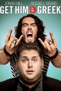
When I first saw this poster I was shocked at just how bad it was, this is heavily composited and I have no idea why, it would have been less effort to photograph anyone of similar build to Russell brand and add his screaming head on after, instead they have used one gesturing hand flipped it and added a ring on one of the fingers, the same ring is then added on to a different finger, as is a buckle to the right arm. Even the shirt seems to have been made from composited patterns, and they do not match up, the technical stuff aside the poster doesn’t tell me anything about the film, this is one of the lost arts in movie posters today, the loss of a narrative or something to get the potential viewer excited.
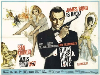
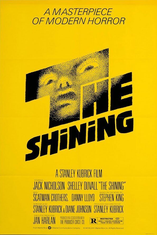
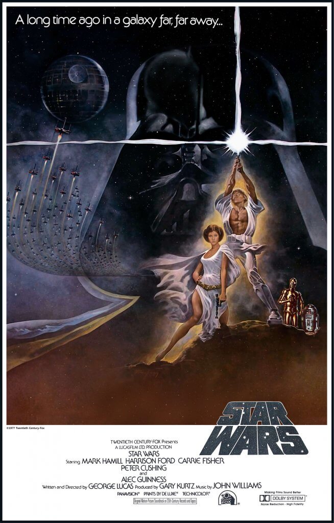
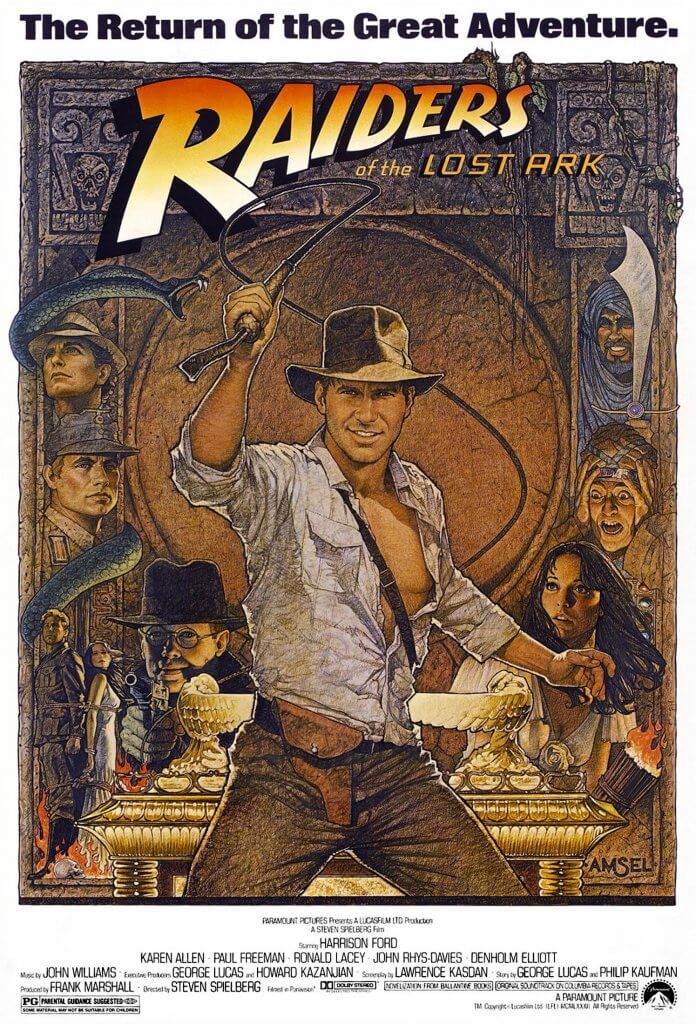
I think the most important thing for a movie poster is to generate some excitement, It has to demand some attention. If a poster hasn’t drawn me in and told me a little of what to expect then I’d class it as a dull poster, the films content might be very good, which is in its own way a tragedy. The poster cant tell you everything either, some of my favourites offer small references back to the film to notice once you have viewed them. The most common reoccurring theme for success is that they have hand drawn elements as opposed to photograph, it seem s odd that these seem to depict the film better than photographs can, they seem to have more life to them when done correctly. There are a few illustrators that dominated film posters, before the quick and easy trend of 3 or 5 characters next to each other with a title above or below took over. The work of John Alvin, Bob Peak, Bill Gold, Richard Amsel, Saul Bass, Tom Jung, Eric Pulford and the mighty Drew Struzan have all at somepoint filled my eyes with marvelment.
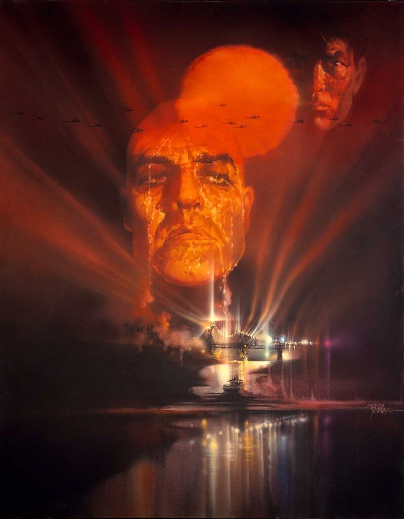
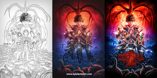
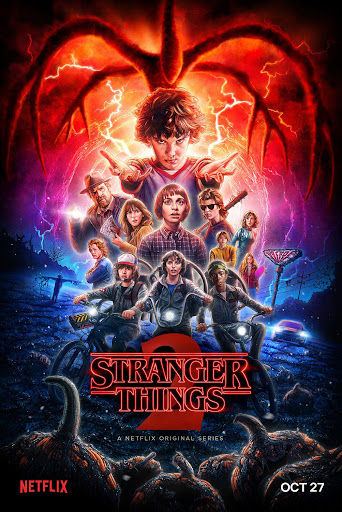
The techniques used for the posters range from oil and acrylic paintings to airbrushed pigment and coloured pencils. There is an illustrator workign in film posters that has based his style on the now retired Drew Struzan, his name is Kyle Lambert and he apes the airbrush, acrylic and pencil approach as an all digital workflow.
Another facet to film posters is the fan made or the re imagined, these are often successful because of a deep love and respect for the source, these artworks are often used for anniversary additions or limited edition art prints, companies like arrow video actually offer two covers the original and a re imagined, this boutique style approach is the back bone of their business or strategy, offering something new and unique, re mastered or reworked. They too seem to value the cover and the faithful representation of the film.
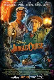
*Below or some examples of posters that just don’t really do anything positive for the films they are representing, These seem to all be of a type, very formulaic and dull in appearance.
*To summarise my findings to me a successful movie poster has to be;
- Quick and Punchy
- Exciting to look at
- Offer a visual cue to some narrative, genre or quality of content
- Interesting Layout with a definite structure
- Quality Imagery and or content