Research point: Magazine typography study

This research asked me to explore lesser used characters and also to use the identifont website to identify the typeface from a magazine I have to hand.

Below I selected some of my most recently used fonts and added the pangram and some extra characters ion the top row to see how they worked with the main alphabet, its interesting to see the similarity and the differences in their construction, the @ symbol and ampersand being the two that seem to offer the most unique shapes.

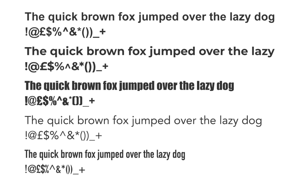
I read an interesting book about type (just my type by Simon Garfield) and I’m sure I remember one of the type designers talking about the ampersand being the character that showcases the artform of type design. They really do vary and the curved shapes take on a life of their own. I imagine they must really enjoy designing that character.

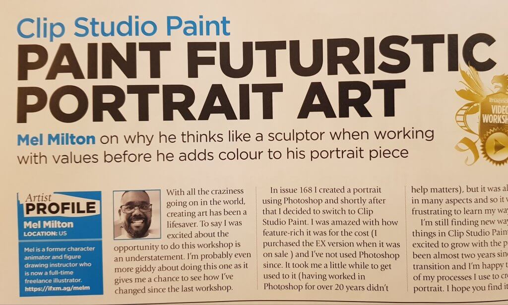
I found a copy of Imagine fx magazine, and started to go through the identifont process, I answered many questions before I was confident that it had found the most likely fonts.
Questions like “What style are the diagonal strokes of the upper-case ‘K’?” and What shape is the dot on the ‘?’ it found the font very quickly, and luckily I had it on my computer the font was Gotham.

Here is the isolated Gotham font for comparison.

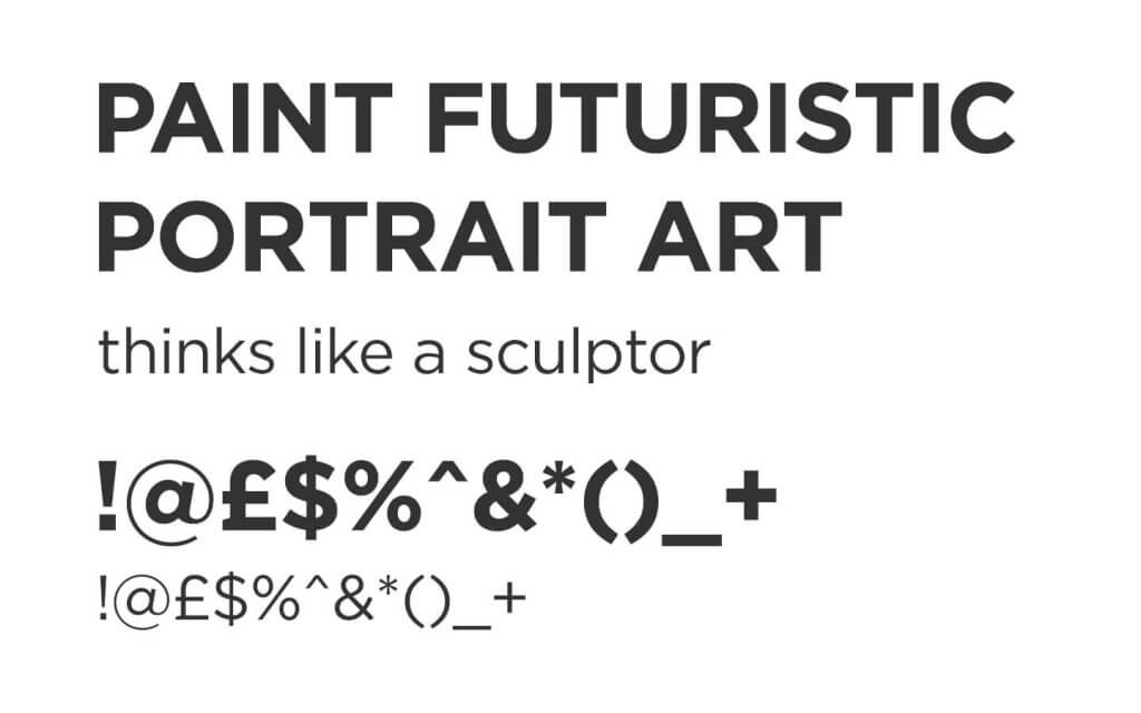
Gotham is also recognisable as the font that Barack Obama used in his Hope campaign.

The Design Behind Color Rush – Milwaukee Art Museum Blog

Gotham Knight

Its a great looking strong typeface, with many variations, so great and this is no surprise that DC comics also used to use it, Gotham being the city that the DC character Batman has sworn to protect.

Exercise: A typographic jigsaw puzzle

For this exercise I was asked to analyse the pangram “the quick brown fox jumps over the lazy dog” and using a page of deconstructed characters trace the correct shapes onto the page.

I fetched a ruler and removed the deconstructed text from my folder so I could lay the tracing paper comfortably without it moving, using a blue pencil I took the. “e” and “o” characters and made a mark from the baseline and another at the top of the character this would be the “x” height, and from there I could establish the median line from there I took the tallest character and established my ascender line, by marking at the top of the terminal.

Now it was just a case of careful observation, I looked at the serifs the letter height and case. I messed up the very first character, I mistook it for a t but now I realise it was likely the tail from the “u” figure. The head serif of the “t” would take it over the median line, I repeated this mistake later on, not realising until I studied afterwards.

The foot serifs were a good indication. as some had a single foot and some double, the bowl shapes also helped distinguish a “c” from the other bowled charcaters such as “d” and “q” although the example was quite small, and the subtle changes in the serifs and terminals were easily missed.

All in all I had a lot of fun putting this puzzle back together and it was a worthwhile anatomical typographic lesson.

Research point: Vernacular typography

For this research I was asked to find examples of vernacular photography in my local area. I visited the high street, and cafes in search for examples of “native” signage. The definition of vernacular typography is quite broad, it is often made by non designers, it could be something very well crafted or something very basic, hand drawn or painted.

This one appealed to me, at first because it looked like it was intentionally coloured or defaced, I tried to look for a hidden message, of course its just been sloppily repaired with a black pen. Whoever repaired it has paid some attention to the base and median lines but couldn’t recreate the geometric precision of the machine cut letters. I found it held some charm so wanted to include it.

This one was on a board outside a food stall, its pretty direct and no thrills. they have used some colour and a crude drop shadow effect, they have kept the message all in white, which means it reads through to the end or at least til the bolder characters. However it looks like it is supposed to read “Traditional german Sausage. Bratwurst served in a baguette.” but it actually reads “Traditional german Sausage Bratwurst, served in a a baguette”, maybe they was trying to say “Traditional german Bratwurst Sausage, served in a baguette.” The “leading” if we can call it that when hand drawn varies too affecting how we read it, “bratwurst” seems to be almost like a tick, standing alone in the middle of the message.

This of course does not matter too much, the sign is temporary, almost disposable in nature and serves its purpose for any bratwurst hungry customer. The hand made nature of the sign, the way the characters vary in height and the leading also seems to be ignored all make it feel very informal.

The imagery here is one of my favourite elements, the floating ghosts of a jacket potato and a buttered tea cake did amuse me as did the garnish on those beans! That aside we have a sign here that has been made with the aid of a computer. The computer has leant some accuracy and consistency to the sign and the typography, the fonts seem to have been picked to be loud and exciting, a script style typeface with very much comic book styling, a thick key stroke around the characters and a yellow to white gradient, would be at home on most Marvel comic pages, this is partnered with typeface that looks short and wide, similar to copperplate without serifs. they don’t look out of place with each other, and the choice of complimentary colours works. The overall tone doesn’t shout quality and looks quite cheap, as this is a less temporary sign than lets say a chalkboard, this is either very old and hasn’t aged well or is the tone they want to convey to customers, cheap and cheerful.

This is a sign for the cafe in a local park, one of the chalkboards came from here too. A lot more attention to detail here and feels a lot nicer than the cruder chalkboards, which in a way sells themselves a little short, this branding could have been a constant fixture to the chalkboards.

probably about 3 typefaces too many on this one, a chalky looking script type and then a serif font, they’ve used a white font on yellow and then realised that adding the lightest tone on a colour that is tonally similar offers no contrast so a dark keystroke has been added, the phone number is displayed a little thinner, this is one of the most important pieces of information and as a local business they would normally want this to be highly visible. I suspect this has been either designed by a non design type or handed to a sign maker who will literally commit what he is given to his work.

I liked the simplicity of this one, the typeface fits well and mirrors the colour of the ice cream, its quite tasteful, if I could edit it I would remove one of the cones and drop the size down a little to give it some breathing room.

This is Western Town, a lawless place where you have to remove your shoes to enter the saloon! The font looks handwritten as the letters do seem to vary slightly, although it might be the material its printed on. It is styled after many western posters seen in films. The visibility here is helped by a strong contrast and large scale.

This one Liked as it incorporated had drawn elements, it has a lot of charm, and has a christmassy feel with its curly serifs.

This sign is clearly advertising Donuts, and as the sign tells you this isn’t intended as health food. Two different comic typefaces have been used, as well as an additionalscript type. Its a small sign and three fonts seems like a lot. A little donut cartoon is generating some extra excitement, in case the style jump in the fonts dont work and the colours are bright and warm. No doubt many an adult has fell victim to this cheap nasty tacky little sign as a child points at it and starts to gear up for a tantrum.

Another handwritten sign, not as charming as its neighbour, they have kept consistent with the script style lettering, a bolder effort for the heading and a description. Also a typo, there is no spell checker or auto correct in real life.