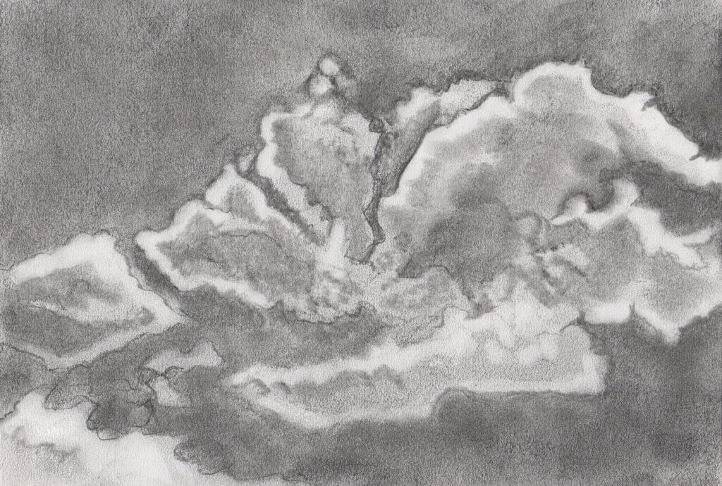
After my research of landscapes and seeing John Constables depiction of clouds, I was rather looking forward to this exercise. My first sketch I tried to outline the shape of the cloud,the sharp lines gave some good definition but felt a little too rigid, I softened up the graphite on my paper, taking a piece of kitchen towel, I worked the medium deep into the papers tooth, I then took a putty rubber and lifted out the lightest areas of cloud. I also used a plastic eraser, to really rub away the marks although this was less accurate. I liked working in reverse taking away the graphite to lighten up my drawing. I tried this approach in my next drawings, trying to use less definite marks.
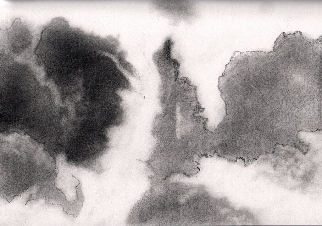
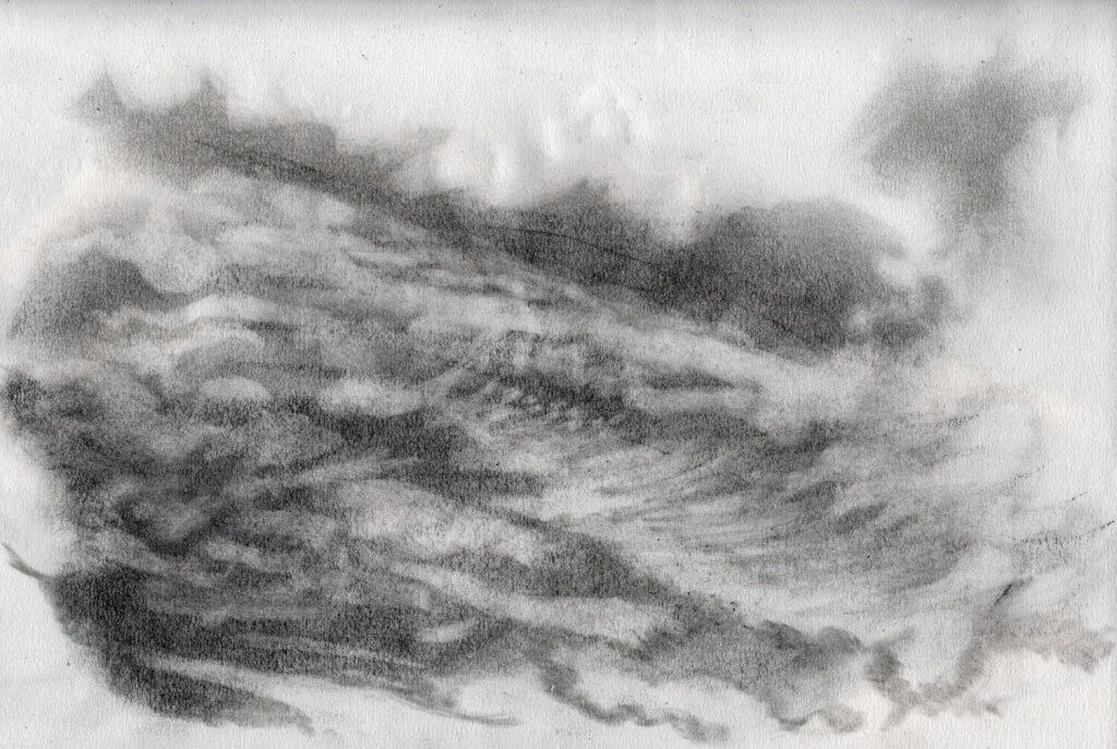
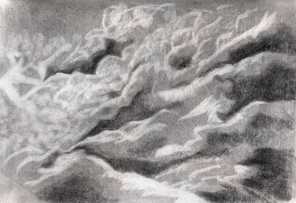
I decided that my next attempt would have no linear values, I used the edge of my graphite stick across the paper and worked this in with the now heavily graphite infused paper towel, the medium already in the kitchen towels fibres seemed to help it glide but also now served as a drawing tool in its own right. once I had the clouds in place I went about a second layer of tone, now adding darker areas in sweeping movements, trying to get as much kinetic energy in the image as I could. I was hapy with this approach and felt I had a good cloud making method, I repeated the process again and came up with the following image. I really went for a higher contrast this time, I quite liked the result and it certainly has that dark ominous mood I was interested in capturing.
I took my sketch book to the local park, the park has quite wide flat fields and leads off to extensive forests. It is a very cold day with a flat porcelain sky, clouds are not distinguishable but I’m sure they are there, hidden under the barrier of humidity. The light is soft but bright, creating diffused shadows over the flat green areas of grass. The exercise states that I cannot use a rubber, I decided to deny myself temptation of correcting a wayward mark or poorly executed choice and work in ink, I’ve quite enjoyed the feel of papermate’s flexigrip ultra retractable Biro’s in the past so I opened two up and checked they had enough ink to complete the drawings, I took two in case one failed on me. Both pens in fact did end up giving me some issues, I don’t know if it was the cold weather but the roller ball kept getting stuck and needed some scribbling to get the ink flowing.
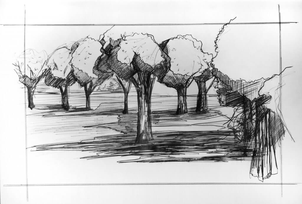
My first drawing I made very fast marks throwing loose lines all over the page, I wanted to establish a composition, my focal point was to be the tree on the far right as there was a good deal of detail on the trunk, it also had a dead looking tree or bush in front of it, leaving behind a twisted mess of twigs and branches matted and knotted and fixed on the trunk. In the end the focal point was actually the bit that I neglected, I started to focus on the shadow under the trees and the ground. The light was a lot softer than the way I chose to depict it in this image, the pale sky and the humidity diffusing the light would have been easier to depict with a medium with a better range of tone, such as graphite or chalk pastel, I could have used precise hatching to create subtle variations but I didn’t feel his would work with the looser approach I started the drawing with.
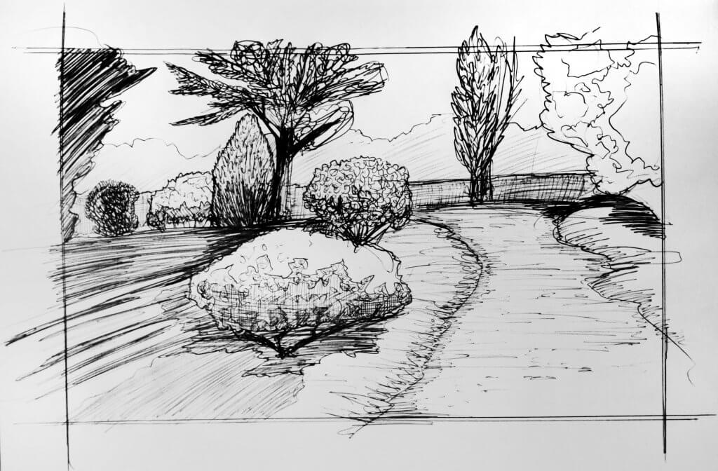
I found another bench and found a view, the treeline created a strong horizontal line, the path framed by trees of different colour and shape, the shadows were apparent on the floor, I tried to treat these with a little more subtlety this time, defining the tonal differences with individual lines and only using an outline when I wanted a harder shadow. I liked this view as the trees were all quite different., I tried to take a different approach with each one. I am working quite loose and fast and I’m not too sure if maybe I am taking it a step beyond where I can achieve an acceptable result. I will try to slow it down a little on the next one.
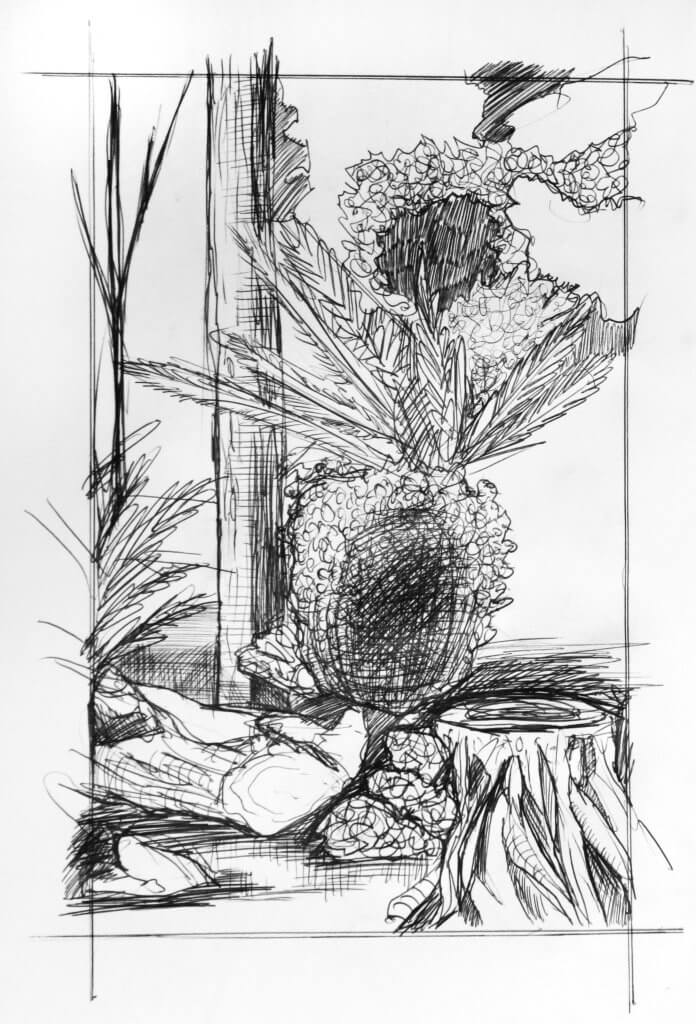
Whilst sitting on the bench I spotted another interesting view, I spun round and looked for a focal point, I thought the tree stump was quite interesting and would break up the textures created by the foliage and the rougher barks on the tree. I started again by adding in some key marks to work out my composition. Working slower now I looked at the darker areas and tried to define and separate the tree trunk from the other objects, I wanted the trunk to have deep and solid sinuous roots but really stand out, I kept the trunk as light as possible while retaining some strong contrast, I also used the fallen branch in the same way hoping it would add a marker to guide the eye towards the bottom of the image.
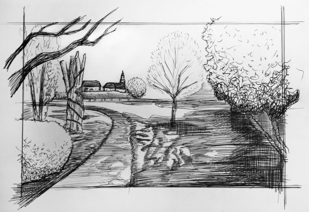
The final image, I tried to approach with all the observations and lessons learned from the previous drawings, the light and shadow on the grass I approached with hatching. I wanted to show a variety of different shaped trees. I framed the church building with lighter tones, I felt that would be the main focal point. I enjoyed the exercise, despite the technical hitch of the pens not working as well as I’d have liked and the cold weather making it quite unpleasant to work in, making my hands numb and less responsive.