This is my exploration into the evolution of lettering to typography in comic books.
Historically comic books were hand lettered, while this is not the case anymore the hand lettered style remains.
Adding text to represent speech happened long before the creation of comic books, some examples are over 270 years old and show primitive examples of the now familiar speech balloon.
Multi panelled sequential art first appeared around the 1870’s, usually before then image and text would be on separate alternate pages. By the turn of the century images and words in balloons was well established, this could be considered as the birth of the comic book.
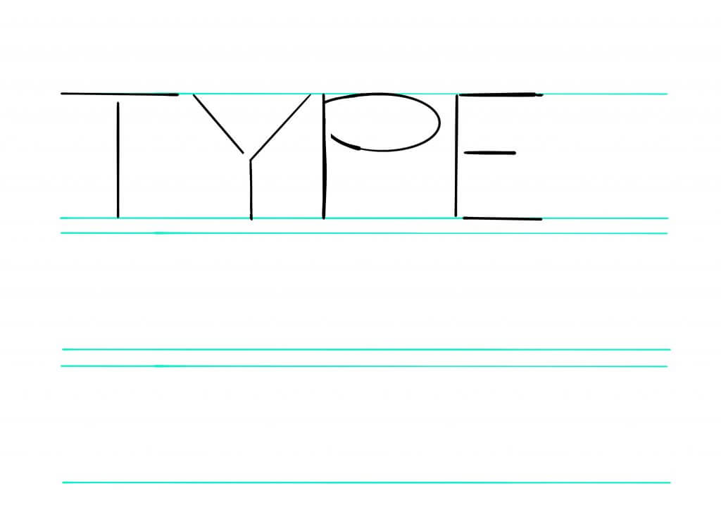
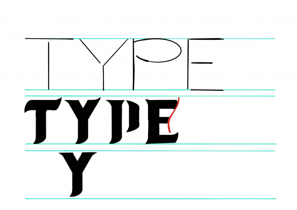
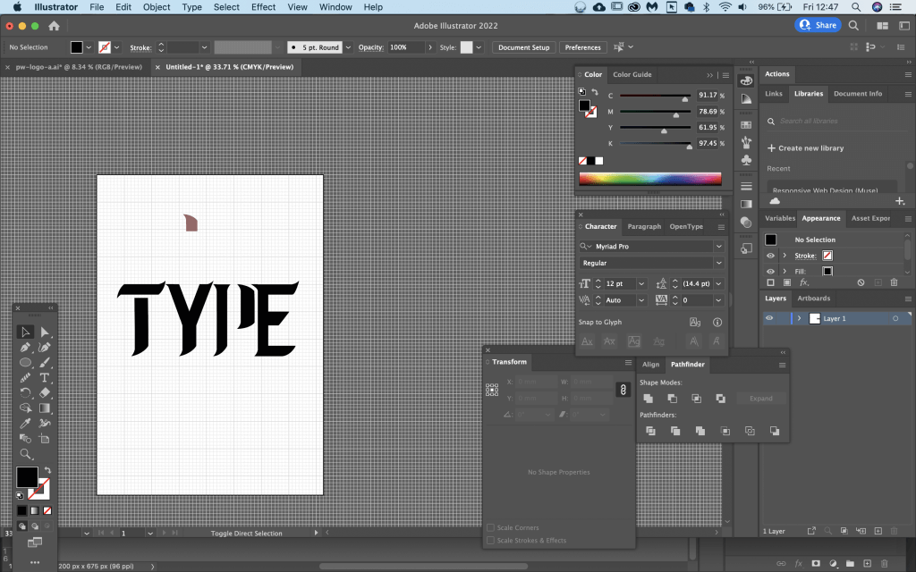
The lettering would normally be carried out by the artist and in their own handwriting this would keep costs down making the project much more financially viable. An invention known as the Ames guide helped to make aligning and arranging the lettering easier more uniform and professional looking.
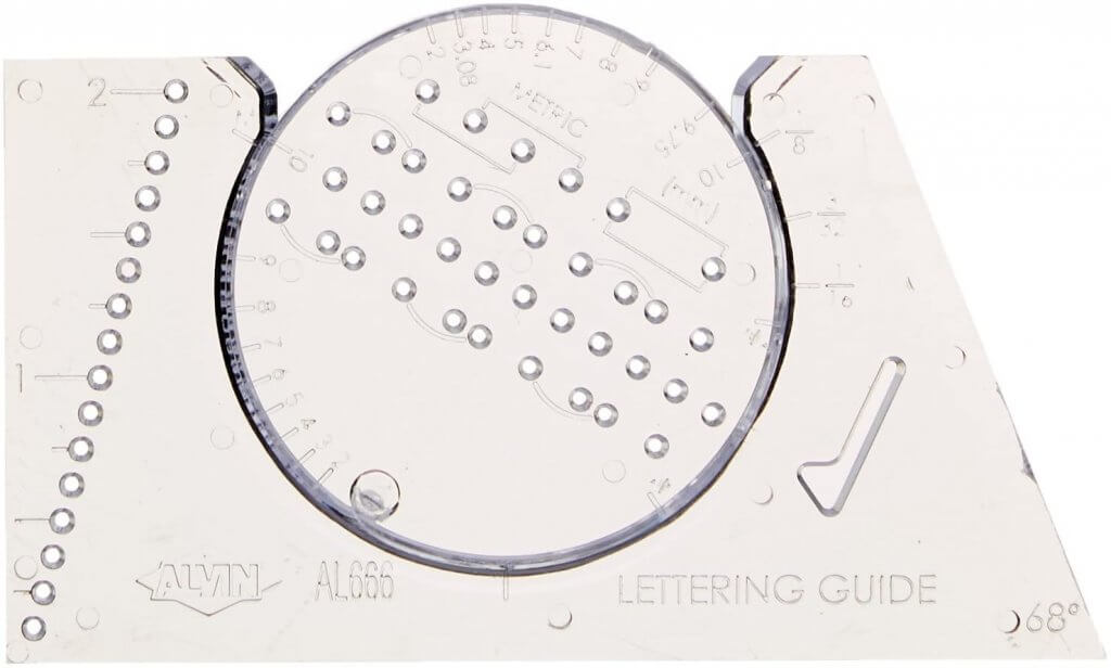
The Ames lettering guide, was used for 70 years in the professional comic book production, eventually it even became a discipline of its own, comic book production is laborious and it needed a faster process to achieve profitable results, eventually the role of the artist was split into penciller, inker, and letterer, in the 1930’s as comics started to print in colour a new role was introduced, colourist. Lettering became a focused skill and each letterer would have his own style.
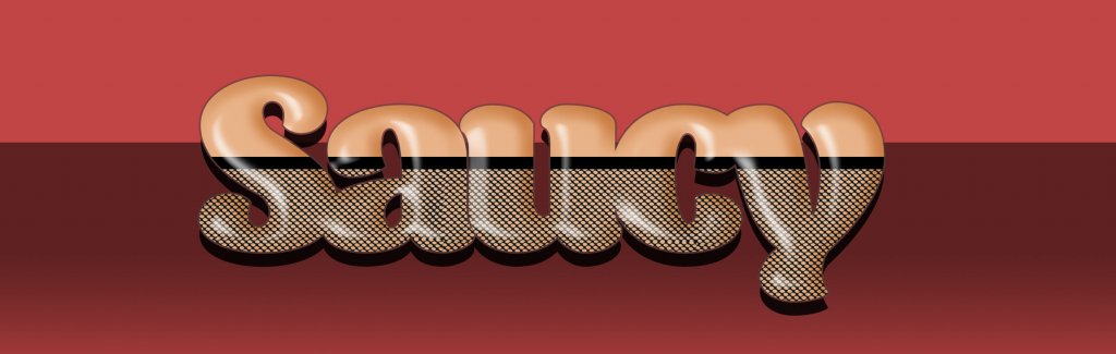
These days professional comics are coloured, lettered and sometimes even pencilled and inked digitally. Like the silver age of comics the fonts are just as unique, there is no standard font that is used for comics, some comic studios will favour a collection of typefaces to give a certain look to their folio of titles.
A Typeface thats often mistakenly associated with comics wasn’t actually designed for them, that font is Microsoft’s Comic Sans. The typeface was originally created for software intended for autistic children, created by Vincent Connaire it was developed in 1994 for a specific programme but ended up being removed due to a technical sizing issue, instead it became bundled with windows pc’s and has been misused and mocked every since.
The font is based on two key graphic novels The Watchmen and the dark knight returns, both books are hand lettered, Dave Gibbons illustrated and lettered the watchmen and John Costanza lettered The dark knight returns, Vincent Connaire copied the handwritten style of the characters and comic sans was born. Dave Gibbons hates the font and in an interview has even said he wished he had been asked, he said “I think what he came up with was vastly inferior, certainly to John Costanza’s lettering and I think also to mine. And I’d have much rather they’d just come to John or me and said: “‘Look, can you do some hand lettering for us?’ I’m sure we would have done it really, really cheaply and I’m sure that what’s out there would look a lot cleaner and a lot better.” but one thing ion particular seems to really bothers him “What really bugs me is the letter ‘I’ in it because in comic books you only use the capital letter ‘I’, which is the one with the crossbars on it, for the first person pronoun. You never use it as a capitalisation of a word or within a word but I believe in Comic Sans that is the only letter ‘I’ that is available. So the whole thing always looks wrong to me. I think it’s a blight, an absolute blight on modern culture”
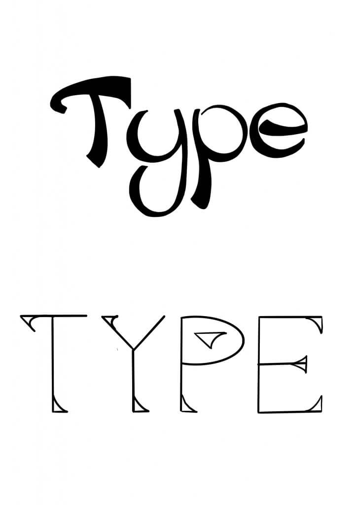
The fonts in use in the modern comics of today certainly pay tribute to the art form started at the turn of the century, I think they would look out pf place if they was used for any other purpose, equally to use a normal sans serif font would be to sacrifice a lot of tone and character.
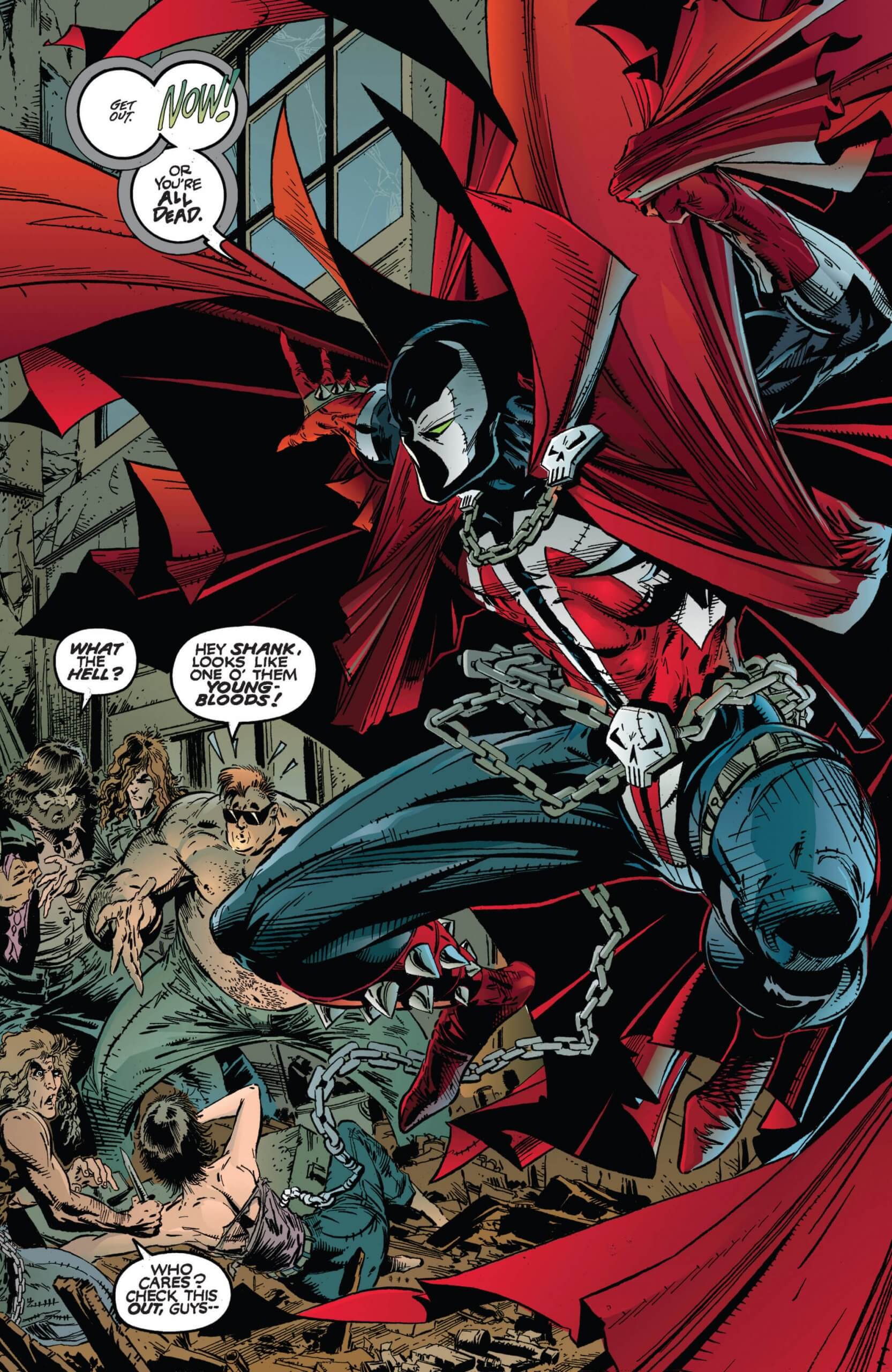
Below is a selection of comics including the hand lettered (first three) the remaining images I believe to be computer fonts, but there is no way of really knowing without close analysis, comparing the letterers work or asking the question directly.
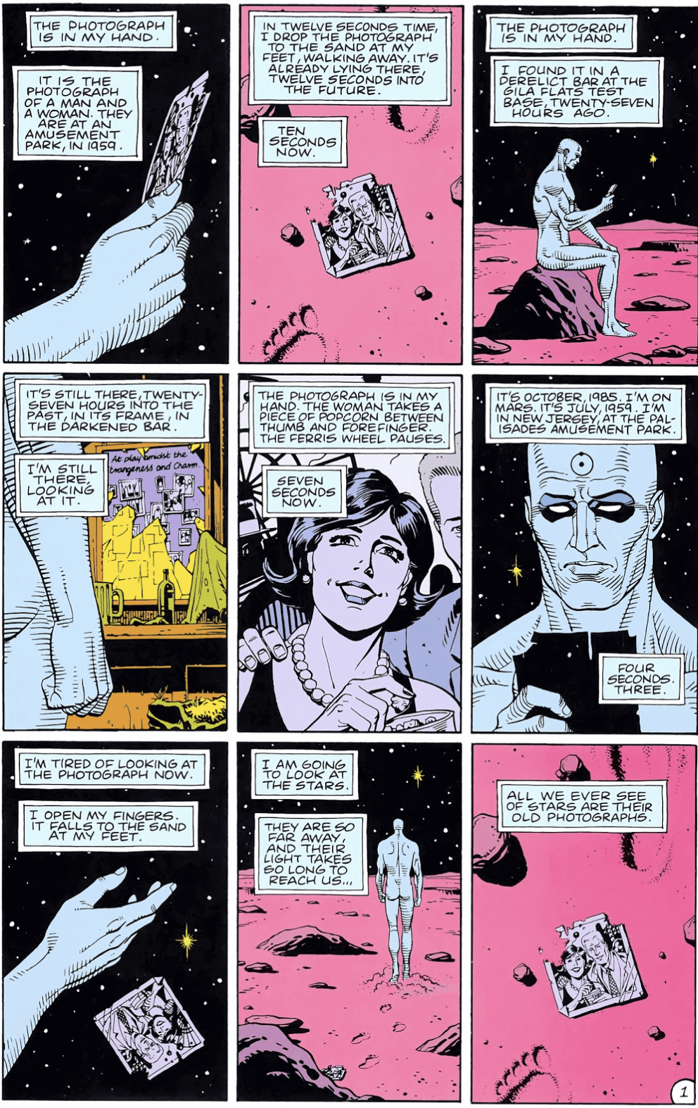
Hand lettered by Dave Gibbons 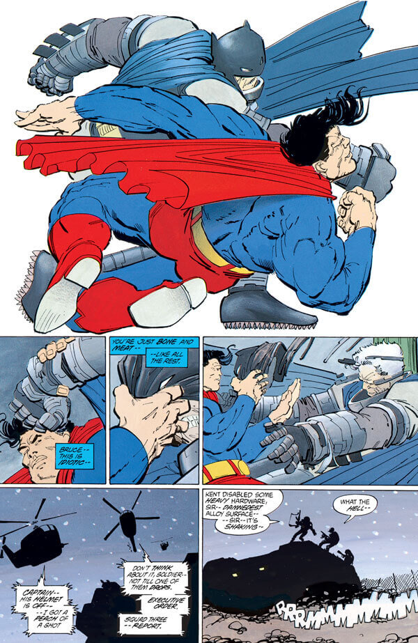
Hand lettered by John Costanze 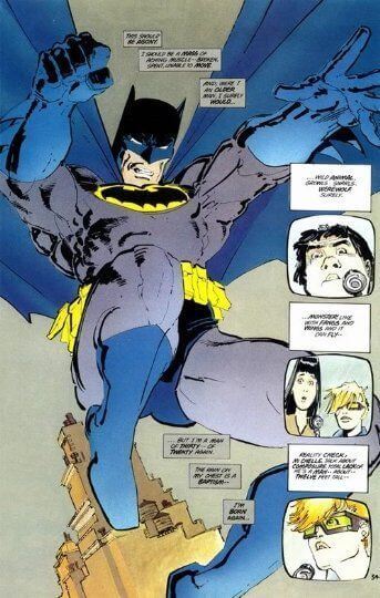
Hand lettered by John Costanze 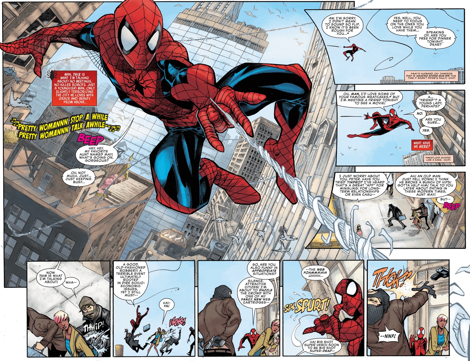
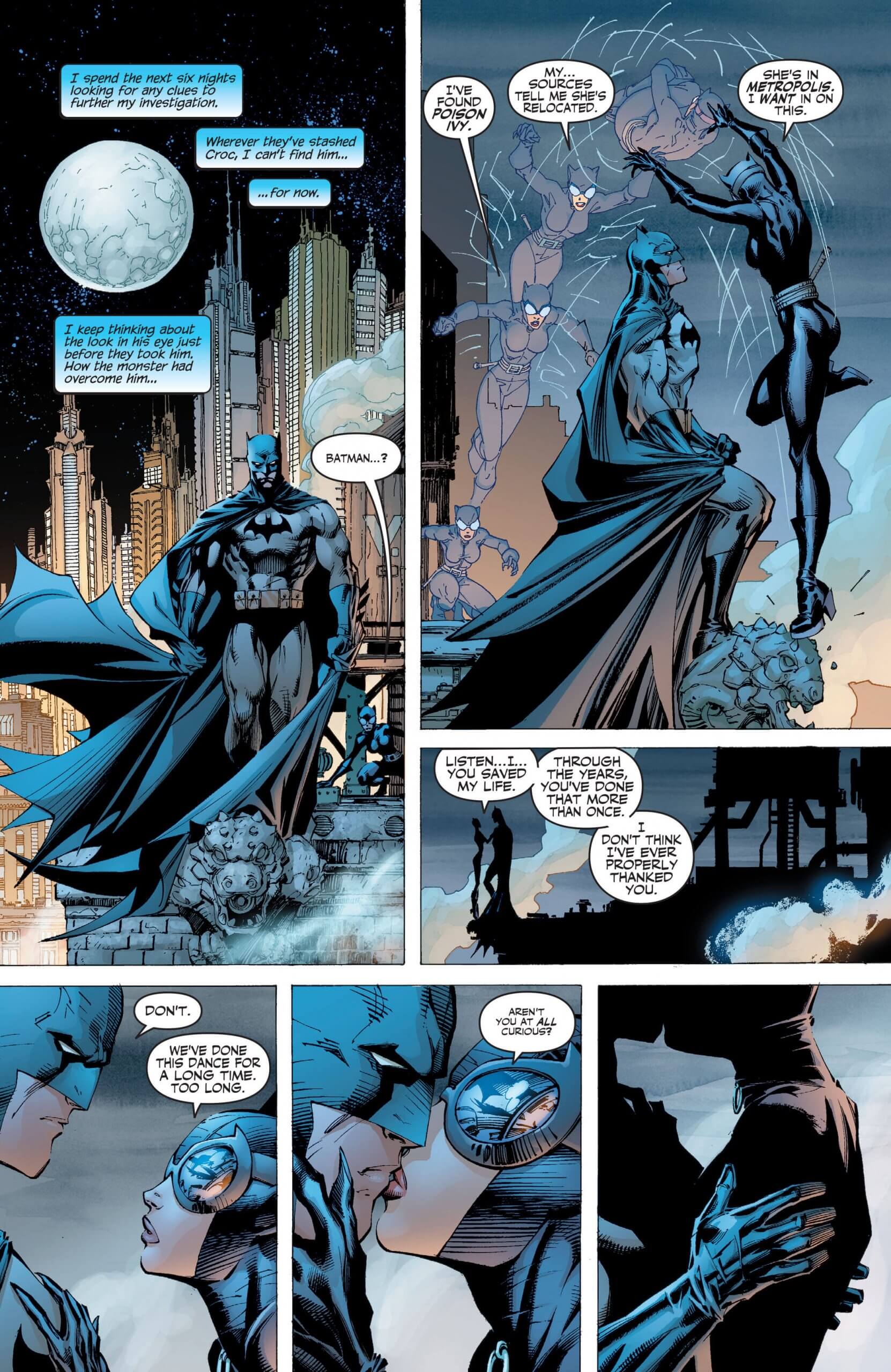
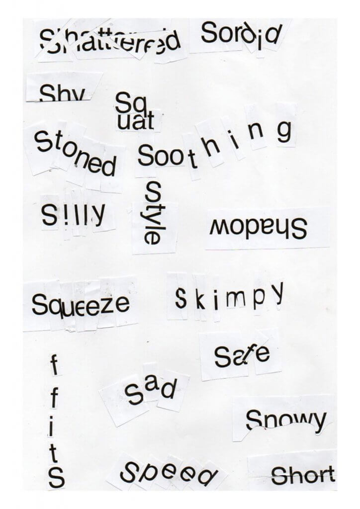
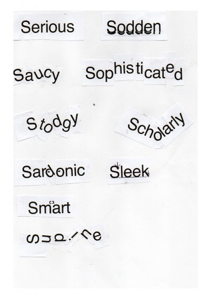
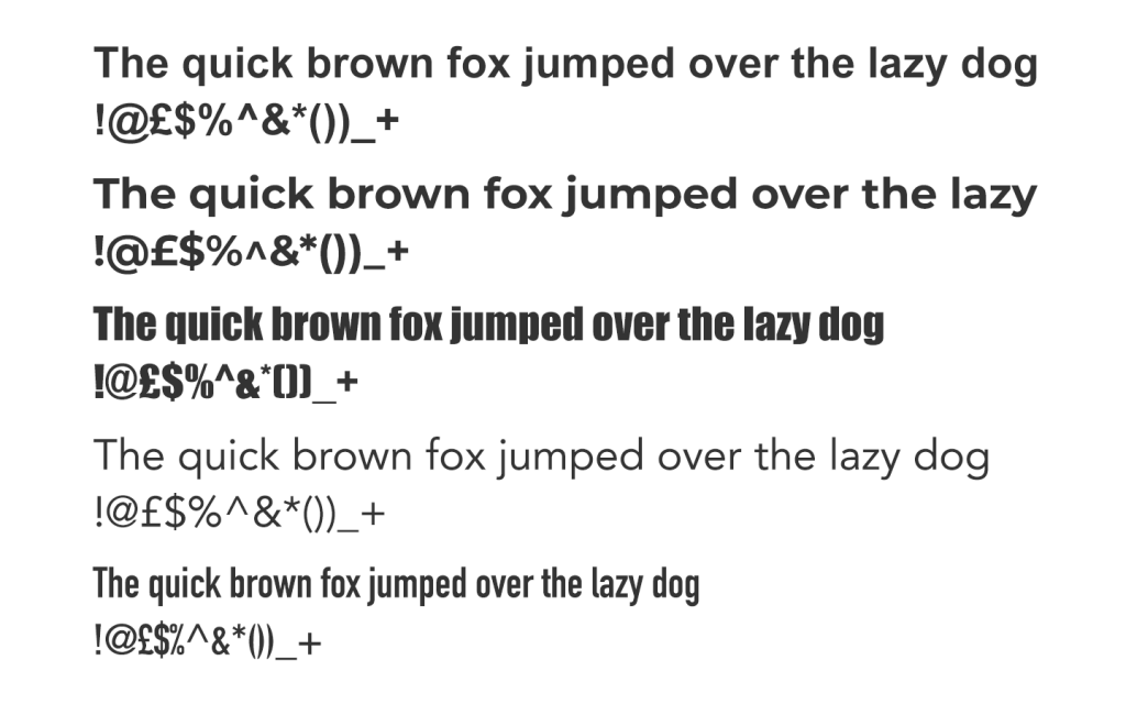
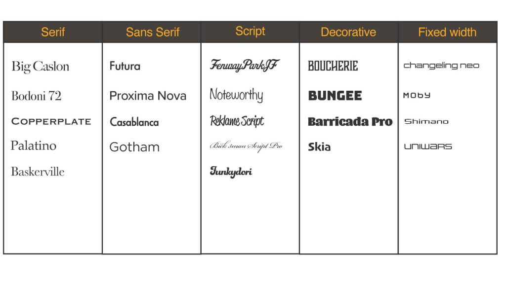
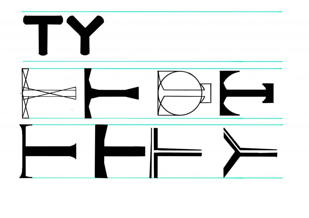
A selection of professional comic book fonts can be found below, this shows how many subtle variations are available.
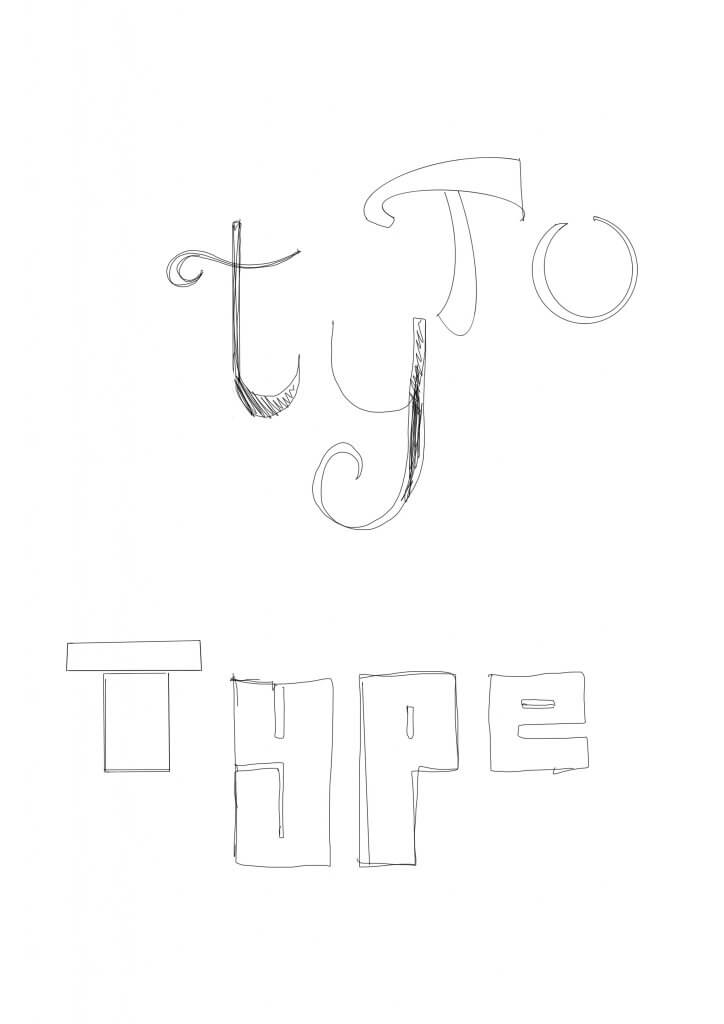
A summary of my learnings.
- First use of dialogue over the image and primitive speech balloon.
- the ames lettering guide and how to use one (if you can find one in the uk, I can not!).
- Comic book was hand lettered for 70 years.
- comic process being compartmentalised and lettering become its own sought after discipline.
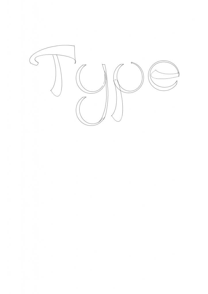
- Hand lettered Styles being unique to the letterer, almost like a signature.
- Like the hand leterrers ther is a wide range of comic centric fonts, to preserve hand written feel.
- Comic sans, inspired by, but not a comic font.
- Dave Gibbons, loves lettering, hates comic sans.