
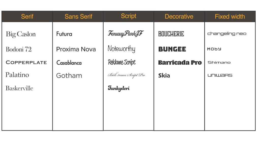
I was asked to make a sample book of typeface, split into serif, sans serif, script decorative and fixed width.
Below was my selection, I was conscious to keep these quite small and picked typefaces that were quite different.
the second part of the exercise asked me to apply the chosen typefaces to different commissions.
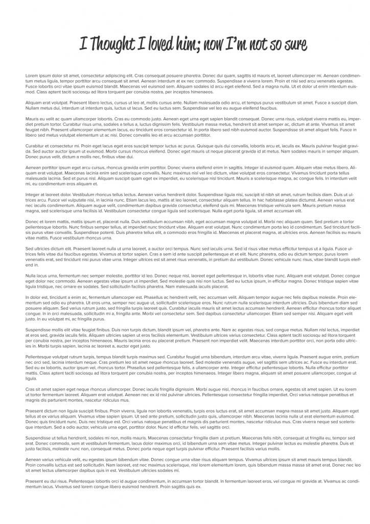
This was for a short story, it needed a header and legible comfortable to read copy.
I opted for a script type header, it felt like this would fit nicely as the title was written in the first person, almost like a diary entry. This font wold be ok for a short header but for sustained reading I would need a sans serif font.
For the header I chose Reklame script and the main copy Proxima Nova.
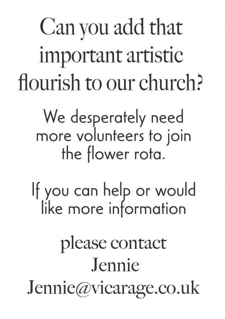
The church leaflet was a other commission that made me think about the tone, they was asking for people with an artistic flourish, in this case as I read on floristry, I decided to use the sort of typeface I would expect a florist to use, I opted for a serif style, big caslon had a nice mix of line weights, it feels a little floral, thin stems and thicker flower petals, again I felt the the main message needed to be separated from the header, I chose the casablanca typeface.
As I am trying uo these notes I can see that both of these types have quite a distinct look if I had to choose again I would go for something a little more neutral.
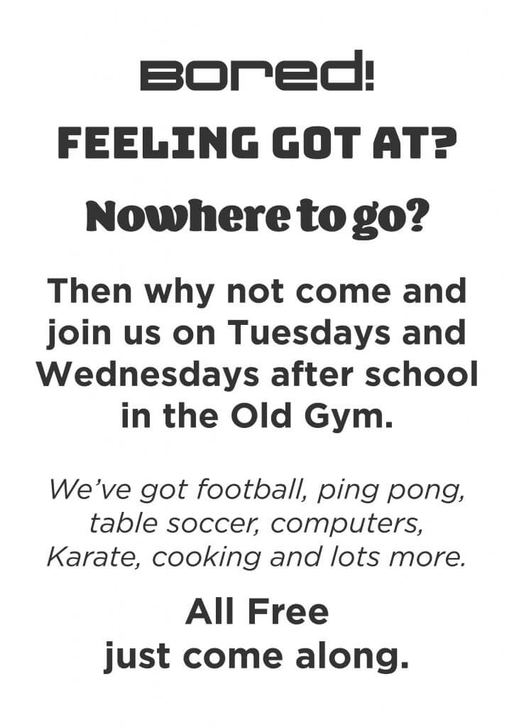
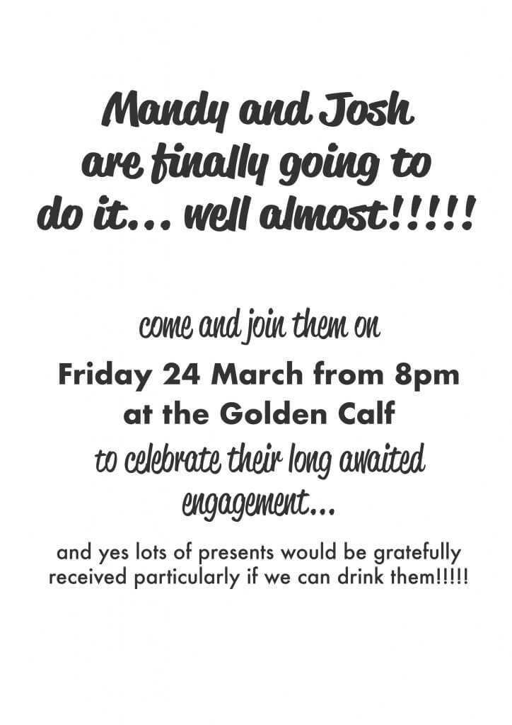
The engagement flyer was another one where the tone of the messaging lead my choice of type face. The intro copy is very jovial, it was personable too, so something hand written seemed to fit, I used Reklame in bold then scaled the copy down using regular for the “come and join” then i switched to a more legible font, a sans serif in bold for the important content, I used futura for this, my intention was to offset the curved script typeface with a more geometrically precise one, to close I switched back to futura as although the copy was still jovial it did mention bringing a present so this needed to be clear.