
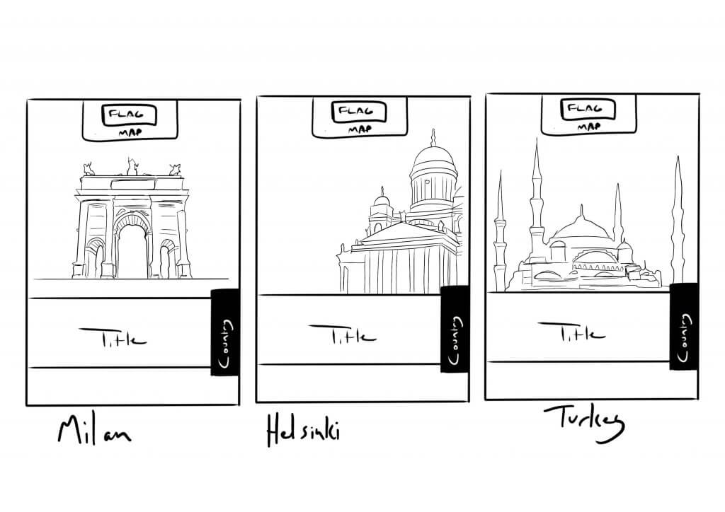
In this exercise, I was asked to produce artwork and a mock for a travel guide based on three locations, Istanbul, Helsinki and Milan. I did some research as I wanted to feature landmarks for the regions. I planned to do some stylised line art for the cover, each book would have the same style and information, instantly recognisable to the avid traveller.
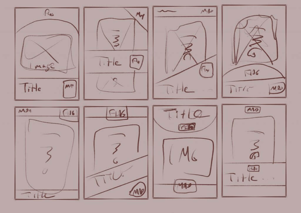
Below was some layout ideas, I needed to include a country location, a region location and I thought a small map Icon would be a good touch.
I explored some layout ideas as I needed to make sure the overlayed information didn’t detract from the image and was consistently presently.
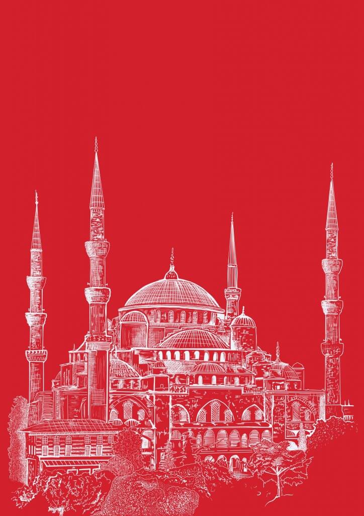
My initial sketch became the final artwork, I reversed the black lines and added used a red and white colour scheme to reflect the Turkish flag.
I mocked up my idea, I used a typewriter style type as it felt like a journal, the kind a traveller might keep to record his journey. The Brief did call for a handwritten type, I did try to recreate the simple stamped shapes with less accuracy and geometric precision but it didn’t really make much of a difference. I think If I was in charge of the lettering too for this project I would argue the case that its more practical to use fonts rather than handwritten type for future translated editions, consistency etc.
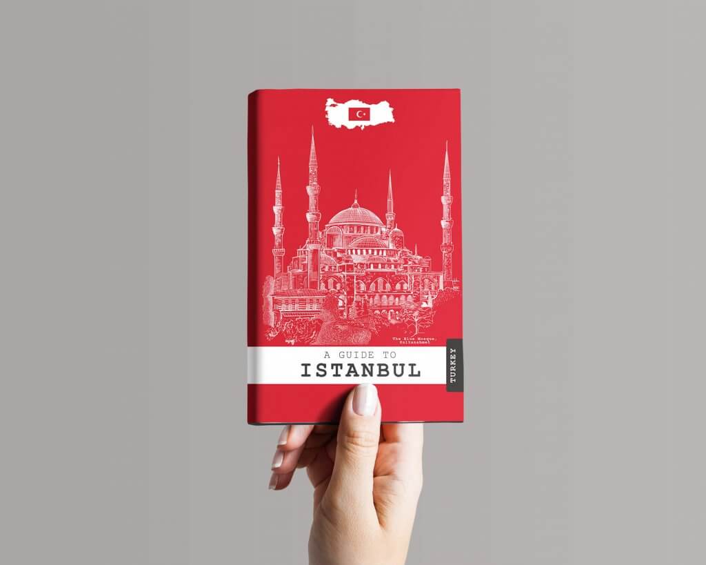
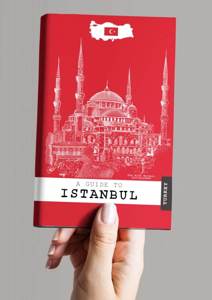
Overall I was pleased with the outcome, I would say it looks like an informative practical guide for the serious modern traveller, but still with fun and style so it would appeal to younger more casual explorers.