
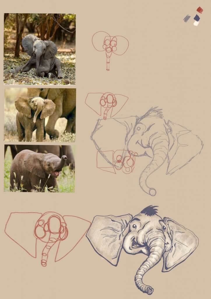
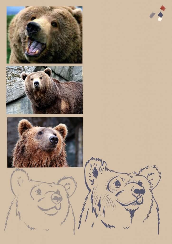
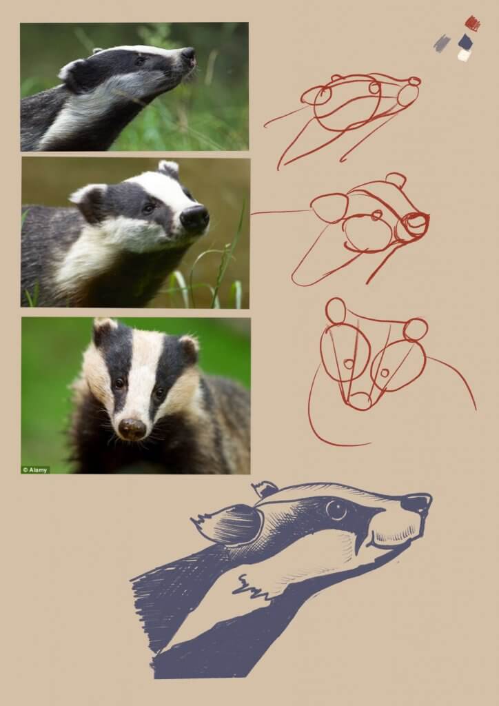
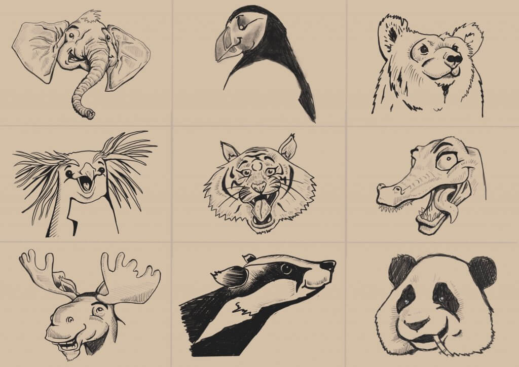
This exercise was all about producing artwork for a children’s book, luckily for me I have a nine year old daughter so I asked her what sort of animals she’d like to see on a book cover, I went about designing them, simplifying them as much as I can and trying to keep a consistent look and feel amongst all the varied animals.
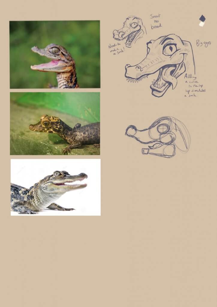
The characters needed to be easily identified as the animal but needed expressions, animals don’t possess the same bone structure and muscles as us humans, so they aren’t capable of the same expressions, some strategy was needed, for example a crocodiles hinged jaw is pretty flat at rest, I managed to add a curved line suggesting a smile, the Tigers stripes I managed to shape into eyebrows etc. This I enjoyed, it was nice to find creative solution to the problem
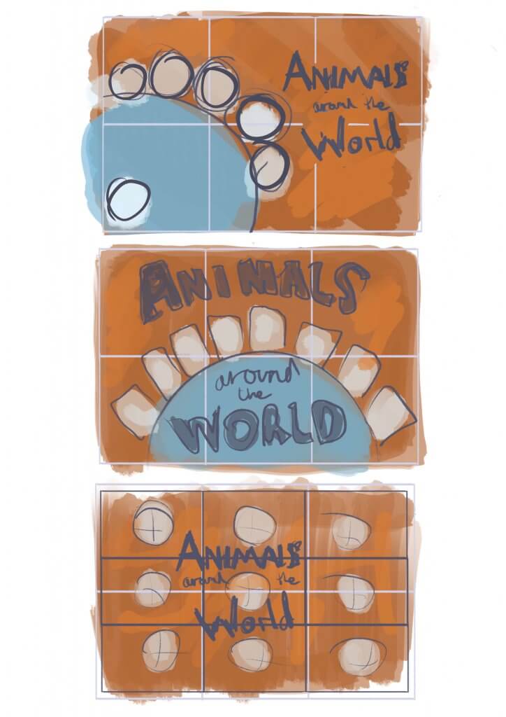
I created the client visuals to explore composition and get an idea for colour. As I wanted to use the Earth in the image, I went for an orange colour as it would compliment blue. I didn’t want to use a dark colour to represent space. Each animal would be in their own respective colours so I thought this would work well.
This was also another opportunity to use real media, a lot of children’s illustrators seem to use watercolours for their artwork, I drew the characters out on a sheet of hot pressed watercolour paper, I wanted some texture to it but still enough for smooth lines. Once happy with the under drawing I rubbed out the lines so I could barely see them. My plan was to use ink for the outlines but after testing a few pens they still ran a little. I opted to put some colour in the paper first then put the key lines back in after. A little backward to my normal approach but nonetheless it protected the ink lines.
I wanted the paper very wet, I managed to get the colours to bleed and blend into each other and I learnt to control the outcome fairly well. I was quite happy with the majority of the artwork. They all looked fairly consistent and worked pretty well together.
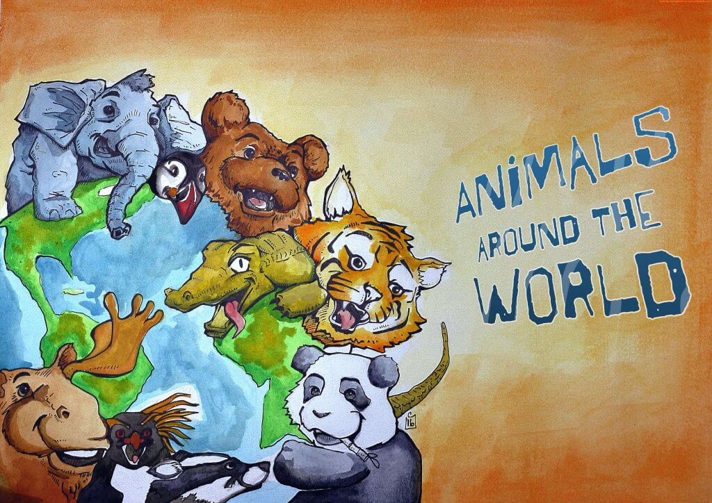
The down side of working with natural media is it needs photographing, I set up some lights and photographed the image on my wall, this in itself is problematic especially as the paper had a slight sheen to it. I managed to get an image that was fairly well exposed but it did seem to be a little blurry in some places, not as sharp as id have liked. The colours also didn’t pop as much as they did on the paper.
I added in some text and created a mock, My daughter actually saw the image as it was still fixed to the wall after I photographed it, she said “Dad are that the animals you had to draw?” I said “Yep, they’re the ones. Do you like them?” she said “yeah, my favourite is the elephant.” I think she liked all of the animals as she looked at it for a while, so maybe while I was very critical of the colours and effect as it was not quite what I had aimed for, it was still appealing to children. It would have been nice to try again digitally but unfortunately time didn’t permit further experiments. Maybe when I have some free time I’ll draw that elephant as a gift card and give it to her for her birthday.