In this exercise I was asked to read existing signs, symbols and images, and draw on their visual language to create my own symbol.
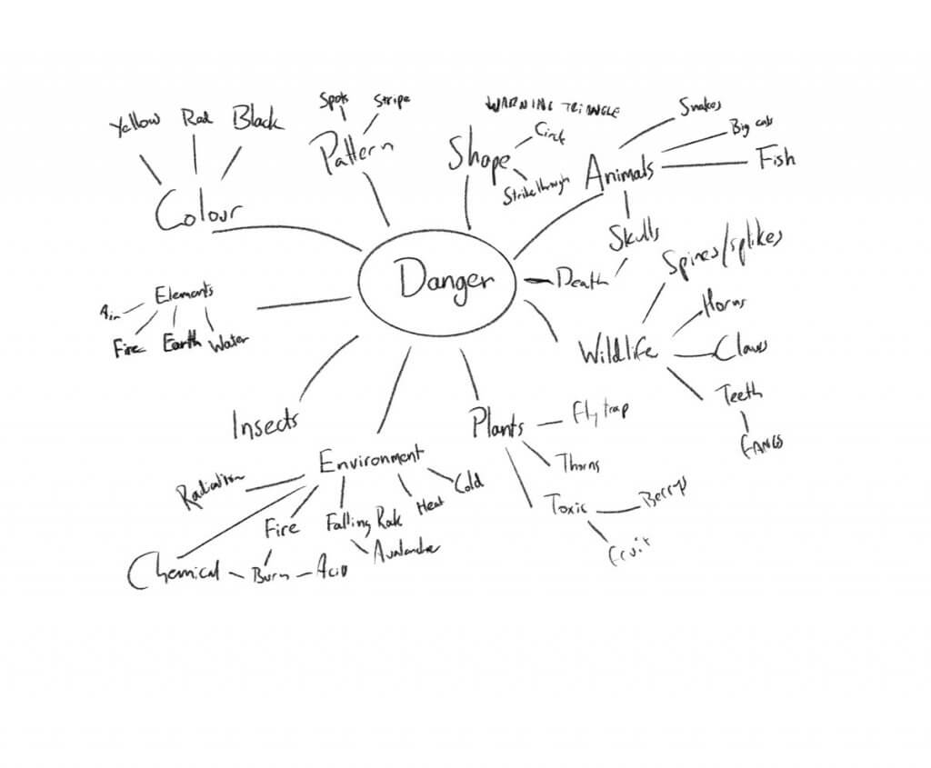
From the 4 options I chose danger, I created a spider diagram and began exploring the word and its close associations.
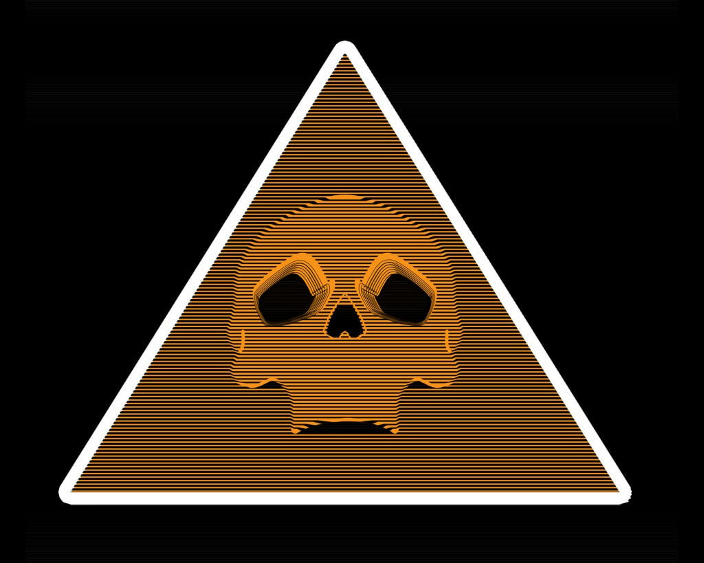
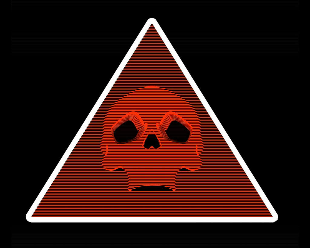
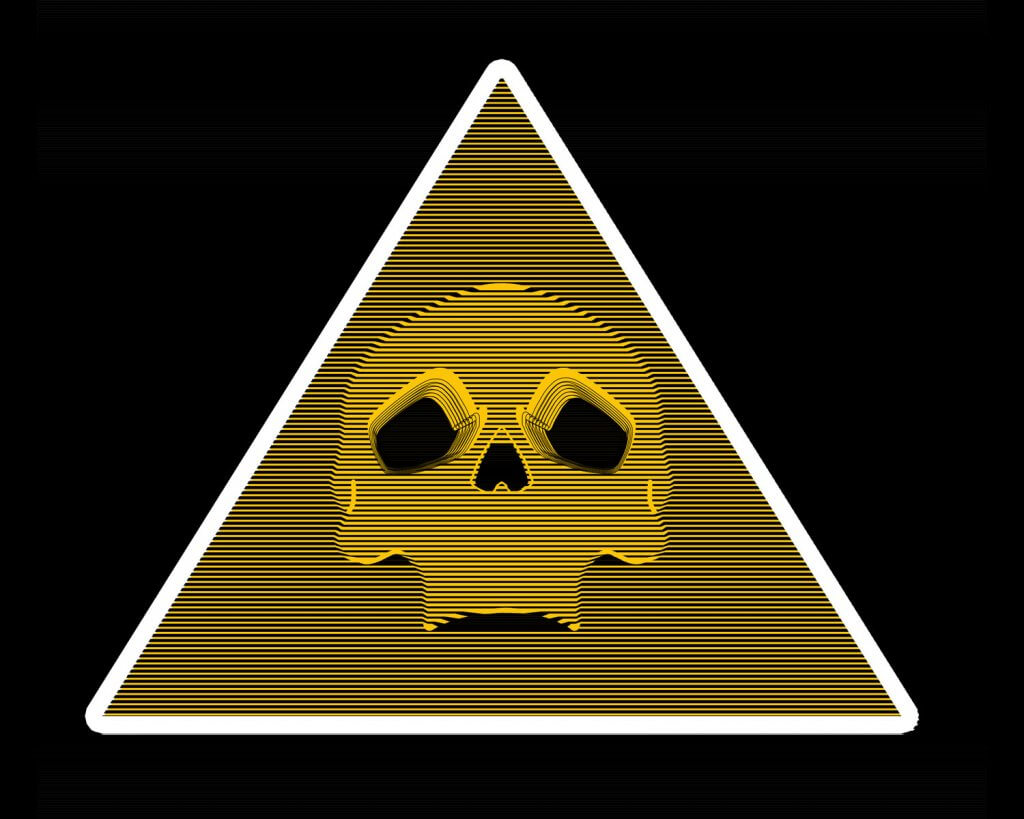
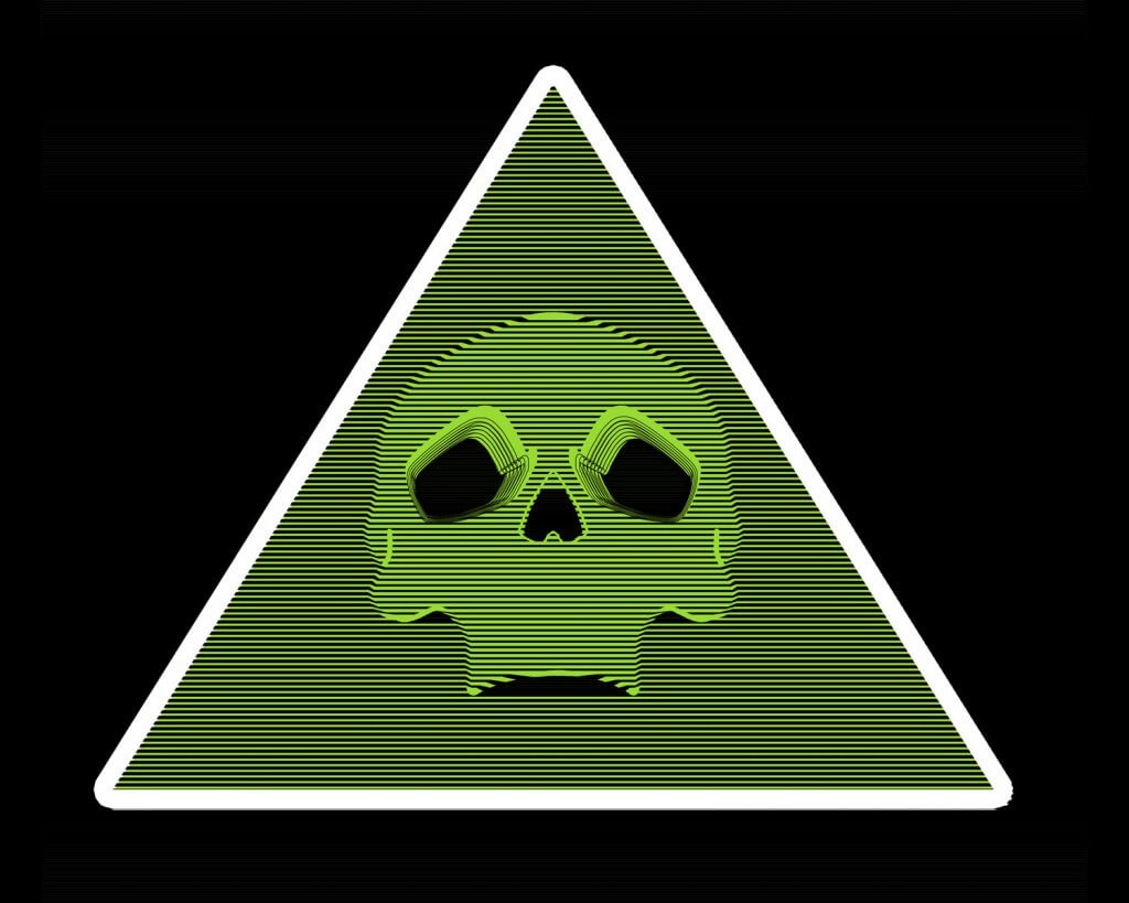
The topic is vast, and danger comes in many forms. I wanted to have a general symbol for danger, this was trickier than I thought, the most obvious and recognised symbol for danger is the skull. It symbolises death, and is intended to scare and remind the viewer of mortality. It was hard to think of a more powerful symbol.
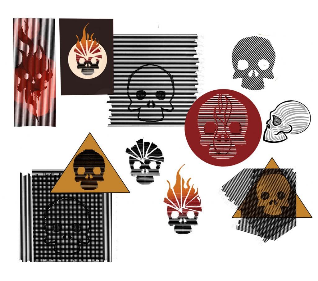
After the spider diagram I took to pintrest to collect some reference.
*The references all showed common themes wether it be from nature or man made, bright saturated colours such as greens, red’s and yellows. distinct patterns, the triangle is used as a warning in signage and computer applications. I was thinking of animal skulls but that became too specific, danger snakes, or dangerous animals.
Everything kept pointing back to the human skull, I then started toying with the idea of using patterns, in particular the hazard stripes that you see on cordoned off areas. I started sketching on the ipad, I really liked the way that the lines added to the outlines, over lapping and offsetting two lined layers made a grid, this was great but not quite what I was looking for, I wanted the stripes but finer so the skull shape is still recognisable, I then combined some ideas, fore, and an explosions. Again this felt too specific, I would need a different sign for all types of danger.
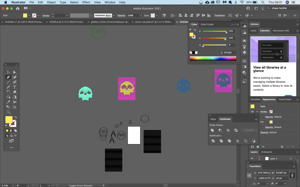
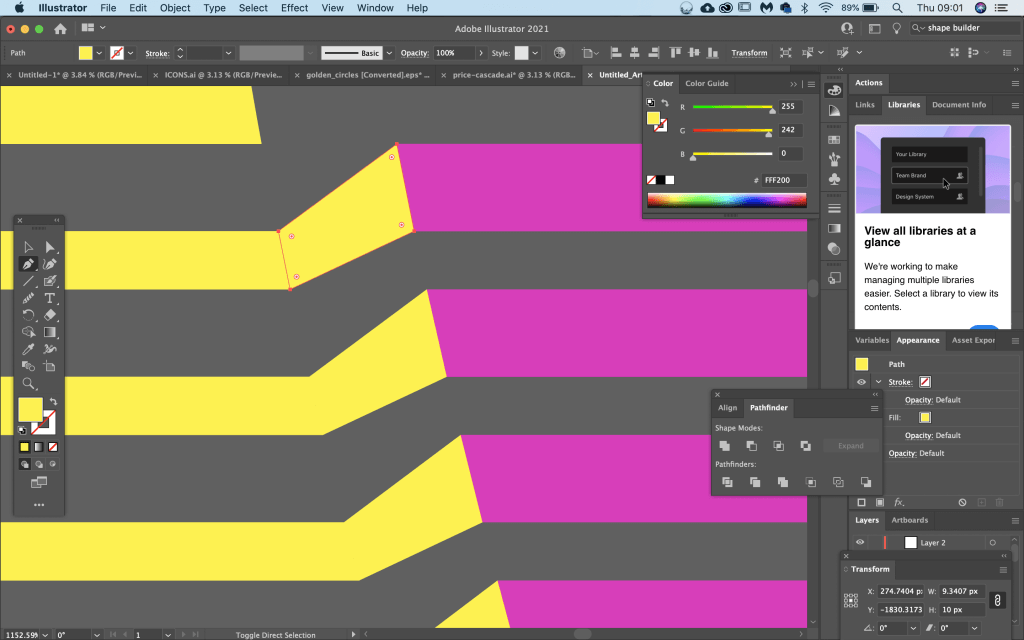
I moved to Adobe illustrator, the tools in this software are ideal to make repeated lines with equal spacing, the ability to add and remove and edit points would also be useful.
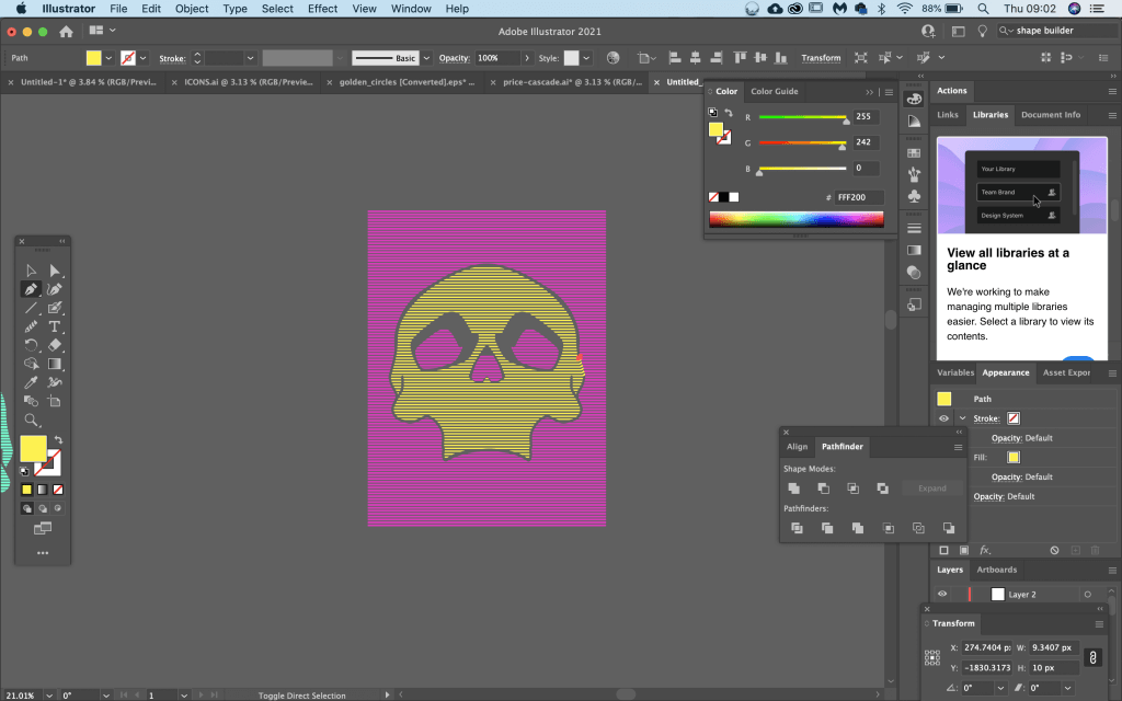
My final symbol artwork. The good thing about the symbol is it will work with all bright colours. It may not be too much of a deviation from existing signage. I found this exercise quite a challenge, there is a reason that symbols exist and its their significance and strength that makes them instantly relatable, to come up with something new and different that still has the same meaning is very hard indeed. I would have liked to have attempted this exercise with another word, I felt I had taken a bit too much time on this symbol, so its best to move on.