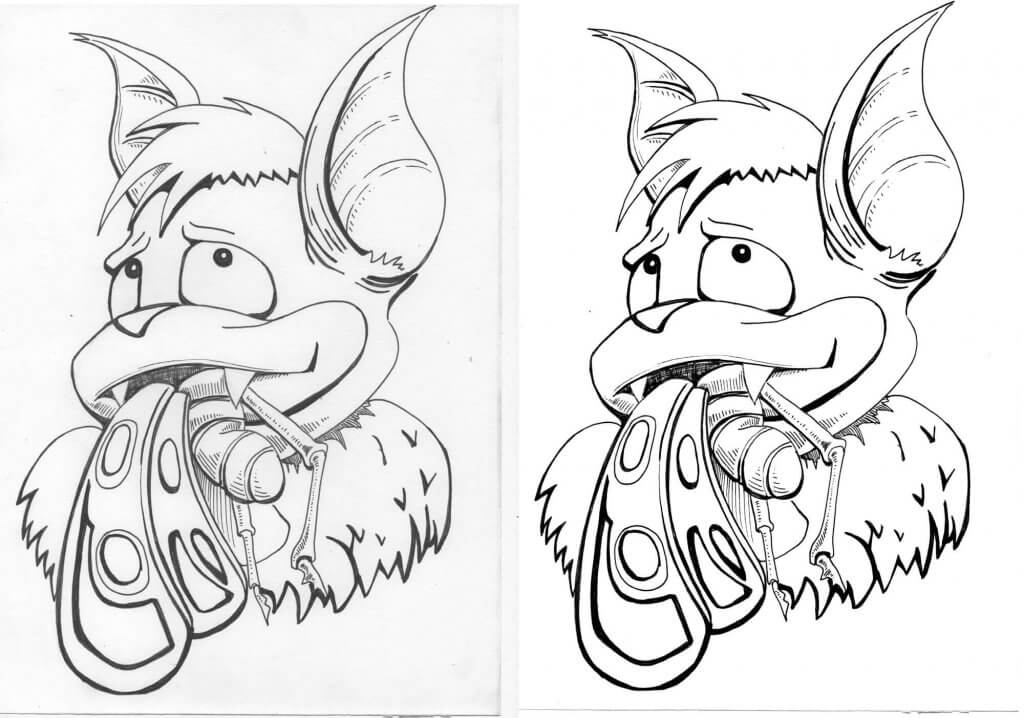
For this exercise I was required to draw from reference, from reference quickly, but capturing the most important details and then entirely from memory.
I found several pieces online and printed them out, in the end I settled on a playful picture of actor Emma Stone on a 70’s style bicycle, she was posed in stereo typical 70s clothing, it had a great feeling of movement and energy, it reminded me of the photo reference I have seen of Norman Rockwell and Gil Elvgren, they seemed to capture the essence and atmosphere of the characters interacting with their scenes and environment rather than recreate it with the greatest of accuracy.
The key elements in my reference were the movement, the weight being distributed, the motion found within the skirt and hair and of course the expression on the face, one of shock and surprise but also a sense of exhilaration and fun, I wanted to capture these with as much intensity as I could.
I started the first drawing on some coloured paper, I wanted to capture a good tonal range as quickly as possible and this approach has served me well in the past, it also helped give it that muted vintage look that I was reminded of while finding my reference. The paper was a4 sized, it allowed me to work the drawing up quite quickly, I didn’t focus on capturing their likeness and I don’t think I quite got the right expression, I felt like I’d made some progress with the movement, but it still felt quite rigid. I thought this over before making the next drawing.
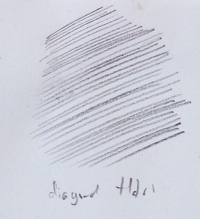
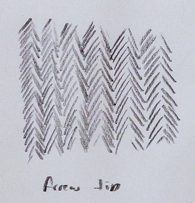
For the second drawing I wanted to draw quickly and use fast and loose movements to capture some energy, I thought a Diogo pen would give me some fine scratchy lines, I worked straight in ink any mistakes would remain and I’d need to correct or push and pull the drawing into shape, I also used a white gel pen to try top add some contrasting definition back in where needed, the hair was to be the darkest and I switched to a brush for that.
My medium sized filbert blocked in some dark areas with little attention to detail, I twisted and dragged the brush simulating the flow of hair.
The drawing was over in a matter of minutes, I resisted the temptation to work into any more than a quick loose sketch with my focus on the parts that would sell the concept and set the scene.
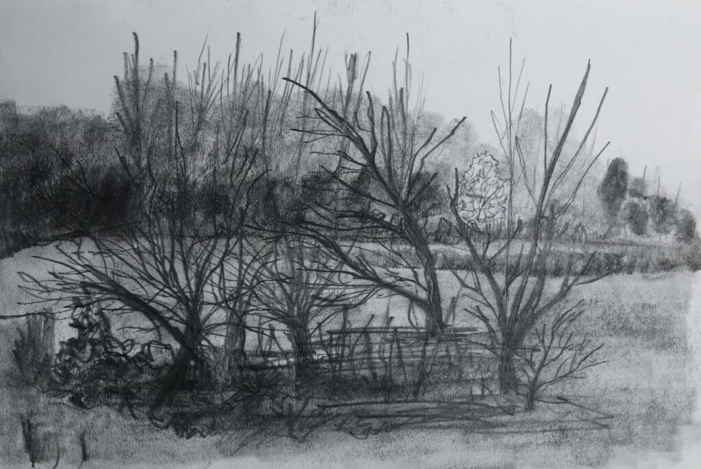
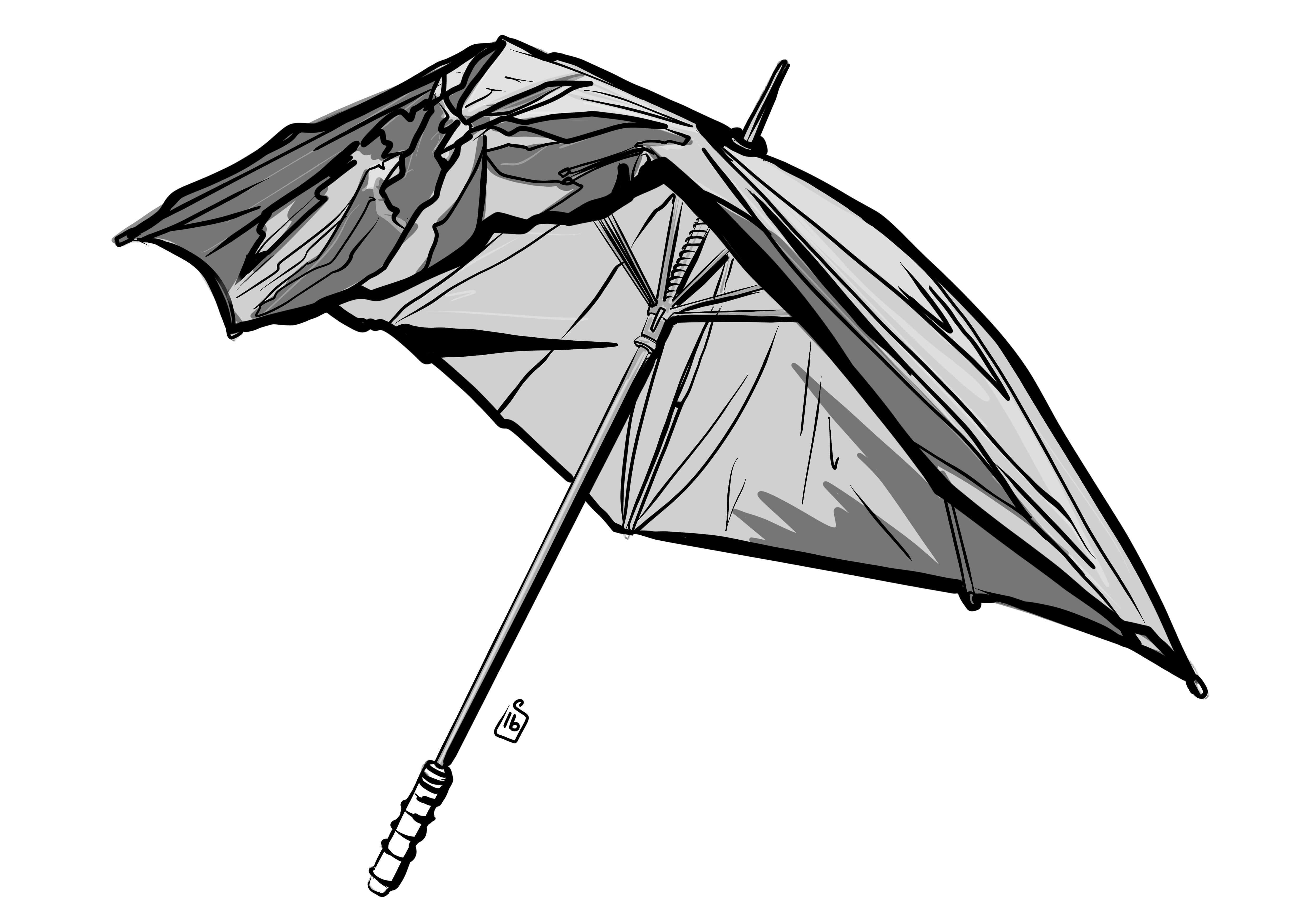
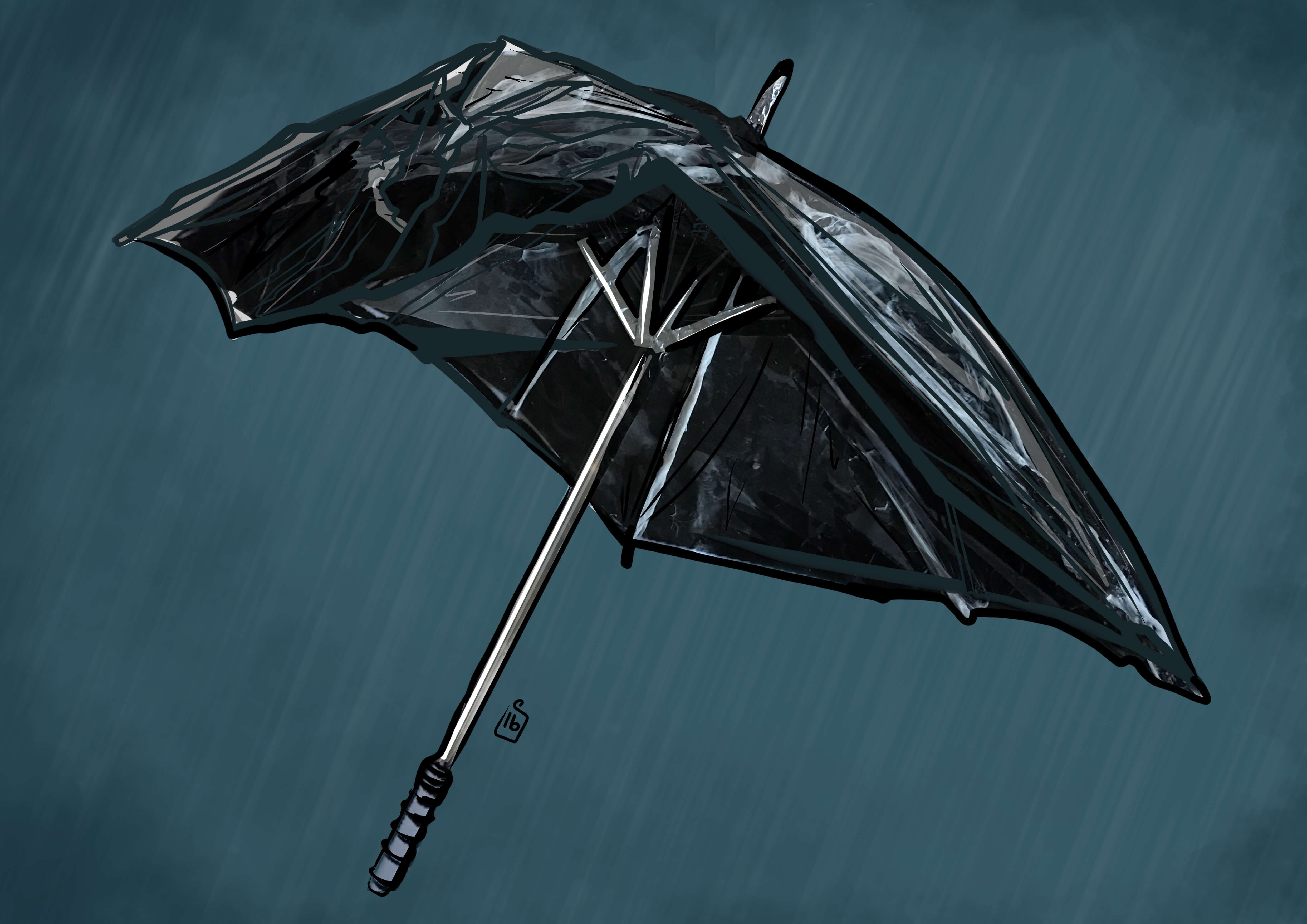
For my third and final drawing for this exercise I used a3 Bristol board as I wanted to get some wider arm movements in for the rounded shapes of the bicycle, I liked the tonal qualities of the original drawings and I thought i would use some alcohol based marker pens to achieve a similar look this time around. Using my memory I sketched out the pose, remembering the pose, expression and key landmarks, from the previous 2 drawings I got it to a place where I was happy with. I really tried hard to capture the surprised expression and the weight distributed over the handle bars to give the feeling of movement, the body’s weight and the forces applied. Once the drawing was set I used a putty rubber to gently fade the marks and went over them with some fine-liner pens, a 0.1 and a 0.3, I tried to add weight to the lines by overlaying until the desired intensity was met. I wanted the ink stage to be a little more structured than the previous drawing but with a more kinetic application, I was happy with how these looked, sometimes when I have re drawn in ink the drawing loses some visual interest, the stark black and white of the page replaces the subtle nuances of the pencil the intensity and soft to shape marks, the pencil has a lot more scope for subtle variations, so experimenting with how I can vary marks during my pen man ship practice is always feels like time well spent. Once I had added some nice contrasting blocks of dark ink I switched to the alcohol pens, starting from the lightest greys I built up layers until I was ready to push the tonal values even more until I was left with a good range of white through the greys to the black of my key lines. I enjoyed this exercise, it really showed me how to spot the most important elements of the subject and how to present them, by the third drawing I was very familiar with the source material and how I wanted to convey that to the audience.