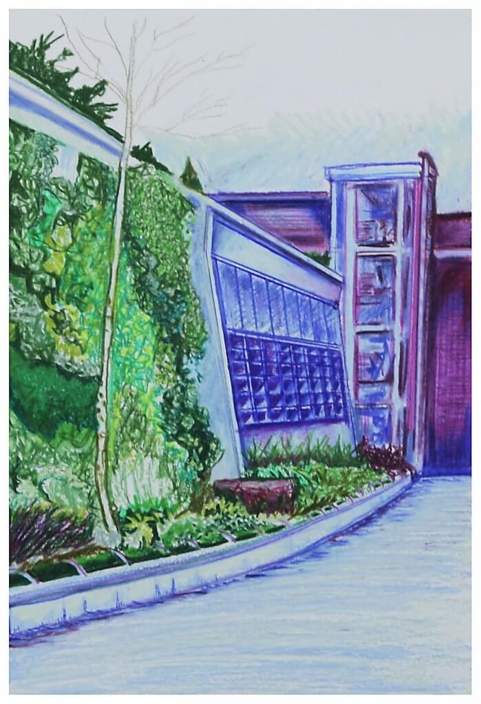
Another view of Romford, this is even more of a star wars set than the last drawing, it even has a metal grid, almost like a rampart.
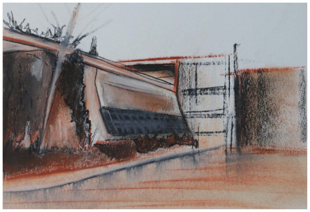
I had two attempts at this exercise, I started out using conte crayons, this quickly turned into a bit of a mess, it maybe wasn’t the best medium for a subject that had a lot of geometric accuracy and small details.
I switched to waxy pencils, I was asked to pick up to three colours, I used green and purple, this almost turned to blue in some instances.
I mapped out my composition with a 2h pencil, very lightly with small indicative marks so I didn’t define any shapes too early on, I wanted to work in blocks of colour rather than linear marks, in the end I used a bit of both, but mainly the blocks prevailed, I thought back to exercise 1 and the two approaches for a similar drawing. I was pleased with the texture I achieved with the foliage, this contrasted the flat surfaces of the buildings.
I tried to create depth with my colour choice, I was hoping the green would advance and the purple hues recede adding depth, It worked to a fashion but maybe a warmer hue such as a yellow/green or an orange would have been more successful.