
The personal project
The first part of this assignment required me to summarise my previous assignments, communicating the successes and problems that needed to be resolved.
Assignment One
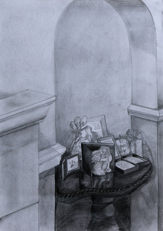
Looking back at this piece, I am really happy with the way the different surfaces came out, I think the composition could benefit from some cropping but overall I am still happy with this.
Assignment Two
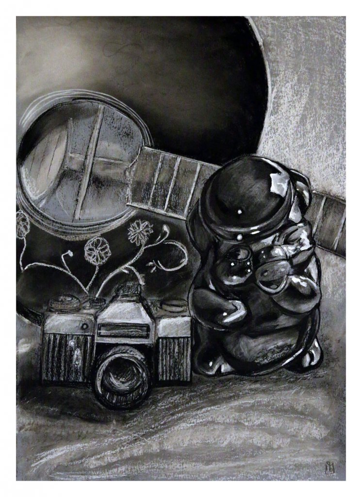
I remember really enjoying the research for this section, I wanted to draw something that would have multiple points of interest, the table is quite personal, if I had to re draw this, I would add more textures, separate planes by using directions of my marks and maybe add in some points of interest around the drawing.
Assignment Three
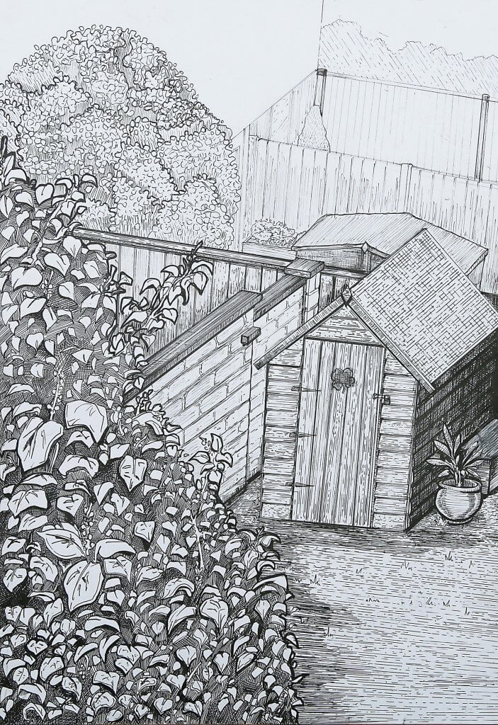
I remember this assignment being very tiring physically and mentally, constantly having to think about the direction of my pen and the type of marks to make. If I was to approach this drawing again, I would try to be more expressive with my marks, I would break my lines, especially outlines, to make for an airier lighter drawing.
Assignment Four
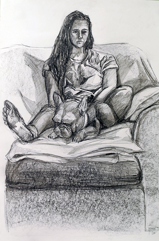
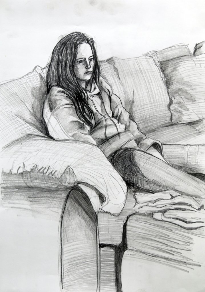
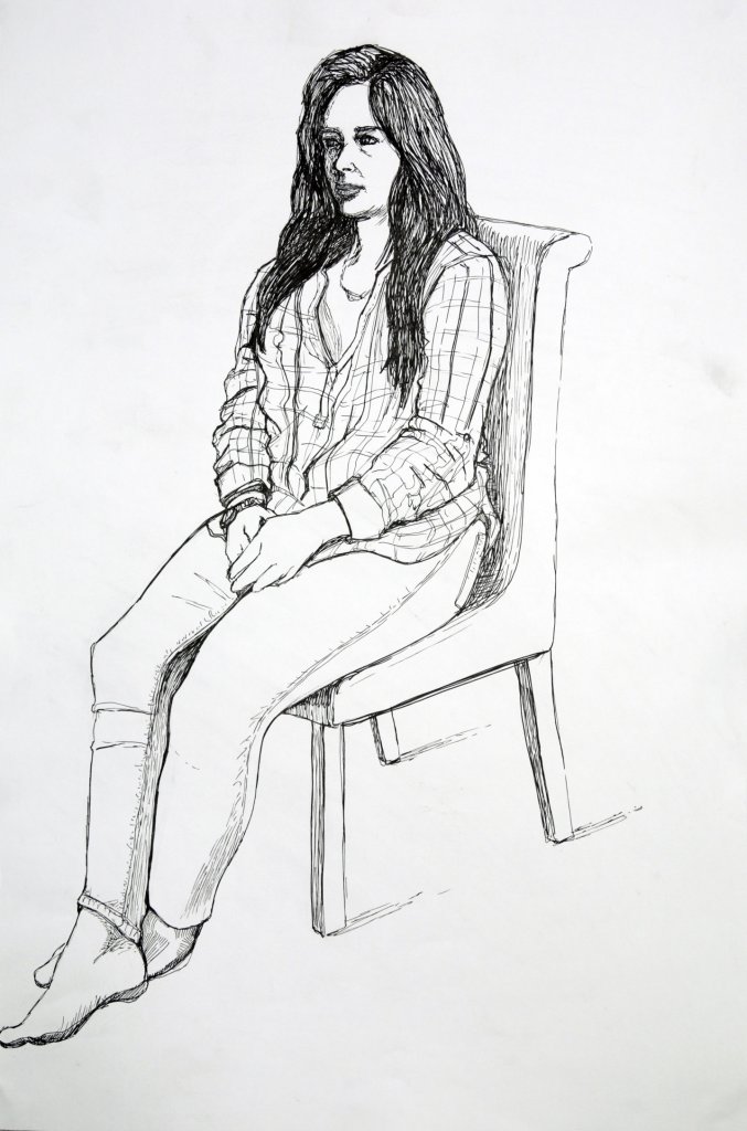
Figure drawing is probably my favourite of the subjects I have covered, I was happy with the way these individual examples came out, they all have a diffrent feel but still feel like my drawing style. If I had to work on these again I would attempt more challenging poses, especially perspective, this is something that I never seem to be able to get just right, and if its off makes a half decent drawing look awful.
Finding a subject
I really enjoyed working with the figure and portraits, I also really liked researching artists throughout the course, but especially the research in part 4: the figure and the head, I found this of great benefit and it has certainly broadened my approach towards my own artistic efforts and working on a sense of style based on what I enjoy looking at myself.
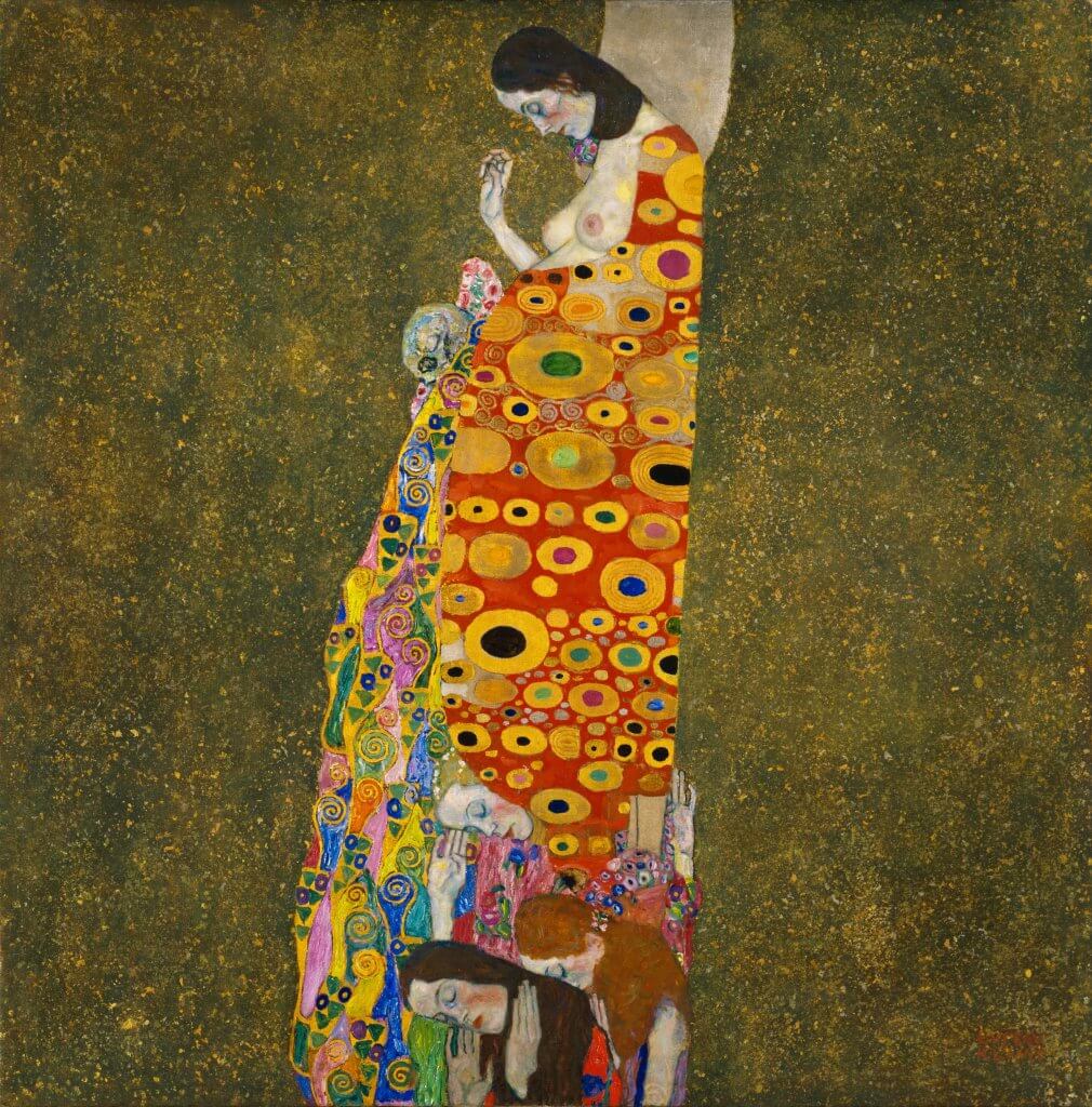
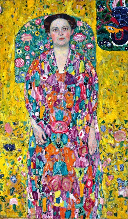
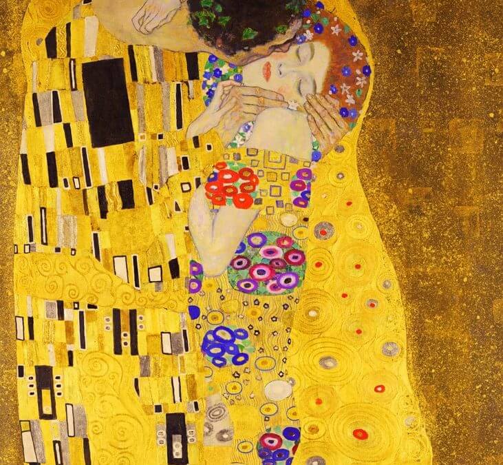
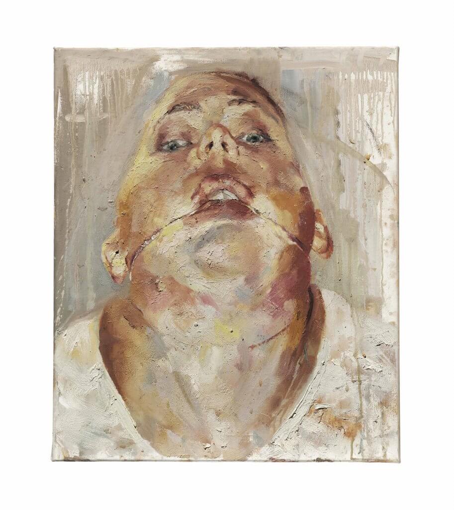
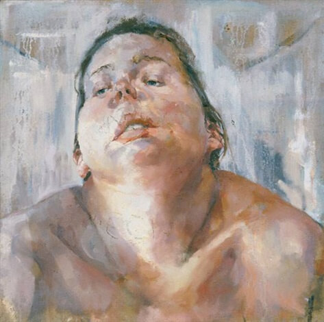
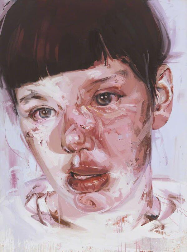
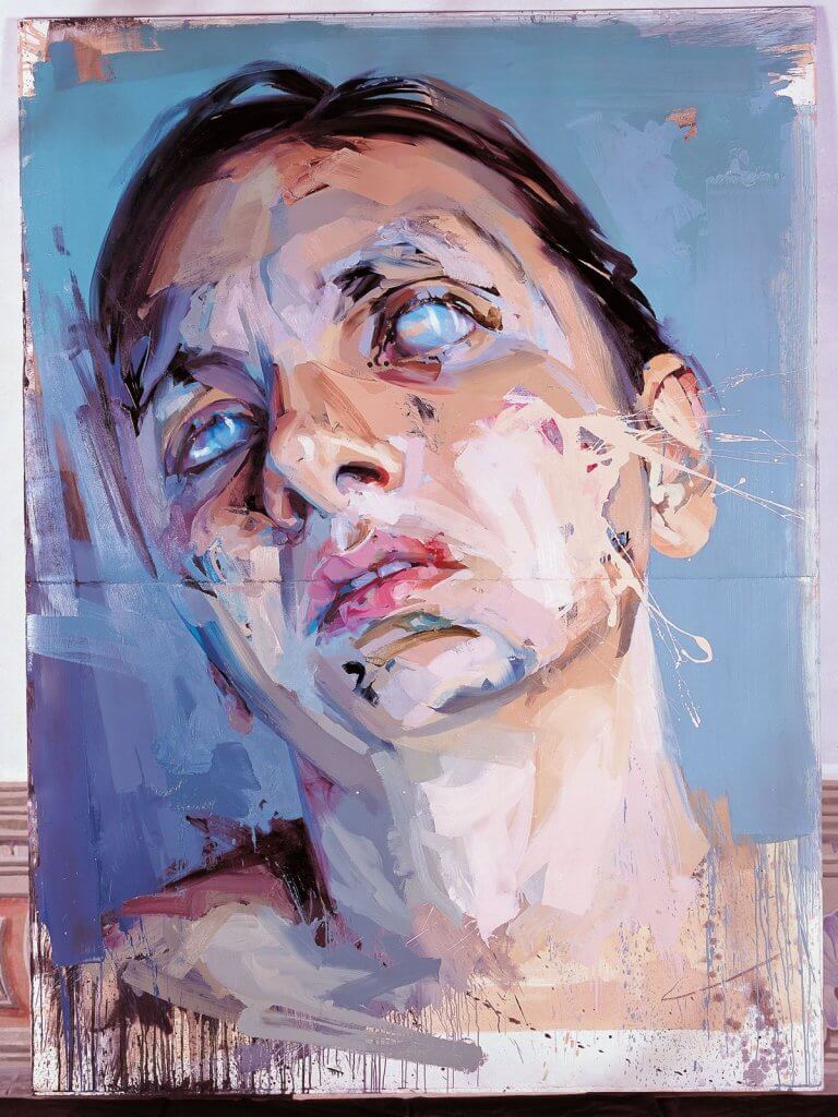
I found a lot of inspiration looking at the work of Gustav Klimt, the way he portrayed realism within the faces partnered with flat areas of colour and pattern, I also enjoyed seeing Jenny Saville’s huge artworks, her use of broad strokes and abstract artefacts, they almost look like the faces are bloodied, bruised or marked with dirt.
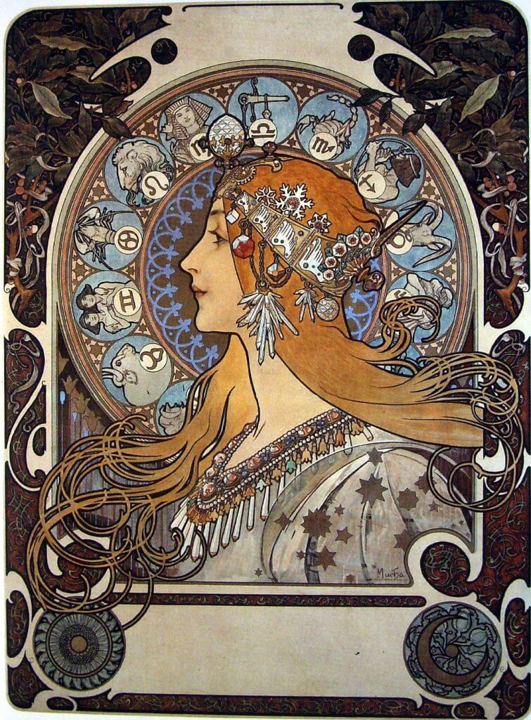
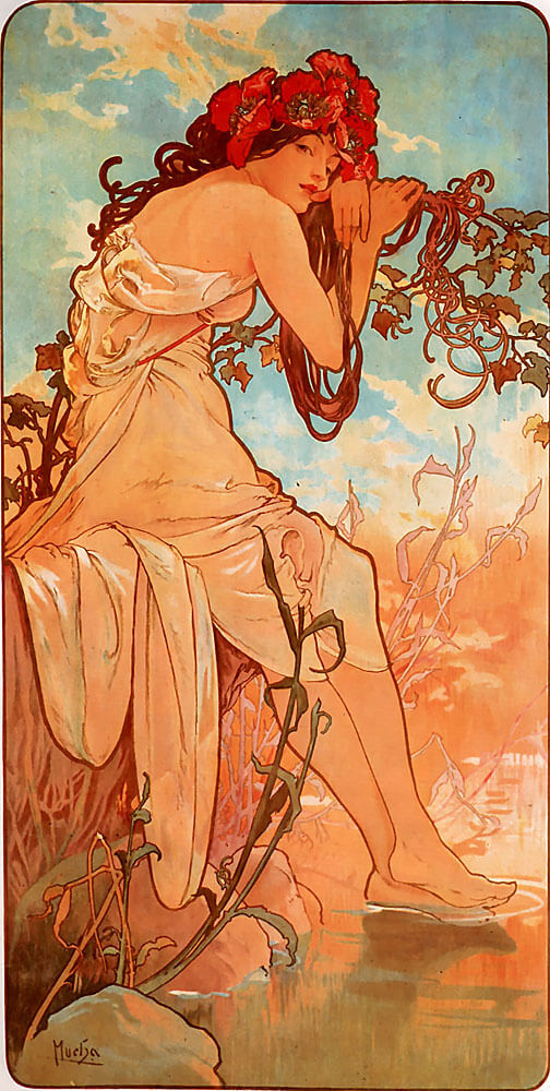
With those artists in mind I thought about maybe a figure or a portrait, I had a look over the web for some more examples of Klimt and Saville’s work and saw some pieces by Alphonse Mucha, I’ve been a fan of his since college, a tutor suggested I look him up after I showed him a cd single I had just purchased, I mentioned to him I liked the art work. He suggested it to be a mix of Alphonse Mucha and John William Waterhouse. I really appreciate Mucha’s presentation and the poses of his figures, I also really enjoy his use of line. I have been advised by my tutor to control my reliance on line work, this has been an extremely hard habit to break, but I do feel I am getting there, I normally go on an autopilot but making the effort to draw in blocks rather than line has forced me to think more about my drawing and look at the subject in a different way.
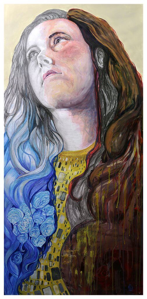
After some thought I decided on a portrait of my partner Kathleen, I wanted to work as large as possible, seeing Jenny Saville’s huge works looked like so much fun, I imagined myself using big brushes and reaching across a vast white space, filling it with angular shapes and harsh marks and scrapes of course my image couldn’t be a fraction of the sizes she can work in. Around a year before I had bought some really nice paper on a roll, I thought to myself it would good to work bigger than I ever had, and wondered if it would change the outcome of my efforts, my approach and drawing style. I looked in our shed for the biggest (improvised) drawing surface we had, I found an ikea table top that was donated to us but never used, as ikea desktops are made of compressed cardboard this gave me a light weight, flat surface measuring 120 x 60cm minus a border around the image for the tape I will use to fix it to the table. The paper is very thick and has a medium tooth, it would be suitable for a wide range of mediums which got me thinking maybe a mixed medium approach would be a nice way to work. As I have mentioned I am trying to work on relying more on tone, but I do enjoy using line in my work. So at this point in my journey I think exploring both is more feasible than tone only, I will of course favour tone more than line to carry on changing old habits. I think I would like to be more experimental in my approach, as this is to be a portrait of a stranger I think that might be more interesting to myself and the viewer, allowing me to get in some points of the subjects way of life and character. Im hoping to realistically depict the subject, but not to the extent of photo realism, I want some abstraction and a freedom in my marks.
Due to light being scarce in the room I will be working in, my sitter having limited time I plan to pose her for a photograph and work from that. To summarise my personal project will be;
- A large format (120c60cm) semi realistic portrait
- Mixed medium
- Thick medium toothed paper
- Combination of line and tone
- I want the piece to tell a story about the subject
Artist statement
The title of my final piece will be “absense” a mixed media representation of the senses.
My partner Kathleen is hard of hearing, I have often thought about the day her hearing goes completely and how that will affect and impact us. I want my piece to represent the human senses, and as the intentional misspelling of my title suggests, the absence of the sense of hearing. I want to incorporate colour and pattern/texture some structured (Klimt) and some random, such as paint flicks, scrapes, splashes and drips (Saville) I want the picture to feel cool and warm using areas of blues and reds. I want to also convey a soft area with little clarity or definition to represent Kathleen’s hearing loss, I want the pose to reflect strength and confidence much like the confident women Mucha depicted.
To give some background, Kathleen’s hearing loss was actually caused my complications during a routine ear operation when she was 2 years old, she had several operations to correct this but unfortunately those were unsuccessful, she has scars behind her ears and usually prefers to cover them, wearing her hair down. As an 8 year old child she was fitted with hearing aids, they were large and ugly and through fear of cruelty by other children opted to not wear them, she relied on filling in the gaps by looking at the shapes on others lips to reinforce what she felt she had heard. Kathleen’s favourite flowers are peonies, I would like to incorporate these into the piece to represent the sense of smell. My paintings usually have a smooth blended appearance, I tend to work in large brush strokes then refine these using a smaller brush until I get to the details, I want to work the opposite for this piece, I want to retain some of the brush strokes, keeping some edges hard. I am not expecting my work to ape or mimic Jenny Saville’s exceptional pieces but I want to approach it in a way that I imagine she would, loose, experimental and most importantly for me not what I would typically choose to do. I will view it as a good iterative start to work towards changing and shaping my developing style.
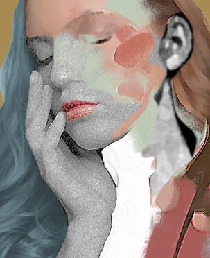
I made a rough mock in photoshop of how I might divide the sections, I found this useful as it gave me the freedom to change my mind and ideas were free to flow at this early stage, as you can see the original idea was quite muted, leaning towards a cooler colour scheme more like Jenny Saville’s paintings.
The Sections
Throughout the drawing I made voice memo’s I have transcribed them and adding these in as quotes. The way I intended to approach this image was section by section, with the intent of a final pass to pull the image together if need be. I rarely work with paint and especially colour, so this image will incorporate a challenge for me. Here is a breakdown of each section, its obstacles and successes.
“If I was planning to make further iterations of the drawing, I think I’d be more comfortable being more experimental.”
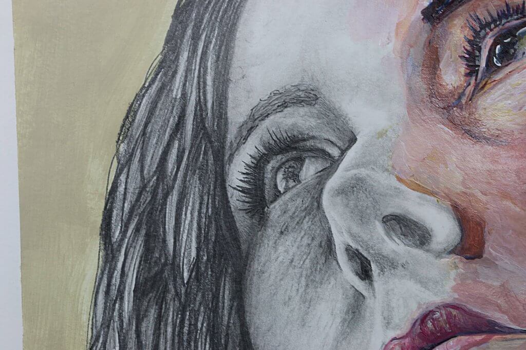
Graphite
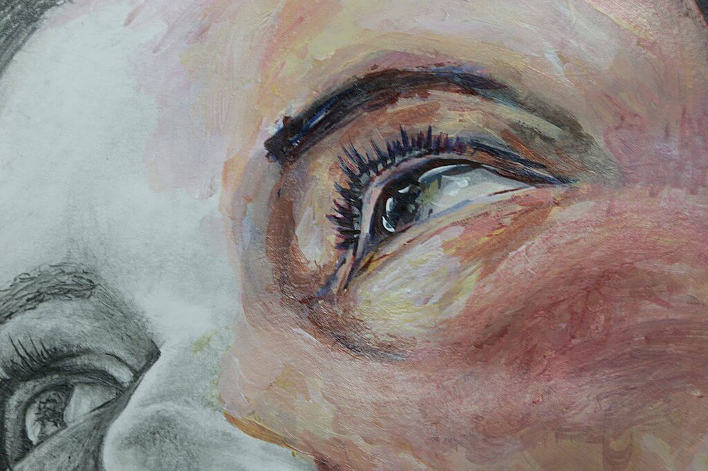
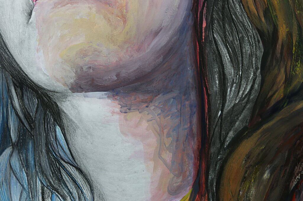
I started using the pencil to slowly build up the tonal values working between hard then softer pencils, using the paper stump/tortillon to blend and work in the graphite, erasing and layering as I went. Using the tools I follow the direction of the contours of the face, although the image is to be mixed media I want it to hang together as one drawing, I don’t want a big jump from one medium to another, I want the transition to be subtle, so tonally this will have to match the other sections. This will likely mean working on the whole image and then refining towards the end to unify the sections, for this to be successful I will have to be both reactive and proactive, planning ahead as much as I can.
I used both a putty rubber and a plastic eraser on its edge to remove a layer, and then put it back on, I do this to try to get a mottled uneven texture, when I work over the pencils too much they start to burnish into a smooth surface and getting more graphite to sit on top is hard if there is nothing for it to key on to, erasing the marks back helps to win back some friction. In addition to this I used an electric eraser with a small tip to bring back any lost light spots. My goal with the graphite was to introduce detail and texture in even the soft flat areas, this in my mind would result in a more realistic effort.
“I have stood in front of and looked at the image for about 20 minutes each day, planning on what areas to work on next, and with which medium, I am trying to be logical with my approach as some mediums will be easier to correct and adjust than others.”
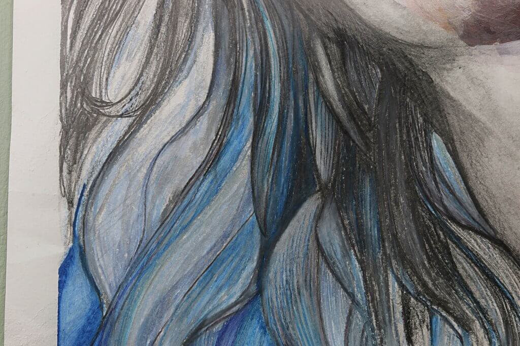
Colour pencil
The face is to be divided into a cool side and a warm side, the coloured pencils will be predominantly blue. I am using the waxy type of pencil, these seem to blend well together, again I haven’t used the medium that much, more experience would help me to understand how to get the best from them.
“I’m making tentative marks at the moment, Im not really trying to make any concrete decisions, using blocks of colour and lighter and darker tones as my tutor has suggested.”
My current approach is to layer the pencils on top of each other. I break up the larger sections of hair and try to get a shape, I look to Mucha again as the hair on his figures is really stylised and has a life of its own, I thought this would be an interesting approach for my work. I liked the way the pencils and graphite merged, giving a silvery look, this helped to soften the transition, it feels quite natural this way and is an answer to one of my predicted problems. The two mediums one waxy and one dry work quite differently but the flowing shapes also help to ease into the next section.
“I want to produce an image that hangs together well, I don’t even want it immediately obvious that the different sections are in different mediums.”
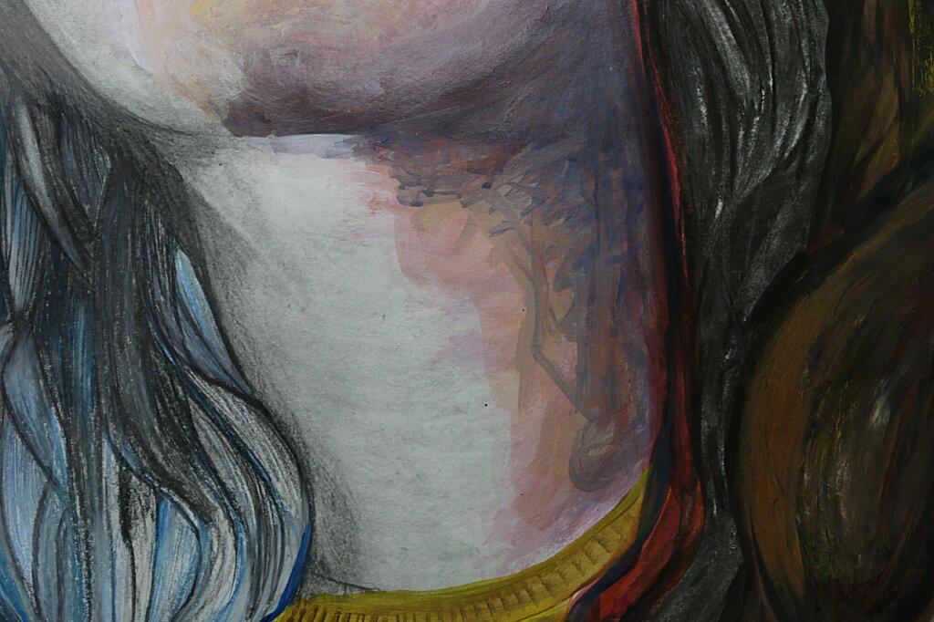
Acrylic Paint
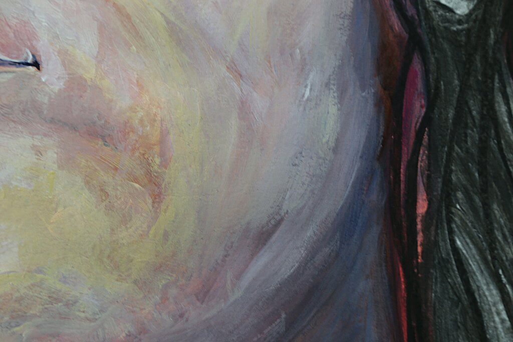
Using a similar approach as the pencil I followed the shaped of the face, I started with big vibrant colourful brush strokes. I chose very bright and bold colours, pinks and blues, I see that a lot in energetic contemporary portraits, I eventually worked in more realistic tones, treating the other colours more like an underpainting. I looked at Jenny Saville’s most common colour palette as she was then main inspiration for the painted section, she uses very warm browns and reds with cool pinks, blues and greens. I added burnt sienna to warm up the face, with some blue for the shadowed areas such as the neck. I eventually lost a lot of the abstract marks, when I look at the picture closely it certainly is different to what I’d normally do, visible brush marks, small blocks of colour all when viewed as a whole seem to render the desired shapes and features. I want to do a few more paintings with this approach, physical or even digitally.
“I’ve not completed a lot of physical paintings, its not one of my core competencies. But at this point I just want to get some colour down, I’ve chosen a basic palette as a jump off point, I think as long as I follow the contours of the face and use roughly the correct tonal values then it will act as a serviceable start.”
When I work digitally I do tend to take more risks, thats likely because it is non destructive and easily reverted if my choices aren’t to my liking. It might be a good way to develop a style in conjunction with experiments with real paint, the approach will be the same for both but the actual application differs greatly, so using both feels like would be of the most benefit. The other are of the painted section is the patterned clothing, I really enjoyed adding in the pattern, I call Kathleen Kat, rarely using her full name, but there is something leopard like, I originally was going to use a red pattern but pleased I chose yellow, it sits nicely with the blue and the warmer red/brown hues. The final part of the painting, which was something I hadn’t planned was adding in the scrapes and drips over the hair, I tried to do some bouncy cloud like shapes, I wanted the hair to have life like in the Mucha examples, it didn’t really work as I’d hoped it looked like chocolate ice cream, so I decided to deface it, scraping and dripping colours that was around the image, I think it did help pull it all together and create a little more interest.
“I tried to approach the image, the painted section particularly with a sense of energy and freedom, I’m nowhere near there yet, still a little rigid and driven on details too soon. Looking at some of Jenny Saville’s painting it looks like she has painted the details and then added a layer of abstract marks and shapes afterwards, I cant imagine myself being successful with that approach, I think I would end up defacing and destroying what I have done.”
Charcoal
This section was to be quite loose, with blended soft marks. I wanted to imply shape, little to no detail, suggesting that the ears are void of colour and nuance, dull, with no sharp trebly tones cutting through. again this section was built up in layers, rough shapes blocked in and then worked into the paper. It took me a while to be content with that final section, it didn’t feel worked on enough, but that wasn’t what I wanted. It needed to be a suggestion and vague.
There are many things that turned out how I planned with the drawing.
I was happy with how vibrant it all looked, I had thought a paler pallette (as per the Jenny Saville examples) initially, but with the addition of the bold “Klimt” pattern I think it works better with a bit more saturated colour. The painted area although it didn’t seem as experimental at first was a good primer for the start of a new direction in my own personal style, with time and repetition I feel I could happily arrive at something more free and loose, and less reliant on outlines and underdrawings which have the potential to make the image seem rigid.
I was hoping for something a bit more distinct and abstract, like I said earlier, the shapes and marks that Jenny Saville uses really appeals to me.
I was once told If you want to play your guitar like a certain person, then the best place to start is with who inspired them, then you can truly approach it with authenticity. This makes a lot of sense, I don’t want to copy someone else, I want to further develop and grow into my own style and way of doing things so I am in a way happy that it didn’t come out the same as a Jenny Saville, or even reach a new style by easily completing one drawing, I will continue to find inspiration in others, read about who they was inspired by and continue to develop my own voice, by using the same energy and approach I imagine they used. This assignment has been a great start, It really has broadened my interest in the art of others and started an evolution of my own efforts.