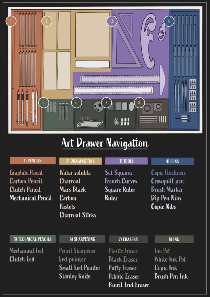
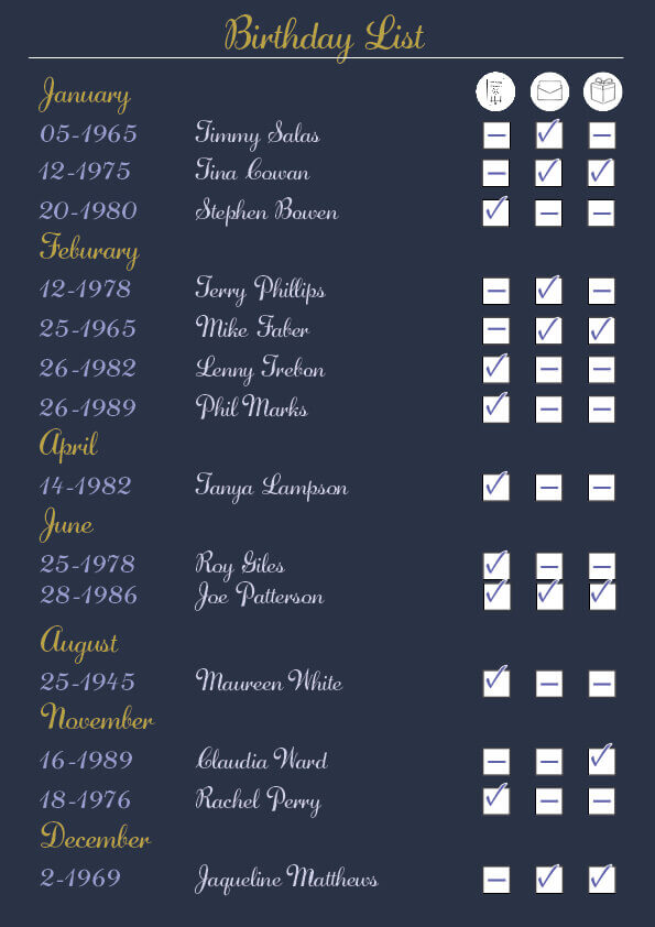
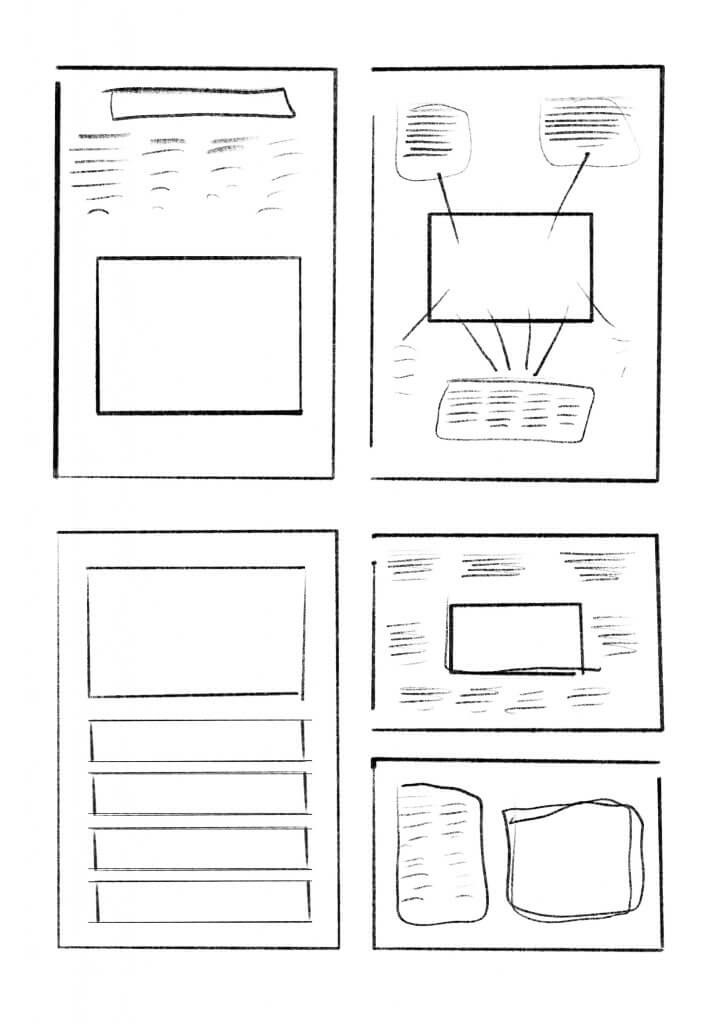
This exercise asked me to draw inspiration from established information graphics and then male my own for my own surroundings. I decided to map out my Art tools and materials drawer. I thought this would be a good one as there is many different items in there that all are sorted into logical groups. I wanted to colour code each different category, and I also thought each colour could have a tint based on its position, left to right top to bottom, with the last item being the lightest. I started to explore the all important layout, depending on wether the map was to be text led or image led would dictate the positioning and prominence of the image. I tried to separate the text lists around the image the obvious problem here was a lack of structure and consistency, displaying the categories together seemed to offer a more simplistic approach and was easier to navigate through. I decided that I would need clear header to describe the category, these alone would be useful to point the viewer in the right direction.
I sketched out the layout and dividers of my drawer, Adding in the contents in clear and logical ways, my drawer is not this neat, its organised exactly like this but some digging and searching is needed for just the right thing.
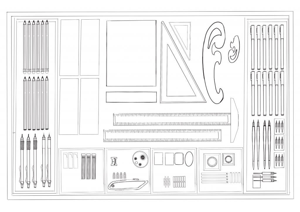
Once I began to colour code a nice even structure become apparent, I tried my original idea of using the same colour but using tints to show the position of the items on the map. This I felt worked well, then I started thinking about the user, what if he had poor eye site or colour blindness, adding a numerical system would add another simple layer of navigation that would ensure bases were covered.
The downside of my colour coding does mean it relies on a dark background to work, as the tint approach means that the last listed item will be white or thereabouts. This may or may not be a problem, in a printed context its probably fine but if this was to be translated to a web environment we may need opposite version for night mode where the image is darkened with shade rather than tint.