
For this research I was asked to find examples of vernacular photography in my local area. I visited the high street, and cafes in search for examples of “native” signage. The definition of vernacular typography is quite broad, it is often made by non designers, it could be something very well crafted or something very basic, hand drawn or painted.
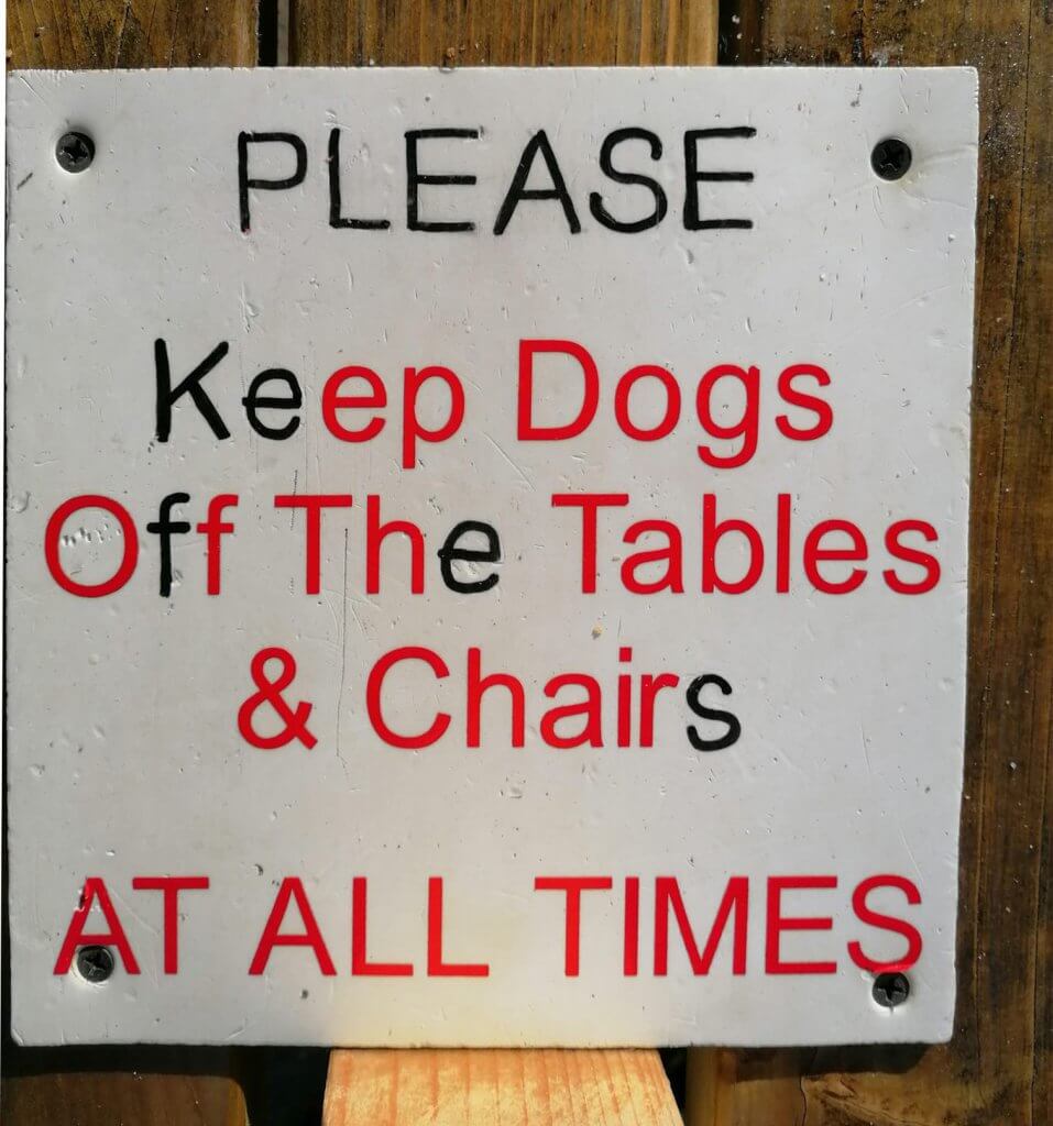
This one appealed to me, at first because it looked like it was intentionally coloured or defaced, I tried to look for a hidden message, of course its just been sloppily repaired with a black pen. Whoever repaired it has paid some attention to the base and median lines but couldn’t recreate the geometric precision of the machine cut letters. I found it held some charm so wanted to include it.
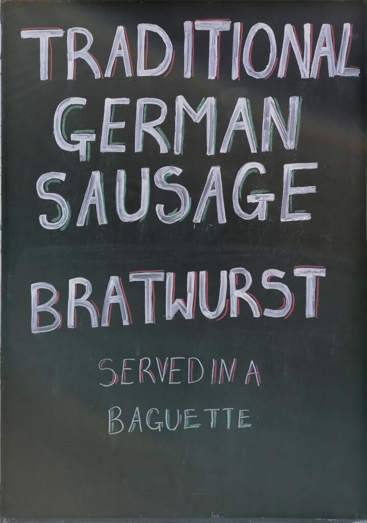
This one was on a board outside a food stall, its pretty direct and no thrills. they have used some colour and a crude drop shadow effect, they have kept the message all in white, which means it reads through to the end or at least til the bolder characters. However it looks like it is supposed to read “Traditional german Sausage. Bratwurst served in a baguette.” but it actually reads “Traditional german Sausage Bratwurst, served in a a baguette”, maybe they was trying to say “Traditional german Bratwurst Sausage, served in a baguette.” The “leading” if we can call it that when hand drawn varies too affecting how we read it, “bratwurst” seems to be almost like a tick, standing alone in the middle of the message.
This of course does not matter too much, the sign is temporary, almost disposable in nature and serves its purpose for any bratwurst hungry customer. The hand made nature of the sign, the way the characters vary in height and the leading also seems to be ignored all make it feel very informal.
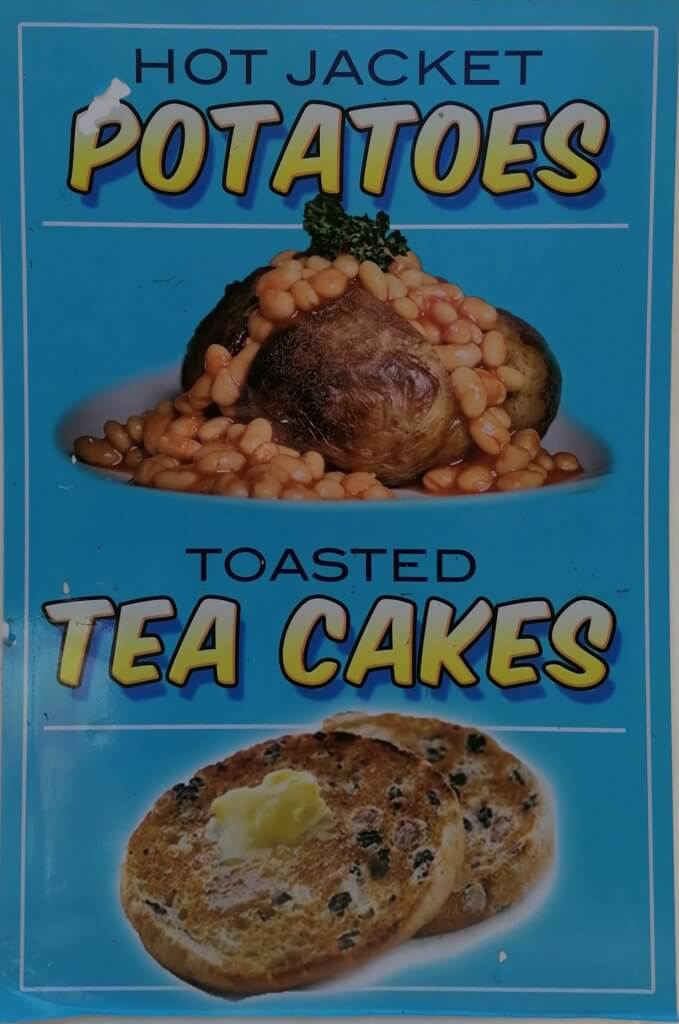
The imagery here is one of my favourite elements, the floating ghosts of a jacket potato and a buttered tea cake did amuse me as did the garnish on those beans! That aside we have a sign here that has been made with the aid of a computer. The computer has leant some accuracy and consistency to the sign and the typography, the fonts seem to have been picked to be loud and exciting, a script style typeface with very much comic book styling, a thick key stroke around the characters and a yellow to white gradient, would be at home on most Marvel comic pages, this is partnered with typeface that looks short and wide, similar to copperplate without serifs. they don’t look out of place with each other, and the choice of complimentary colours works. The overall tone doesn’t shout quality and looks quite cheap, as this is a less temporary sign than lets say a chalkboard, this is either very old and hasn’t aged well or is the tone they want to convey to customers, cheap and cheerful.
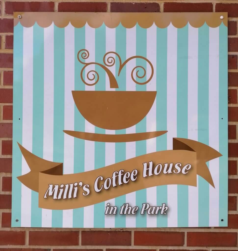
This is a sign for the cafe in a local park, one of the chalkboards came from here too. A lot more attention to detail here and feels a lot nicer than the cruder chalkboards, which in a way sells themselves a little short, this branding could have been a constant fixture to the chalkboards.
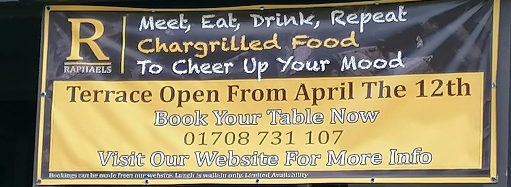
probably about 3 typefaces too many on this one, a chalky looking script type and then a serif font, they’ve used a white font on yellow and then realised that adding the lightest tone on a colour that is tonally similar offers no contrast so a dark keystroke has been added, the phone number is displayed a little thinner, this is one of the most important pieces of information and as a local business they would normally want this to be highly visible. I suspect this has been either designed by a non design type or handed to a sign maker who will literally commit what he is given to his work.
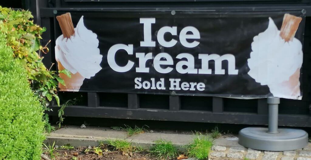
I liked the simplicity of this one, the typeface fits well and mirrors the colour of the ice cream, its quite tasteful, if I could edit it I would remove one of the cones and drop the size down a little to give it some breathing room.
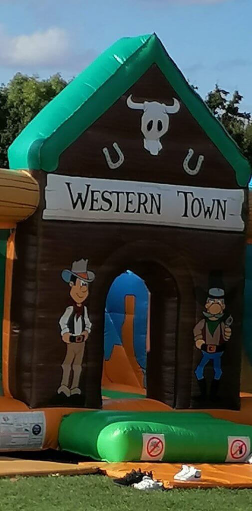
This is Western Town, a lawless place where you have to remove your shoes to enter the saloon! The font looks handwritten as the letters do seem to vary slightly, although it might be the material its printed on. It is styled after many western posters seen in films. The visibility here is helped by a strong contrast and large scale.
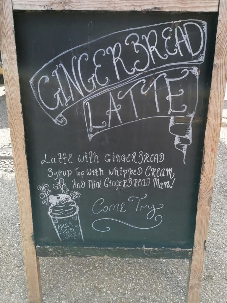
This one Liked as it incorporated had drawn elements, it has a lot of charm, and has a christmassy feel with its curly serifs.
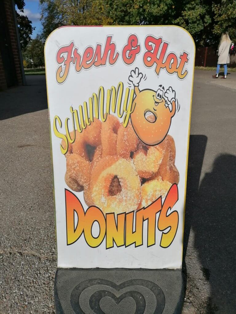
This sign is clearly advertising Donuts, and as the sign tells you this isn’t intended as health food. Two different comic typefaces have been used, as well as an additionalscript type. Its a small sign and three fonts seems like a lot. A little donut cartoon is generating some extra excitement, in case the style jump in the fonts dont work and the colours are bright and warm. No doubt many an adult has fell victim to this cheap nasty tacky little sign as a child points at it and starts to gear up for a tantrum.
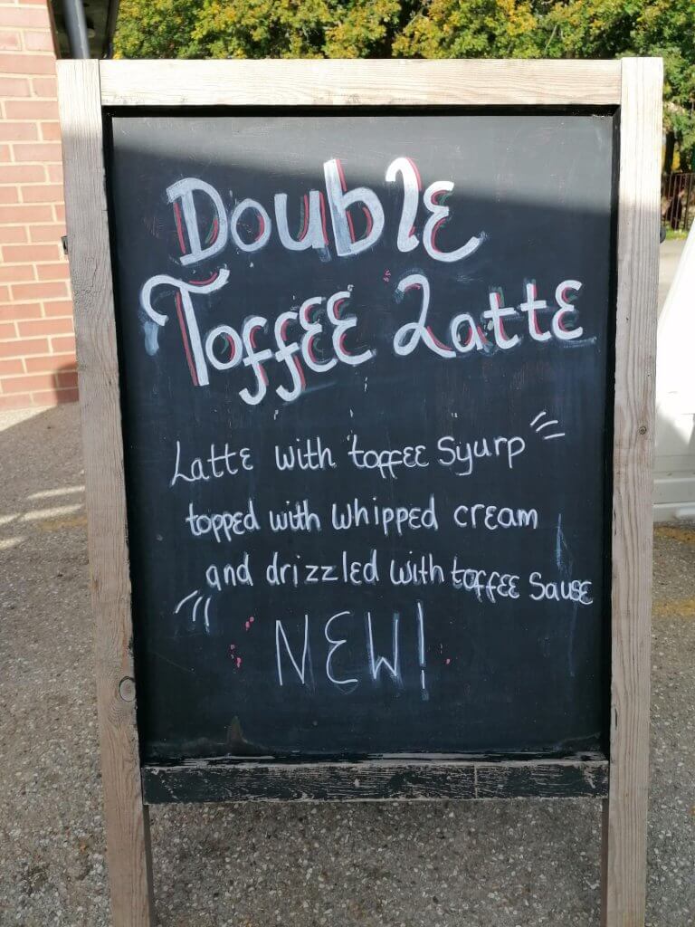
Another handwritten sign, not as charming as its neighbour, they have kept consistent with the script style lettering, a bolder effort for the heading and a description. Also a typo, there is no spell checker or auto correct in real life.