For this research point I looked at logos, their colour schemes, design and how they work.
Most of the logos I found seemed to be in black, all logos will have a black, white and a set of colours they can be displayed in as part of the brand guidelines set by the company. The majority of fast food company’s seem to deal with colour, reds and yellows seem to be very prominent. McDonald’s Chupa chups, Burger King, Pizza Hut and coca-cola all seem to feature bright reds. Fashion brands seem to take a one colour or monochrome or monoton approach. This seems to be a more tasteful and elegant way to display the brand. Some logos such as the fed ex hide hidden elements, the hidden arrow is perfect to represent a fast delivery service.
Finally I was asked to recall the OCA logo, I was sure it was a white box with a red key line with OCA in a handwritten brush script, it was in fact a solid red square with a single A character. The colour seemed to be the only aspect I actually remembered correctly.
The Chance Housing Association has been set up to try and help first time buyers get onto the housing ladder and they want you to develop a brand image for their stationery.
The brief goes on to establish the tone of voice they want to use in the new brand assets, they want to appear as a modern, helpful and welcoming to young people.
Research
I looked at other housing associations and their brand image such as logos and colour palette. There was a lot of blue and green, blue seemed like a good strong colour, dependable and secure. Some of the examples I found used bright almost fluorescent colours, this made it look fun but also cheapened them a little, I think the balance of fun and modern needs to be even with helpful and dependable, this is the customers future so it needs to be serious too.
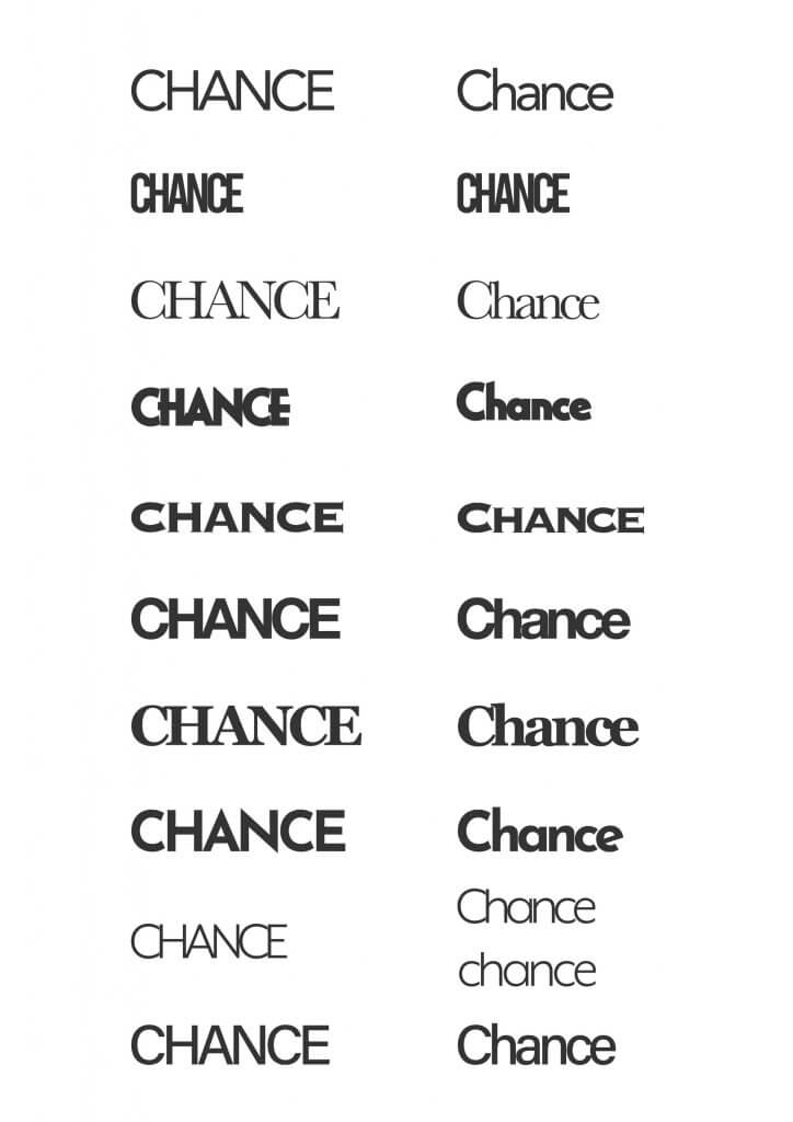
Choosing type
I looked at some type, I did an all caps and a sentence case version of 10, this may have been too much choice. I was looking for distinct shapes and styles, and trying to spot patterns and relationships that may give me a shape of one of the elements I found on my spider diagram, such as a key, or a house shape.
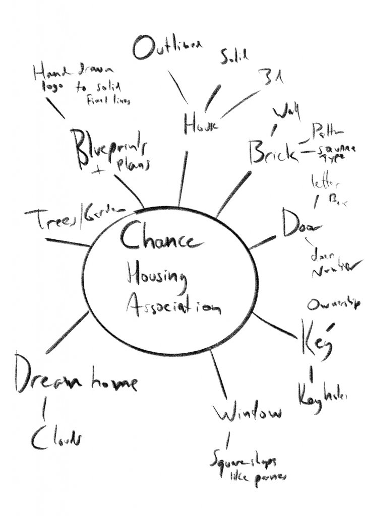
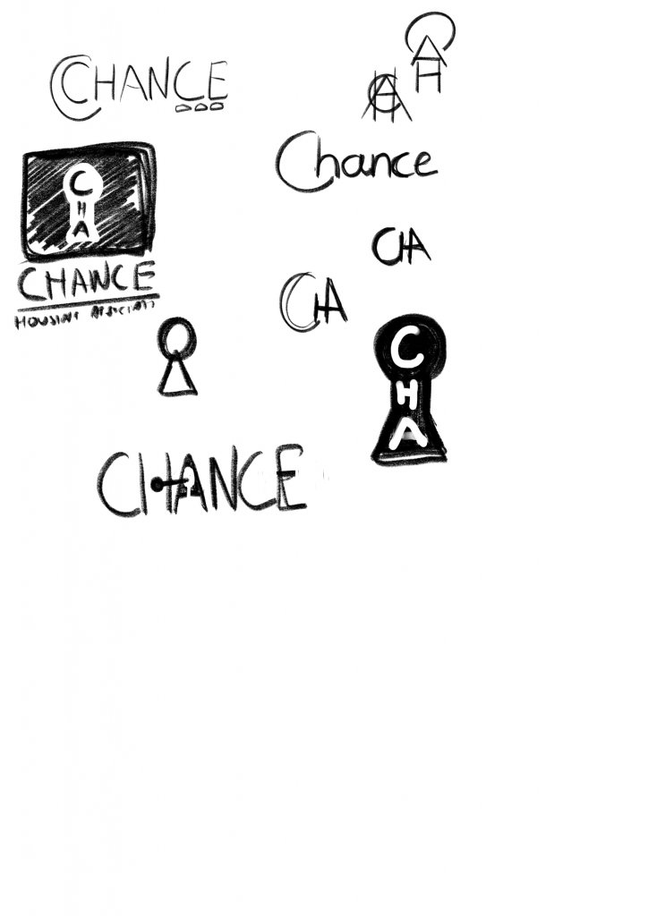
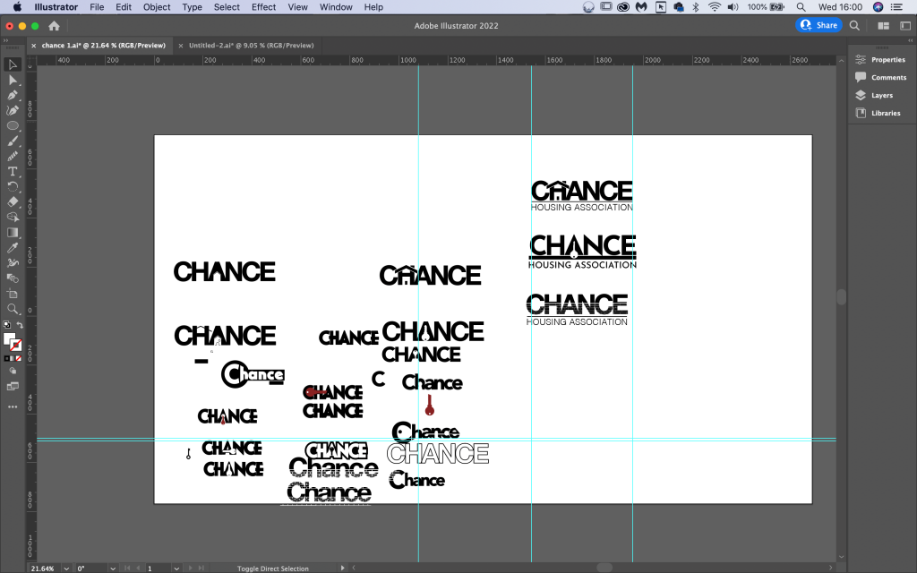
I created a spider diagram and explored some loose sketches, in the end I decided it might be easier to actually play with these ideas in some software such as adobe Illustrator, I can manipulate the actual typefaces and take advantage of the shapes, I was looking to come up with three to present to the client for further development. I worked in black and white. I didn’t want colour to affect my judgements as these would need to also work in black and white. I also wanted to integrate images and copy, or at least thats how I read the brief when it asked “using just typography sketch up some ideas” it did feel like a more challenging way to approach this exercise and I was sure to learn a lot from this disciplined approach, it would be very easy to place a house icon above the type. I did try to make a half way effort though, by using an acronym. the C, A and H made a house with a sun above it, I didn’t feel this was quite what I was being asked to do so stopped developing that idea.
I ended up with three different designs.
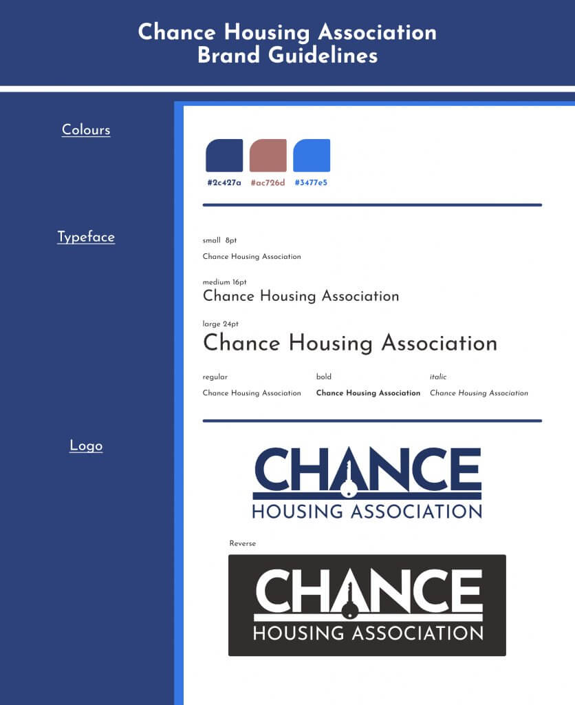
I think my favourite was the key, the key has a distinct shape, it also has some extra meaning, a key to your future or a way to unlock possibilities. it was also the clearest at a smaller size. The House wasn’t too bad but felt a little too similar to soem of the examples i had seen, the brick work was the most unique but again didn’t really display at. small sizes.
Letterhead & Business Card
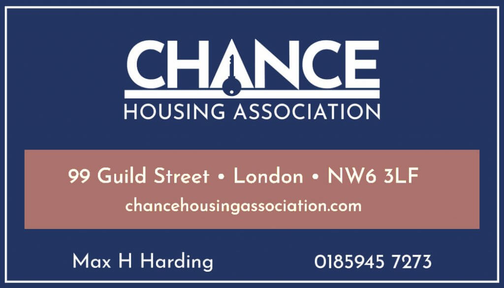
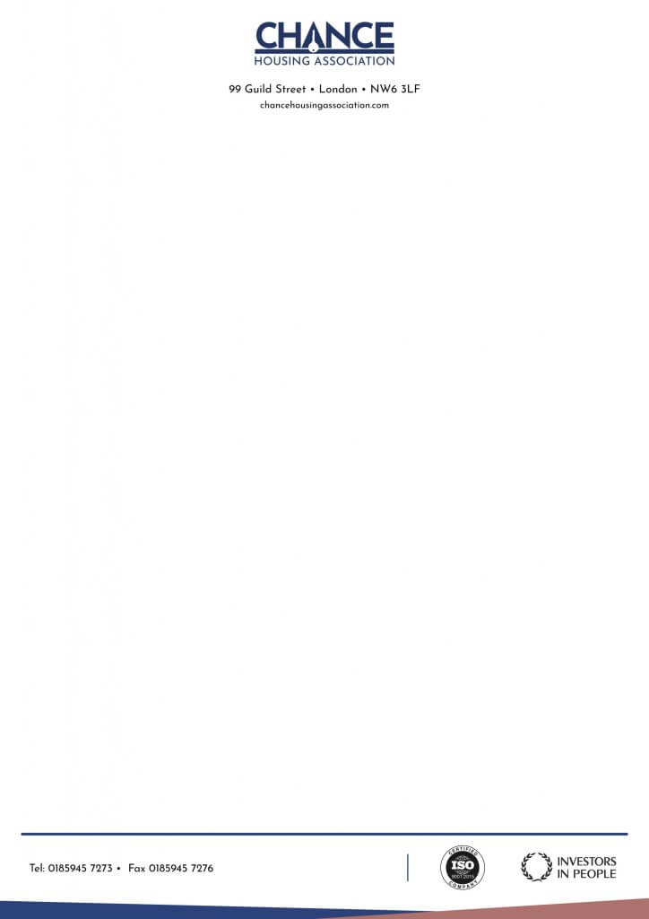
I settled on partnering the blue with a “house brick pink” I felt this was sensible and reserved with a sense of service and purpose. The logo at a small size was just about small enough to read as a key, any smaller and it would be lost, or mistook for a banjo or a frying pan. The dark blue made a nice base for the warmer pink/red to sit on, I felt it drew the eye to the address quite nicely. In hind site maybe the Hierarchy here is a little off, I don’t suppose the most important information is the address but it also frames the name and number too, so I started to look at it a different way, the highest contrasting items being the most important, I think that helped make my mind up, When I added the logo in the pink it didn’t look as striking so I kept this as below.
The letterhead I kept contrasty and dark as possible, I thought if this was the lighter and it got photocopied then the logo would be quite a lot lighter and get lost. I looked at a few letter heads but the centre aligned one seemed to feel more modern, less formal.
Feedback
I was worried that it wasn’t fun enough, so I showed it to a few people, they said given the context it fit well enough and they could tell it was a key. So I was happy to proceed as is. I think if I hadn’t incorporated the imagery into the type this would have been easier, the examples I found above seemed to integrate an image and type a little less directly as my efforts did. This resulted in an even more challenging space to work with.
Presentation Pack and stationary
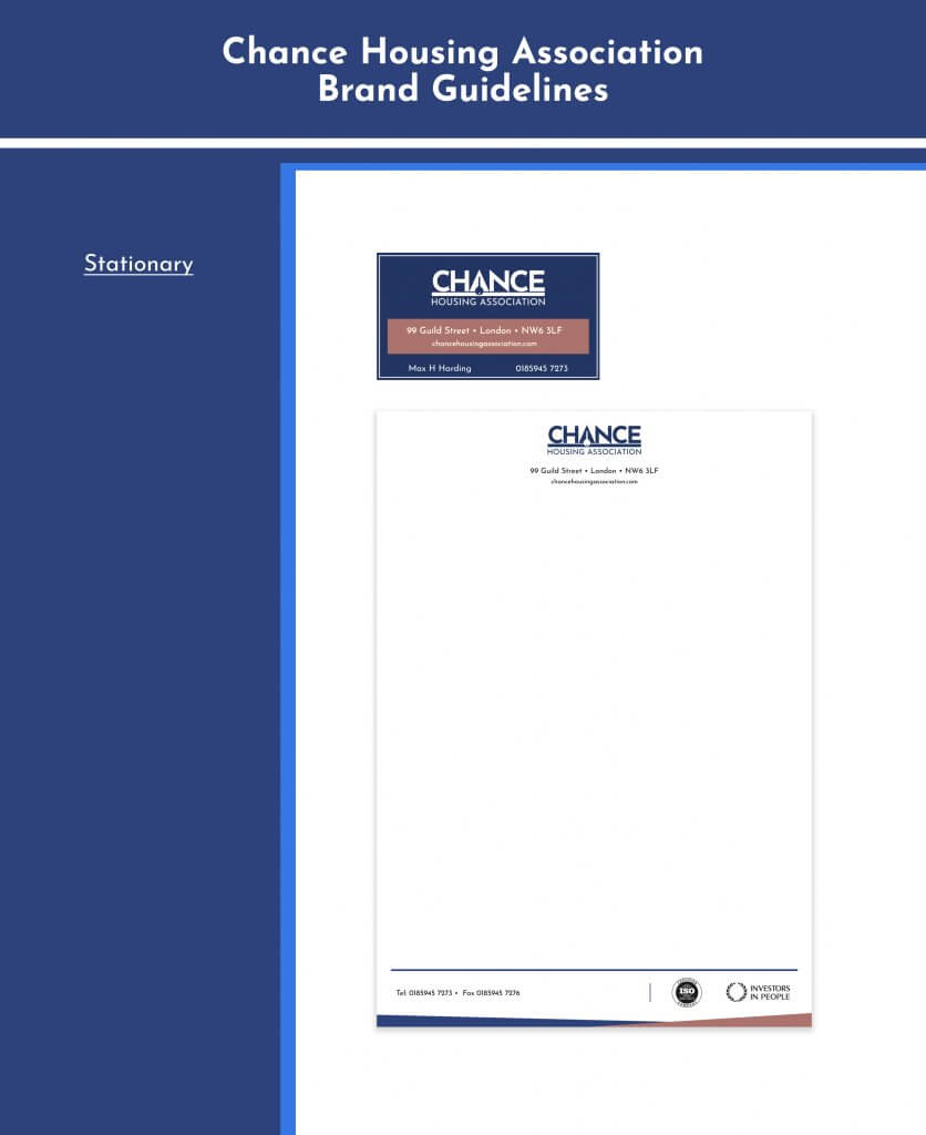
I put together a small set of brand guidelines, nothing too detailed just enough to start to build a brand identity to present to the client. Overall I was happy with what I learnt from this exercise, it offered some good problem solving and made me consider what sort of tone the brand needed.