This assignment required me to produce an a3 poster based on a colour that is personal to me and celebrates a theme associated with that colour.
The poster was to be made with my chosen colour and its complimentary colour, I was allowed to add tint and shade to these colours.
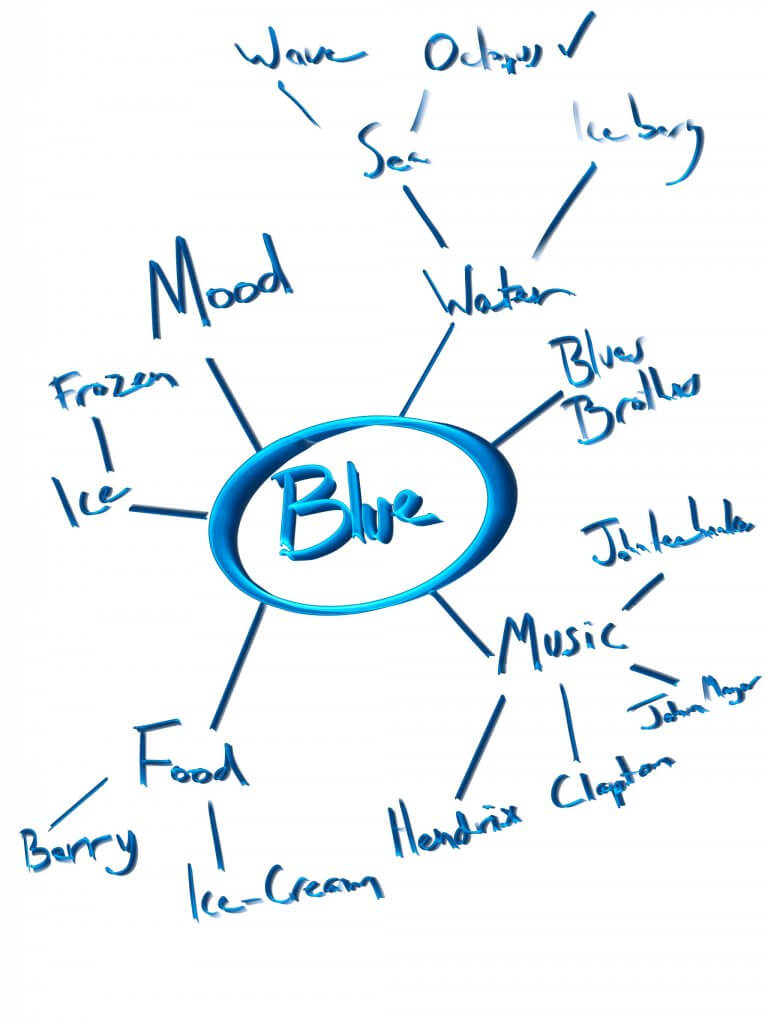
I have always been called blue or blue boy, by friends and family. It doesn’t have any specific meaning it just stuck with me, I decided to use that as my colour, opposite blue on the colour wheel is orange so my chosen colours will be blue and orange I made some spider diagrams to find a Blue centric subject. I decided on an octopus, it’s my favourite creature from the deep blue sea and would be a good visually interesting theme, it would allow me some organic shapes and the contrasting orange felt like it would work too. Octopi are incredibly colourful, pose with amazing dynamic exaggerated shapes and they have always fascinated me.
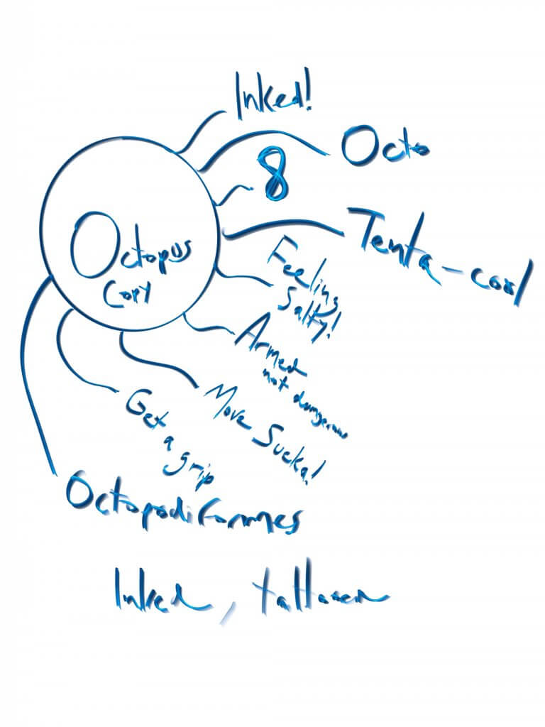
I wanted to add copy or a message to the poster, something light or maybe even humorous so I made an additional spider diagram, I shortlisted a few and made some thumbnails of how I could use them.
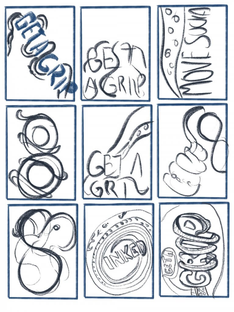
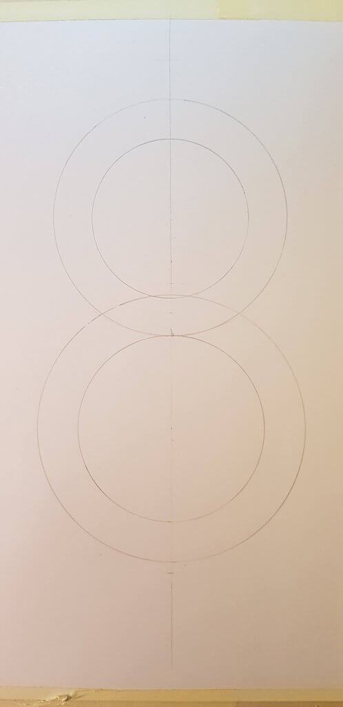
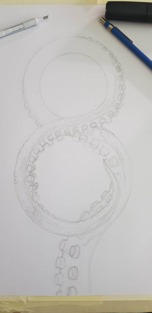
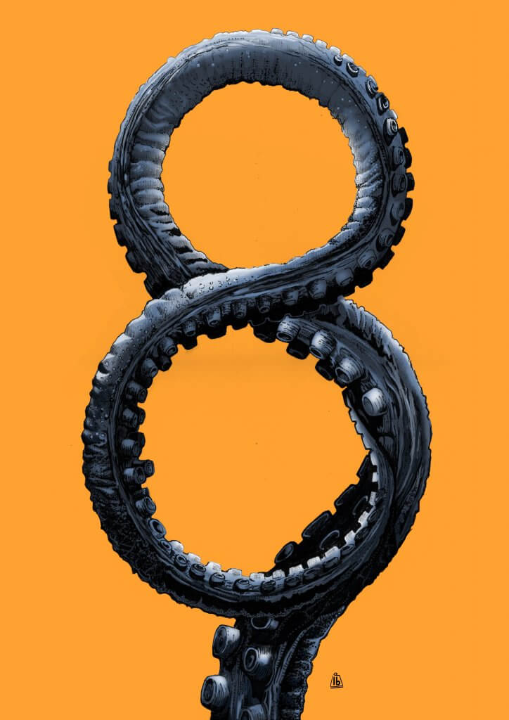
I really liked the simplicity of the number eight, it has symmetry and even feels like a tentacle with its round cylindrical shapes. I decided to use the Occam’s razor approach and make my 4 version of the poster the simple “8” design.
I found some reference photos and added them to a pintrest board. One of the thumbnails would work best as an illustration, this was a tapered tentacle in the figure of 8 shape
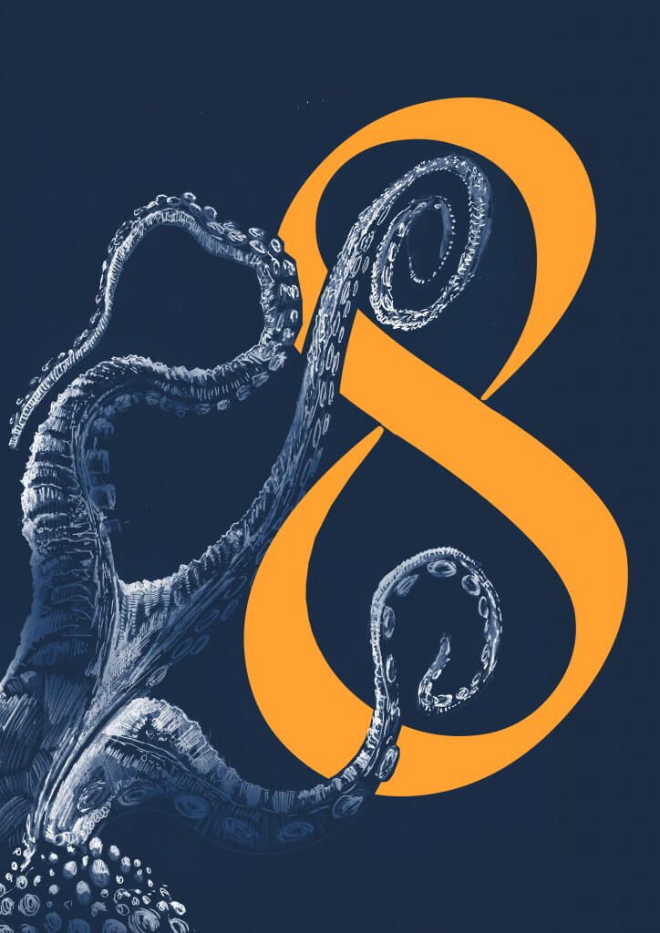
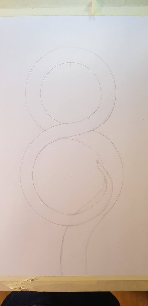
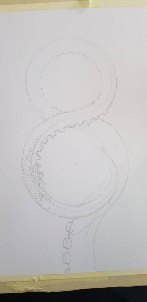
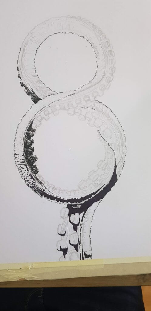
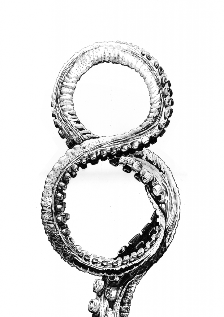
I wanted to draw in loads of texture, I decided to use fine liners on bristol board. my goal was to draw the tentacle with strong shadows and render the octopus tentacle as striking as possible while still describing the round muscular shapes. below are some of the first steps. I started by making a rigid and uniform figure of eight, I then erased and re drew in the flow’ of the tentacle, I added a taper until I was happy. Eventually the original “8” was erased or worked over, it was only a guide and had served its purpose.
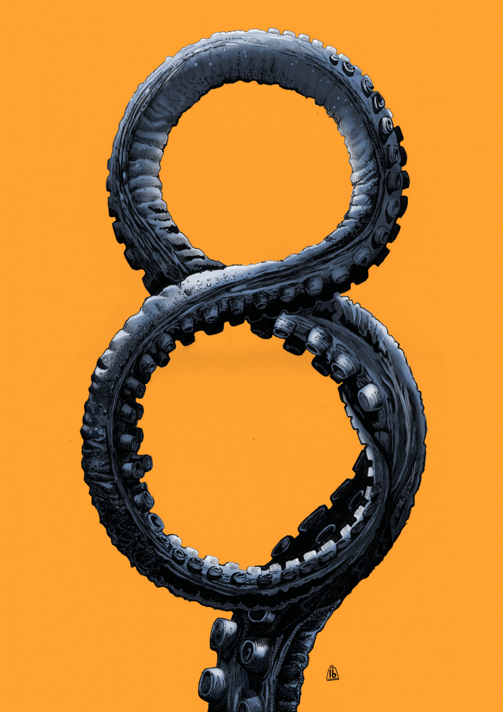
Once scanned I sent to my ipad, I then added colour with the apple pencil and the excellent procreate software. I started off with a mid blue and added black and white to recced and lift the tones in and out of the cracks, crevices, and bumped octopus skin. I wanted this to be really striking so I used the complimentary orange colour as the background, I found this to be visually stimulating and very dynamic.
I was thinking an interesting hand drawn approach would be to work on black paper and draw in the lit elements, I was hoping this would give it a deep darkened water quality. I used white pencil and gel pens. The gel pen seemed to cut out a lot on the paper and left broken marks. It required a forced, harder and almost scrubbed action to my marks. I liked the effect, I was getting loads of rough texture as a consequence which was perfect.
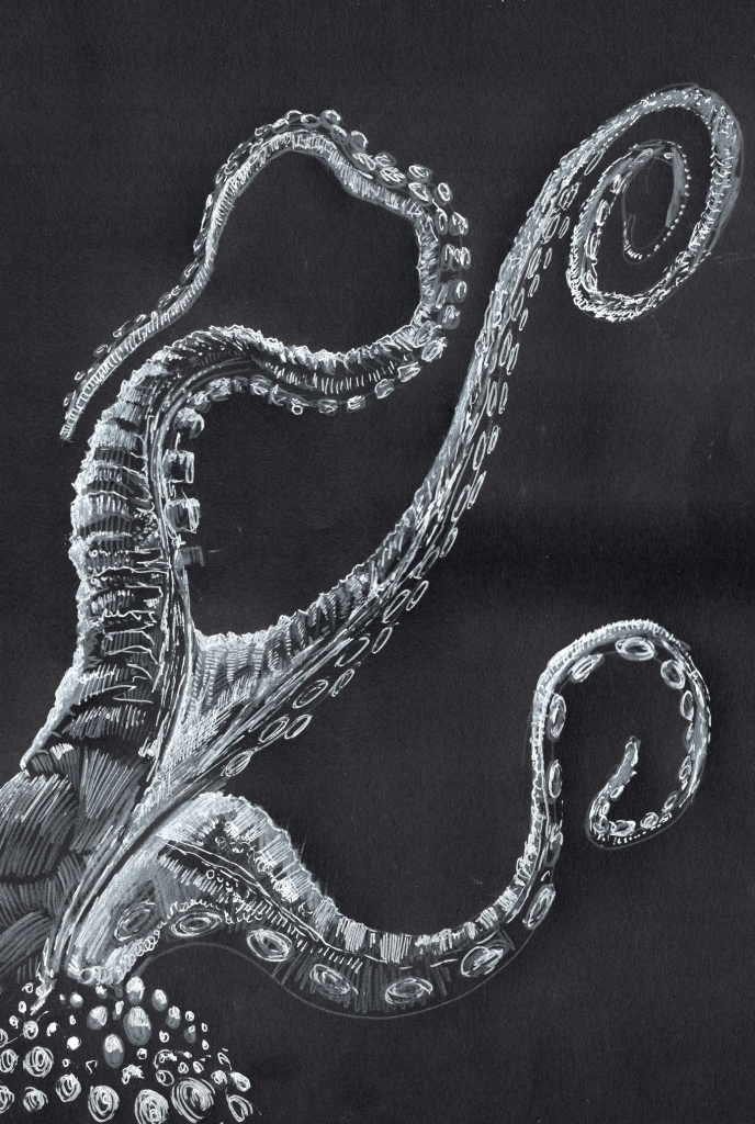
I scanned both of the drawings, these were both drawn on A3 paper, the scanner was a4 so I had to composite the drawings., once scanned I used the curves to boost the darks and lights until I was happy with the image. I then copied the adjusted scans onto an alpha channel and removed the unwanted background information, leaving just a digital representation of my pen and pencil marks.
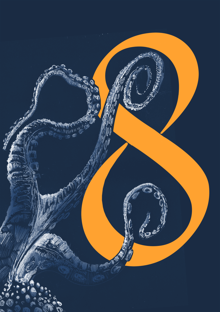
Working in photoshop I added colour and type, which modified slightly by tapering the edges to give them a probing tentacle look.
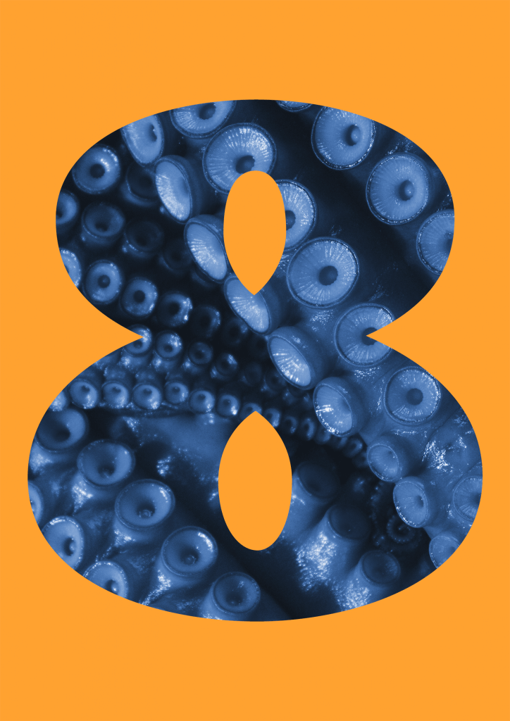
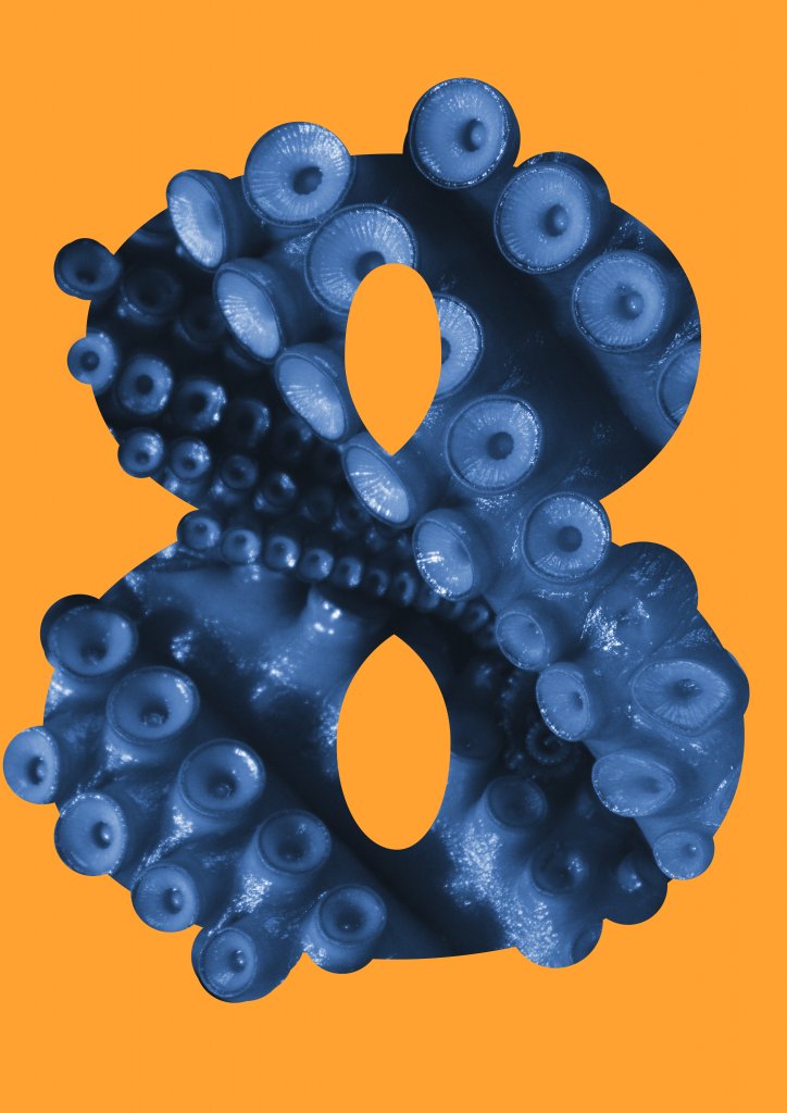
I chose a photograph of octopus tentacles, I then added a gradient map to it this allowed me to select blue as my mid tone and then black and white to tint and shade the end result is a one colour image that retains all the tonal depth of the original, I then used a clipping mask to clip to the shape of the “8” . I wanted to sculpt a more natural and organic outline, so I rasterised the number eight and using a round brush painted in the suckers.

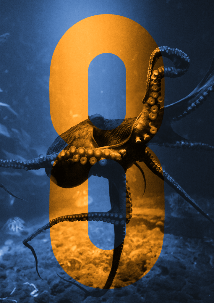
For the next experimental variation I took a really nice image of an octopus in motion, it was reaching with his winding outstretched appendages. I used another gradient map across the Image to remove all but one hue, I then added the “8” over the top, I then made a selection from the still text based element and selected the original full colour octopus image. I copied the selected shape and pasted in place, I then added a second gradient map, this time I selected an orange hue. This gave me more control than if I` had used a blend mode and clipping mask, and was able to adjust the tonal range to my liking.
I was asked to make a finished piece and three variations, It is quite hard to say which one I felt worked best. I really enjoyed making them all and I am very pleased with the outcome. If I was to repeat the exercise, maybe I would try to draw the two that used photographs. And would be interesting to recreate one using the photo montage approach. when I see them all together they make quite a nice set, but I think the one that I’m drawn to is the texture of the fine liner “8” I also enjoy the atmosphere the light and shadow create as it cascades down the tentacle.
Final Piece