
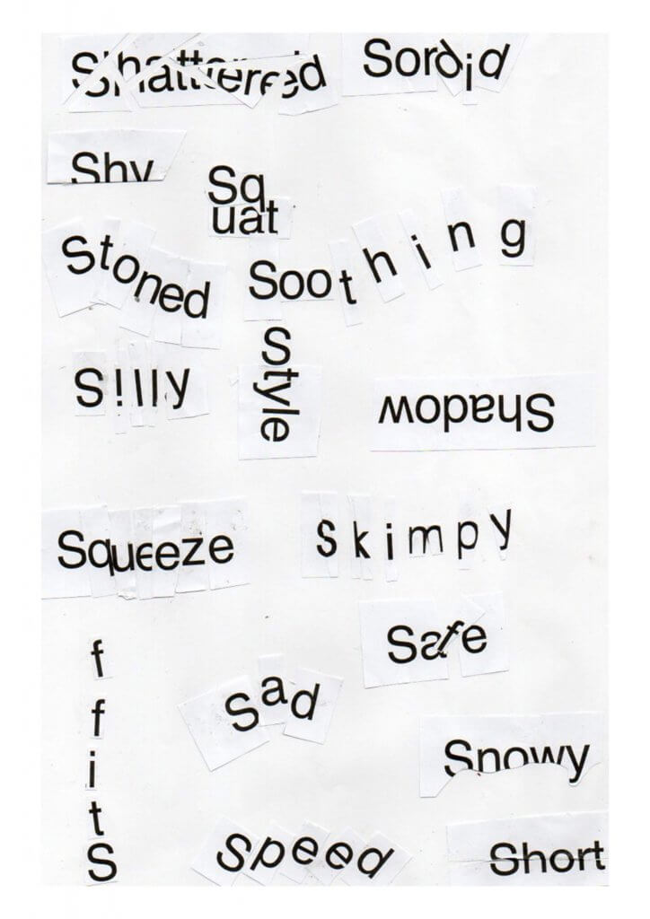
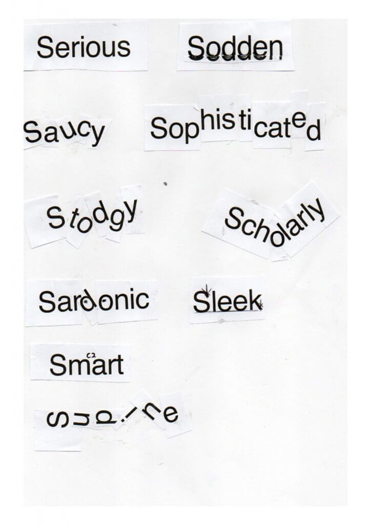
I was asked to print out a selection of “s” words and arrange them in a way that represents the word.
The first thing I noticed was how limiting the cut paper version were, it really started my thought process up and gave me some limitations, This made me talk to myself, I said things like “how can I change the colour/shape” and “this would be easier if I could..” I can see now exactly where this exercise was taking my process. The limitations aren’t there to make it difficult but to invent solutions to the problem, the right tools being unavailable at that time forces an unexpected approach. I really enjoyed this exercise and it certainly unlocked new doors to displaying the written message.
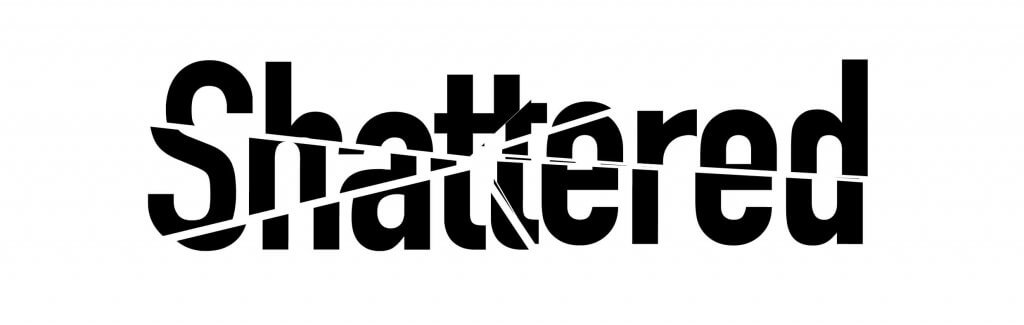
Shattered
This one is pretty direct, I picked a point and had all my lines emanate from that point, cutting out with the polygon lasso tool and repositioning, this needed a thick type so the word would still read correctly
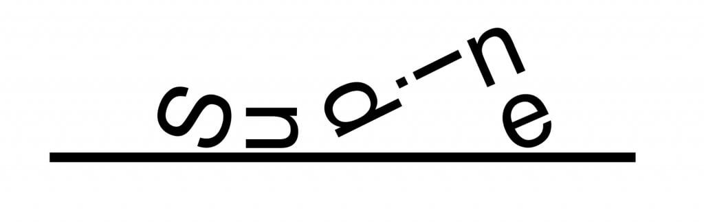
Supine
Not a word I use a lot but I wanted to personify the word, to make it into a figure and make the “S” a face, the word is laying down face up, to make it feel more human I added in a bent leg too.
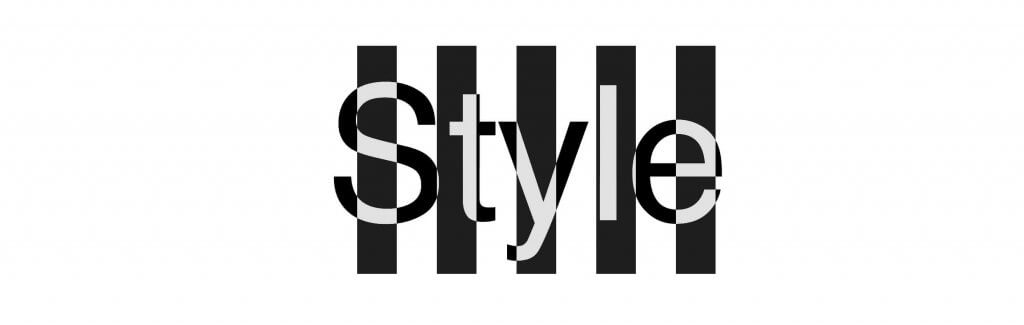
Style
This one was quite tricky, I toyed with patterns such as spots and floral, in the end the stripes seemed to win, part of style is standing out and this allowed me to make a bold contrasting background.
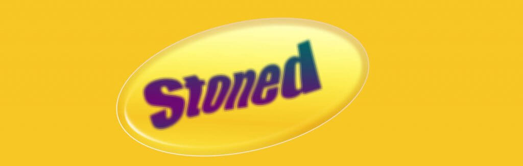
Stoned
I wanted a 60’s-70’s hippy feel to this one, I could have went biblical and used the other type of stoned but that seemed a lot harder.
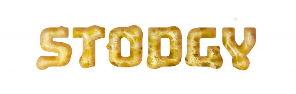
Stodgy
Thick and lumpy, or a spongy pudding is the. first thing that I think of as stodgy, I was going to add custard but I felt the distorted letters was enough and didn’t want to skew the message
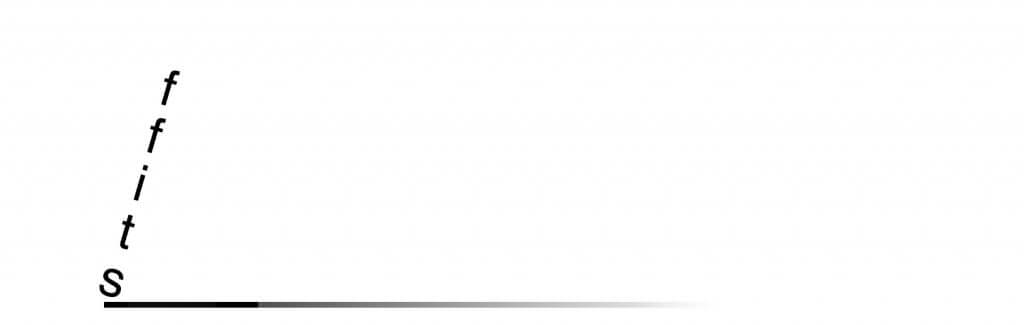
Stiff
Very similar to the cut paper version except I added a long shadow to give it scale and some environment, this seemed to make it stiffness a little clearer
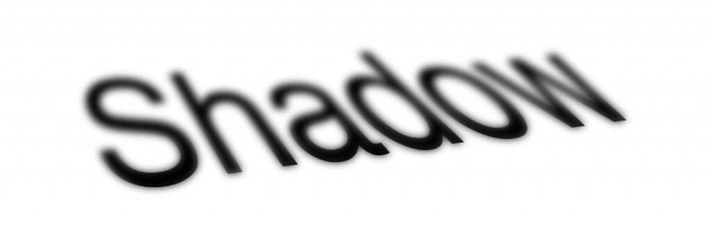
Shadow
I added two layers here blurring one and then using layer masks to combine the hard edge where the shadow starts to the soft diffused edges where the shadow drops off.
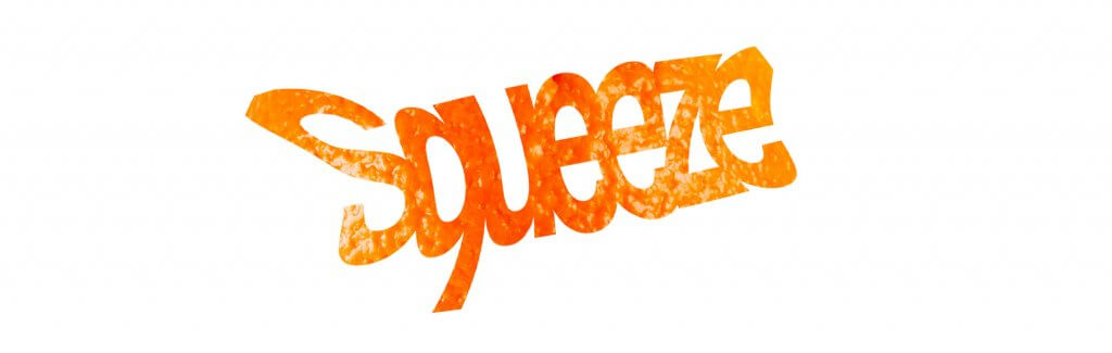
Squeeze
I used an image of an orange here to create the colour and a texture, which was placed over some type that I had turned to a smart object and warped. I wanted to show something distinct that we associate with squeezing, an orange seemed the natural choice. the type needed to be bold and the tracking of the characters set very close to give it enough of an imprint for the pattern to take effect.

Squat
Short and square, this was another where the word took on a human form, I used the t as make shift legs, at this point I was avoiding embellishing the words too much, something as the exercise went on I found myself more an more reliant on.
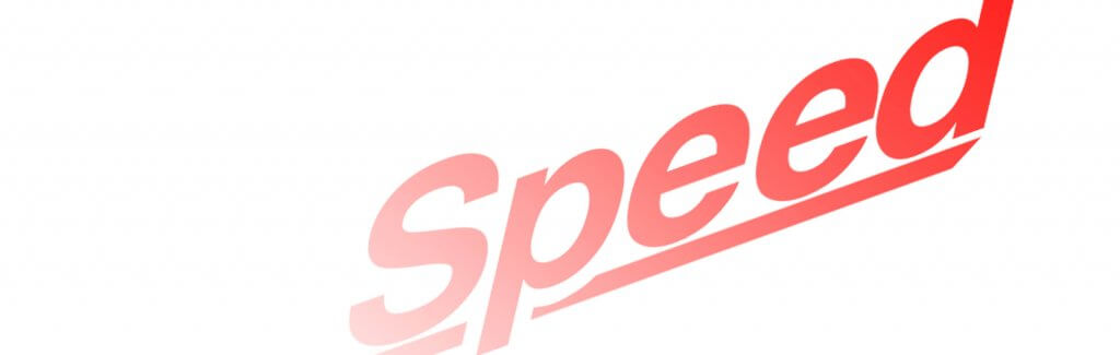
Speed
angled italic type feels like its moving, I added in a fade and racer red colour, I tried to steer away from blurring here although a second layer could have had some blurred motion lines for effect.

Sordid (a)
there was two versions of this, in my paper version I tried to make evil eyes, in this version I kept it simpler. This again seemed the obvious thing to do.

Sordid (b)
I think this version muddies up the clear message of the first, one embellishment should be enough or its clearly the wrong choice.
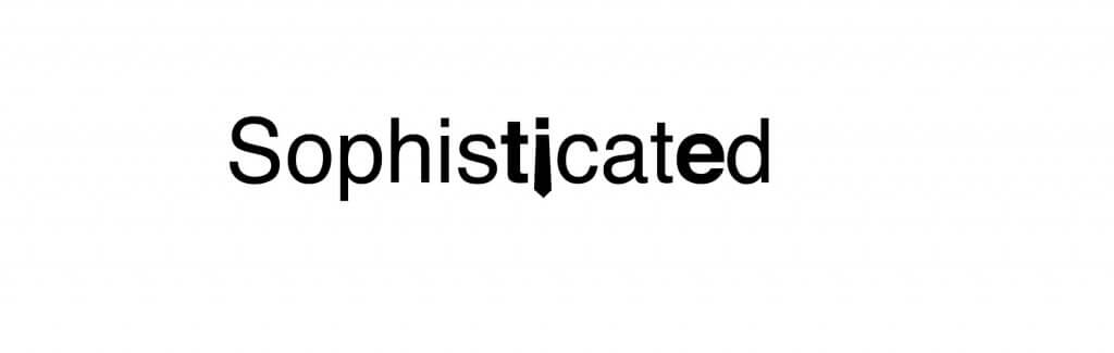
Sophisticated
The paper version of this highlighted the words his tie, in this version I have done the same, but simplified to tie, and made the “i” character a tie. This again may be one idea too far but they do work together so this may be a rule well broken.
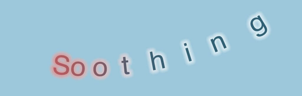
Soothing
irritated red to a relieved calm blue, the relief is so great that it gives a floating feeling.
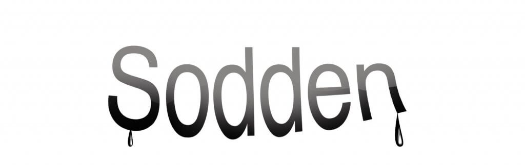
Sodden
I Wanted the words to sag on the bottom as the liquid soaked material begins to change shape it didn’t see enough so I added n some droplets
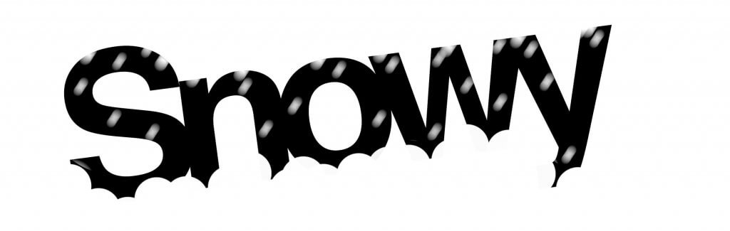
Snowy
Like my paper version, this word is half buried in. the snow, I also added some blurred snow to imply motion and that the event is still ongoing, as snowy would suggest present tense. Snowed would still work but the copy would be solid black.
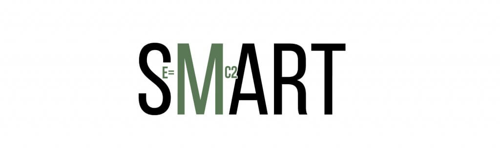
Smart
My colour choice here comes from Robert De Nero’s grumpy father character in one of the Focker films, he remarks on Ben Stillers car saying “They say a genius picks green” so I went with that colour, its also the colour they use in the breaking bad titles which is based on the periodic table, not sure what the significance is but culturally it seemed like the right choice. I added in e=mc2, this was similar to the paper version, the colour and font choice made this work a lot better, I was able to separate the hidden message and the different typeface allowed me some room to add the second message. I overlaid the “c2” slightly and cut into the “A” this was an attempt to force the viewer to read both.
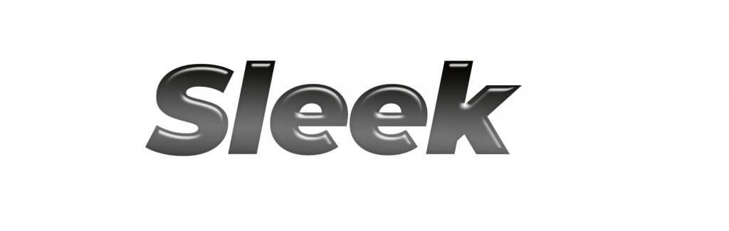
Sleek
Shiny and leaning forward, like a shark or a sports car.

Skimpy
another simple, one just a very slight type which I stretched with the vertical scale setting in photoshop, the trick was to try not to destroy the look of the font, I was just on the edge of good taste here.
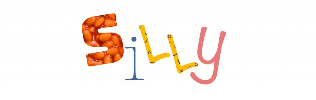
Silly
some crazy clipping masks, beans are always going to be silly and the different fonts and their orientation gave it a manic nutty feel.
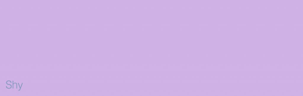
Shy
shrinking violet, the shy again is a slight font, displayed small in a colour very similar, this one doesn’t really work past the gimmick, if the copy was important this would be a big fail.

Serious
serious underlining, serious orientation, serious font, and an exclamation point. This one could be either underworked or just no joking matter.
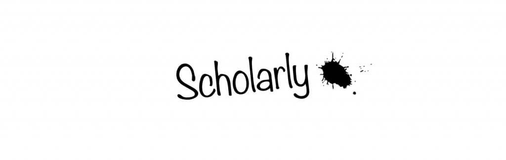
Scholarly
I wanted a hand written font, at a slight angle decorated with a nice ink blot, that sums up school days for me. Ink stained pencil case!

Short
like squat I wanted to get something square to give it a sense of scale.
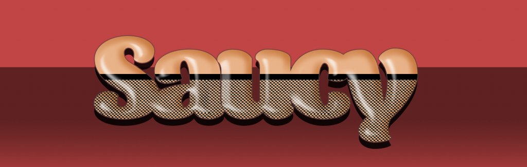
Saucy
Carry on Typesetting! I couldn’t help but draw inspiration from the old carry on films when I saw the word saucy, I used a round soft typeface that felt like it would be used a lot in the 60’s-70’s, again I wanted to personify the word, it wouldn’t be saucy if it didn’t feel like a person, I then threw some fishnets on it, and used red light district hues, added a bevel to render the soft round fleshy shapes

Safe
A dangerous red, in a safe green box with a thick solid wall.

Sad
Tried to turn this into a deflated sorry for itself downturned mouth, the word is too short to be legible and extremely distorted, the colours also help reflect the mood but this one isn’t my favourite from this group.
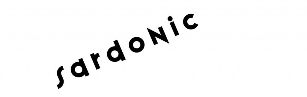
Sardonic
grimly mocking or cynical, I wanted this to be spiky and cutting.