
I was asked to collect examples of type and see what the designers have done to make them legible.
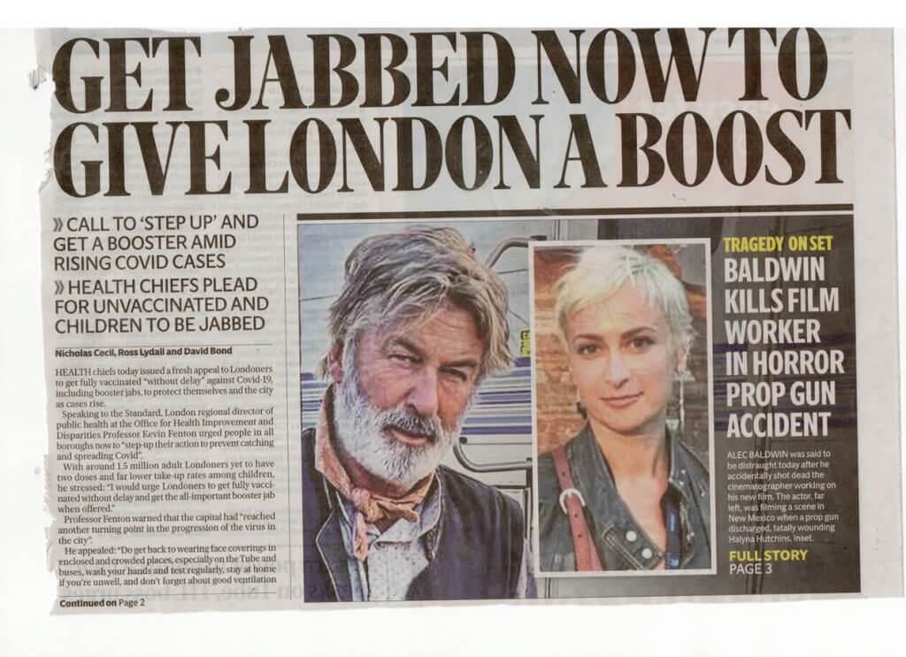
I found this one to be a little confusing, the headline relates to the column on the left, but the size of the image and the contrast makes this the second biggest thing, so I was drawn at first to that. I feel they have tried to combat this with the yellow type, they have also added a thick divider. I wonder if they had put the column on the right it would have a better flow, I would finish reading the headline at the right and with enough dividing space in the column gutters I would then pick up the right trail.
This one felt a little lost on the page, it must be challenging to fit all the content on to pages. for newspaper publication, and still leave it navigable, this one just felt a little too short and would be easily missed, the headline and small body copy also feels disjointed, a sub heading maybe have given it easier passage onto the short stubby 5 columns of copy, I also think the headline has gone for style over substance, I’m not sure what they mean by drumbeat.
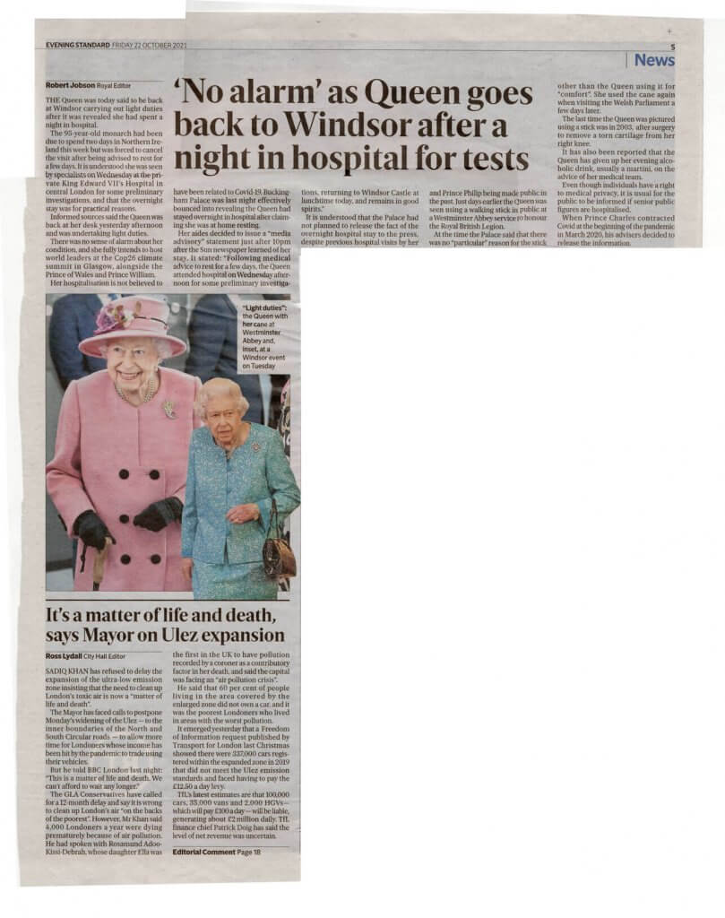
This one seemed unusual, the headline is in the middle, we establish that the copy is surrounding it, so far all the things I have found have been scanning issues, if we was reading the content left to right top to bottom it would make sense, but this layout with the large image at the bottom left feels like it was trying to be a bit clever. I also found the image to be somewhat confusing, it seemed to belong to either article, The Queen appeared with a puppet version of herself, and this was attached to the. border which due to the close proximity feels like it belongs to the article below. If this was a wide headline with the text and imaged aligned then it would be clearer.
I found this one to be nice and clear, we have a headline and sub-header over the image, this is sitting on top of the copy like a crown,The drop cap leads in nicely with the orange that was established with the section header we have a small inset with quick tabular information, again with the right hand side column in orange, The hierarchy here has been carefully thought through, I think I would see the header, the image, maybe back to the subheading if the image had taken my interest and then the information. box, as it stands out amongst the copy, if this was all to my liking the same orange would lead me into the article.
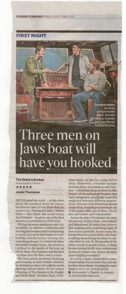
This was another that felt like it had clear layout and hierarchy, the dark image above. the copy, the headline. is in white and feels very harmonious with the image, we have some short leading information, the. body text and then finally. some closing information about where to see it.
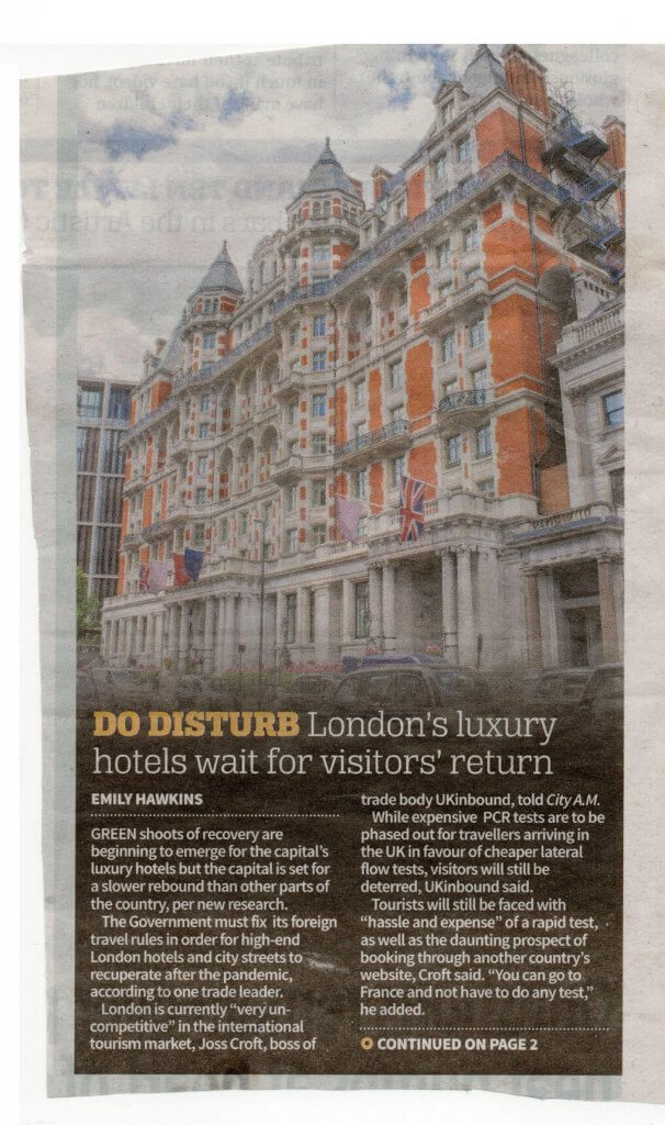
I liked the way this article was all enclosed, the image becomes host to headings main and sub, and then onto a short amount of copy, encouraging us to continue to page 2 for more. This felt like a good way to fill some small space and to lead into something larger.
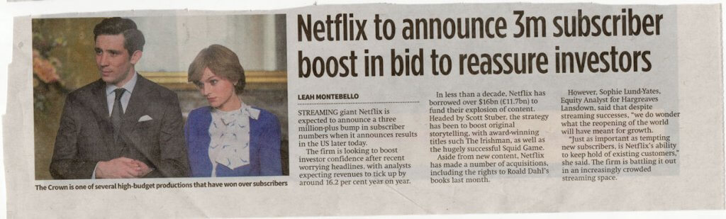
I had above a short 5 column article that I felt didn’t work, this one does, although it is lighter on information, this is still essentially a 5 grid but the first 2 is used for an image, this then flows into the header and then the article. The article doesn’t actually centre around the image they have used, I wonder if they are riding on the popularity and public awareness of the “crown” the only mention of the crown is in the caption below the image.
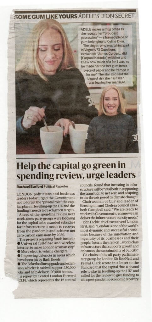
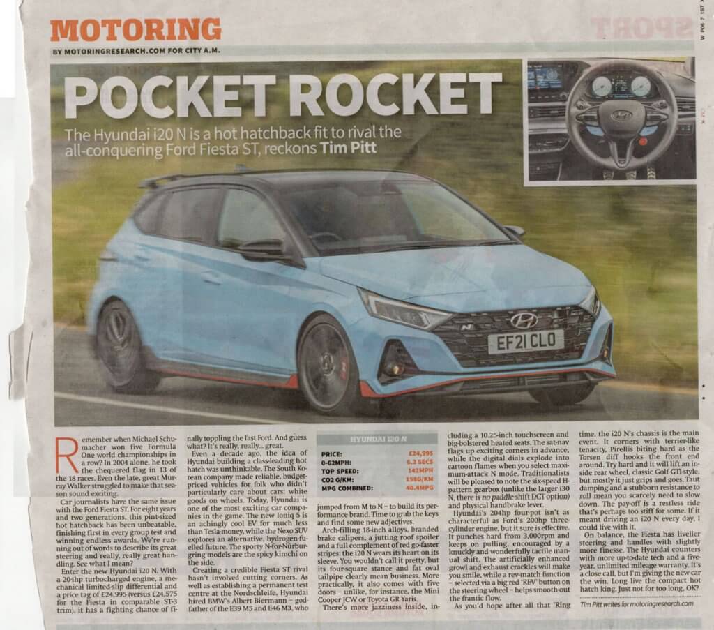
This one I found to be confusing too, at a glance the copy below appears to belong to the image, the text that does belong to the image is very short the headline is also above the image, we have seem this done better above. Again this is only an issue of i was flicking and scanning through the paper.