Research point

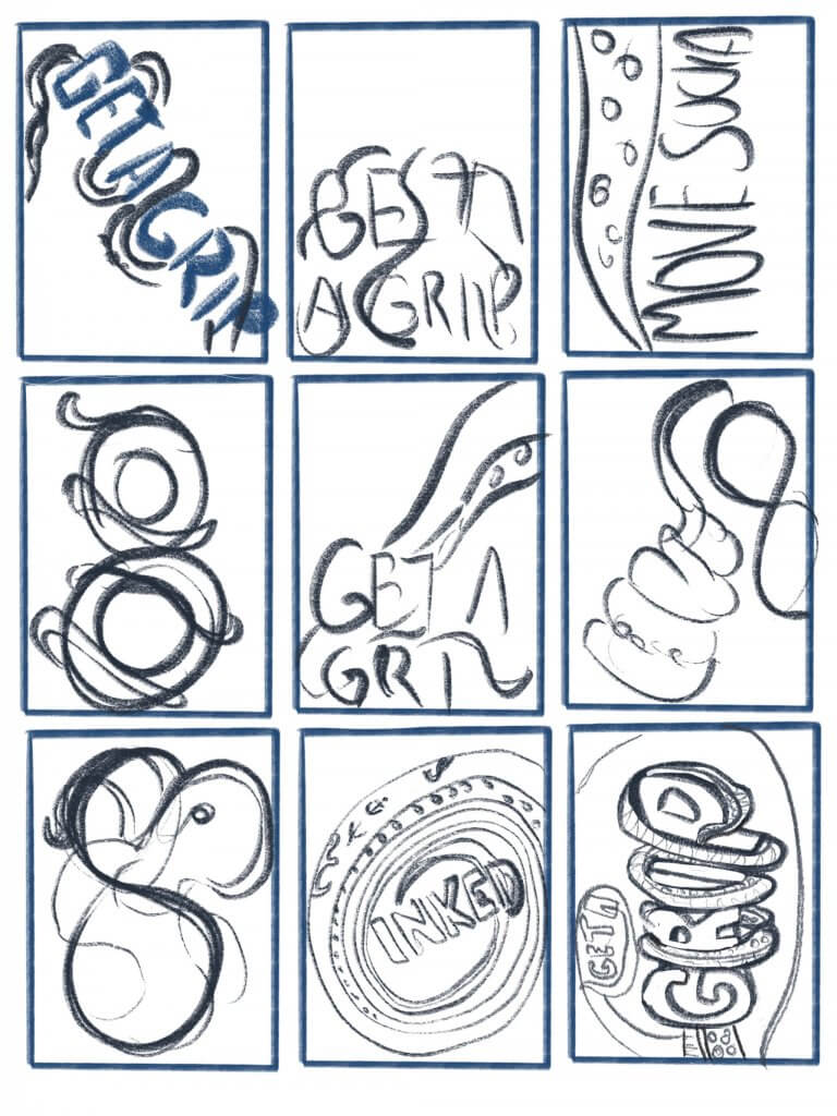
The work of graphic designers
I believe designers are more known for the individual pieces of work they do than their actual character. Like a musician they will have a sense of style and are recognisable but they will cover a wider range of subjects that maybe wont even touch most peoples life.

The designers I have chosen to research have all done something big that has in fact entered the subconscious of the culturally aware populous. To contribute to this cultural soup must be one of the highest honours for any designer.

Chip Kidd
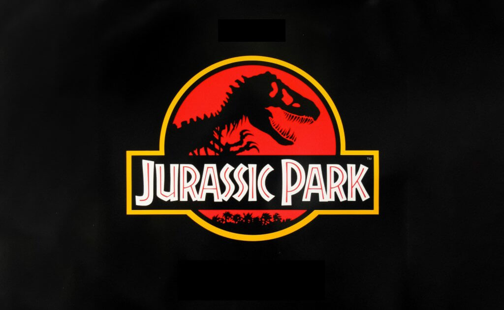
Chip Kidd is a good example of loving someones work without knowing anything about, not even their name. It was April 1993 that I first saw his iconic work and in July when the film was released I saw it on the big screen. The film was Jurassic Park, with its big budget, ground breaking effects and Steven Spielberg directing it was being talked about by everyone, I can even remember being on a weekend away and our family sitting in a restaurant and the table next to us was all talking about the film.
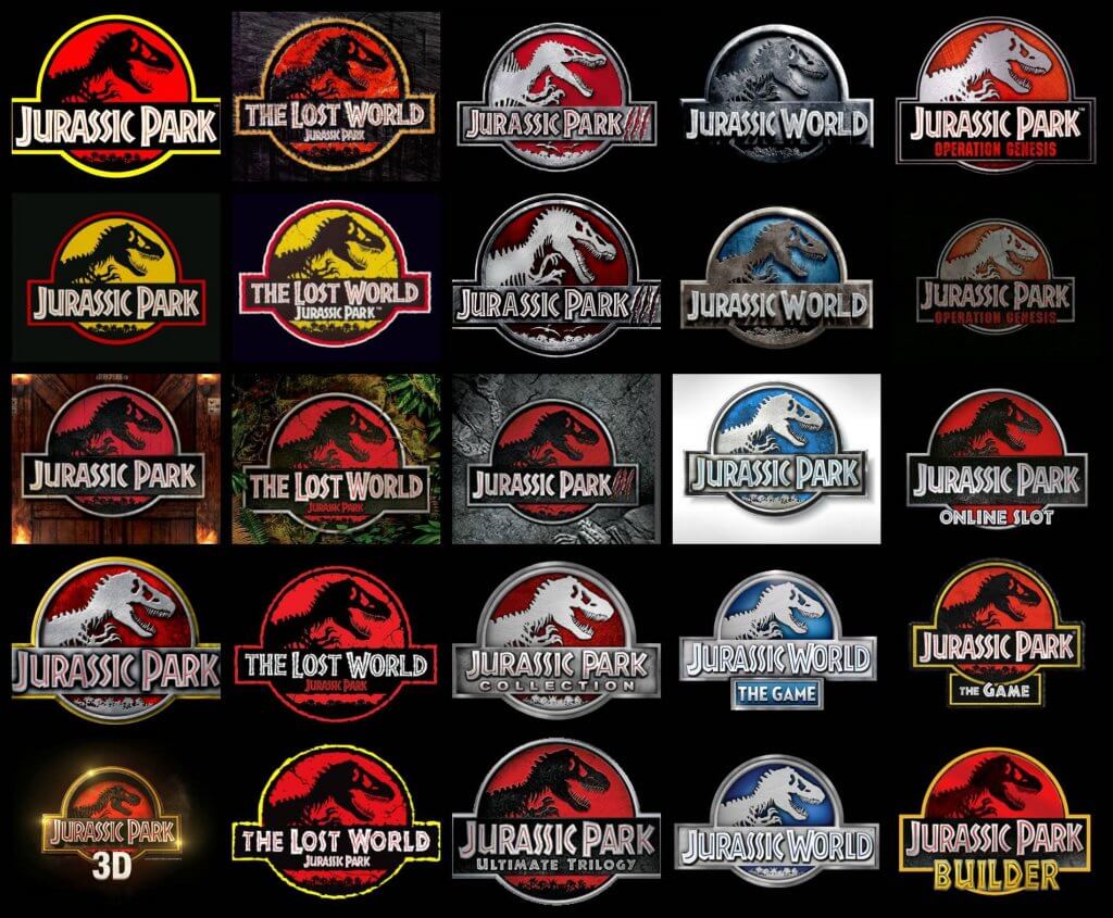
Chip Kidd created a logo that not only felt corporate but summed up the stories content perfectly, this had already been used for Michael Crichton’s Book, but once delivered to the masses it become instantly recognisable. The logo was everywhere and has been used with different variations through all merchandise, sequels (books and film) and toy lines, including video games. It’s longevity seems to be lasting too as a new film is on the horizon.
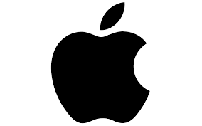
Rob Janoff
I have read a lot about the design of the apple logo, and while the logo has been updated since its 1977 release it has always had the same outlines and proportions, Rob Janoff used the golden ratio to design the logo, a set of points and sizes devised form the fibonacci sequence of numbers, and adding the playful bite to the fruit seemed to be the obvious thing to do. I cant imagine the logo without it, and it certainly is a more interesting shape because of it. Again you would have to be from a different planet to have not seem the logo, and if you didn’t know what the logo was for then you probably don’t interact and operate within the modern world.
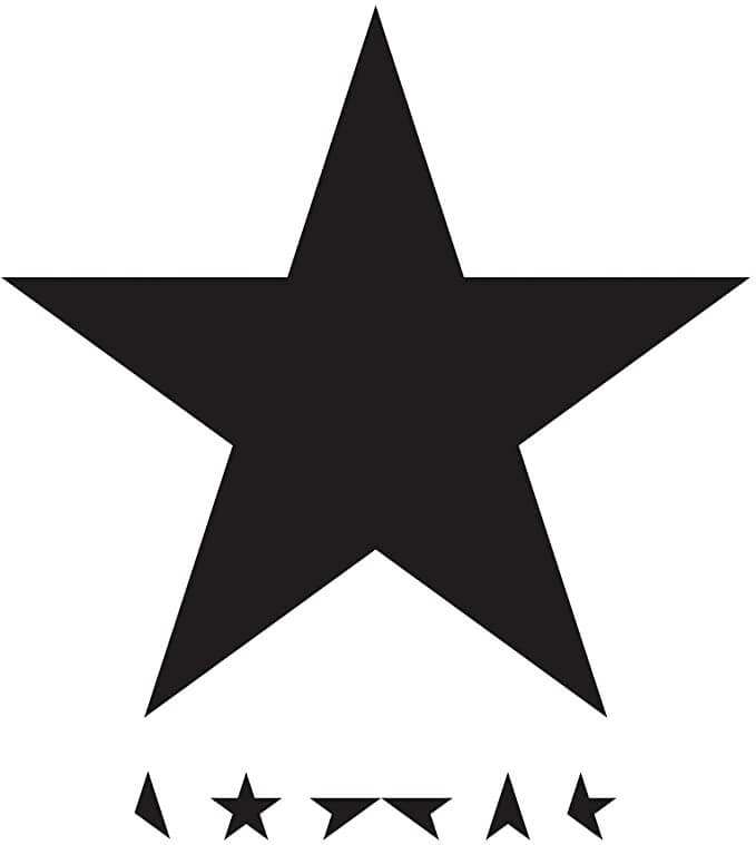


Jonathan Barnbrook
I had to actually look up the name of this designer. I have always loved David Bowie but the cover for his final album before he passed away is a masterpiece. Its simplistic, but instantly recognisable, and with the addition of the star being disassembled (or maybe reassembled) really looked unique. Most of Bowies albums do actually feature himself on the cover. He knew he was dying so maybe he is represented here as the blackstar, in a state of decay. Just my interpretation.
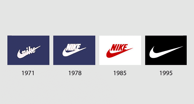

Carolyn Davidson
This designer peaked early in her career and is also a good example of occum’s razor, where the simplest ideas seem to be the best and have lasting appeal. That said a logo will always be reinforced by the success of the company using it, and they don’t come much bigger than Nike.
Carolyn Davidson designed the Nike swoosh as a student, she was payed $35 dollars for it and they stuck with it ever since. Another instantly recognisable logo that has entered modern culture. Sadly I don’t think Carolyn ever came close to re creating the success of the Nike logo but as she was given 500 shares of Nike stock in 2015 she become a very wealthy women overnight.
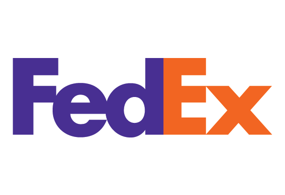
Lindon Leader
The Fed Ex logo is one of my favourites, the subtle use of negative space to incorporate an arrow was nothing short of genius, he was actually a student of legendary film opening sequence designer Saul Bass, Saul Bass designed logos for Kleenex, Minolta cameras and many more big brands.
Lindon Leader knew he wanted to include an arrow between the E and X characters but couldn’t find a typeface that would work, in the end he combined two different types to solve the problem.

Exercise: A visual diary

I have been keeping a visual diary for many years, using the pintrest app, I ritually add interesting images, designs and ideas every day on my commute to work.
Using it as a scrapbook or moodboard, I organise the web articles, images and other influences I see into logically named boards. This takes up 0 space, is always available and is totally free.
I currently have a total of 5,967 pins at the time of writing, this number will grow by about 10 each day, an example of some of the titles of the boards are

  • Pinball art
  • Old style book covers
  • Video Games
  • Concept art
  • William morris
  • Icons
  • David Hockney
  • Film Posters
  • Vintage cartoons
  • Pirates
  • Dragons

  • Children’s Illustrations
  • Mad Magazine
  • Comic book art
  • Album covers
  • Web Design
  • T shirt designs
  • email confirmations
  • Robots
  • Logos
  • Illustration reference

And many, many more.

I would say by looking at the list I’m focused on the popularity and style of images, images that are used to sell or promote things such as films, clothing etc. I want my influences to be popular, a little different but still with a mass commercial appeal.
I seem to tick off many subjects and genre. I don’t just stick to one type or era. I have researched robots as a term but not exclusively, I seem to be equally interested in pirates or dragons. These all have a “cool” factor in the world of the visual creative fields such as comic book, film and video games. If i had to summarise as a genre it would be pop culture.

This would suggest to me it is that kind of community I would be looking to communicate with.

a random selection of some of my pins

Exercise: Signs and symbols

In this exercise I was asked to read existing signs, symbols and images, and draw on their visual language to create my own symbol.

From the 4 options I chose danger, I created a spider diagram and began exploring the word and its close associations.

The topic is vast, and danger comes in many forms. I wanted to have a general symbol for danger, this was trickier than I thought, the most obvious and recognised symbol for danger is the skull. It symbolises death, and is intended to scare and remind the viewer of mortality. It was hard to think of a more powerful symbol.

After the spider diagram I took to pintrest to collect some reference.

*

The references all showed common themes wether it be from nature or man made, bright saturated colours such as greens, red’s and yellows. distinct patterns, the triangle is used as a warning in signage and computer applications. I was thinking of animal skulls but that became too specific, danger snakes, or dangerous animals.

Everything kept pointing back to the human skull, I then started toying with the idea of using patterns, in particular the hazard stripes that you see on cordoned off areas. I started sketching on the ipad, I really liked the way that the lines added to the outlines, over lapping and offsetting two lined layers made a grid, this was great but not quite what I was looking for, I wanted the stripes but finer so the skull shape is still recognisable, I then combined some ideas, fore, and an explosions. Again this felt too specific, I would need a different sign for all types of danger.

I moved to Adobe illustrator, the tools in this software are ideal to make repeated lines with equal spacing, the ability to add and remove and edit points would also be useful.

cutting out the striped elements
I loved these colours I chose to work with, but they may not be dangerous enough.
I offset the lines and then joined them by hand creating new points and bridging the gaps.

My final symbol artwork. The good thing about the symbol is it will work with all bright colours. It may not be too much of a deviation from existing signage. I found this exercise quite a challenge, there is a reason that symbols exist and its their significance and strength that makes them instantly relatable, to come up with something new and different that still has the same meaning is very hard indeed. I would have liked to have attempted this exercise with another word, I felt I had taken a bit too much time on this symbol, so its best to move on.

Final symbol and some alternative colours

Exercise: Seeing the light

For this exercise I was asked to restrict my elements to an image of a light bulb, the word ‘light bulb’ and a block of colour. I found the limitations actually forced me to think outside of the box and come up with some layouts I wouldn’t have thought of if the limits weren’t in place.

shown in the previous project.

Exercise: Understanding colour

I found the premise of this exercise quite tricky. The intro explained that the grid of colours I dislike might be the preferred collection of colours, this was not the case for me. I put this down to me preferring muted colours, or more accurately tints and shades.
If I’m being honest when it comes to art and design I don’t have a favourite colour or a set pallete. Each project is bound to a subject and result I am striving for, I could pick a bright gaudy set of swatches if it was needed for the result I wanted to achieve. To get around this I picked colours that I would be comfortable wearing.

Colour psychology in itself could be subjective and even changes culturally and geographically. We do associate colour with emotions in both written and visual messages, phrases like green with envy, green is also quite widely used to indicate a chemist, as well as portraying a negative emotion it also feels like a colour of health. In the uk a hospital is signified with a red cross, a danger, emergency colour. In some American states the same sign is depicted in blue, a calm reassuring peaceful colour.

All Hues are subject to nuance and their meaning can change quite easily by the slightest shifts.


In that respect I proceeded with the opinion that there is no right or wrong and this was indeed based on my own feelings and perceptions and hopefully they would be similar to the general consensus, this made me feel a little more confident in my choices.

A selection of likeable hues
A selection of dislikable hues

I think I could repeat this exercise and get slightly different results, especially for some that are similar like gregarious and sociable. My current mood might even be a factor. I think this kind of exercise may work better in a group, that. way you could get a better feel for a more universal common choice. This subject is an important one and something I will pay more attention to in the future.

Exercise: Abstract cities

In this exercise I was asked to create a series of 10 abstract designs in which you balance blocks of subordinate dominant and accent colours.

This exercise I found quite difficult I had been advised by my tutor to focus less on producing an image and more on my choice of colour and the mood it creates, with that in mind I couldn’t help but think that every cover could be represented exactly the same way, with different colour choices. I looked at other students learning logs and it seemed that they had also ended up trying to depict a scene, or landmark, some recreated these with accurate geomertry and some used squares.

The presentation of this exercise wasn’t my only concern. I hadn’t really visited these places, I had no emotion or mood attached to them so I had to research online, I looked at tourist board pages, to get a feel for them, most. of the information show the same kind of imagery they all want bright and colourful photography to encourage visits. So I was concerned that this might already influence the kind of “feel” I got from most of the places.

Some of the destinations are more familiar than others, because the way they are depicted in tv, film and general opinion, it’s easy to think of Madrid as warm, orange yellows reds, and Manchester as a cold industrial grey area. Others were not as easy and these also proved hardest to try to produce some imagery.

In the end I tried to think about how I could generate some abstraction so I can start to apply these colours, I looked up some abstract art, and they wasn’t all square blocks but all the material leading up to this exercise seemed to suggest this was the approach needed, the images of Beiruit while similar seems to not speak of mood but just to take the existing colours and objects and lay them out using a quadrilateral approach.

Choosing colours for mood seemed the easy part, I just couldn’t decide how best to present these. The exercise also started to feel quite ill fitting for its intended use, these were for a range of travel guide books, why would you want to distort and disguise the imagery of your intended destination, to what level of abstraction would be too much. As an image by Ben Nicholson was used on the exercise notes I looked at some of Ben Nicholson’s examples online, one was for a flyer for imperial Airways, it used much he same colour and feel as the example. This confused me more about exactly what I was trying to produce as this was almost random in context of the ad for air travel.

I am on a tight time frame and I needed to get this started so in an effort to familiarise myself with the locations I started finding interesting Imagery which might spark some direction, and started to translate these into simple shapes.

This did help me familiarise myself with the destinations. But I was still a bit lost on how to present, I even tried using some filters (below) to generate squares to speed things up, this didn’t feel right ad I wasn’t in control of the outcome.

I know Mark Rothko used a lot of square shapes in his art, I thought I would draw some inspiration from him, with a more organic painterly feel to my blocks. I started a new collection of images with just mood in mind.

I still wasn’t sure this was exactly what I wanted or what the exercise called for, I thought I would try to add the titles in as I had before on the filtered images above, I wanted the titles to cut across the square shapes, my intention was to create some separation from the main image.

I feel I’ve exhausted my options now for this exercise. It has taken a lot longer than I had planned, I feel I met the requirements from the notes and my tutor who suggested I keep the emphasis on the mood the colours create so the time at least form my point of view was well spent.

Exercise: Photomontage

For this exercise I was asked to create a political photomontage. I decided to google some environmental issues as they will always be a current concern. Fossil fuel and fracking for shale oil and gas was one of these issues that kept coming up high in the search results. I imagined my image being used to accompany an article on drilling for crude oil or fracking, I didn’t prepare any sketches for this, I wanted to search through images and pull an idea from the collected elements.

I know of a site where I can get royalty free stock imagery so I started by selecting some I started by selecting planet earth some environments, cloud sky, one of the articles related the oil industry to the human heart, saying that “oil was the life blood of industry” I decided to use this idea as it would surely produce some strong imagery. I then selected an image of a heart, I thought that earth as a fragile hollow egg would also look quite good and serve the narrative. I selected many images only some where of use, I have included these below.

Of course just the right images weren’t always available so I did need to adapt some for purpose, such as a stack of maple syrup soaked pancakes.

I worked in photoshop, I created an art-board and added all the images I had gathered next to my working space, I used these images at their full size and set them as smart objects, this meant I could scale up and down without any loss of quality. As this document would serve as a live sketch this would ensure that I have the flexibility to re arrange all the elements I was using.

I removed backgrounds and any unwanted parts of the images with layer masks, again I did this so I could add or remove and adjust as needed. but during the first stages I didn’t focus on accuracy, as I knew it would be time wasted if I spent any length of time and decided to remove the layer as the idea took form.

I cut around the outer egg shell and made a copy on a separate layer, I used this as a template to cut out the earth and lay this over the top. I wanted to show the earth hollow and vulnerable, its heart exposed and the life blood being drained into a fuel pump, the egg itself was intended as a symbol of life. I used the cityscape and a paper texture as a sandy desert.

Once I was happy with the composition I refined and finessed any rough edges with a fine brush in the layer mask. Finally I made some slight colour adjustments to the overall image to unify all the elements into one common theme.

Assignment Three: Colour Me

This assignment required me to produce an a3 poster based on a colour that is personal to me and celebrates a theme associated with that colour.

The poster was to be made with my chosen colour and its complimentary colour, I was allowed to add tint and shade to these colours.

I have always been called blue or blue boy, by friends and family. It doesn’t have any specific meaning it just stuck with me, I decided to use that as my colour, opposite blue on the colour wheel is orange so my chosen colours will be blue and orange I made some spider diagrams to find a Blue centric subject. I decided on an octopus, it’s my favourite creature from the deep blue sea and would be a good visually interesting theme, it would allow me some organic shapes and the contrasting orange felt like it would work too. Octopi are incredibly colourful, pose with amazing dynamic exaggerated shapes and they have always fascinated me.

I wanted to add copy or a message to the poster, something light or maybe even humorous so I made an additional spider diagram, I shortlisted a few and made some thumbnails of how I could use them.

I really liked the simplicity of the number eight, it has symmetry and even feels like a tentacle with its round cylindrical shapes. I decided to use the Occam’s razor approach and make my 4 version of the poster the simple “8” design.

I found some reference photos and added them to a pintrest board. One of the thumbnails would work best as an illustration, this was a tapered tentacle in the figure of 8 shape

I wanted to draw in loads of texture, I decided to use fine liners on bristol board. my goal was to draw the tentacle with strong shadows and render the octopus tentacle as striking as possible while still describing the round muscular shapes. below are some of the first steps. I started by making a rigid and uniform figure of eight, I then erased and re drew in the flow’ of the tentacle, I added a taper until I was happy. Eventually the original “8” was erased or worked over, it was only a guide and had served its purpose.

Once scanned I sent to my ipad, I then added colour with the apple pencil and the excellent procreate software. I started off with a mid blue and added black and white to recced and lift the tones in and out of the cracks, crevices, and bumped octopus skin. I wanted this to be really striking so I used the complimentary orange colour as the background, I found this to be visually stimulating and very dynamic.

I was thinking an interesting hand drawn approach would be to work on black paper and draw in the lit elements, I was hoping this would give it a deep darkened water quality. I used white pencil and gel pens. The gel pen seemed to cut out a lot on the paper and left broken marks. It required a forced, harder and almost scrubbed action to my marks. I liked the effect, I was getting loads of rough texture as a consequence which was perfect.

white pencil and gel pen on black paper

I scanned both of the drawings, these were both drawn on A3 paper, the scanner was a4 so I had to composite the drawings., once scanned I used the curves to boost the darks and lights until I was happy with the image. I then copied the adjusted scans onto an alpha channel and removed the unwanted background information, leaving just a digital representation of my pen and pencil marks.

Working in photoshop I added colour and type, which modified slightly by tapering the edges to give them a probing tentacle look.

I modified the figure of eight slightly from the original typeface.

I chose a photograph of octopus tentacles, I then added a gradient map to it this allowed me to select blue as my mid tone and then black and white to tint and shade the end result is a one colour image that retains all the tonal depth of the original, I then used a clipping mask to clip to the shape of the “8” . I wanted to sculpt a more natural and organic outline, so I rasterised the number eight and using a round brush painted in the suckers.

The “8” with suckers painted in

For the next experimental variation I took a really nice image of an octopus in motion, it was reaching with his winding outstretched appendages. I used another gradient map across the Image to remove all but one hue, I then added the “8” over the top, I then made a selection from the still text based element and selected the original full colour octopus image. I copied the selected shape and pasted in place, I then added a second gradient map, this time I selected an orange hue. This gave me more control than if I` had used a blend mode and clipping mask, and was able to adjust the tonal range to my liking.

I was asked to make a finished piece and three variations, It is quite hard to say which one I felt worked best. I really enjoyed making them all and I am very pleased with the outcome. If I was to repeat the exercise, maybe I would try to draw the two that used photographs. And would be interesting to recreate one using the photo montage approach. when I see them all together they make quite a nice set, but I think the one that I’m drawn to is the texture of the fine liner “8” I also enjoy the atmosphere the light and shadow create as it cascades down the tentacle.