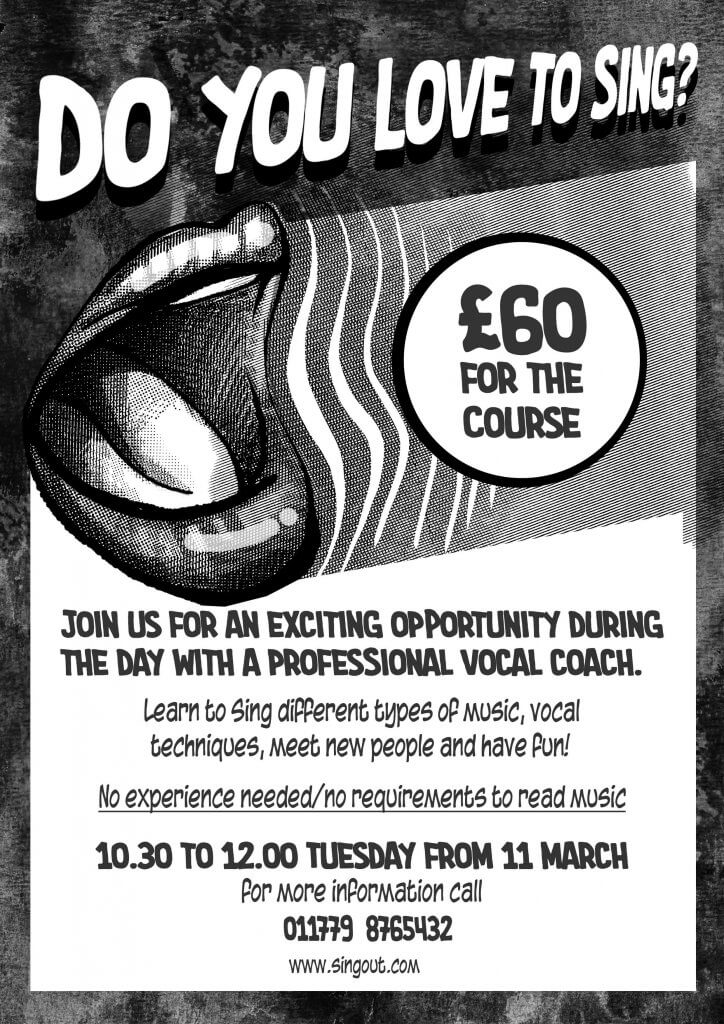
This exercise asked me to design a poster and accompanying flyer, the exercise is about how to deal with different work spaces, the poster is large and one sided, the flyer is smaller and double sided. This is also to be photocopied so will be in black ink/toner on what ever paper they select when making copies.
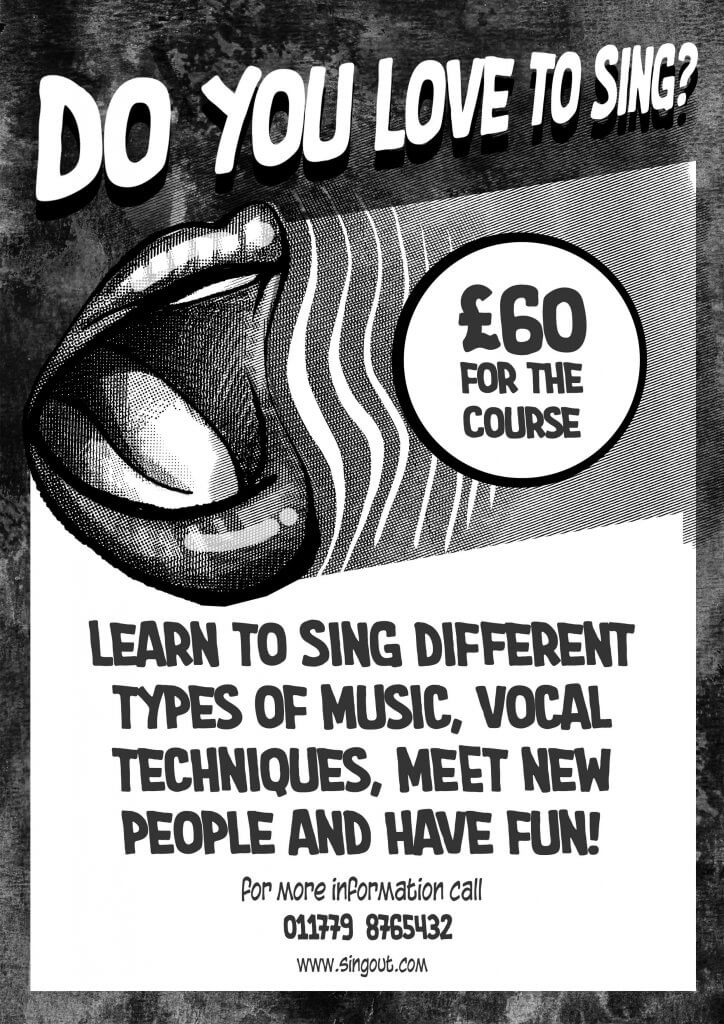
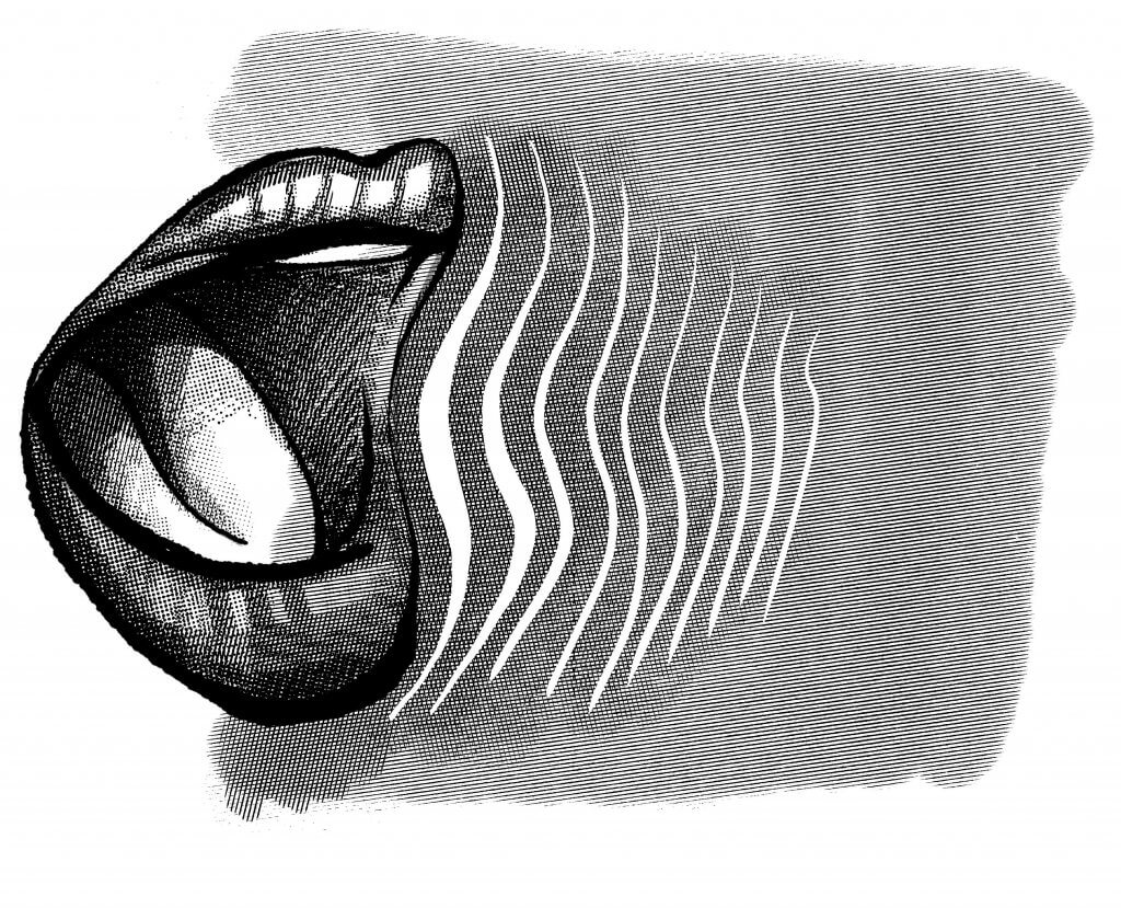
It advised me to carefully consider the use of imagery as these wont reproduce very well, it also asked the question was anything missing from the brief. Once I read through the brief the only thing I was wondering was how did the client want the advert to look, was this a high end prestigious advert or a fun, cheap piece of marketing. As they was looking to reproduce this with a photocopier I imagined a conversation that would imply the latter, a fun cheap local singing course. Given my limitations it also gave me a low if kind of advert feel, the sort of thing you would find in a comic, almost like a coupon for x-ray specs. I wanted to add an image and this could be very simple, in fact it had to be, I kept thinking something fun was needed so started to work up some ideas around singing and sound waves.
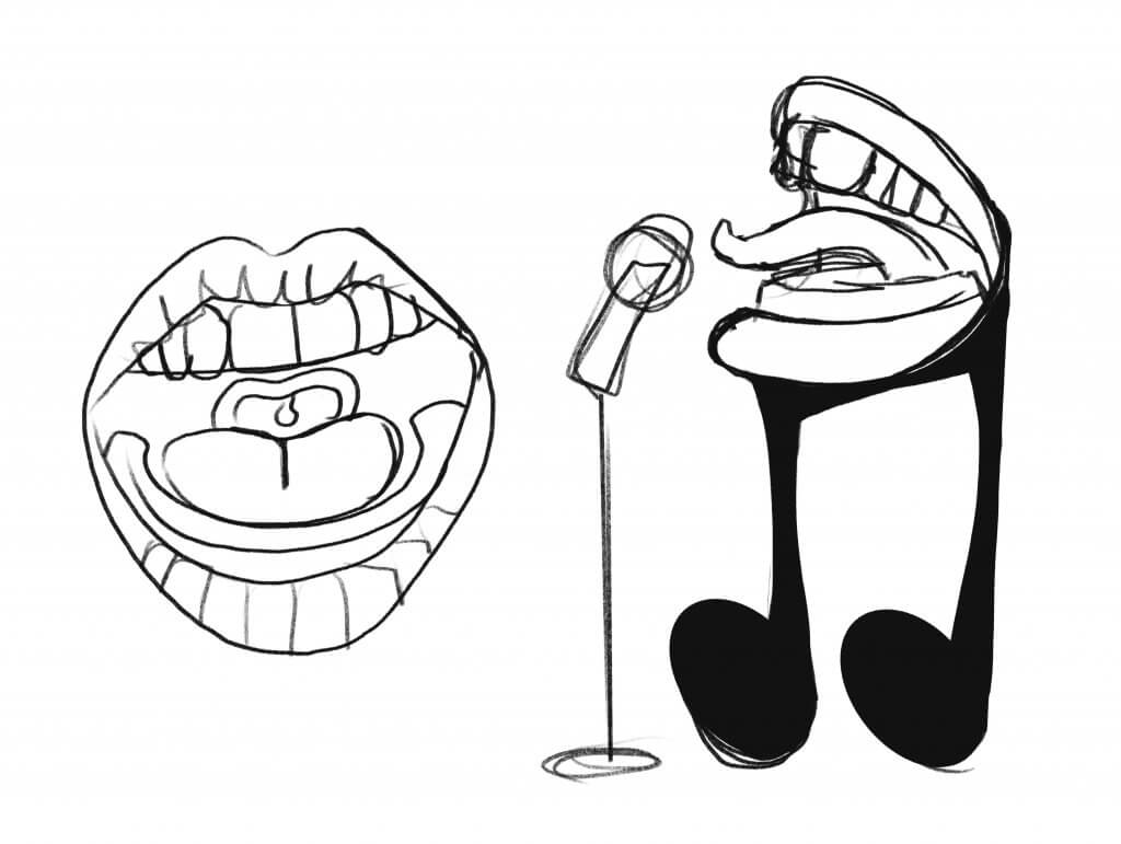
these seemed too cartoony
Once I settled on the image I started to add the copy, Starting with the poster first I chose a vintage pulp comic looking script typeface. The price seemed like it was very reasonable and decided this would be very high up in the information hierarchy, that along with the header seemed to play to each other’s strengths. After that it was quite wordy, I split the two messages into a bolder sub header and a lighter message that stated no experience was needed, the contact information and Timings being important had to stand out these I gave a bit more vertical space form the previous message hoping it would create two distinct groups. I added a rough distorted background, as no colours can be used this was a pure tonal exercise I tried to create strong contrasting areas without out looking dull and lifeless. Using the news print style halftone pattern added to the theme and also covered up any potential loss of quality when reproducing wit a photocopier.
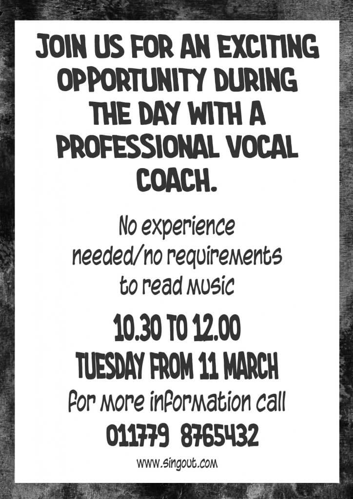
The flyer being two sided allowed me to use one side as an attention grabber with the headline, Image contact details and price on the leading first side and then all the additional information on the reverse. I think it was important to keep these looking uniform, the flyer may be available where the poster was being displayed and it seems important that these are obviously the same local event. I also switched the header and sub header, I felt that the sub header was more descriptive and I wanted to separate them so I would lead with the sub heading message.