The work of graphic designers
I believe designers are more known for the individual pieces of work they do than their actual character. Like a musician they will have a sense of style and are recognisable but they will cover a wider range of subjects that maybe wont even touch most peoples life.
The designers I have chosen to research have all done something big that has in fact entered the subconscious of the culturally aware populous. To contribute to this cultural soup must be one of the highest honours for any designer.
Chip Kidd
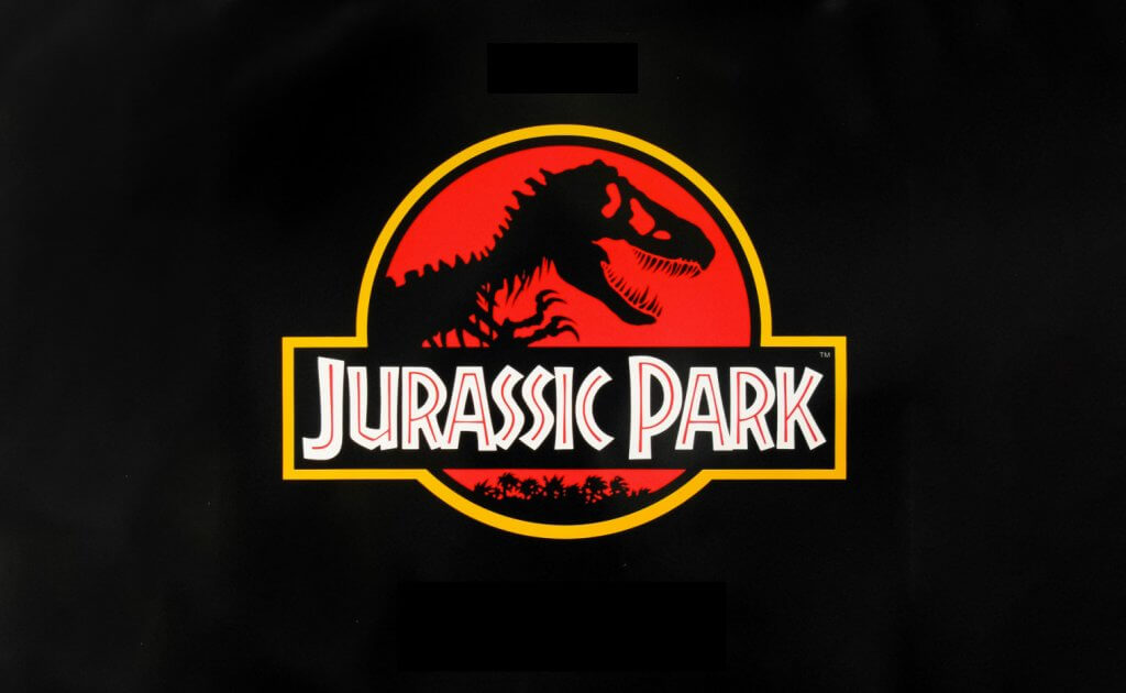
Chip Kidd is a good example of loving someones work without knowing anything about, not even their name. It was April 1993 that I first saw his iconic work and in July when the film was released I saw it on the big screen. The film was Jurassic Park, with its big budget, ground breaking effects and Steven Spielberg directing it was being talked about by everyone, I can even remember being on a weekend away and our family sitting in a restaurant and the table next to us was all talking about the film.
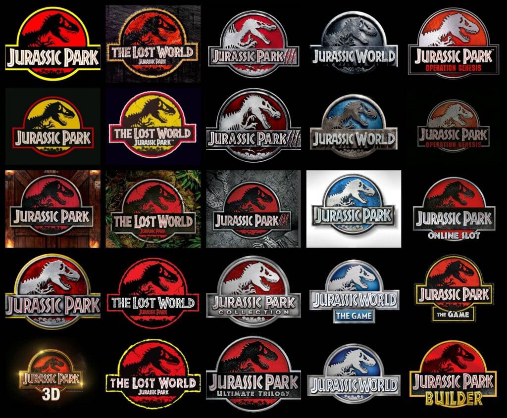
Chip Kidd created a logo that not only felt corporate but summed up the stories content perfectly, this had already been used for Michael Crichton’s Book, but once delivered to the masses it become instantly recognisable. The logo was everywhere and has been used with different variations through all merchandise, sequels (books and film) and toy lines, including video games. It’s longevity seems to be lasting too as a new film is on the horizon.
Rob Janoff
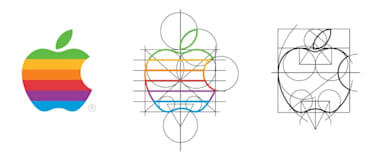
I have read a lot about the design of the apple logo, and while the logo has been updated since its 1977 release it has always had the same outlines and proportions, Rob Janoff used the golden ratio to design the logo, a set of points and sizes devised form the fibonacci sequence of numbers, and adding the playful bite to the fruit seemed to be the obvious thing to do. I cant imagine the logo without it, and it certainly is a more interesting shape because of it. Again you would have to be from a different planet to have not seem the logo, and if you didn’t know what the logo was for then you probably don’t interact and operate within the modern world.
Jonathan Barnbrook
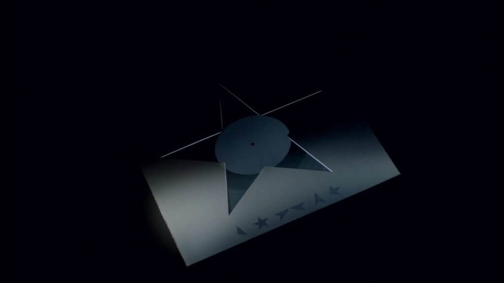
I had to actually look up the name of this designer. I have always loved David Bowie but the cover for his final album before he passed away is a masterpiece. Its simplistic, but instantly recognisable, and with the addition of the star being disassembled (or maybe reassembled) really looked unique. Most of Bowies albums do actually feature himself on the cover. He knew he was dying so maybe he is represented here as the blackstar, in a state of decay. Just my interpretation.

Carolyn Davidson
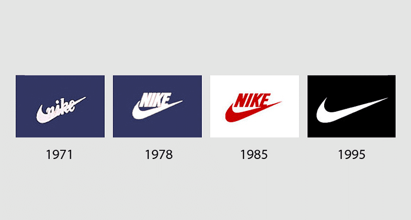
This designer peaked early in her career and is also a good example of occum’s razor, where the simplest ideas seem to be the best and have lasting appeal. That said a logo will always be reinforced by the success of the company using it, and they don’t come much bigger than Nike.
Carolyn Davidson designed the Nike swoosh as a student, she was payed $35 dollars for it and they stuck with it ever since. Another instantly recognisable logo that has entered modern culture. Sadly I don’t think Carolyn ever came close to re creating the success of the Nike logo but as she was given 500 shares of Nike stock in 2015 she become a very wealthy women overnight.
Lindon Leader
The Fed Ex logo is one of my favourites, the subtle use of negative space to incorporate an arrow was nothing short of genius, he was actually a student of legendary film opening sequence designer Saul Bass, Saul Bass designed logos for Kleenex, Minolta cameras and many more big brands.
Lindon Leader knew he wanted to include an arrow between the E and X characters but couldn’t find a typeface that would work, in the end he combined two different types to solve the problem.

