This exercise asked me to analyse one of the examples from the previous exercise, looking to match the type and layout as close as possible.
Type faces
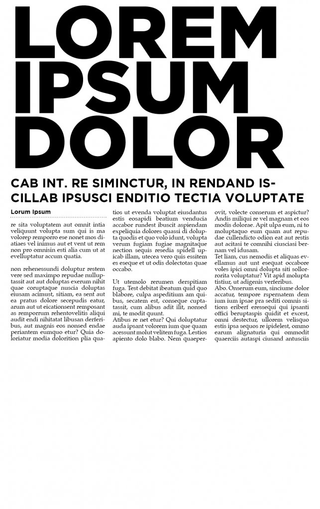
The type faces used was a heavy san serif, a bold san serif and then finally a serif font for the body copy.
I chose Gotham, in its black and bold variation, I approximated the font size and the leading the headline I was trying to copy was three rows long so this gave me a good indication of size. I guess that a newspaper would have set sizes to work from to keep rhythm to the spacing. For the body, I chose a typeface called Palatino, a serif font, I actually chose this because the way the serifs on the upper terminals went straight down.
Hierarchy
The Hierarchy of the page is made from a Header in Uppercase, a sub header, again displayed in uppercase. We then have one last bold sans serif which is teh name of the articles authir and a dotted diving line leads into the copy.
The body is laid out into three columns using justified text, paragraphs are used and a space is offered to help readability.