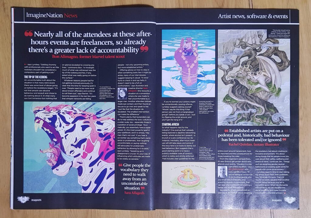
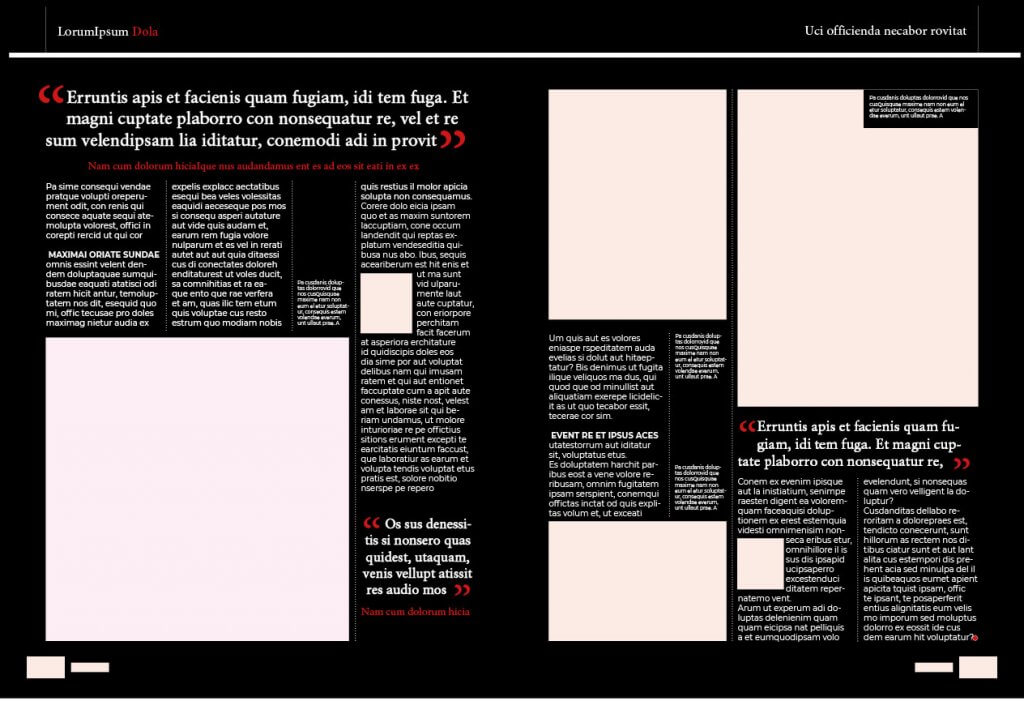
I was asked to analyse a magazine, to observe the sizes of the page the margins, the rows of text and the gutters in between, the magazine I buy seemed to not fit into a standard size which I googled to double check. I measured where. the content start and finishes from left to right and to the bottom and top, I now had my overall measurements and margins. I moved to indesign and inputted the measurements. I could see in the magazine that the column width would vary from page to page. I noticed some pages would include a very. thin columns left for captions, I assume this is to maximise the image size or as it is an art magazine to leave the images simple and free of distractions. I saw the smallest column could fit with in the margins seven times with a small gutter in between. I decided to add these in as guides, creating a seven column grid with a 5mm gutter.
I used the font finder software from the previous exercise to find similar fonts, the copy text I used Montserrat and the closest I could get to the header font I found was free for personal use, I assume that the font they used maybe a bespoke one and not available for commercial use.
I closely followed the layout, my seven column grid seemed to work, offering very similar results to the source material, it was then just a case to approximate the type sizes and little flourishes such as the captions, quotes and other page decorations.
The SF Masterworks collection from Orion publishing group is over 180 classic sci fi books. As you can see the images are very prominent, and have likely been commissioned by a small group of artists, they do vary in style but some seem to be similar. The series title is consistent in position, as this is intended as a set or collection, the title and author are also the same, each book has an endorsement or quote and its here we see a little change in the art direction, fitting around either the imagery or the book title.
I own this collection myself and the books look really great, the covers are all black and white “inked” drawings, the red white and black scheme really pops, the spines together make a colourful image of all the characters featured in the 2000ad universe. The Image again is very prominent taking up around a 1/5th of the cover at the bottom, with the title of the collection taking up half the cover making two distinct columns.
I have always noticed the ration of authors name to book title with the Stephen King Books, this isn’t limited to a certain series or collection I have added a book on this board that doesn’t belong intentionally to show this. He is after all the biggest Horror writer so we will allow him this indulgence. That said the titles o this series have special consideration with an almost illustrated style to the titles, photo or near photo realistic illustration is featured and add a lot of the horror mood.
Known for their romance novels these look very colourful, bright and feminine. the books are clearly aimed at females, or the romantic at heart. The images are consistent and may even be all the same illustrator, the flower logo is very prominent as is the Mills and Boon label, this would suggest to me that the author is less of a consideration than the brand, people aren’t choosing by author just for the familiar style and content.
The penguin books offer a very rigid consistency, this is largely due to the clear structured layout, you don’t even have to look for any hidden guides, grids or markings as they have conveniently added coloured divides and lines. The Logo is also separated form the publishers name, I cant think of a logical reason to separate these, the logo does occasionally vary in position but this could be slight revisions over time.
The Ladybird books series has glorious old fashioned looking art, again this looks to either be the house style or the same illustrator that worked on them. All the information such as logo, title and series are at the top, an author isn’t credited on these covers. something which would seem standard even if its not important to the books sales.
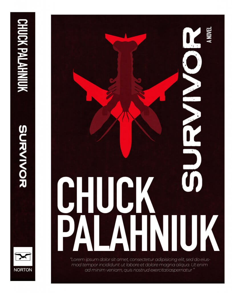
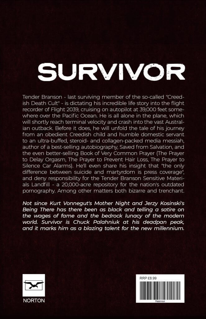
For this exercise I was asked to design a book cover, spine and back page for a book I was familiar with, I was asked to create 2 versions, one using photography or illustration and the other using only type (no imagery) I picked a book I was familiar with and had recently recommended to a friend.
I decided to create an illustration rather than photography,As I recalled the book a scene was very prominent in my head, it involved lobsters, the story center’s around a man who as the story unfolds decides to crash a 747, killing himself, these things both had strong imagery and the shape of a lobsters tail and body reminded me of an aeroplanes tail and fuselage, I drew both out in procreate, using the mirror functionality for consistency.
I added a fine colour halftone filter over the image, I wanted a distorted look to the image and title, giving it a “pulp” novel feel. I took the Stephen King Approach and made the authors name very large. as the book was about a plane destined to crash, I placed the aeroplane facing down, I ran the title alongside it, I felt this helped give the impression of downward movement. I placed all the elements on a grid, carefully sizing and aligning my content, I wanted it all to sit comfortably. I was really quite pleased with how the image turned out, it has a sense of the. whacky to it and the lobster diving head first juxtaposed with the sweeping opposite wings of the plane added a good amount if interest and intrigue. My friend also liked it, having read the book also.
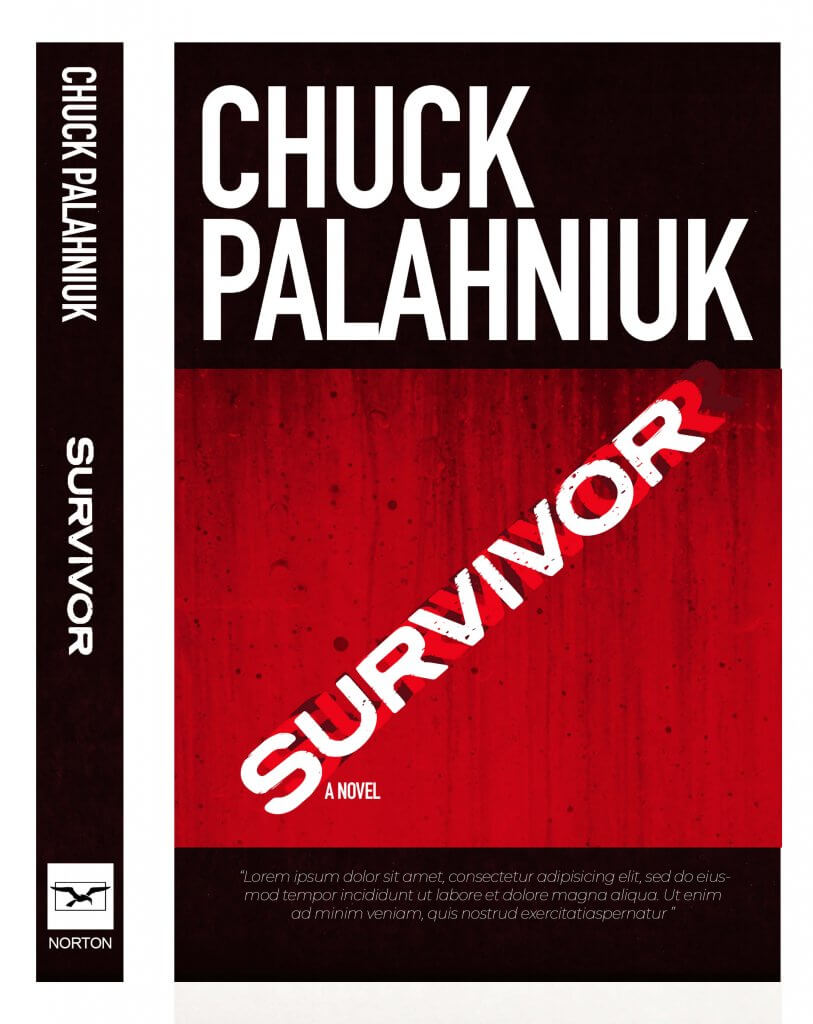
The next imageless cover was a lot trickier, it was hard to make it interesting or even relate to the story, in the end I decided to add the title in at a crashing angle, it looked workable but I still felt it could look more interesting. I added in two more titles and made it look like the title was moving. I kept to the same “danger colour scheme for both.
I feel that the book cover with the image works best, I cant think of many times I have seen a book with out some kind of imagery to help it stand out, hard back books with dust jackets removed tend to be plain underneath, I think imagery is important, it does draw our eye over to a book, and if it can tell you what genre of story it is even better.
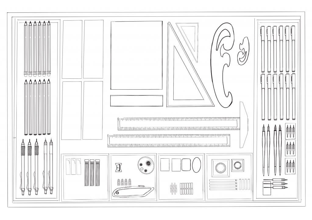
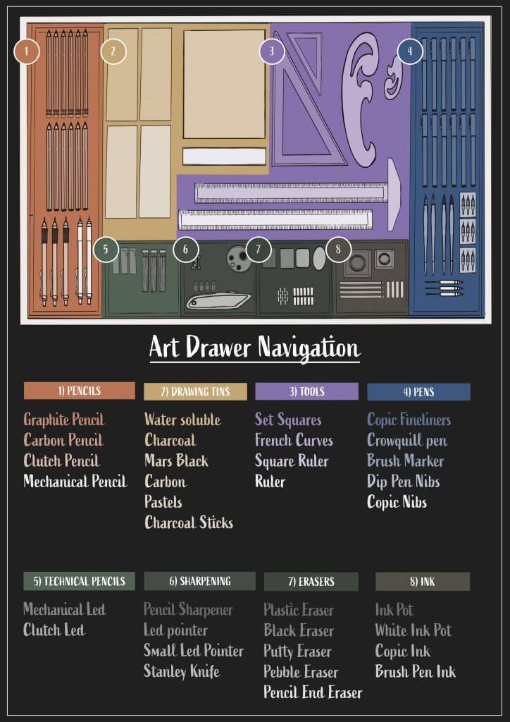
This exercise asked me to draw inspiration from established information graphics and then male my own for my own surroundings. I decided to map out my Art tools and materials drawer. I thought this would be a good one as there is many different items in there that all are sorted into logical groups. I wanted to colour code each different category, and I also thought each colour could have a tint based on its position, left to right top to bottom, with the last item being the lightest. I started to explore the all important layout, depending on wether the map was to be text led or image led would dictate the positioning and prominence of the image. I tried to separate the text lists around the image the obvious problem here was a lack of structure and consistency, displaying the categories together seemed to offer a more simplistic approach and was easier to navigate through. I decided that I would need clear header to describe the category, these alone would be useful to point the viewer in the right direction.
Exploring layouts
I sketched out the layout and dividers of my drawer, Adding in the contents in clear and logical ways, my drawer is not this neat, its organised exactly like this but some digging and searching is needed for just the right thing.
Once I began to colour code a nice even structure become apparent, I tried my original idea of using the same colour but using tints to show the position of the items on the map. This I felt worked well, then I started thinking about the user, what if he had poor eye site or colour blindness, adding a numerical system would add another simple layer of navigation that would ensure bases were covered.
The downside of my colour coding does mean it relies on a dark background to work, as the tint approach means that the last listed item will be white or thereabouts. This may or may not be a problem, in a printed context its probably fine but if this was to be translated to a web environment we may need opposite version for night mode where the image is darkened with shade rather than tint.
I started a document in adobe inDesign, the functionality for adding/editing guides feels best to me. I made a grid 8 columns by 13 rows, one for each month and one for a header these were fixed to my margins I had set so I have some space above and below for ant additional styling or decoration.
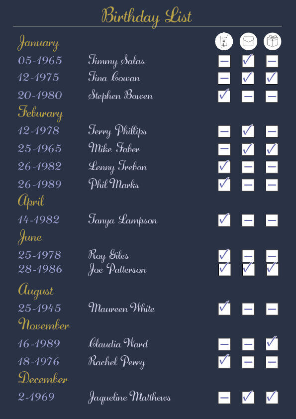
I wanted a date of birth field so I can calculate an age if need be, also the name and then the checklist items.
The problems with creating a table of this kind of data is the format would need to change if I was to find another friend, I tried to approach it logically by month, this runs in chronological order but doesn’t include all months, only the ones that include friends/family’s birthdays. I think this is the most logical way of doing this task, as time is the main focus, I added in the date but omitted the month as this was already included in the header.
I added in the card, text, and gift as Icons to save space, the type would be either really small or have to be turned on the side to fit in if not. These are the icons below, they didn’t come out too well after I compressed the image for web.
I enjoyed this exercise and at first it seemed simple but it really is when you start looking at the data that you have to start to overcome problems and find the best way of displaying the information.
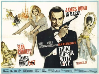
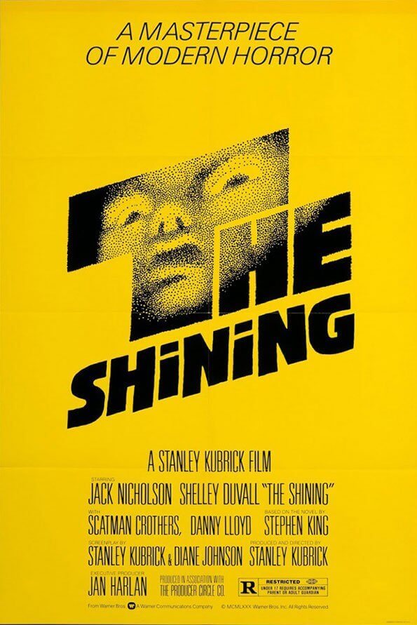
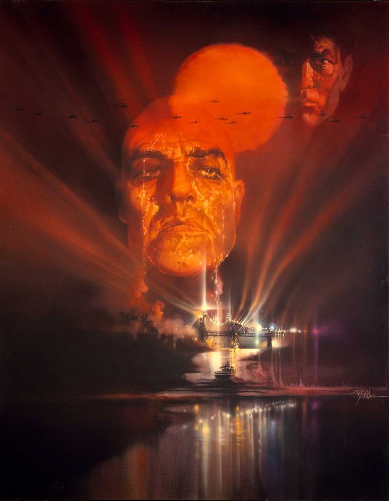
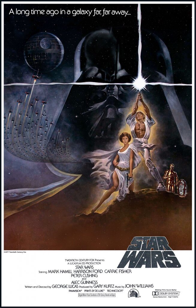
I have always loved movies and the posters have alway had an amazing allure to me, sometimes they even look better than the actual films. These days a lot of movie posters are quickly put together in photoshop and some are done with very little care, I will include some of the worst some of the best and even some that are specially made for the super fans of the films, and aim to summarise what makes a successful poster at the end.
When posters go wrong.
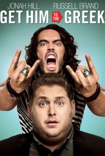
When I first saw this poster I was shocked at just how bad it was, this is heavily composited and I have no idea why, it would have been less effort to photograph anyone of similar build to Russell brand and add his screaming head on after, instead they have used one gesturing hand flipped it and added a ring on one of the fingers, the same ring is then added on to a different finger, as is a buckle to the right arm. Even the shirt seems to have been made from composited patterns, and they do not match up, the technical stuff aside the poster doesn’t tell me anything about the film, this is one of the lost arts in movie posters today, the loss of a narrative or something to get the potential viewer excited.
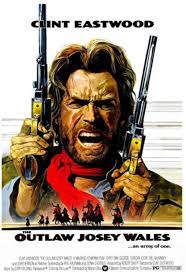
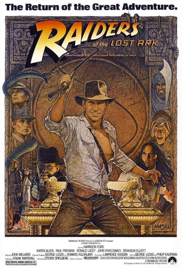
I think the most important thing for a movie poster is to generate some excitement, It has to demand some attention. If a poster hasn’t drawn me in and told me a little of what to expect then I’d class it as a dull poster, the films content might be very good, which is in its own way a tragedy. The poster cant tell you everything either, some of my favourites offer small references back to the film to notice once you have viewed them. The most common reoccurring theme for success is that they have hand drawn elements as opposed to photograph, it seem s odd that these seem to depict the film better than photographs can, they seem to have more life to them when done correctly. There are a few illustrators that dominated film posters, before the quick and easy trend of 3 or 5 characters next to each other with a title above or below took over. The work of John Alvin, Bob Peak, Bill Gold, Richard Amsel, Saul Bass, Tom Jung, Eric Pulford and the mighty Drew Struzan have all at somepoint filled my eyes with marvelment.
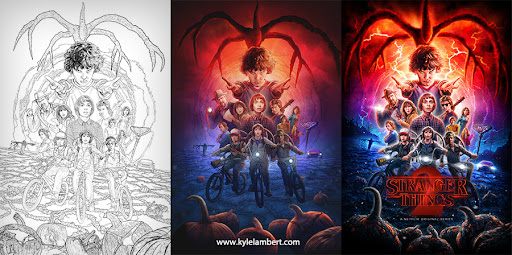
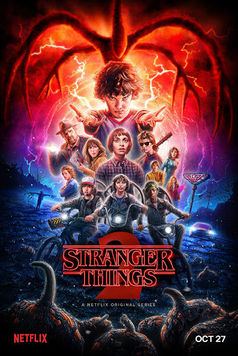
The techniques used for the posters range from oil and acrylic paintings to airbrushed pigment and coloured pencils. There is an illustrator workign in film posters that has based his style on the now retired Drew Struzan, his name is Kyle Lambert and he apes the airbrush, acrylic and pencil approach as an all digital workflow.
Another facet to film posters is the fan made or the re imagined, these are often successful because of a deep love and respect for the source, these artworks are often used for anniversary additions or limited edition art prints, companies like arrow video actually offer two covers the original and a re imagined, this boutique style approach is the back bone of their business or strategy, offering something new and unique, re mastered or reworked. They too seem to value the cover and the faithful representation of the film.
Below or some examples of posters that just don’t really do anything positive for the films they are representing, These seem to all be of a type, very formulaic and dull in appearance.
This exercise asked me to design a poster and accompanying flyer, the exercise is about how to deal with different work spaces, the poster is large and one sided, the flyer is smaller and double sided. This is also to be photocopied so will be in black ink/toner on what ever paper they select when making copies.
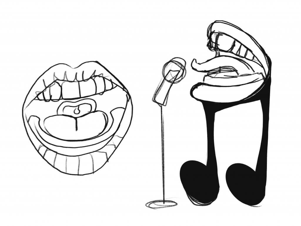
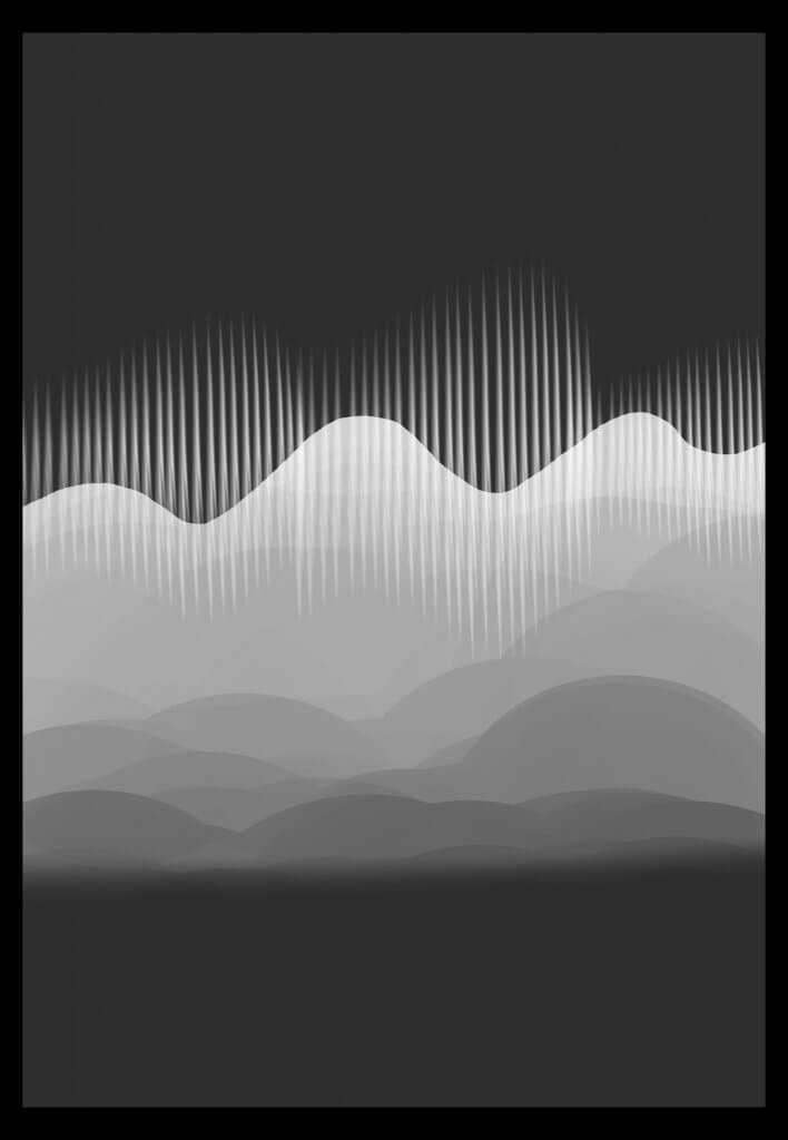
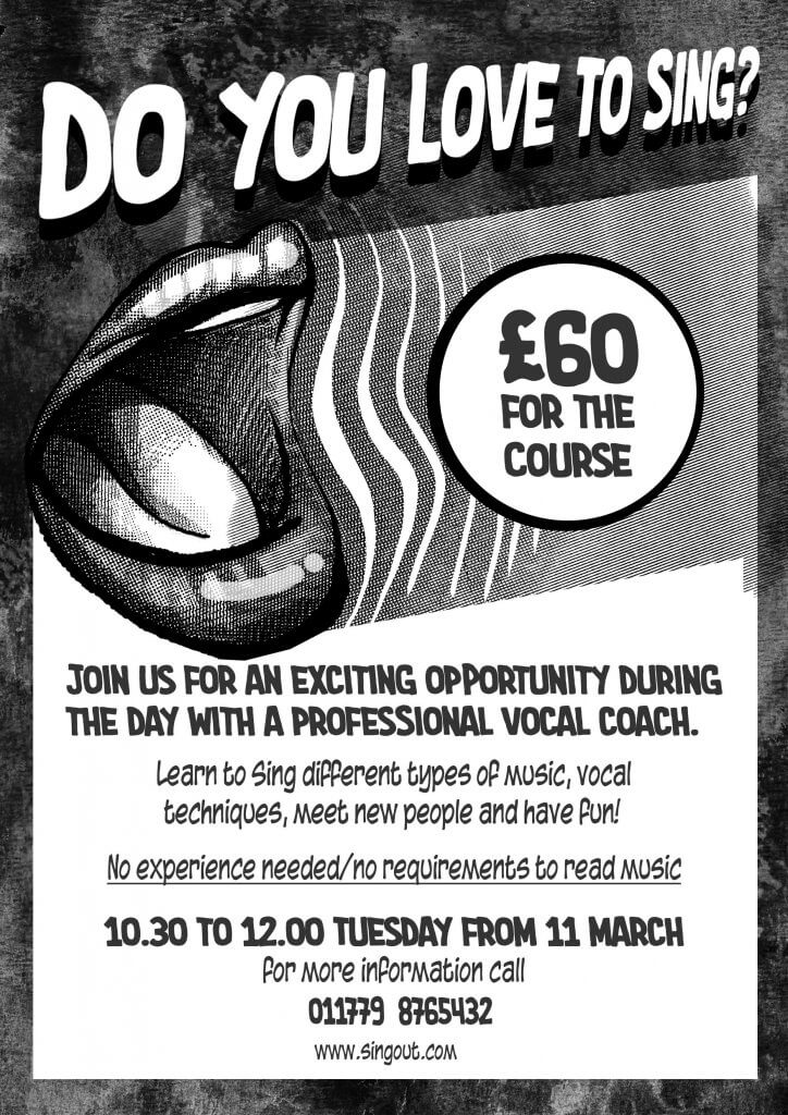
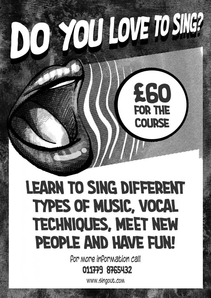
It advised me to carefully consider the use of imagery as these wont reproduce very well, it also asked the question was anything missing from the brief. Once I read through the brief the only thing I was wondering was how did the client want the advert to look, was this a high end prestigious advert or a fun, cheap piece of marketing. As they was looking to reproduce this with a photocopier I imagined a conversation that would imply the latter, a fun cheap local singing course. Given my limitations it also gave me a low if kind of advert feel, the sort of thing you would find in a comic, almost like a coupon for x-ray specs. I wanted to add an image and this could be very simple, in fact it had to be, I kept thinking something fun was needed so started to work up some ideas around singing and sound waves.
these seemed too cartoony
this sound wave felt like it was too abstract and I was worried it would lose something in reproduction
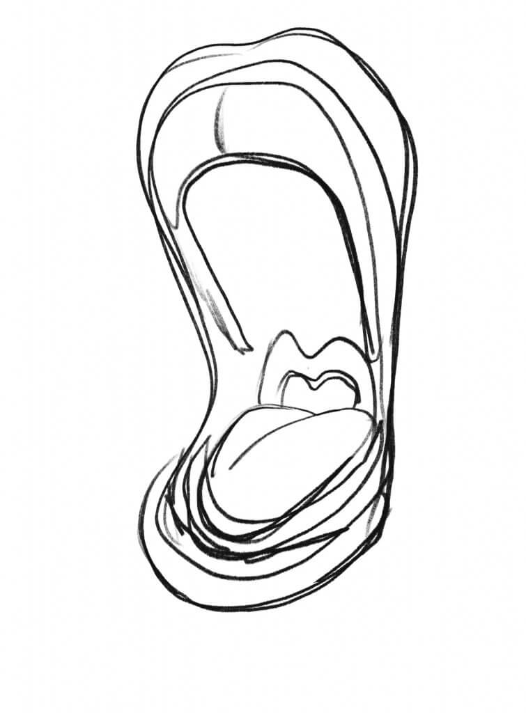
Adding a mouth seemed to add to the problem
I liked this mouth but seemed to be in pain rather than singing
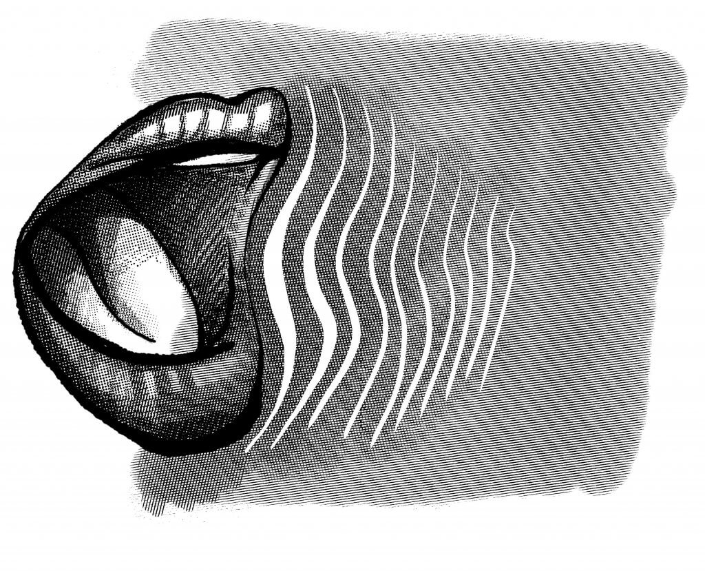
This felt like a good fit for what I had in mind, I used a halftone brush to add some rendering and give the mouth some form and style that would fit in with my vintage stye comic advert.
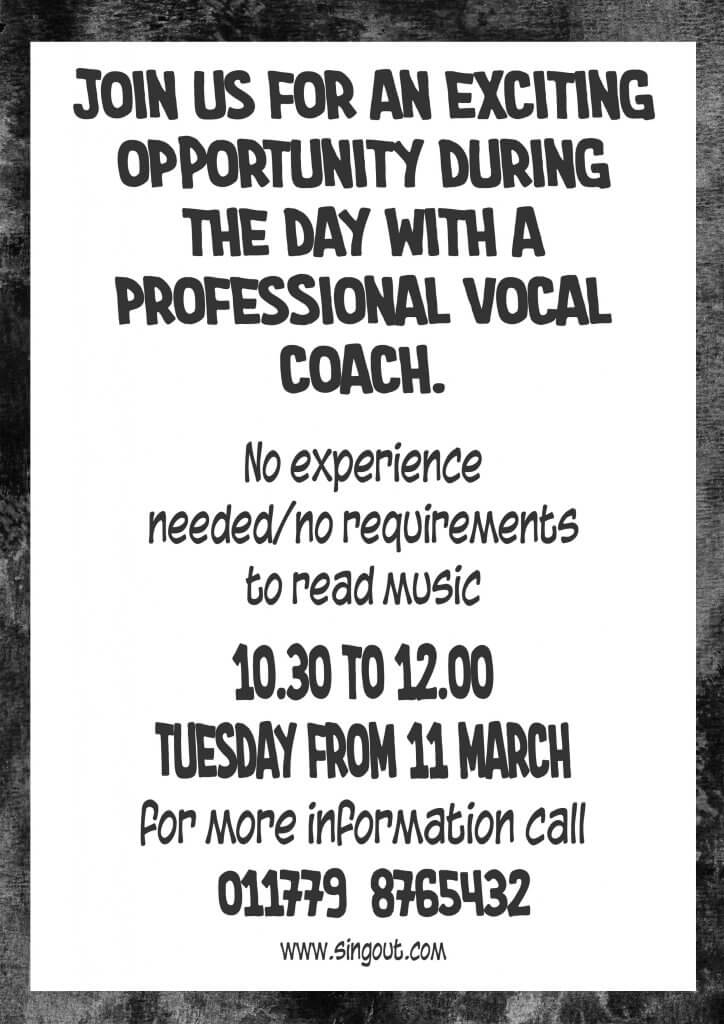
Once I settled on the image I started to add the copy, Starting with the poster first I chose a vintage pulp comic looking script typeface. The price seemed like it was very reasonable and decided this would be very high up in the information hierarchy, that along with the header seemed to play to each other’s strengths. After that it was quite wordy, I split the two messages into a bolder sub header and a lighter message that stated no experience was needed, the contact information and Timings being important had to stand out these I gave a bit more vertical space form the previous message hoping it would create two distinct groups. I added a rough distorted background, as no colours can be used this was a pure tonal exercise I tried to create strong contrasting areas without out looking dull and lifeless. Using the news print style halftone pattern added to the theme and also covered up any potential loss of quality when reproducing wit a photocopier.
The flyer being two sided allowed me to use one side as an attention grabber with the headline, Image contact details and price on the leading first side and then all the additional information on the reverse. I think it was important to keep these looking uniform, the flyer may be available where the poster was being displayed and it seems important that these are obviously the same local event. I also switched the header and sub header, I felt that the sub header was more descriptive and I wanted to separate them so I would lead with the sub heading message.
For this research point I looked at logos, their colour schemes, design and how they work.
Most of the logos I found seemed to be in black, all logos will have a black, white and a set of colours they can be displayed in as part of the brand guidelines set by the company. The majority of fast food company’s seem to deal with colour, reds and yellows seem to be very prominent. McDonald’s Chupa chups, Burger King, Pizza Hut and coca-cola all seem to feature bright reds. Fashion brands seem to take a one colour or monochrome or monoton approach. This seems to be a more tasteful and elegant way to display the brand. Some logos such as the fed ex hide hidden elements, the hidden arrow is perfect to represent a fast delivery service.
Finally I was asked to recall the OCA logo, I was sure it was a white box with a red key line with OCA in a handwritten brush script, it was in fact a solid red square with a single A character. The colour seemed to be the only aspect I actually remembered correctly.
The Chance Housing Association has been set up to try and help first time buyers get onto the housing ladder and they want you to develop a brand image for their stationery.
The brief goes on to establish the tone of voice they want to use in the new brand assets, they want to appear as a modern, helpful and welcoming to young people.
Research
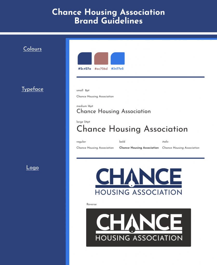
I looked at other housing associations and their brand image such as logos and colour palette. There was a lot of blue and green, blue seemed like a good strong colour, dependable and secure. Some of the examples I found used bright almost fluorescent colours, this made it look fun but also cheapened them a little, I think the balance of fun and modern needs to be even with helpful and dependable, this is the customers future so it needs to be serious too.
Choosing type
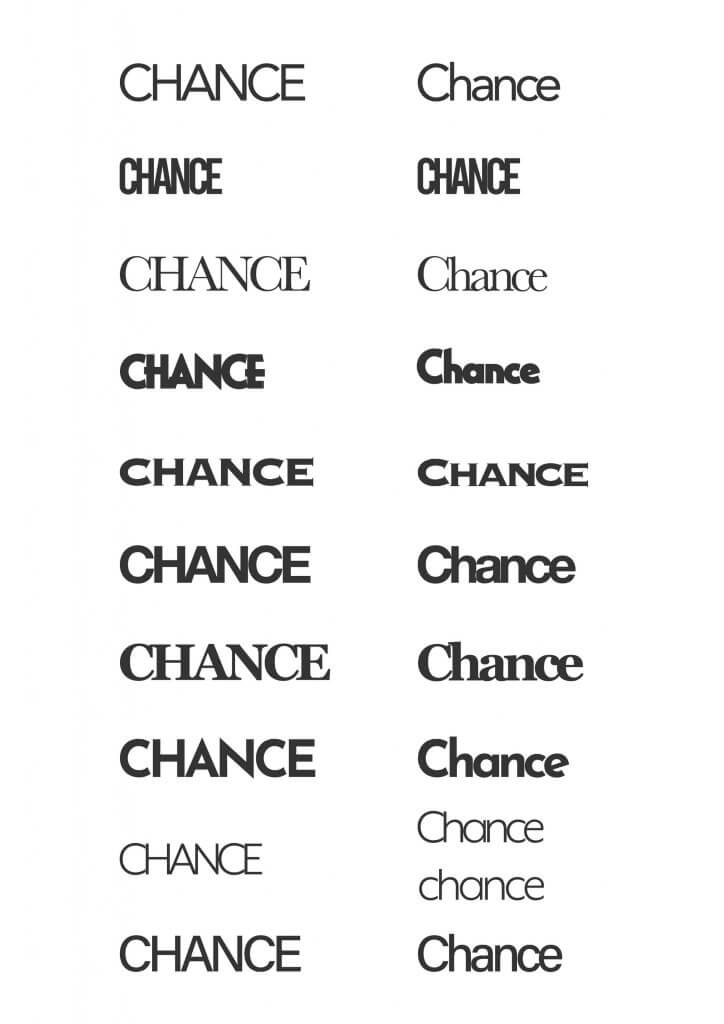
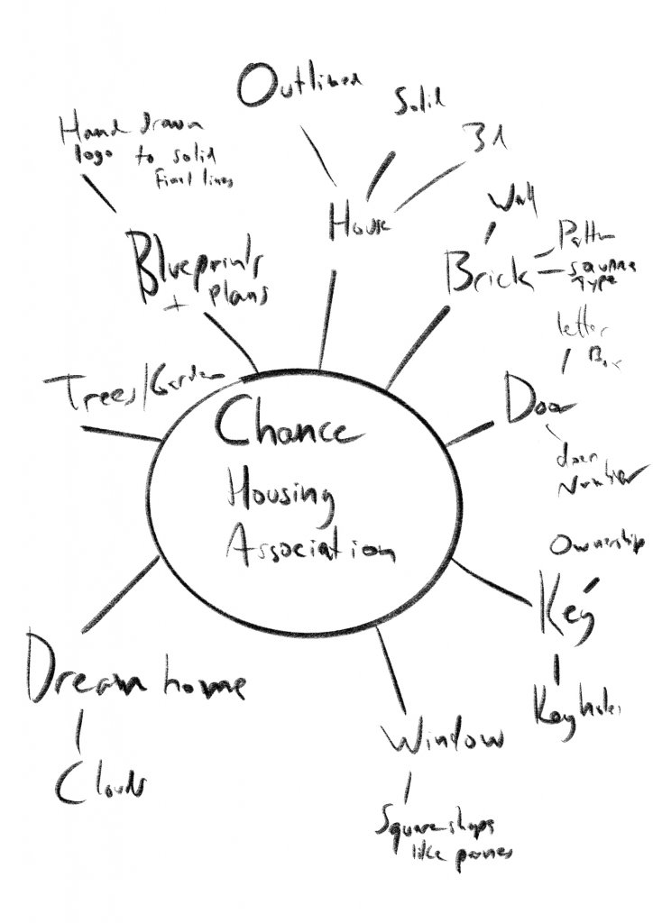
I looked at some type, I did an all caps and a sentence case version of 10, this may have been too much choice. I was looking for distinct shapes and styles, and trying to spot patterns and relationships that may give me a shape of one of the elements I found on my spider diagram, such as a key, or a house shape.
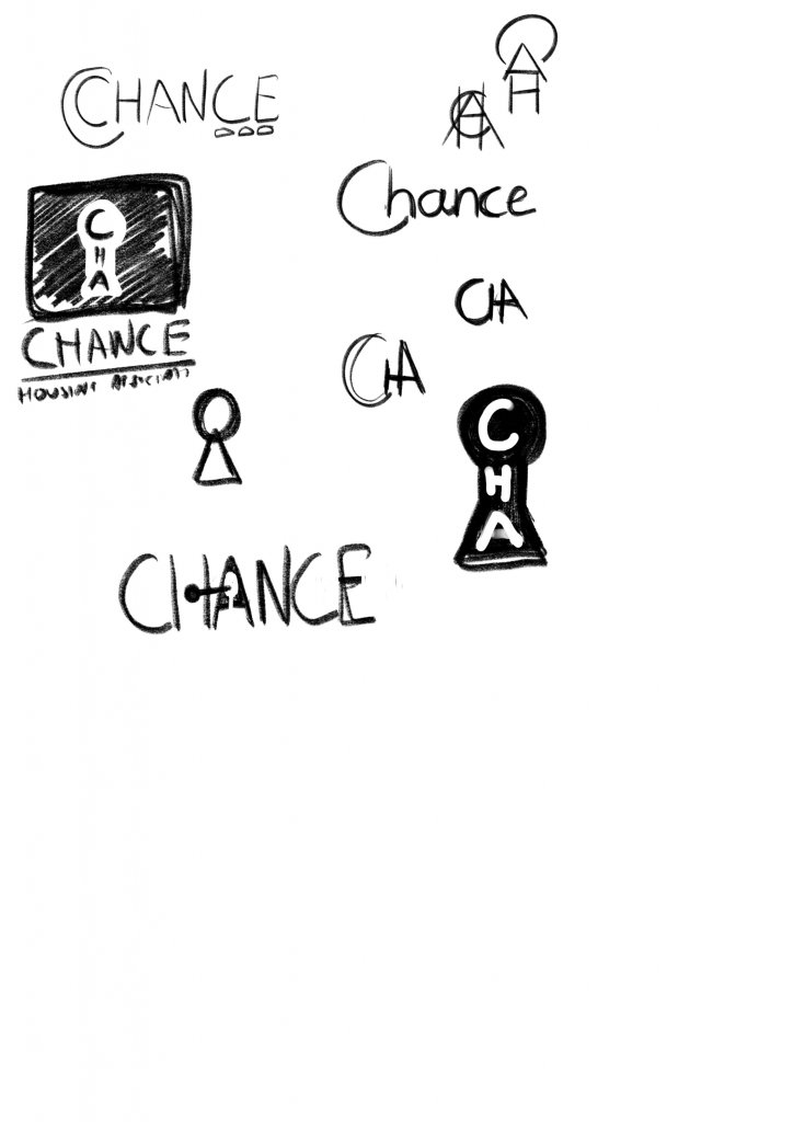
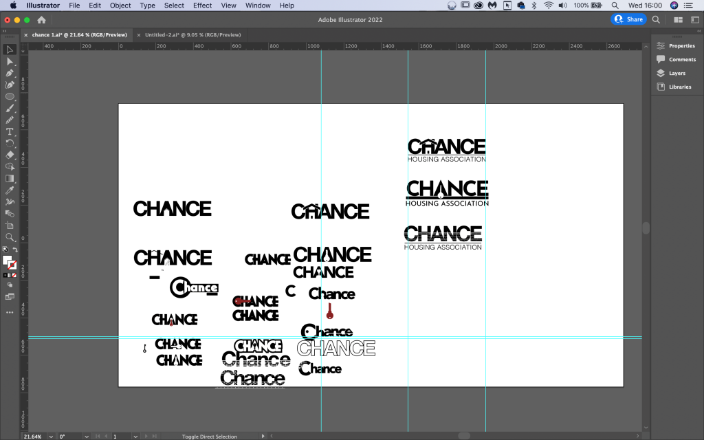
I created a spider diagram and explored some loose sketches, in the end I decided it might be easier to actually play with these ideas in some software such as adobe Illustrator, I can manipulate the actual typefaces and take advantage of the shapes, I was looking to come up with three to present to the client for further development. I worked in black and white. I didn’t want colour to affect my judgements as these would need to also work in black and white. I also wanted to integrate images and copy, or at least thats how I read the brief when it asked “using just typography sketch up some ideas” it did feel like a more challenging way to approach this exercise and I was sure to learn a lot from this disciplined approach, it would be very easy to place a house icon above the type. I did try to make a half way effort though, by using an acronym. the C, A and H made a house with a sun above it, I didn’t feel this was quite what I was being asked to do so stopped developing that idea.
I ended up with three different designs.
I think my favourite was the key, the key has a distinct shape, it also has some extra meaning, a key to your future or a way to unlock possibilities. it was also the clearest at a smaller size. The House wasn’t too bad but felt a little too similar to soem of the examples i had seen, the brick work was the most unique but again didn’t really display at. small sizes.
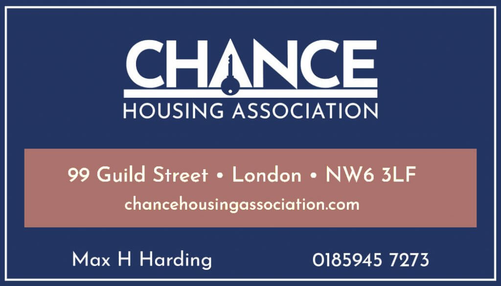
Letterhead & Business Card
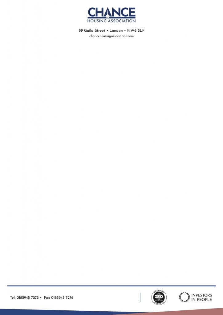
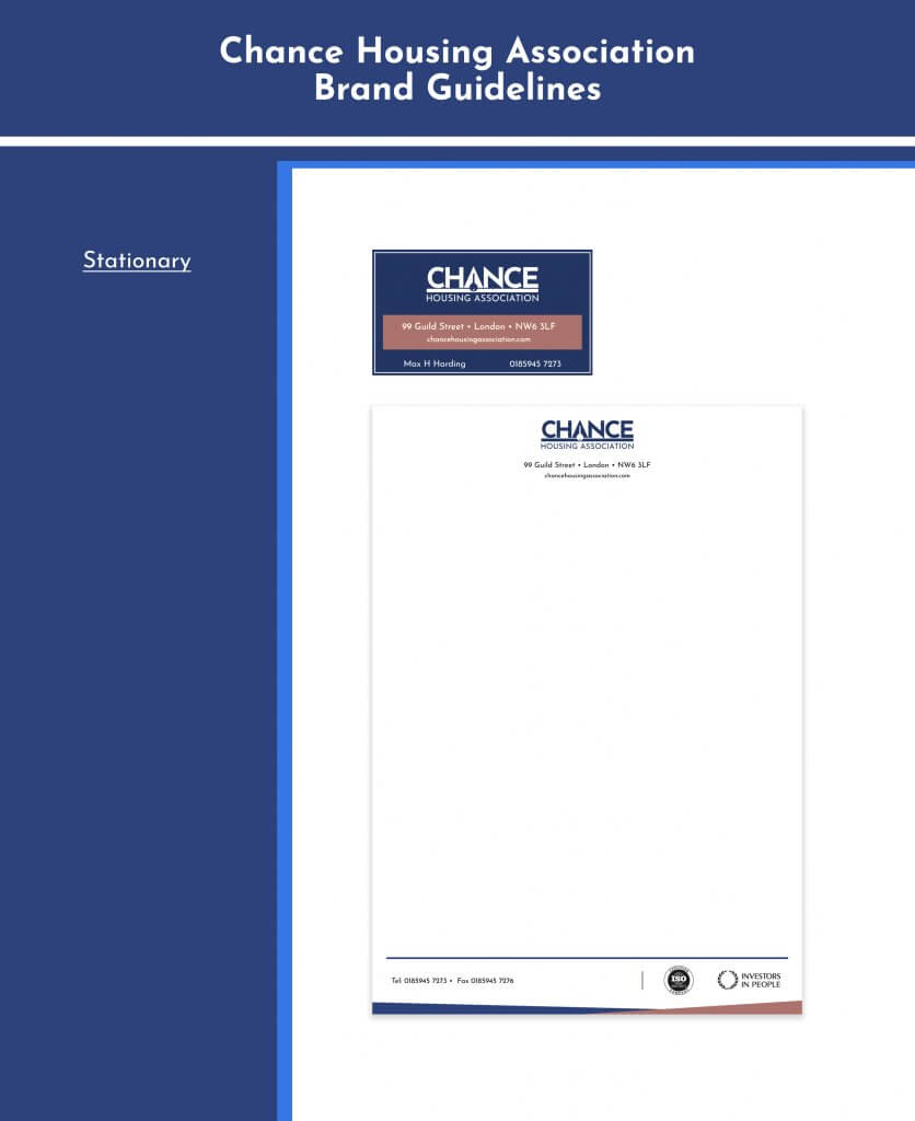
I settled on partnering the blue with a “house brick pink” I felt this was sensible and reserved with a sense of service and purpose. The logo at a small size was just about small enough to read as a key, any smaller and it would be lost, or mistook for a banjo or a frying pan. The dark blue made a nice base for the warmer pink/red to sit on, I felt it drew the eye to the address quite nicely. In hind site maybe the Hierarchy here is a little off, I don’t suppose the most important information is the address but it also frames the name and number too, so I started to look at it a different way, the highest contrasting items being the most important, I think that helped make my mind up, When I added the logo in the pink it didn’t look as striking so I kept this as below.
The letterhead I kept contrasty and dark as possible, I thought if this was the lighter and it got photocopied then the logo would be quite a lot lighter and get lost. I looked at a few letter heads but the centre aligned one seemed to feel more modern, less formal.
Feedback
I was worried that it wasn’t fun enough, so I showed it to a few people, they said given the context it fit well enough and they could tell it was a key. So I was happy to proceed as is. I think if I hadn’t incorporated the imagery into the type this would have been easier, the examples I found above seemed to integrate an image and type a little less directly as my efforts did. This resulted in an even more challenging space to work with.
Presentation Pack and stationary
I put together a small set of brand guidelines, nothing too detailed just enough to start to build a brand identity to present to the client. Overall I was happy with what I learnt from this exercise, it offered some good problem solving and made me consider what sort of tone the brand needed.
Like the previous exercise this exercise was also about finding a suitable and serviceable tone of voice for a brand.
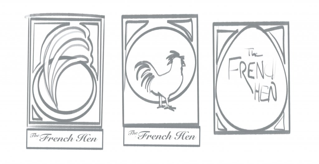
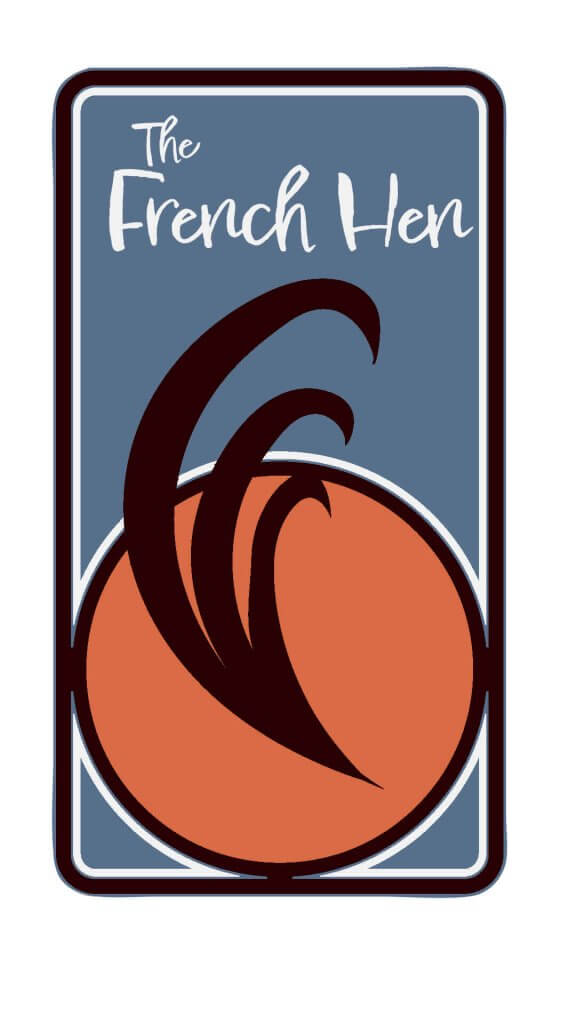
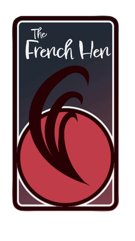
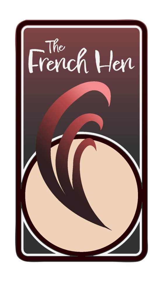
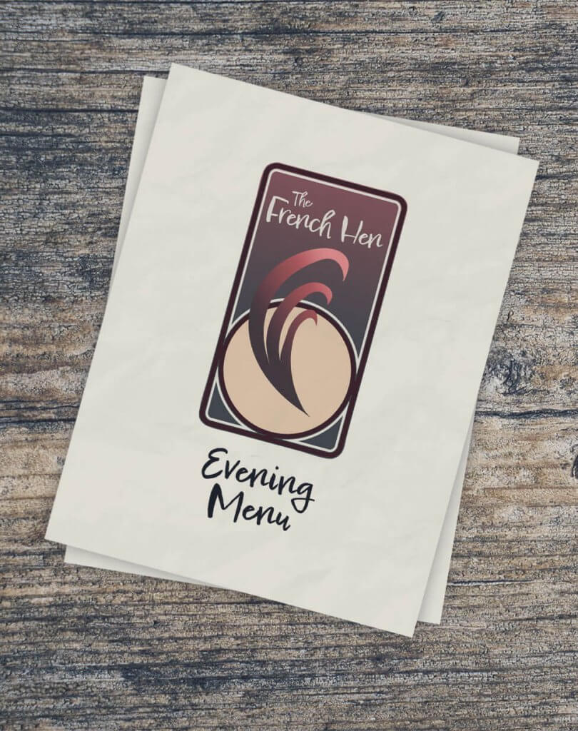
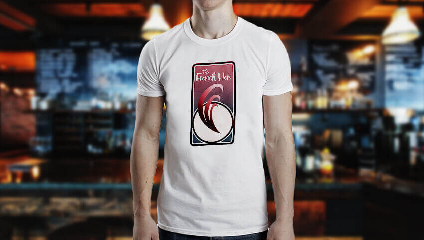
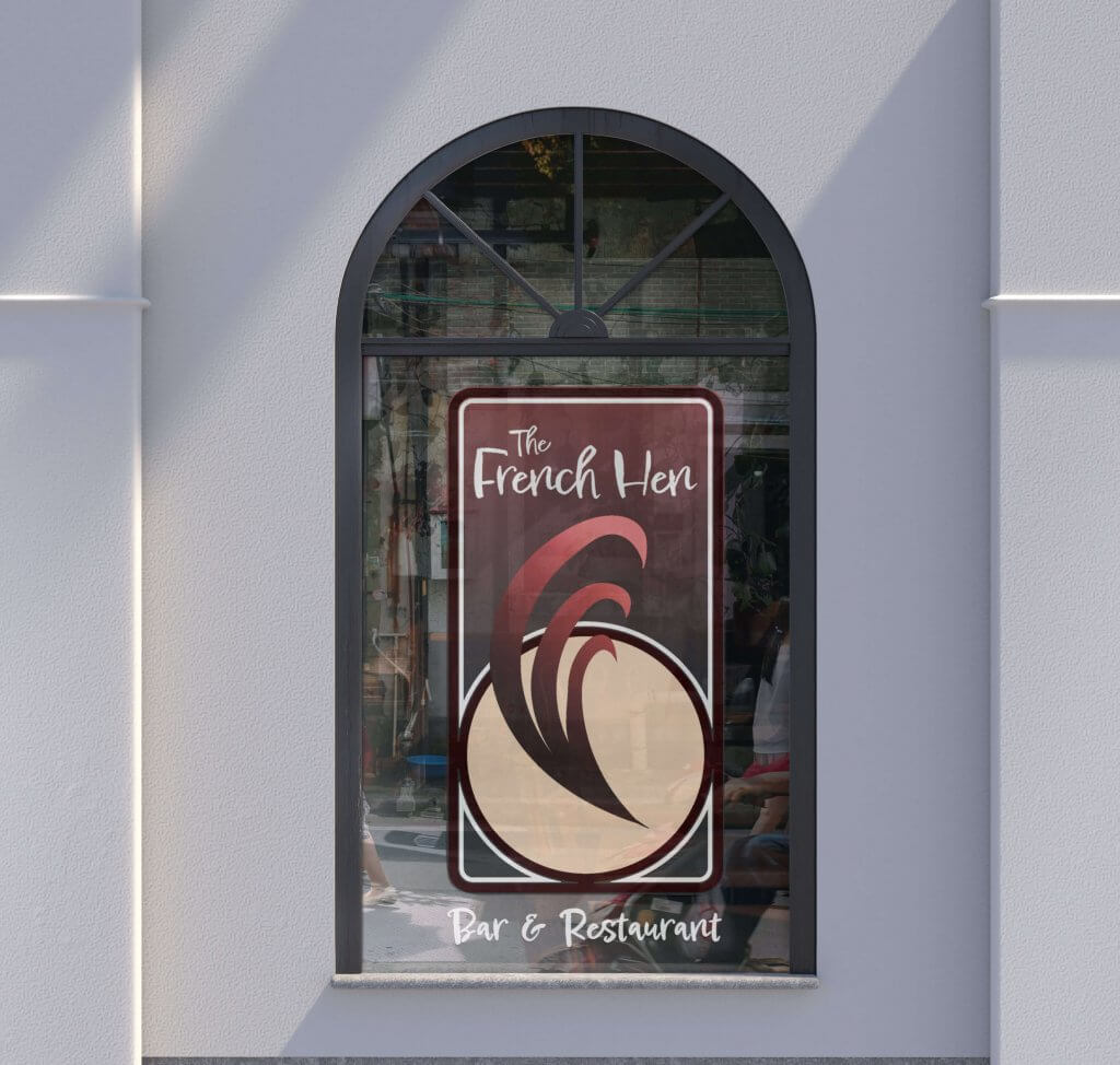
This asked me to develop some ideas for a bar/restaurant, it needed to be separate from similar local vendors that offer alcohol and food, it needed to be sophisticated and relaxed. The Bar is called The French Hen, the accompanying literture showed an art nouveau/deco style poster, this did start to influence how I saw the project.
I created a pintrest board, the search for french hen brought up all sorts of avian lithographs and wood cuts, and reinforced my approach to an art nouveau theme or a softer rounded art deco feel. This was also fitting with the more cultured and refined brand that was required for the project.
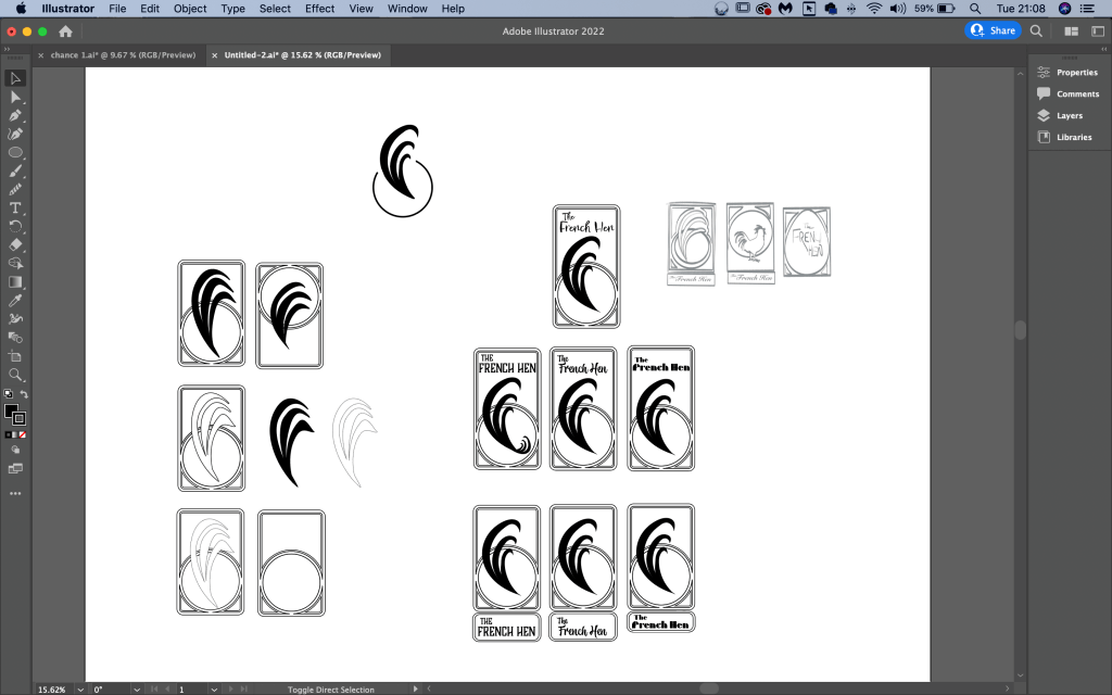
I started to loosely sketch ideas, I soon realised I didn’t want a picture of a hen I feared it would look too much like an old pub. I imagined a weathered wooden sign with a fluffy black chicken on it, I carried on exploring. An egg shape was next, it did get away from the full on hen effect but also felt a little comical, I started to extract elements from the hen in my mind. A claw/talon would be too aggressive as wold a beak, in the end the most distinct and unique characteristic was the tail plume, this fit the curves found in art deco and had the potential to carry the right image. I added some text to my designs (below) and after some analysis the plume fit best for the brief. I imagined that would be the one the client would want to further explore.
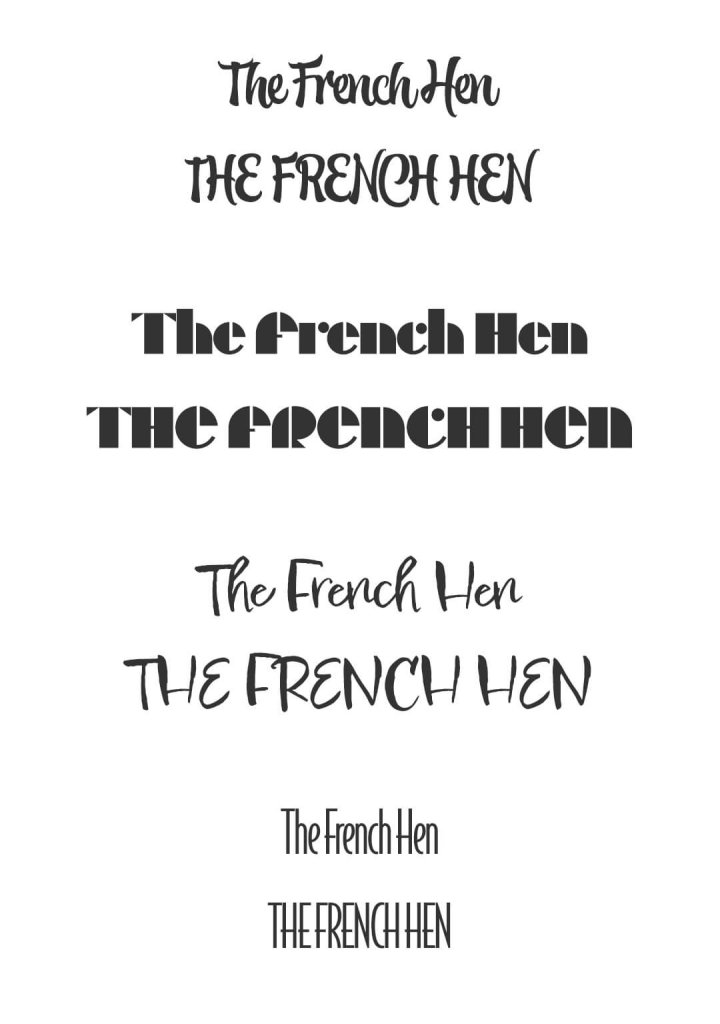
Typography
I picked out some type that I felt would fit in, I literally searched for art deco in the filters of the adobe font service and found some suitable, ones I then looked at some more handwritten style, I liked the idea of it having a personal touch, something a little less corporate and franchise driven so after adding them to some more advanced near final worked up ideas I eventually settled on a font called Epicursive script, it had a nice bouncy rhythm to it.
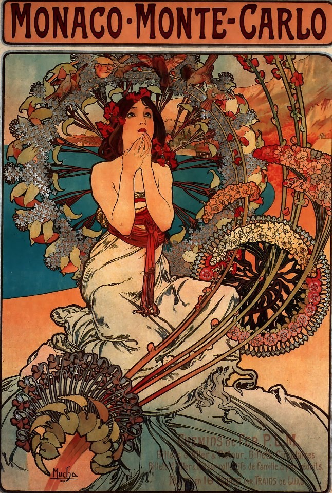
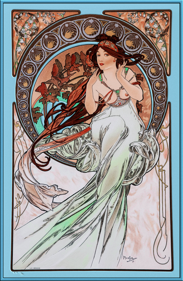
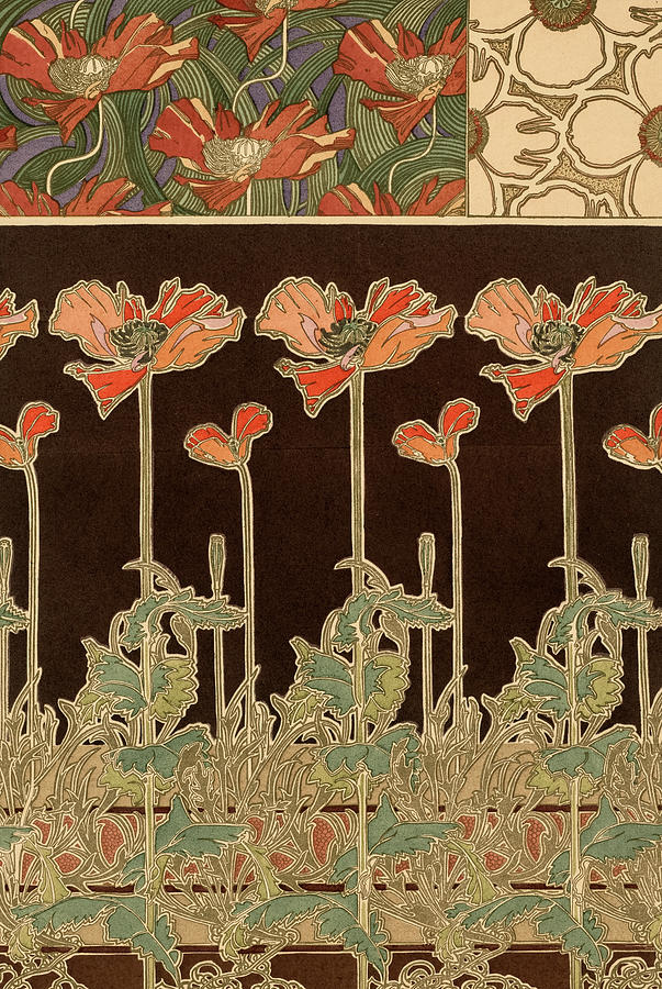
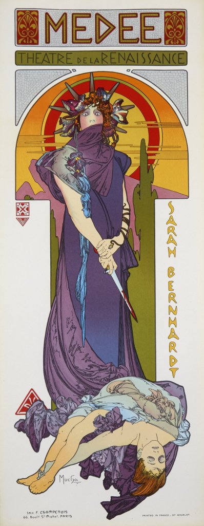
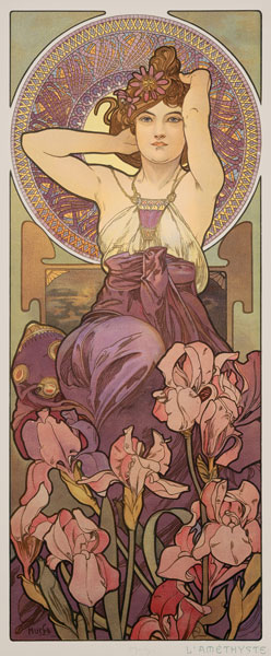
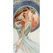
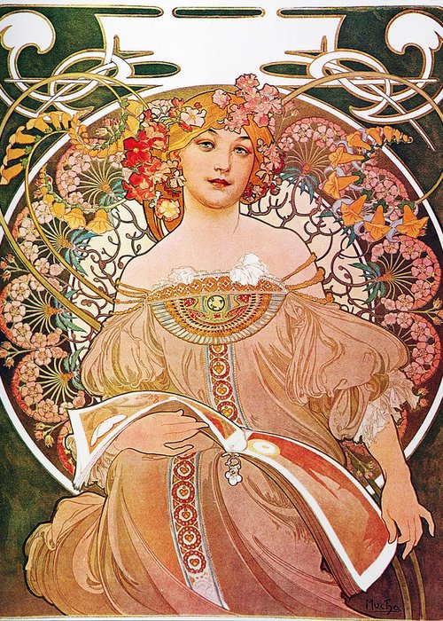
I imported my sketch into adobe Illustrator and started to add some shapes, I did draw some inspiration from the Czech artist/illustrator Alphonse Mucha, he added in some nice curve shapes to his portraits framing the subjects in what looked like leaded glass windows. I kept the icon simple whilst drawing inspiration from it. I explored several layouts.
The different layouts with the top three typefaces I picked, I didn’t want to rule any out until I had seen them near finished.
Colour
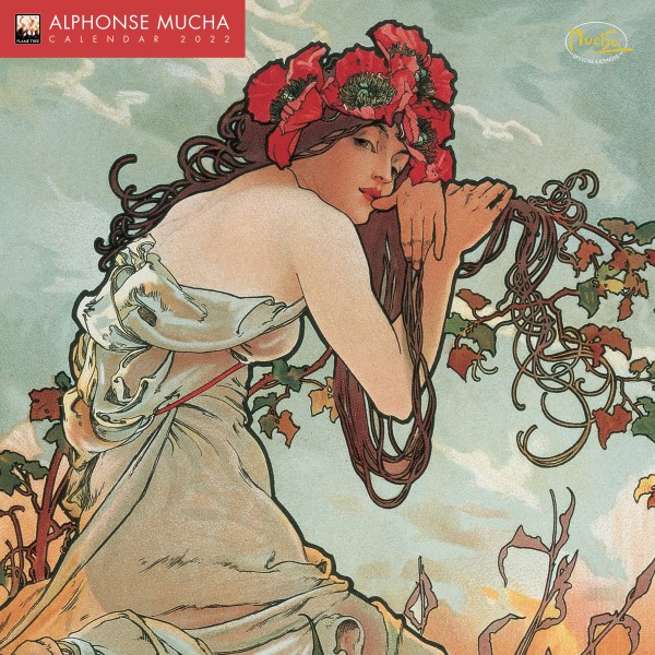
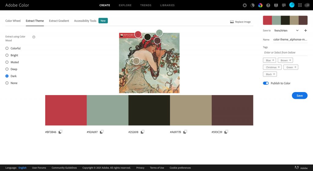
When it came to adding colour I wanted to again draw from reference to keep with the spirit of Alphonse Mucha, I selected some of his work and generated soem colour swatches with the adobe colour site.
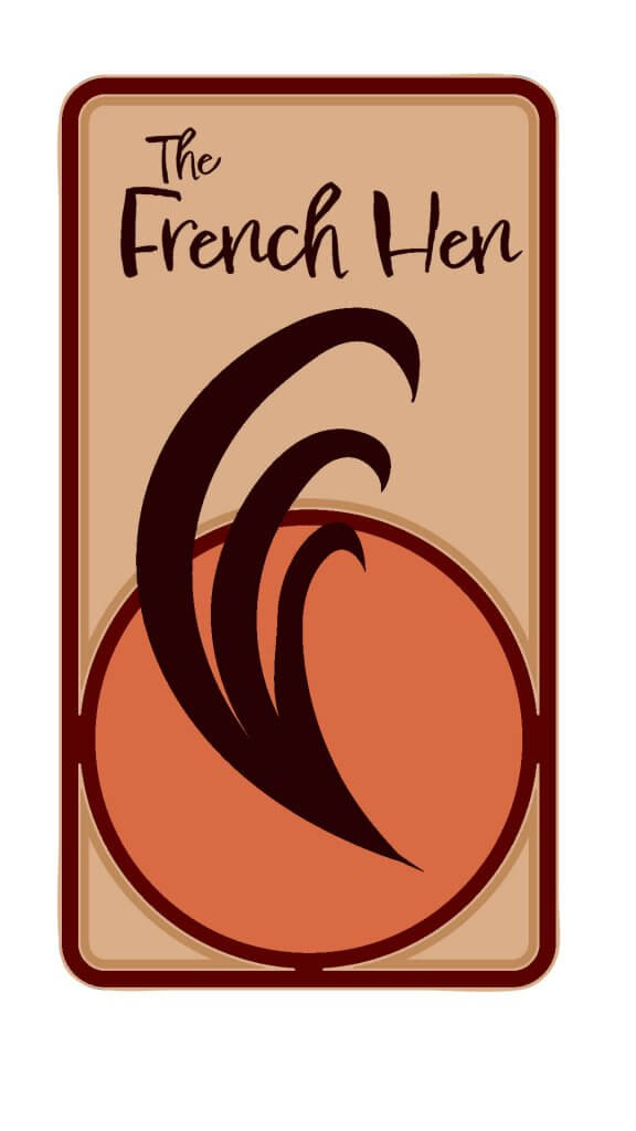
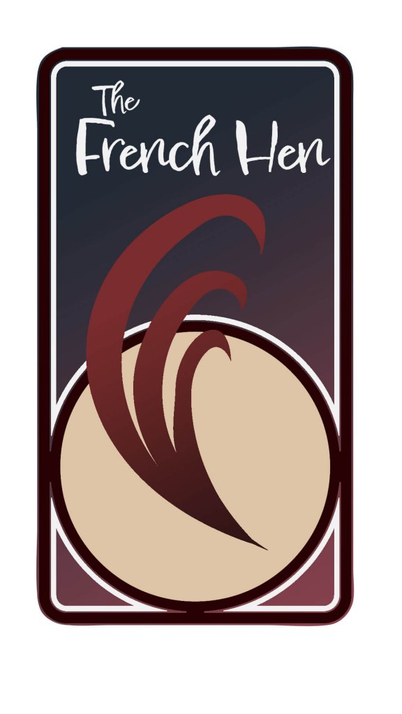
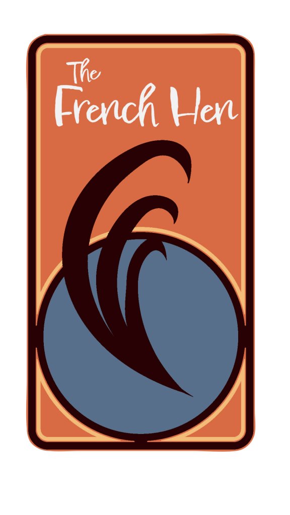
I had several swatches to work from, after some experimentation I did pick and mix these, below are a few I imagine I must have tried around 50 variations, but I didn’t save each one. I wanted to give it an evening feel, the browns, reds and oranges felt to me like they was working best. The darker versions felt more like a night spot while the lighter ones maybe more of a coffee shop feel.
The Japanese hen
I liked this one too, but didn’t feel like a night time venue.
I chose the final design below as it felt sophisticated, had good contrast , it felt like a night time venue and also somewhere with food due to its warm cooked brown hues.
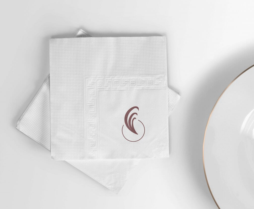
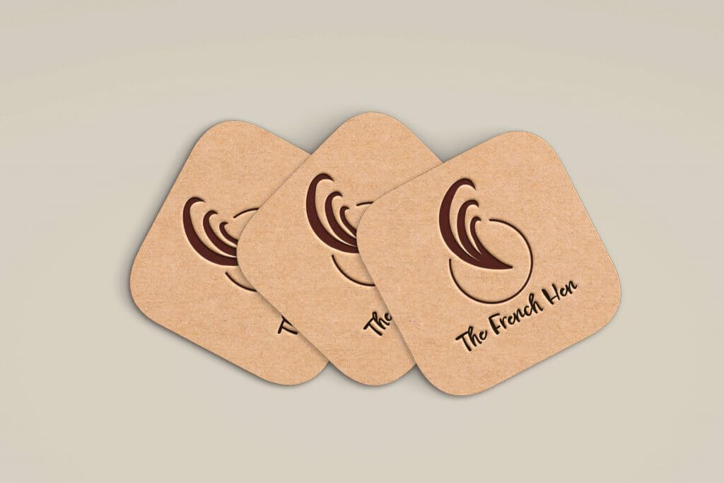
The Icon seemed to fit on all the suggested materials, I even was able to further simplify the tail plume for the napkin. and coasters, this also potentially could work well for a chefs hat or even a managers polo shirt to signal a higher status. The Font felt like it still worked on the menu, but would really only be suitable for headings.
I feel this exercise like the previous gave my mind a good workout, trying to feel my way around the brand image, I imagine this exercise would be a hard one to sign off as the client would likely have some idea of how they saw the business too, being able to adapt not only the design but the look and feel would be key. Another interesting aspect of this project was when I started to strip back the logo using the occum’s razor approach I still felt like it worked, maybe adding a stripping back step early on in my workflow might be beneficial to the final design.