Drew Struzan: Final Piece

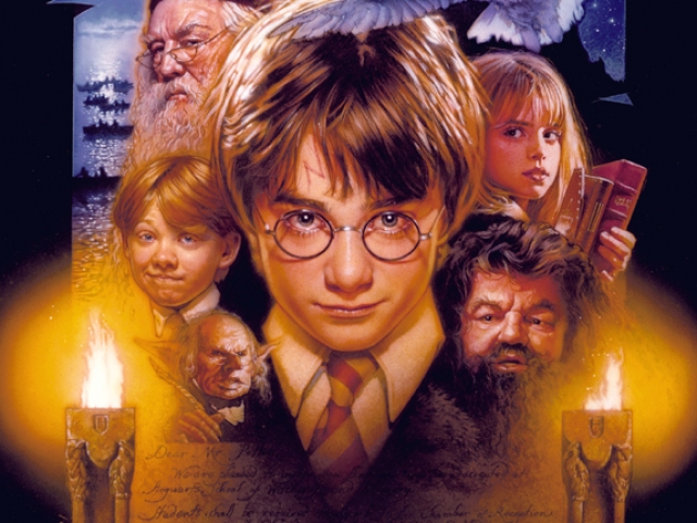
I was thinking it would be nice to use the witches again, the brief did say to use similar subject matter and it would be good to show the difference in presentation between the two illustrators. Drew Struzan had worked on some Harry Potter artwork so there was a good few examples of his approach to the subject matter.  In the thumbnails I included cats and spell books, moon imagery etc, anything that can add little points of interest and detail to the piece.  I really liked the window and decided to do a larger portrait as the main focal point and using other witch imagery to frame the character.
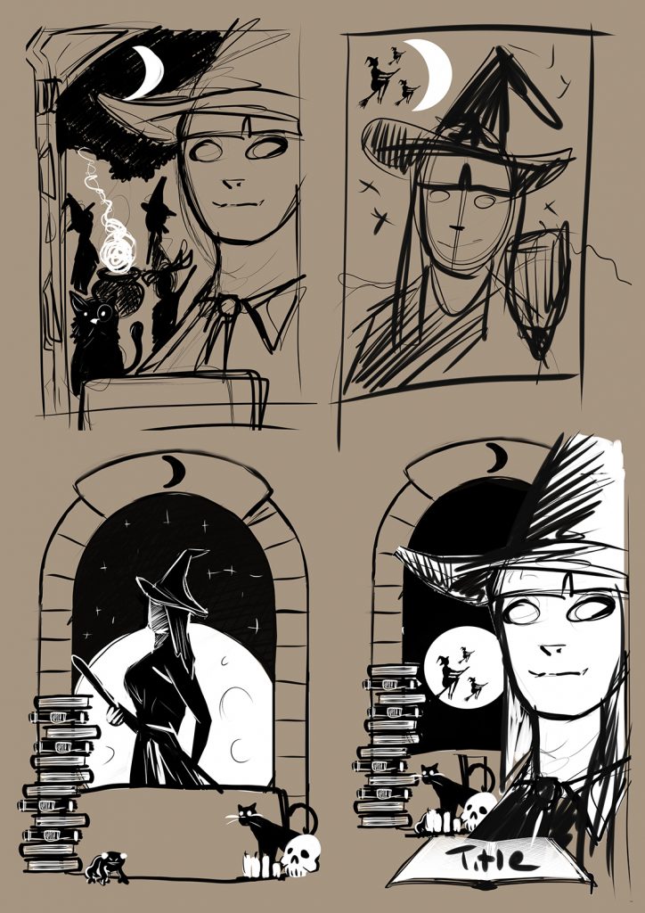
Witch thumbnails
I liked the idea of a stone window as a frame so I went with the bottom right hand side image

Using an image of Bryce Dallas Howard as reference I added the witches hat as she hasn’t as of yet played a witch to my knowledge  so no photo exists. I produced the artwork in Photoshop starting with a simple sketch to work out the composition. It would have been great to use an airbrush and follow the techniques that Drew Struzan uses but I just didn’t have the necessary equipment.
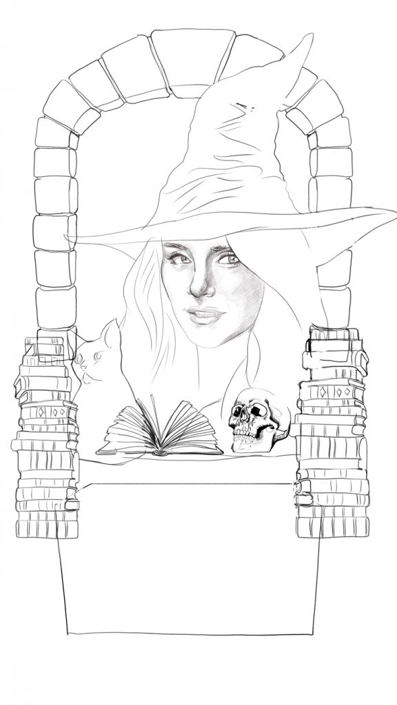
initial sketch
Establishing a composition

I then added the texture around the window with a simulated spatter brush, I worked more detail in with a pencil brush then added the colour with a soft brush, it was quite good experimenting with the settings to get the desired effect. I also added some textures over the top to give it a painted rough look. Somewhere in between the colour and the detailed pencil work I lost the likeness a little, I was a bit disappointed with that but happy with the way the overall image turned out even though its not quite a Drew Struzan the composition seemed fitting and with a few more attempts I’m sure I could improve on it if i wanted. More Importantly and certainly something I’ve learned form this exercise is that I need to keep searching for my own style even if that means temporarily borrowing others.
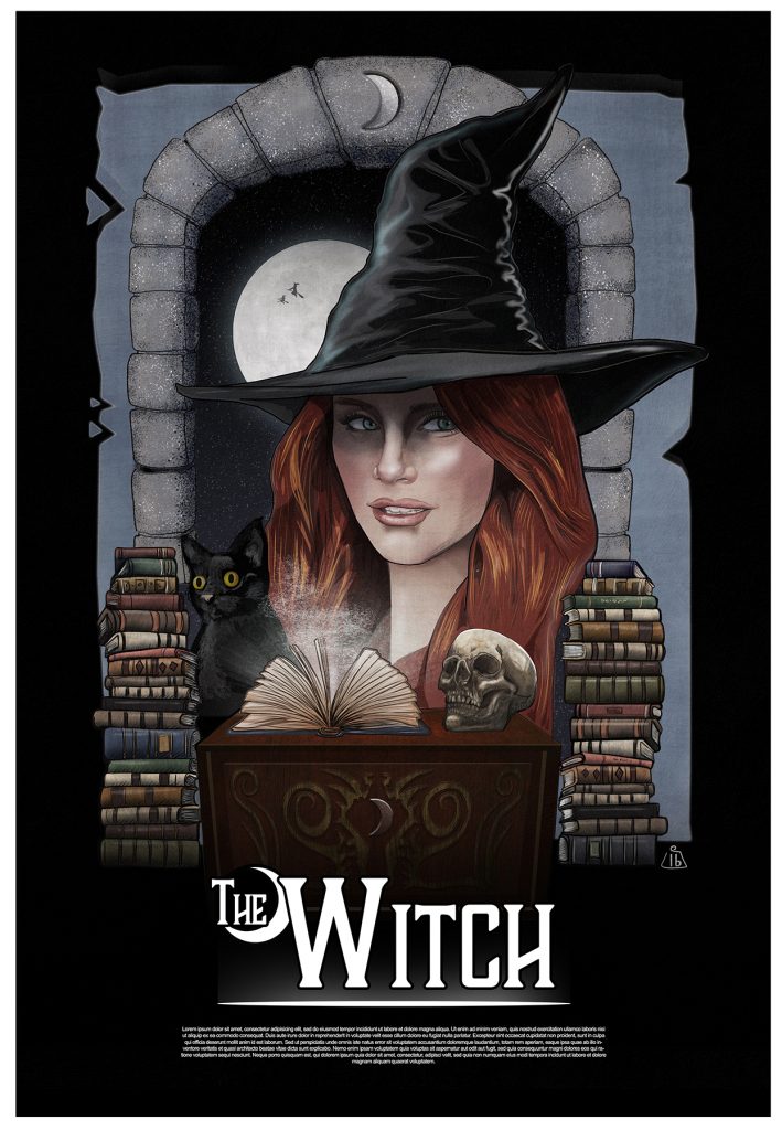
final piece with titles
Just to add some context I came up with a generic movie title and worked up a little logo.

Drew Struzan: A more detailed approach

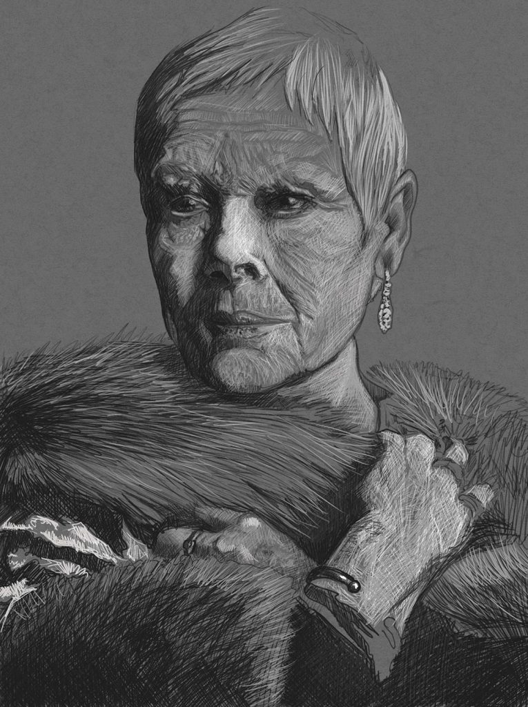
I decided to start again, this time really trying to carve  out the features with the direction of my lines and try for more detail.  I decided to use an older face, I found some good reference for Dame Judy Dench and I went about trying to improve on the last image. The key here was to keep it detailed with an abundance of texture and using short lines that follow contours. I still needed  to keep the expression and mood of the photo even though I was in fact making up a lot of things that wasn’t present in the reference photography.

Dame Judy Dench
I was quite happy with the “Regal” feel to my Image

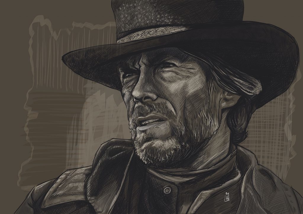
Was overall happy with this, has a stylistic look and the portrait is recognisable which would be essential for a film poster, I wanted to try one more time with  a  more heroic character.

Clint Eastwood
I felt this came pretty close to a Drew Struzan style sketch

I was feeling confident I was ready to move onto a final piece and I had an idea how best to approach it. I really felt my drawing took a leap forward I was pleased with the outcome of all the work, still room for improvement but definite progress.

Drew Struzan: Understanding his techniques and style

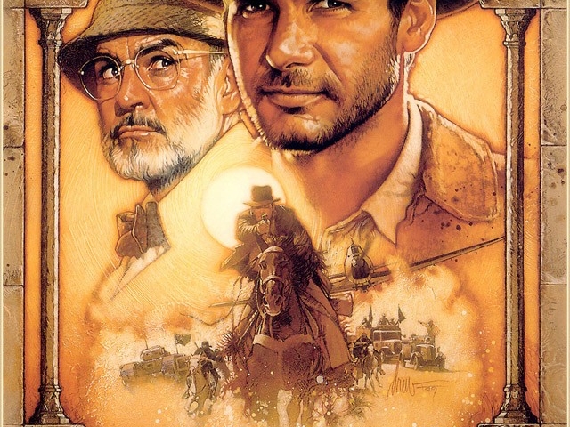
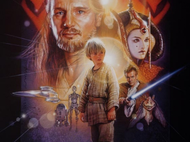
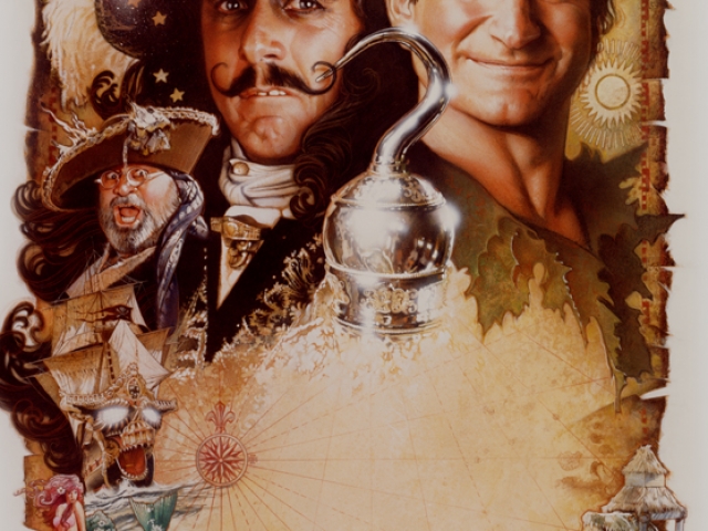
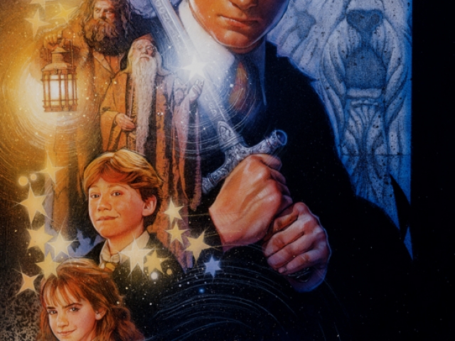
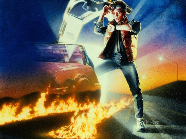
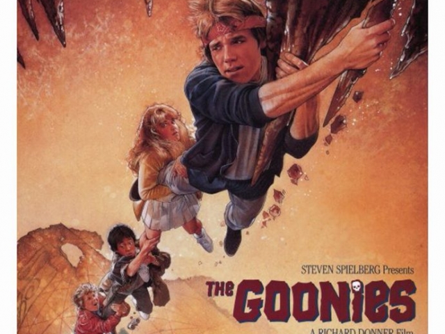
Drew Struzan works heavily from on set photography and publicity shots from the films he is producing the artwork for.  He decides on his composition using several sketches and then projects the provided photographs onto illustration board, tracing the characters with pencil and then drawing in the details. Once he is happy he paints in the darkest areas with black and spatters black paint over areas he wants to be textured, he uses an old typewriter cleaning brush to do this. For the next step he uses an airbrush to add colour over his pencil and paint, he finally picks out highlights and further detail over the airbrushed areas with coloured pencil, its then sent of to be photographed.

His work has a little bit of a Norman Rockwell feel, and like him he often frames his images with shapes. I thought I’d start with some sketches of film stills myself to get a feel for his style.

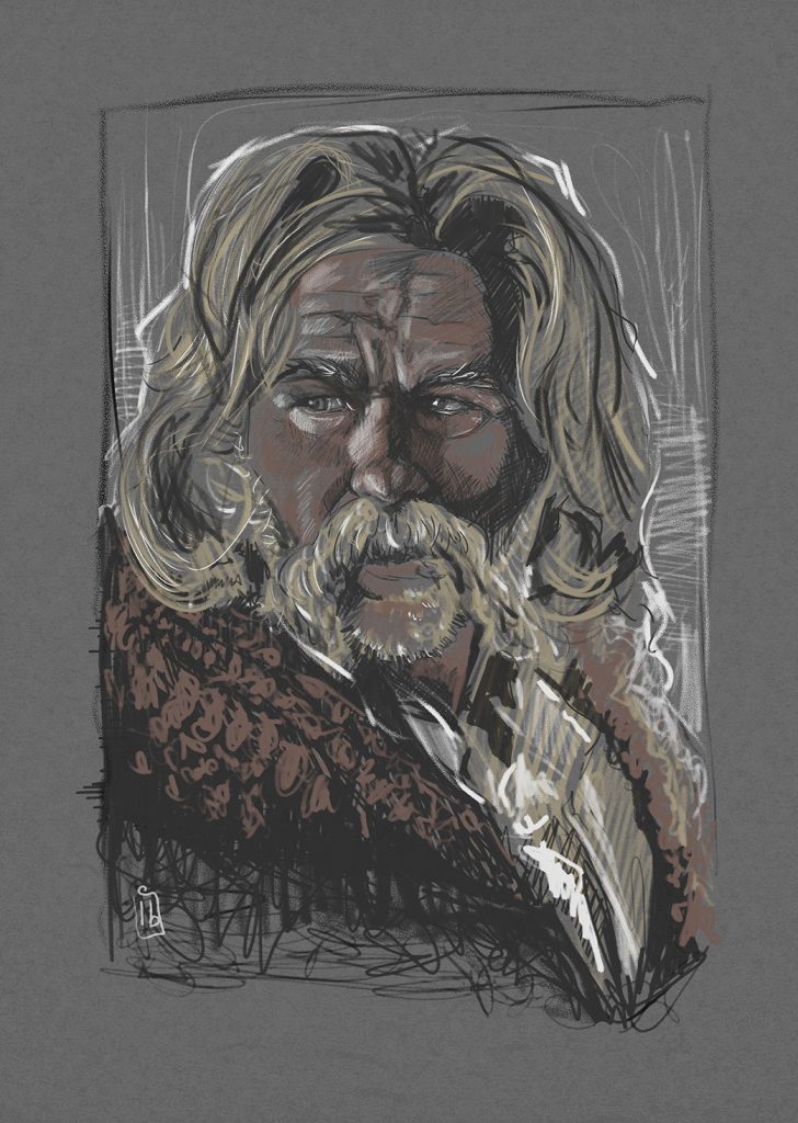
Kurt Russel
Kurt Russel from the movie the Hateful 8

I kept it loose and used the same scratchy lines Drew Struzan favored, he will pick out a person facial contours by using line to “scuplt” the features, that’s what I tried to do, it didn’t have the same photo realism that Drew’s Images have.

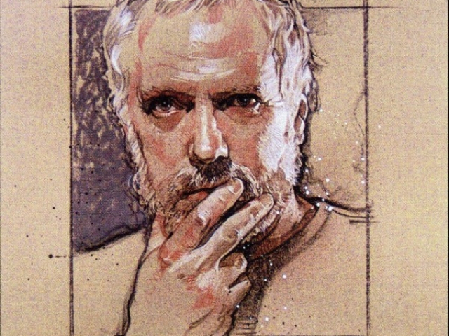
Drew Struzan

When I was asked to pick a contemporary Illustrator one came to mind almost instantly. I have always loved films and enjoy looking at the cover art, unfortunately these days most film covers and promotional imagery are cheap poorly produced Photoshop montages and demonstrate little artistry or flair. Since the 70’s directors who wanted a timeless movie poster always called on Drew Struzan, I loved his work long before I even knew his name, his style is so distinct that you can always spot a Struzan piece.
As a complete opposite in style and technique of Edward Ardizzone I decided to study and attempt to emulate the work of Drew Struzan.

Drew Struzan