
Like the previous exercise this exercise was also about finding a suitable and serviceable tone of voice for a brand.
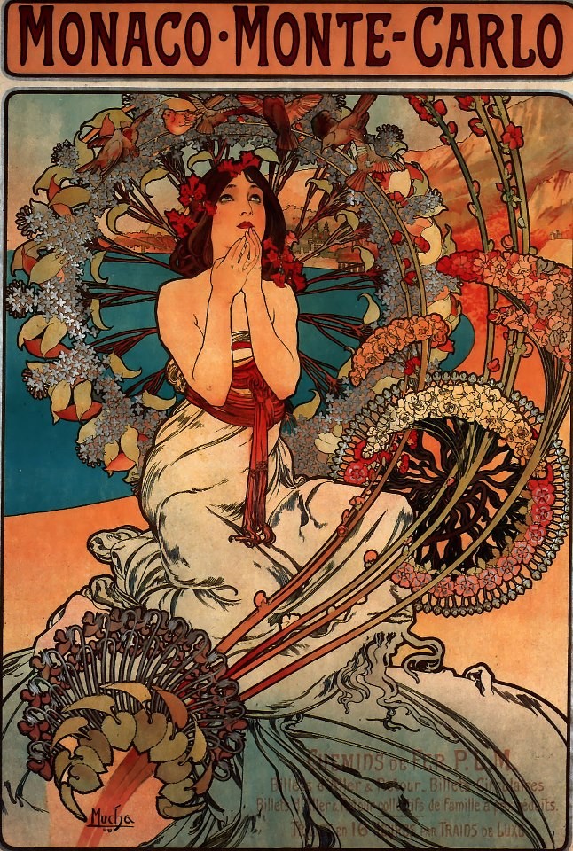
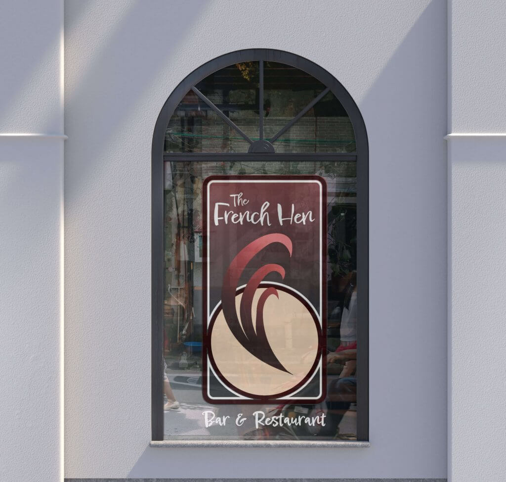
This asked me to develop some ideas for a bar/restaurant, it needed to be separate from similar local vendors that offer alcohol and food, it needed to be sophisticated and relaxed. The Bar is called The French Hen, the accompanying literture showed an art nouveau/deco style poster, this did start to influence how I saw the project.
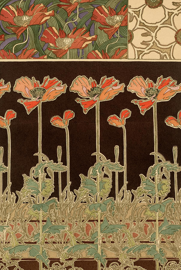
I created a pintrest board, the search for french hen brought up all sorts of avian lithographs and wood cuts, and reinforced my approach to an art nouveau theme or a softer rounded art deco feel. This was also fitting with the more cultured and refined brand that was required for the project.
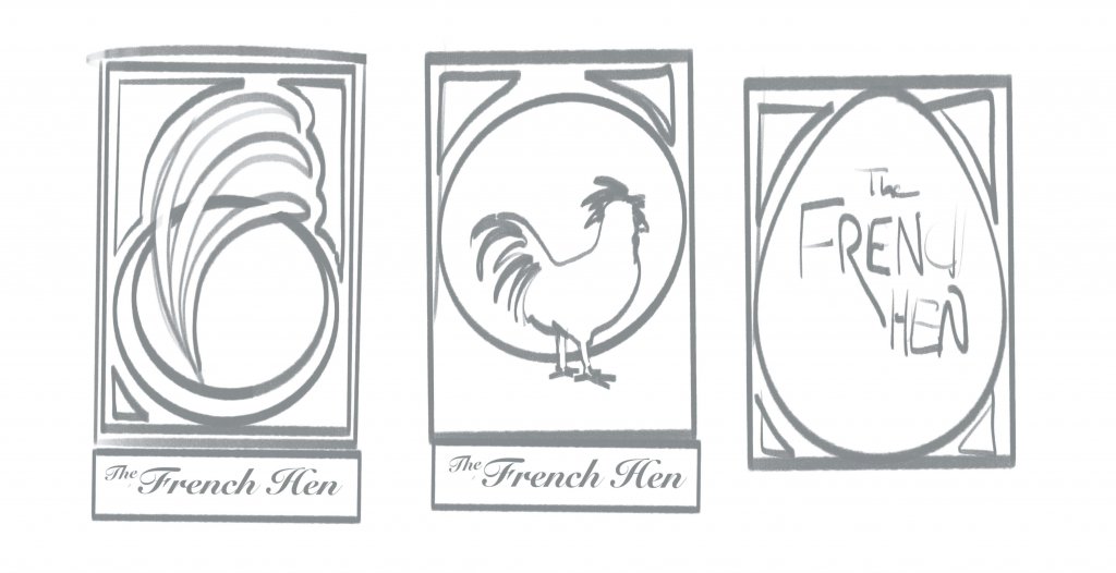
I started to loosely sketch ideas, I soon realised I didn’t want a picture of a hen I feared it would look too much like an old pub. I imagined a weathered wooden sign with a fluffy black chicken on it, I carried on exploring. An egg shape was next, it did get away from the full on hen effect but also felt a little comical, I started to extract elements from the hen in my mind. A claw/talon would be too aggressive as wold a beak, in the end the most distinct and unique characteristic was the tail plume, this fit the curves found in art deco and had the potential to carry the right image. I added some text to my designs (below) and after some analysis the plume fit best for the brief. I imagined that would be the one the client would want to further explore.
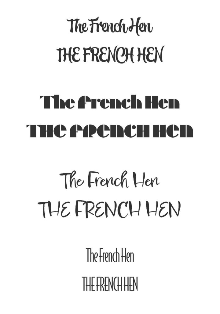
I picked out some type that I felt would fit in, I literally searched for art deco in the filters of the adobe font service and found some suitable, ones I then looked at some more handwritten style, I liked the idea of it having a personal touch, something a little less corporate and franchise driven so after adding them to some more advanced near final worked up ideas I eventually settled on a font called Epicursive script, it had a nice bouncy rhythm to it.
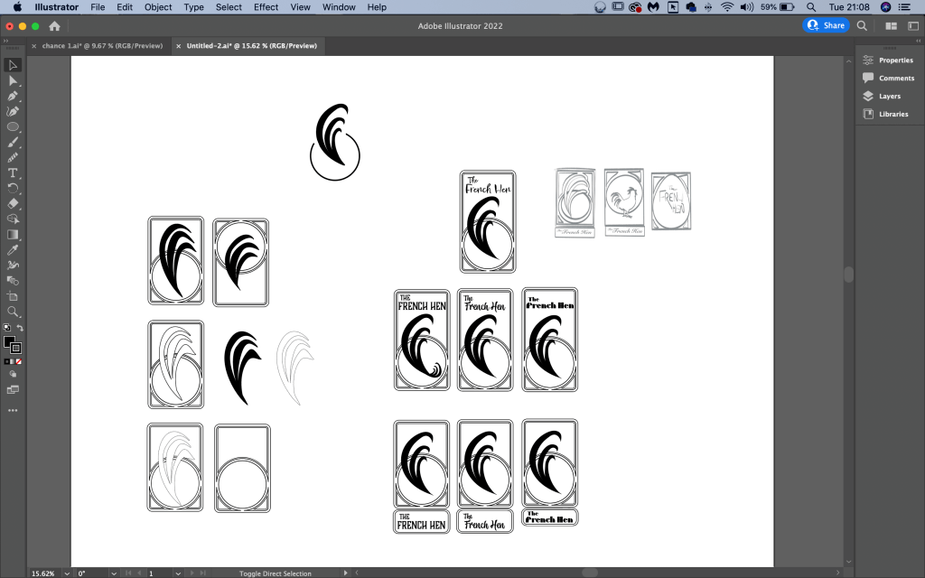
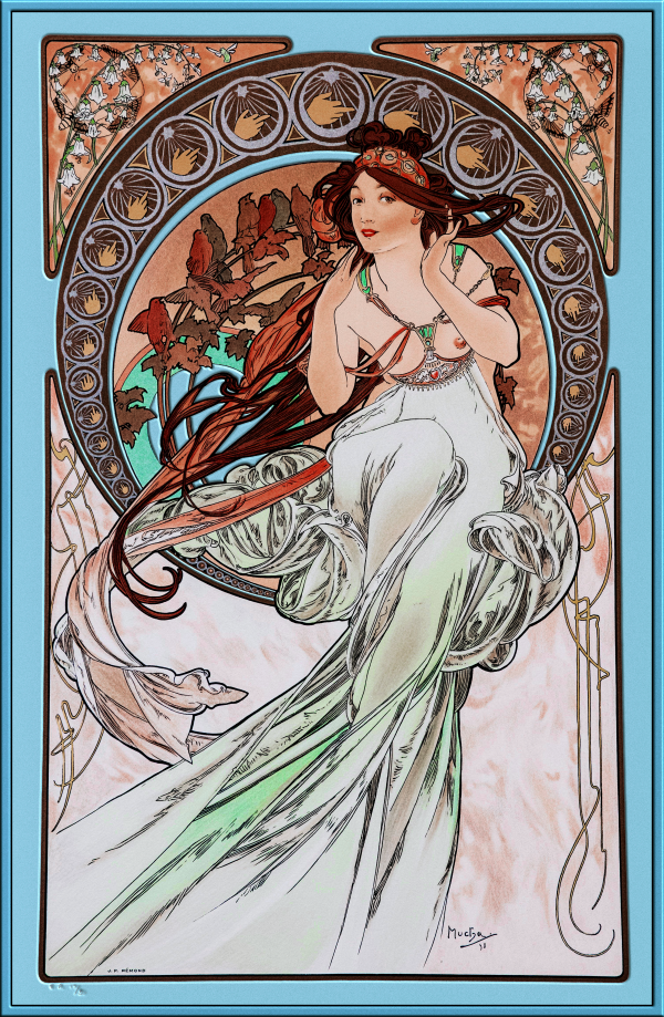
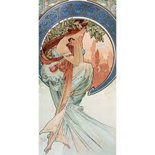
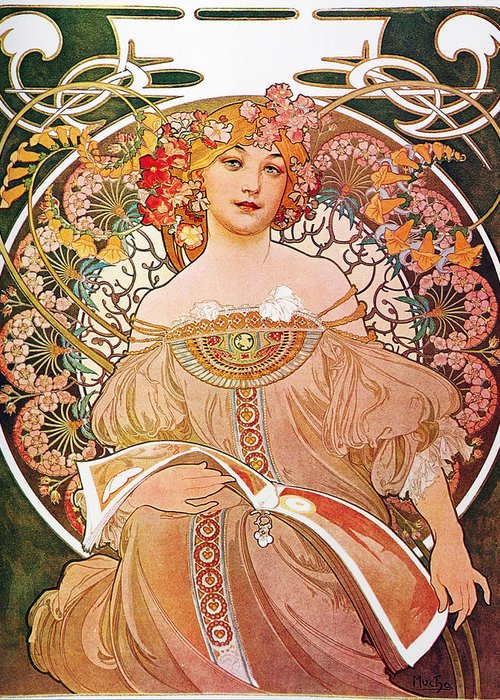
I imported my sketch into adobe Illustrator and started to add some shapes, I did draw some inspiration from the Czech artist/illustrator Alphonse Mucha, he added in some nice curve shapes to his portraits framing the subjects in what looked like leaded glass windows. I kept the icon simple whilst drawing inspiration from it. I explored several layouts.
Colour
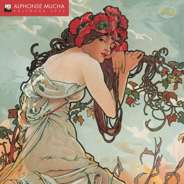
When it came to adding colour I wanted to again draw from reference to keep with the spirit of Alphonse Mucha, I selected some of his work and generated soem colour swatches with the adobe colour site.
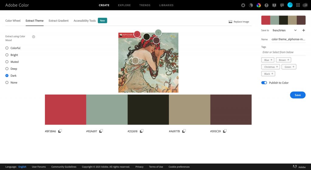
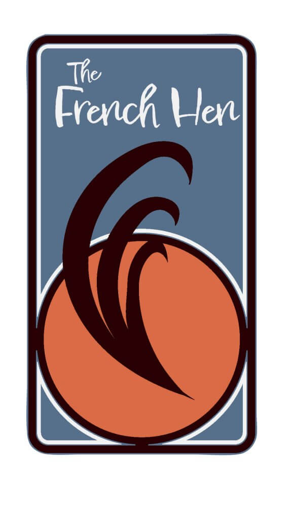
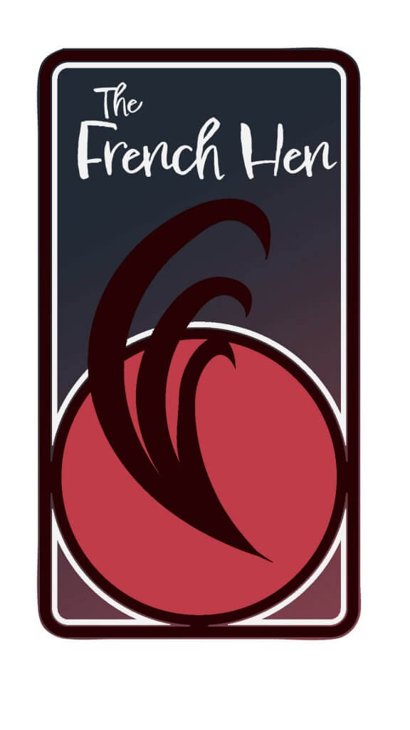
I had several swatches to work from, after some experimentation I did pick and mix these, below are a few I imagine I must have tried around 50 variations, but I didn’t save each one. I wanted to give it an evening feel, the browns, reds and oranges felt to me like they was working best. The darker versions felt more like a night spot while the lighter ones maybe more of a coffee shop feel.
The Japanese hen 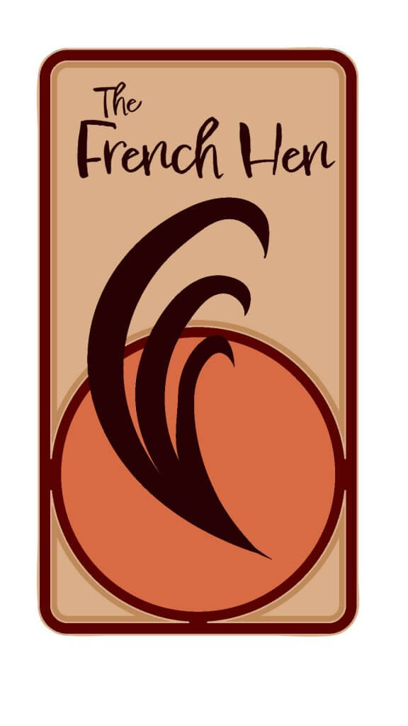
I liked this one too, but didn’t feel like a night time venue. 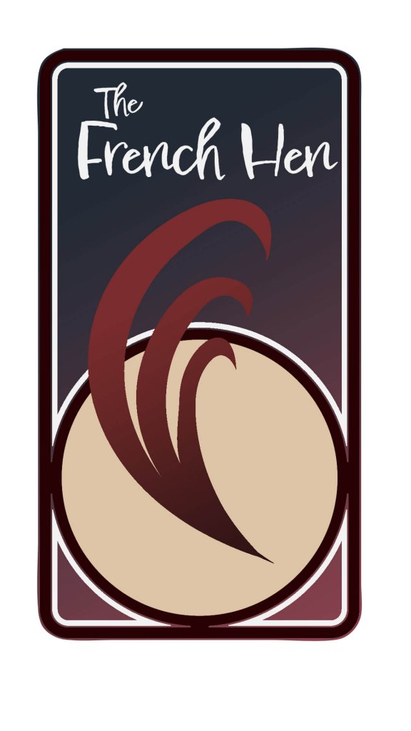
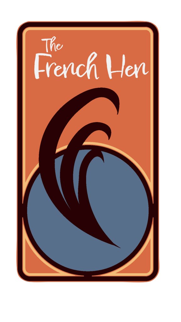
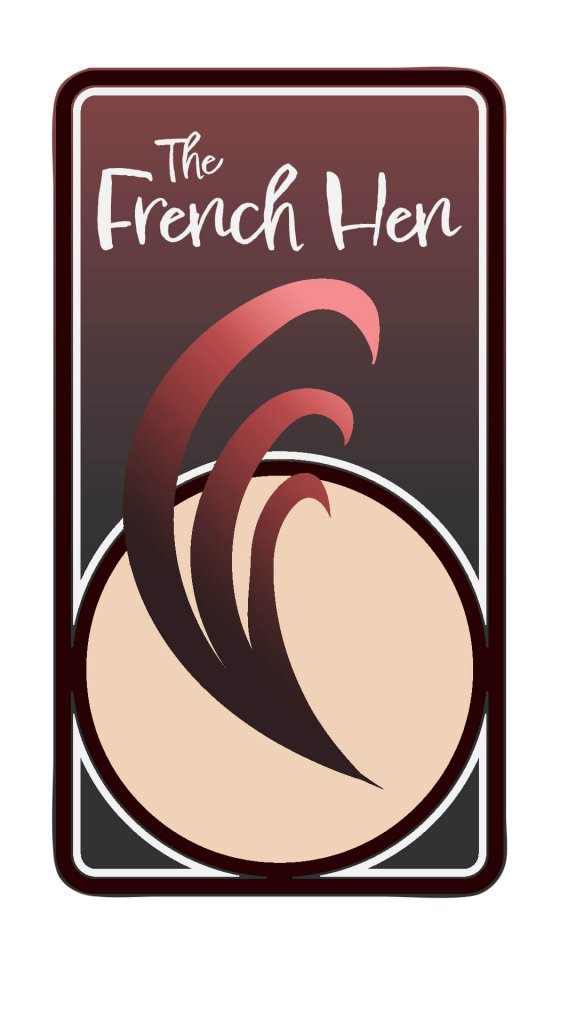
I chose the final design below as it felt sophisticated, had good contrast , it felt like a night time venue and also somewhere with food due to its warm cooked brown hues.

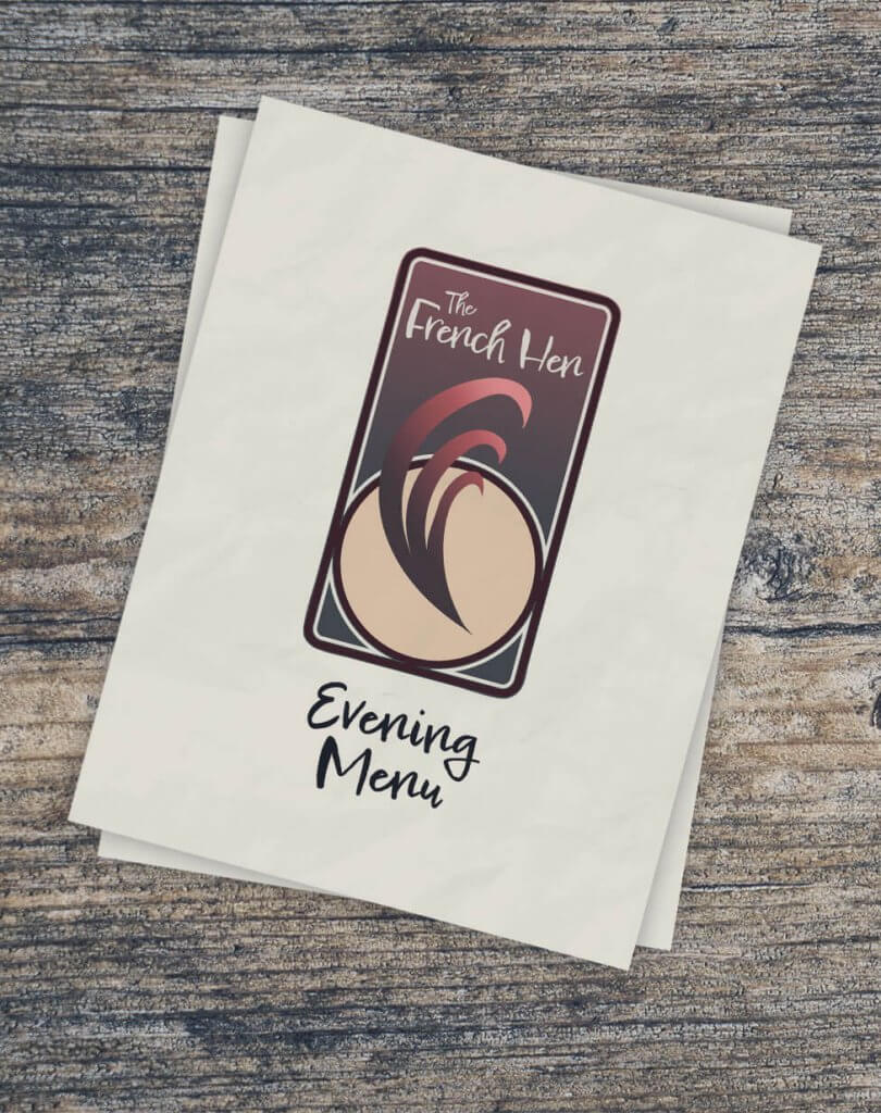
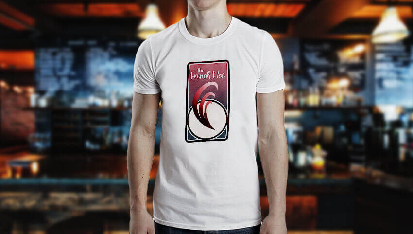
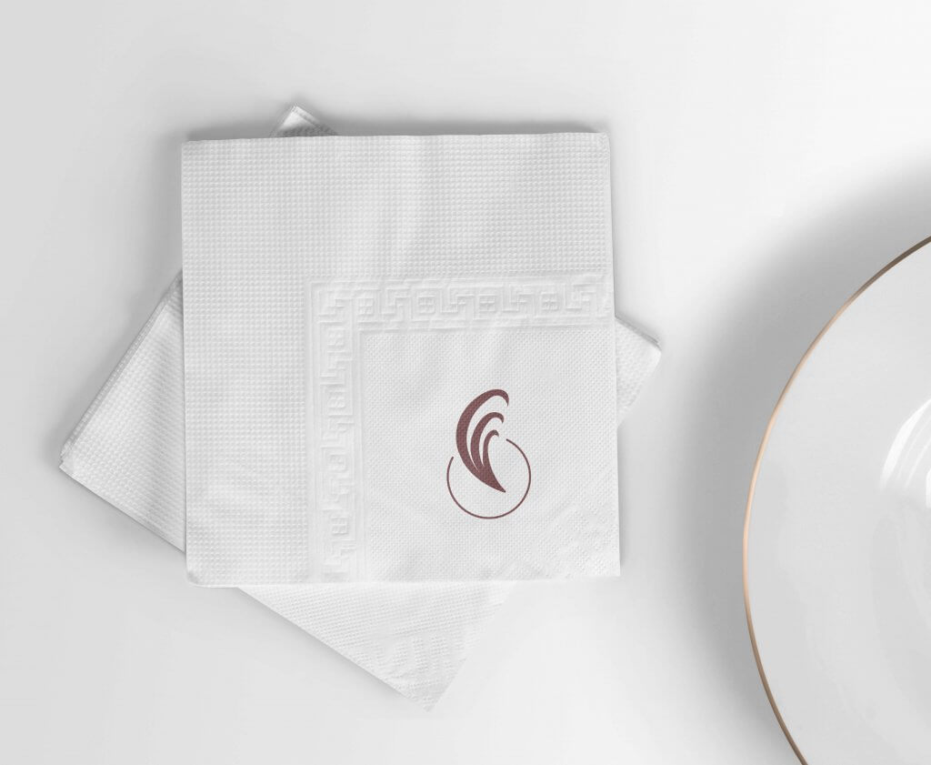
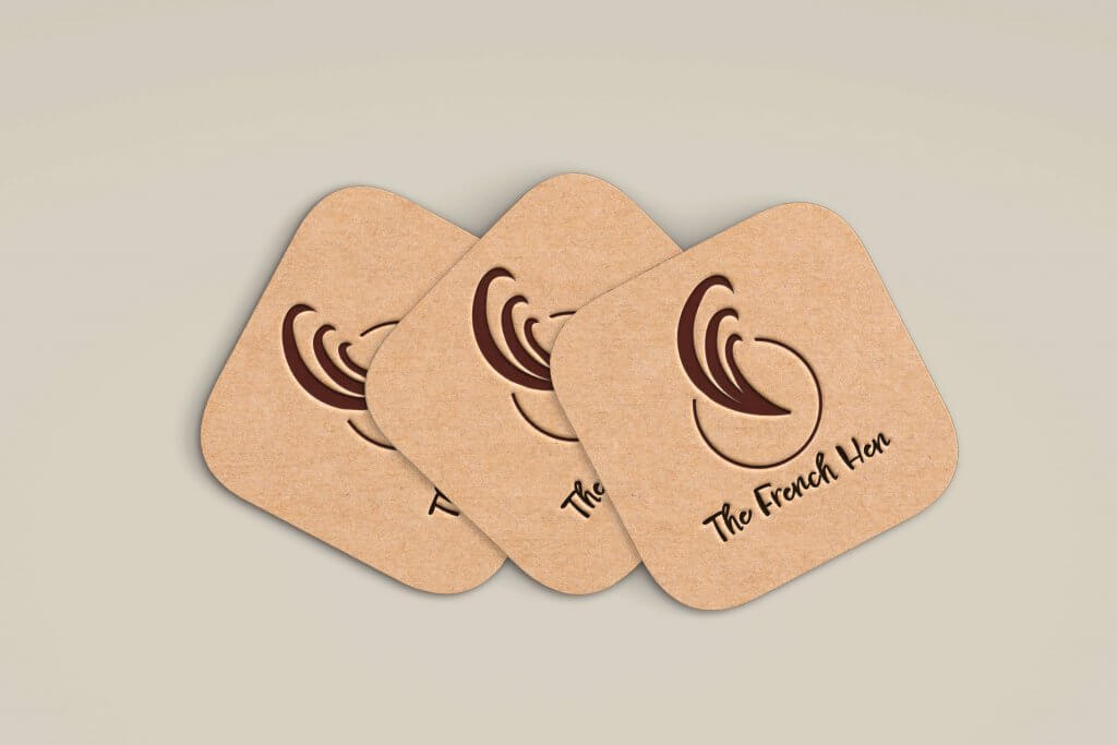
The Icon seemed to fit on all the suggested materials, I even was able to further simplify the tail plume for the napkin. and coasters, this also potentially could work well for a chefs hat or even a managers polo shirt to signal a higher status. The Font felt like it still worked on the menu, but would really only be suitable for headings.
I feel this exercise like the previous gave my mind a good workout, trying to feel my way around the brand image, I imagine this exercise would be a hard one to sign off as the client would likely have some idea of how they saw the business too, being able to adapt not only the design but the look and feel would be key. Another interesting aspect of this project was when I started to strip back the logo using the occum’s razor approach I still felt like it worked, maybe adding a stripping back step early on in my workflow might be beneficial to the final design.