
In this exercise I was asked to create a series of 10 abstract designs in which you balance blocks of subordinate dominant and accent colours.
This exercise I found quite difficult I had been advised by my tutor to focus less on producing an image and more on my choice of colour and the mood it creates, with that in mind I couldn’t help but think that every cover could be represented exactly the same way, with different colour choices. I looked at other students learning logs and it seemed that they had also ended up trying to depict a scene, or landmark, some recreated these with accurate geomertry and some used squares.
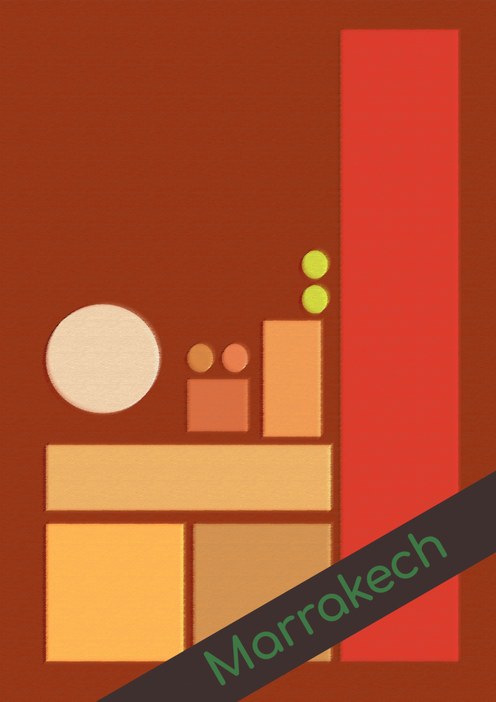
The presentation of this exercise wasn’t my only concern. I hadn’t really visited these places, I had no emotion or mood attached to them so I had to research online, I looked at tourist board pages, to get a feel for them, most. of the information show the same kind of imagery they all want bright and colourful photography to encourage visits. So I was concerned that this might already influence the kind of “feel” I got from most of the places.
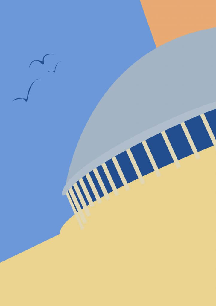
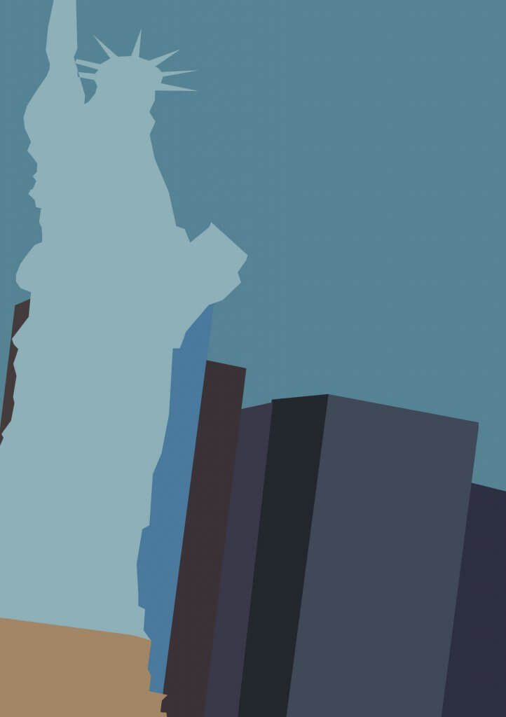
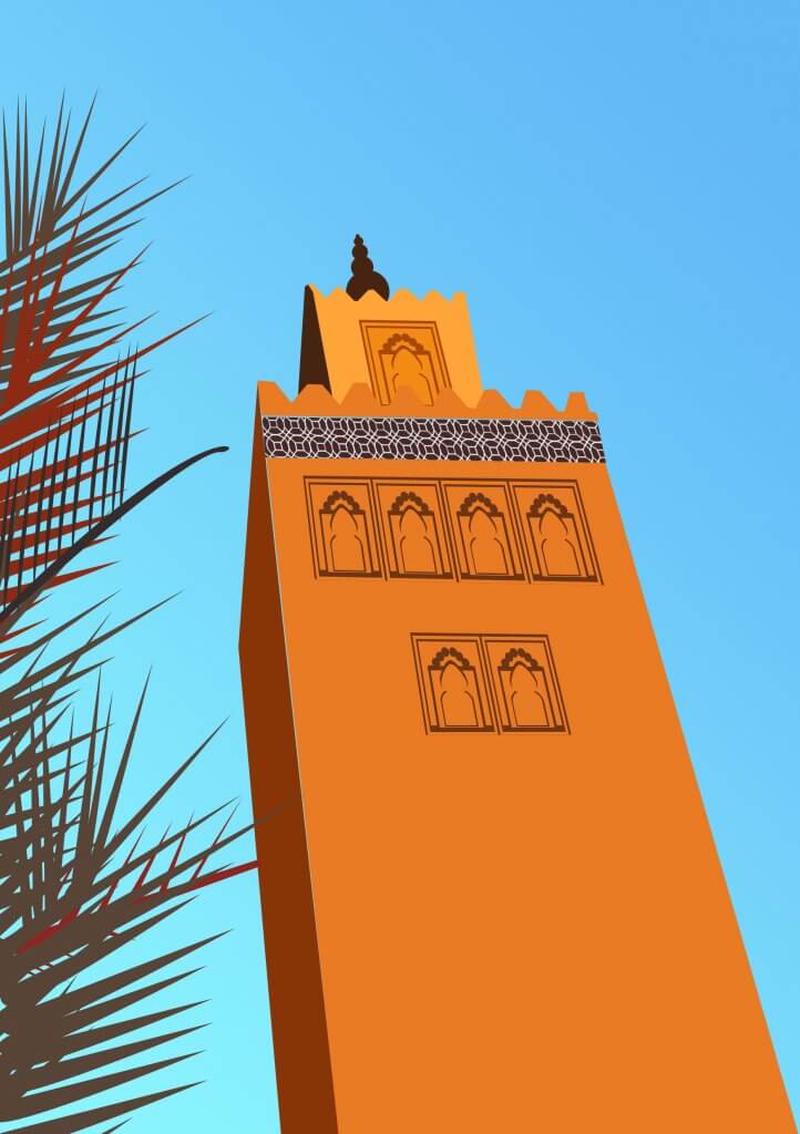
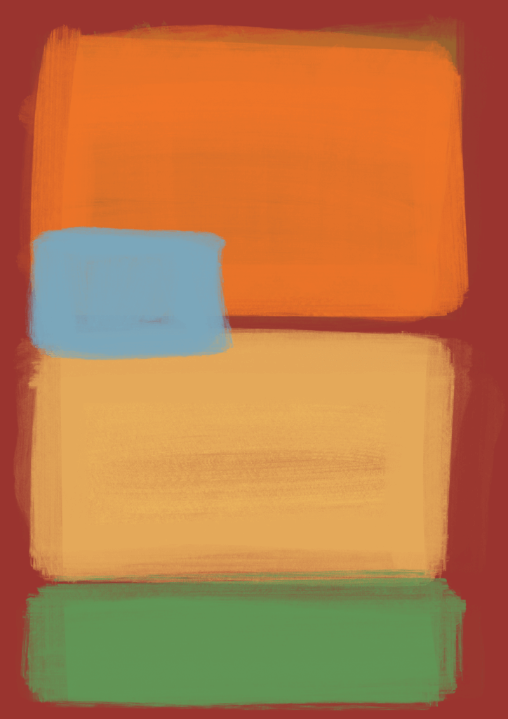
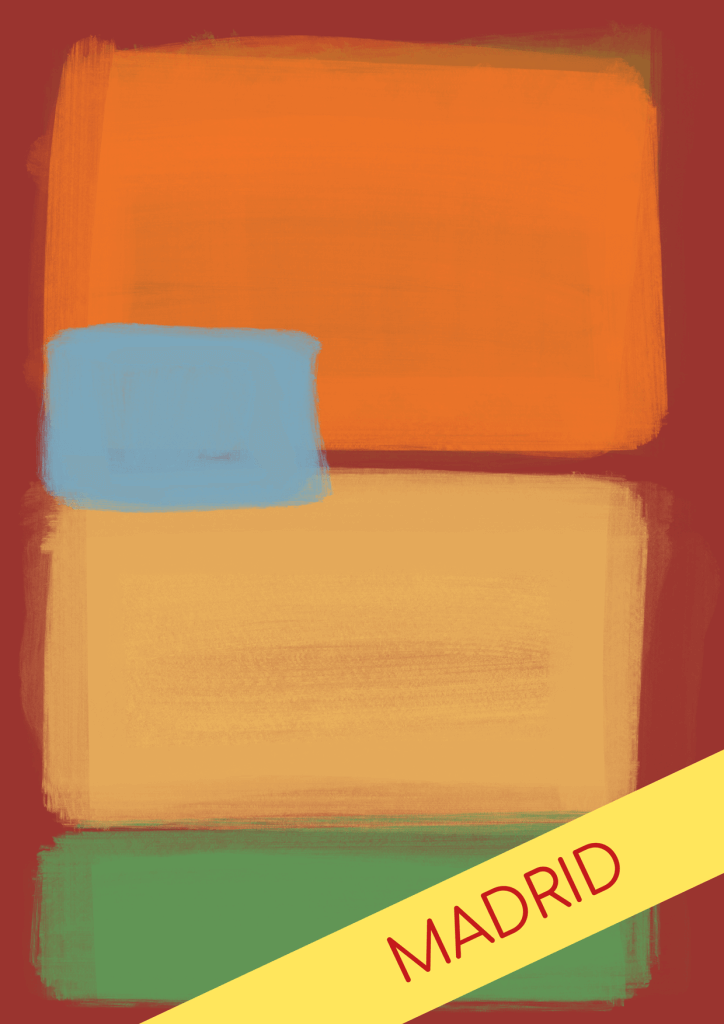
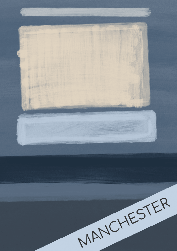
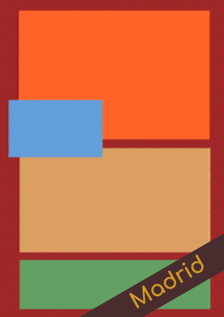
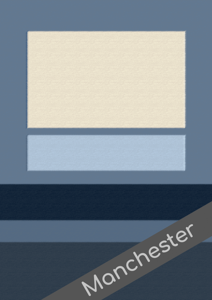
Some of the destinations are more familiar than others, because the way they are depicted in tv, film and general opinion, it’s easy to think of Madrid as warm, orange yellows reds, and Manchester as a cold industrial grey area. Others were not as easy and these also proved hardest to try to produce some imagery.
In the end I tried to think about how I could generate some abstraction so I can start to apply these colours, I looked up some abstract art, and they wasn’t all square blocks but all the material leading up to this exercise seemed to suggest this was the approach needed, the images of Beiruit while similar seems to not speak of mood but just to take the existing colours and objects and lay them out using a quadrilateral approach.
Choosing colours for mood seemed the easy part, I just couldn’t decide how best to present these. The exercise also started to feel quite ill fitting for its intended use, these were for a range of travel guide books, why would you want to distort and disguise the imagery of your intended destination, to what level of abstraction would be too much. As an image by Ben Nicholson was used on the exercise notes I looked at some of Ben Nicholson’s examples online, one was for a flyer for imperial Airways, it used much he same colour and feel as the example. This confused me more about exactly what I was trying to produce as this was almost random in context of the ad for air travel.
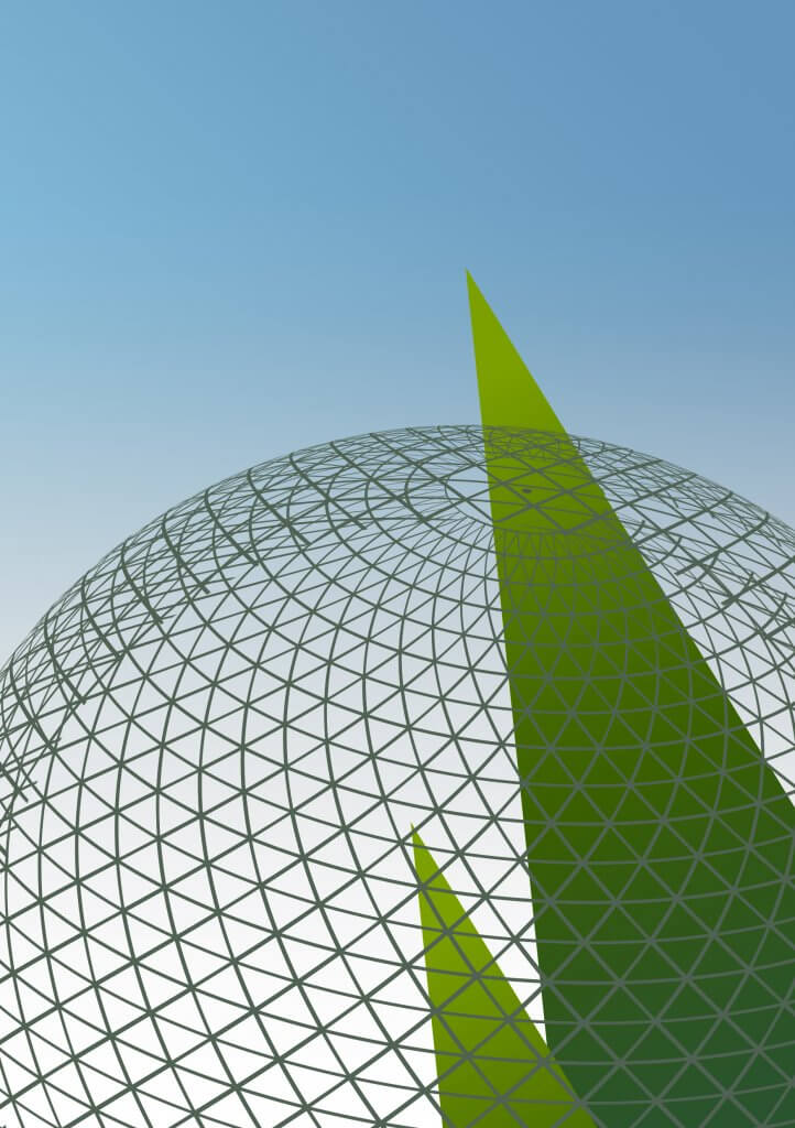
I am on a tight time frame and I needed to get this started so in an effort to familiarise myself with the locations I started finding interesting Imagery which might spark some direction, and started to translate these into simple shapes.
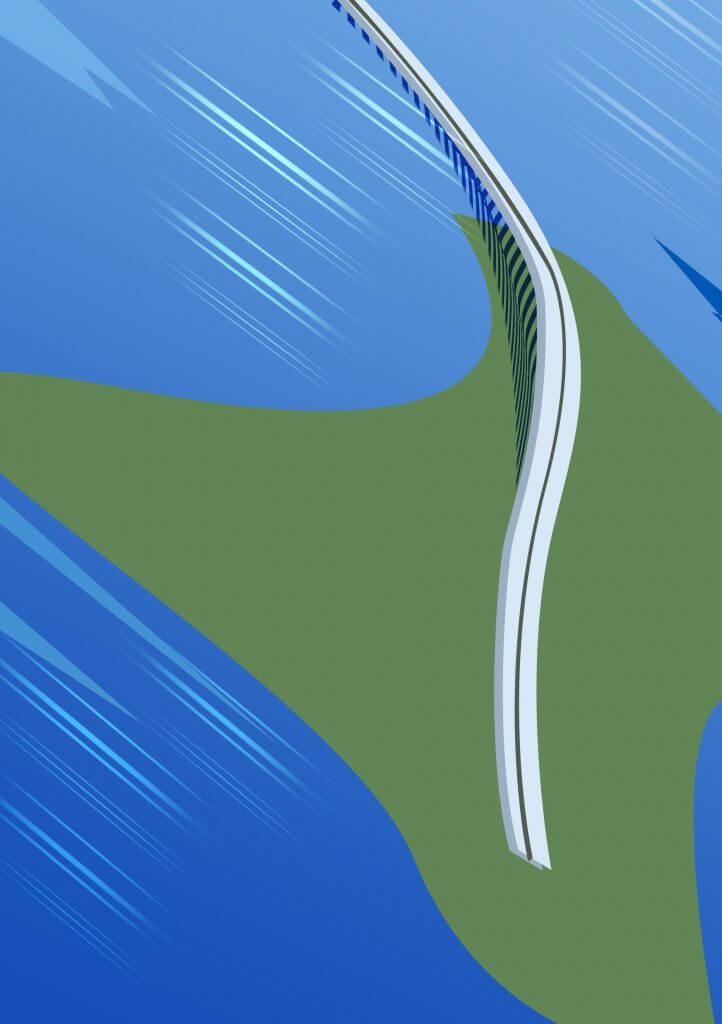
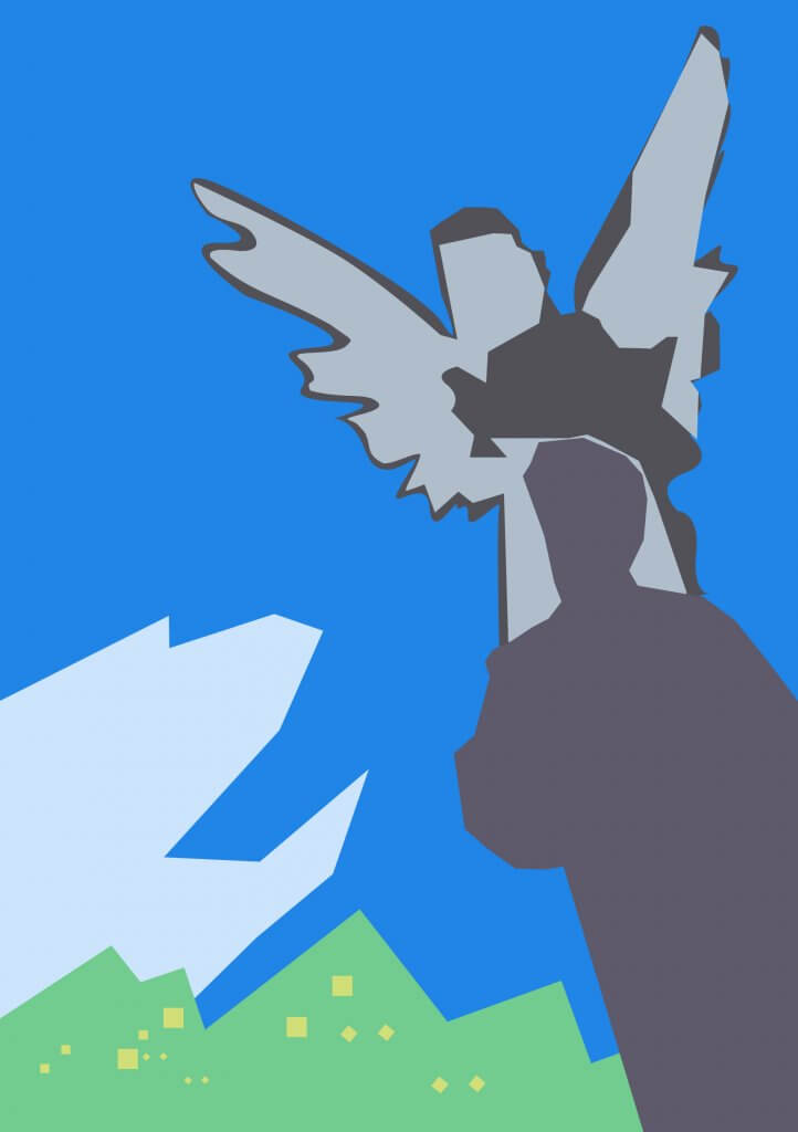
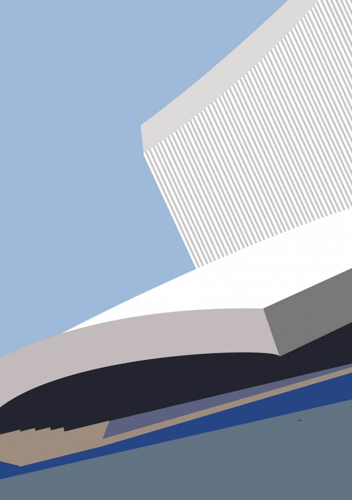
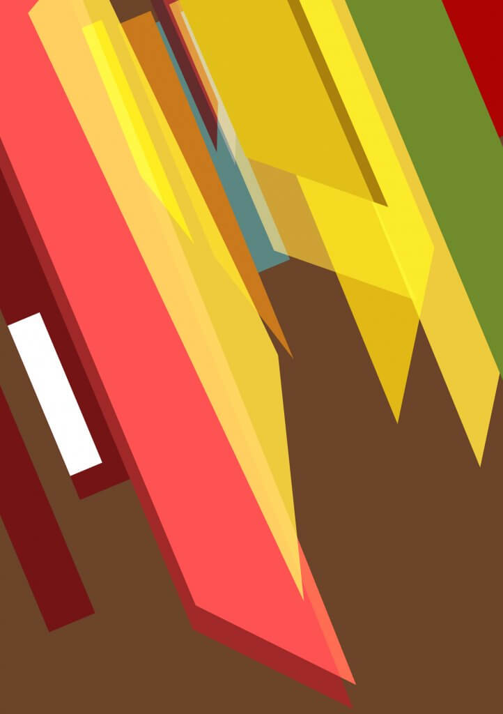
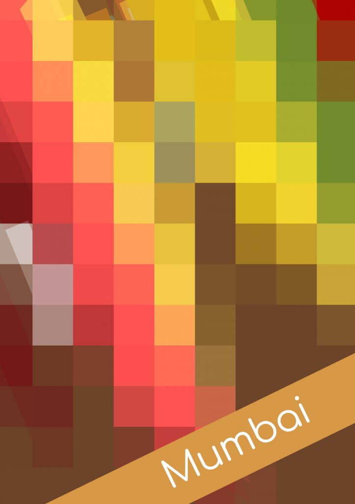
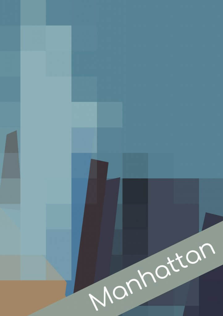
This did help me familiarise myself with the destinations. But I was still a bit lost on how to present, I even tried using some filters (below) to generate squares to speed things up, this didn’t feel right ad I wasn’t in control of the outcome.
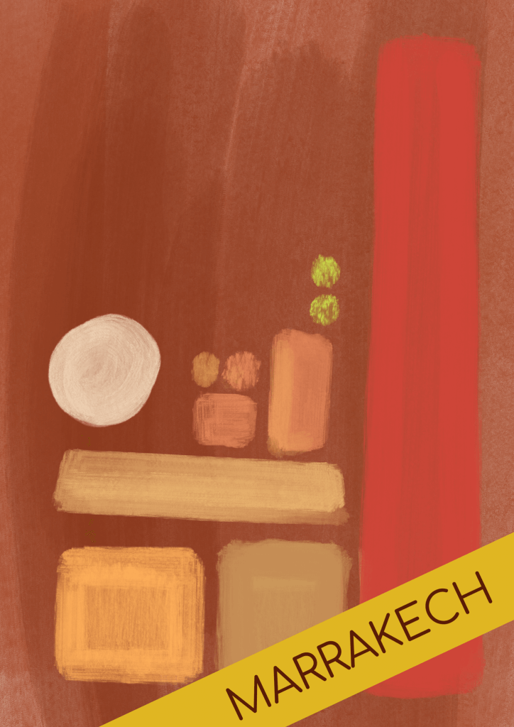
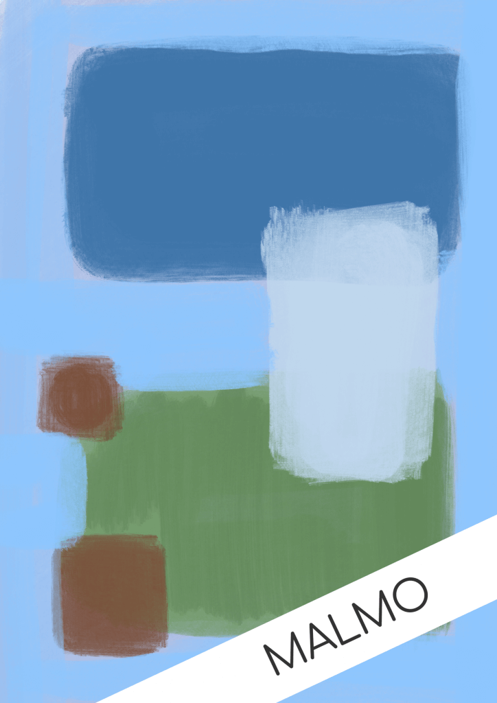
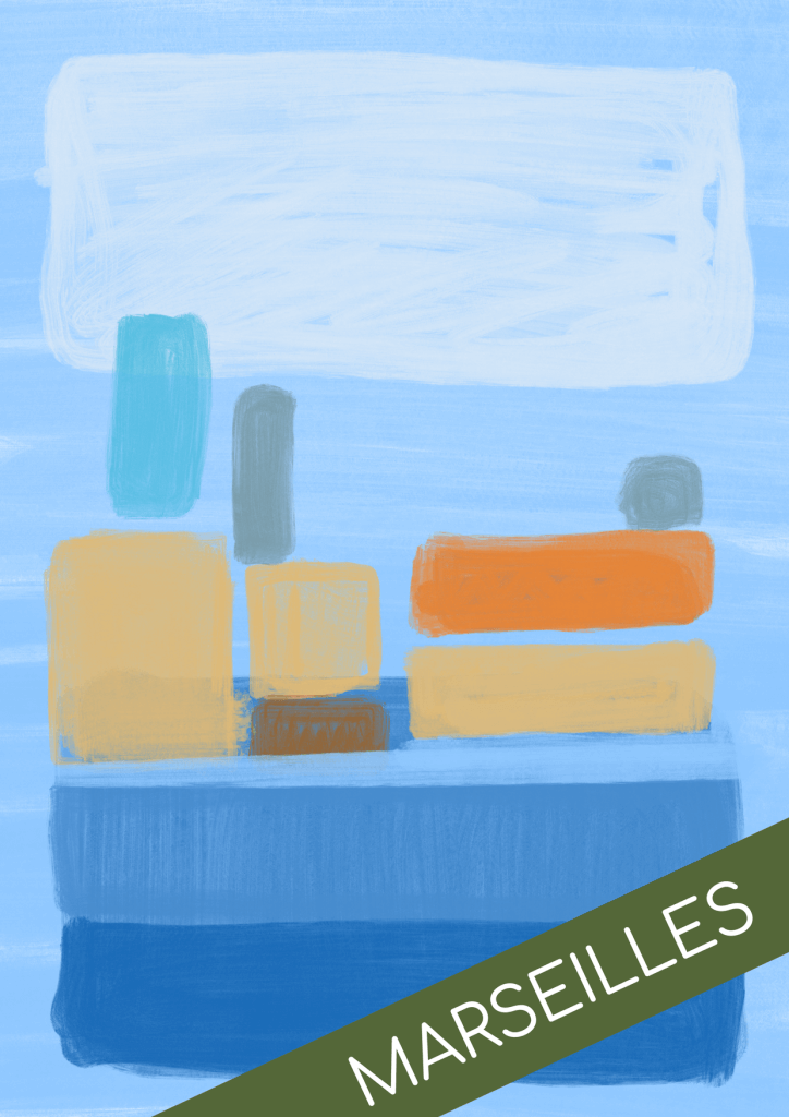
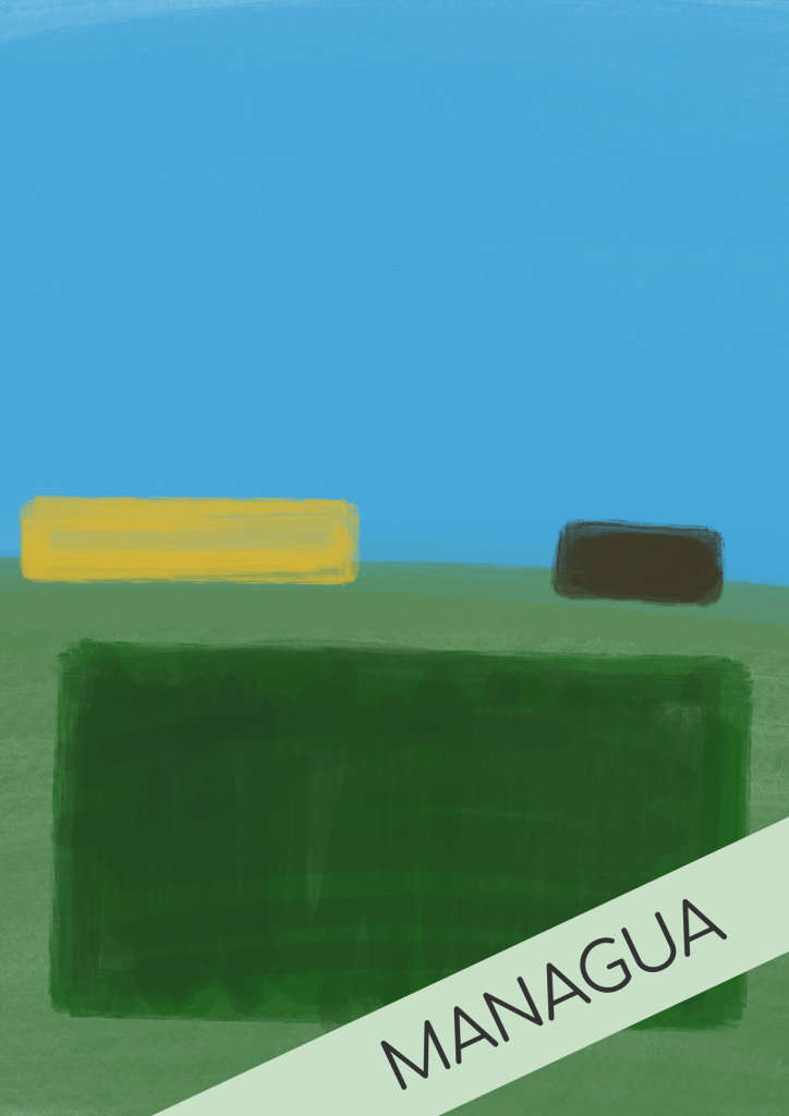
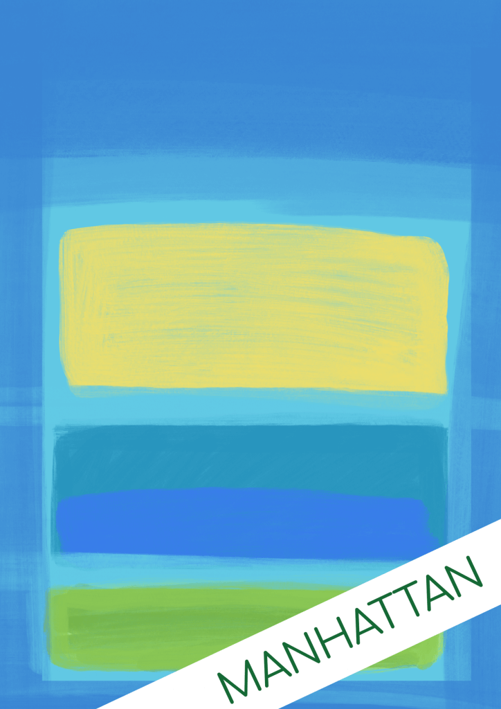
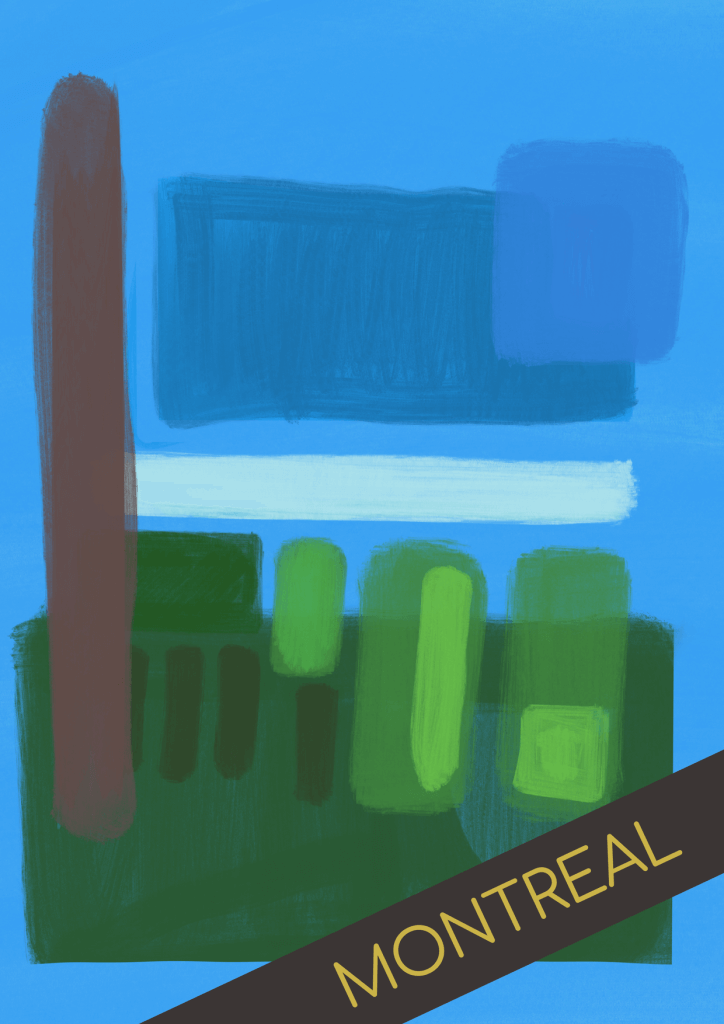
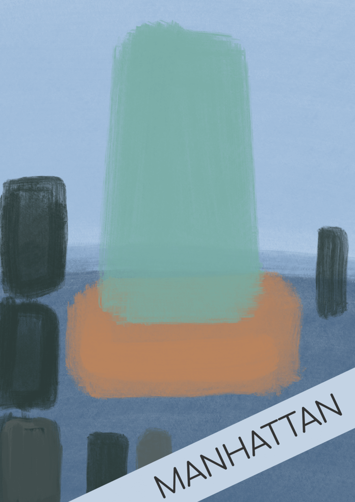
I know Mark Rothko used a lot of square shapes in his art, I thought I would draw some inspiration from him, with a more organic painterly feel to my blocks. I started a new collection of images with just mood in mind.
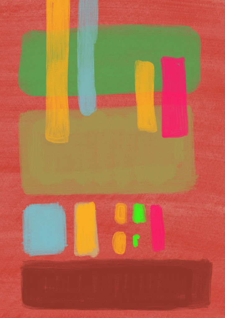
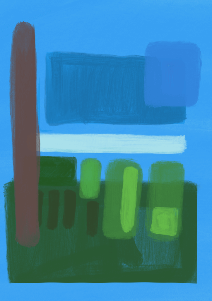
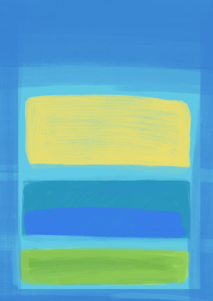
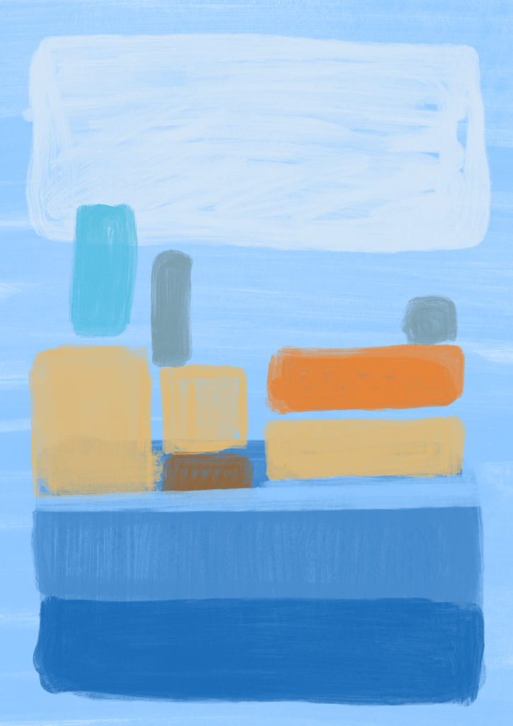
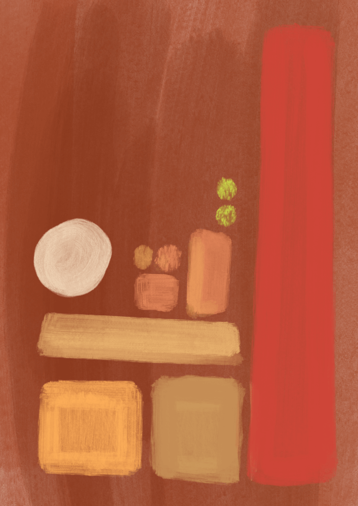
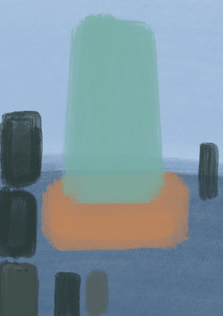
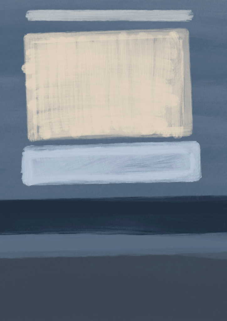
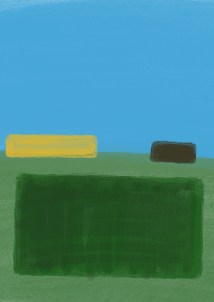
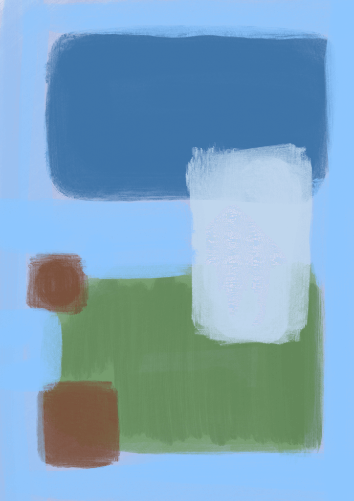
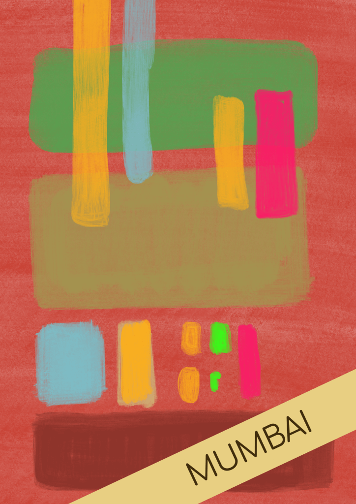
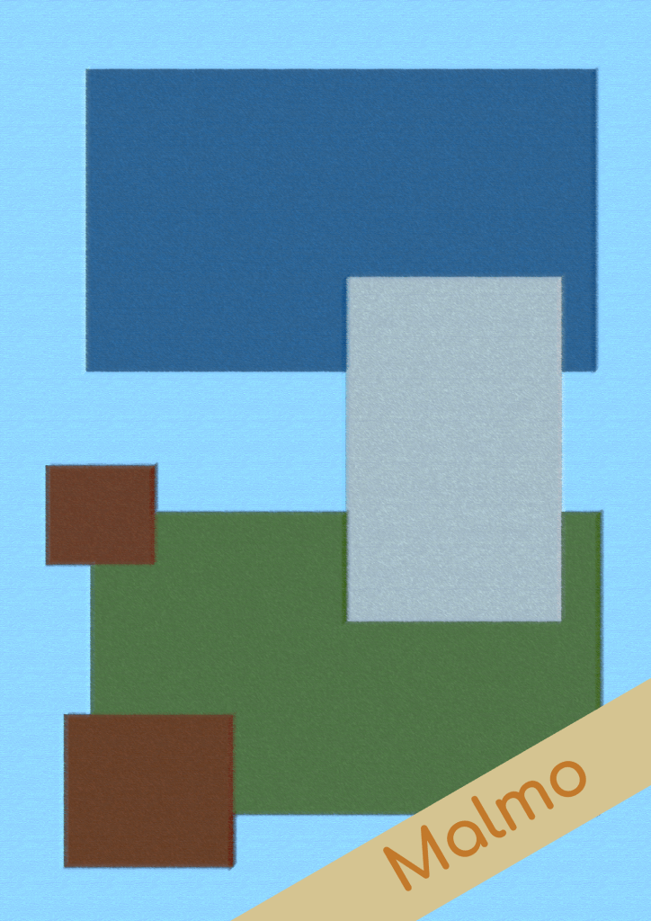
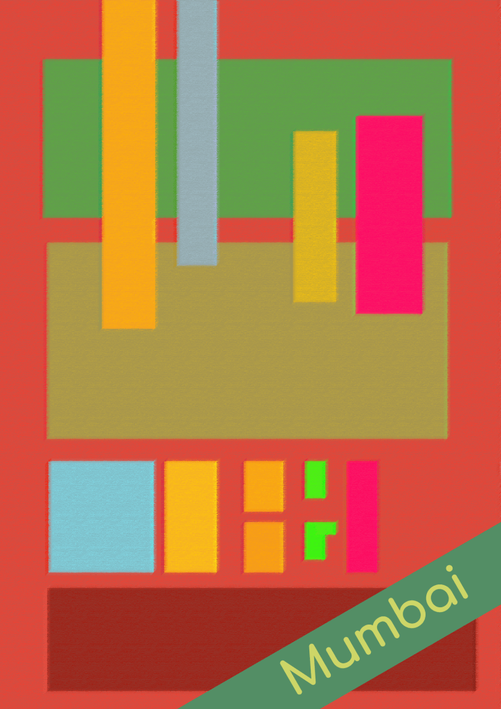
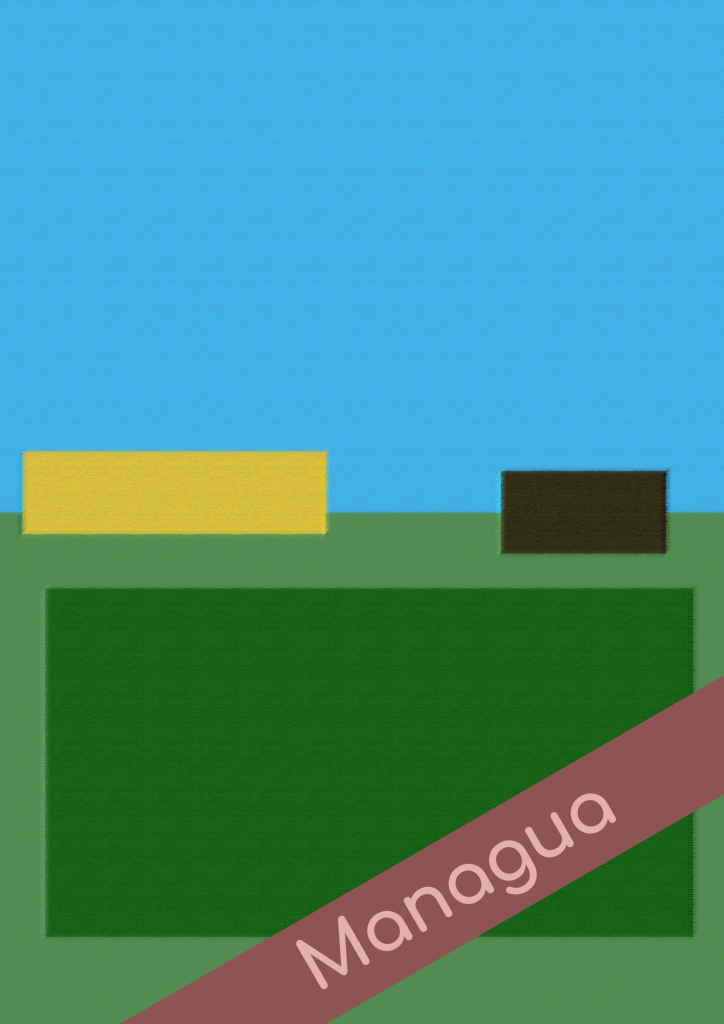
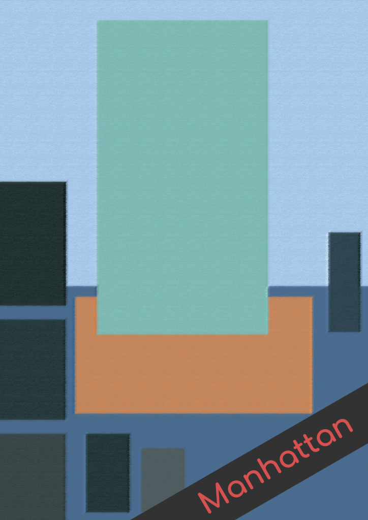
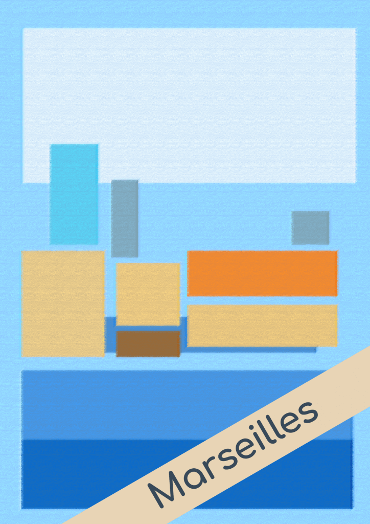
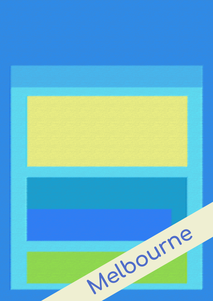
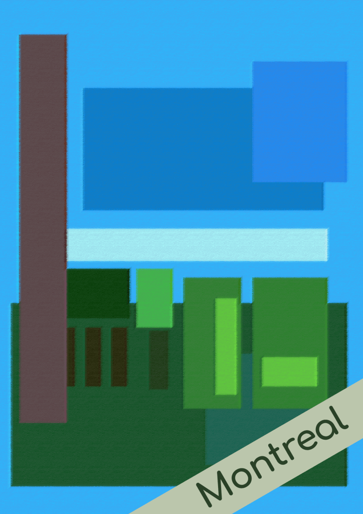
I still wasn’t sure this was exactly what I wanted or what the exercise called for, I thought I would try to add the titles in as I had before on the filtered images above, I wanted the titles to cut across the square shapes, my intention was to create some separation from the main image.
I feel I’ve exhausted my options now for this exercise. It has taken a lot longer than I had planned, I feel I met the requirements from the notes and my tutor who suggested I keep the emphasis on the mood the colours create so the time at least form my point of view was well spent.