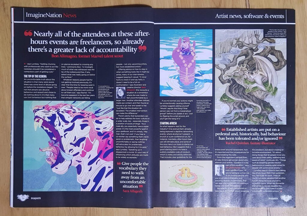
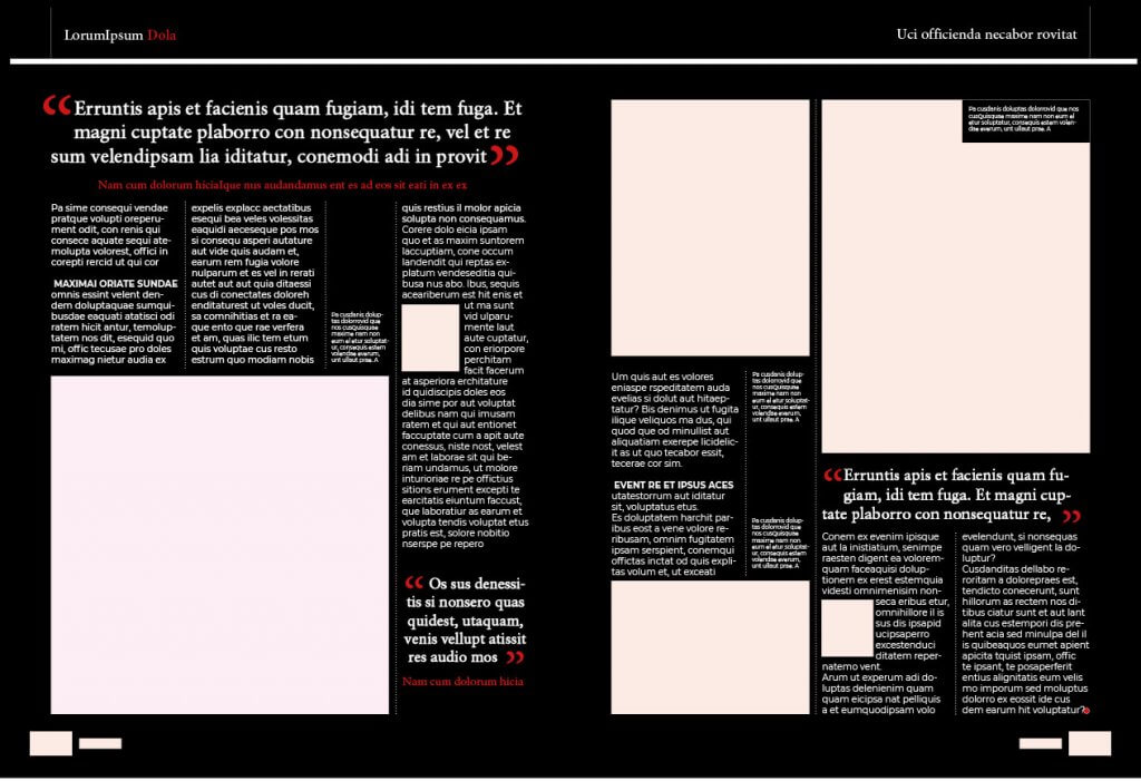
I was asked to analyse a magazine, to observe the sizes of the page the margins, the rows of text and the gutters in between, the magazine I buy seemed to not fit into a standard size which I googled to double check. I measured where. the content start and finishes from left to right and to the bottom and top, I now had my overall measurements and margins. I moved to indesign and inputted the measurements. I could see in the magazine that the column width would vary from page to page. I noticed some pages would include a very. thin columns left for captions, I assume this is to maximise the image size or as it is an art magazine to leave the images simple and free of distractions. I saw the smallest column could fit with in the margins seven times with a small gutter in between. I decided to add these in as guides, creating a seven column grid with a 5mm gutter.
I used the font finder software from the previous exercise to find similar fonts, the copy text I used Montserrat and the closest I could get to the header font I found was free for personal use, I assume that the font they used maybe a bespoke one and not available for commercial use.

I closely followed the layout, my seven column grid seemed to work, offering very similar results to the source material, it was then just a case to approximate the type sizes and little flourishes such as the captions, quotes and other page decorations.

