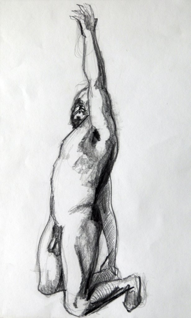
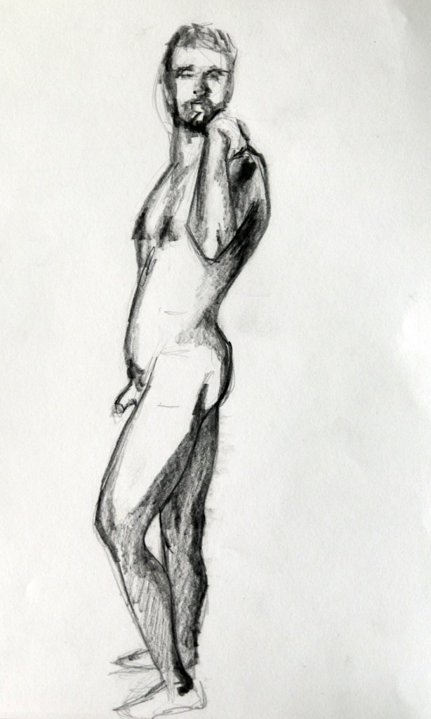
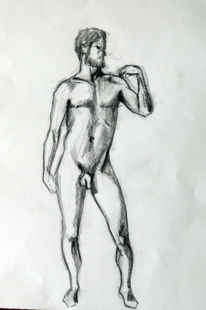
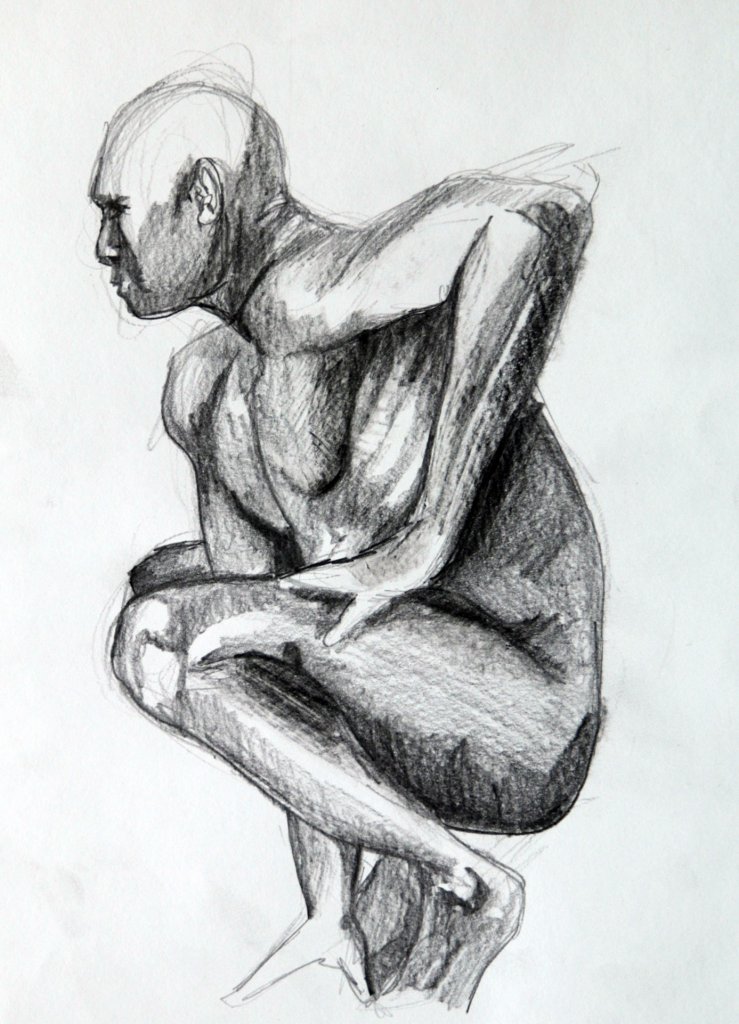
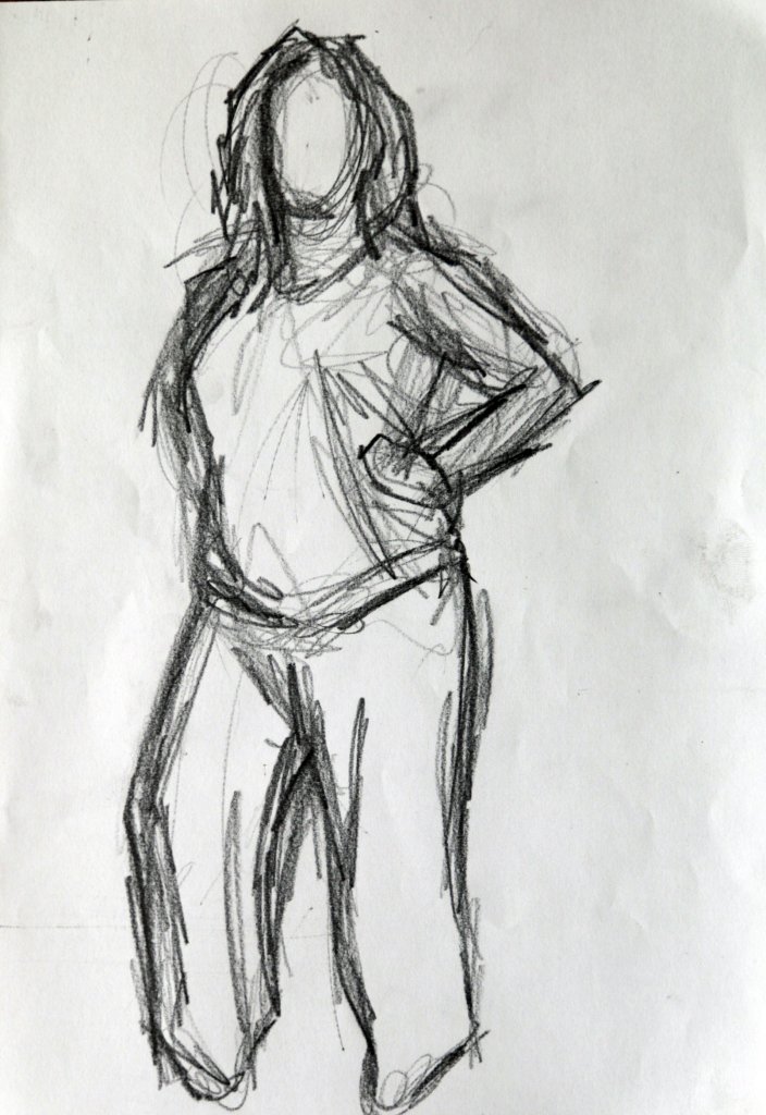
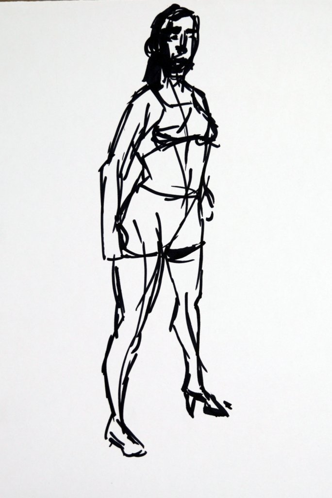
This exercise asked for a sequence of six different poses lasting 10 minutes each. I didn’t have access to a model at the the time, and I did want to complete some studies of the unclothed figure. Due to lockdown I was unable to join a life drawing class, the only alternative was to work from photographs. I did have several books on poses for artists, these while wasn’t as good as a real model was quite useful, every pose was photographed from various angles surrounding the model, from this you could get a better sense of the forms of the body, it was an acceptable middle ground.
I set a timer for 10 minutes, my aim was to use blocks of tone, I used the edge of the pencil to make my strokes broader, covering the space and rendering the forms quickly, refinements being sparred until the end.
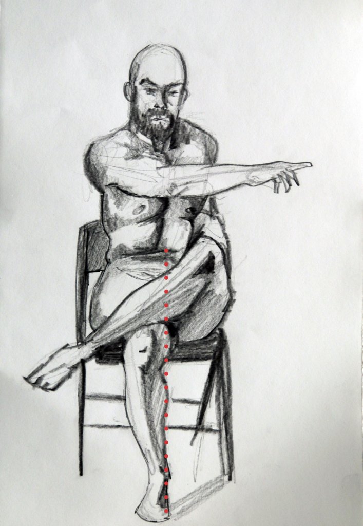
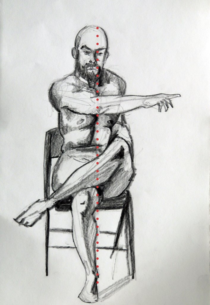
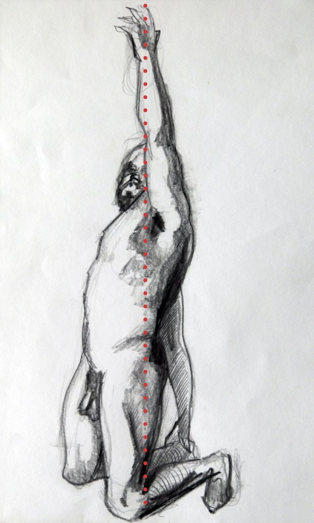
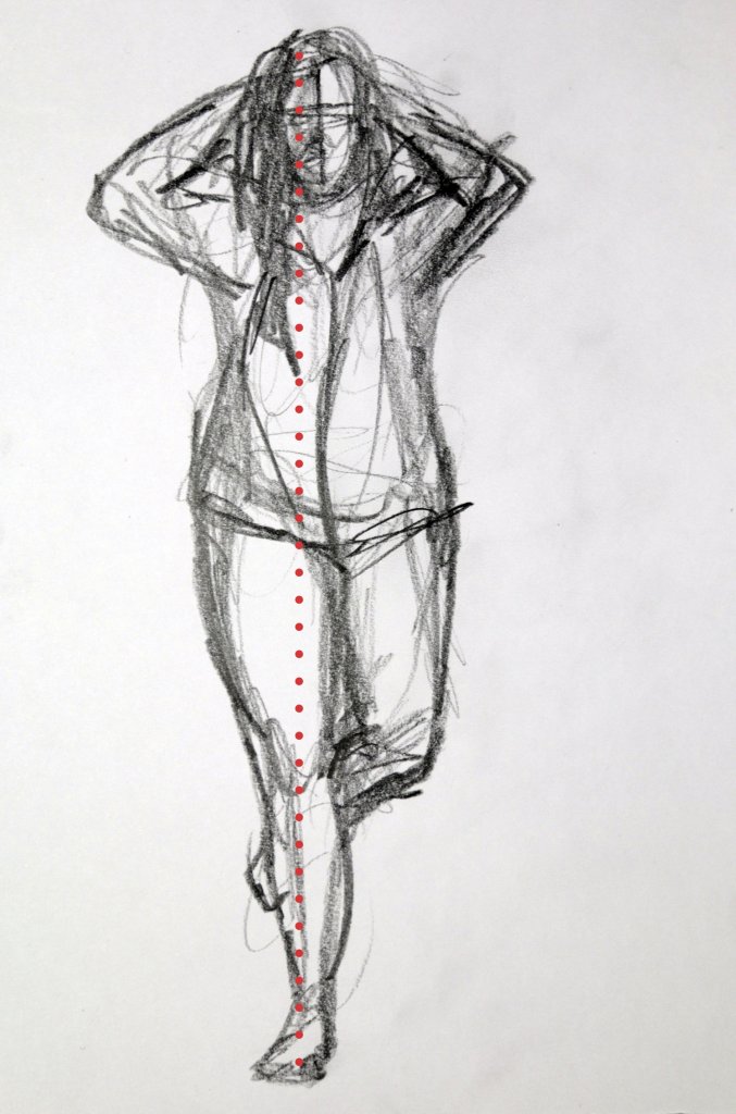
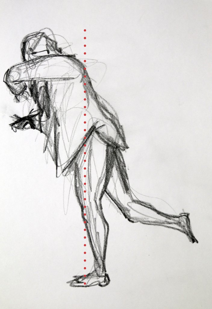
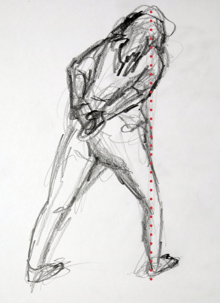
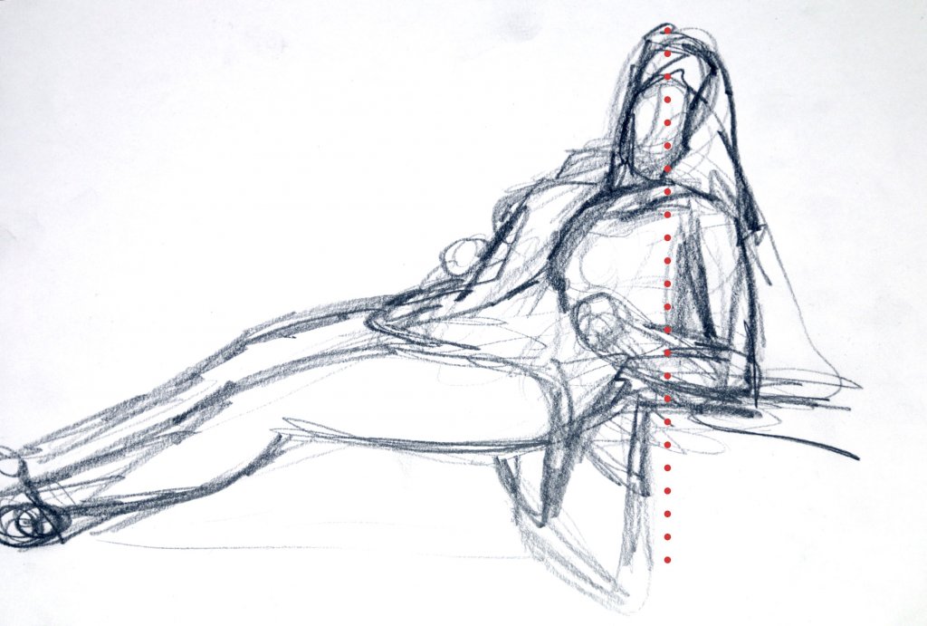
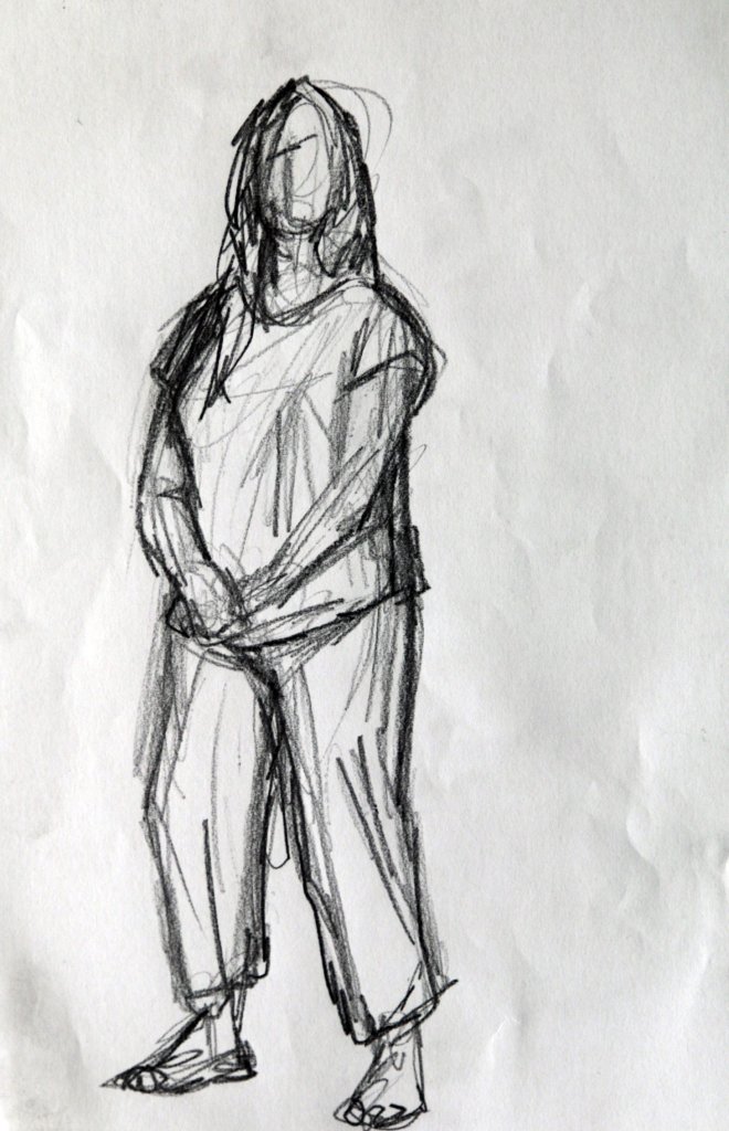
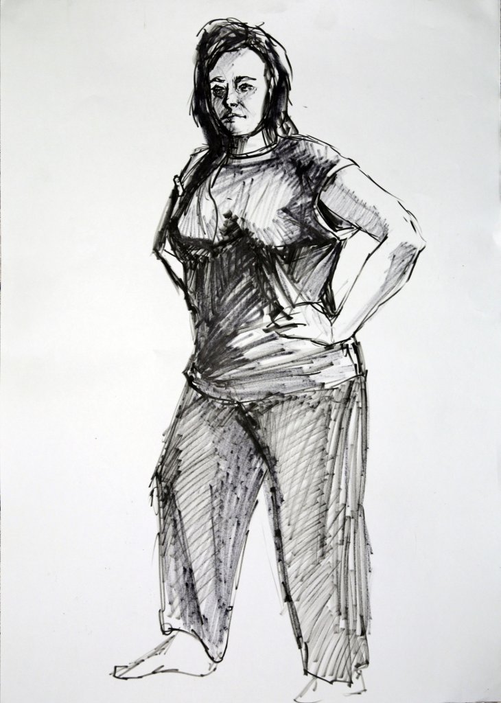
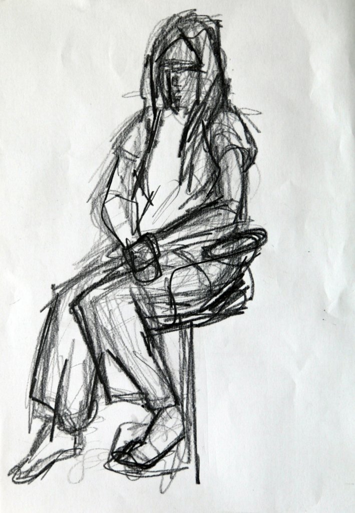
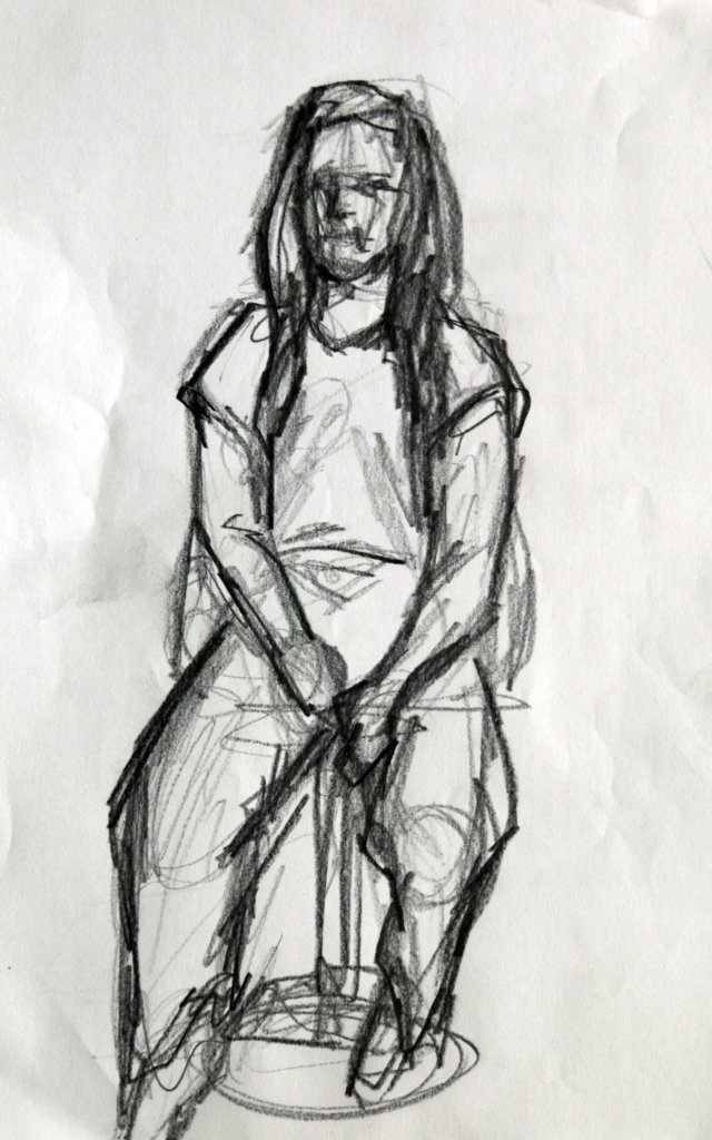
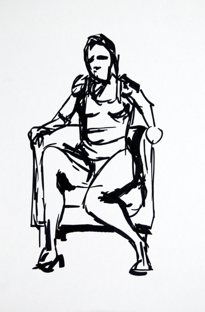
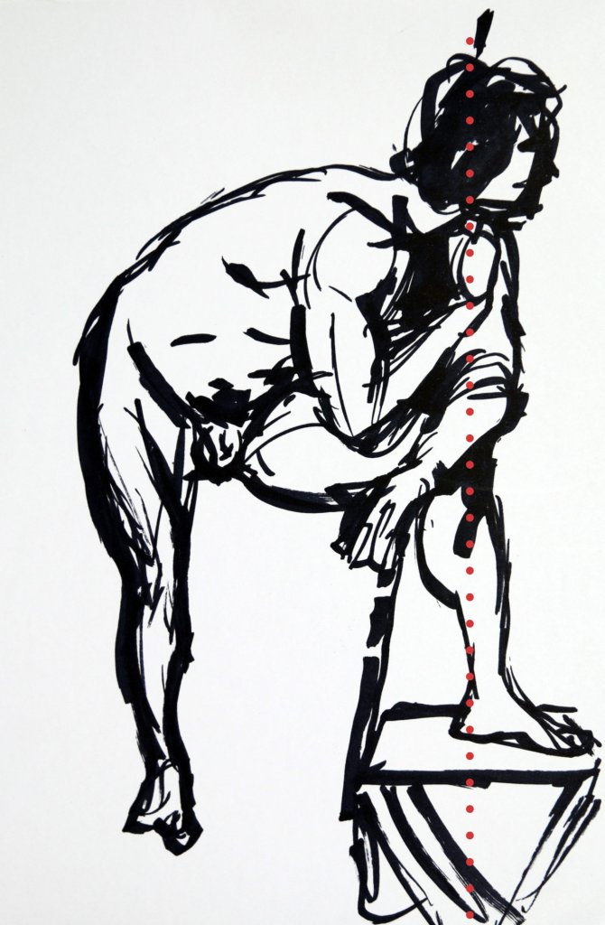
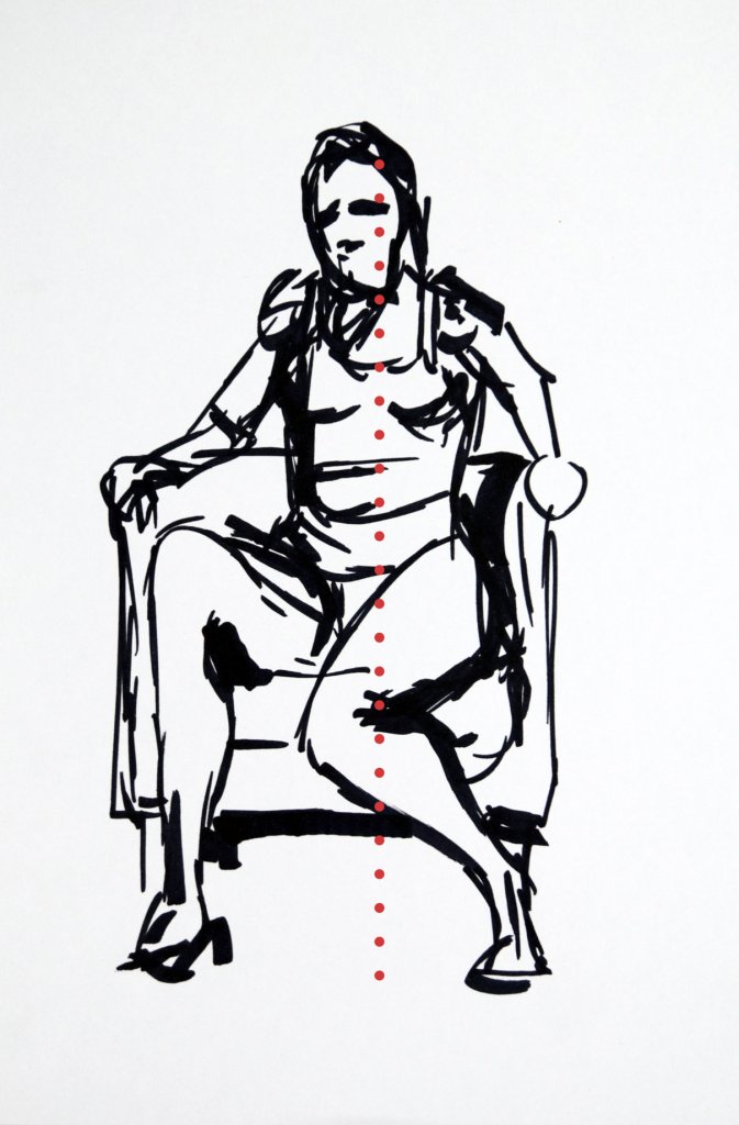
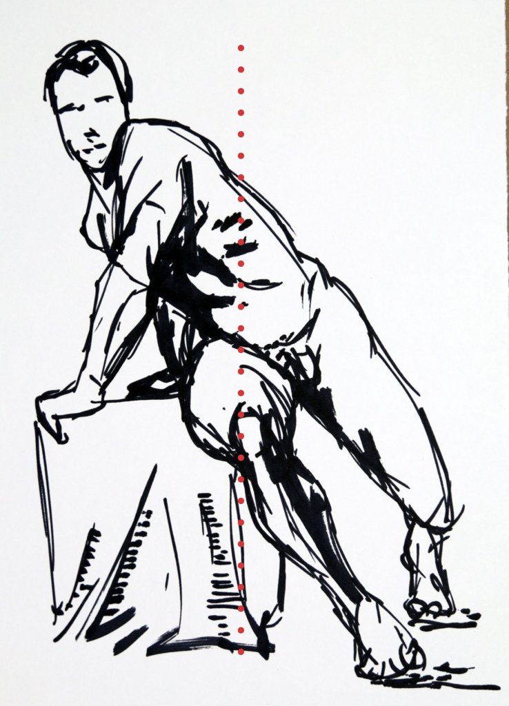
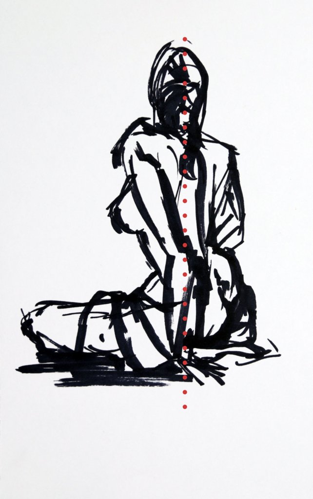
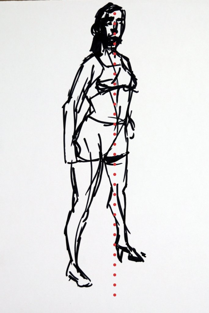
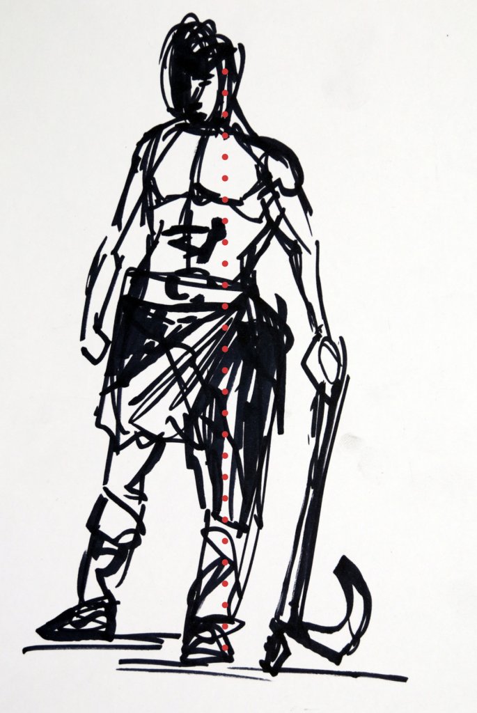
\All but two of the studies showed a slight lean from the models central axis, that was the seated figure and the standing arms crossed. I have marked below where I believe the models centre of gravity and weight distribution would be calculated.
I found it hard to choose a preferred drawing, they all felt like the poses had a sense of distributed weight and mass, and I was pleased with the forms I described in the 10 minutes allotted to the task.
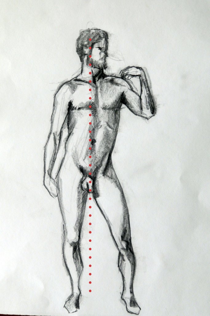
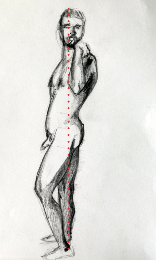
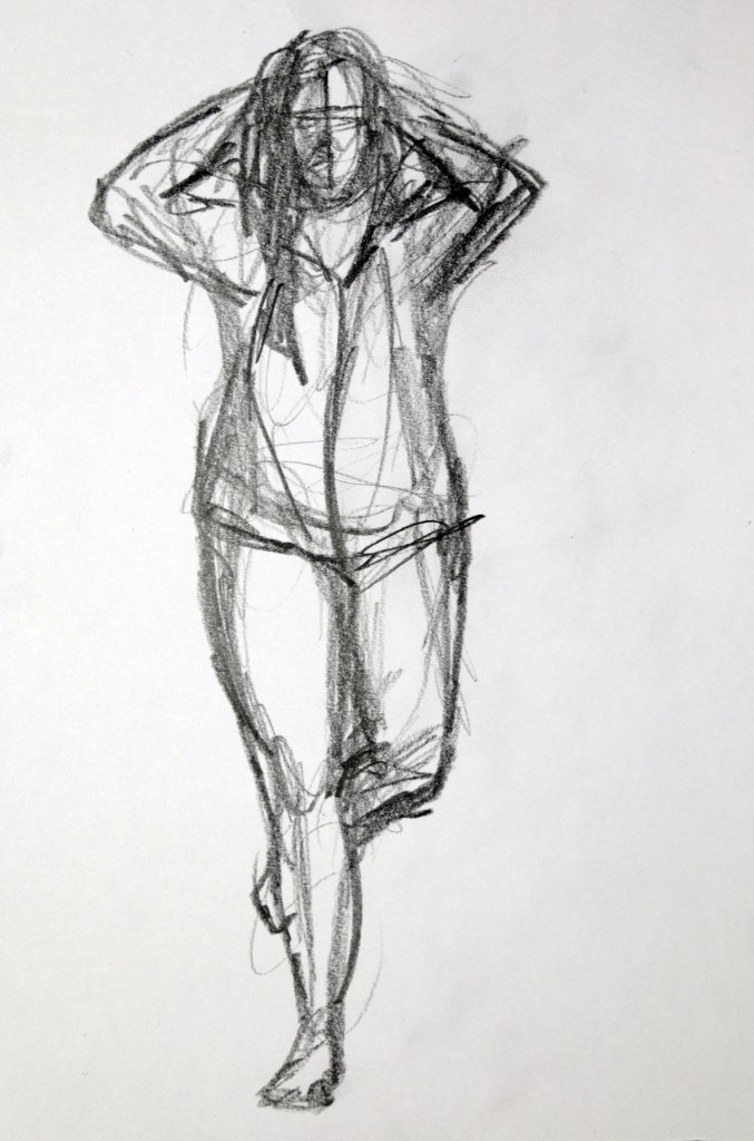
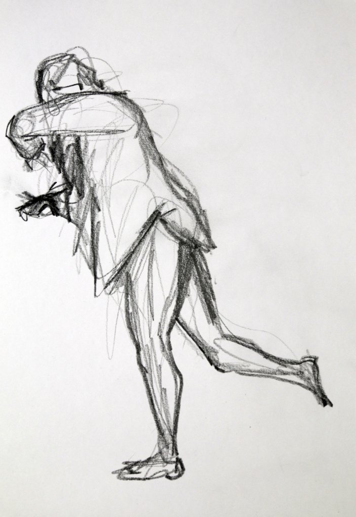
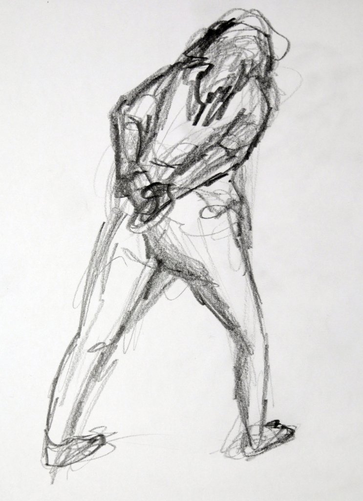
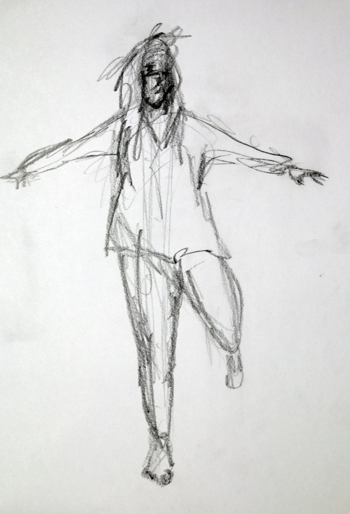
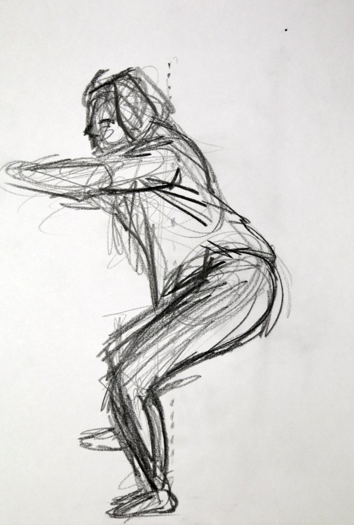
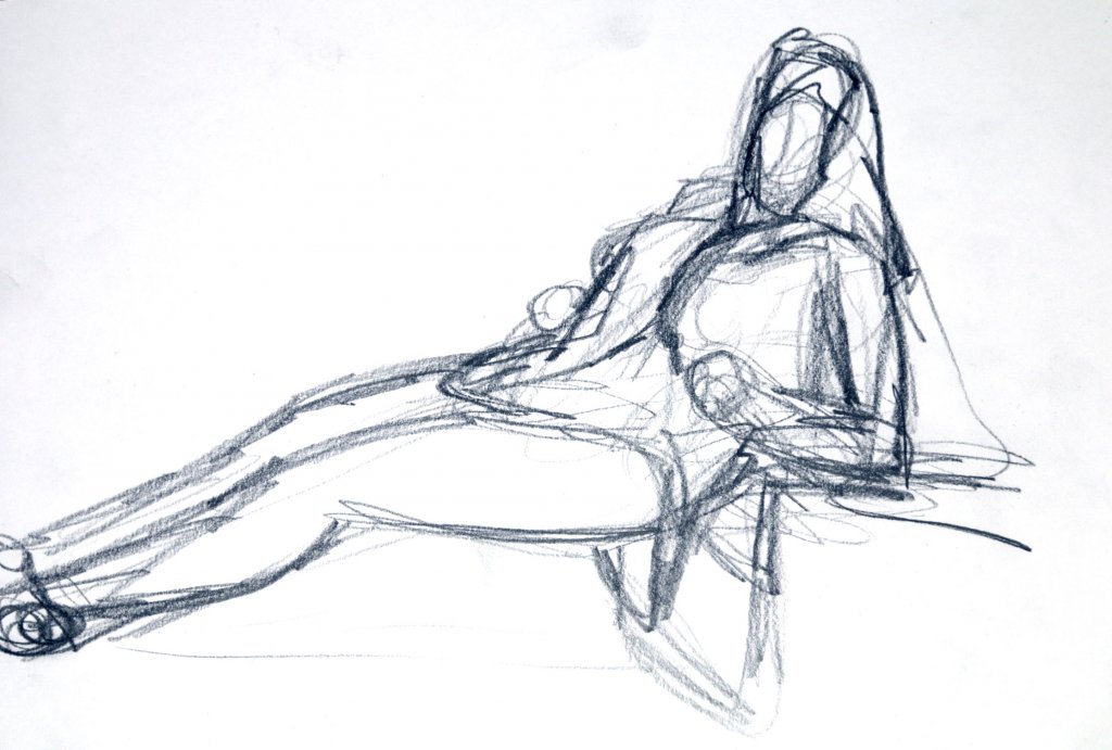
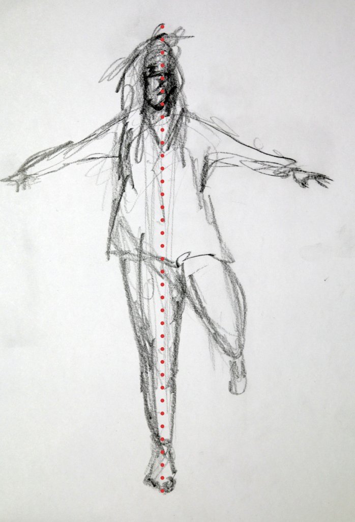
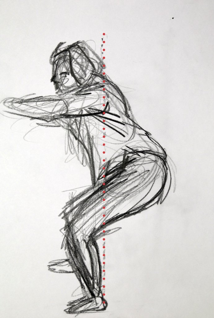
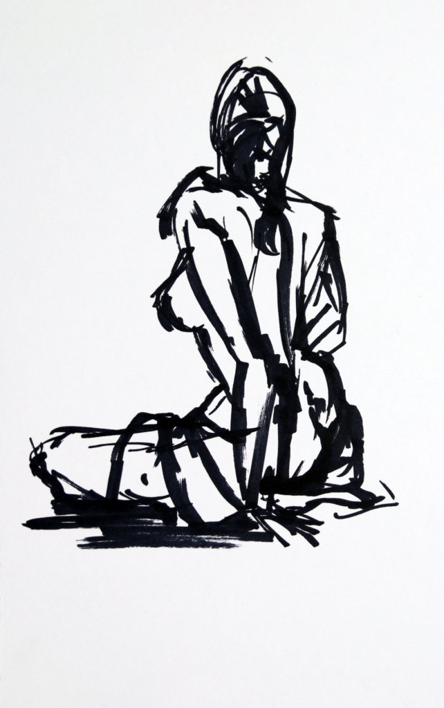
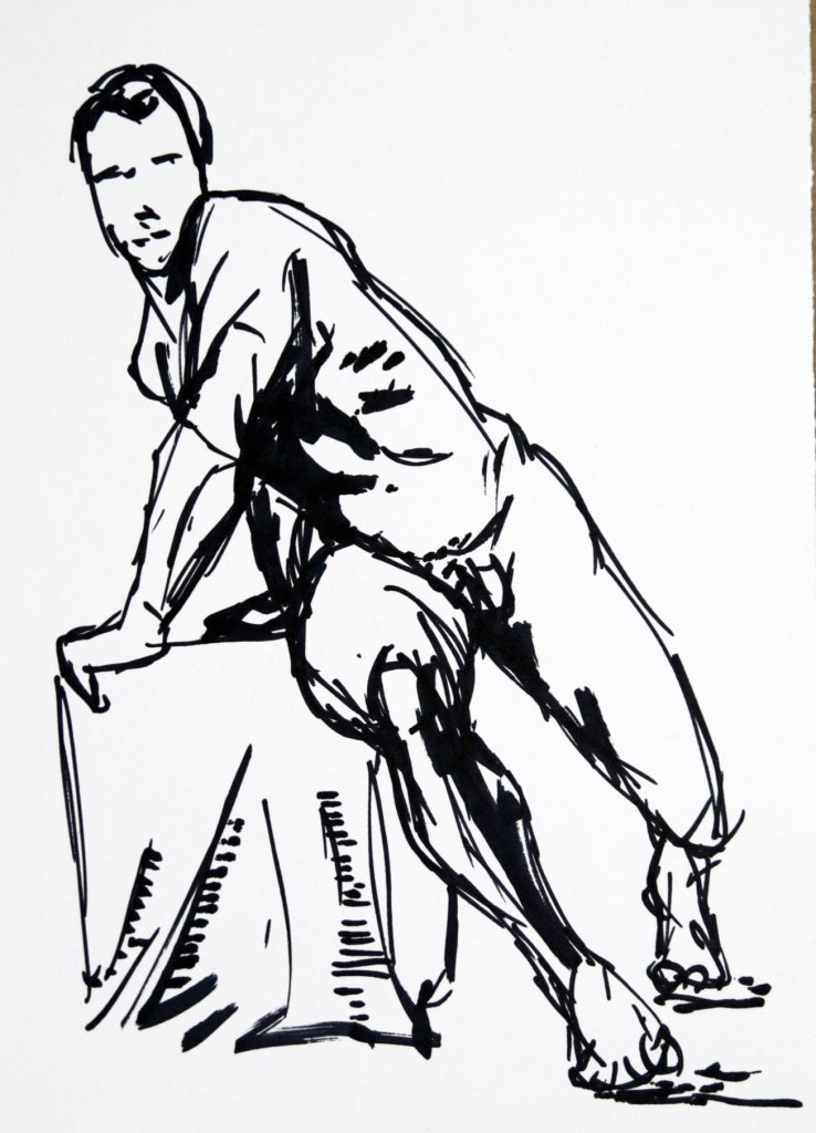
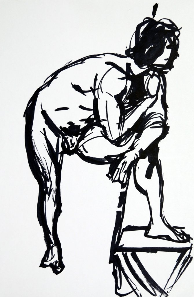
This was an exercise comprised of quick 2 minute sketches with the emphasis on balance and observing the figures centre of gravity. I have marked on the image where I believed each central axis was during each pose. I noticed how much more confident I had become drawing the figure, especially ones that are off balance. I feel this section has definitely given me a greater understanding and the start of some good practices to draw a successful figure.
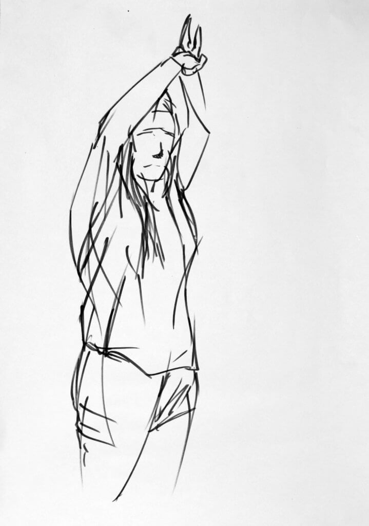
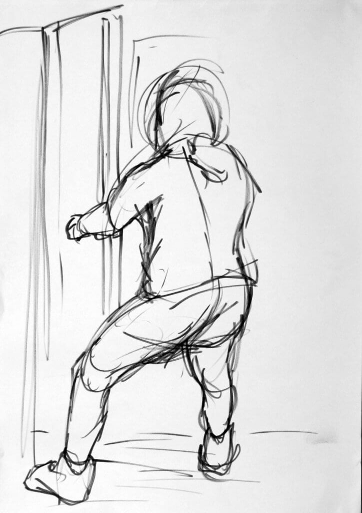
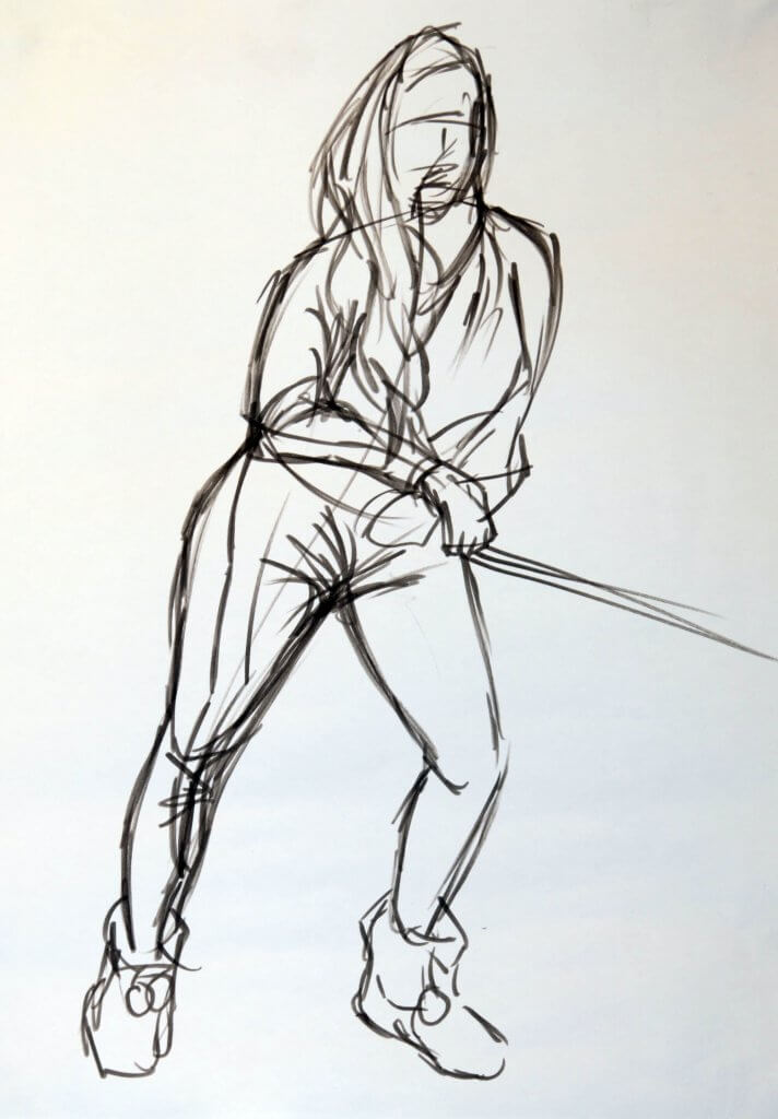
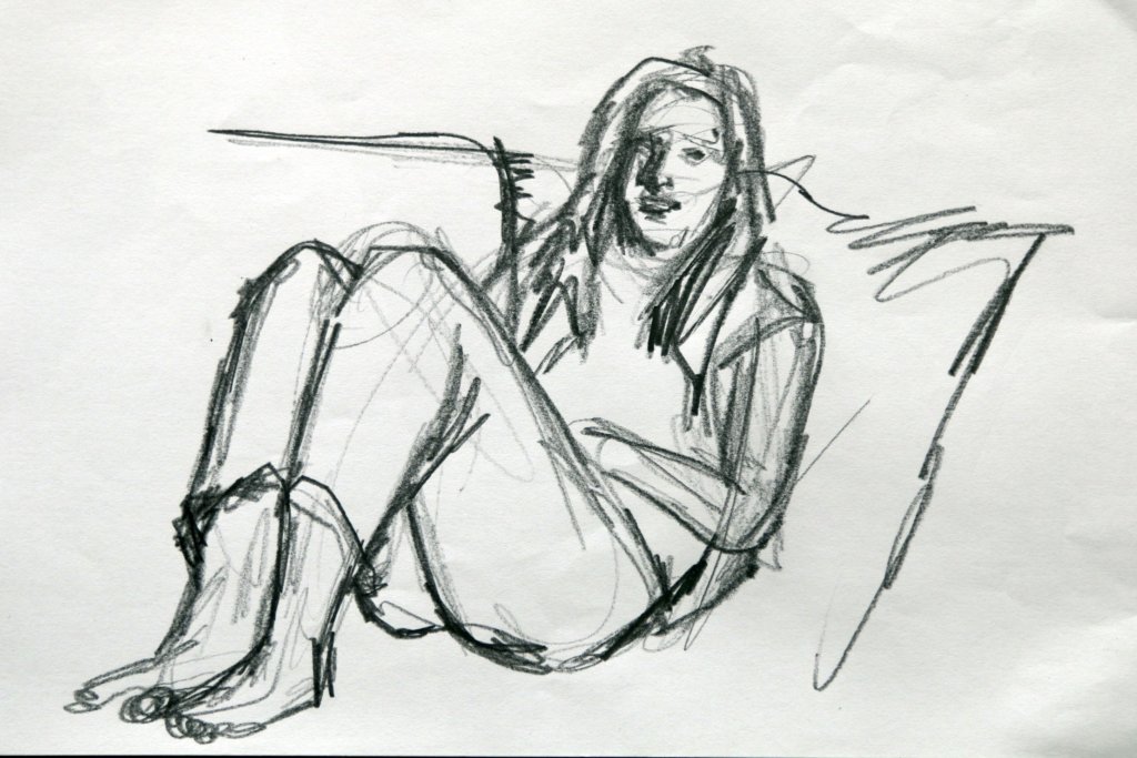
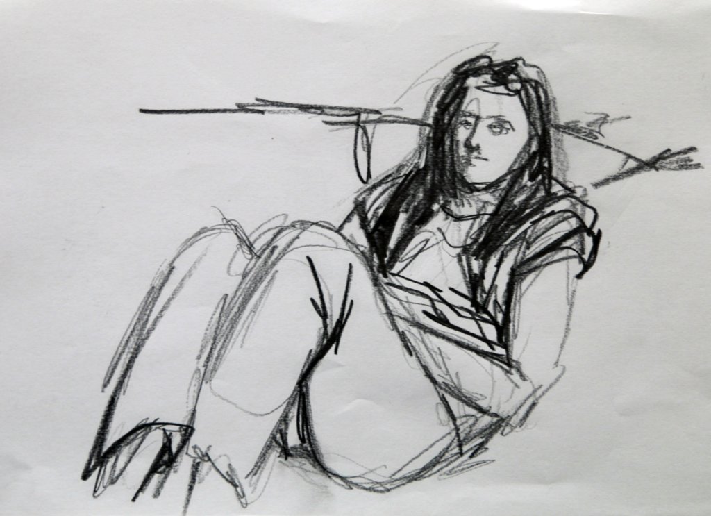
This was another round of quick sketches focusing on energy, I used a brush pen, I enjoyed working this way on the loose sketches of Exercise 1: Quick studies and wanted to use it in a similar way to capture the motion of the subject. I asked my subject (Kathleen) to stretch, lean and pull in various poses, everything seemed to affect the poses, if my placement of the feet was off slightly then the poses intensity was reduced. I refined my lines until I was happy they conveyed the correct amount of force, weight distribution and any other physics that applied.
A reaching stretch, a pulling force with the right arm against the left
leaning backwards on the door handles, the tension in the arms taking the majority of the backwards force
cross armed lean, the weight on the subjects left foot, countered by the extension of the right leg
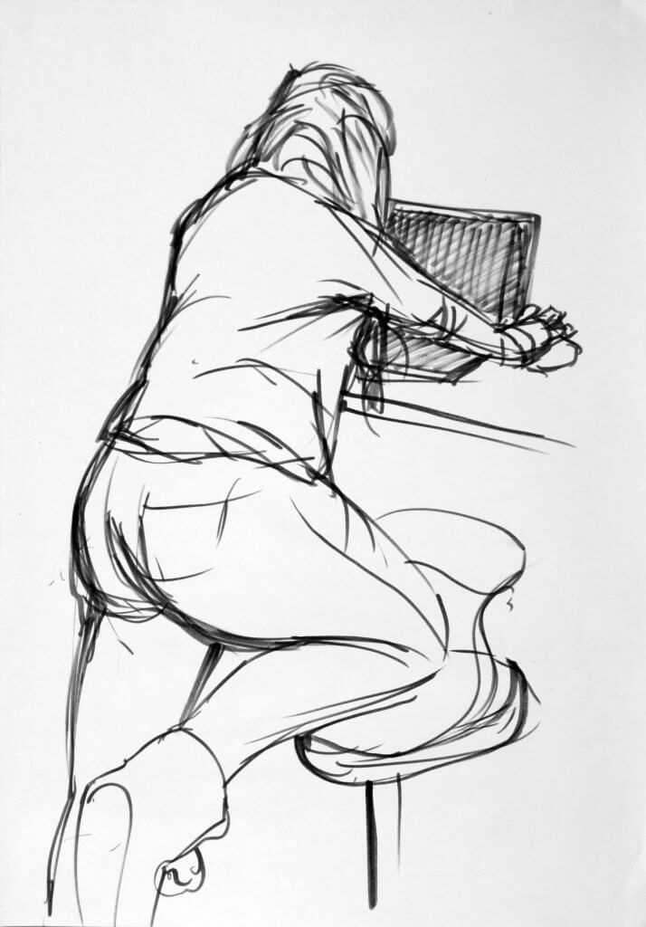
leaning over the counter reaching for the computer mouse, weight on the left leg and supported by the stool on the right leg.
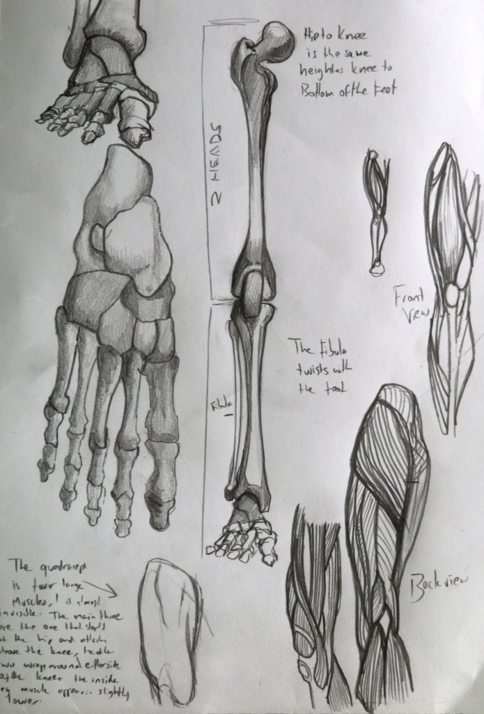
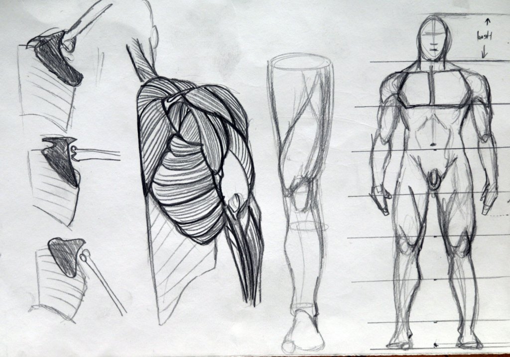
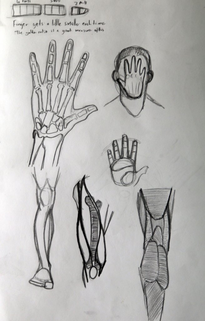
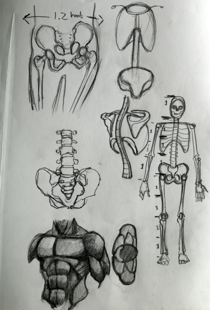
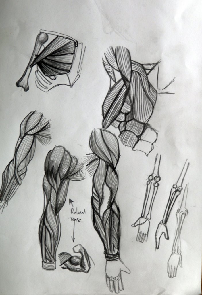
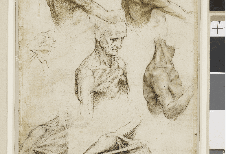
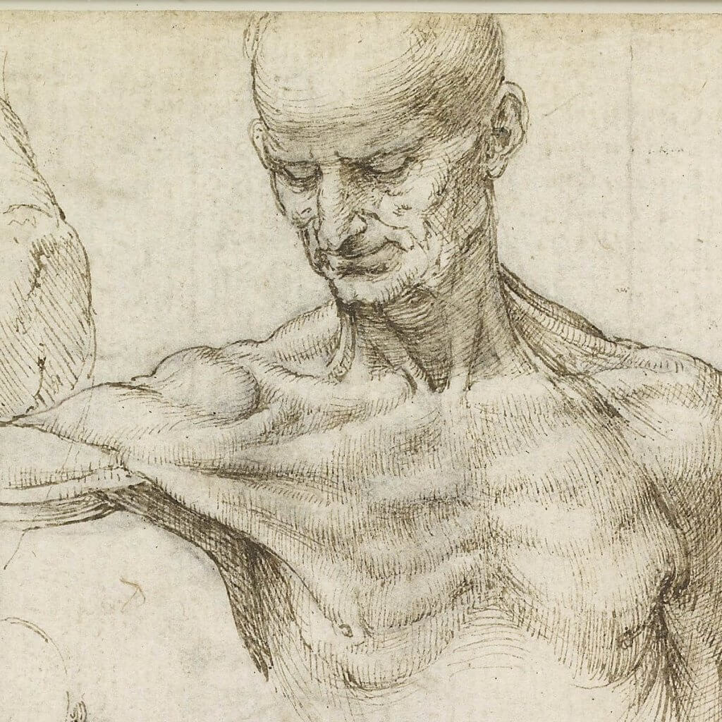
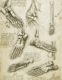
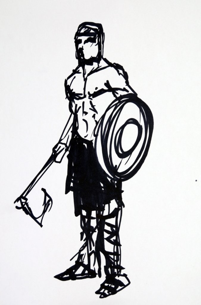
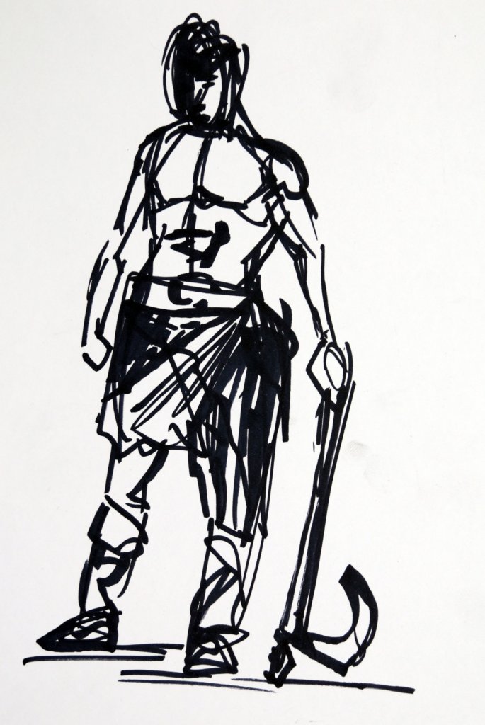
I used this exercise to get a greater understanding of not only the shape and form of the body parts but their function as a mechanical object. I tried to cover the whole body and picked out some of the more complicated structures and their relation to each other not only in position but size also.
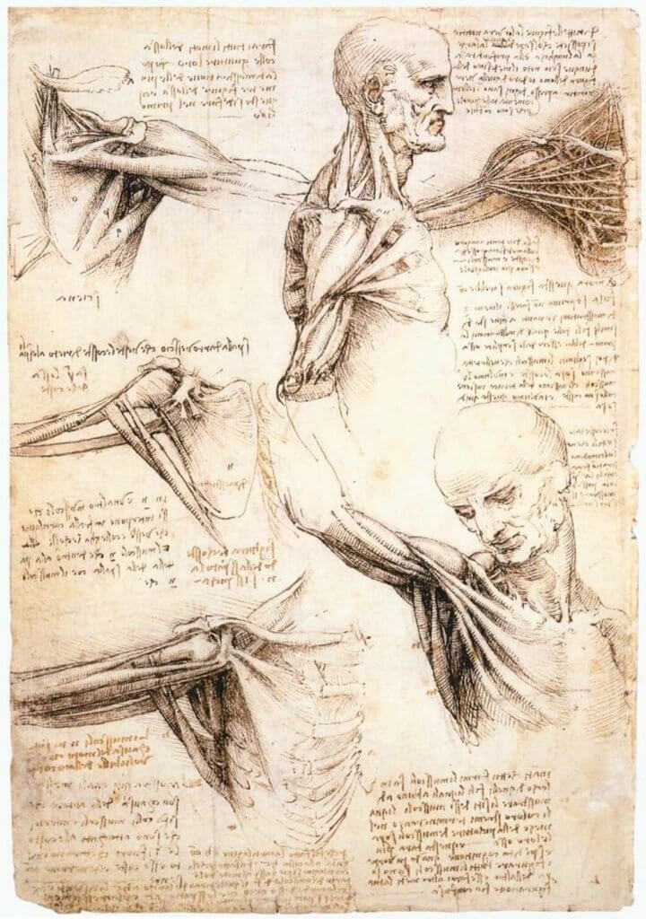
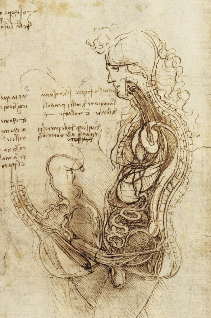
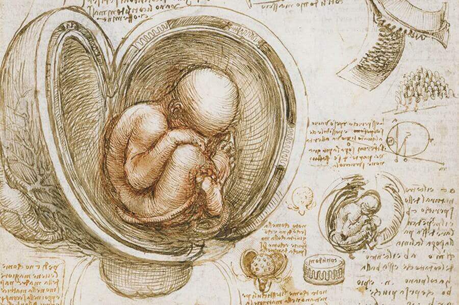
When I first read the text for this research point I immediately thought Leonardo DaVinci, I’ve seen incredibly detailed exploratory sketches involving the human body and he certainly is the most well known, but thats not what research is about, I want to discover some new artists who study the body. I decided I would do some investigation and look into several historic and contemporary artists who’s style resonated with me.
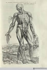
Leonardo DaVinci 1452 – 1519
As I mentioned above the first artist who sprung to mind was Leonardo. He was not only an artist but also a student of anatomy, astronomy, botany, cartography, and palaeontology. As you can imagine he was a naturally curious person, and longed for understanding of the curiosities of the world.
Leonardo Da Vinci
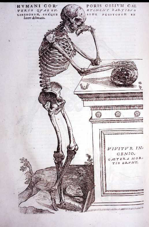
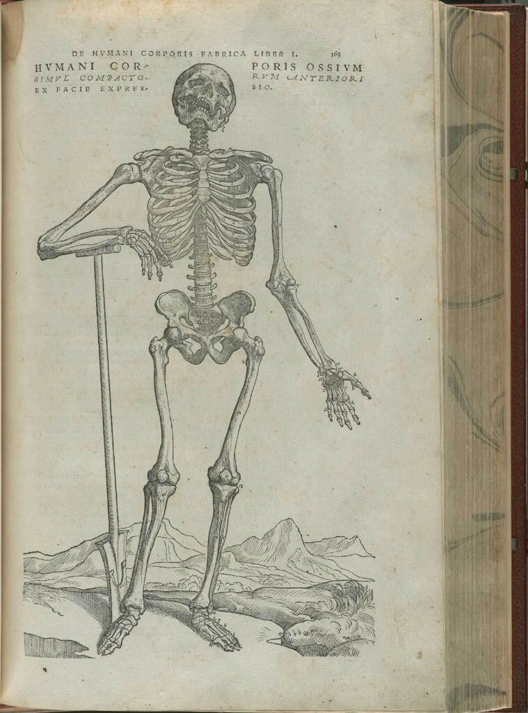
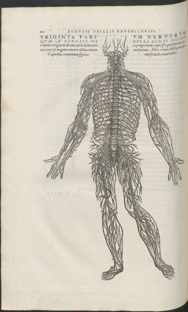
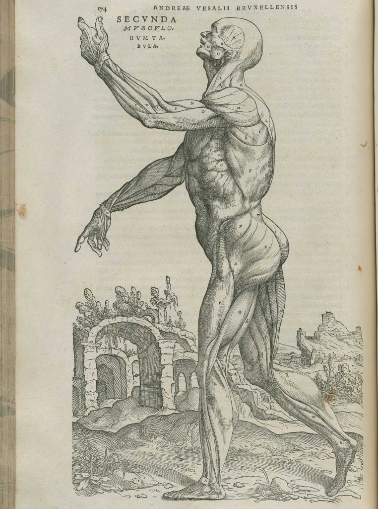
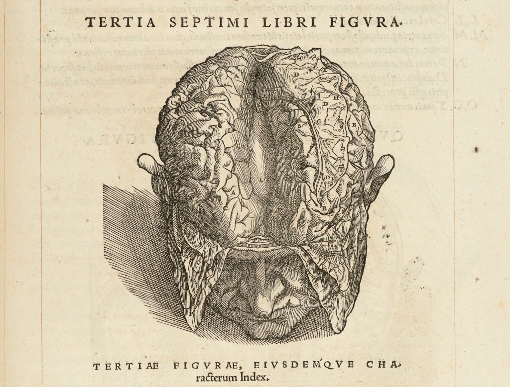
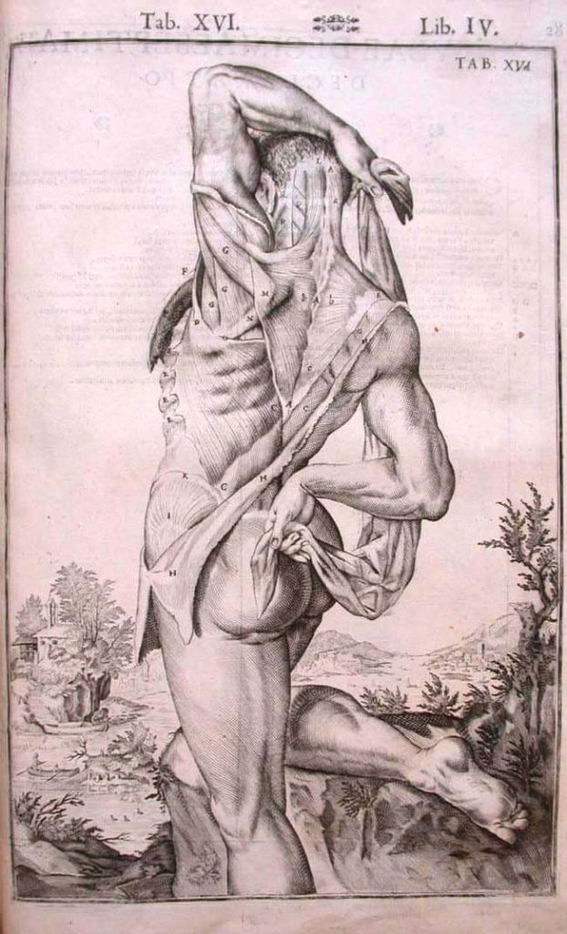
Andreas Vesalius & Jan van Calcar
I have had to put two names down for this entry, as the author seems to have left the artists name uncredited. Andreas Vesalius was a anatomist and physician, he was alive between 1514 – 1564 he will often come up when you search for anatomical drawings, he was the author of the “De humani corporis fabrica libri septem” a series of illustrated books comprised of in depth anatomical drawings. The Illustrations are believed to be the work of German born, Jan van Calcar, they are actually very detailed woodcuts. The work while being intended as descriptive really is quite delicate and beautiful, offering a strong style, the work posing the skeletal subjects in day to day ordinary poses.
Andreas Vesalius & Jan van Calcar
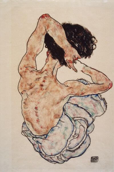
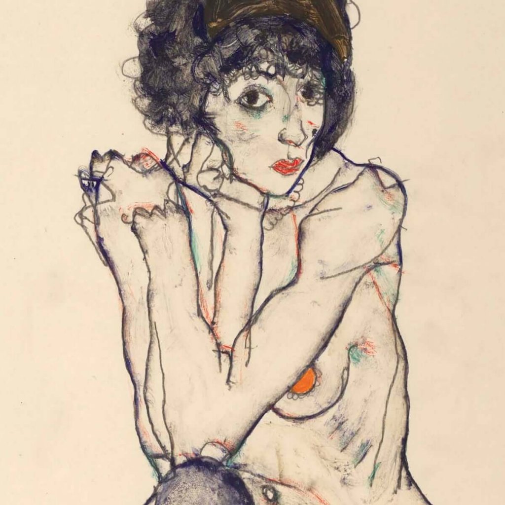
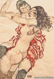
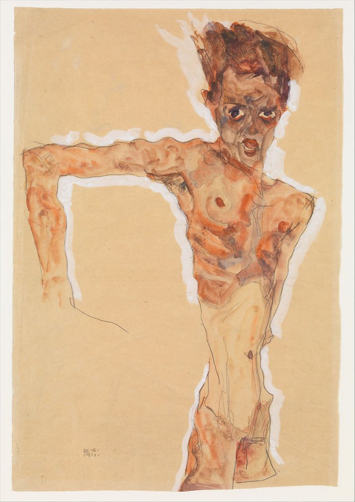
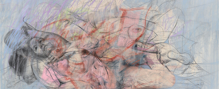
Egon Schiele
I was really quite taken by the works of Egon Schiele when I researched the changing nude, you only have to look at his work to see that beneath the exaggerated and distorted figures in Schiele’s work is a thorough understanding of anatomy, particularly in terms of bone structure.
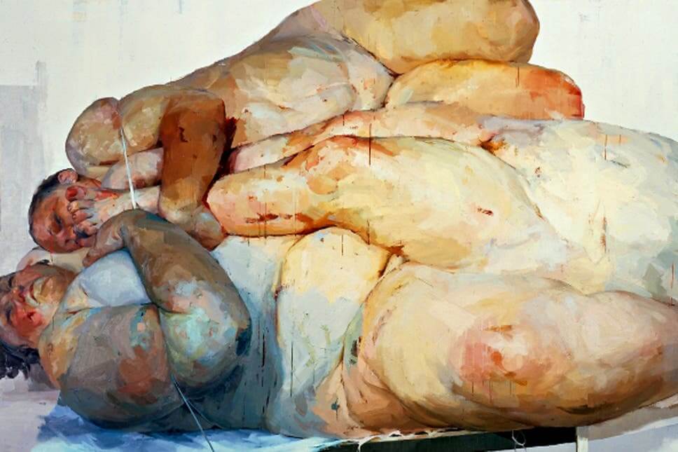
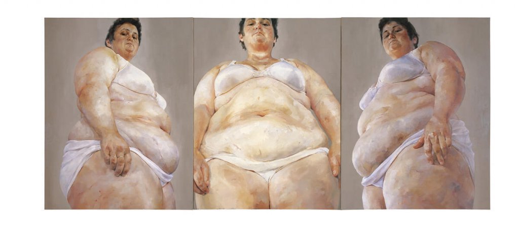
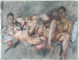
Jenny Saville
Any fans of the Manic Street Preachers, will already be familiar of Jenny Savilles work. She works at a very large scale with broad strokes of colour. The overweight figures she paints cited to have been the result of watching a surgeon perform liposuction procedures gave her a greater understanding and influenced the way she approached the human body. The hard structures of the body draped in the softer jelly like fat layers meticulously described in her images.
Jenny Saville
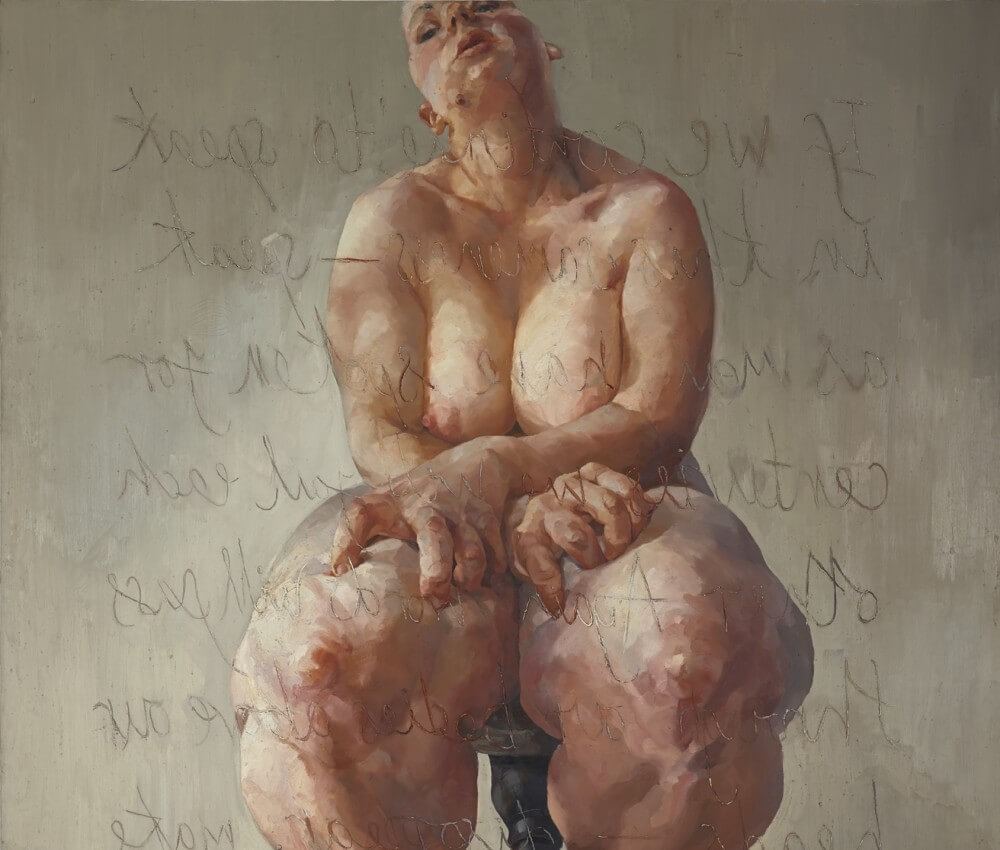
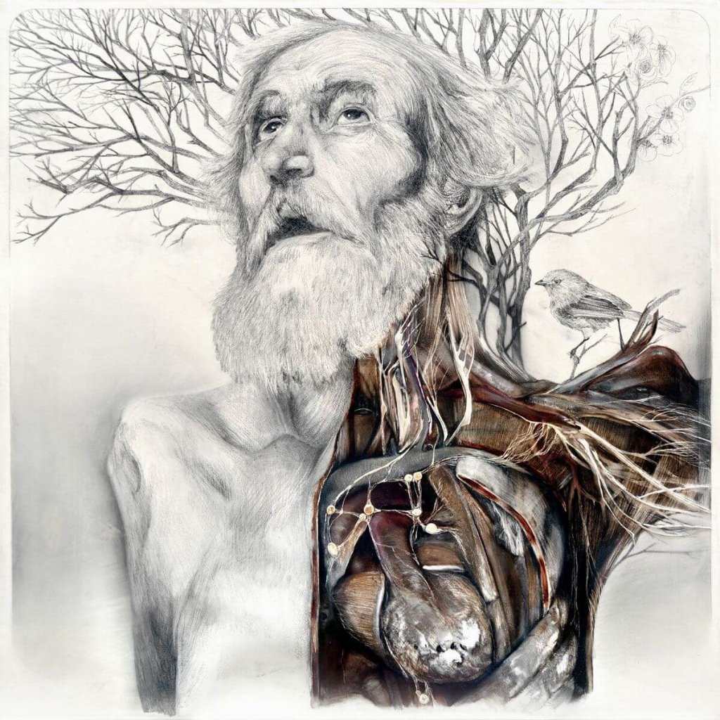
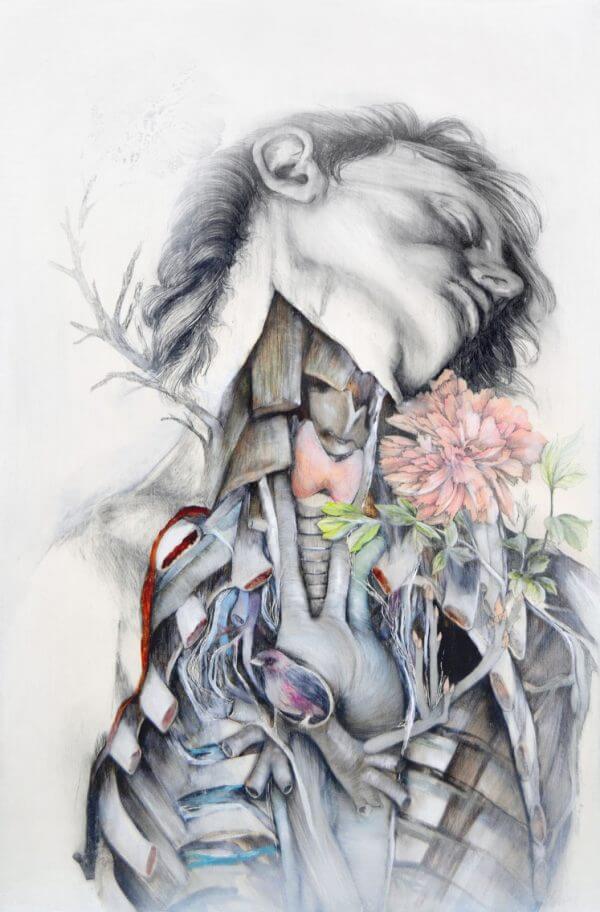
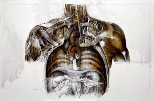
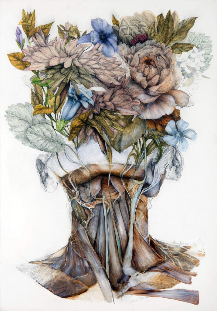
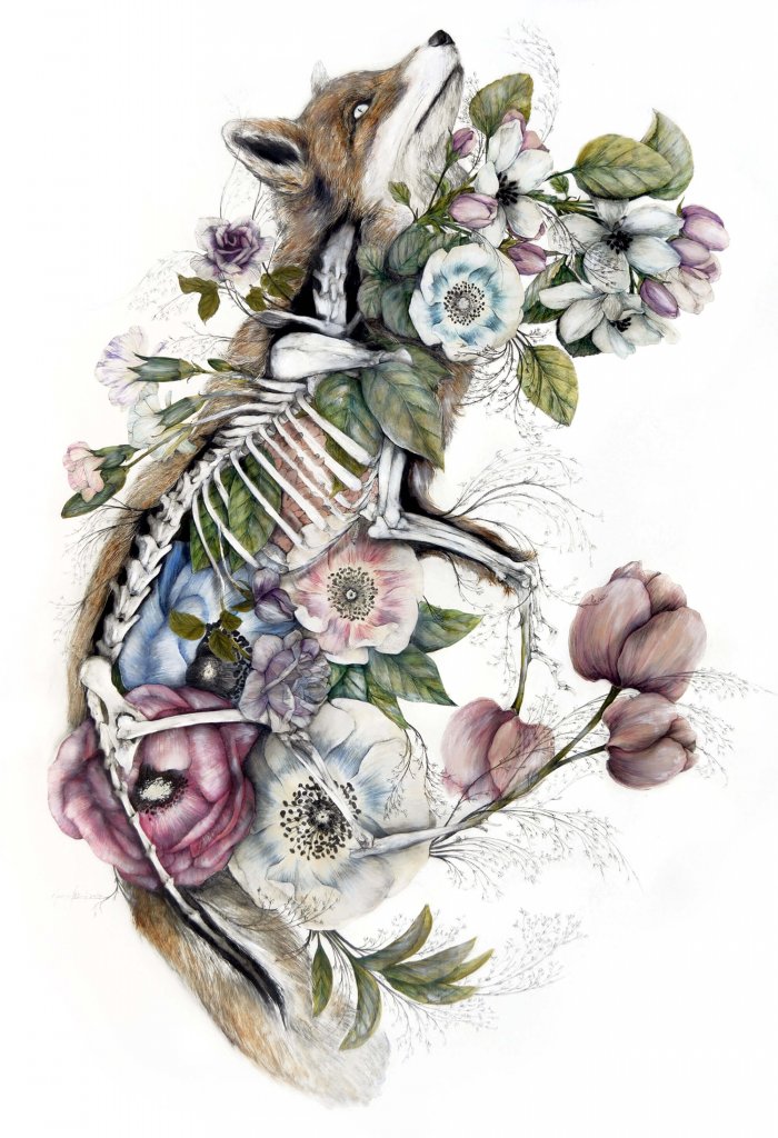
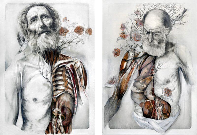
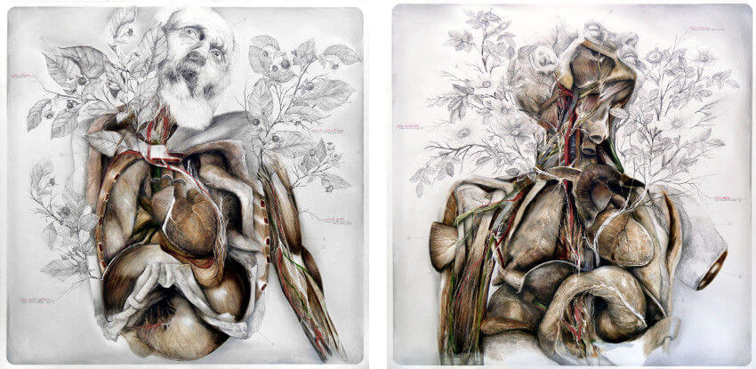
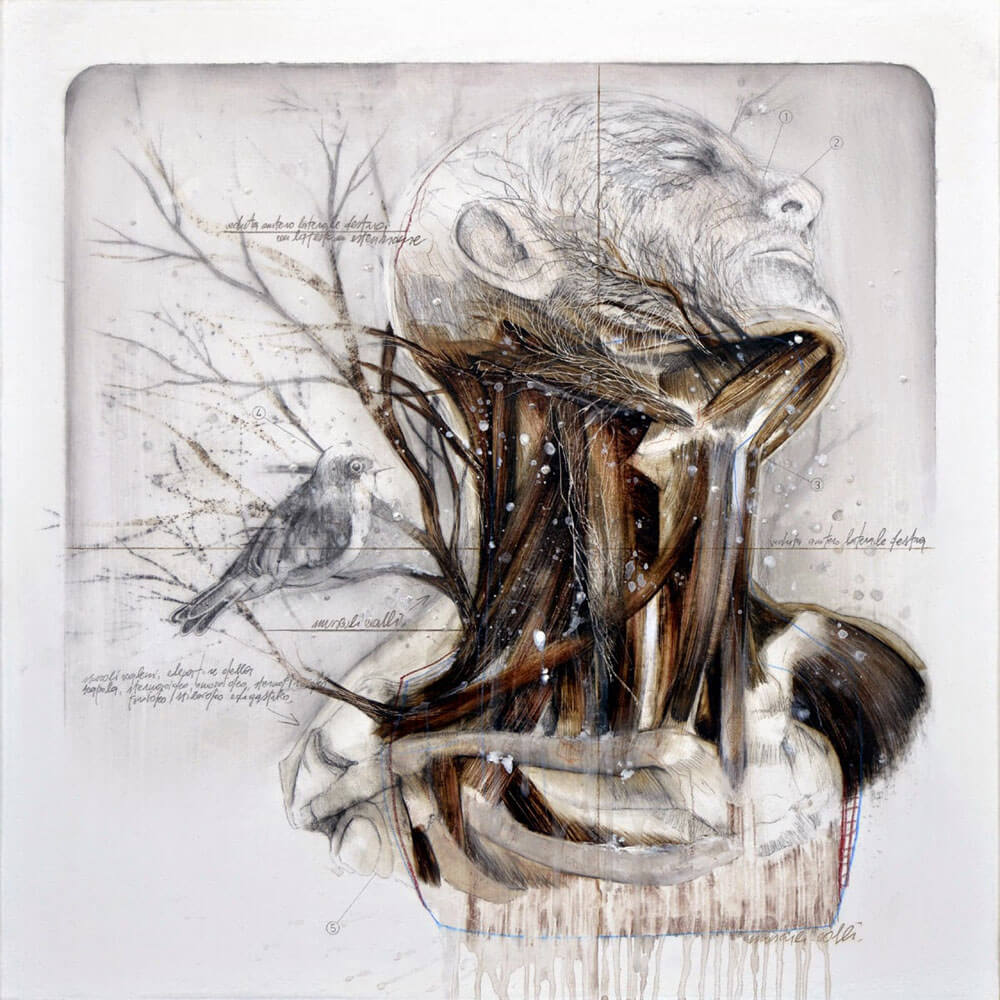
Nunzio Paci
I stumbled upon Nunzio Paci while searching for Jenny Saville, and I’m very pleased I did. His images feel like they are almost vandalised anatomy books. The detailed anatomical drawings are embellished with a secondary drawing, normally botanical in nature.
This exercise required me to complete three drawings with different tools ;
Standing, I chose brush pens and chisel markers
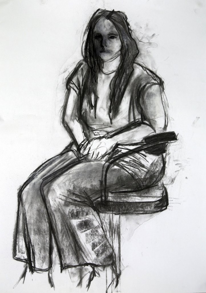
Seated, this drawing used charcoal
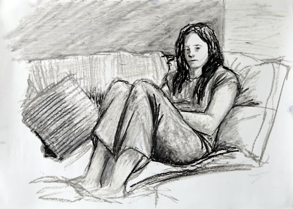
Lounging, I chose oil pastel for this image (mainly because I found my set and wanted to experiment)
I carried out 2 sketches for each larger image, I have found this useful for several reasons, it helps to understand the figures form, its mass/force distribution highlight any weakness in the pose and composition, I think it also serves up as a warm up or a dummy run, going through the motions once or twice before the main piece of work seems to inform your approach
Standing
Using a brush pen I marked out the pose, taking consideration of the subjects stance and where the balance was distributed, the left side of her hip turned upwards and her leg bent supporting her mass with a slight forward lean. I had a stubby Pentel chisel marker, I really like these markers, they are quite expensive and I tend to keep them past their prime, they take on a nice scrubby feel leaving a broken texture, the last of the wet ink clings tightly to the dry felt head, the pen squeaking in pain as its head is dragged against the paper. It means that I can get a mid tone from the black ink, and I like the effect.
Seated
I thought I’d give charcoal a whirl again. It is imprecise and messy in my hands, but thats probably due largely to my lack of exposure to the medium. Again I was happy with the way I had captured the pose, the weight of the model shifted to her right side, her right leg anchored to the floor. As I had expected the image was starting to get a little muddy, I decided to pause there and seal the drawing, unfortunately the lacquer seemed to react strangely with the paper, the lacquer picked up the pigment and made some water colour like wet edges. it also took the more delicate marks on the face and washed it into one grey tone. Im not sure what caused this, too heavy with the fixative or maybe the paper and charcoal had created a barrier that made the fixative pool on top. I did try to fix the drawing with a white conte crayon but it didn’t seem to make it much better. I decided to leave it as is and put it down as a lesson.
Lounging
Again I was pleased with the pose and the way I captured the figures lean and relaxed arms versus the strong triangular shape of the legs. The oil pastel was thick, the large A2 sized paper allowed me to add a little more detail in, I would like to complete a drawing with oil pastel at a larger A1 size, just to see how far I could push the detail with the stubby greasy stick.
I worked tonally, using a grey pastel to mark the subject and than adding in darker and lighter tones with black and white oil pastels, I like the way the pastel acts as a blender as it passes over a neighbouring marks space, I tried to use this to sculpt and render the shapes such as the arms and legs, following the rounds and flats of the subject on to the paper, pulling and curving the pigment to delineate the desired form.
This was an ongoing exercise and one that I undertook out of order of the syllabus, I actually contribute the majority of my favourable outcomes from drawing the figure to the loose and confident approach that this exercise taught. Using a chisel marker, I carried out each image with a 3 minute timer, detail was sacrificed for the pose, I wanted it to look natural, the result is almost like concept art for a video game or a film, capturing essence and movement over minutia.
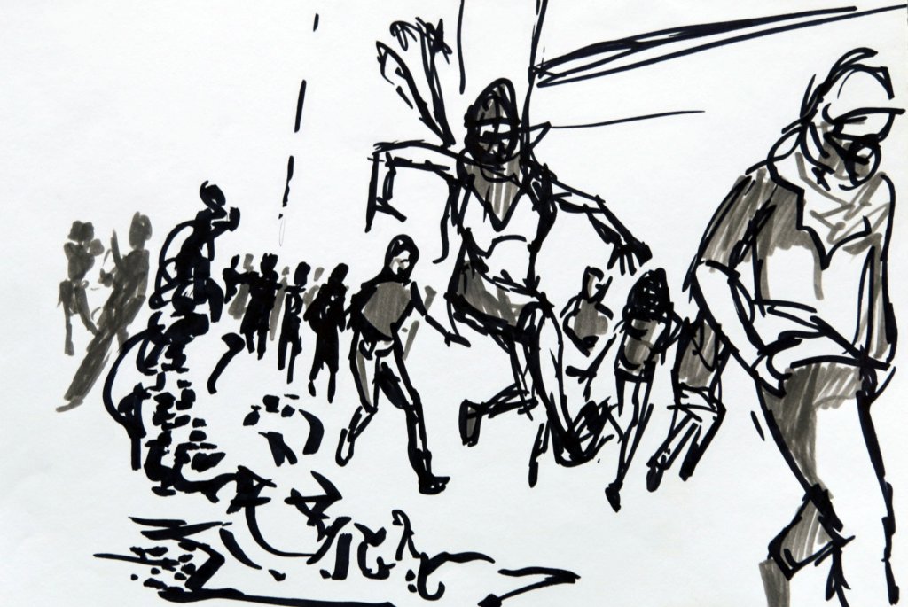
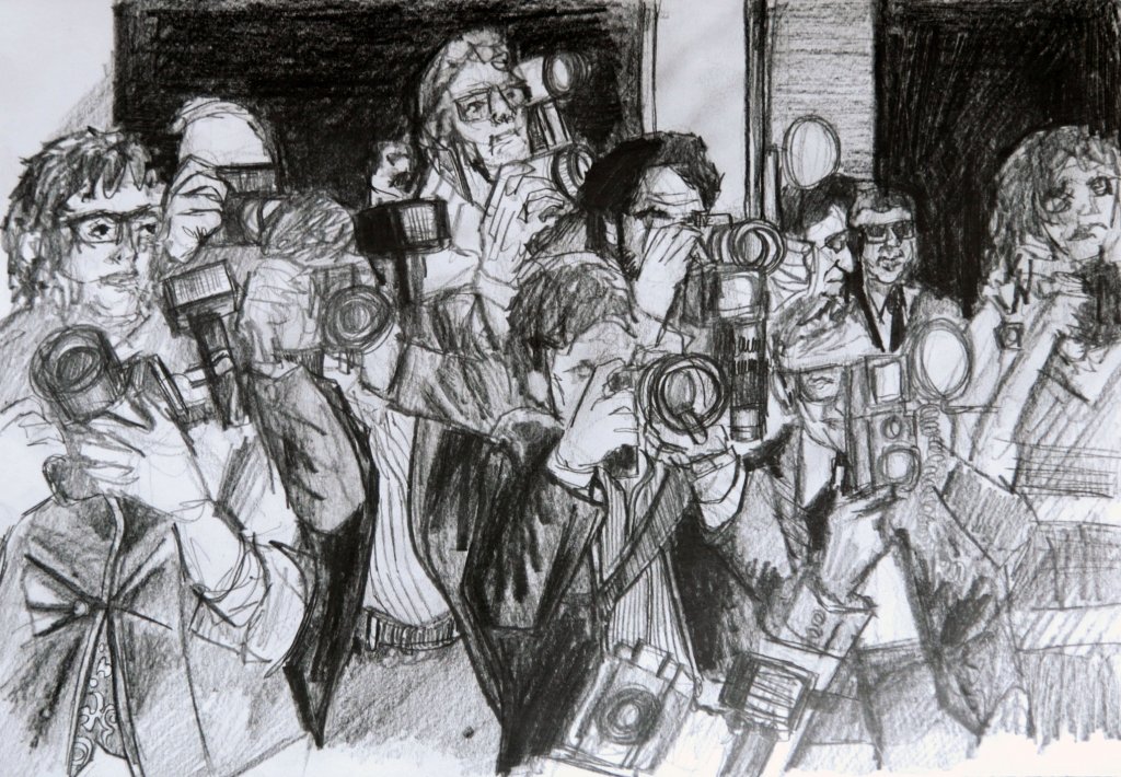
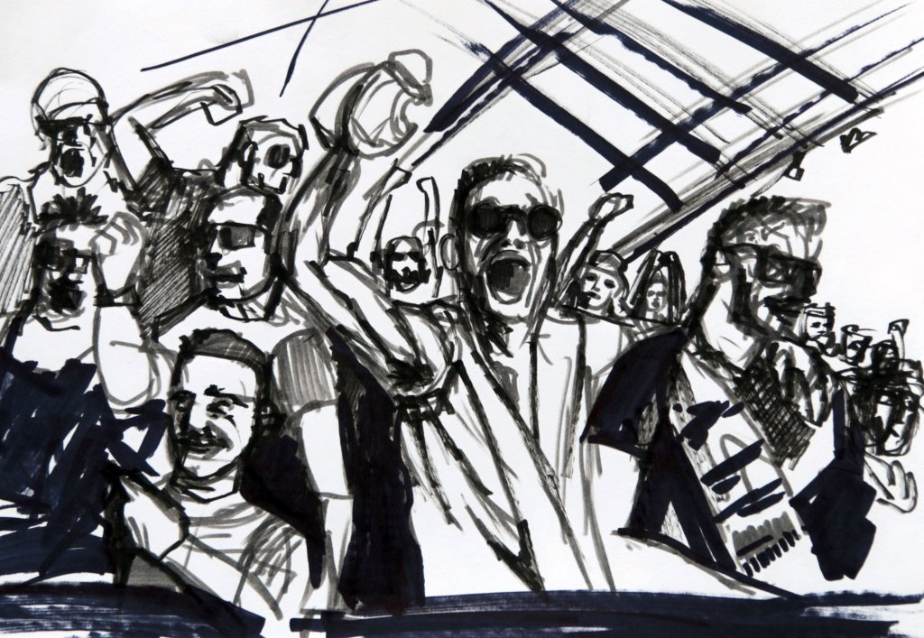
At the moment we are in lockdown, even if we wasn’t we still have social distancing in place, the spirit of a crowd is lost when they have a 2 metre gap between them, I had to rely on photos for this exercise, I wanted to explore the interaction between the figures, the way that space between them is reduced, sometimes uncomfortably, I searched for crowds, groups etc but they came up with some pretty generic characterless photos, I decided to be more specific, riots, paparazzi and football crowd. these came up with some imagery that offered some more drama and some characters.
Riot
Using a grey and black brush pen , I tried to capture the aggression and movement of a charging crowd, people jumping, changing direction, I attempted to use the two tonal values to suggest numbers, this is more of a quick sketch, although I feel it would make for an interesting image if I was to have worked this up further into a more finished piece.
Papparazzi
I liked this image, the way the off balanced characters all contorting and defying gravity to lean back for a well composed shot. the details here add to the bustle and the faces that aren’t obscured have a stylised sense of character. I could have easily have given these characters which are exaggerations of their real life counter parts nick names, again I would like to make a finished piece where the viewer could peruse the crowd, finding small details and hints at their characters and back story’s.
Football stand
Another quick study with brush pen, I really wanted to capture joy and movement with this image, the photograph I used while it does capture a frozen moment in time, has less to offer than a drawing that tries to show the kinetic energy of a moving shaking mass of bodies wedged together, I tried to use the two values of brush pen here to give a shaky look to it. I think back to some of the animations in my youth that used a scratchy style of animation such as rhubarb and custard or even to a lesser extent the animations by Gerald Scarfe featured in The wall, the changing lines and textures giving a moving, vibrating effect. I have added the videos below to further demonstrate the effect I was trying for.
Even when standing still the character’s seem to be moving, almost as if they are made of ants.
Pink Floyd’s the wall has also has an interesting effect due to the approach taken with the style of “textured” animation
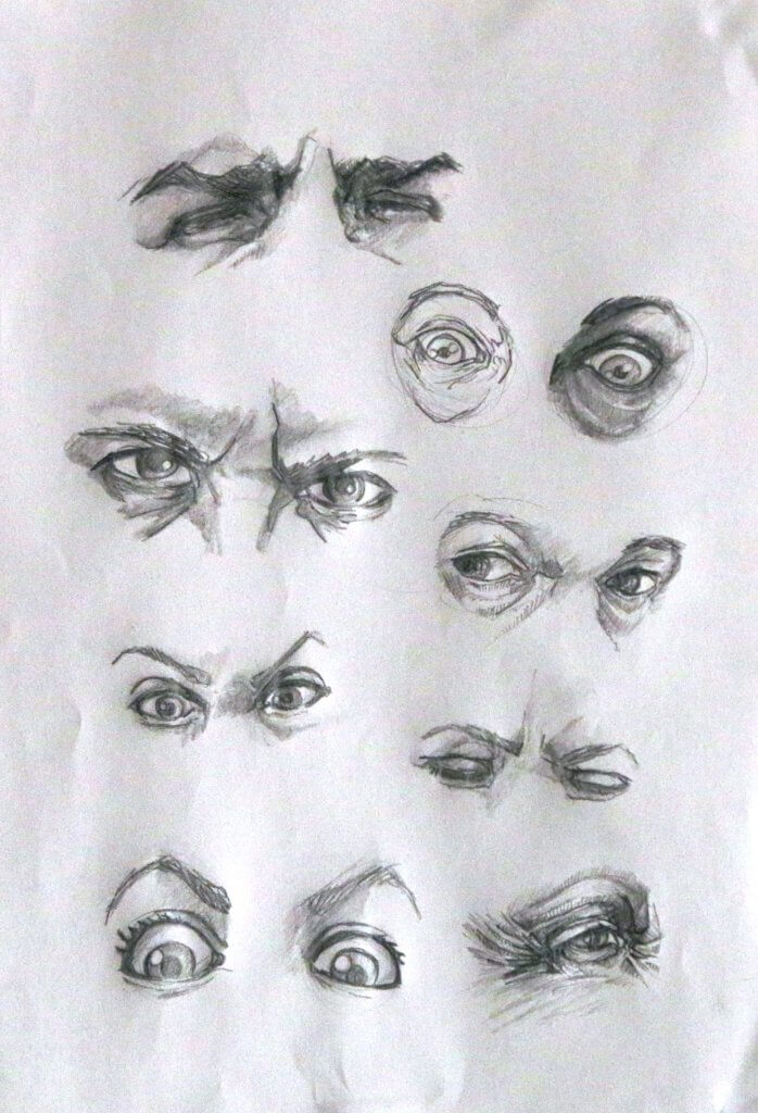
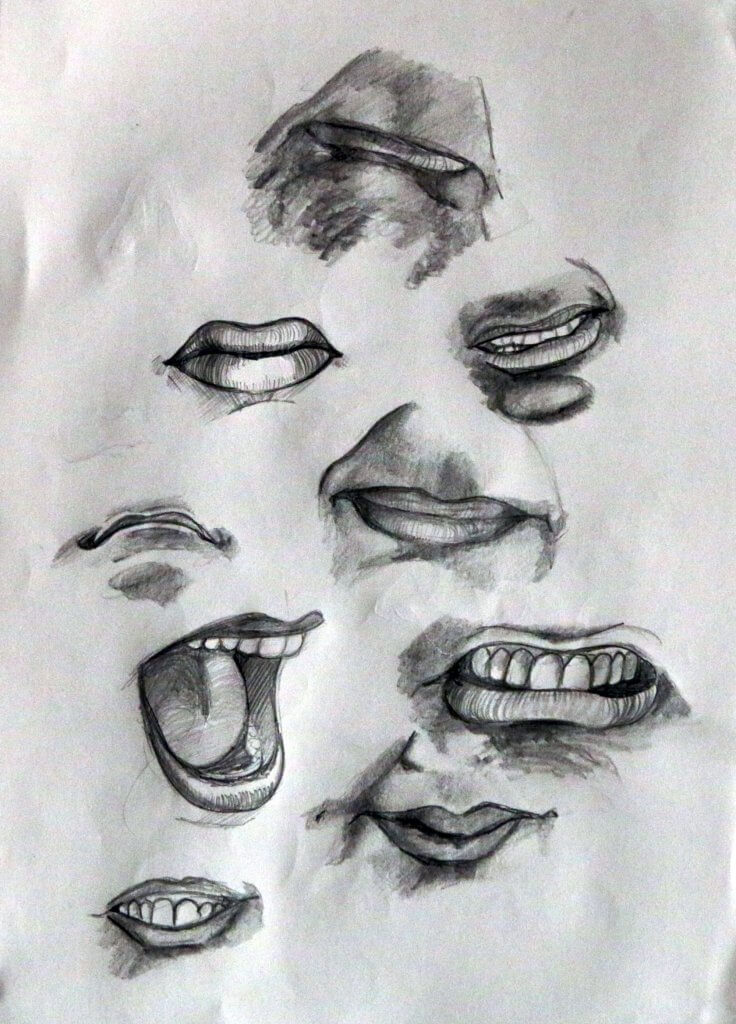
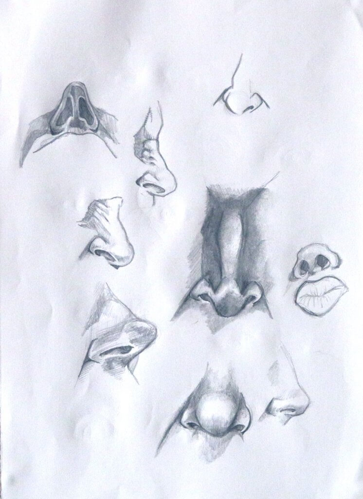
Another exercise that I found very useful, isolating the feature and repeating seems really useful to understand the construction of the face, the focus being so narrow cuts out a lot of noise.
I ended up actually drawing the round shapes that are made by the eye socket, the visible eye is of course just the tip of a larger sphere, that is wrapped up in two sheets, one that has a perambulating motion.
the mouth is essentially controlled by a large floating hinge, the top part being fixed, the way the mouths gestures are controlled is by pulling or pushing, repositioning the bulbous shapes of the lip over the teeth to produce a multitude of shapes.
The nose seems to be made of around 5 separate shapes, I found it really helpful to draw the bridge, the ball the nostrils and the septum that separates the nostrils and joins the the nose to the philtrum and lip
Using a photo i tried to draw Bob Dylan, It started to go wrong early on so I abandoned this, the likeness was off and the face seemed a little out of kiklter.
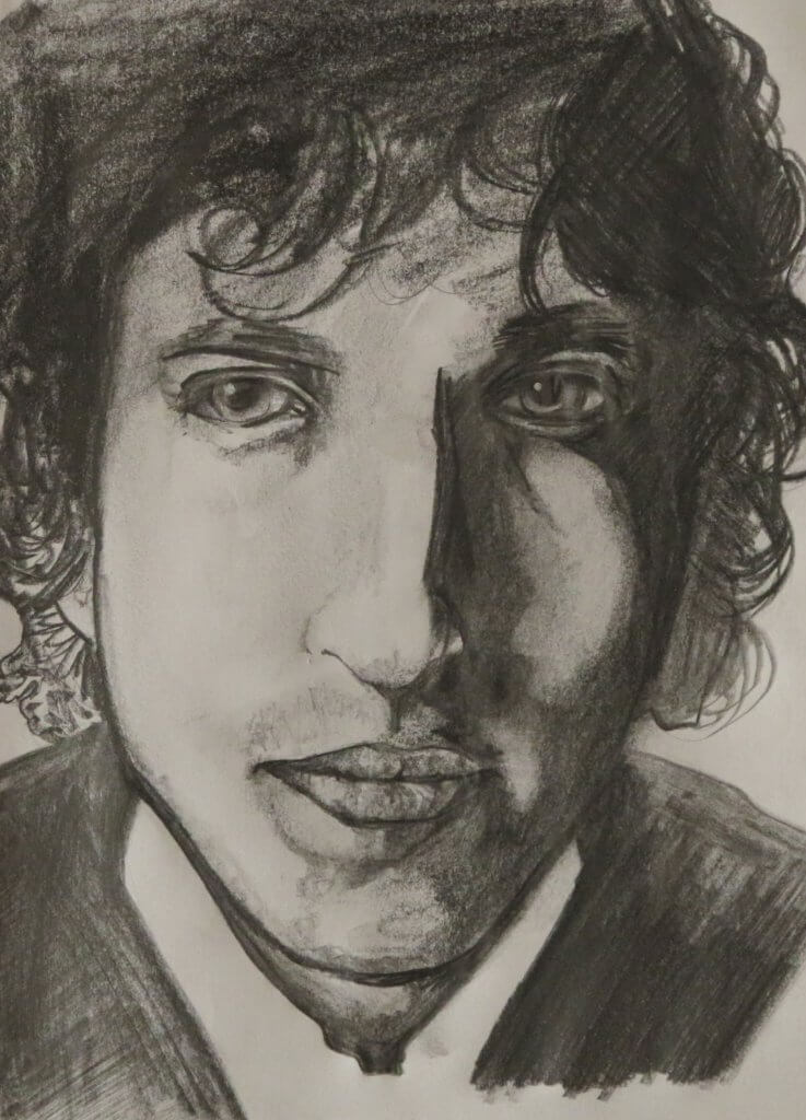
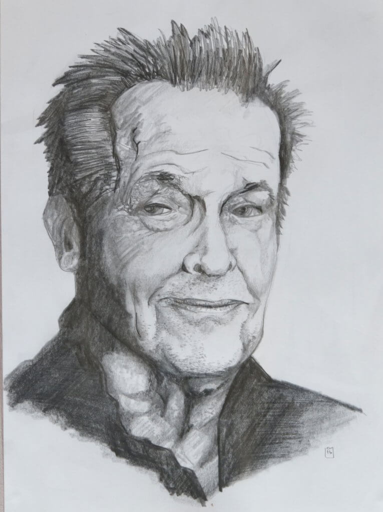
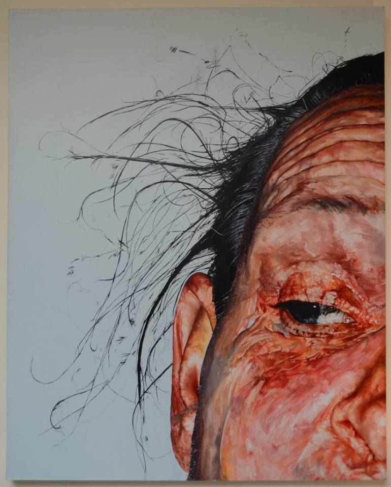
I then found a photo of Jack Nicholson, I wanted to try to capture some of the weathered features of his face, textures of old stubbly skin.
I was asked to look at some artists who focus on portraiture, the two that was suggested was Graham little and Elizabeth Payton, while I was researching I stumbled upon a contemporary artists work that I really enjoyed, his name was David Booth
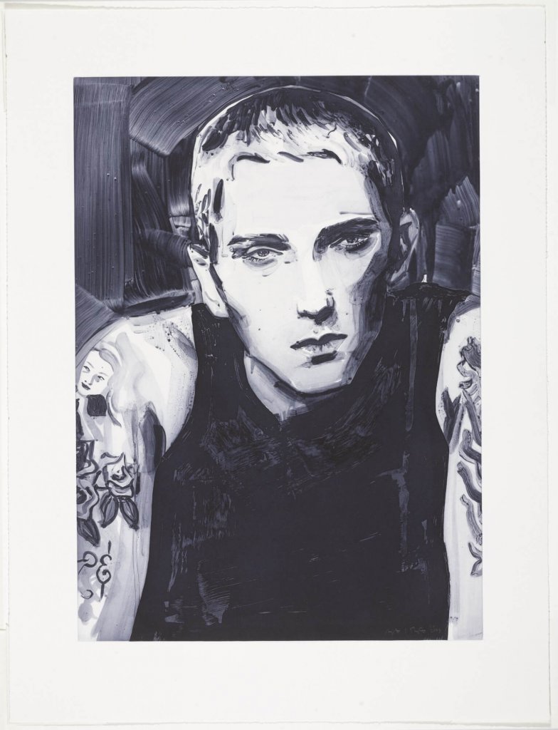
Elizabeth Payton
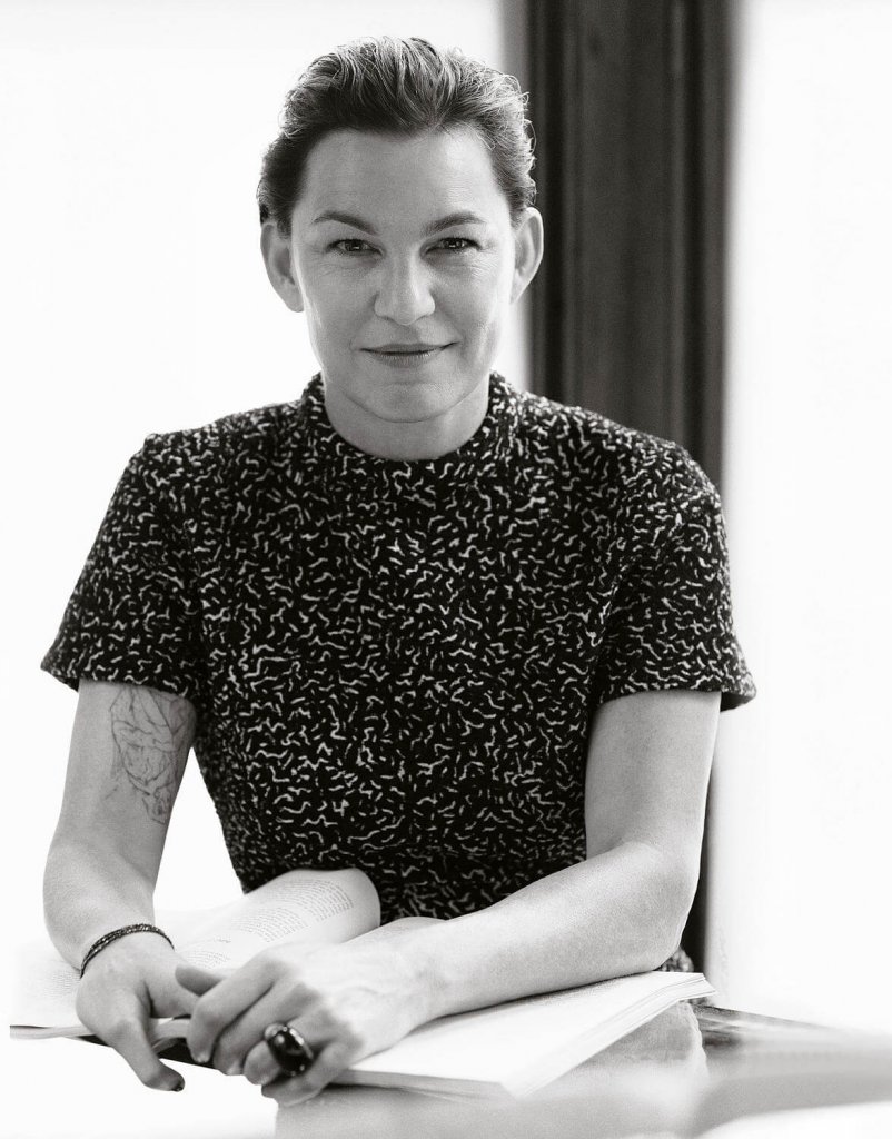
I read that her main source of inspiration from the works of Gustave Flaubert and John Singer Sergeant, this I found quite interesting as they both have a rich colourful style that seems to sit just below a realistic style, by that I mean their work while very true to life still seem like paintings. Elizabeth Paytons work is quite the opposite, it isn’t her intention to capture photo realistic images, but to capture expression or mood. In fact her work is so stylised I found that most of the portraits, while clearly recognisable looked like their subjects all seemed to have a similar appearance, in fact when I saw the artist photograph you can see quite a lot of the repeating characteristics in her own face.
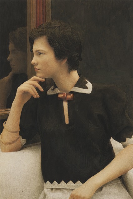
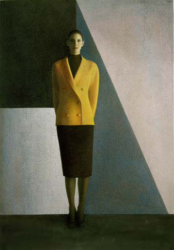
Graham Little
I was quite taken back by Graham little’s use of coloured pencils, these images have a muted photographic quality, I loved the way that his small stippled strokes actually mimic film grain, adding to the photographic quality. I tried to get a close up of this as I really wanted to see his marks, but had absolutely no luck. When you use certain medium it gives a certain appearance or aesthetic, but I would never have imagined the artist was using coloured pencil.
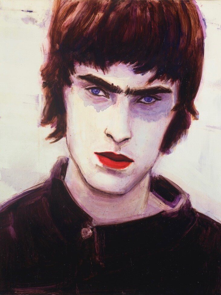
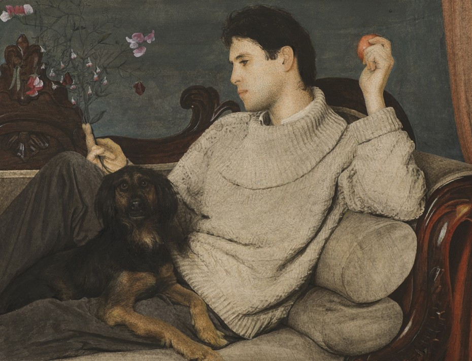
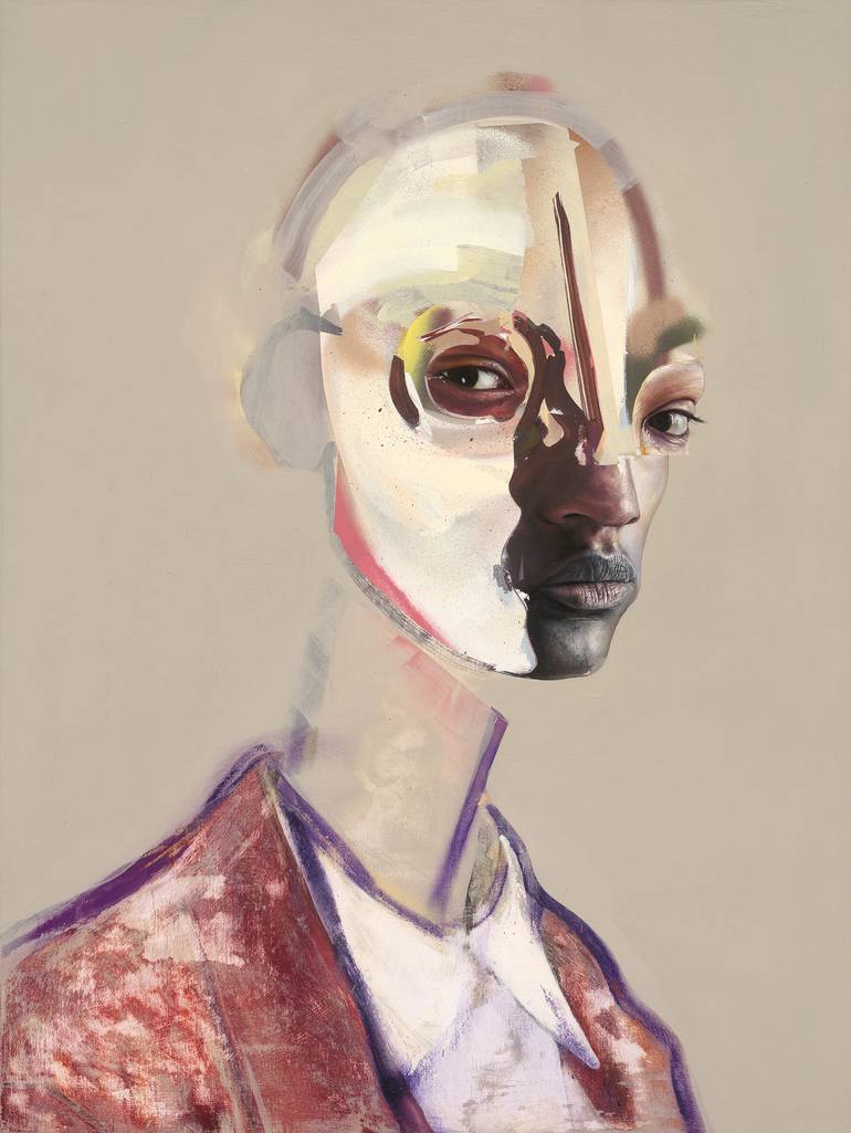
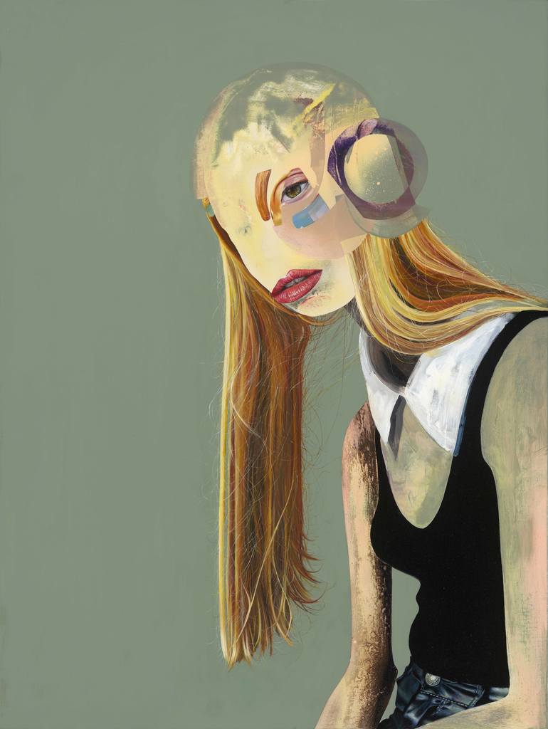
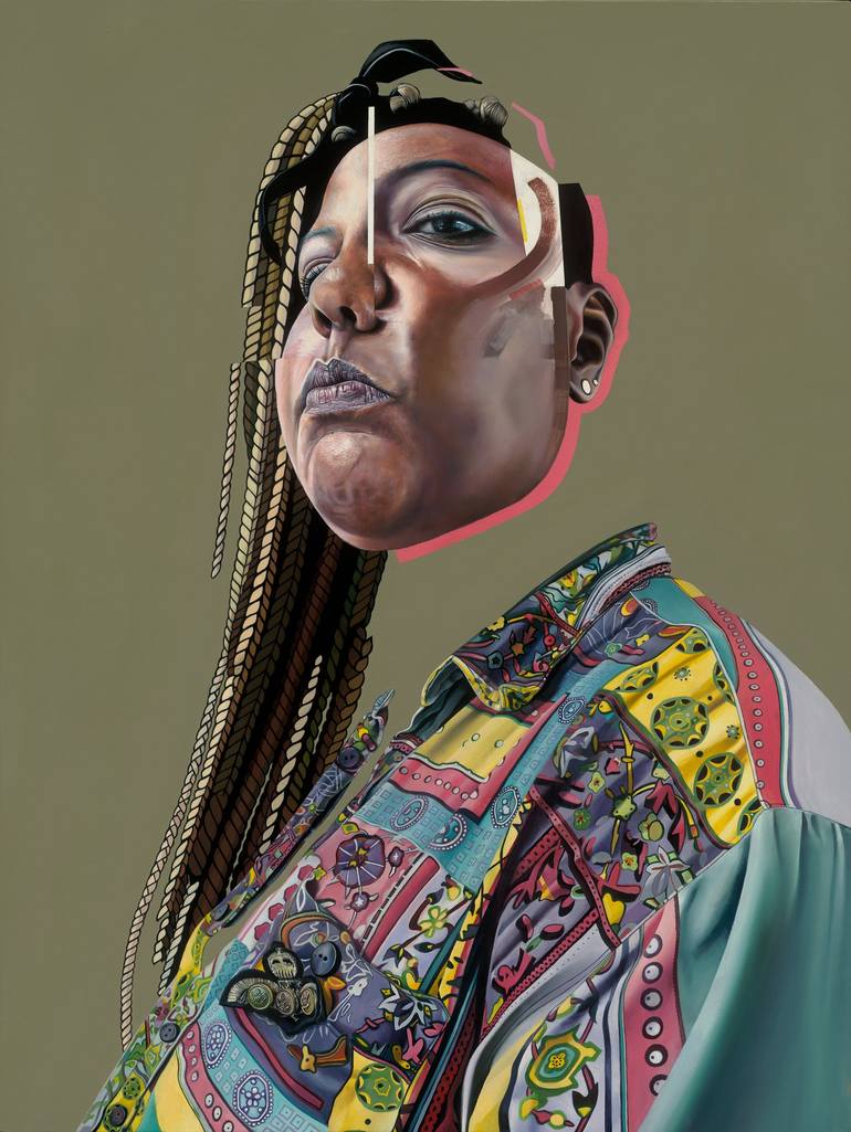
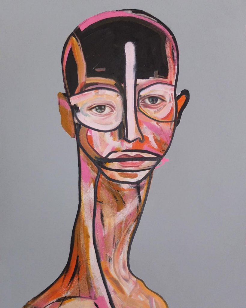
David Booth
I had never saw any of his work until doing this research, It popped rigth out in a google image search. I like the mixed style and the way that even though the faces aren’t complete, or in some cases recognisable as human they convey a range of emotion and interest that that makes you want to look at the whole image rather than just for example the eyes. He has won several awards, and I will certainly be keeping an eye on him and wouldn’t mind attempting something similar with my acrylics when I get some down time.