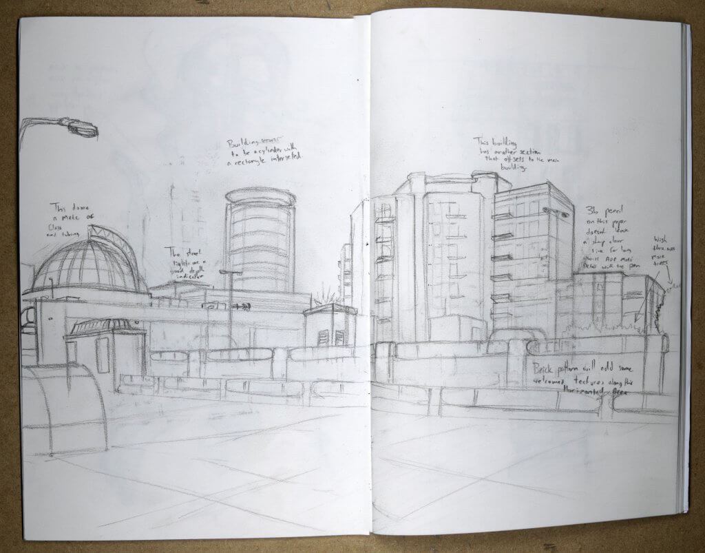
This drawing was also made from a photograph, in fact the same set of photographs I took for my previous drawings. We are still in a lockdown and this area is actually a busy multi story carpark, it did give me a good view point to work from, captuting the tops of the skyline. These buildings are very 70’s looking, the unconventional shapes feel like they they almost could serve as filming locations for something set in the future, like Kubricks clock work orange or Star wars. This is Romford, below that scene is an expanse of retailers, coffee shops and mobile phone repair. Not the most scenic or interesting place to visit or indeed draw. I started out with a sketch as instructed, I learnt a great deal of how the buildings were constructed and gave some thought on how I might apply some texture.
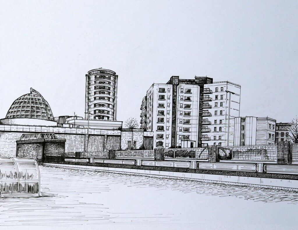
I decided to draw the final image on bristol board, the image looks a little skewed here which I think might be more to do with the photography and the angle I photographed it at, I will try to re photograph this if I end up selecting this as a submission piece.
I Initially didn’t want to use a ruler, keeping it free hand would give it a very different feel , this proved to be problematic, especially in the details, one false move and it really threw off the perspective. I carried on with the ruler and tried to keep the line weights varied.
The weather was very over cast there was little to no shadows, I wanted to add some texture to the drawing to try to stop it being too flat. This made a lot more work, I ended up developing a bit of a system using pen and ruler to help aid the line work, hatching and angling the ruler to cross hatch I would sometimes use a flat line and sometimes a broken line, sometimes i would stop and add in some dotted marks along the edge of the ruler. I could see with a little more practice this could be worked into something quite stylish.
Another view of Romford, this is even more of a star wars set than the last drawing, it even has a metal grid, almost like a rampart.
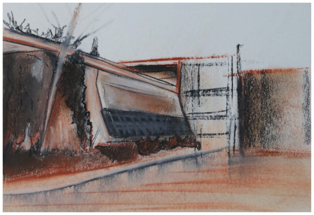
I had two attempts at this exercise, I started out using conte crayons, this quickly turned into a bit of a mess, it maybe wasn’t the best medium for a subject that had a lot of geometric accuracy and small details.
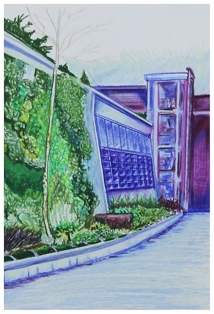
I switched to waxy pencils, I was asked to pick up to three colours, I used green and purple, this almost turned to blue in some instances.
I mapped out my composition with a 2h pencil, very lightly with small indicative marks so I didn’t define any shapes too early on, I wanted to work in blocks of colour rather than linear marks, in the end I used a bit of both, but mainly the blocks prevailed, I thought back to exercise 1 and the two approaches for a similar drawing. I was pleased with the texture I achieved with the foliage, this contrasted the flat surfaces of the buildings.
I tried to create depth with my colour choice, I was hoping the green would advance and the purple hues recede adding depth, It worked to a fashion but maybe a warmer hue such as a yellow/green or an orange would have been more successful.
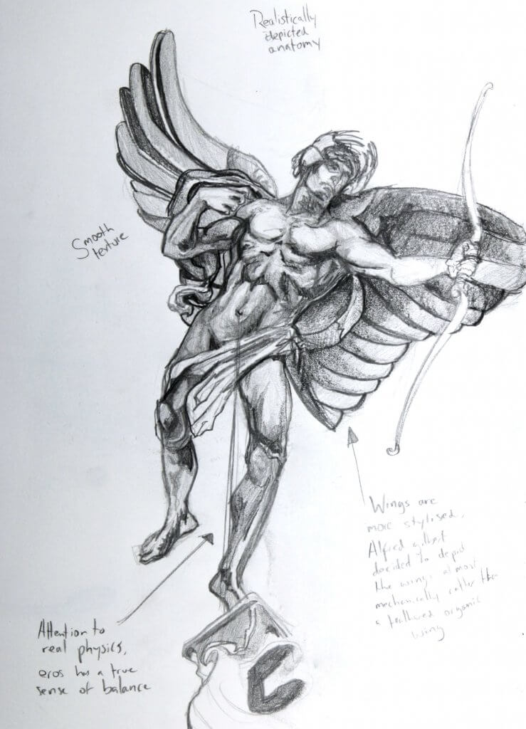
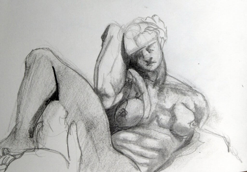
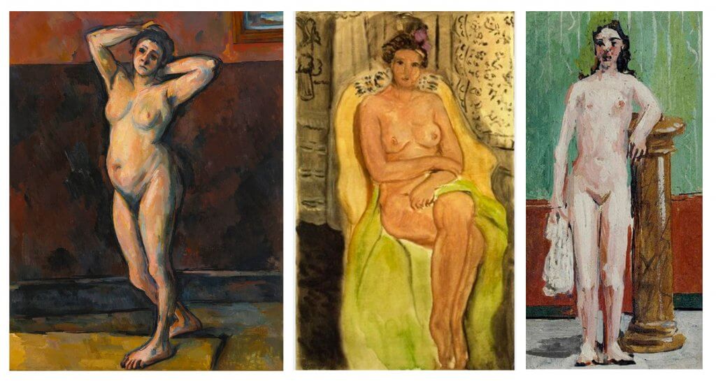
Again Covid has really left me with limited options, I googled to see if there was any local statues, but didn’t have much luck. In the end I decided to find some statues from artists I have admired, Sir Alfred Gilbert, Bernini, and Michalengelo, I also found a really nice statue from a church in Stratford. I noticed part 4 centers around the figure and all the statues I picked all portray anatomy in their own unique way. Some intentionally stylized, some incredibly accurate and even one that breaks convention.
Sir Alfred Gilbert was a sculptor I was introduced to by a tutor at college, I was absolutely knocked back by the level of life that these pieces of bronze had, they was all strong dynamic figures, they looked like they had been peeled from a page in a comic book, I would loved to have seen how Alfred Gilbert would have lent his art to a character such as Super-man, or even a Gothic Batman. The statue of Eros, has a tremendous sense of balance, the gesture in the arm looks like seconds before it was hard and taut, we see the statue micro seconds after he has let his arrow fly into his next love struck target. It was these things I wanted to try to capture, you can see I have the horizontal line tracking down from the naval, this would be the center of gravity, this lines up nicely with the foot firmly planted. The right arm of Eros with tension now released, wrist relaxed offset with the tensed bicep of the bow hand.
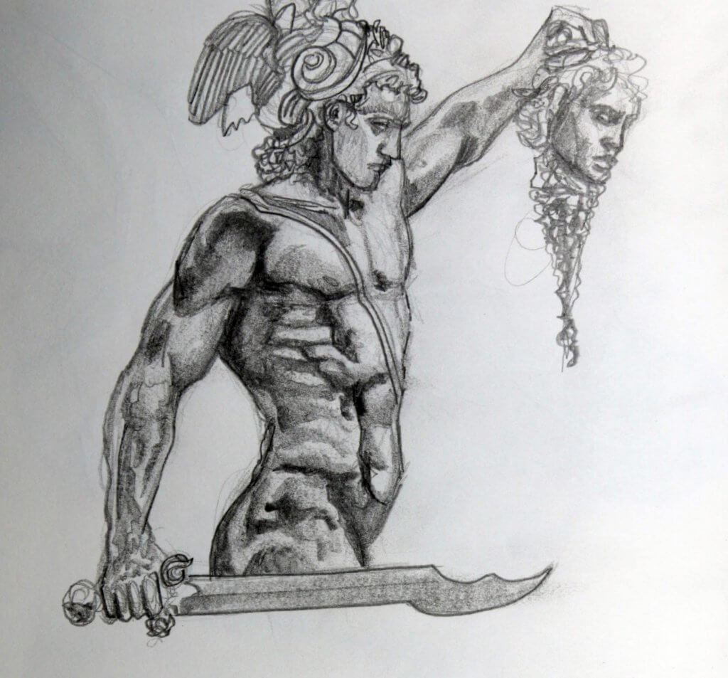
Perseus slaying medusa is another one of Sir Alfred Gilberts works, this is a favorite of mine as the musculature is very nicely done, a real sense of weight and tension can be seen in the arm of Perseus, no doubt Medusa’s head of snakes, still writhing was a challenge to hold steady and aloft.
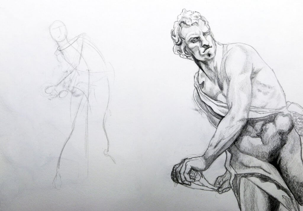
Next is a sketch of the sculpure of David by Bernini. I have to say that Bernini really is one of my favourite sculptors, his work is so sensitive, the poses and depiction of mass, soft and hard and all under the influence of physics, such as gravity and force is just on a different level to anything I’ve ever seen. I would love to see these amazing pieces of marble in person. When you compare this baroque piece vs Michelangelo’s Renaissance version of David you really have to marvel the amount of action and life that Bernini portrayed, this is by definition as I understand the main aesthetic difference between the two periods.
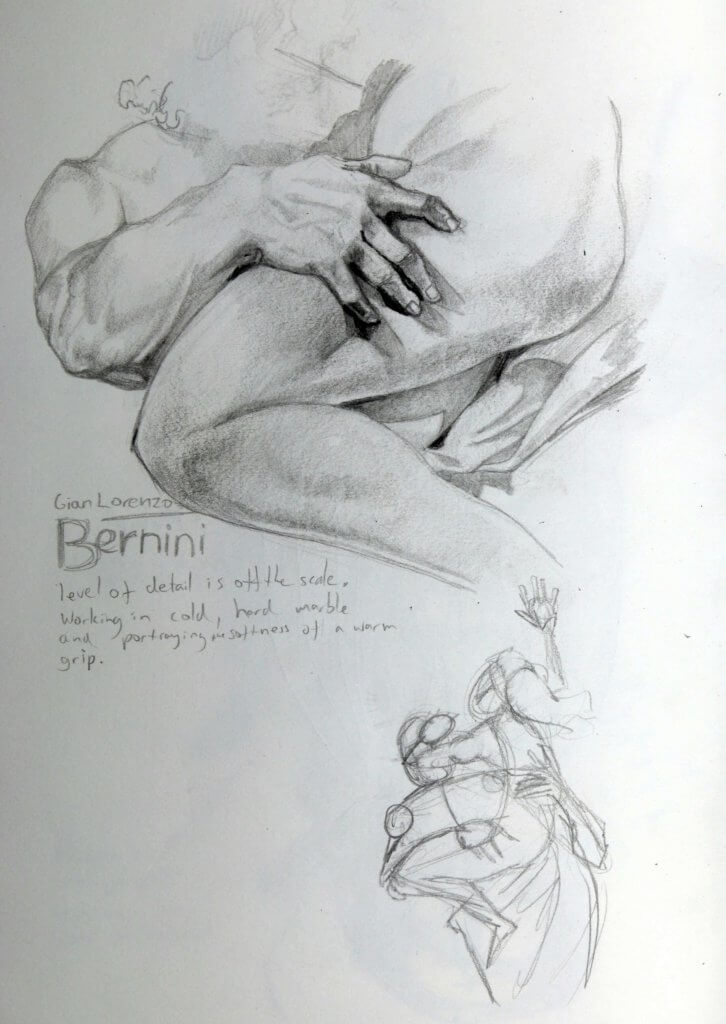
The image below is a detailed drawing of Bernini’s approach to soft sinuous tissue in comparison to a softer almost gelatinous mass. The rigid fingers impress into the soft thigh, his embrace, very physical and tensed, muscles engorged, and rounded. I also included a looser gestural drawing of the whole figure, this shows the forces at work.
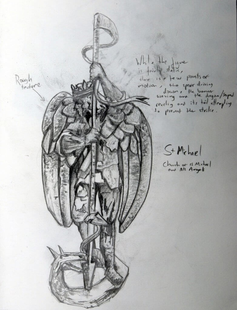
Below is a statue of St Michael, this is on an exterior wall of a church in Stratford, I really loved the way it had stylized anatomy and a really rough texture, the stance is mostly passive, but St Michael is driving downwards a spear into a dragon, this is not a natural pose like we see with the likes of Bernini but a really interesting one all the same.
Finally we have Night by Michelangelo, I am always fascinated by Michelangelo’s depiction of the female form, there are several theories for this, albeit speculative reasons I needn’t go into here, but he had clearly used male models, the male form is apparent in every instance, even the female breast appears to be an after thought, almost affixed after the fact,to a muscular ches. Obviously this isn’t the case as he sculpted in marble and would be planned meticulously. Whilst his female statues don’t portray the female form as accurately as the likes of Bernini they still are fascinating to see, and offer an insight into the artist, his choices and the mystery of why.
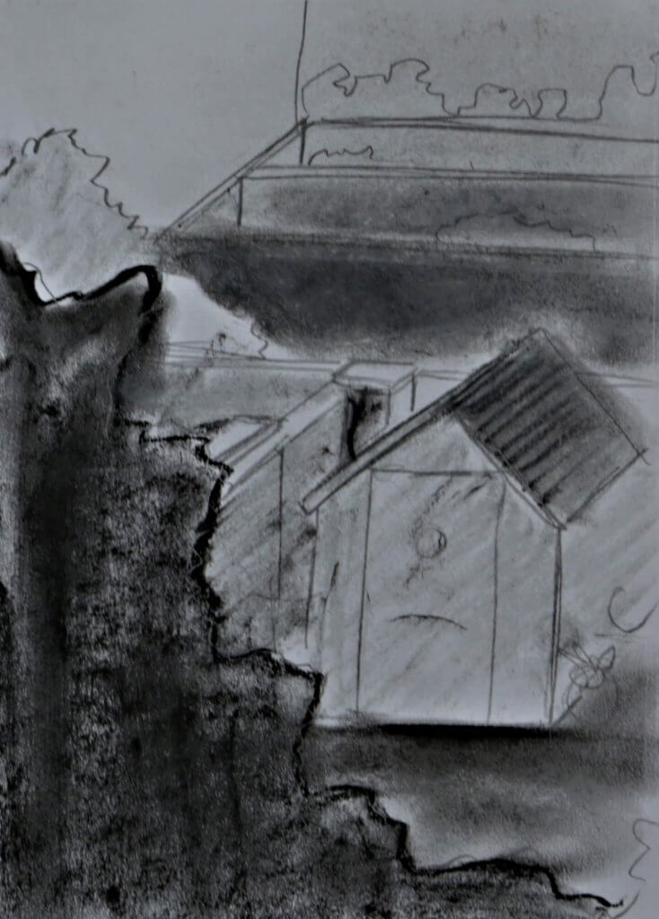
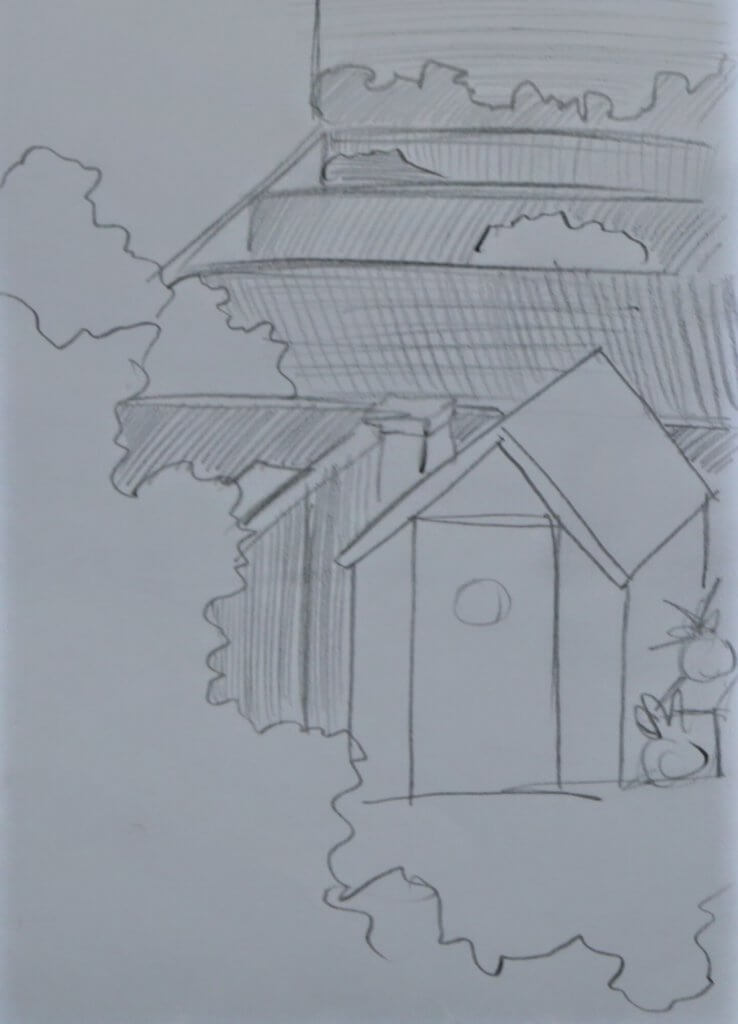
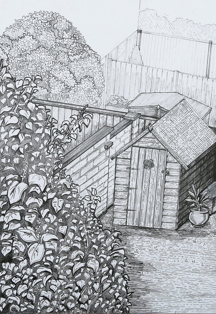
The view from my top window is dull to say the least, I wanted to portray the depth of the rows of gardens and centre it around the tall tree near the window and the small shed at the bottom of the garden.
I penciled in a light composition, trying to get a good understanding of the basic shapes and perspectives.
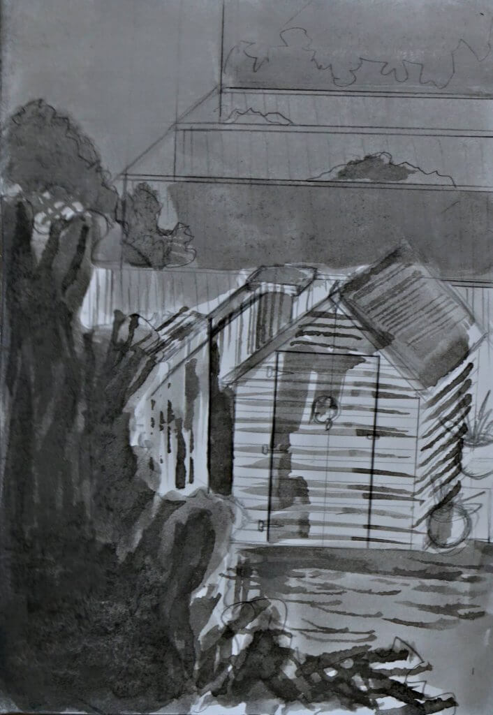
I used the same ruler and pen technique I had started in exercise 2, being careful to progress the drawing whilst retaining a level of control and accuracy, some parts of the drawing after a point felt over worked, I tried to hold back on adding too many lines. The main emphasis of the image was its textures, and the variations of those marks. The image does have a caricature quality to it, almost like a carton approach, whilst this wasn’t my intention I soon embraced this and it did add a sense of fun to an otherwise mundane scene. The materials I used was fineliners, the smallest nib was a 0.05, 0.5 and a 0.7, I wanted to be very strict with where I added the thickest to thinnest lines to help portray atmospheric perspective or at least a line of interest to follow through the image.
Overall I was happy with the outcome, I hadn’t enjoyed this section as much as the other two but I think this section was the one that pushed me past a zone of comfort, and offered me some good lessons and opportunity to experiment.
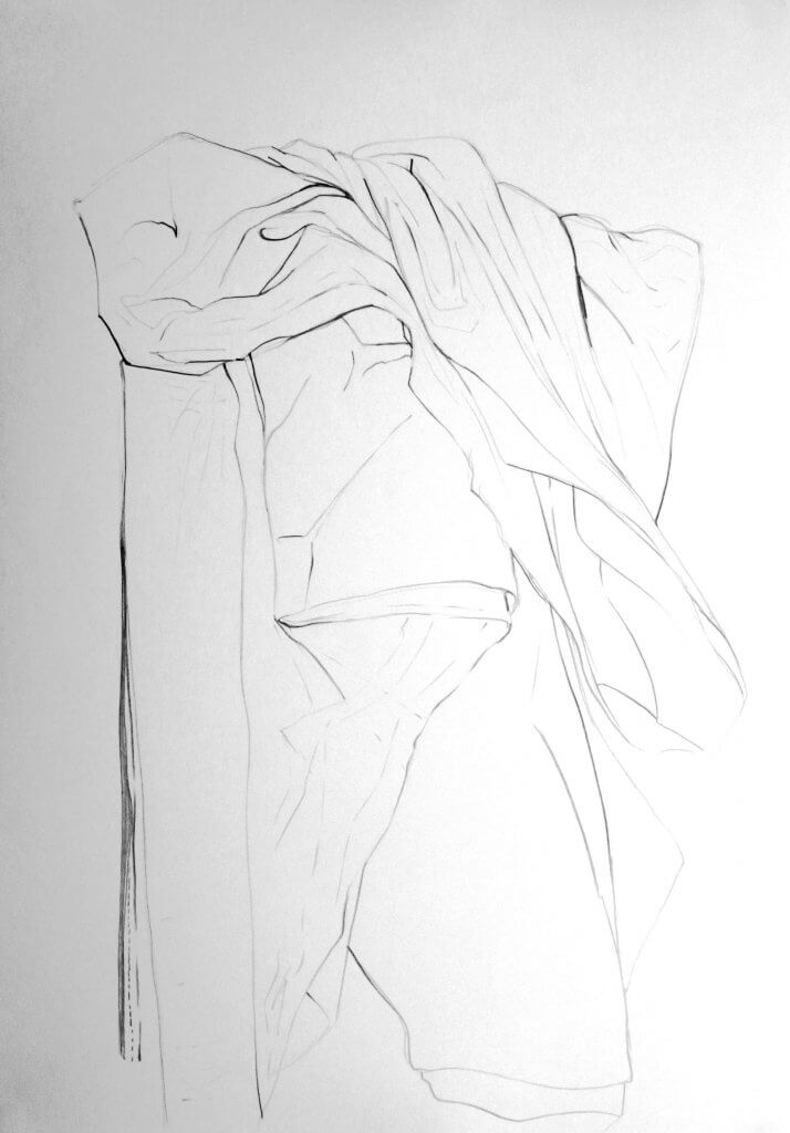
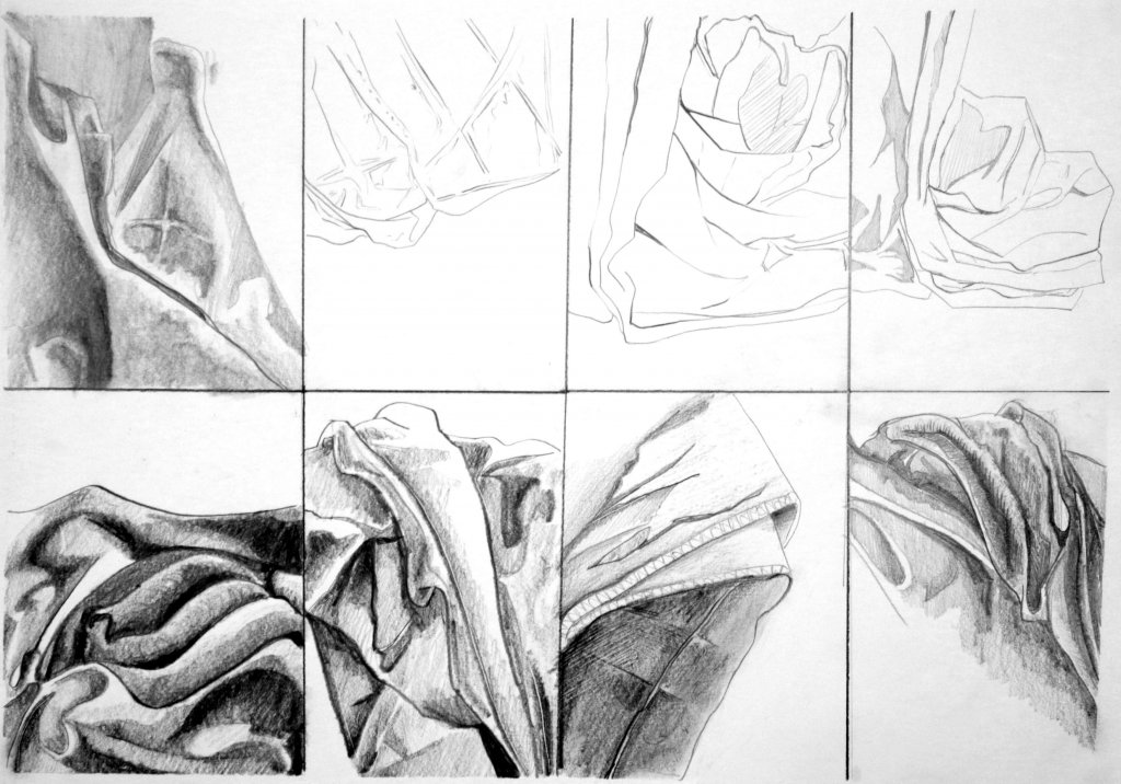
In my opinion fabric is another thing that if drawn incorrectly, looks like a glaring mistake. I think it has a lot to do with physics and the rules that all things ordinarily obey. I tried to suggest deeper folds with, heavier, darker marks. This proved to be quite effective. Observing the shape of the cloth was also important, a fold or crease appears very different to the tube like shapes that material can make. Using line weight was the only way I could think of creating depth without starting to build up areas of hatched lines, I was tempted to do this but restrained and stuck to a purely linear approach.
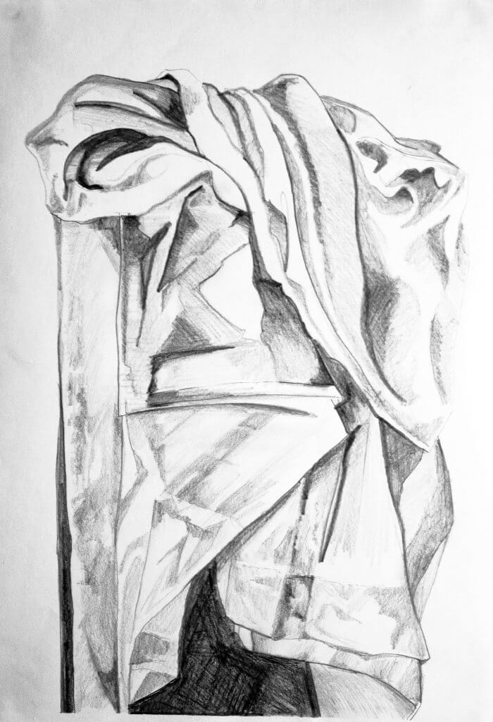
Creating. a tonal study had its own challenges, mainly resisting using line to map out the labyrinth of creases folds and recesses in the folded cloth before me. The depth was a lot easier to describe with a range of tones and gradual variants. I can see how a combination of both would sometimes be necessary to best demonstrate all the possible combinations of creases and folds.
I carried on drawing in detail, I really wanted to try to describe the way the cloth was creased where it had been folded, the material takes on a veiny look, my study below was getting close, all in all I was happy with the study. I felt that the key to this was to study the type of form I was describing as individual components before making a mark, as the cloth is unpredictable and hard to read. A little like map reading in a way, you will often look at the starting point and the destination before setting off, getting an idea of where you will pass through and any noticeable landmarks that may create a detour or change in route.
This exercise called for less detail and more of a gestural approach, describing the way the cloth defines the form underneath. I worked on a sheet of paper roughly a2 size, I wanted to work on a large scale, drawing more from the elbow and throwing my line across the surface in a way that would mimic the clothes characteristics, such as the way it hangs, folds and suspends from the underlying shapes.
As detail wasn’t the priority I decided to use my 5.6mm mechanical pencil, its a lovely, heavy hunk of graphite with a comfortable feel, it can be sharpened to a point with a suitable sharpener, in this case (and most cases) I used it quite dull, I feel it promotes rapid strokes and is good for capturing fluid gestures etc.
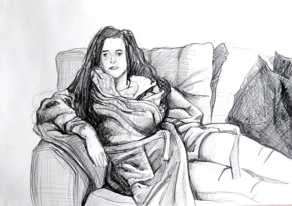
I chose a fairly straight on pose, I made the subject (my partner Kathleen) as comfortable as possible then adjusted some of the folds and hanging material of the dressing gown over her legs and off the chair, I was hoping that the curve of the fabric would better describe the form beneath. With speed and great energy I worked over the entire drawing, planning and marking key points in my composition, and once everything was in place, happy with my proportions and arrangement, I started to work over the drawing with more intensity, following the folds
of the dressing gown. Trying to repeat the actions of the previous exercise, I found myself using harder, darker and thicker marks to describe the creases origin until it fades off or diverged into a new fold. Using tone as well as line weight to suggest depth was quite effective. Drawing the figure underneath the cloth also introduced some other types of creases in fabric, most notably where cloth was under stress, such as around the pocket area, the fabric pulling upwards or towards a point of contortion, had a very different appearance to a crease that was suspended. I was happy with the outcome, I haven’t really drawn many figures from life since college, there I was studied the male and female nude and it really was quite evocative. When the world returns back to a state of normality and time permitting I would like to find some life drawings courses in my local area.
I started watching the video series “Ways of seeing” the information in this documentary series was excellent and the passion with which it is conveyed is admirable, I then went on to research across the internet.
I wanted to look into several of the key factors that I would suspect would be potential catalysts and possible reasons as to why the nude figures portrayal in art had changed over time, the main factors that spring to mind would be;
censorship of art considered to be indecorous
trends and style, starting anew and also keeping consistent with the artists contemporaries
Individual beliefs and values, theologically, morally and sexual
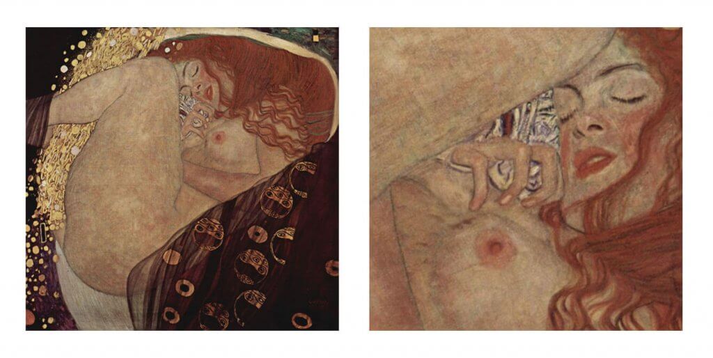
Censorship The section about context in the “ways of seeing” was very enlightening, isolating sections of an artwork can easily lead to a complete change of narrative or intention, in the case of the nude this kind of distortion of the artists intent could change the entire emphasis and meaning, below is Danäe by Gustav Klimt, the original image depicts a character from greek mythology, the narrative is that the father of Danäe imprisoned her in a tower to keep her safe from the attention of men, Zeus is actually impregnating her with a shower of golden coins. When we crop the image and emphasise our attention on the breast, the facial expression and the gesturing hand it takes on more of an erotic tone. It removes the narrative entirely, the only thing connecting the story to the art being the title of the piece. Could a misunderstood message or a misplaced focus be responsible for historical censorship of the nude, this seems quite possible.
I have changed the emphasis entirely of this image, just by cropping and rotating the image. the original pose of the sleeping figure is changed into something carnal.
Another reason a painting could be censored is interpreting the narrative based on the censors beliefs. After all for some cultures, nudity isn’t lewd or inappropriate, for example the unclothed figure has been used as a sign of fertility in ancient artworks, the Mayans and Egyptians civilisation centered around the power of fertility and the nude was featured heavily across art disciplines.
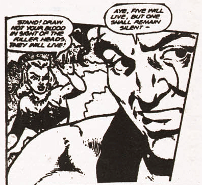
One censors misperception or indeed a manipulation of a perception is all it takes to make a big change, this isn’t reserved for antiquated beliefs or mentalities, while a slight divergence from nudes depicted in art, there is a relevant story about nudes in comic books that proves that one mans opinion can bring on direct change. In 1954 a psychiatrist named Frederick Wertham wrote a book called the Seduction of the Innocent, this book was a warning to the parents of children. According to his research, comics were a bad influence on children, and would lead to delinquency, one of his key pieces of “evidence” was an indecent image, he alleged a partial nude had been placed subliminally and with intent to corrupt young minds. The image depicted a male shoulder, the darkened area of shadow in the deltoid muscle he felt displayed the pubic area of a woman and was intended to be obscene. His campaign against comics brought on the comic book code and in 2010 he was found to have falsified his findings and data to prove his own speculation, in 2011 the comics code had been abandoned. Frederick Wertham was able to manipulate an audience into thinking the American comic book was a damaging influence on the young reader, and that was only 67 years ago. I imagine it being a lot easier historically for this kind of censorship to be introduced, religion alone having a stronger presence and influence, stating that showing nudity is sinful or inappropriate.
just an arm or ‘armful?
Comic book code displayed on all comics from the 1954 up until 2011.
The most well known form of religious censorship in art is the “fig leaf” campaign. The fig leaf campaign is most commonly thought to start with Michelangelo’s David (although some of the research suggested this is just the most well known example of the fig leaf censorship), the 17 foot tall statue depicting the biblical character just before or maybe after defeating the giant Goliath, is nude. The bible offers explanation to why David is nude, he was dressed in armour before battle and decides that he doesn’t want the armour as he is not used to them. The catholic church decided that “figures shall not be painted or adorned with a beauty exciting…lust.” this resulted in works of art that featured nudity being covered and censored by draped cloth and fig leaves. David was adorned with a garland of bronzed leaves, this was contrary to the description in the bible and didn’t really fit the beauty exciting…lust criteria, in this instance it was the censors own subjective understanding that brought on the change to the previously accepted nude. The leaves remained for half a century until opinions changed.
Trends and style
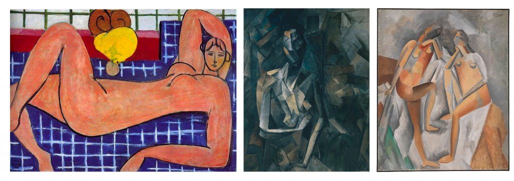
The many periods of art all depict the nude in different ways, for example, the female nude in medieval art is often portrayed as having a rounded stomach, sometimes an almost pregnant looking appearance, or the abstraction of the figure as seen in cubism, the still and static female nude during the renaissance period is wholly different to the the sensual and dramatic portrayal of the baroque period. Its easy to imagine that, other artists would be influenced and study the works of art by their influencers, Picasso and Mattise were both inspired by the works of Cezanne, and were known for their sense of rivalry, eventually their work would start to be very different but their earlier works had a similar approach, below is a comparison of a Painting (left) by Cezzane painted in 1898-99, a Matisse painted in 1920 (center) and a Picasso also from 1920 (right) while they are all clearly painted by three different artists, you can see a visual connection.
Cezanne (left) Matisse (center) Picasso (right)
Mattise and Picasso’s style, I imagine as a result of their well documented rivalry did change into very different approaches, Mattise using the Fauvism style a strong, vibrant, and flat aesthetic vs Picasso’s Cubist approach, which aimed to capture a subjects form at a range of viewpoints, the very opposite of flat. Below is an example.
Art movements do follow a set of ideas and style which in turn dictate how the subjects are presented, the nude figure is no exception.
Individual beliefs and values
Nudity in art doesn’t necessarily suggest sexuality, The renascence artists seemed to prefer to show the nude form not to convey lust in any form but as a study of anatomy, after all these were usually religious pieces and the subjects the art focused on were not always of that nature. Baroque art shows us a more dramatic nude, but again, usually had religious content.
There have been many artists that have used sexuality as their muse, the ones that stood out during my research were Gustav Klimt, Egon Schiele and Lucian Freud. Egon Schiele had an amazing and unique sense of style and focused on nudes of both genders, his art is raw and in some cases quite graphic, and sexually explicit, Schiele was a protege of Gustav Klimt, Klimt’s work also showed quite a lot of sexuality, particularly his sketches. the sketches are quite far removed form his painted works, his paintings are characterised by his use of pattern, the sketches are quite sexual in nature, particularly from his choice of pose.
Lucian freud also shows us a graphic nude, although quite differently to Schiele ( I did read that Schiele was an influence), less sexuality seems to be on display, we are shown in his male nude studies, great detail and realism depicting just how ugly and grotesque a male figure can be, as the grandson of Psychoanalyst Sigmund Freud you can imagine the work is intended to be quite cerebral and jarring, maybe even as the viewer uncomfortable.
I mentioned this before in one of my previous exercises about statues, Michelangelo’s representation of the nude female he is apparently using male models. There seems to be no way of knowing exactly why, I have read several different theories, one was that Michelangelo’s own sexuality or maybe even a lack of it meant he never saw the female form, another theory was that he was incredibly religious and would not look at the female form, living for the catholic church in celibacy. It has also been suggested that female models were hard to come by. Michelangelo was not unique in this case, other Renaissance artists seem to have used male models for female studies, nude or clothed, Raphael’s St Catherine of Alexandria was based on a male model, while not as immediately apparent as Michelangelo’s sculpture “night” this could mean Raphael was familiar with the characteristics of a female, and how best to adjust the male to female characteristics to portray the gender. Donatello, was said to have been homosexual and was quite obvious about this, despite what the catholic church would say, his version of David is now considered to be a work of homoeroticsim, a google search brings up quite a few articles on this. It is quite hard to find which one, if any applies, wether sexuality, beliefs or risk of offending the Catholic church, who was commissioning the artwork at the times was the contributing factor of the artists of the Renaissance periods choice of model.
My time spent researching the changing nude has probably brought up more questions than I ever imagined and certainly more I have the knowledge to answer without more extensive research. Above are three broad reasons that I imagine are all valid contributors in the evolution of the nude in art, I’m sure there are many more. Importantly for me, I think the biggest message I have taken from the research is context, and how it reinforces the choices of the artists, and what it means to the overall experience or message if it is removed, corrupted or even unintentionally changed.
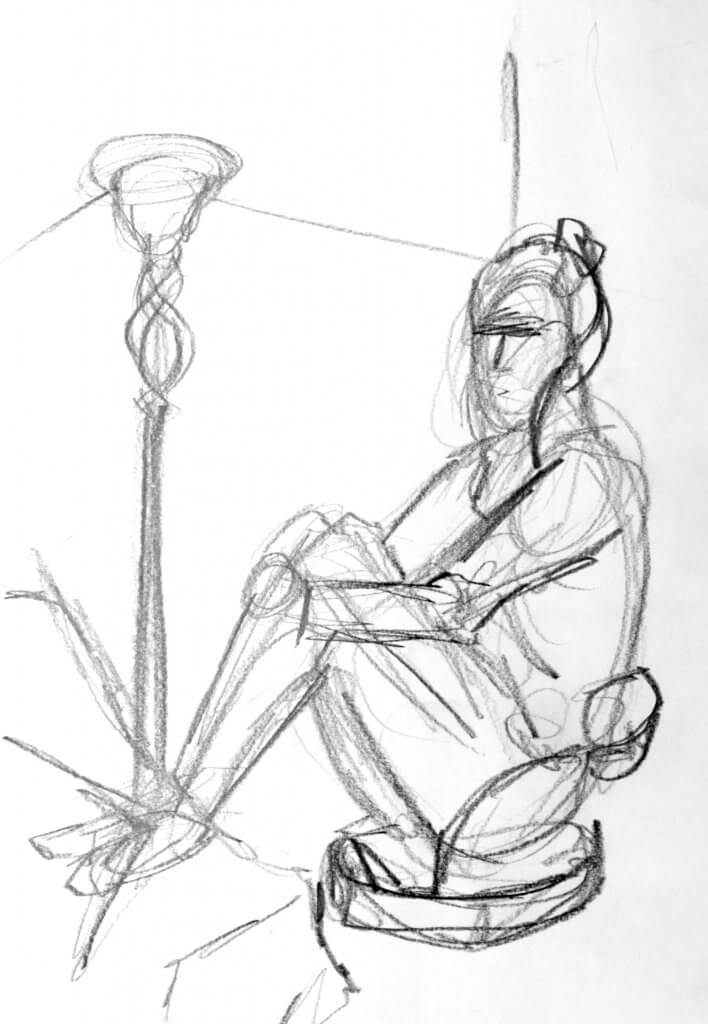
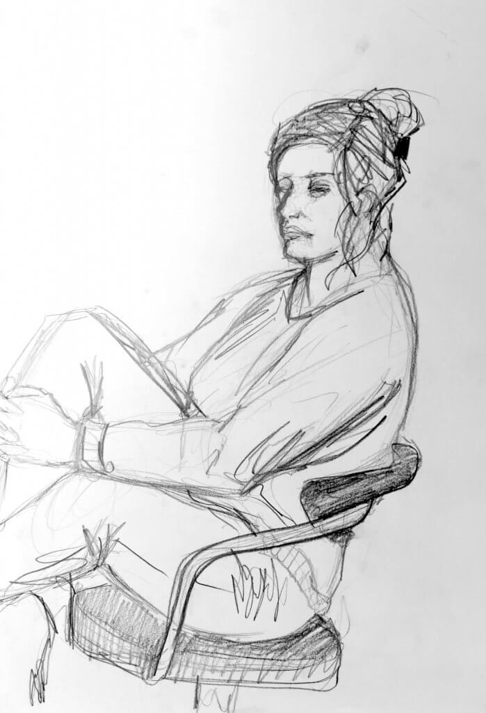
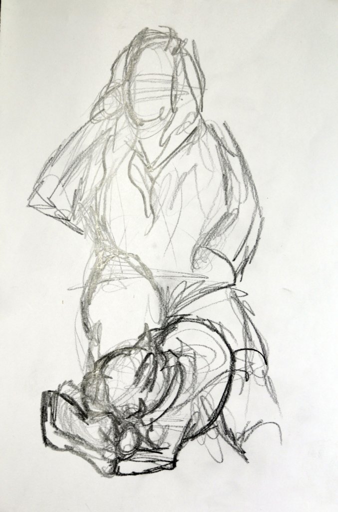
This exercise called for a series of quick sketches based on a seated model. the first instruction was to familiarise myself with the pose by drawing some 2 minute sketches. I worked with my large graphite pencil, I am increasingly leaning towards this tool for quick studies, preliminary sketches and just to capture some energy before moving on to detail. I tend to do the exact opposite of what the exercise text suggests, I don’t start from the middle but work more gesturally, I may put a curve in to suggest the forward arching torso or a bending hip, I then normally mark out my proportions for the head, and work in the rest of the gestures for the other parts of the body. I tried to change my approach to working from the middle but it was quite tricky to break my habit, I will try to force this more in my upcoming sessions, it may bring on some positive changes.
I outlined the gesture with repeated marks, trying to feel out the form and the tension points keeping the pose in one solid mass, i could see there was tension in the arms as they pull the back towards the tightly gripped hands, the pulling force opposite the arched back was really what was going to sell this image and its representation of the pose.
Pre sketch 1
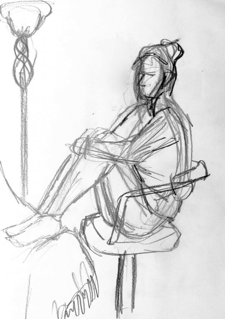
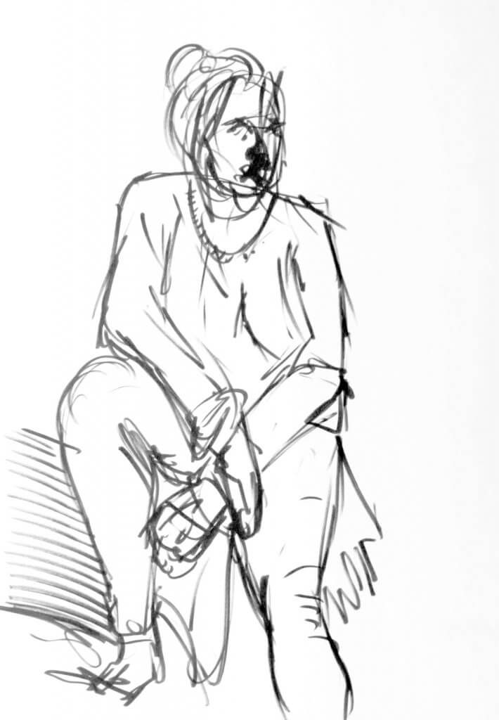
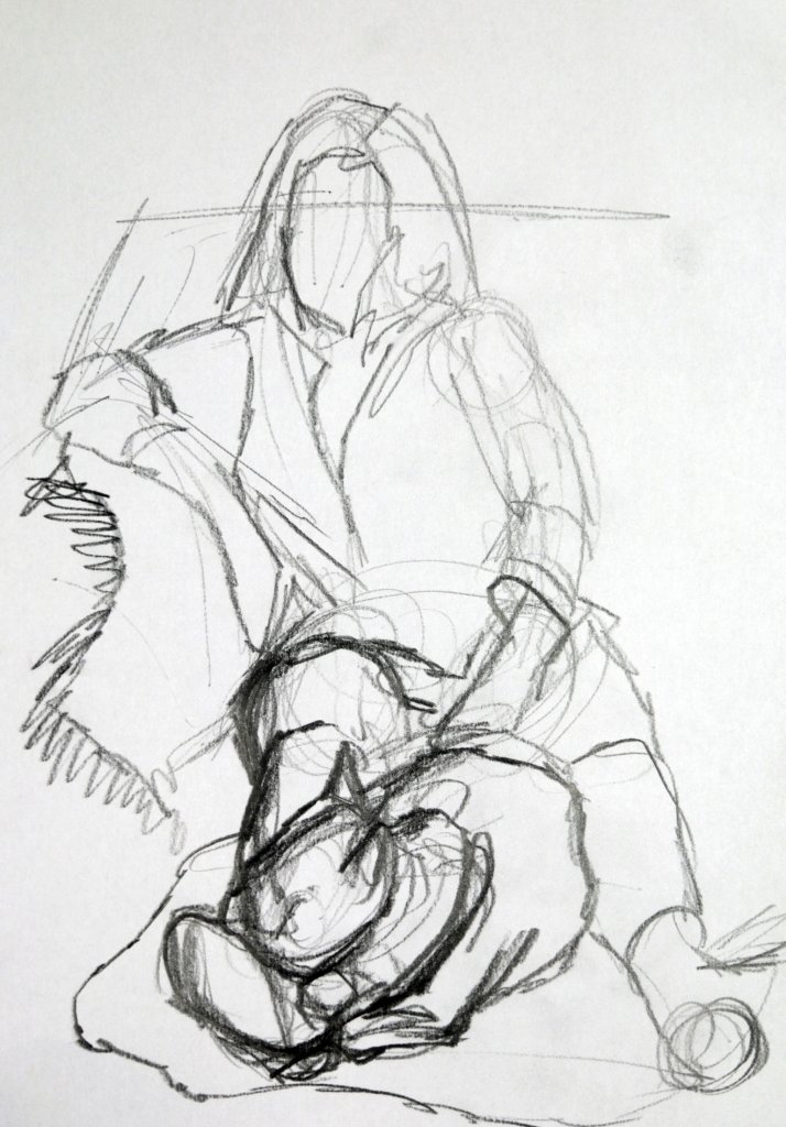
I remember my first mark on this sketch was actually a quick line to suggest the backs curvature and then an upward mark from the ankle to the knee, this first sketch while using more exploratory lines offers less impetus, the pose seems passive and relaxed, indeed the model did move slightly between the two pre sketches but i wont use that as an excuse, I want to be more mindful of the weight and direction of my lines, especially where a point of tension, or stress is involved, it stands to reason that the energy used in making my mark, will lend itself to the drawing.
Pre sketch 2
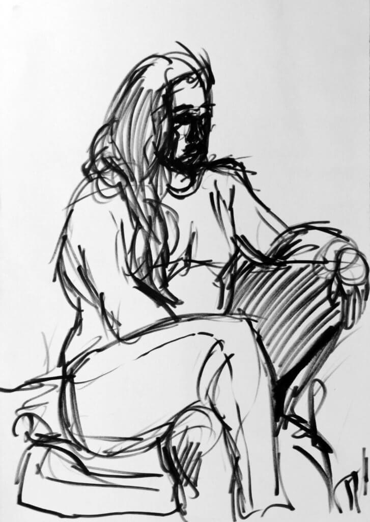
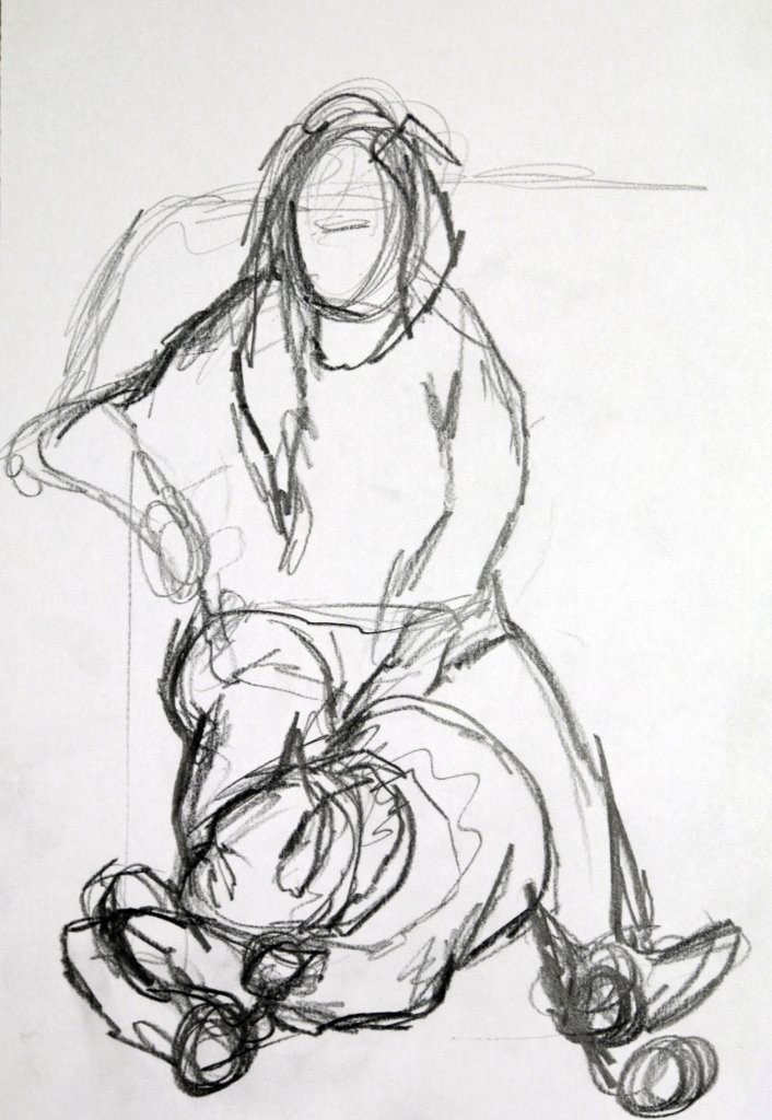
This sketch seemed to have less marks than the first, I feel it also has more information, the stretched material at the points of stress seem to offer an extra layer of tension in the pose. This could be that I have entered the correct mindset to be analytical of my subject or it could even mean that going through the motions once I have a greater understanding of the pose. I do tend to work my drawing from a sketch to refined sketch to finished piece, getting into the habit of making these preliminary sketches seemed to be most fruitful and should be incorporated more into my workflow.
10 minute drawing 1
I did this larger sketch with the thick graphite pencil, again feeling the gesture and form with quick marks. it is in fact made up of two layers, a lighter tentative under drawing and then thicker strokes.
10 minute drawing 2
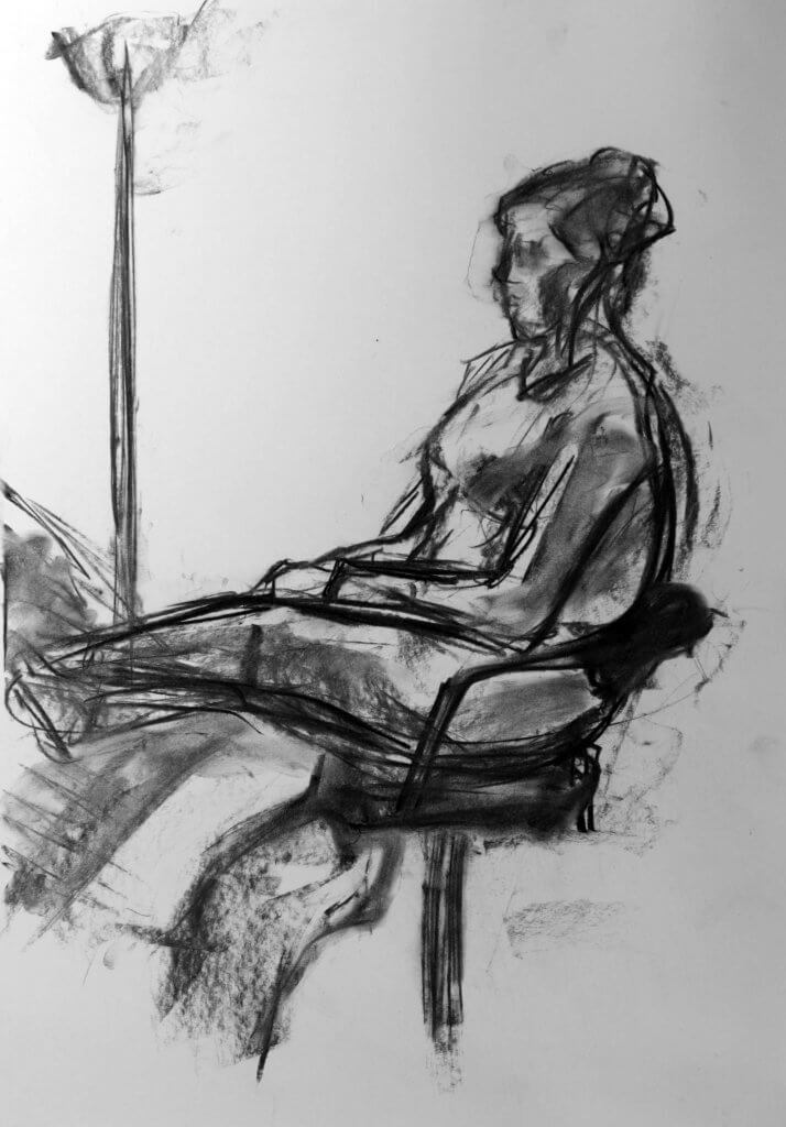
The second drawing I decided to use charcoal sticks, selecting quite a large short stick, as I wanted to deliver bolder marks with blocks of tone, the smallest lines accomplished with a flat edge. I did quite enjoy using charcoal, I don’t often use it because it is messy and cumbersome, it always looks very energetic and appealing, and seemed to fit the idea of a quick study, so seemed a suitable choice for this exercise.
I was also asked to make some other sketches with slightly adjusted poses. i wanted to try to do these with a brush pen, I suspected it would offer a good range of line weight, would be permanent and force me to correct the drawing without erasing.
Again I enjoyed the impulsive feeling it added to the drawing, I did several of these sketches, and stuck with the brush pen, it was very liberating freely throwing lines over the drawing adjusting my pressure from hard to slight, I had a lot of fun. there was plenty of flaws in these sketches and I didn’t mind at all, they wasn’t supposed to be refined or finished, but as an exercise I felt they had served their purpose. In fact I think I some of these were indeed my favourite of the exercise.
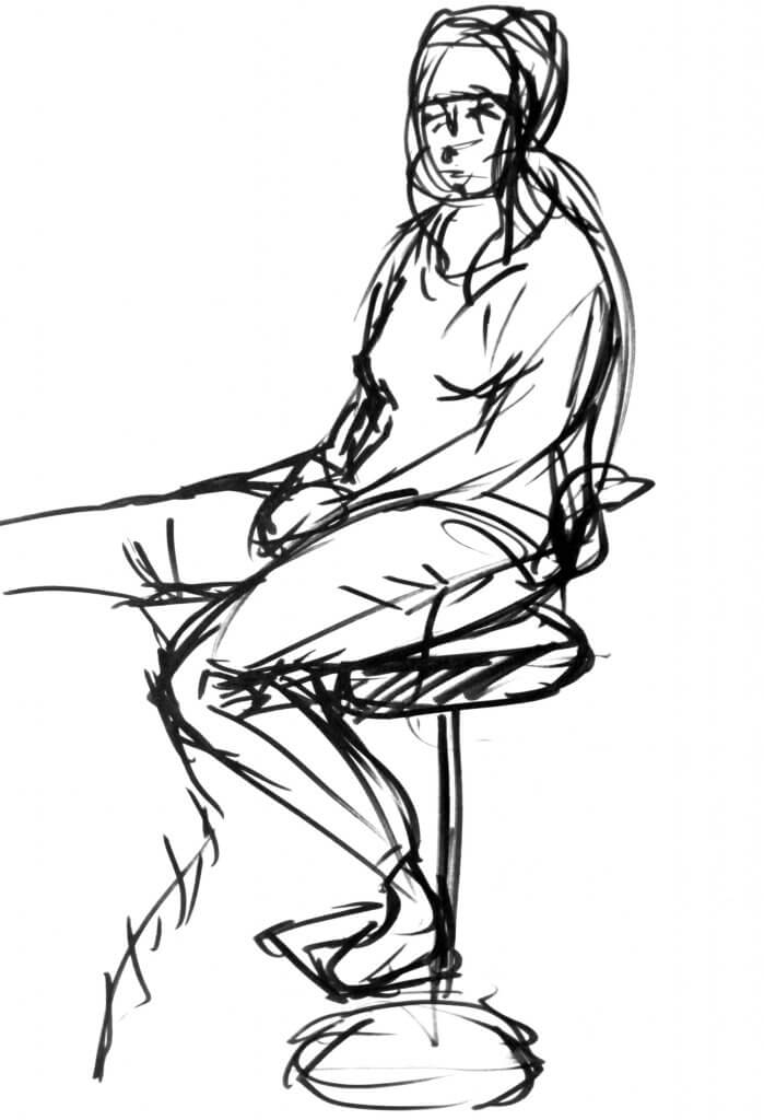
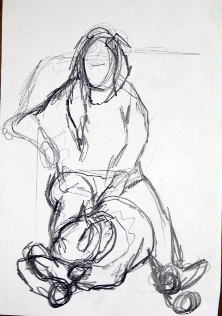
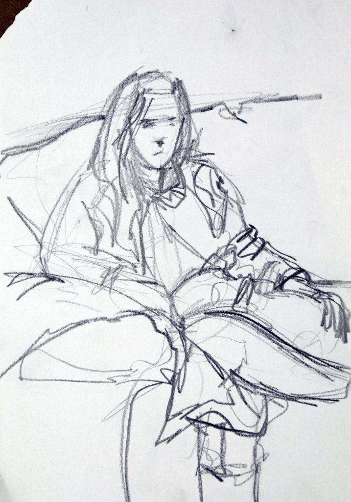
This was by far the most tedious exercise, I wanted to get a sense of perspective in the figure, its one of the skills I would like to work on, I find it hard as the slightest mistake either way to long or short, small or large and it throws the drawing off. I tried, and I tried and tried some more. Even our dog Hugo was bored half way through and decided to sit in his bed. I tied making adjustments to the pose, I couldn’t get the length and sizes for the lower half right, I lifted the subjects leg up hoping to bridge the gap but no luck, eventually I got there I feel. I was sick of the pose and it didn’t seem, to be working, I didn’t let it beat me though, I changed both the pose and position and carried on afresh.
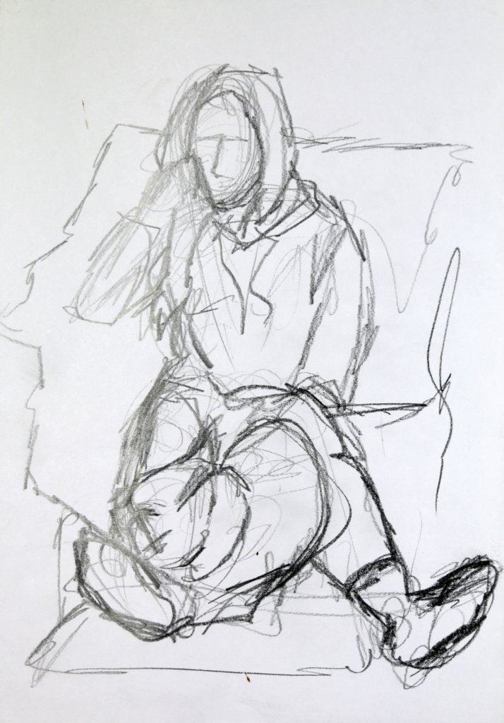
My alternative pose seemed to be a bit more candid and closer to the subject, with that in mind I was more than happy to change. Sometimes if things aren’t working it is best to just start again rather than make do with something that is off. After all its these events that teach us some of our most revealing lessons.
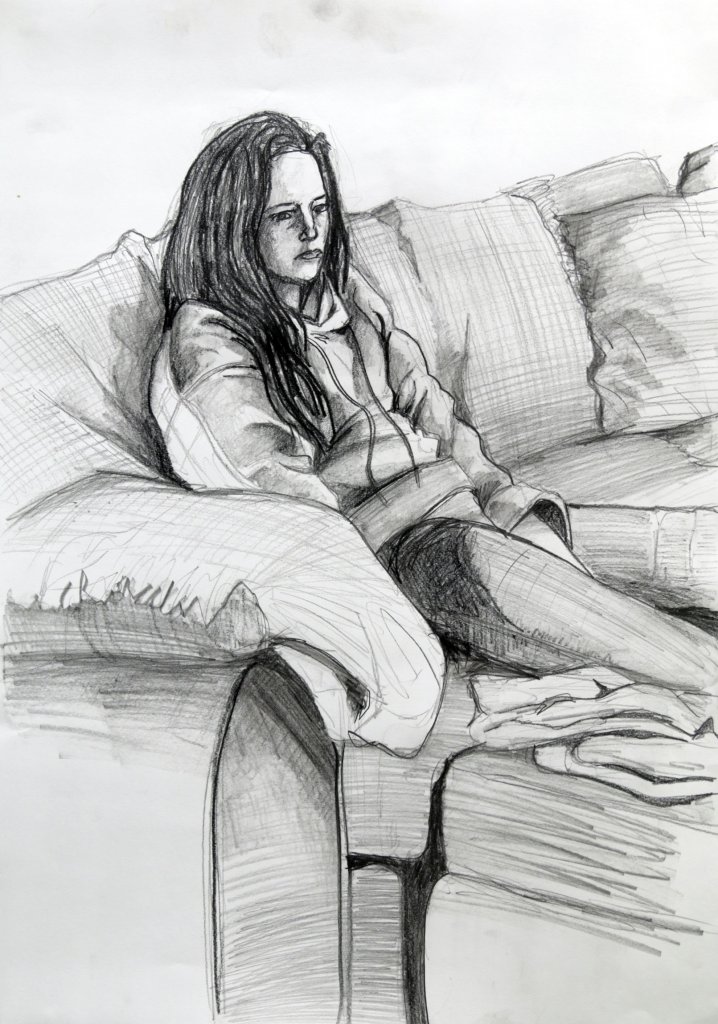
I was happy with my final image, Hugo had gone to take inventory of his toys and hidden dog treats by the time I started the drawing, I was tempted to add him in from memory but as a lot of the figure was obscured I decided to use the remaining forms to describe the slumped and relaxed pose.
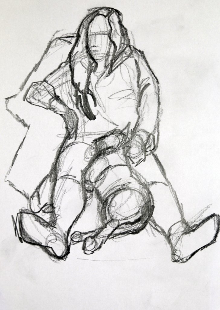
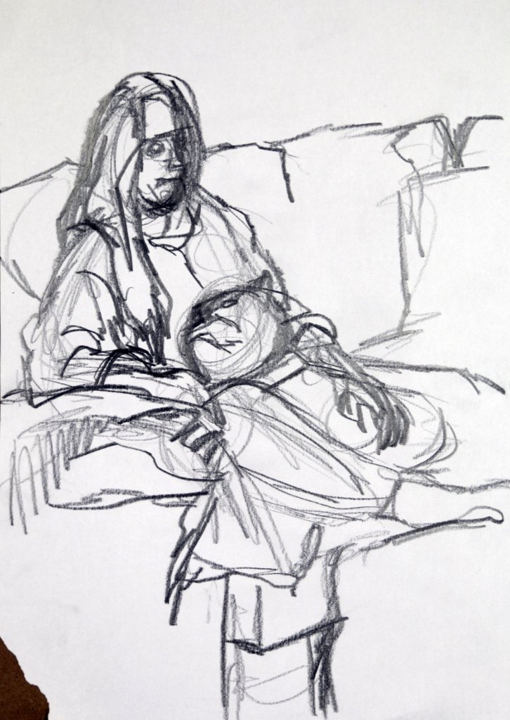
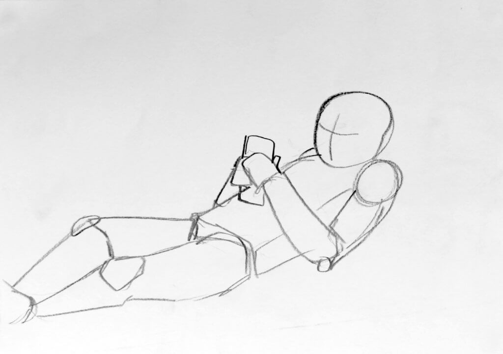
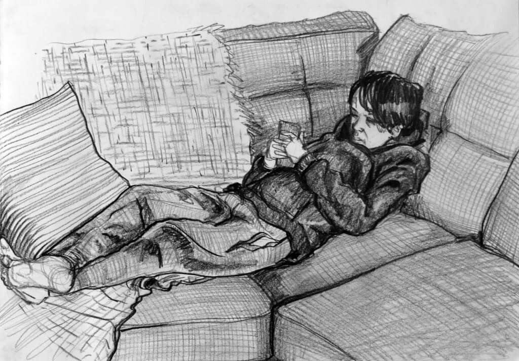
I managed to acquire my stepson Mason to sit for this sketch, the caveat to this was he wanted to lay down and watch a seemingly endless stream of mind numbing drivel on TikTok, It didn’t seem to be a bad way to get him to sit still for a duration so I agreed to his terms, his diplomacy in his debate club seems to be paying off. I completed three drawings for this exercise, the first two being preliminary drawings, this was a great way of understanding the pose and the position of the body. The angle of the head the arms relaxed over the trunk and the legs crossing over and locking at the feet, the second drawing was all of the above but with more of an emphasis on the composition and atmosphere.
Sketch 1
Basic shapes and their relation to one another, I was careful to try consider the weight and downward force that came from the reclined pose.
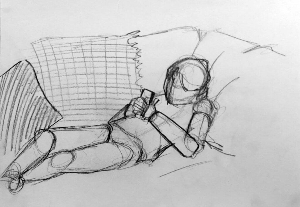
Sketch 2
More background and interaction with the soft furnishings helped to describe the weight and mass from the subject as he absorbs some annoying visuals and grating sounds. This was also a good lesson for me to remain focused throughout polluting distractions.
Final drawing
With the form explored, understood and committed to muscle memory, I selected a larger sheet of paper around A3 size, I followed my normal process and selected my 5.6mm mechanical pencil, I am aware that this is almost becoming a crutch to lean on, it seems to be working so while I am reluctant to change things up I will try to change my process in the spirit of experiment. I loosely and lightly outlined the forms onto the page, I am conscious to not make the pose mechanical or too rigid, I introduce the background at this step too as this will be directly affected by the model, if the background was a lamp or a bookcase for example I would probably imply it is there on the sketch and work that up once my anatomy seems successful. This drawing needs to have weight and the sofa needs to show that, it needs to wrap, distort and change its shape to follow the subjects form. The hatched lines on the material added to the compression effect on the soft material.
Using both linear and tonal value to describe the influence each form has on one another. The exercise notes did suggest that the model be prepared to sit for an hour, we didn’t sit down for more than 35-40 minutes in total including a toilet break half way through the final drawing, luckily I had all the information needed to pick up the pose where we left off. I don’t know how I would have used the extra 20 or so minutes, I feel I had enough time, I may have spent the “free” time to work into the sofa some more, really describing the forms with a little more intensity, although this may have detracted from the pose overall so I am not too concerned.