
This exercise asked me to design a series of book covers for the work of H.G . Wells, I am well aware of his work and have seen many of his stories as films, often with an updated more contemporary setting, such as the Tom Cruise war of the worlds, I didn’t want those tom influence my choices too much, I will try to rely on descriptions from the actual texts rather than the interpretation of others.
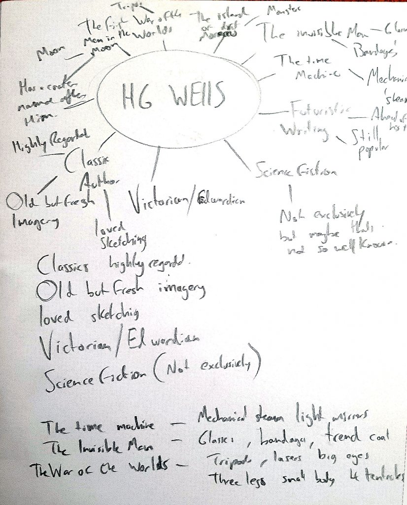
I started off with a mind map/spider diagram to get a feel for H.G. Wells, from that I made some key observations.
- Highly regarded author
- Classics
- I would like to use old but fresh imagery
- Victorian- Edwardian time period
- More known for science fiction but not exclusively
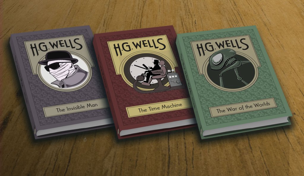
As he was a highly regarded author and this was to be a series I imagined his name would be more prominent than a standard novel. I didn’t want it to be too large and domineering, but I did think this could be a nice way to have a thread running through the whole book series.
As it was a classic book series I wanted some sort of prestige and sophistication to the books. As the author was alive during Victorian -Edwardian period I thought a pattern and some type reminisce of the art nouveau would be a good place to explore, partnered with a flat almost minimal approach. This book series would need to be specific to the author and not they individual style of his work as while I knew him more for science fiction the exercise literature did state that this genre was not the only one he explored.
I used pintrest to research some visuals, particularly around minimal book covers, old book cover designs and the patterns of William Morris.
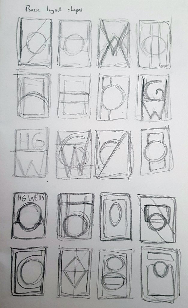
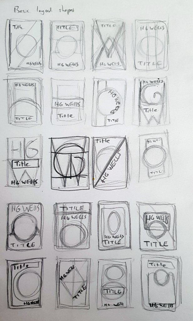
* * *As this was to be a series I wanted to explore some interesting, structured layouts. I tried shapes and even making some from the authors initials.
Once I had a page of layouts I looked for ways to add the key areas, the authors name, book title and the imagery. One shape lent itself nicely to shape some text, and another felt like it had a strong solid structure, I ended up combing elements from those two to make the final layout.
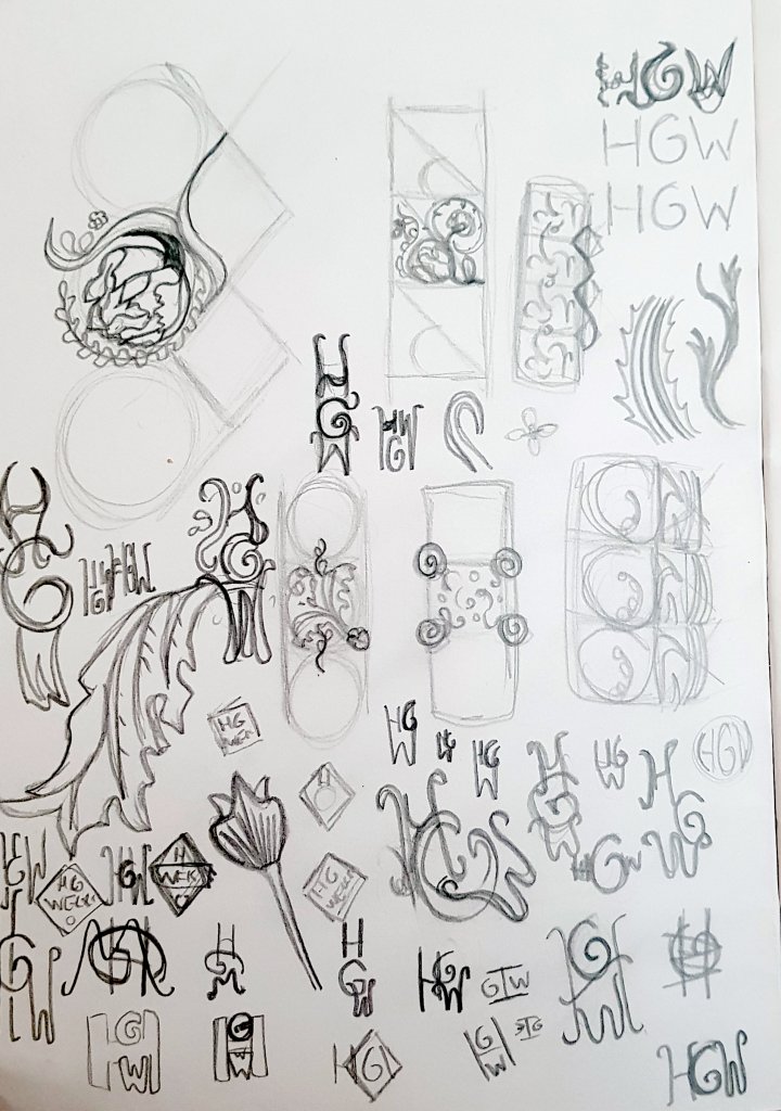
I wanted to make my own tiled pattern, I liked the idea of using leaves and the authors initials to make a fine repeating pattern to be used in the non active areas of the cover, I was hoping this would provide a “frame” for the key areas, add texture and some style with a victorian feel. I also found a font in adobe fonts that would fit the theme nicely.
I made the layout in illustrator, I googled popular book sizes and worked with a 6″ x 9″ format, once I was happy with the layout I made the repeating pattern, scaled it to size and set it to be transparent so the underlying colour would tint it, I wanted this template to be easy to edit for the other books in the range so I put some thought in the most efficient way to do that, I also added all the titles in and sized them together, this way I was sure I wouldn’t hit any obstacles later on with type size or layout.
Imagery
I made some loose sketches for the images I wanted to add to the circular window in the centre of the books, I googled the descriptions of the key items from the books such as the tripods, the time machine and the invisible man. I tried to keep my focus on these descriptions rather than the visual information I had gathered from films. I did have some reference imagery for a barbers chair but apart from that i managed to get what I had in my head into the sketches.
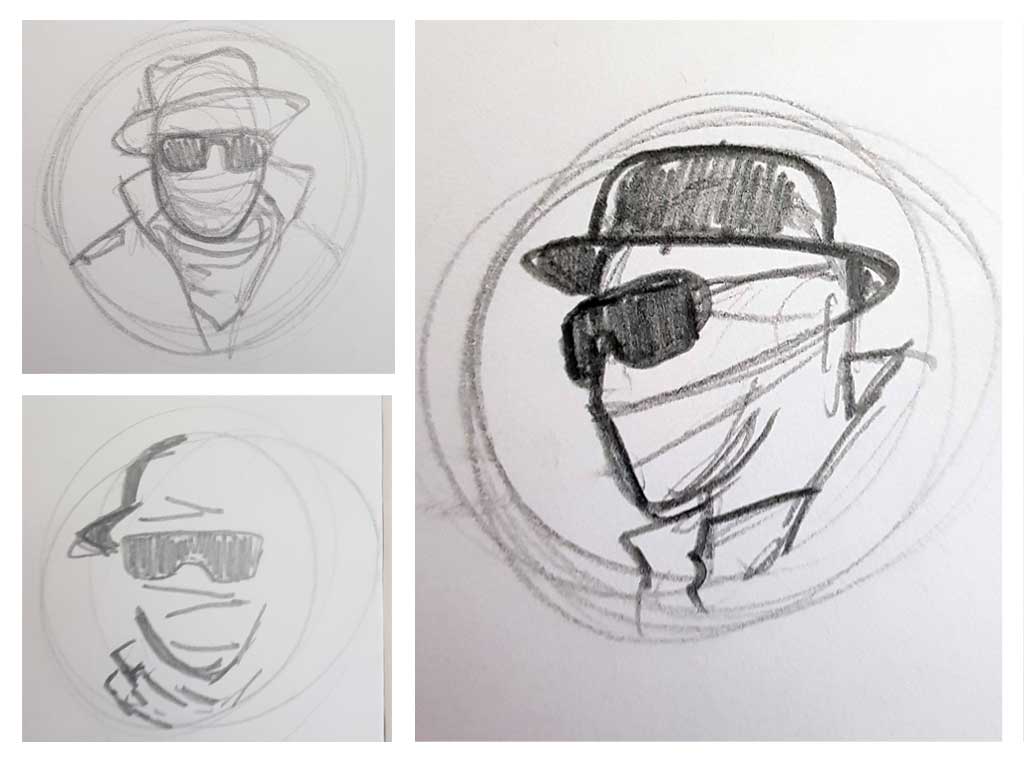
I tried some different approaches, I liked the 3/4 angle, it was more interesting, the minimal lines I didn’t feel would have as much impact.
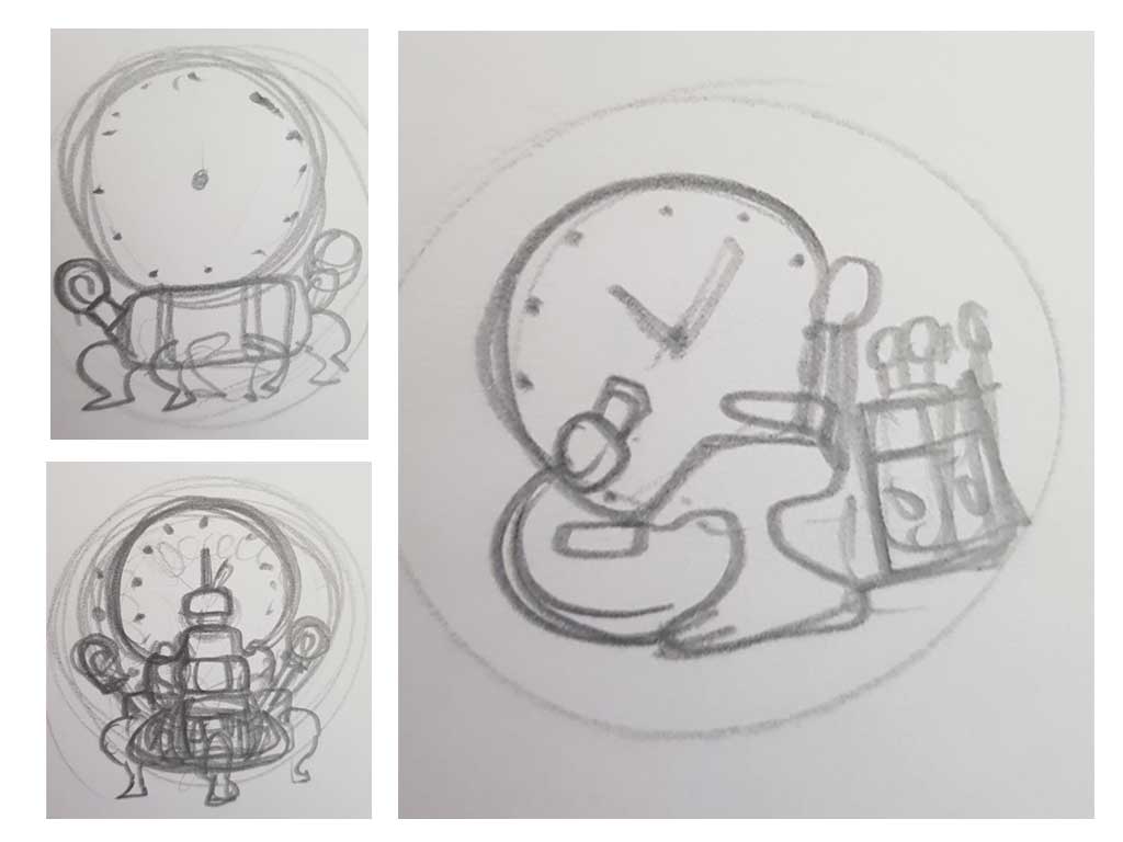
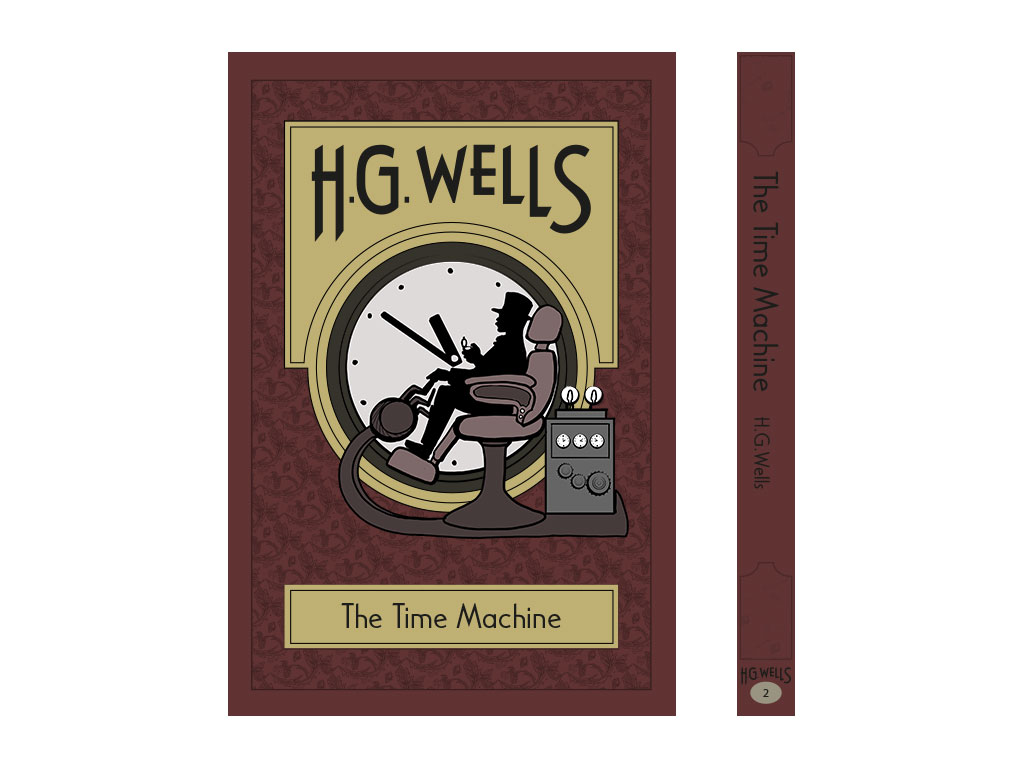
I was sure I wanted a large clock, the chair didn’t have a very clear stamp head on, I looked at old Victorian barber chairs in profile and sketched that down, I added some valves/light bulbs and gears for a mechanical feel.
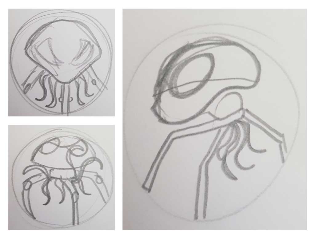
Again the profile angle seemed to be more descriptive and added a bit of drama as it walks across the book, the user safe and undetected.
I worked over these sketches in adobe illustrator, all keeping to the circular placeholder but with a view to allow some of the image to extend outside the circular border.
Colour choices
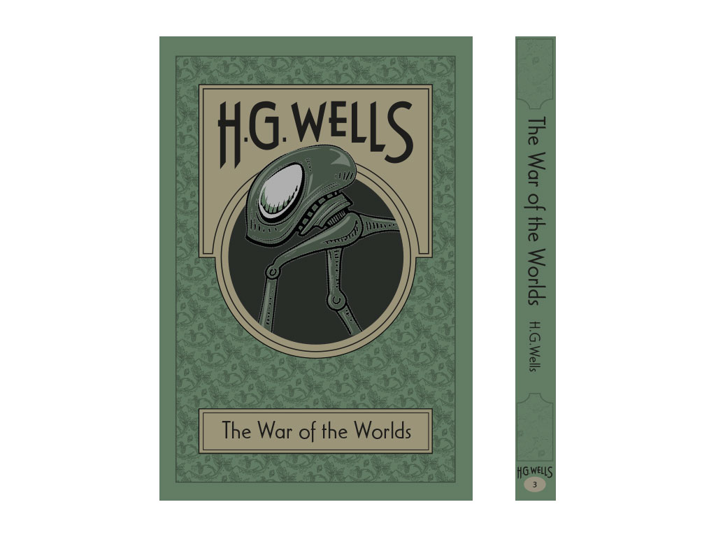
The colour choices, I wanted to have an old feel, I stayed away from bright colours, leaning towards dark or pale tones and hues. I tried to apply some logic to my colour choices. For the invisible man I chose the violet colour as ultra violet light is invisible, so it seemed to fit nicely. The deep red for the time machine cover came from the red leather I imagined on the barber style chair, or other Victorian leather furniture. I chose green for the War of the Worlds was because it is often associated with aliens and martians, for example, little green men.
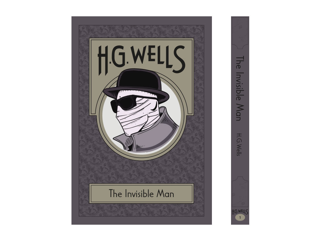
Overall I was happy with the outcome, I felt that I had stayed within the parameters set by the brief and by myself, it has a timeless classic feel, with the Victorian patterns, typeface and colour choices, a fresh minimal approach to imagery and it celebrates the author with his name being a main feature of the cover / book series.