For this exercise, I was asked to use marks to express an emotion or feelings. This was an interesting task and involved more thought than I had first imagined as some emotions seemed to cross over, for example, angry marks can quite easily seem like excitable ones. This would easily be cleared up with colour choices or even a descriptive title, but the challenge here was to use a choice of line and shape in a way that would carry a message and emotions.
I chose 4 mediums to work in, Graphite pencil, black paint with water applied by brush, willow charcoal stick and finally Indian ink. I then divided the a1 sheet into 4 equal sections by folding the paper in half and half again.
I set about trying to capture emotion with my marks, I decided to keep the same 4 mediums so I could compare each page at the end.
The emotions I used were Anger, Calm, Joy and loneliness.
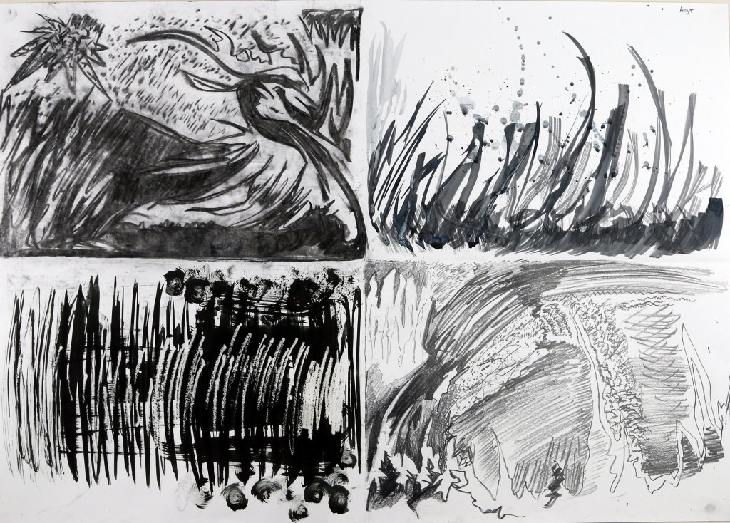
Anger
I wanted to use jagged shapes and opted for uncontrolled fast stabs and slashes, really bullying my drawing materials onto the paper. As I mentioned before this could be viewed as lively or excitable marks out of context but I carried on attacking the paper angrily.
This was by far the most textured of all the pieces created for this exercise, splashes short marks long marks dark and light warring for space on the page.
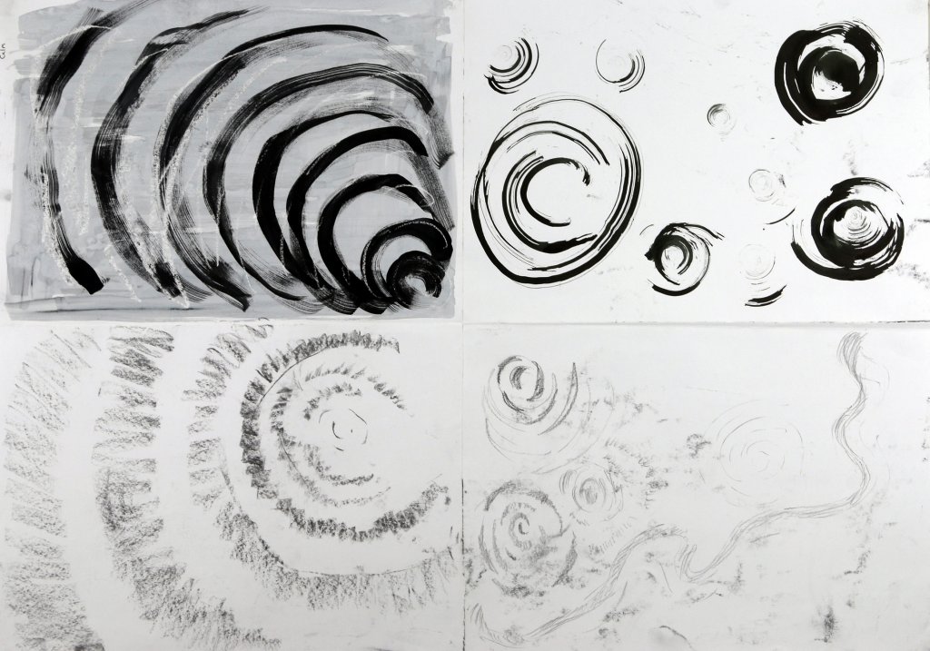
Calm
For calm, I needed to convey the peace and tranquillity that runs deep within this emotion. The shapes had to be soft, pulsing and light. I tried to capture the effect of rippling circles and imagined a warm bassy pulse accompanying my strokes. I tried not to saturate the ink on to the page and kept my pressure light with the graphites and charcoal this meant I could get more of a softer subtle grey tone. The ink I used undiluted and swirled with a texture scouring pad to make a collection of finer lines. I used a candle and drew invisibly to keep the white of the paper shining through the watery black paint, this wash gave a grey tone and with the addition of the white arches helped make the black marks less harsh.
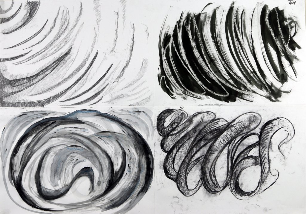
Joy
For joy I wanted to convey a sense of rhythm, a flow almost like the feeling of flight. A solid lively stroke with plenty of action seemed to capture this. I wanted to get some variance in my tonal values going from deep blacks to the brightest white of the paper. I even tried to construct “tubular” shapes for the eye to follow across the image.
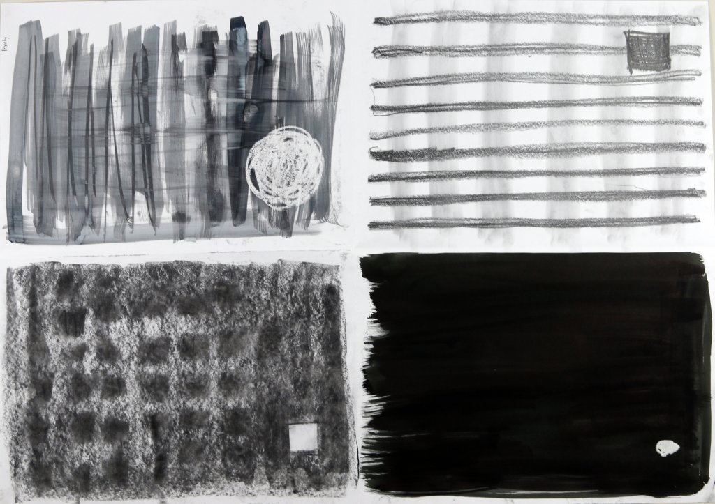
Loneliness
For this collection of images Kept it really simple. To create a feeling of isolation in a secluded environment I used a small focal point, I wanted this to be of high contrast, I didn’t want it to blend in or belong with any other elements in the images. I tried to add grid-like patterns to give it an imprisoned feel. The charcoal section uses square shapes in a uniform grid and makes a distinction from the other shapes, to try to create something un-relatable.