
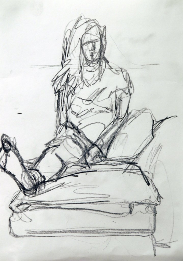
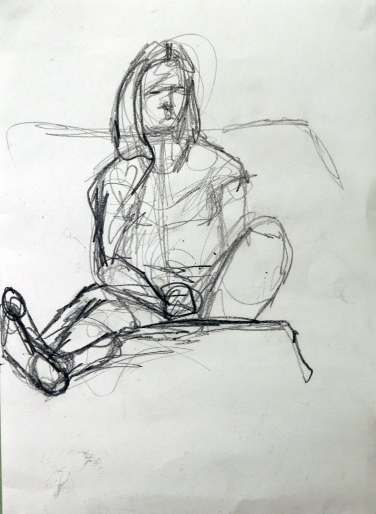
Assignment four was made up of three parts, I have got into the habit of preparing a couple of sketches before the main piece to work out any complicated aspects of the pose and get a sense of space around the composition.
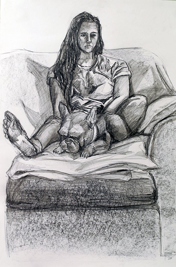
Figure study using line – Seated model in an upright chair
My notes suggested I experiment with some unusual formats, found paper etc, as the drawing was in a large format I couldn’t find any found paper large enough, I also wanted to explore clean lines with smaller marks for details so some smooth paper cartridge paper was probably best, I wanted to work with ink, I like the control of fine-liners but I wanted to use them in a way that didn’t appear technical. My thinking was after I had a drawing I was happy with I would use some of the techniques I explored in the Experiment with mixed media exercise, such as wax and inks or water colours. I also wanted to try water colour and salt, to texture the paper. I could add all this to the image in post. This was ideal as I didn’t have access to the model the day after so this could be carried out then.
After my drawing was complete I didn’t want to ruin it, I really liked how fresh the lines appeared, I was happy with the tonal values I had created my the length and orientation of my marks.
I thought about how it would look if the paper was a different colour, or even if I could experiment non destructively, for example with a large sheet of acetate, almost like a film cell overlaid. Another option was take the drawing and work on it digitally, changing the background colour, texture etc.
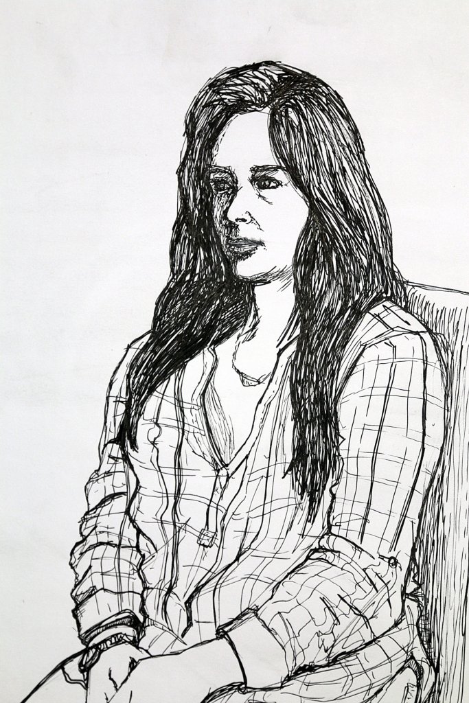
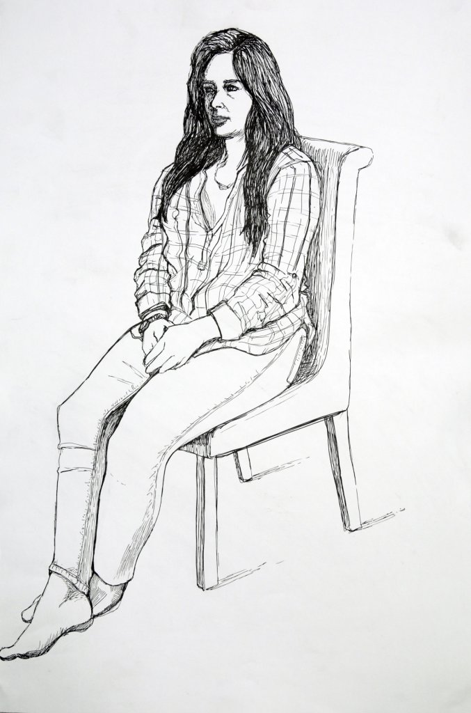
Figure study using tone – Reclining model
Again I produced two sketches for this piece, I also wanted to revisit some perspective in the body, after my frustrating attempts to do this before, now calm and focused I thought I would take another stab at it. I sat a lot lower this time, in hind site I wished I sat closer to further distort and exaggerate the perspective. Again I found it quite a challenge to not work initially with line, I ended up outlining blocks and filling them in before finally settling into a blocks of tone only style. my subject was actually watching the tv, it was really quite shocking to see just how much the light from the tv fell on the subject, and how the changes on screen affected the shapes of the face as the shadows changed positions. Overall I was happy with the drawing, if I was to do it again as I mentioned above I would change the pose to a more exaggerated, distorted almost fish eye effect.
Portrait combining line and tone
Feeling a little guilty about the lack of experimentation from the first study, I thought it might work nicely here to do something interesting with the surface for the portrait. I was thinking I would like to use colour, the exercise does ask for line and tone, tone is present in colour so I thought this would be ok. I was hoping to achieve something similar to Jenny Saville’s work, big bold blocks of textured thickly applied colour. I decided that oil pastels would be a good medium. Ionly had some smaller sheets of pastel paper, i wanted to work fairly largely, I thought if I was to rip them leaving an uneven edge I could join them together and add the resulting off cuts to build up some, different surfaces on the paper, I also thought some black marker pen as an under drawing might make a good effect, similar to the one that I was trying to achieve with the “group of figures” exercise, a kind of moving while frozen double image.
I was looking to cover most of the paper with oil pastel and black marker so the surface was of more importance than the actual colours, we will see how successfully they cover over the paper and glue. Another interesting thing about this method was that the pastel paper has a heavy toothed side and a smooth. While the main body of the paper is toothed the additional texture scraps are a mix of smooth and rough. I am hoping this makes for interesting marks.
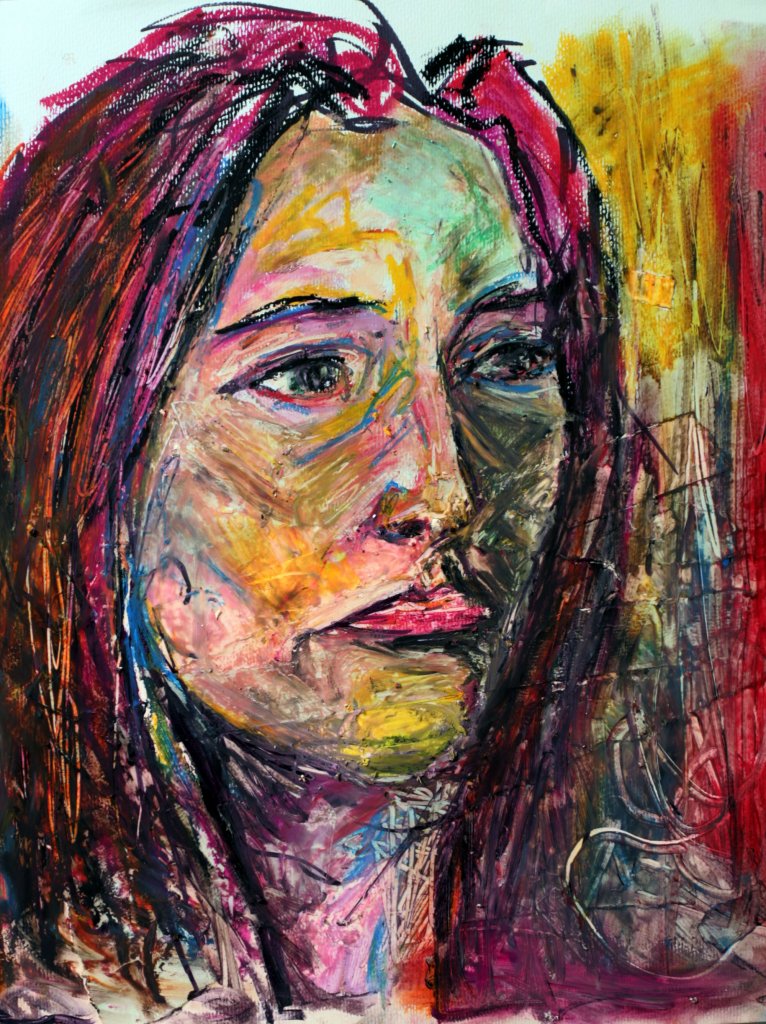
My picture had a lot more texture than I was expecting, my loose under drawing, was all but lost under the pastel, I can see the advantages to using wet media to get the effect i was after, I added vaseline and baby oil to try to smooth the pastel together, as I had used PVA glue over the scraps of paper this actually acted a s a barrier and smearing the pastel resulting in “cleaning” off the marks, it would seem my experiment was more of an obstacle in this case.
I also used the other side of a brush and scratched into the oil, this is a trick that Rembrandt used and In an interview with Jenny Saville which I actually saw on the OCA by pure chance she reveals she does the same, claiming that you can learn everything you need to know about painting by studying Rembrandt. If i was to attempt this style of portrait again, I would go larger scale and ideally with paint, I think oil pastels was a good choice but not wet enough to produce the broad unpredictable swirls and dashed marks.
I do like the final image, but already I can see things I would approach differently. I tried to separate the face into three colours, green for the shadowed side warm pinks and red for the light and yellow green for the top of the forehead. I feel this structure would work better with a bit more distinction between the areas. The positives are their is certainly a mood to the piece, albeit not a happy one and there is a decent amount of form described. I think it had a good resemblance to the model, she didn’t see it as much. Hopefully that’s because how we see herself is different to the perception of others. None the less, I very much enjoyed all of this assignment and hopefully my deviations from the text aren’t too much of a problem.