
I was asked to collect different examples of imagery aimed at these age groups;
- pre-reader
- preschool (3-5)
- early reader (5-7)
- established reader 7-9
- older age groups
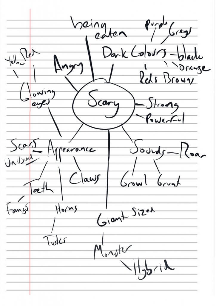
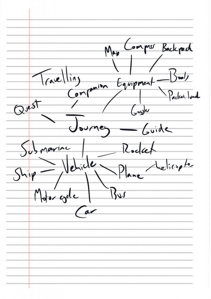
then I was asked to pick at least one word from a list, I chose journey and scary and apply it to an animal suitable to two of the age groups.
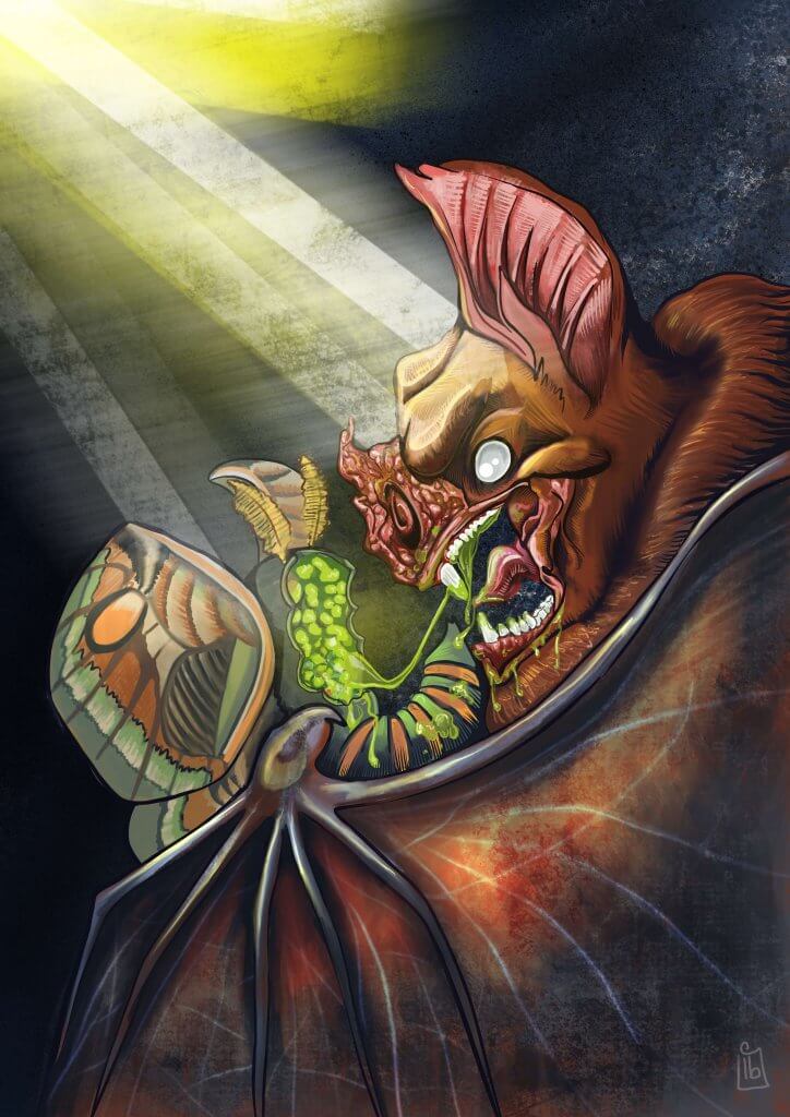
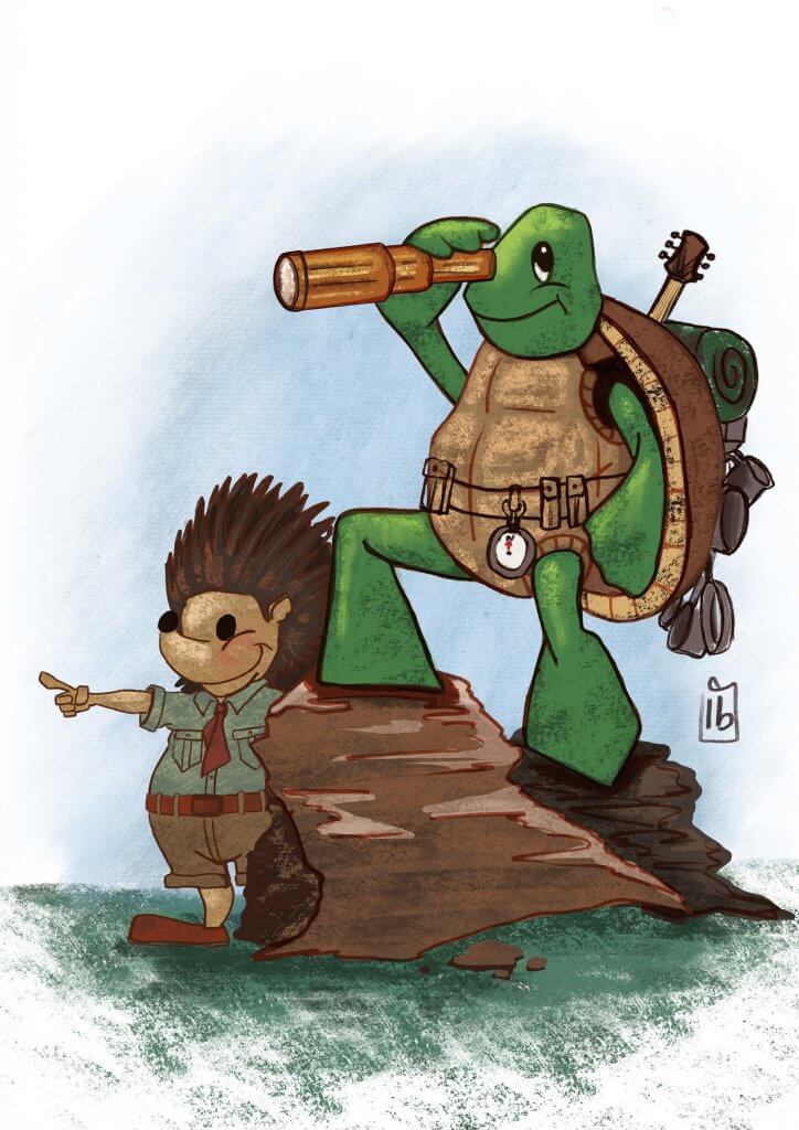
I chose established reader, the word scary and a bat as the animal, I also chose from the list, early reader, the word journey and a hedgehog and a tortoise as the animals.
I’m not sure that it’s easy to define an image type per age group, I found a lot of images could cross over to different ages, It seemed that the simpler an image was the younger the relevance to the age group would be, the opposite seemed to apply to the older age, the detailed or more stylistic approaches seemed to fir them better. This does seem to be quite a generalisation though. The simple geometry of something like hello kitty at a glance would seem to appeal to infants but they print her image on all sorts of adult T-shirts, rucksacks and even shot glasses, they seem to have a product that spans the age divides, I guess what this means is that you’d tend to develop and style ideas towards your target market, age groups may be a factor but not the most defining one for every context.
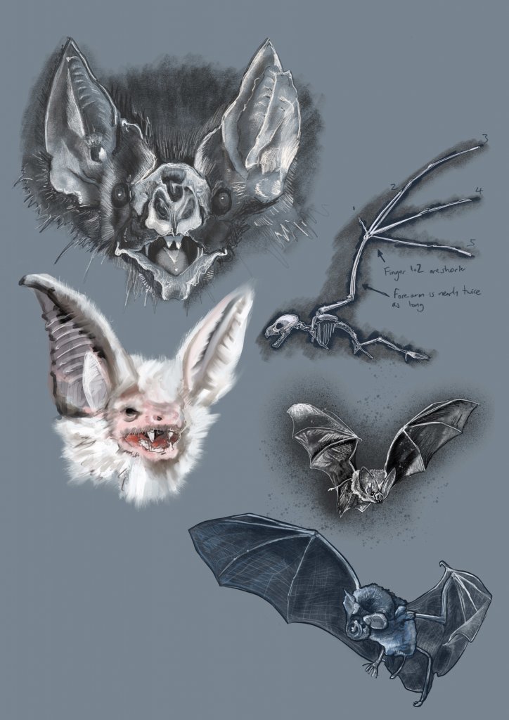
For the established readers and as per my findings I wanted to use a lot of detail and “realistic” stylised qualities for this image. I started out researching Bats and produced some visual studies, I wanted the final artwork to be grounded in reality as it would suit the age group quite better. This was a great help as it really did help for me to understand the anatomy and unusual facial characteristics of a bat.
I brainstormed the words scary and journey to try and get some ideas flowing for the content, In the animal kingdom the scariest thing must be to be hunted killed and then eaten, so I started to think about a bat and his pray, the moth. I wanted to make the bat look very menacing as it devours its prey. A little artistic licence would be needed to give the character some facial expression as I’m sure bats wouldn’t possess the muscles needed to express anger etc.
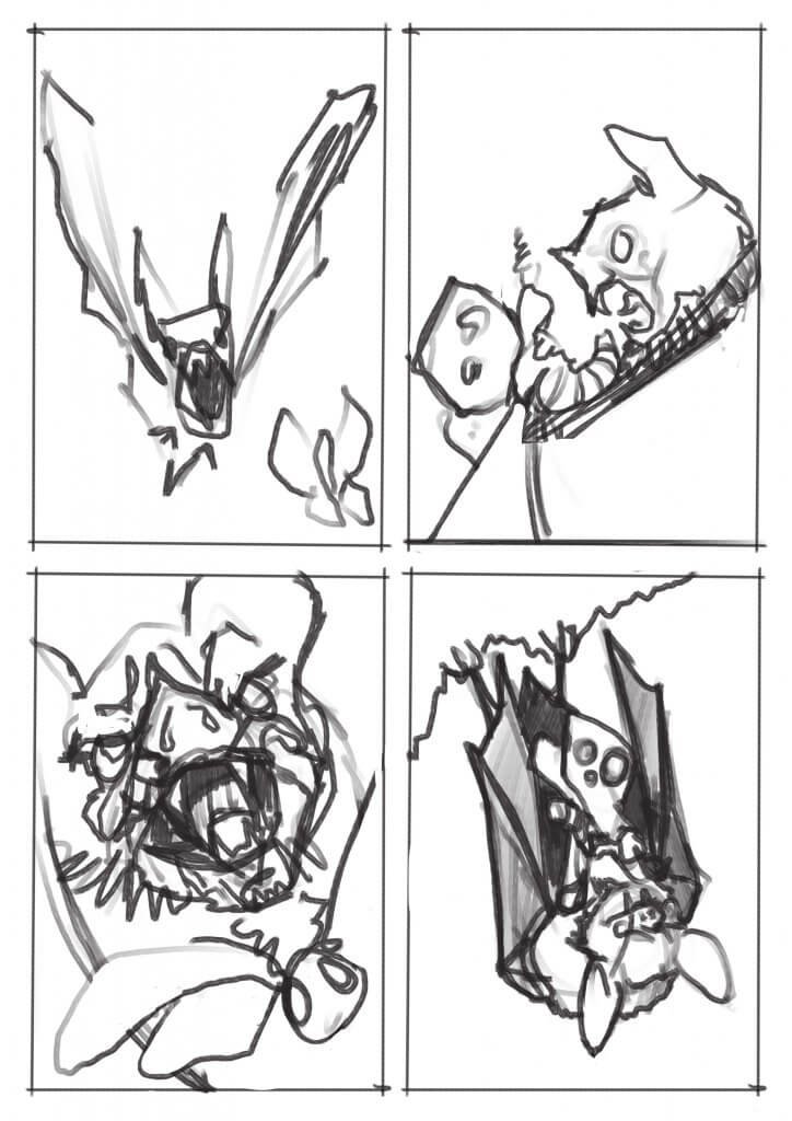
I created 4 visuals to try and arrive at a pleasing composition, one of the feeding characteristics of a bat is that they eat upside down, this wasn’t as exciting, it looked a little passive and at rest. I much preferred the side view with the bat looming over its prey, I went with that option.
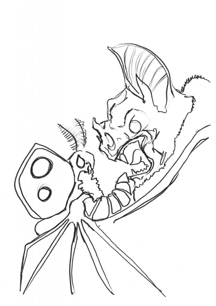
I was quite happy with the outcome, I liked the narrative and the atmosphere, the lighting added a good mood and I managed to get the translucency of the bat wings in there too.
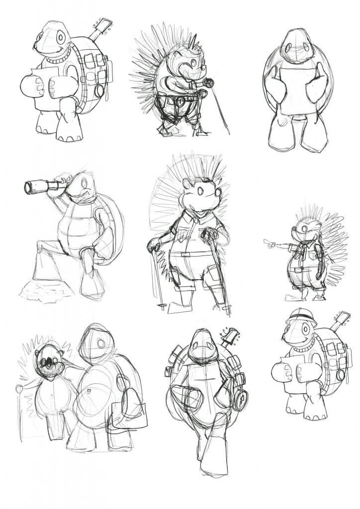
For the early readers, I wanted to keep it simpler brighter with the focus really being on the reader being emotionally attached to the characters, I wanted the children to like them.
Within my brainstorming diagram, I mentioned including a travelling companion, I deliberately chose 2 animals that would find a long journey quite troublesome, I thought a hedgehog and a tortoise would be a good direction to take the exercise in.
I worked up a loose character sheet, and once I felt like I knew the two characters I used the drawings to work up a few ideas.
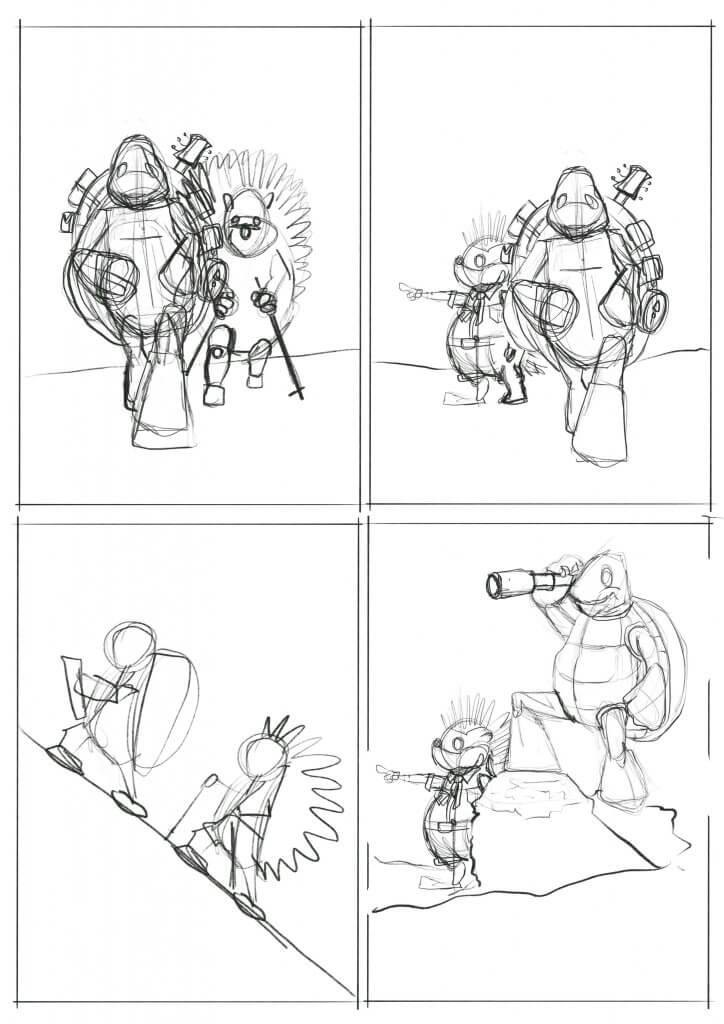
I chose the image where they are looking forward to the journey ahead.
I tried to give the artwork an almost drawn in crayon appearance to keep it light and simple as possible,
I really did enjoy this exercise, it really made me think about my approach an how my choices would affect the overall appeal of the image to the different groups I was aiming the artwork at. I also liked being able to breathe life into the characters I created, which is something I have been trying to work on lately, this exercise definitely helped.