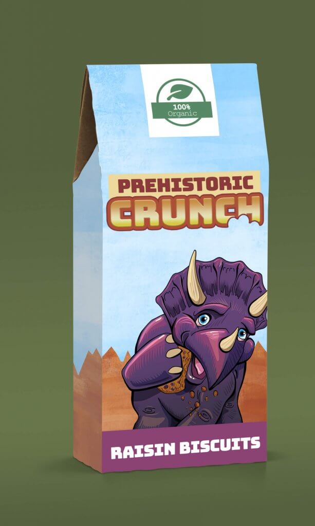
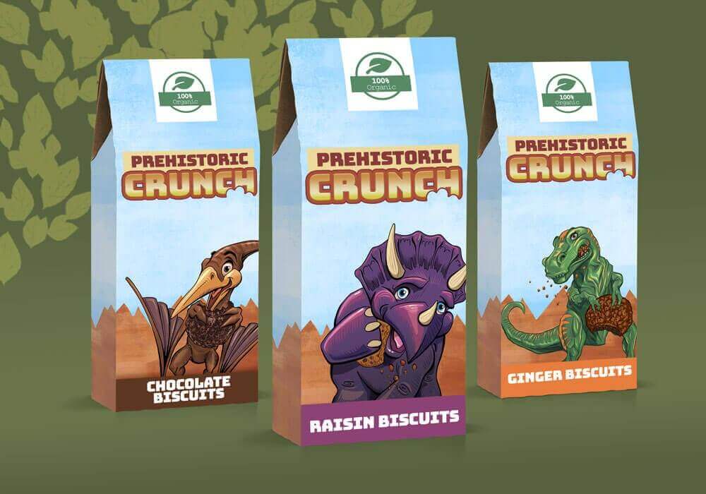
This brief called for some original artwork for packaging for organic biscuits aimed at children, this was to feature three extinct animals. My plan was to show some vibrant appealing characters the children will see and cry for when being pushed in a trolley or skidding up and down the aisles of the supermarket. When choosing the extinct animals I had to take into consideration the audience, kids wouldn’t necessarily make a distinction between an elephant and a mammoth, a big cat and a sabre-toothed tiger or a dodo and a toucan.
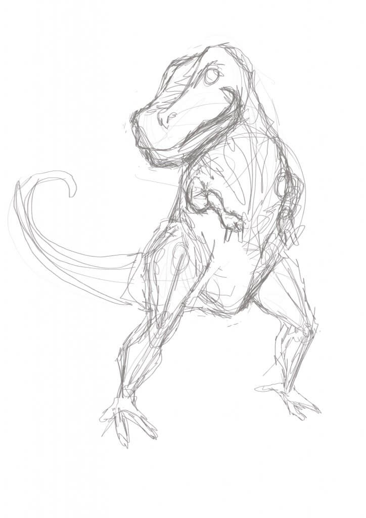
Dinosaurs seemed to be the best if not a little clichéd choice, they come in all different shapes and sizes, live on land, air and water and have a very wide appeal. I picked three of the more distinct ones and started to sketch out some shapes.
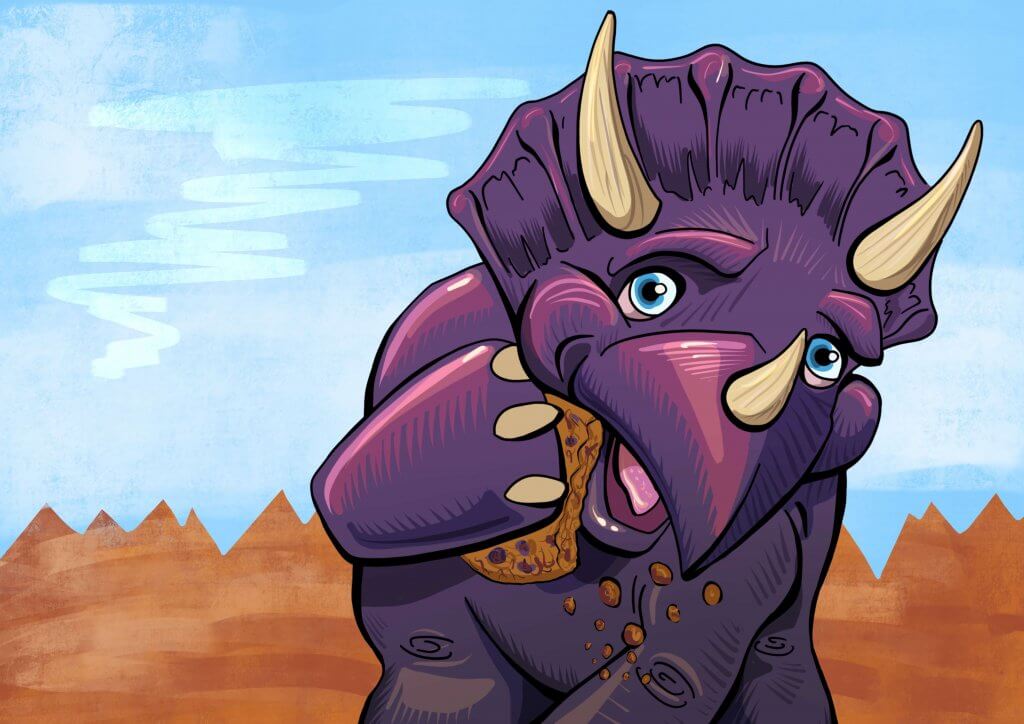
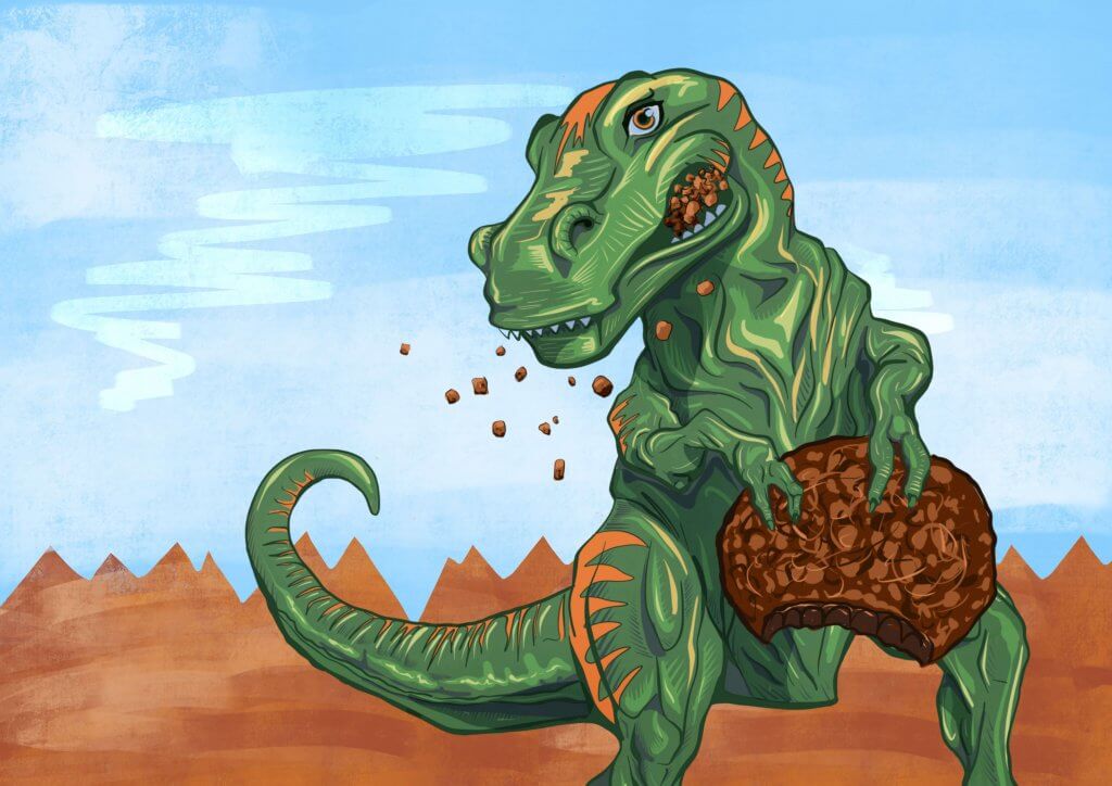
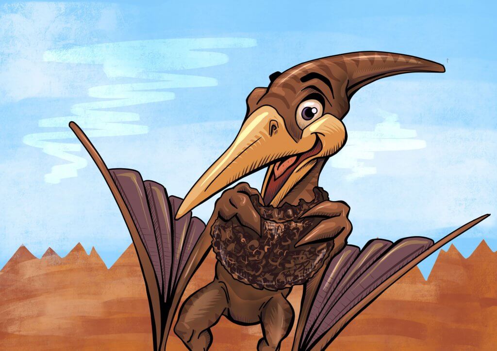
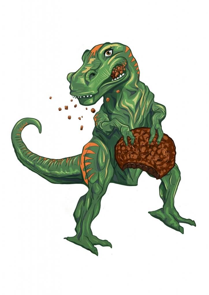
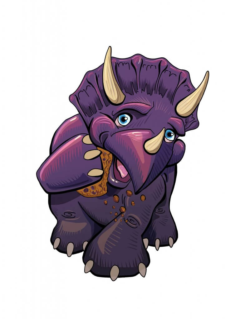
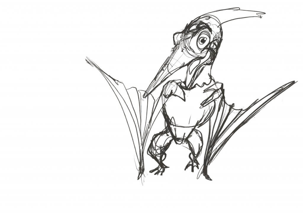
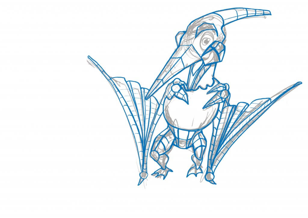
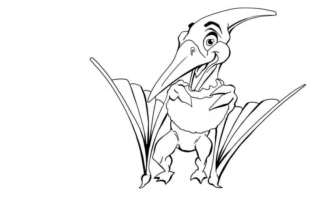
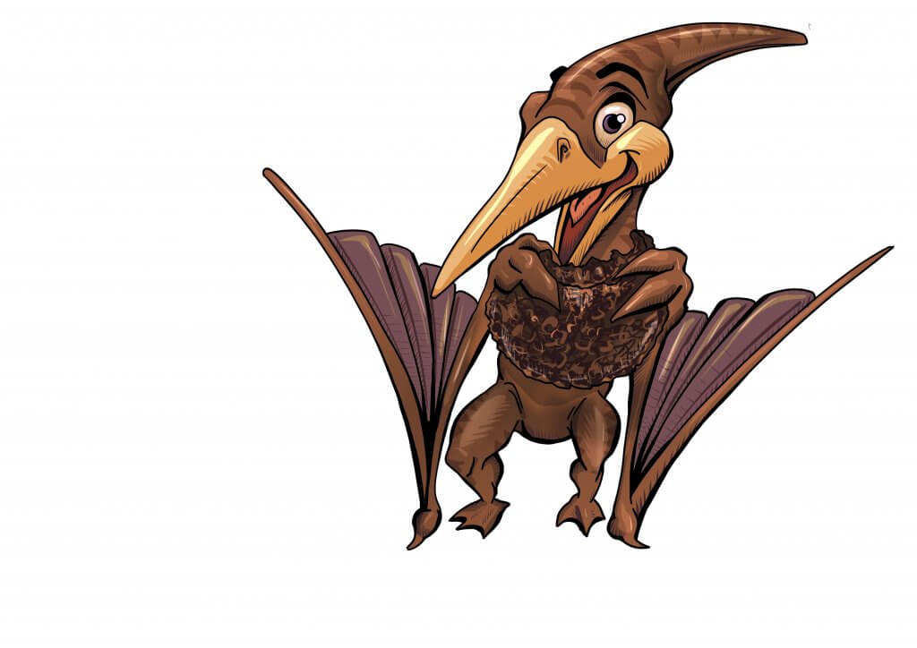
I kept in the back of my mind the flavours I needed to push and the colour schemes they may be, I also wanted to match the characters somewhat to the flavours. The strong powerful flavour of ginger was to become a fierce T-Rex, the raisin a small stout round fruit, would do well as a Triceratops and that left chocolate, an earthy muddy Pterodactyl would serve well here.
I’ve been trying to really develop a sense of weight, balance and shape in my characters, this time I took a different approach to these characters as I wanted to really try to get a sense of movement or even a high-end animation feel to it. I sketched out with some lively rough lines the pose I wanted, I made some adjustments where necessary, I was only interested in capturing the movement at this stage, thinking about how the characters would balance etc, I wanted to try to retain this as much as possible for the next step.
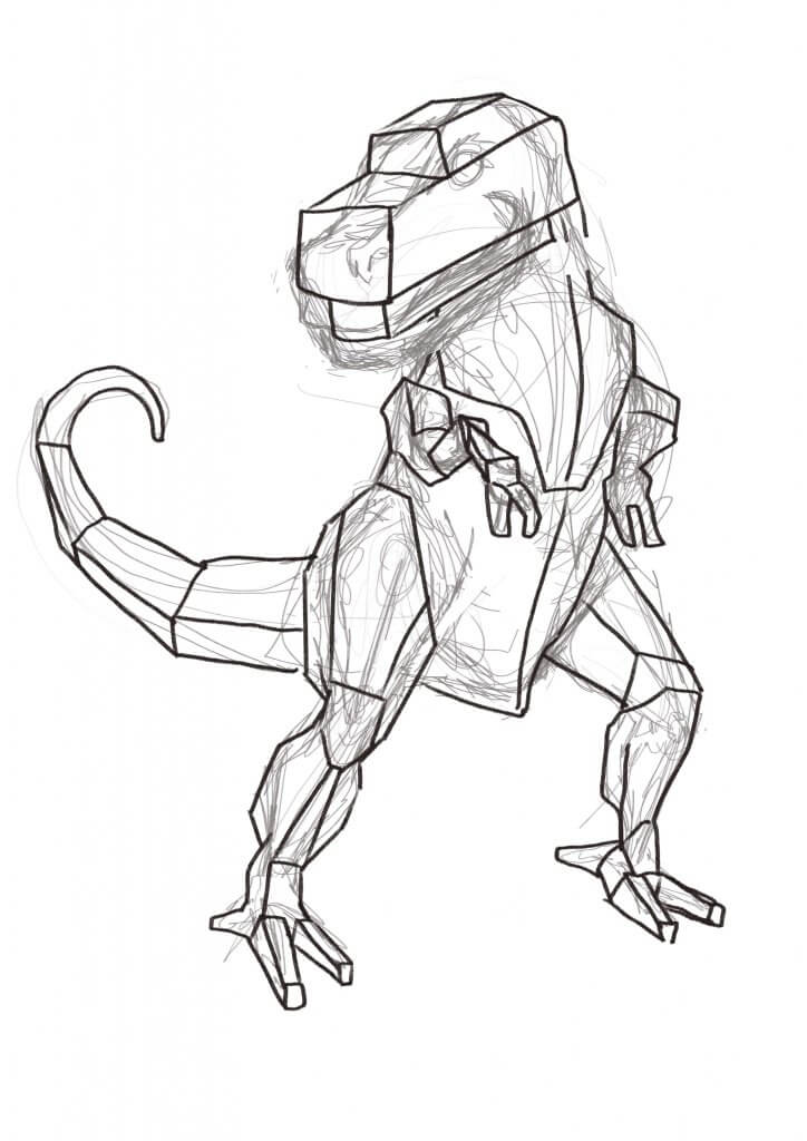
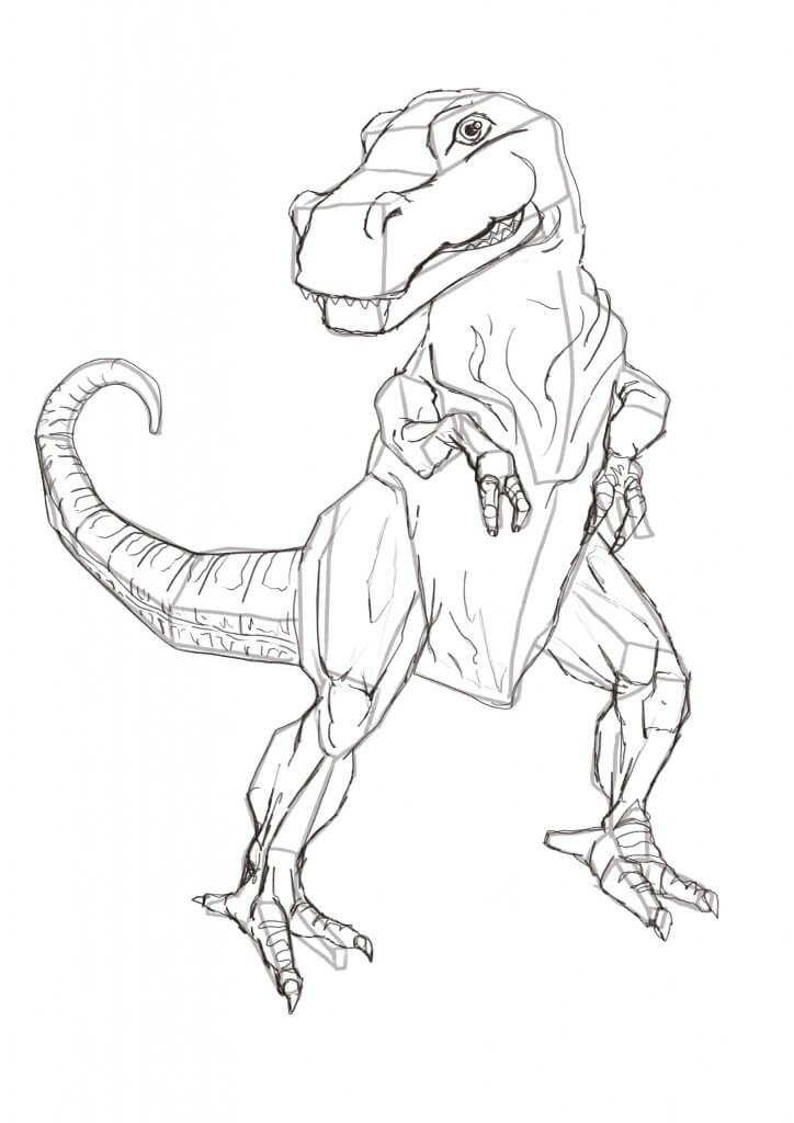
I would normally start off at this point, boxing in some shapes and add some depth and body to the anatomy, this in the past has made some pretty rigid characters, this time with the lively, loose under sketch it really helped to “animate” the character to life. I will take this approach in the future as while it added in an extra step added in so much more to the final image. I then went about the drawing in much the same way I normally would, I pencilled over the construction lines, then inked in the key lines and then coloured. I really liked this new workflow and will be making it a standard drawing practice from now on.
The Packaging needed some common branding so it was recognised regardless of the flavour, I added in a simple cartoon background for the titles and the information to sit on. I also needed to add some messaging too as the brief called for Organic messaging as a selling point for the adult purchaser. As an Illustrator, I’m sure my job would finish at this point but I really wanted to see these crumbly prehistoric treats come to life in the mockup so no detail was spared.