This exercise was to establish a relationship between words and their meaning visually. I was asked to write out the words normally and then using upper and lower case rewrite them to reflect their meaning.
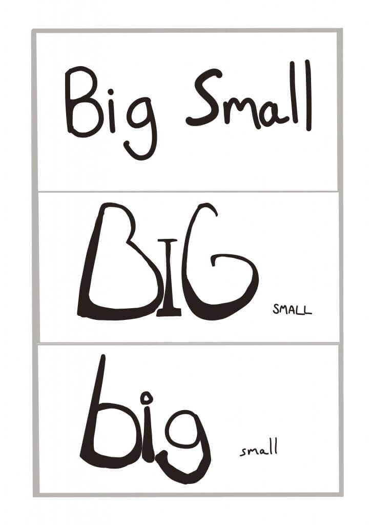
Big & Small
with this one, I tried to almost get a worm’s eye view on the word big, tapering the image at the top to suggest reaching great heights. Small in this instance would only work in relation to the word “big” being displayed with it. as I played on the scale to achieve this difference.
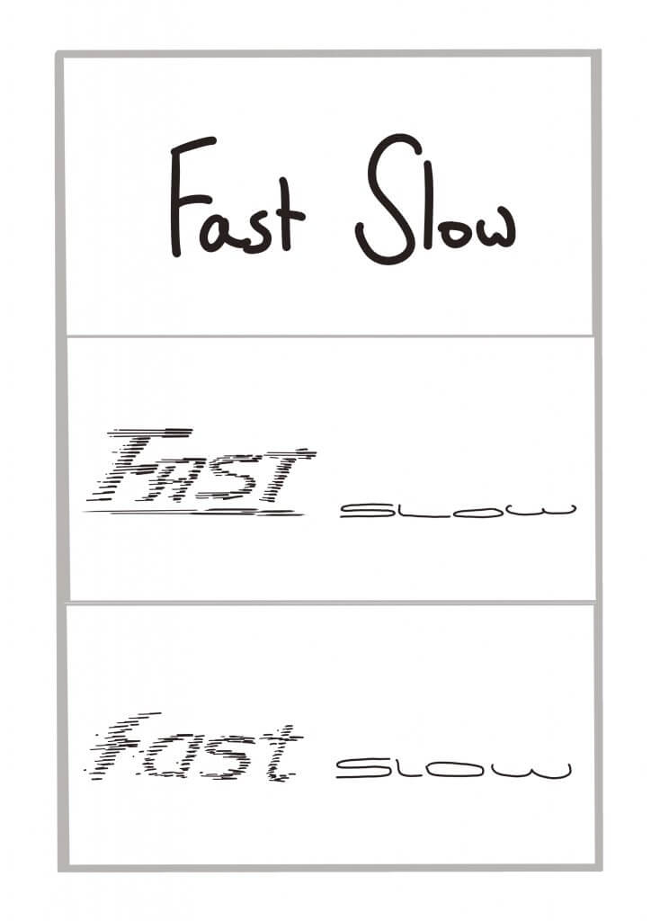
Fast & Slow
For these opposites, I tried to use cartoon speed lines to add some movement to the word fast, slow I tried to make squat and stuck to the ground, almost like its sliding along slowly.
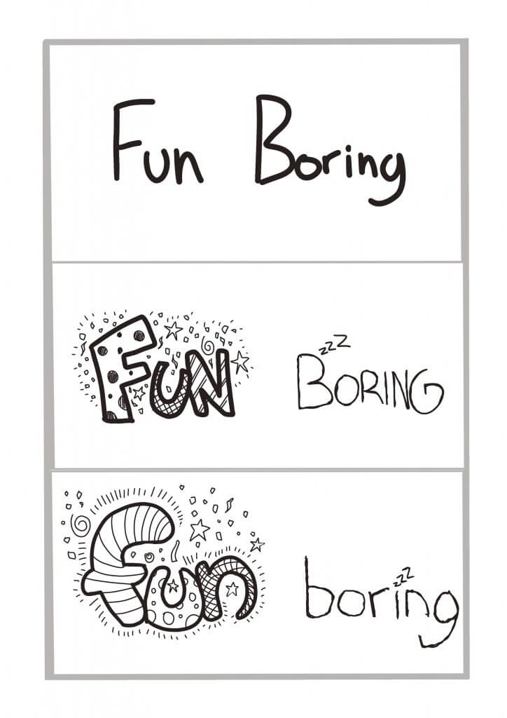
Fun & Boring
Loads of things going on here for the word fun, again the boring is a thin plain word, I also added some snooze “z’s” to give it a bored aesthetic.
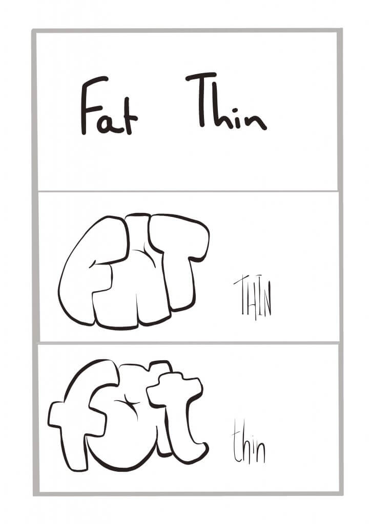
Fat & Thin
This called for some swollen bloated lettering, and some wire like thin characters to provide the opposite.
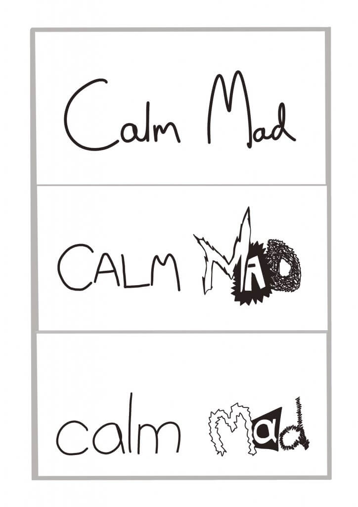
Calm & mad
I tried to use thin round shapes to portray calm, the opposite for the word mad, spikey rough edges inconsistent jumpy sizes and tonal differences to give a crazy look.