Below are four composited images, my challenge was to use the same content and produce an image that was visually interesting, this didn’t have to be factual.
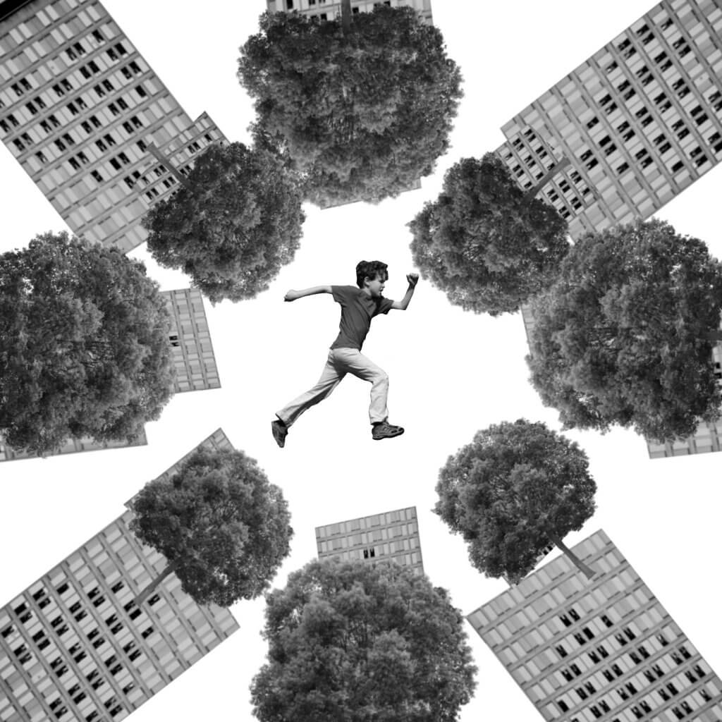
This image frames the boy against the white background, making him the focal point even though he is quite small in the center. The negative space around him and placement of the buildings and trees at these angles feels like he is escaping danger, it seems everything is in motion. This layout gives me an uneasy feeling.
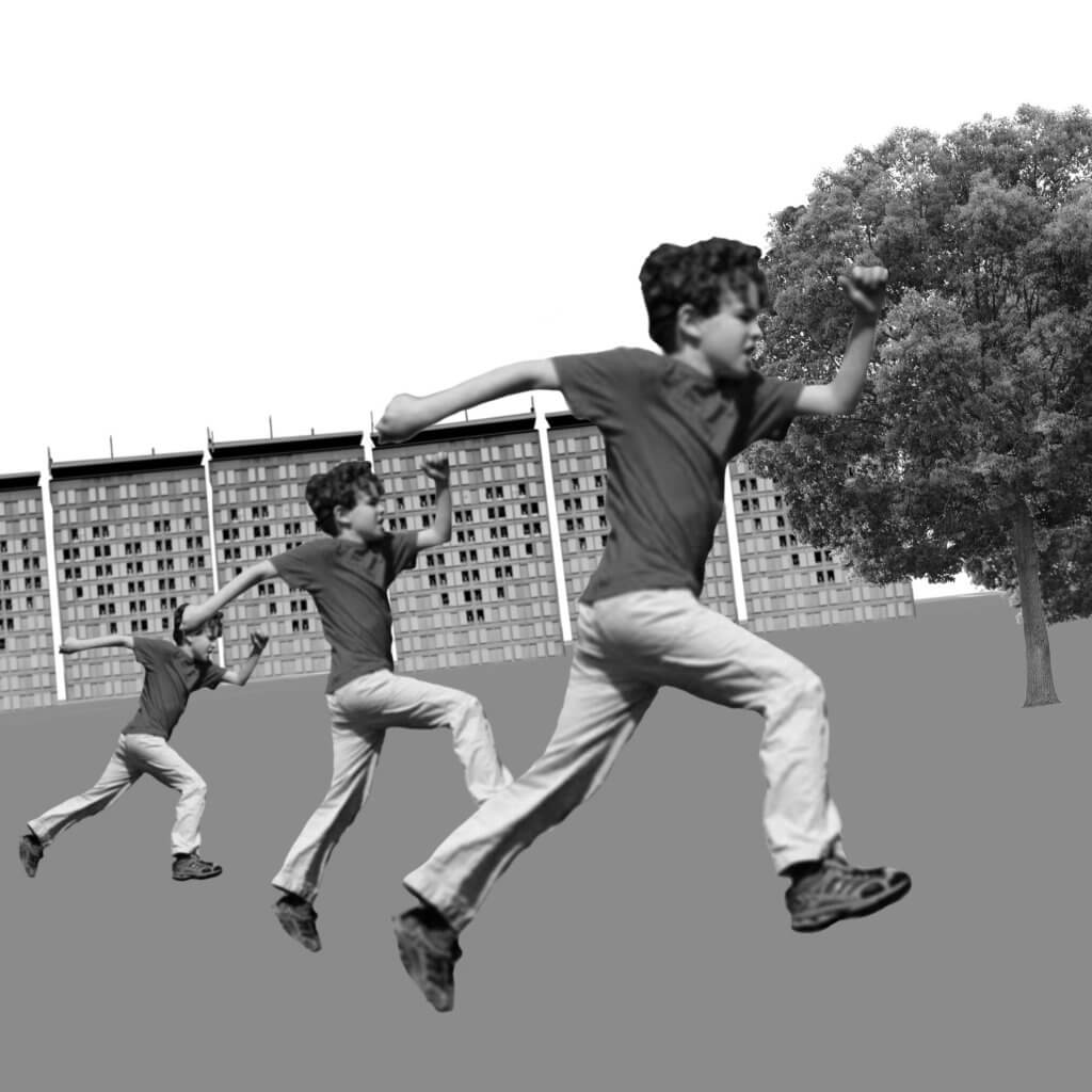
The repeated characters here seem to have a narrative, it appears to be a race rather than the boy being chased. The main focal point is the boy at the front, he is larger and also his face breaks into the white sky creating a contrast too strong to ignore.
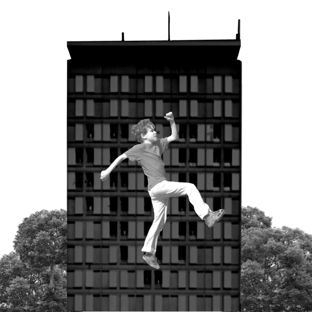
For this one I made the building behind a bit darker and placed the boy in front, I wanted to give the impression of height, the negative white space around the building leading the eye toward the centre where we find the tall dark block , the trees at the bottom add weight to the image and also help to force the eye up which is then broken by the figure of the boy.
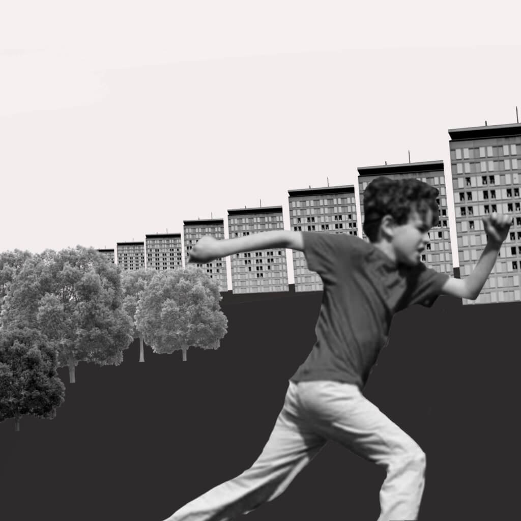
This image with its buildings ascending in height and scale give the figure a good sense of motion, the placement of the figure, large and cropped out of frame suggests to me that the figure has ran in front almost surprising the viewer. The small trees give a good sense of space in the surroundings, and giving the illusion of depth.