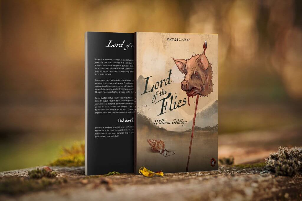
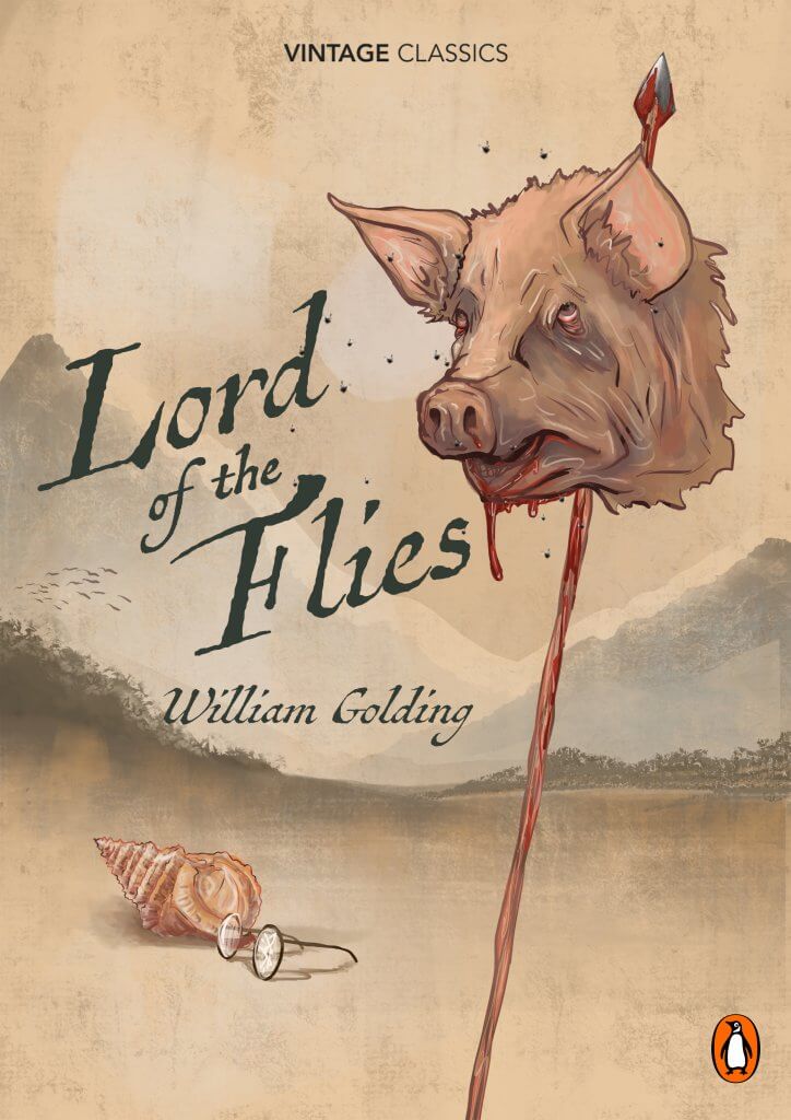
I really quite enjoyed this exercise, I looked at my book shelf and picked out William Golding’s, lord of the flies, I have read the book a while ago but I can still remember the story, its message (at least my interpretation) and its key scenes.
The key scenes/characters for me, are the conch shell they use to establish a democratic system and order, who ever holds the shell is the one talking. This upsets some of the boys and eventually divides them, this needed to be a part of my cover.
Piggies Glasses, these to me represented a few things, they represent civility, and mans achievement to create and repair even poor eye site. They allow the boys to create fire for survival, these to me sum up mans inventive side, again these also are a sought item by the other faction who just want to have fun be reckless and hunt, which brings me to the main character, and the shocking part of the story, the pig, I was in two minds about displaying something so shocking as a pigs head on a spear, it sets the tone for the story and as an old book it seems to be the main feature for most of the covers, I decided that maybe a bit of shock was needed, I’d seen a few (examples below ) that included the text in the image rather than in a box over the top for example, I quite liked that look so decided that’s what I’d aim for.
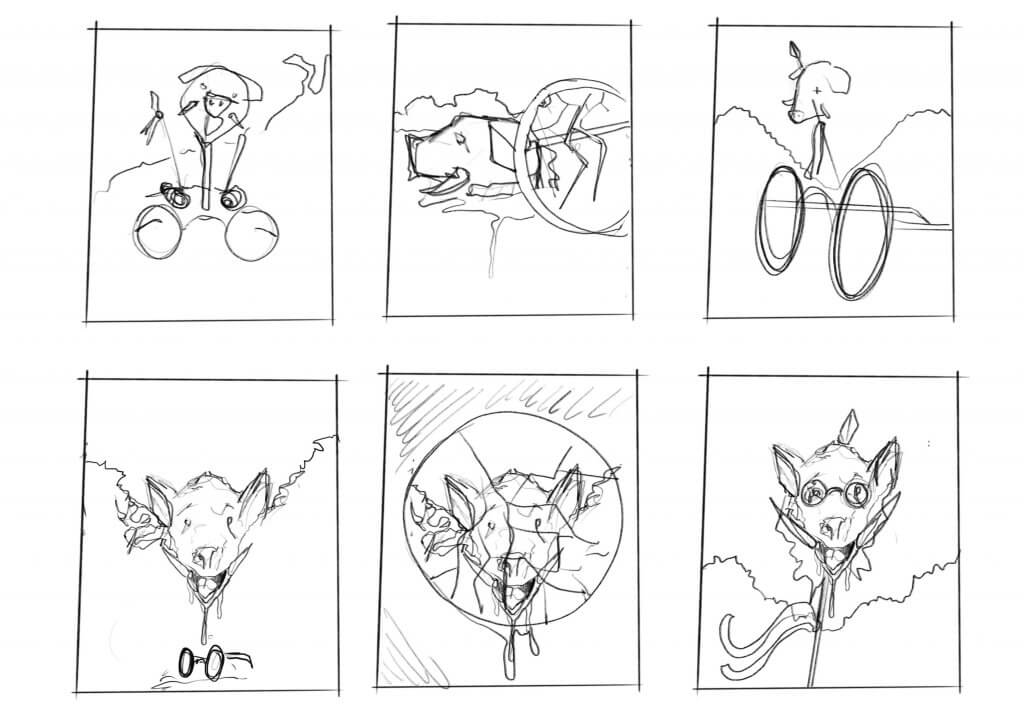
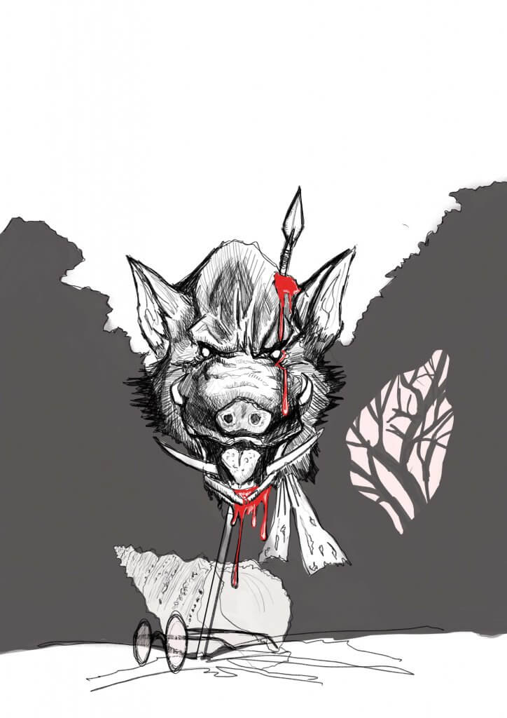
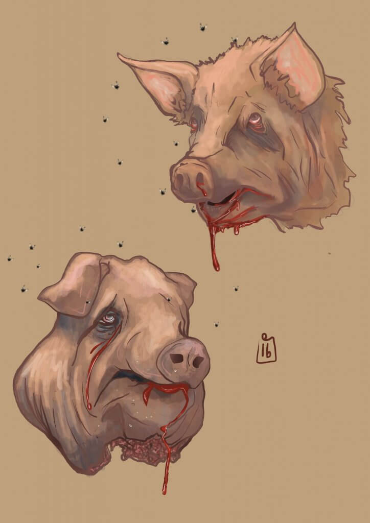
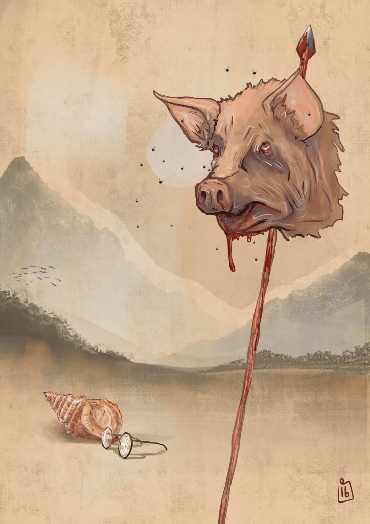
I tried several different version as you can see from the thumbnails, I wanted to get over a classic look, I opted for worn old looking faded colours and a washy style of paint, I had originally seen this maybe as more of a woodcut style but this didn’t convey classic enough.
