For this brief I was asked to create an image for The Radio Times for a TV programme about racial discrimination in the police force.
The problem:
- To come up with an idea that suggests what discrimination is
- To ensure sensitive depiction of people of diverse ethnic origin
- to create an image that entices people to watch the TV programme
This was a real challenge, Racial discrimination comes in all forms and guises, and was essential I stay fair and impartial in the presentation of the artwork.
I originally planned to make a grid of police officers all looking outwards with an officer in the middle being looked at from above below and from the sides.


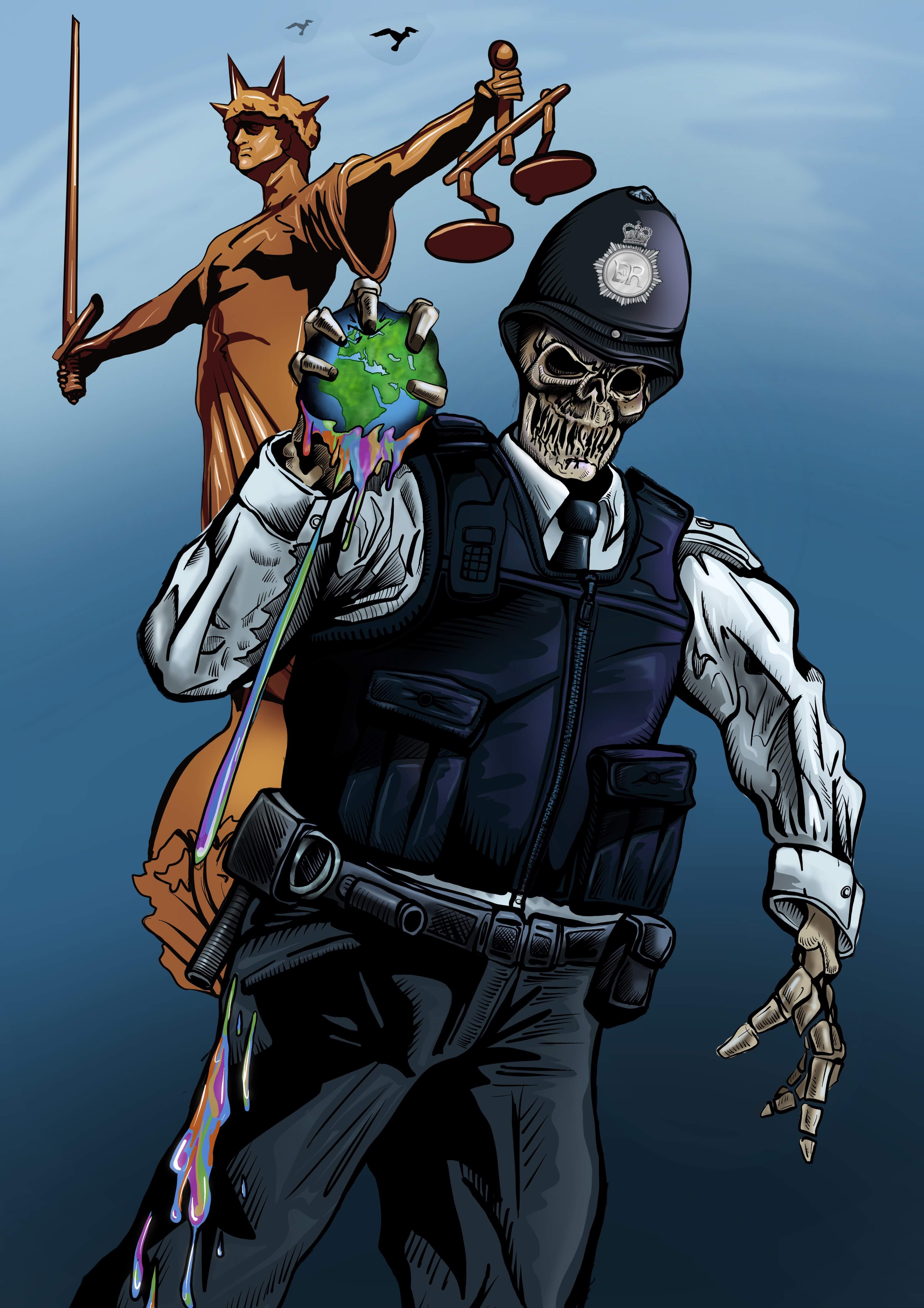
This seemed like a good enough concept, but it was flawed as it meant showing different ethnic groups even though I intended on showing all the characters in blue tones, I didnt want to portray a group as a victim and I didnt want to imply the depicted groups were all racist, I then thought what if I didn’t show their faces, I then came up with the idea of using skulls.
Using Skulls would remove any reference to ethnicity and make a strong statement, we are all the same underneath.
The skull idea would bring a very sinister and dark tone to the image, which I eventually offset with bright colours.
I then had the idea of putting the skulls not in a grid but depict a skeleton police officer, squeezing the colour from the world, the symbol of lady justice with her scales in the background looking away, the whole act of discrimination being a hate crime carried out by people paid to enforce the law.
I felt was on the right tracks, I’d solved the problem of keeping it equitable so as not to offend minority groups and to come up with a shocking and visually interesting concept to attract viewers.