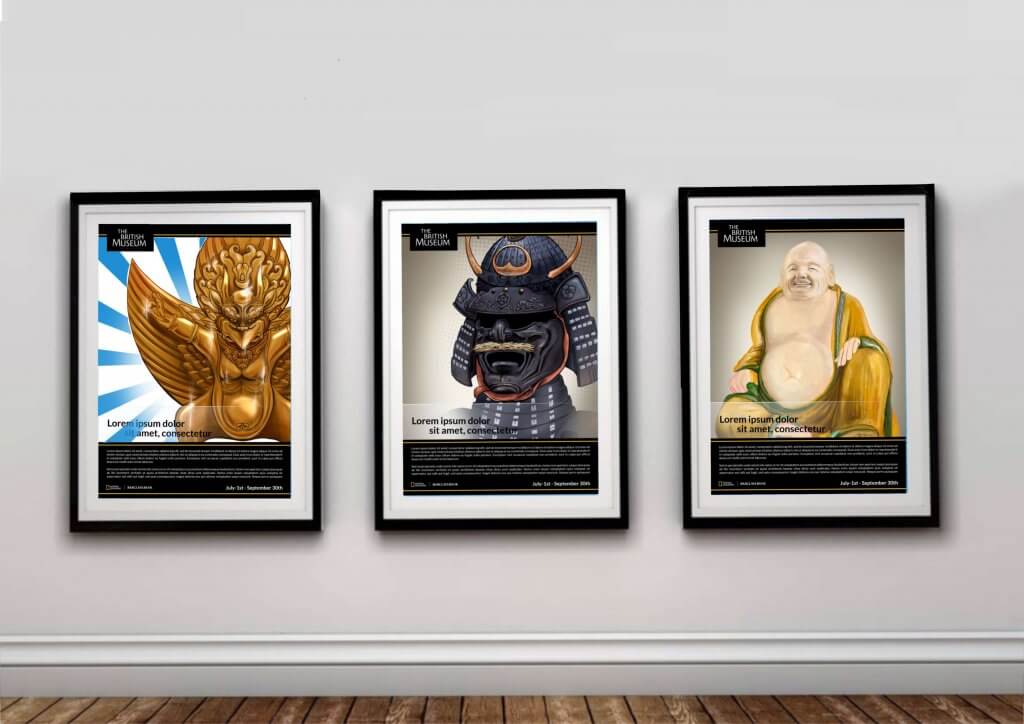
In this exercise I was tasked with producing three A3 images to publicise some upcoming museum exhibits. The three posters had to appeal to three different age groups, children aged 5-9, teenagers 13-16 and a general adult audience. I visited the British museum to take photos for research and reference.
I picked three subjects, a statue of the monkey god Hanuman, a suit of samurai armour and a Buddha.
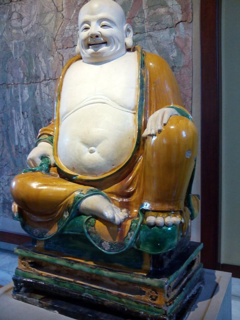
I wanted to present these in three separate ways, The monkey god reminded me of a Japanese cartoon character in his appearance, like Pokemon or Dragon Ball Z, I wanted to render him as if he was in a Pixar film or other modern cartoon. The samurai would certainly appeal to teenagers due to the cool factor. For this one I didn’t want it to look childlike or have too much of a realistic quality. I wanted to portray it with textures and a sense of liveliness a touch of aggression or even horror, I tried for a style more like like a comic book or “grown up” Japanese animated style. The third I would need to reproduce with some accuracy and approach it from the angle that the statue is full of detail and workmanship, I needed to conjure up a peaceful feeling also due to the nature of the subject. I have been encouraged by my tutor to use natural mediums. I thought some washes with Gouache might represent a softer side and create some nice textures, things didn’t go as smoothly as I had hoped!
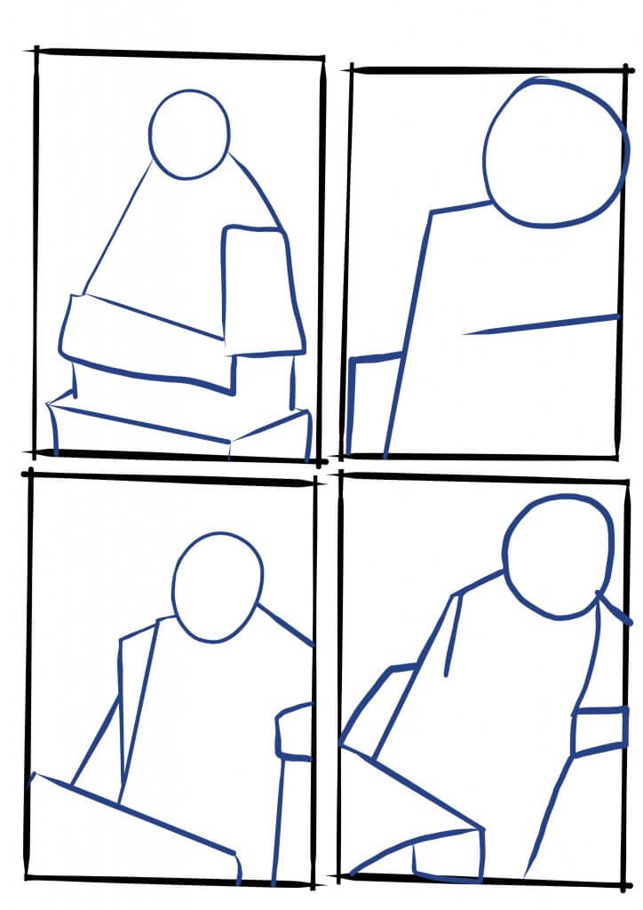
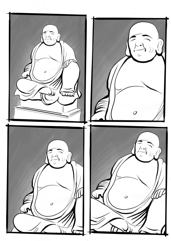
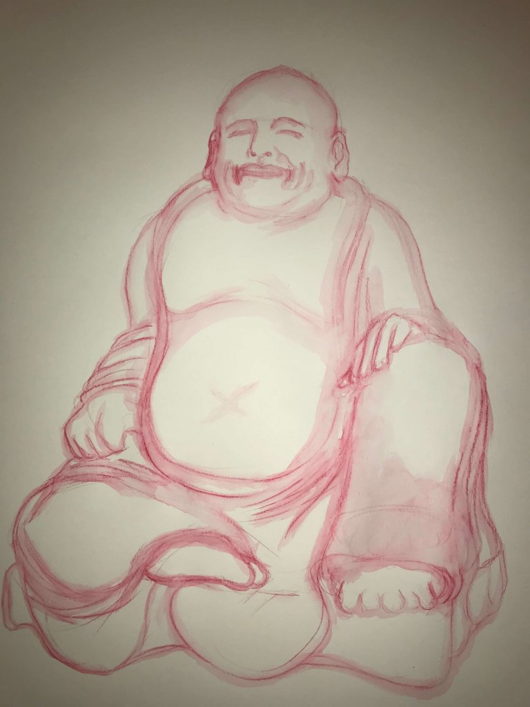
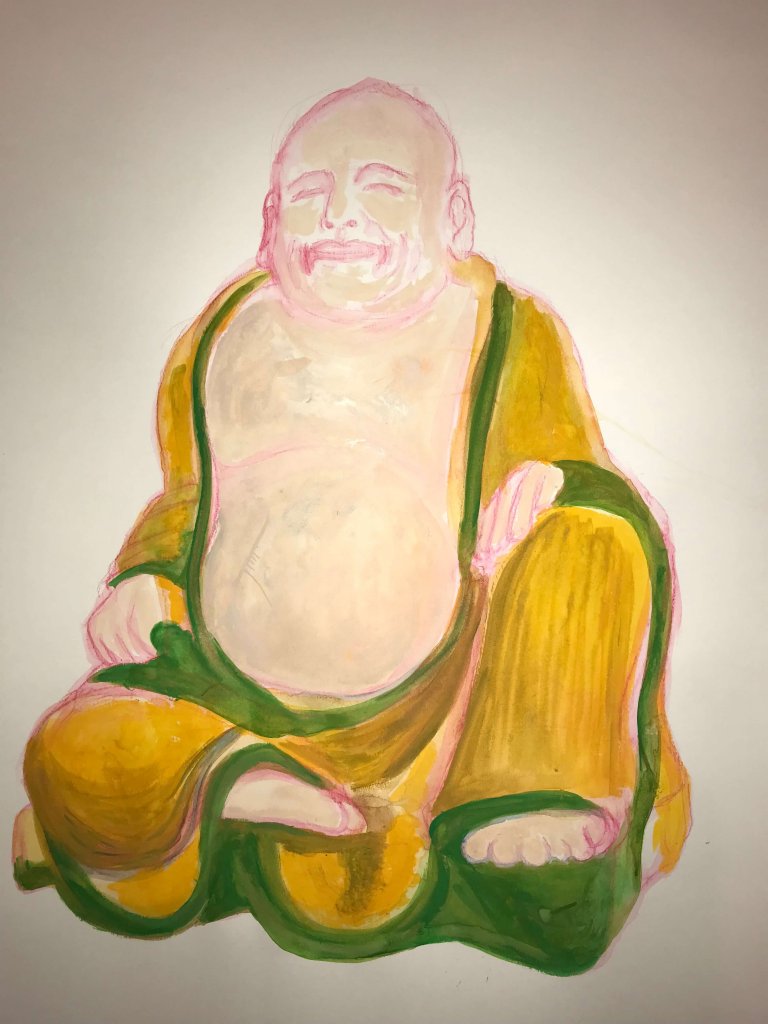
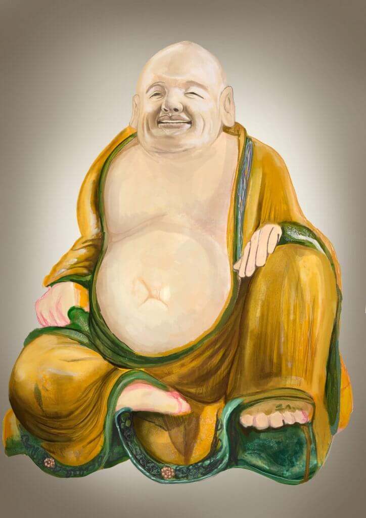
I started out with the buddha, I thought as I was trying to paint with real medium I may need extra time, this was a good call. I used a warm coloured water soluble pencil on an A2 sheet of mixed media paper, I thought this may be best as the lines would be removed/ covered up when I applied the paint as I didn’t want any hard lines for this image, the warm tones that would mingle in with the paint would compliment the paint rather than muddy it. I added in my washes and started working in the shapes, I thought my initial drawing would serve the image, I did run into a few issues that normally I could fix with a digital process. I persevered but I got to a point where I just wasn’t happy. I was ready to start again when I thought maybe I could photograph the artwork up to this point and complete the rest digitally, using the painted textures and fixing the issues. I was quite happy with the way this worked out, I felt it was the best of both, the textures of real medium and the versatility and edibility of digital. Unfortunately the experimental process had set me back, I will explore this further but maybe not on such an ambitious level.
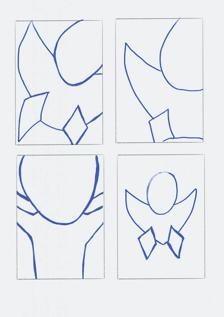
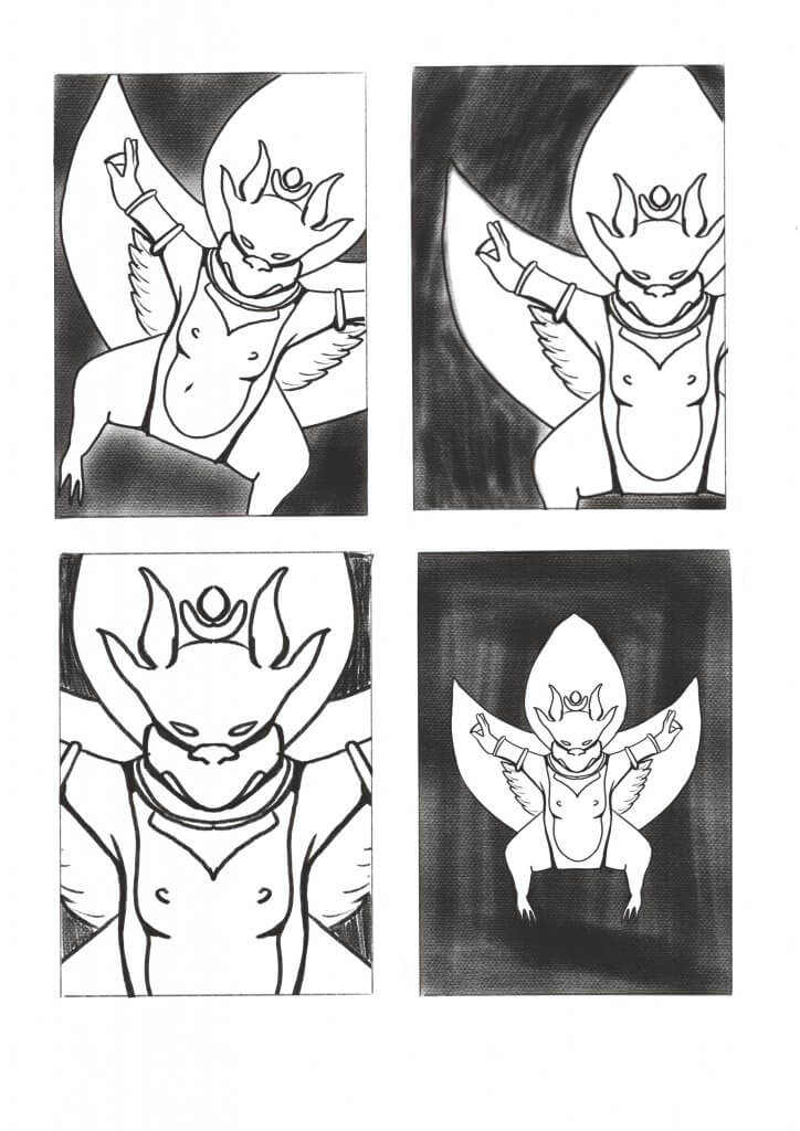
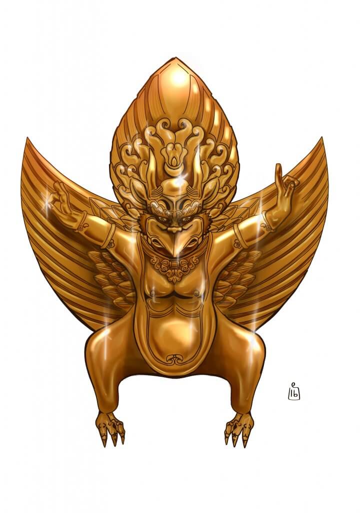
Next up was Hanuman. I wanted to render this golden statue like a digitally produced cartoon, I used soft brushes to render the shapes and brown/gold key lines to keep a cartoon feel but with a degree of subtlety. After I finished rendering light and shape I added some shine marks, which I thought really brought it to life, I’d even go as far to say it added some movement where I used different sized flares. Finally when I mocked up the artwork I added a background with some speed lines to add a bit more cartoon style action.
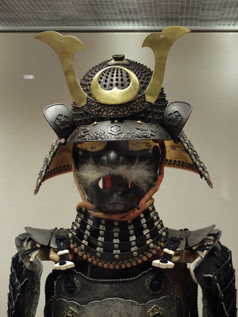
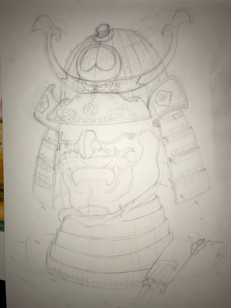
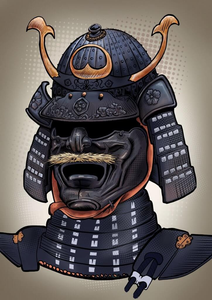
The next image was the samurai armour. I had taken reference photos but the suit was supported on a frame inside a glass case, it looked very noble and alert on display, but this didn’t really help me to get over a sense of action or the “cool factor” I transposed the information from my photographs into a more interesting 3/4 view, this was a very satisfactory exercise in itself, and while I used an eraser a lot it was something I was mostly happy with. I felt like I really used the reference as just that, something to refer to whilst creating something new. I used a medium tight crop on the face to emphasise the eyes and demon mask. This led me on to the next obstacle.
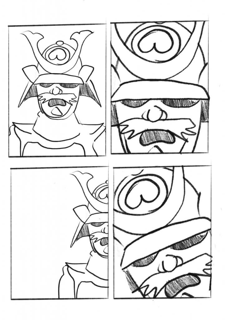
This exercise did highlight another aspect of producing illustrations for advertising and one I’m not sure I found the answer to. Once the artwork is delivered to the client they need to be able to use it. My artwork while A3 in size didn’t lend itself too well for positioning and text layout, maybe this would be agreed in a rough layout in advance with the designer of the poster, maybe a template would be provided or agreed on, it’s a little like the chicken and the egg, would they send me a template or would they work a new one on my artwork. I am a designer myself and I do work to briefs and guidelines with brands, Im sure in this case there would be a few amendments to layout if they didn’t have an existing set of boundaries to work to. I managed to mock up the artwork with a few tweaks and made a seemingly valuable observation in doing so.
Overall I’m happy with the results, the temptation here was to go very cliche, very cartoony for the kids, pop art for teenagers and photo realistic for the general adult audience I feel I kept a good enough distance from that. They all still describe the exhibits with a degree of realism and intrigue so I felt I satisfied the brief.