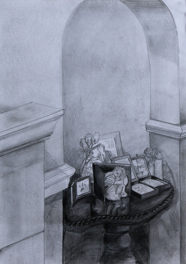
Using my previous 4 drawings I picked the viewpoint that offered the most interest. I decided a focal point and looked at the tonal values.
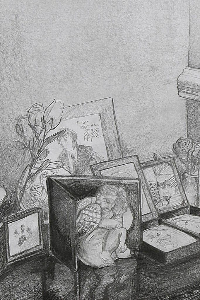
The white walls and fireplace are surrounded by the dark table, the table had a lot of objects on it. This table serves as a Memorial to my late father and our beloved pets that have passed. on the table is a silver cherub, its size and light tonal values made me think this would be a good focal point.
Using Graphite pencil, I blocked in the darkest parts and basic shapes, I don’t normally smudge pencils but as the walls are light and smooth I took too smudging in some hb pencil and then using a rubber I “lightened it up”
One thing I did notice is that my eraser soon become very slick and heavy soiled with graphite, this actually become a useful tool to block in large areas of lighter tone, used flat I followed the shapes of the walls and the archway, the graphite transferring from the eraser to the paper.
Studying the values in front of me I established my darkest tones was to be some of the black box frames on the table, the lightest would be some objects on the table and the wooden dado rail on the wall, these light shapes cutting through the darkened tones of the table helped draw the eye to the cherub.
The research I did just before this drawing did help me make some choices, for one I didn’t want to be too picky about the accuracy of my perspective, imperfect lines might add to the character of the drawing, and mine certainly wasn’t perfect or true to life, in the end after several attempts to get a straight line by hand I did use the edge of a metal pencil tin to get a clean line, the hand drawn ones I was making didn’t really look rough enough ti be intentional but wasn’t smooth enough to represent the solid structures of the fore place.
The research also made me aware of how you can show something that at first seemingly mundane can have some secondary focal points that surround the main subject. I tried to do this with varying degrees of detail and contrast.
Overall I’m happy with the end result, and the lessons learnt. I chose graphite pencil as I thought it would allow me a good amount of detail, it is problematic to work with in a large format and I do not think my paper was up to the heavy layering of different grade pencils I used. It got to point where the graphite didn’t hold to the paper anymore, and it would almost “clump” in certain areas, it certainly added texture but it also shows every movement and mark I made with my pencil. I would benefit further from experimenting with different toothed paper and layering pencils to prevent this “effect” when trying to establish dark yet detailed tones.