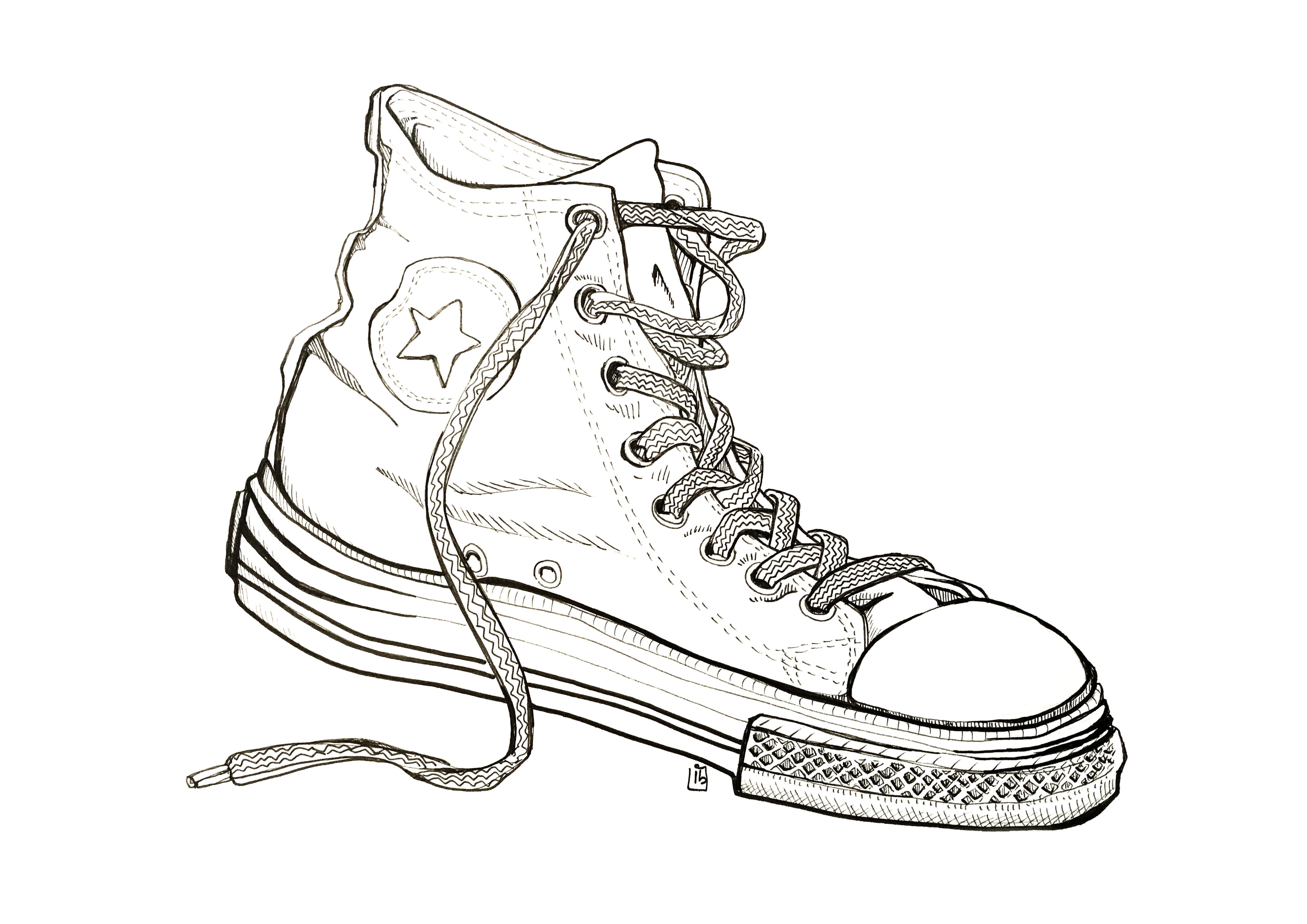
For this exercise I was asked to pick from a list of items and visually explore its characteristics such as texture and function, I thought the shoe would afford me a good range of exploration.
I chose a converse High Top style as it has different materials canvas hard moulded plastic and metal eyelets.
I varied the line weight to describe depth and tried to sculpt out the creases buy following the contours of the material, the harder parts I created a thicker harder line and for the canvas I tried to keep it thin to describe its ability to crease and flex.
Although the brief didn’t ask for it to be coloured I was curious what colour and tone would add to the image so I added some.
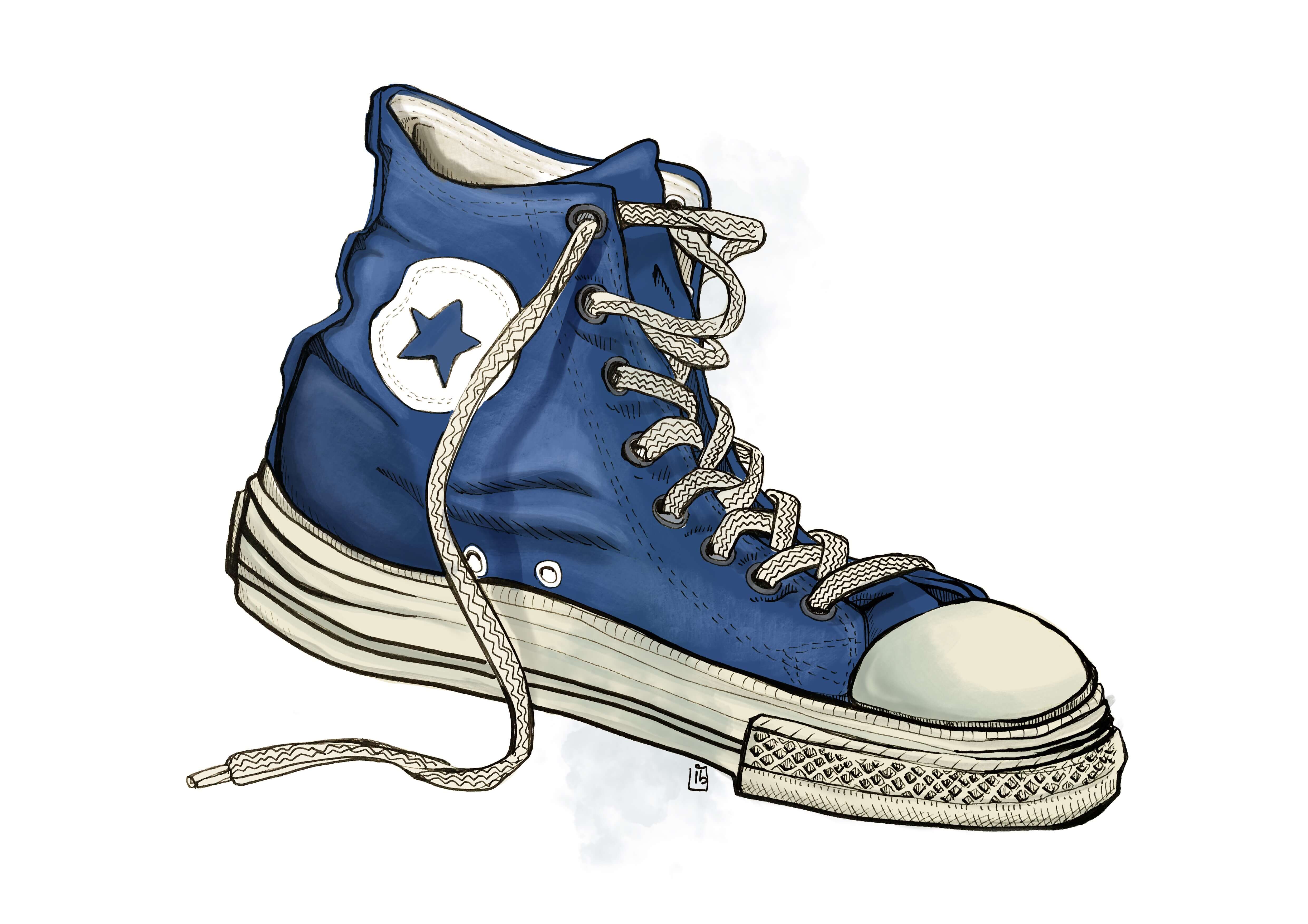
Linear drawing, trying to convey the characteristics of the materialsI added some colour to see if It would further describe the material.
For this task I was asked to make an alternative sketchbook.
I collected paper and card of different textures colours and thickness, and used a combination of conventional and alternative drawing tools. I believe this exercise was to explore the different mediums, again I did not focus on accuracy or producing anything too finished. I went experimental and had a lot of fun and enjoyment trying new approaches.
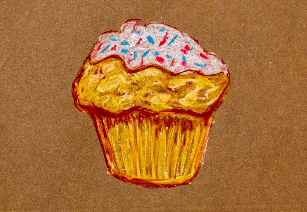
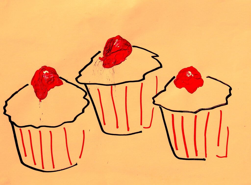
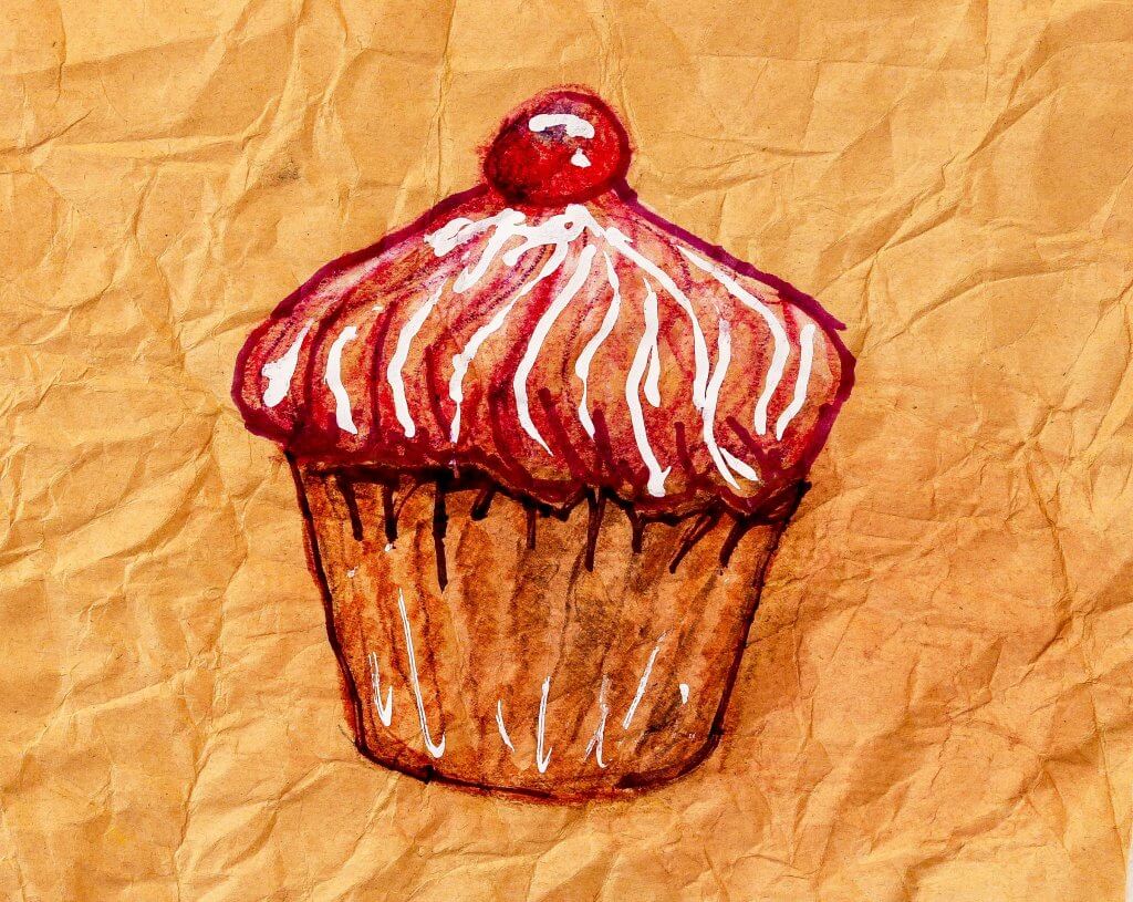
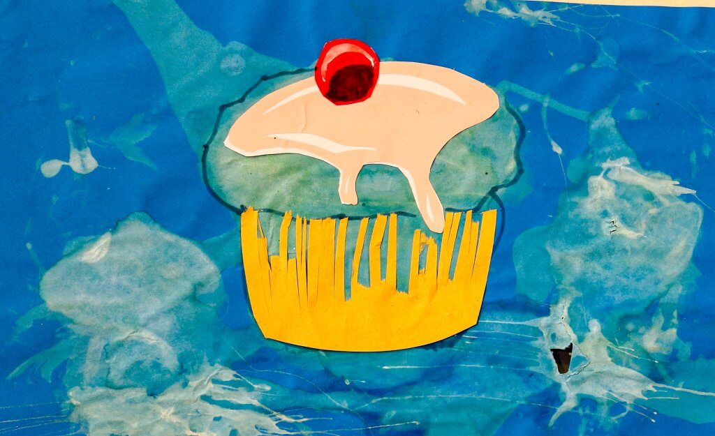
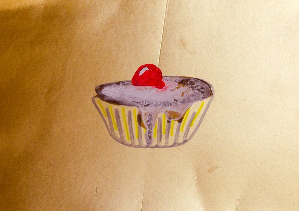
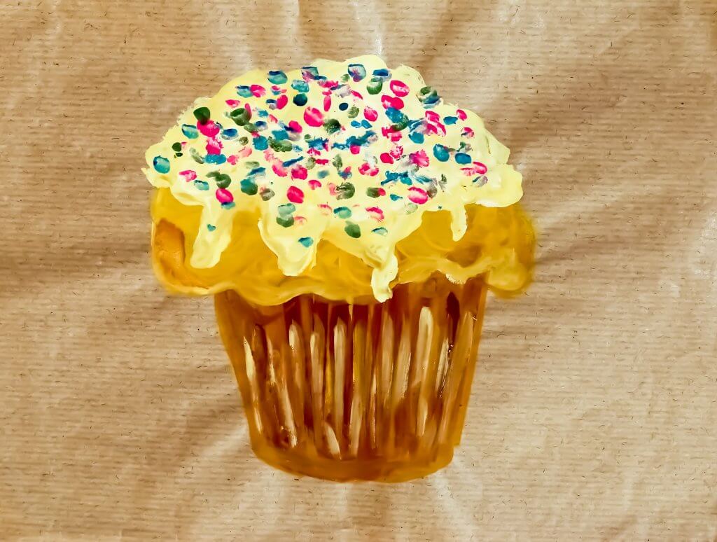
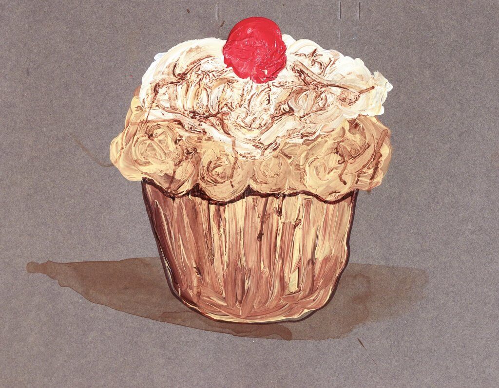
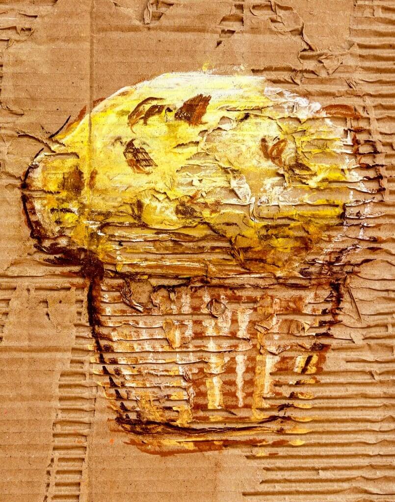
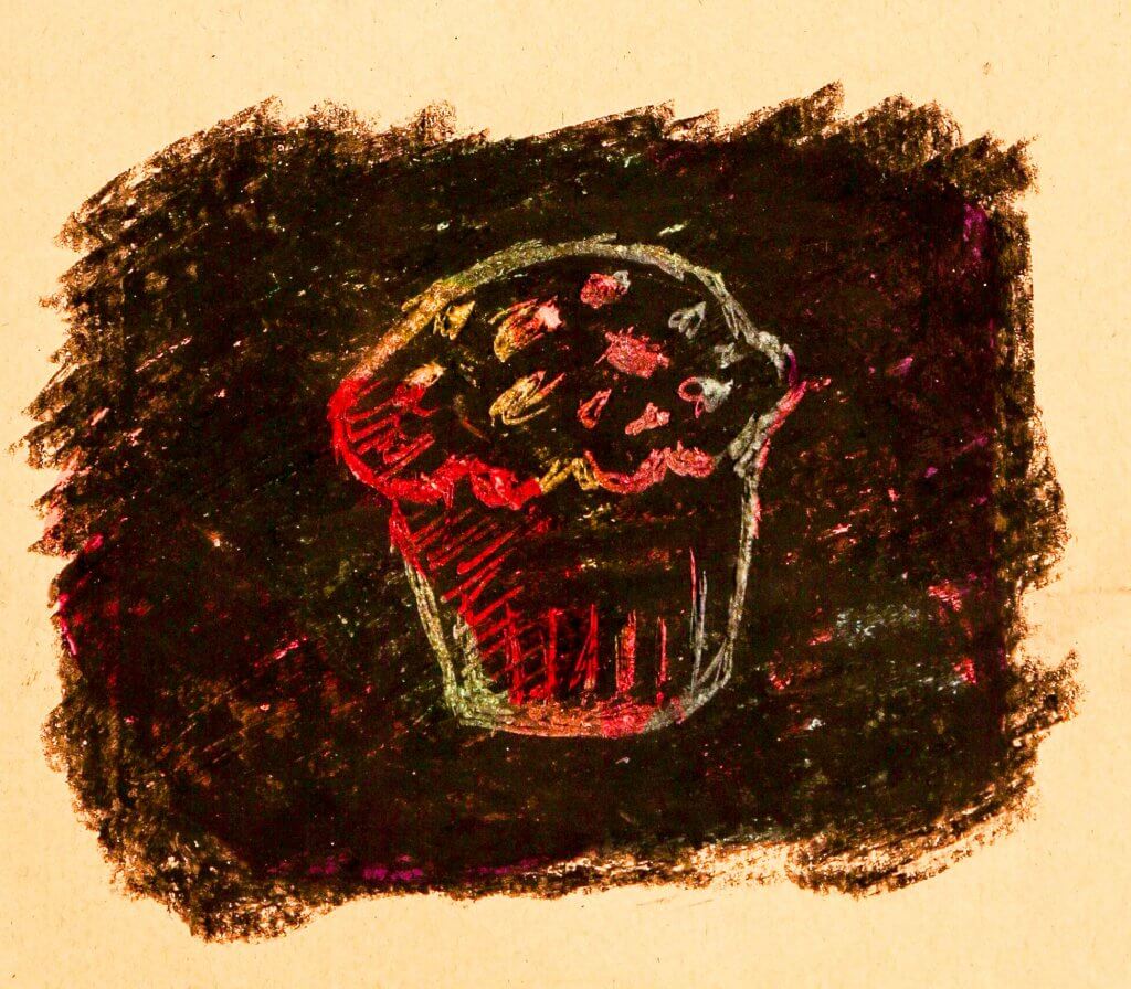
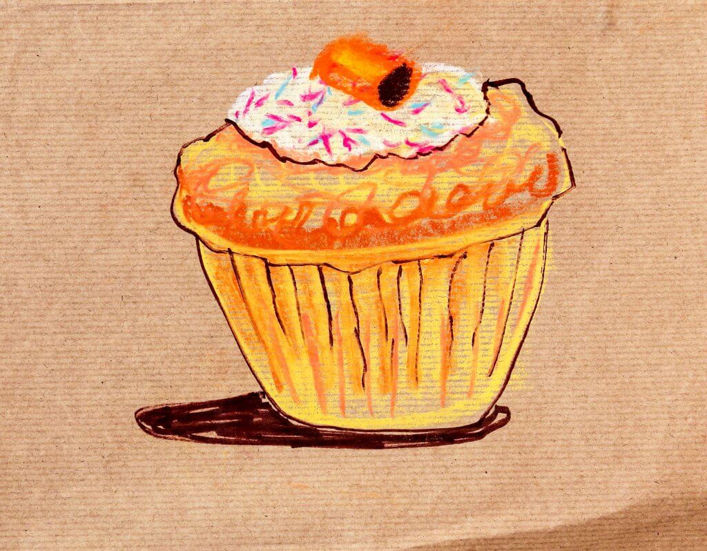
Out of the suggestions offered I decided to use cake as my subject, This afforded me some variety, although I mainly stuck to muffins as these seemed more distinct and easier to describe with a few well placed marks.
Oil Pastel on brown envelopeFelt pen on yellow paper with thick acrylic paint cherrysScrewed up waxy paper with coloured pencil and correction fluidBlue paper splashed with bleach, drawn in marker pen with cut paperGold card with marker pen and correction fluidBrown waxed paper with Oil pastelGrey card and thick acrylic paint, once dried I applied a thin water colour wash to fill in the cracks and groovesRipped box with exposed corrugated card effect drawn with chalk pastelsFelt tip under black wax crayon, the drawing was scratched in revealing the colours underneathOil pastels on smooth cardChalk pastels on rough corrugated paper
In this task I was asked to collect reference from the 1950’s period.
A lot of the reference I found seemed to originate from American culture, 1950’s Americana didnt take long to influence other countries, we can see this in car design fashion, advertising and interior design.
Checkered or Gingham patterns seemed to be favoured, American diners seemed to feature checkered flooring and wall tiles, while young people wore gingham shirts and dressed as part of the “rockabilly” look.
Car design seemed to heavily influence other aspects of 1950’s aesthetics, Radios Juke boxes and kitchen appliances, were all styled with curves and chrome embellishments, this probably was inspired in turn form the american space programme, things were being designed to reflect the futuristic space age.
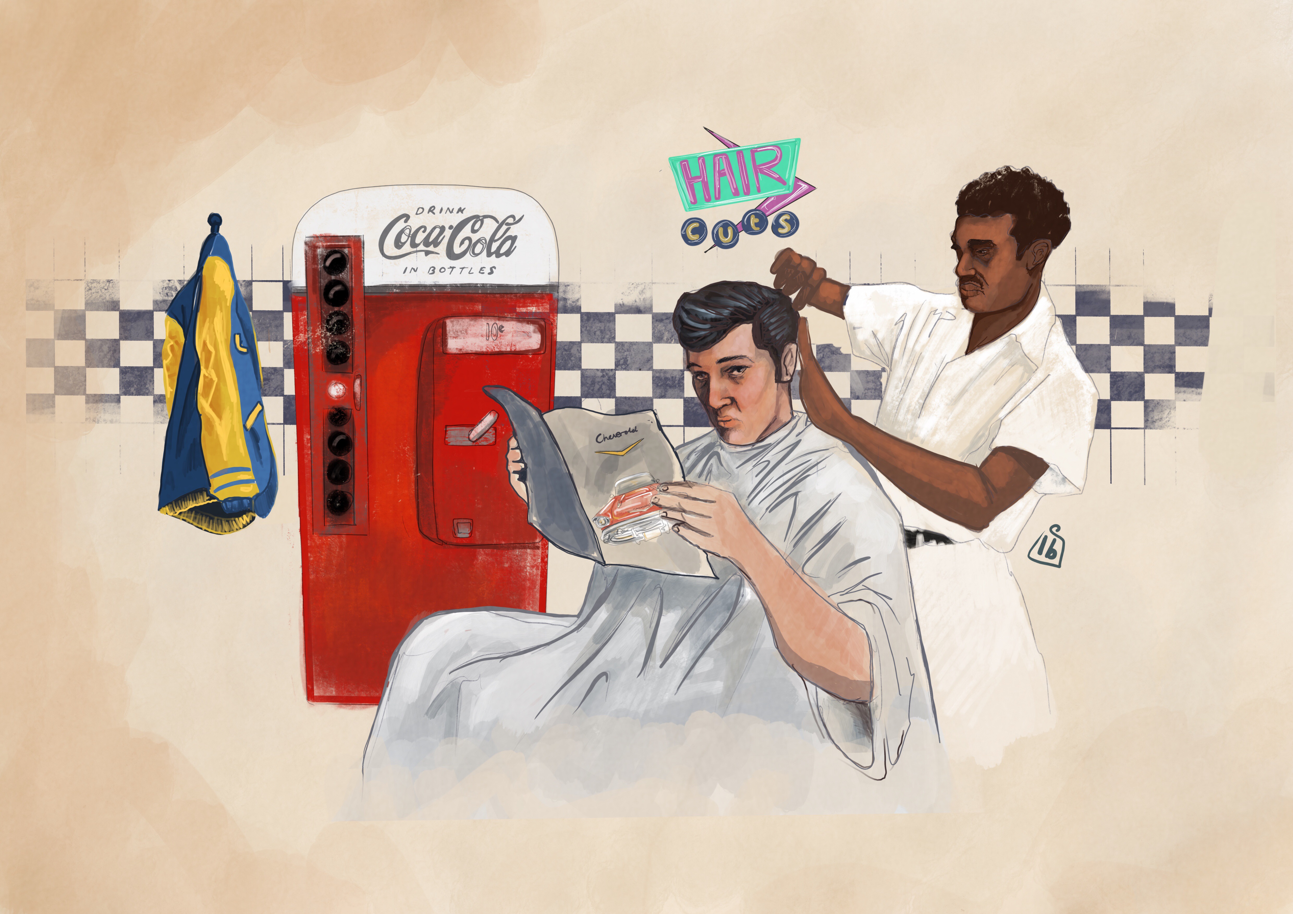
My drawing based on 1950s styling
I found a picture of Elvis Presley having his hair cut, I thought that may make an interesting alternative of someone sitting in a chair, is it Elv is or just one of his fans emulating his hero’s look, who knows, he is reading a chevrolet magazine/brochure. His college jacket is hanging up on the hanger (didnt mean to but looks like the one Michael J Fox wears in Teen Wolf) next to a glass bottle coca cola machine. For an extra 50’s touch I added the chequered tiles and a 50’s tinged wall sign, similar to what’s seen outside motels of the period.
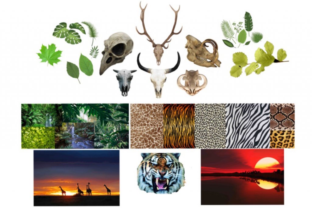
In this exercise I was asked to create a moodboard from my previously chosen word, wild.
While I was collecting the references for the moodboard I instantly saw the benefit, not only did it serve as a good collection of reference including texture and color, but it also served to generate and bounce new ideas, Its definitely something I would incorporate into a professional workflow.
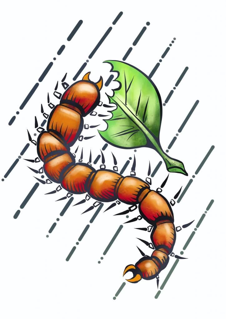
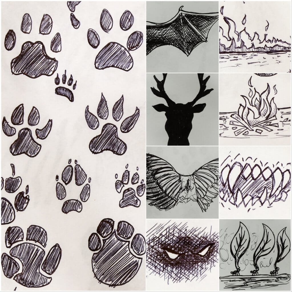
In this exercise I was asked to produce some loose drawings from a list of words, I chose the word Wild.
This was quite a liberating exercise as I didn’t have to worry so much about accuracy or finesse, just the idea of portraying the theme pictorially.
I would like to revisit some of these little scamp sketches and work them all up at some point, I purposely worked small, so I wasn’t tempted to add in too many details
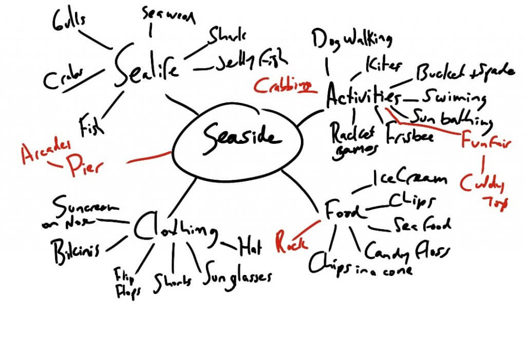
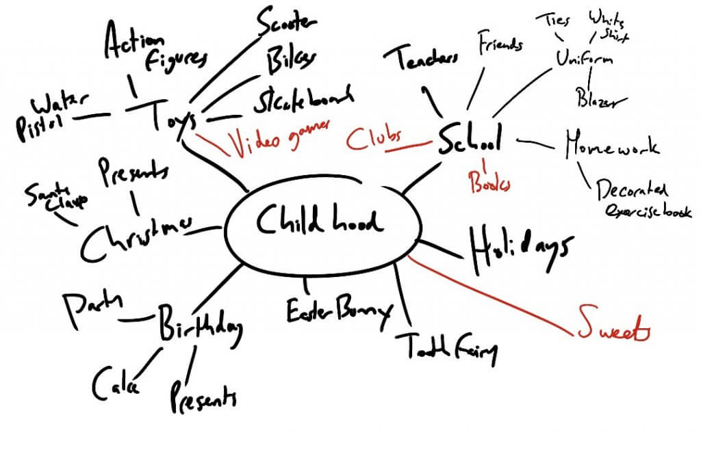
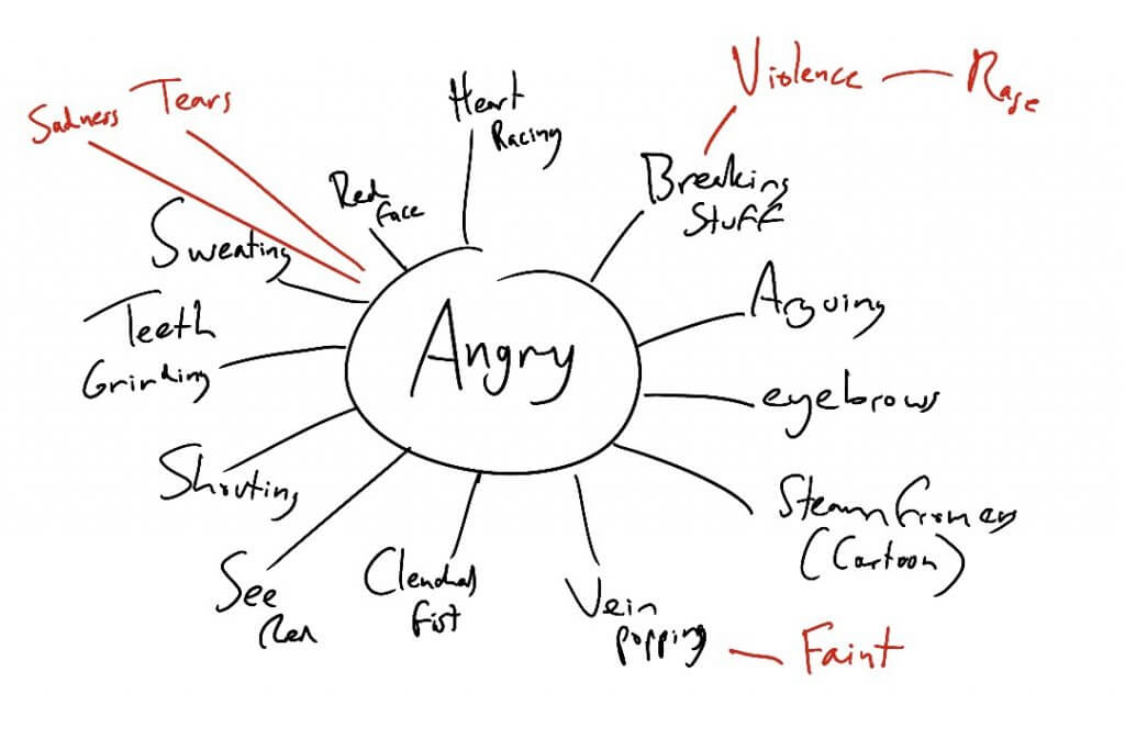
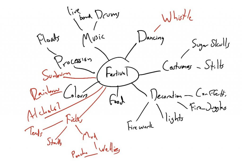
In this exercise I was asked to generate a spider diagram from each of the following four words, Seaside, Childhood, Angry, and Festival, I was then asked to get another person to repeat the task.
This exercise was an interesting one, based on personal perception, experience and recollection. This will of course vary from one person to another, but anything that featured on both lists would suggest a common or universal connection to the words and the individuals memory, thus making any artwork produced from it have a broader response and appeal.
– Which word was most difficult for you to work with?
Festival was the hardest one for me to relate to, I have never been to one and isn’t really my scene, although I love music.
– Which strategies that suited you best to come up with more words?
I liked getting the input of others to get a broader view. The spider diagram does grow and stem off into new ideas, maybe sometimes too many, but is a great way to come up with something that you wouldn’t have normally considered.
For the first exercise I was asked to write a brief for a piece of work that an illustrator I have a connection with, and to choose a piece I admired for its conceptual or narrative dimension.
One of my favourite illustrators is Jock, I have followed his career with great enthusiasm. He is a comic book and concept artist and his style stands alone with distinction in the comic book world. I am the proud owner of 4 limited edition signed and numbered prints that have increased in value although I’d never part with them, they are more precious to me than some extra figures in my bank account.
The artwork I chose to “brief” was the cover for Detective Comics #880, a batman story that features a now infamous cover.
– What are you being asked to do?
The brief is to produce original cover artwork for Detective Comics #880 a batman story that features the Joker. We want to show Batman indirectly, this should mainly focus on the joker.
– Why the client wants the Illustration- what they want it to achieve.
The artwork will be used to attract a sale of a comic book and possible later reprints as graphic novels, it has to be eye catching, exciting and dramatic with a “cool factor” to entice new readers.
– Who is the target audience?
The target audience are children to adult collectors from age 11 upwards, the content has to portray and uphold DC comics company values and shouldn’t contain excessive horror or violence.
– Where it will be produced and at what size?
The final artwork will be reproduced at 116.83cm x 26.0 cm which is a standard comic book size, however we encourage you to work larger as if the artwork is successful and gains a cult status we may want to use it for other promotional materials such as oversized editions and posters and other merchandise.
– Whether there are any restrictions as to colours you can use.
A limited palette is preferred and shouldn’t be too rich in colour, muted tones should be used in keeping with the feel of the book.
– Wether it will be used as a stand alone or with text, are there to be spaces left for titles, copy etc.
There will need to be space for titles, logos and barcodes etc, template will be provided.
– When they want to see the initial ideas, the visuals and the finished artwork.
Please submit examples of intended direction, preferably no more than 3 initial ideas, these have to be descriptive but not necessarily detailed. Once approved a deadline will be set.
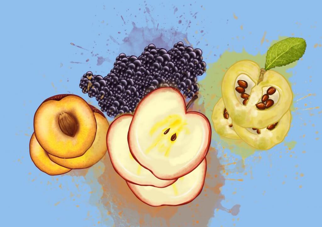
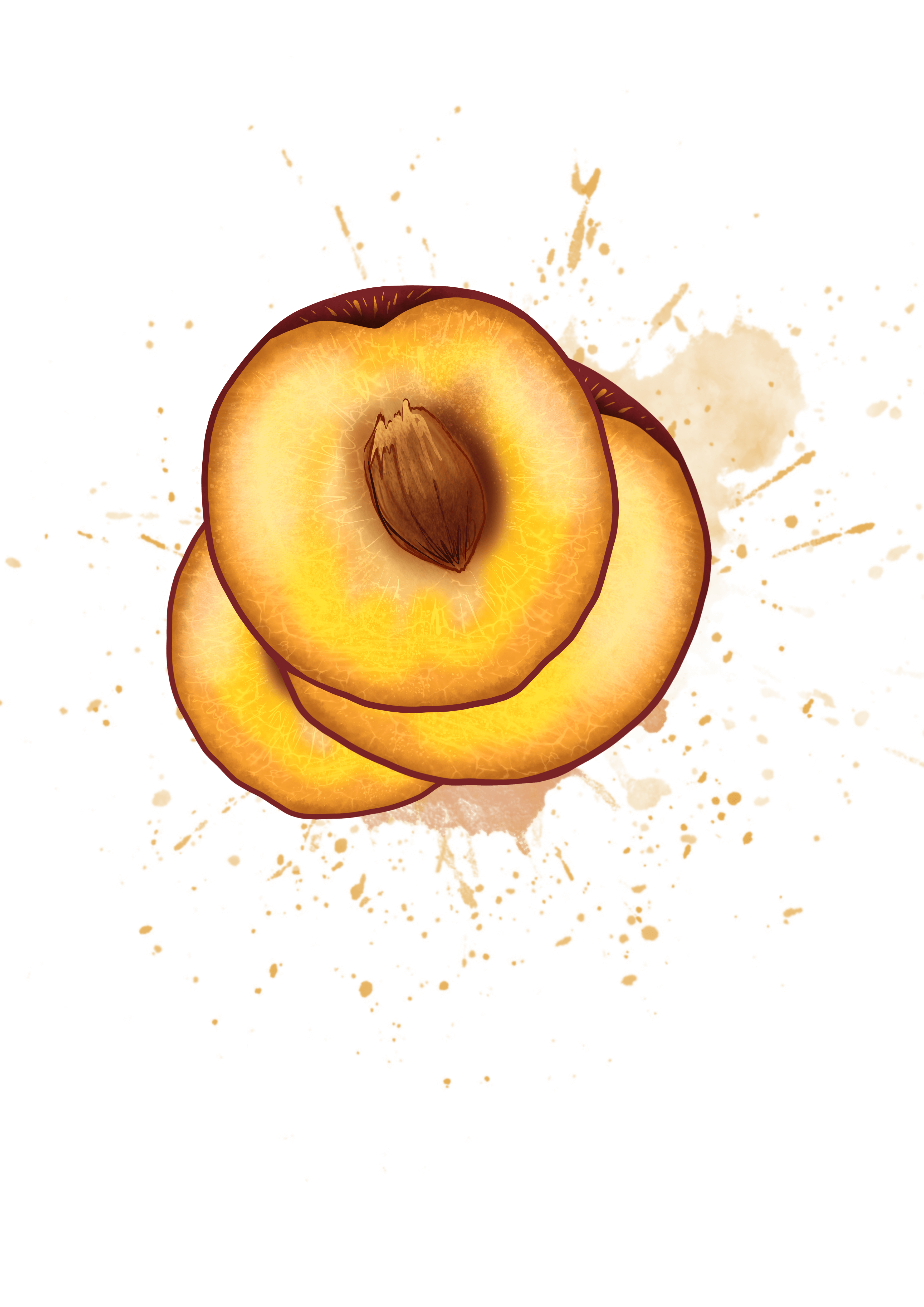
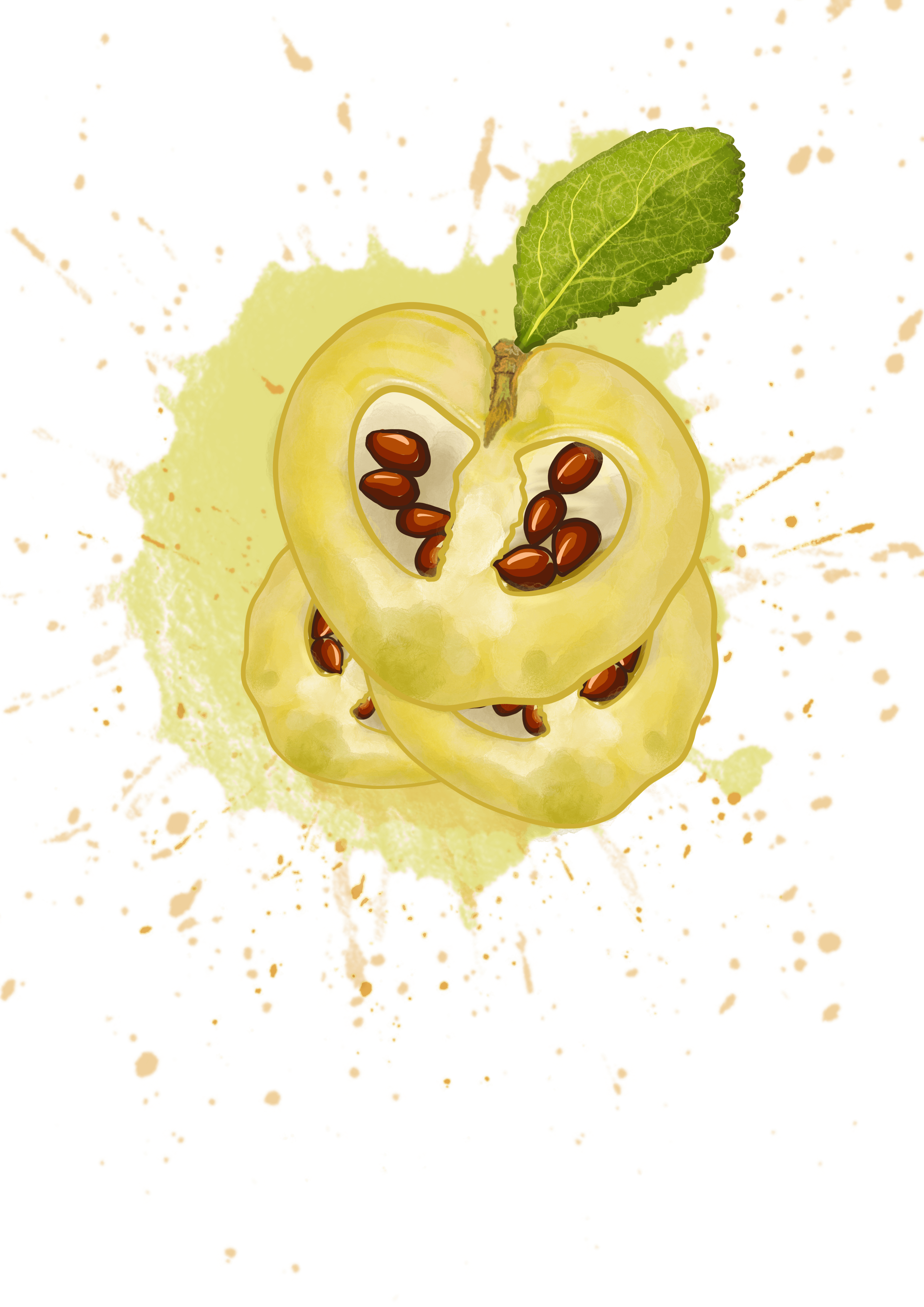
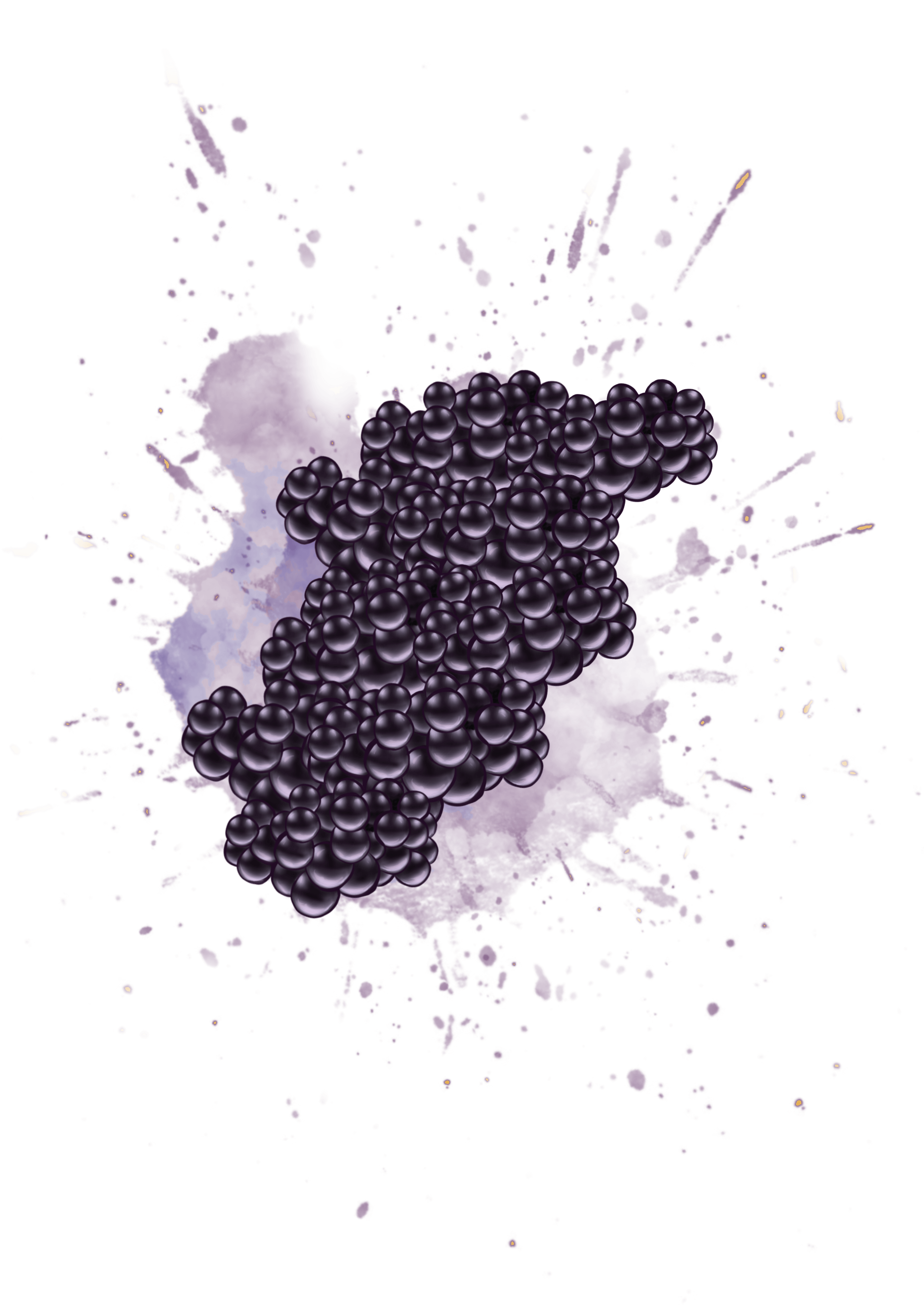
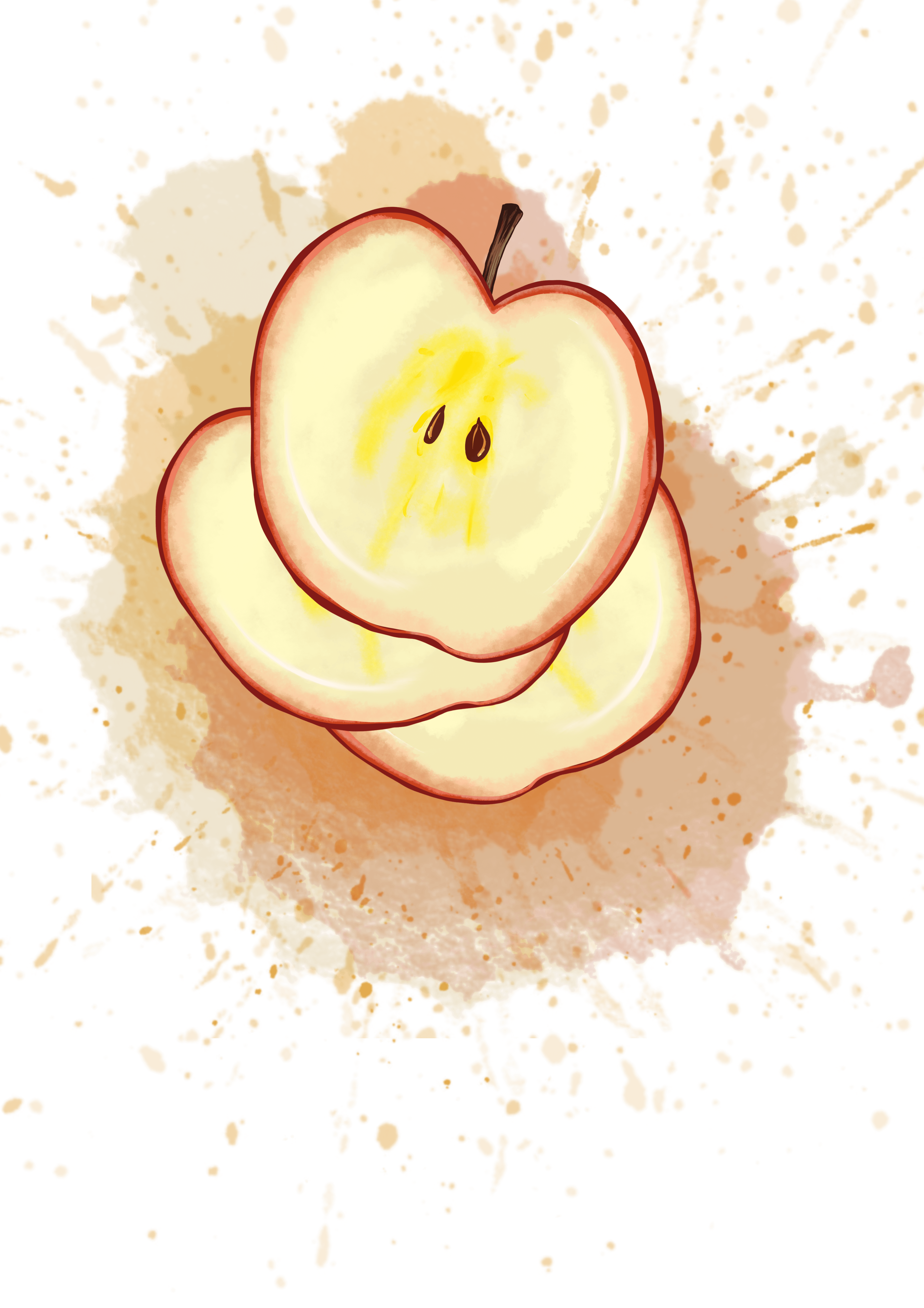
For this brief I was asked to create an image of seasonal fruits for Good Foodmagazine.
The problem:
To make a selection of appropriate fruits
To make the fruit seem appetising
to create an image which will work against text in that particular publication
I researched into seasonal fruits and gathered some information, from that list I started sketching out some ideas, I initially wanted to do some straight photographic style images, I have seen these featured in cafes and restaurants around london and they always looked quite appetising, once I started working on a drawing it really seemed quite a stagnant and passive concept, so I stopped working towards this direction.
I started to think about what makes fruit appealing, it’s not the organic shape, the lumps and rough bits, these would need to be present in the Illustration to depict the subject faithfully and accurately but wouldn’t make it appetising.
I came to the conclusion that Fruit is preferred when its juicy and ripe, colourful and interesting to look at, I started to sketch fruits cut in half and included some splashes, I kept the shapes simple the detail minimal but with texture, this to my mind seemed to fit the brief.
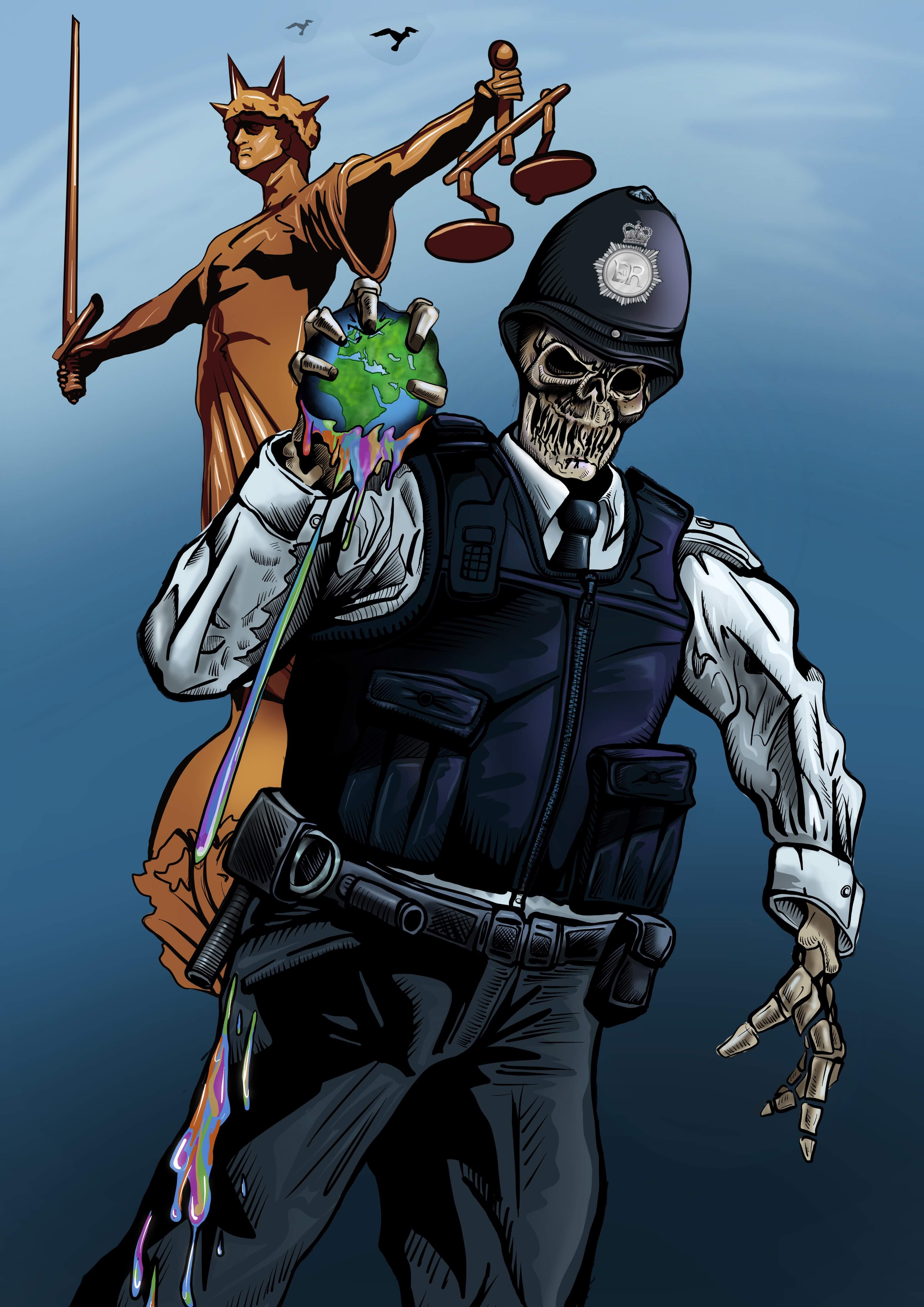
For this brief I was asked to create an image for The Radio Times for a TV programme about racial discrimination in the police force.
The problem:
To come up with an idea that suggests what discrimination is
To ensure sensitive depiction of people of diverse ethnic origin
to create an image that entices people to watch the TV programme
This was a real challenge, Racial discrimination comes in all forms and guises, and was essential I stay fair and impartial in the presentation of the artwork.
I originally planned to make a grid of police officers all looking outwards with an officer in the middle being looked at from above below and from the sides.
This seemed like a good enough concept, but it was flawed as it meant showing different ethnic groups even though I intended on showing all the characters in blue tones, I didnt want to portray a group as a victim and I didnt want to imply the depicted groups were all racist, I then thought what if I didn’t show their faces, I then came up with the idea of using skulls.
Using Skulls would remove any reference to ethnicity and make a strong statement, we are all the same underneath.
The skull idea would bring a very sinister and dark tone to the image, which I eventually offset with bright colours.
I then had the idea of putting the skulls not in a grid but depict a skeleton police officer, squeezing the colour from the world, the symbol of lady justice with her scales in the background looking away, the whole act of discrimination being a hate crime carried out by people paid to enforce the law.
I felt was on the right tracks, I’d solved the problem of keeping it equitable so as not to offend minority groups and to come up with a shocking and visually interesting concept to attract viewers.
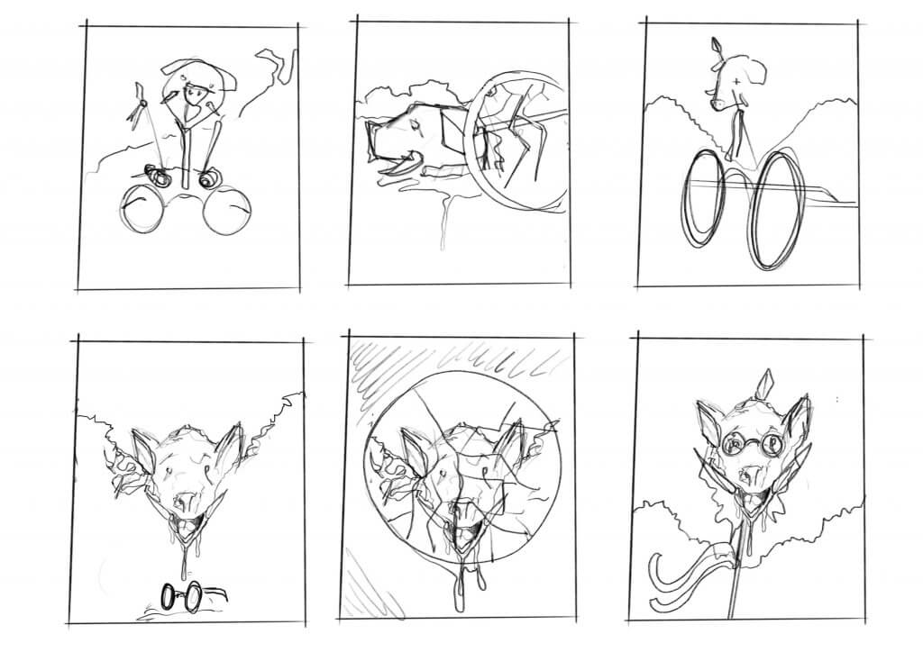
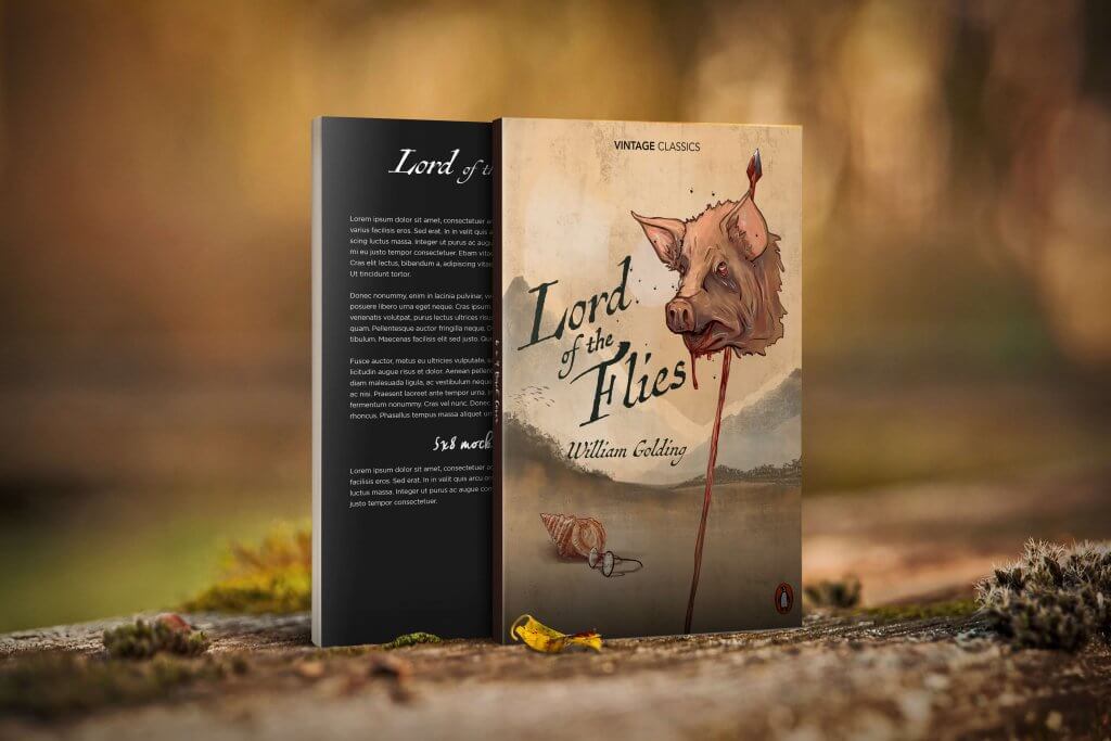
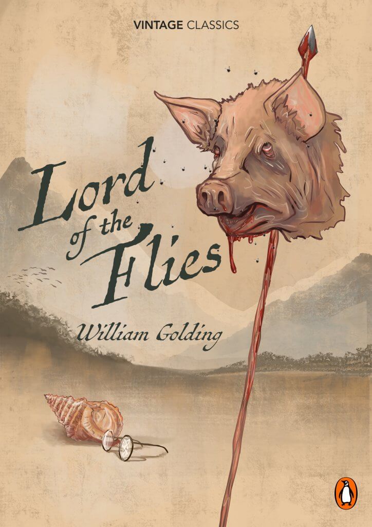
I really quite enjoyed this exercise, I looked at my book shelf and picked out William Golding’s, lord of the flies, I have read the book a while ago but I can still remember the story, its message (at least my interpretation) and its key scenes.
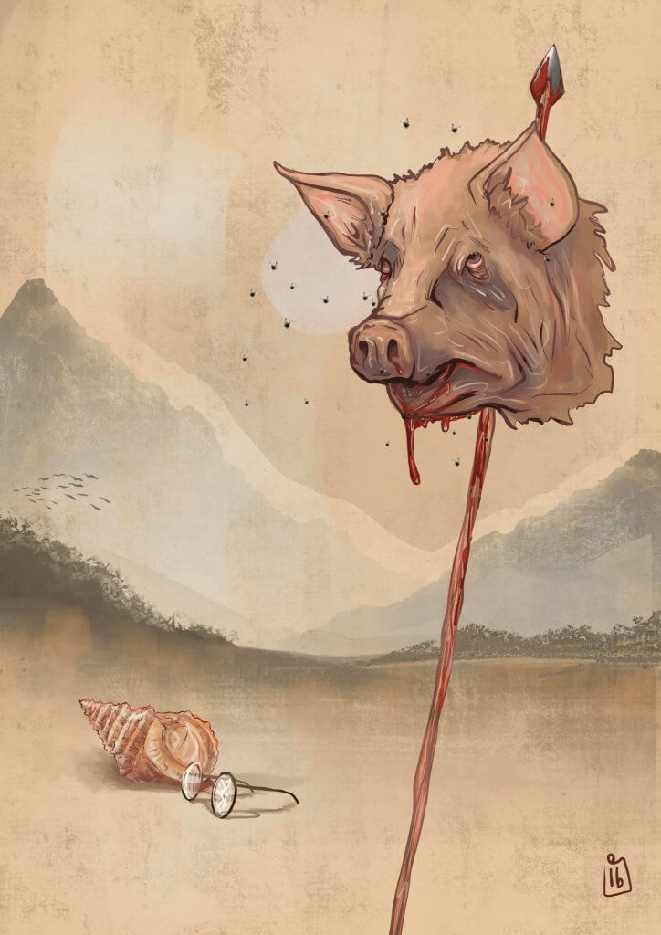
The key scenes/characters for me, are the conch shell they use to establish a democratic system and order, who ever holds the shell is the one talking. This upsets some of the boys and eventually divides them, this needed to be a part of my cover.
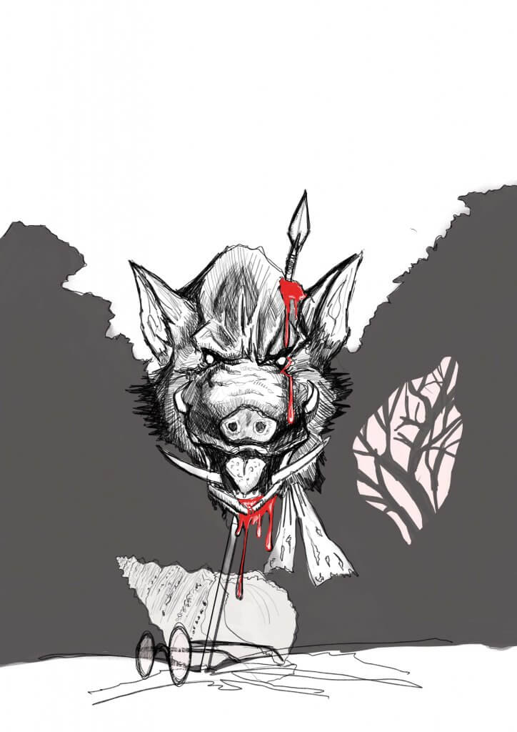
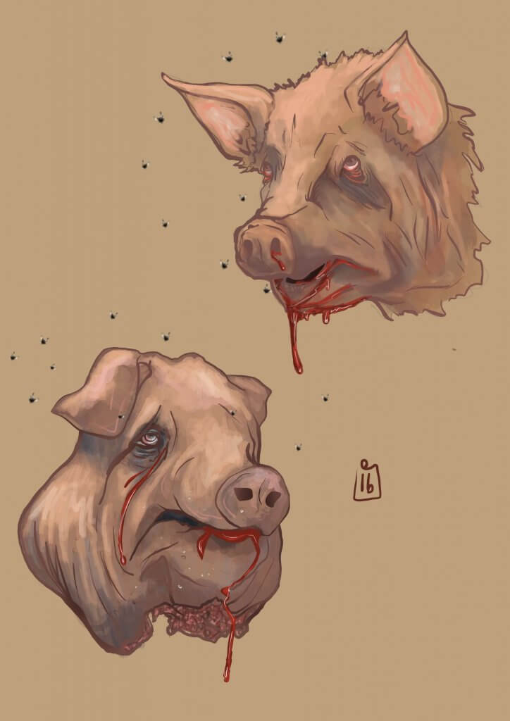
Piggies Glasses, these to me represented a few things, they represent civility, and mans achievement to create and repair even poor eye site. They allow the boys to create fire for survival, these to me sum up mans inventive side, again these also are a sought item by the other faction who just want to have fun be reckless and hunt, which brings me to the main character, and the shocking part of the story, the pig, I was in two minds about displaying something so shocking as a pigs head on a spear, it sets the tone for the story and as an old book it seems to be the main feature for most of the covers, I decided that maybe a bit of shock was needed, I’d seen a few (examples below ) that included the text in the image rather than in a box over the top for example, I quite liked that look so decided that’s what I’d aim for.
lord of the flies thumbnailsThis was a sketch to get a better understanding of the subjectsSome more in depth studies, I decided to go with a pig rather than a boar.
I tried several different version as you can see from the thumbnails, I wanted to get over a classic look, I opted for worn old looking faded colours and a washy style of paint, I had originally seen this maybe as more of a woodcut style but this didn’t convey classic enough.
The final Artwork Mocked up with titles logos etc.