Exercise 1: Still life using line

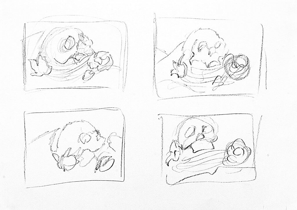
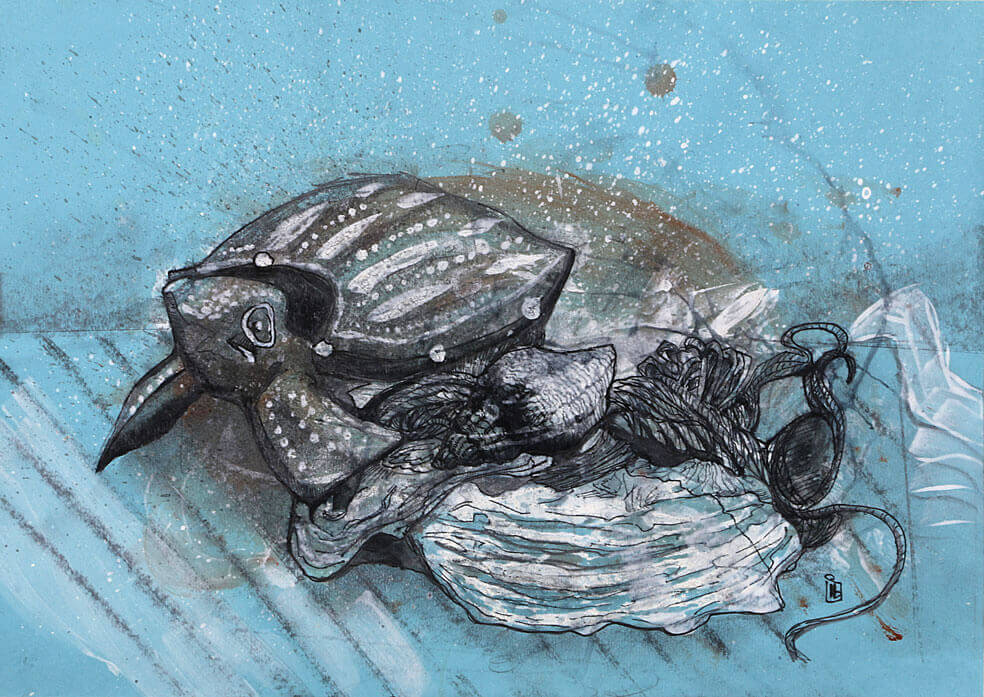
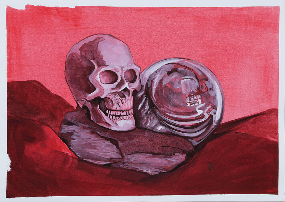
I put together a still life trying to find objects that are round or curved, I found a plastic skull I use for reference some coiled line and some dried flowers from a bowl of pot pourri. I made for sketches to choose an interesting composition.

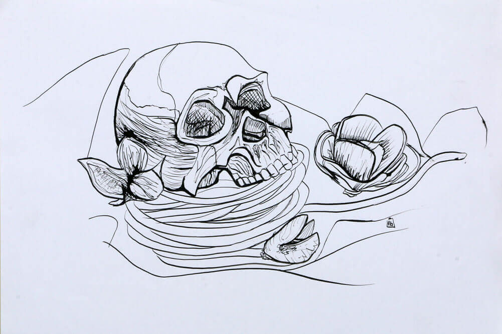
Using a dip pen and black Indian ink I started to sketch directly to the paper, it didn’t specify if I could or should do an under drawing. It certainly was a test of my mettle as I bravely made marks with no underlying suggestion of the composition. The dip pen is a tool that I’d love to invest more time in, it has an amazing variation of line weight but it also has a pretty steep learning curve, I did end up with an unwanted blob of ink and the odd smudge.

This was to be an exercise in texture pattern and shape using line only, I managed to resist blocking in black areas and tried to focus on line weight to describe depth and shadow. The drawing didn’t come out quite as I hoped, I want to try it again with a light under drawing to make sure my composition is a little more thought out, this time I will try a brush pen and really focus on the weight and direction of my line. I think the brush pen will be a little more intuitive for me even though it’s not my go to method to disperse ink, that would be a fine liner pen, so this exercise will be a valid introduction into brush markers.

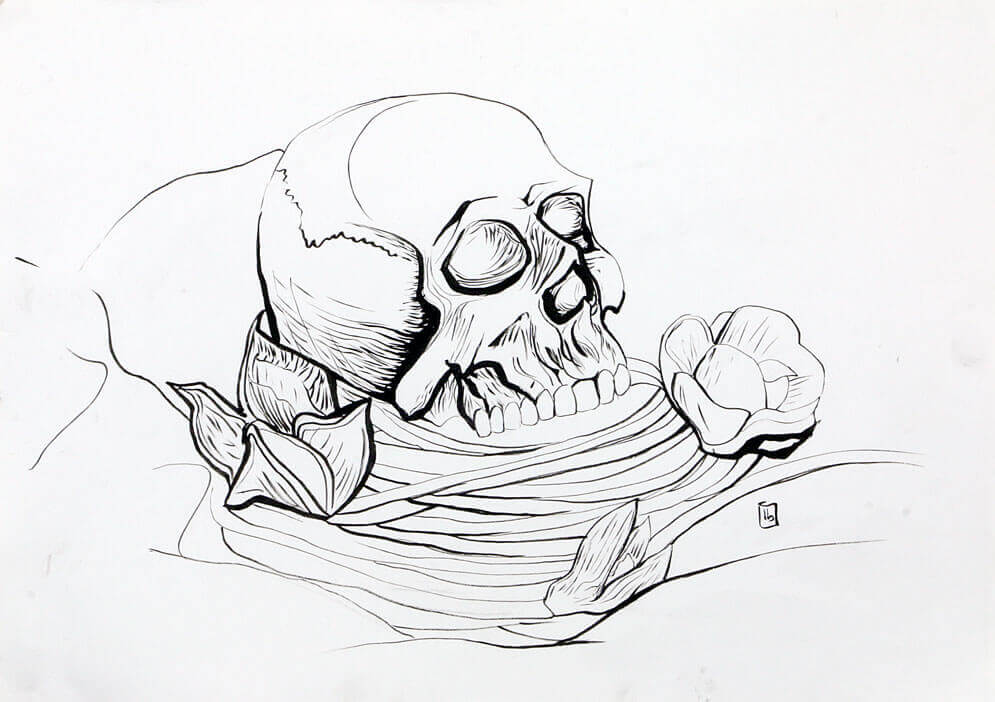
I restarted the drawing this time using a soft pencil to gently outline the composition, I wanted to ensure I had some interesting tangents in my lines, and some of the items cutting through other shapes i’m hoping this should make a more interesting end result.

Once I was happy with the layout I gently rubbed the lines out so there is just a very faint guide to follow with my Pentel brush pen.

The brush pens main benefits is a continuous supply of ink with the wide range of line weight. The brush isn’t as firm or stiff as the metal nib of a dip pen so a lighter touch is definitely required to make the most of the potential range. Another consideration with the brush is direction, it does produce the best intentional line when pulled, a characteristic that doesn’t exist with a fine liner. I start by making very light strokes, and open the bristles of the brush with some pressure where i want to convey depth such as the plastic skulls eye sockets and nose, I also try to make the lines heavier around some of the pot pourri that is darker in colour with an attempt at ensuring the focal point is on the left side of the image. Overall I am much happier with this image, its seems less messy and a little more informed, although looking at the first attempt again there is some things I like about it, the texture for one seemed a bit more interesting.

Exercise 2: Still life in tone using colour

For this exercise I was asked to set up another still life, the aim was to introduce colour while still observing tonal values.
All but one of the objects in my still life had a smooth reflective quality, the coarse string would need a different approach to the hard shapes being reflected. Whilst the glass bottles all had a colour I wasn’t so much focused on representing their true colours, I have a limited set of oil pastels and I thought using colour this way may be more interesting.
The liquids inside offered smooth tonal; transitions and hard distorted shapes, I tried to use my yellows and oranges to represent the lighter tonal values and the purple blue hues to convey the darks.
I was pleased I chose a palette that wasn’t true to the subjects, this took away the focus from trying to recreate the exact hues and saturation and focus on the tonal values. I also used to think that reflections in in glass or mirrored objects were quite daunting, but with all the glass items at my disposal its certainly something I’m more comfortable approaching now.

The coarse string, while it was affected by light was much more simple to separate, very little steps in between, I did try to break it up visually by adding a few colours next to each other, hoping that would give the feel of a rough coarse item.

Exercise 3: Experiment with mixed media

Working on blue paper I sketched an under drawing in graphite. I used a wax candle to seal the paper. I flicked white paint over the image, I wanted to add some texture and break up the flat blue of the paper. Next I added some brown paint, I thought this would sit well with the blue, the wooden turtle was brown in colour. I used a hair dryer and dried off the paint, the wax did its job and prevented the paint from penetrating the paper. this helped create the irregular but smoothened edges of the shell.
Once the paper was totally dry I added a layer of ink, I used a permanent, water proof uni-pin fine-liner. building up line weights to try to describe the shape of the objects. Finally I picked out the remaining details and highlights in white. The end result is a space exploring turtle, I quite like the outcome though.

Exercise 4: Monochrome

I assembled some items for the still life, a glass paper weight, a piece of blue slate and a resign skull I use for reference when drawing heads.
Using a single red, a white and a black tube of Gouache paint I mixed three values, tinting the red with white and creating a shade with the black.

The three objects have three different qualities, the glass paper weight is transparent, and glossy, it picks up all the reflections from the room and the surrounding items in the still life, its shape distorts the reflections. the resin skull is quite dull and doesn’t reflect light as well, grey in colour shows up the shadows quite well and offers a lot of detail.
The slate has a lot of texture and the ridges create some harsh changes in tone.
The key to these tonal exercises seems to be some forward planning, observing the tonal values and then establishing a medium to make either lighter or darker. The dark cloth being the darkest in this still life and then the reflections off the glass paper weight picking up from a selection of all gave me a lot to study. I really enjoyed this exercise.