Exercise 1: Developing your studies

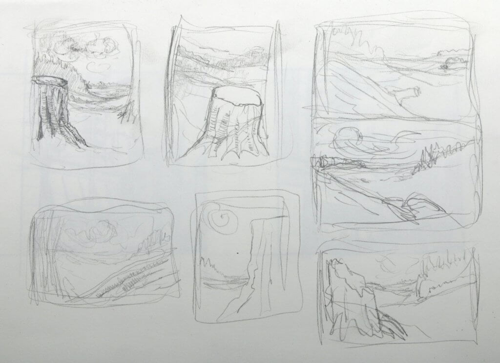
This exercise called for me to draw upon my observations so far, the main thing I have noticed with my landscapes, the focal point is often small, subtle or even non existent. This is likely because I am having to find suitable areas to draw for the exercises rather than having inspiration hitting me and seeing something that would be interesting to draw.
For this image, I wanted to draw on some of the things I have enjoyed and found interesting to draw, I hope that will make my efforts more interesting and hopefully even a little dramatic.

I wanted my composition to have some depth, I wanted to portray some receding landscapes, some rolling hills and valleys all under a dramatic sky, much like I saw in Constables works. My main focal point would be a cut/broken tree trunk, as you look past that other things will lead you through.
I divided my scene in layers, my focal point up front, this would show the most contrast and detail, as we journey through the drawing, we see a deep forest, this would be less contrasty, but have dark to mid tones, finally the far distance, this would offer the less contrast and me much lighter in value, I only wanted to imply detail here as it would be too far away to carry minute visual information.

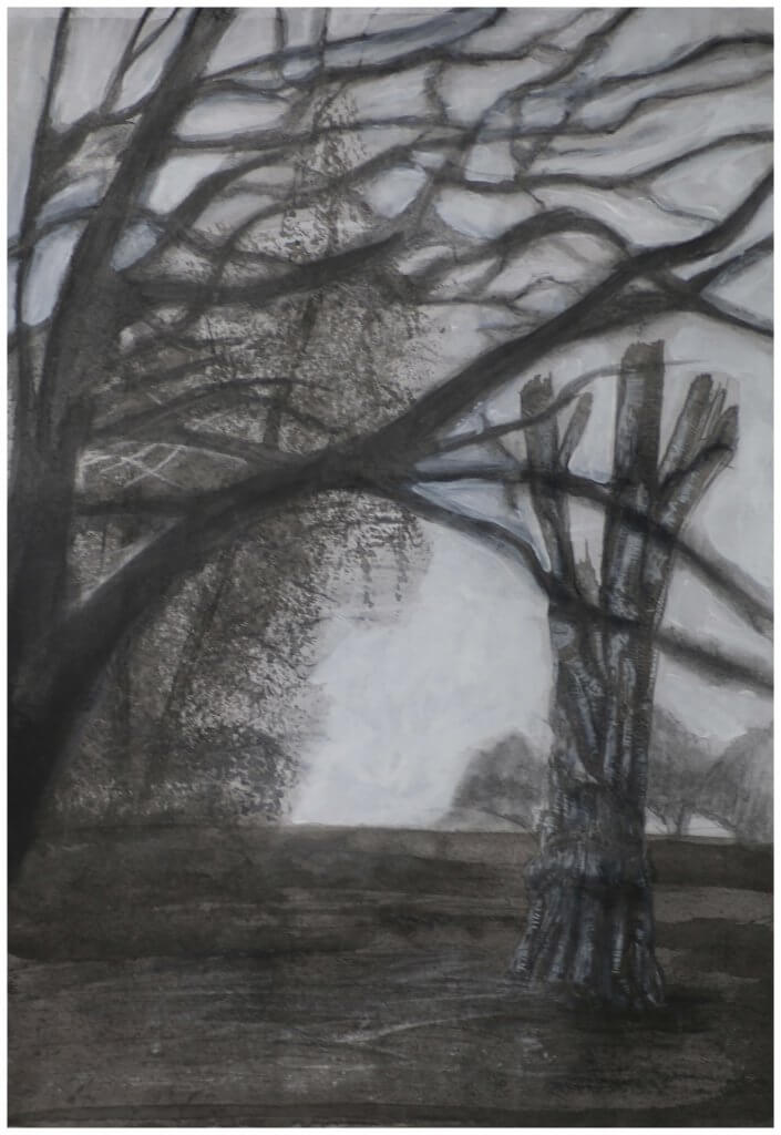
I worked to my strength of understanding to the mediums I had been using, Pencil offers me control, and come in a wealth of tones, if I require darker tones and soft edges I can select a pencil that will help with that. Clouds seemed to be well suited to this medium, I can work the graphite into the paper smudge and blend hard edges to soft and get a good degree of control into my marks and gestures.

I really have enjoyed using diluted drawing ink with a brush, the varied brushes offer a wealth of pattern and marks, the fan brush when suitably loaded with diluted ink, starts to clump and lends itself nicely to building dense foliage, it also means I don’t have to work with line, I want my line work saved for the main focal point.
For the tree stump, I used a combination of fine liners and diluted ink, this line and wash technique was how I hoped to retain the white of the paper and some nice deep blacks, offering a good range of contrast.

Some composition thumbnails

Exercise 2: Foreground, middle ground, background

As the title suggests, this exercise is all about establishing a fore, middle and background. I took that very same approach in my previous image, I thought this time I would attempt something that while still covers off the learning in this exercise diverges slightly from the guidelines.

I wanted to try to use the middle ground as the focal point, obscuring the focus from the fore ground to suggest depth, the technical challenge here was trying to recreate the blurred depth of field, like you would get if you was using a camera with a large aperture.

I layed out a horizon with some diluted ink, allowing it to dry and settle in pools, wanted a ground like texture and this seemed to work nicely on other attempts with this medium.

Again I blocked in the tree in the background with a fan brush soaked in diluted ink, I didn’t want this to be to bold and dark, I wanted it to appear distant and misty.

next I worked with a large graphite stick the blurred foreground branches, i worked it into the paper, I didn’t want any had edges or clarity, this was to be a blurred soft focus. It didn’t really work, it lacked structure and fidelity, it wasn’t immediately obvious we was looking through tree branches, I contemplated starting over but wanted to have a think about why it was failing or I was destined to recreate a mistake ion the future.

I squinted and blurred my eyes. looked at photos that used the shallow depth of field technique and decided that i needed to tighten up the shapes, I had distorted them too much. I fetched some white acyrylic paint and thought it would be worth a salvage attempt, even if it was just to experiment. The paint went on and muddied a little, the graphite stick I had used was the water soluble variety, it was not a totally awful result as the moisture in the paint mixed with the graphite it took on a new life.

The final image, isn’t what I quite had in mind, but I wasn’t too opposed to the end result, my attempt to fix the drawing had given it an almost double image or ghosted effect, a little like when you look at something cross eyed.

I felt I had learnt some good lessons from the exercise, even one or too that ended up as a bit of a surprise. I was ready to call the image complete and move on.