Exercise 1: Groups of objects

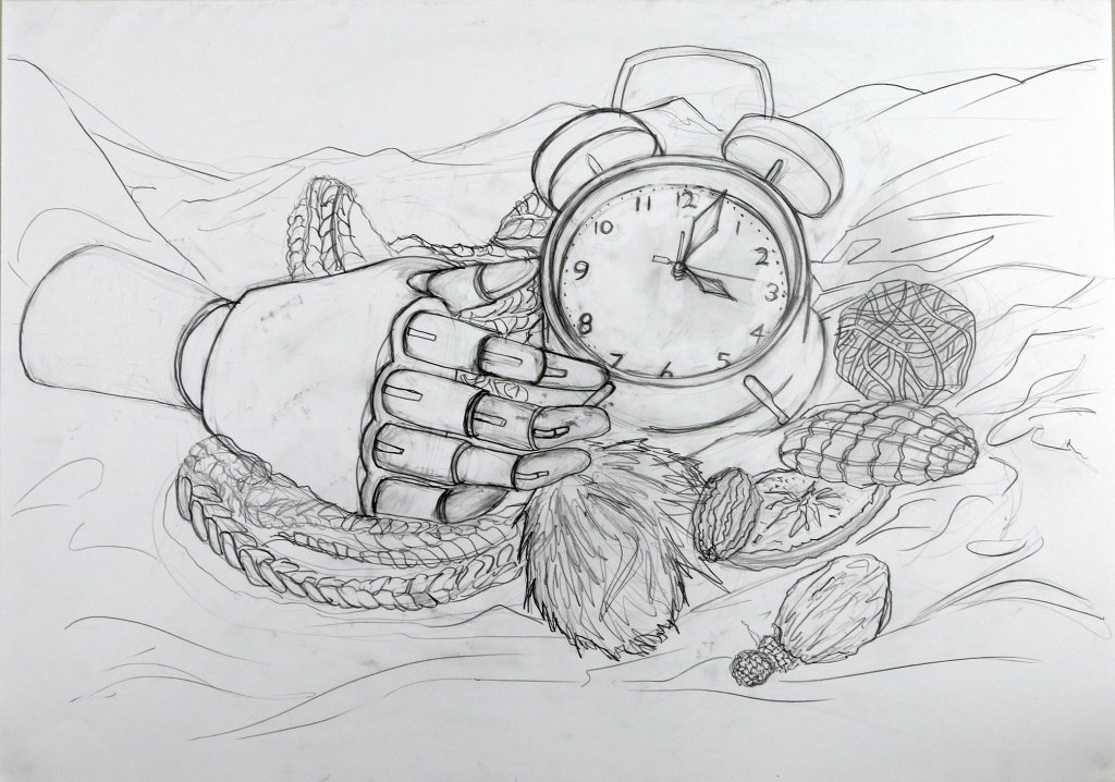
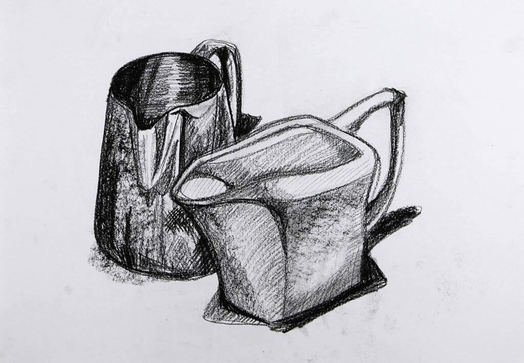
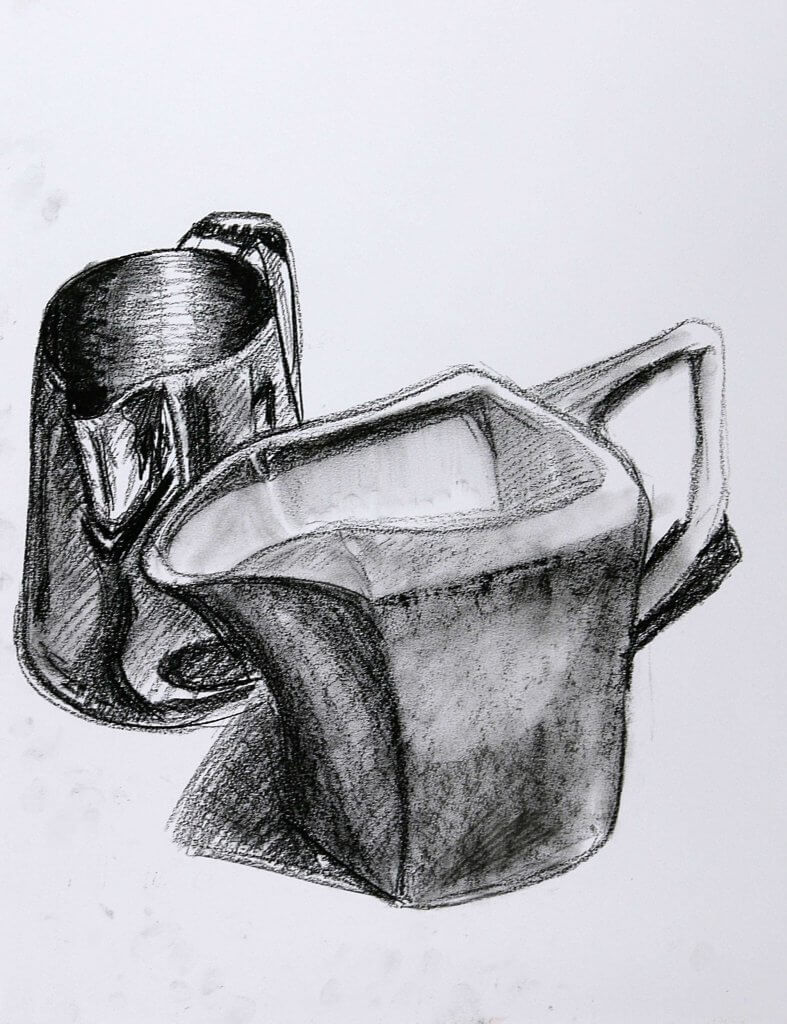
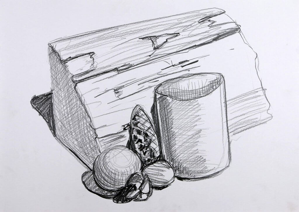
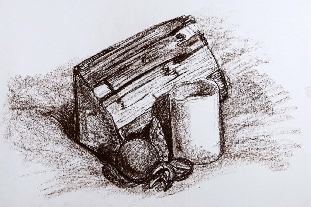
For this exercise I was asked to find a group of objects ad arrange a still life to draw, I wanted to explore line weight in this image, I was hoping I could vary my marks thickness and intensity to describe both light and the solidity of their structure.

I chose graphite pencils to do this as they offer a relativity consistent line weight when kept sharp an as they get duller produce a wider mark.

Using a softer approach I sketched in the form of the objects, trying to remain mindful of my light source and the surface I was trying to capture.
once I had the composition mapped out on my paper I worked in heavier lines under the under drawing, as in the exercise guidelines  tried to work through objects, this helped me to understand the objects form and shape, this was easier with the man made objects, such as the clock and artists hand as they was comprised of obvious shapes, the more organic items are harder to predict.
I tried to keep line weights thin where light would reflect, and conversely thick where they would not, these were really quite difficult rules to follow, I was still trying to capture shapes even with the aid of my loose under drawing. A more methodical and strict passes would probably be a better approach if I was to repeat this exercise, all in all I was happy with the outcome, while the drawing is still pretty rough around the edges and didn’t quite capture the lighting as  I had hoped. I feel I learnt a little about the importance of my approach, accuracy and structure rather than looseness and spontaneity, and how that relates to presentation of the resulting artwork.

Exercise 2: Observing shadow and using blocks of tone

This exercise was about observing and the blocking in of tonal values,
I wanted to capture the light interacting with the two different materials the objects are made of.
One was a metal jug, I tried to recreate the grain in the metal, I followed the contours to mimic the brushed steel. the jug was made of a dull porcelain, I didn’t want to put too much texture and grain on the jug, this was proving difficult, I decided to restart the drawing, the second drawing I would try to make the porcelain jug smoother, using a softer approach. while more successful in some areas I couldn’t quite get the look I had in my mind, the paper was too toothy and left too much texture when I blocked in the tine. I felt I had learnt enough form this exercise and moved on to the next with this in mind, the paper is always a consideration too and I would need to consider that to get the effect I was looking for in future drawings.

Exercise 3: creating shadow using lines and marks

This exercise was about creating shadows using lines and marks.
for the first experiments I picked some bananas as a subject.
they have a ridged form and the waxy exterior would reflect some good soft gradual light. 
Using Graphite, Biro, fineliner pen and brush and Ink, I worked up the four drawings, using hatched lines for the first three drawings and the edge of the brush to smear ink. I was comfortable drawing with the pencil, the fine liner and the biro the most, the brush was a little more complicated, I needed a softer touch and my loose experimental approach didn’t lend itself as well, at least not with the approach I was taking.

The second part of the exercise called for another drawing of 5 objects.

I actually started the next drawing (below) in graphite then after my initial drawing I thought it might be more effective in a softer medium, so I started a second drawing in brown conte crayon.
While both do demonstrate the shadows I observed, the second drawing feels more finished and brought to conclusion, I think that’s because the overall image is darker and has more contrast.
I kept my approach to this as simple and loose as I could. While looking at the objects I assigned them one of three values, light medium and dark, in this case the paper became the lightest value, once I established my tones I worked at building up my marks to create texture and tone.
the drawing tools I picked for the first drawings did seem to lend themselves to mark making, the conte crayon got a little muddy.

I feel the fine liner was my most satisfying drawing, it had a good range of tone and the line work looks interesting and angular.

I enjoyed this looser approach it really adds a lot of information of light and form very quickly, I can see this approach really helpful for rough pre sketches.


Exercise 4: Shadows and reflected light

This exercise called for 2 objects with reflective surfaces. I chose 2 decorative items, A glossy shell and small pot, they was both made of ceramics, both fairly light in colour an off white and a warm grey, the shell had more reflective qualities than the duller pot.

I really wanted to make the distinction between the two finishes, and the way the light would interact with each distinct surface.

the natural lighting was pretty soft, the room has flat white ceilings and walls, so a lot of the light falling on the objects had been bounced and diffused around the room, the ivory sheet was also serving as a reflector of sorts.   There was another light source from above, several ceiling spot lights, I had them on throughout to keep some consistency to the lighting.
there is also a set of glass doors next to the objects this provided more focused light pouring in from the right side.

I very gently worked in my blocks of tonal value, I ended up exaggerating some of the values especially the shell, I really wanted the objects to pop, some added contrast seemed just the way to achieve this.

Once I was happy with my composition and values, I tried to cut back in some details with the putty rubber, this helped somewhat, but when it came to the specular highlights where the spot lights reflected off of the ceramic shells glossy exterior I opted to use some white acrylic paint, the paint has no problem sitting on top of the drawing medium and creates a hard bright mark, perfect to describe the hard bright light that is reflected from a high gloss surface.

I was pleased with the outcome, I certainly used some artistic license by boosting the mid and dark tones of the subject, I feel this was of benefit. portraying reflections is something I have always been drawn to, the way images are distorted around an objects shape is a tough thing to get right, I have seen many technical drawings and airbrushed artwork that portrays surfaces such as chrome faultlessly. This was a simple introduction to light and how its reflected, if I had a more complex reflective object I would have undoubtedly learn a great deal more, but this will do for now.