Exercise 1: Detail & Tone

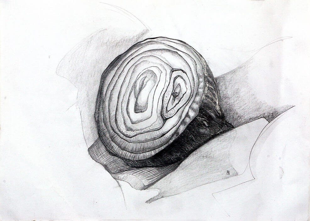
This exercise focused mainly on tonal values.  I chose half a red onion as it had a really dark exterior and also had a good amount of sheen to it, this partnered with a furrowed texture and a lighter interior would offer good opportunity to explore the visual differences of the onions surfaces. Using graded pencils I went to work sketching out my object.  Starting with a HB pencil I worked linearly to establish my shapes and composition, I very lightly started to pull out the contours of the onion, gently following the shape as if I was drawing a grid over the onion, being sure to follow the curves and grooves and trying to establish my darkest blocks of tone.

I switched to a 4H pencil to get some harder lines established, the 4H was nice and sharp and gave a good clear line, I started to mark my contoured lines with more pressure, it really exaggerated the peaks and troughs of the onions outer surface, I wanted to smooth this out a little, I went with the 4H’s opposite and selected the 4B.  Gently laying down some tones an interesting thing happened, the hardness of the 4H had given it a coating that seemed to prevent the 4B from covering over, as I tried to apply pressure another interesting effect occurred.

The Hardness of the pencil had left indentations on the paper, the soft 4B gave an almost brass rubbing effect, the 4H feathered lines started to show through retaining a texture but tonally the image was getting darker and more contrasty.   The interior of the onion while overall tonally lighter did offer some variation around the layers of onion, using the side of the 4H pencil I very softly added in a smooth gradient, around the ring of each layer, I then sharpened the 4H and added in some directional lines which all painted towards the centre, I wanted to show the roundness of the vegetable and this seemed a good way to do it.

The last steps was to make sure that the image was tonally balanced and sharp, using my three pencils I made a pass with the 4B to make the darkest tones darker, I then made another pass with the 4H and HB to sharpen up any soft areas that the 4B had created.  Overall I am happy with the results, I feel I managed to add a good amount of detail and texture to this image as well as varied  lines and  blocks of contrast to add some visual interest.

Compositionally, the drawing is quite an accurate record, it might have been a little more interesting to crop it closer and really zoom into the fibres of the onions flesh and focus on the wet almost sandy effect it makes when the light hits it. The abstract approach would have also meant it would likely be unidentifiable as an onion so maybe a wider shot could also be investigated as a halfway measure.

Exercise 1: Still life using line

I put together a still life trying to find objects that are round or curved, I found a plastic skull I use for reference some coiled line and some dried flowers from a bowl of pot pourri. I made for sketches to choose an interesting composition.

Using a dip pen and black Indian ink I started to sketch directly to the paper, it didn’t specify if I could or should do an under drawing. It certainly was a test of my mettle as I bravely made marks with no underlying suggestion of the composition. The dip pen is a tool that I’d love to invest more time in, it has an amazing variation of line weight but it also has a pretty steep learning curve, I did end up with an unwanted blob of ink and the odd smudge.

This was to be an exercise in texture pattern and shape using line only, I managed to resist blocking in black areas and tried to focus on line weight to describe depth and shadow. The drawing didn’t come out quite as I hoped, I want to try it again with a light under drawing to make sure my composition is a little more thought out, this time I will try a brush pen and really focus on the weight and direction of my line. I think the brush pen will be a little more intuitive for me even though it’s not my go to method to disperse ink, that would be a fine liner pen, so this exercise will be a valid introduction into brush markers.

I restarted the drawing this time using a soft pencil to gently outline the composition, I wanted to ensure I had some interesting tangents in my lines, and some of the items cutting through other shapes i’m hoping this should make a more interesting end result.

Once I was happy with the layout I gently rubbed the lines out so there is just a very faint guide to follow with my Pentel brush pen.

The brush pens main benefits is a continuous supply of ink with the wide range of line weight. The brush isn’t as firm or stiff as the metal nib of a dip pen so a lighter touch is definitely required to make the most of the potential range. Another consideration with the brush is direction, it does produce the best intentional line when pulled, a characteristic that doesn’t exist with a fine liner. I start by making very light strokes, and open the bristles of the brush with some pressure where i want to convey depth such as the plastic skulls eye sockets and nose, I also try to make the lines heavier around some of the pot pourri that is darker in colour with an attempt at ensuring the focal point is on the left side of the image. Overall I am much happier with this image, its seems less messy and a little more informed, although looking at the first attempt again there is some things I like about it, the texture for one seemed a bit more interesting.

Exercise 2: Still life in tone using colour

For this exercise I was asked to set up another still life, the aim was to introduce colour while still observing tonal values.
All but one of the objects in my still life had a smooth reflective quality, the coarse string would need a different approach to the hard shapes being reflected. Whilst the glass bottles all had a colour I wasn’t so much focused on representing their true colours, I have a limited set of oil pastels and I thought using colour this way may be more interesting.
The liquids inside offered smooth tonal; transitions and hard distorted shapes, I tried to use my yellows and oranges to represent the lighter tonal values and the purple blue hues to convey the darks.
I was pleased I chose a palette that wasn’t true to the subjects, this took away the focus from trying to recreate the exact hues and saturation and focus on the tonal values. I also used to think that reflections in in glass or mirrored objects were quite daunting, but with all the glass items at my disposal its certainly something I’m more comfortable approaching now.

The coarse string, while it was affected by light was much more simple to separate, very little steps in between, I did try to break it up visually by adding a few colours next to each other, hoping that would give the feel of a rough coarse item.

Exercise 3: Experiment with mixed media

Working on blue paper I sketched an under drawing in graphite. I used a wax candle to seal the paper. I flicked white paint over the image, I wanted to add some texture and break up the flat blue of the paper. Next I added some brown paint, I thought this would sit well with the blue, the wooden turtle was brown in colour. I used a hair dryer and dried off the paint, the wax did its job and prevented the paint from penetrating the paper. this helped create the irregular but smoothened edges of the shell.
Once the paper was totally dry I added a layer of ink, I used a permanent, water proof uni-pin fine-liner. building up line weights to try to describe the shape of the objects. Finally I picked out the remaining details and highlights in white. The end result is a space exploring turtle, I quite like the outcome though.

Exercise 4: Monochrome

I assembled some items for the still life, a glass paper weight, a piece of blue slate and a resign skull I use for reference when drawing heads.
Using a single red, a white and a black tube of Gouache paint I mixed three values, tinting the red with white and creating a shade with the black.

The three objects have three different qualities, the glass paper weight is transparent, and glossy, it picks up all the reflections from the room and the surrounding items in the still life, its shape distorts the reflections. the resin skull is quite dull and doesn’t reflect light as well, grey in colour shows up the shadows quite well and offers a lot of detail.
The slate has a lot of texture and the ridges create some harsh changes in tone.
The key to these tonal exercises seems to be some forward planning, observing the tonal values and then establishing a medium to make either lighter or darker. The dark cloth being the darkest in this still life and then the reflections off the glass paper weight picking up from a selection of all gave me a lot to study. I really enjoyed this exercise.

Exercise 3: Material Differences

Using my previous 4 drawings I picked the viewpoint that offered the most interest. I decided a focal point and looked at the tonal values.

The white walls and fireplace are surrounded by the dark table, the table had a lot of objects on it. This table serves as a Memorial to my late father and our beloved pets that have passed. on the table is a silver cherub, its size and light tonal values made me think this would be a good focal point.

Using Graphite pencil, I blocked in the darkest parts and basic shapes, I don’t normally smudge pencils but as the walls are light and smooth I took too smudging in some hb pencil and then using a rubber I “lightened it up”

One thing I did notice is that my eraser soon become very slick and heavy soiled with graphite, this actually become a useful tool to block in large areas of lighter tone, used flat I followed the shapes of the walls and the archway, the graphite transferring from the eraser to the paper.

Studying the values in front of me I established my darkest tones was to be some of the black box frames on the table, the lightest would be some objects on the table and the wooden dado rail on the wall, these light shapes cutting through the darkened tones of the table helped draw the eye to the cherub.

The research I did just before this drawing did help me make some choices, for one I didn’t want to be too picky about the accuracy of my perspective, imperfect lines might add to the character of the drawing, and mine certainly wasn’t perfect or true to life, in the end after several attempts to get a straight line by hand I did use the edge of a metal pencil tin to get a clean line, the hand drawn ones I was making didn’t really look rough enough ti be intentional but wasn’t smooth enough to represent the solid structures of the fore place.
The research also made me aware of how you can show something that at first seemingly mundane can have some secondary focal points that surround the main subject. I tried to do this with varying degrees of detail and contrast.

Overall I’m happy with the end result, and the lessons learnt. I chose graphite pencil as I thought it would allow me a good amount of detail, it is problematic to work with in a large format and I do not think my paper was up to the heavy layering of different grade pencils I used. It got to point where the graphite didn’t hold to the paper anymore, and it would almost “clump” in certain areas, it certainly added texture but it also shows every movement and mark I made with my pencil. I would benefit further from experimenting with different toothed paper and layering pencils to prevent this “effect” when trying to establish dark yet detailed tones.

Exercise 2: Composition – an interior

I completed 4 quick sketch studies of an interior, these were to be viewed from 4 different viewpoints, I chose an elevated one standon gon a small foot stool, one seated on a stool and closer, another from the floor from around the same distance as the previous and finally one seated on a stool but a little closer.

I chose a corner as I thought this would be intersting, some angles and foreshortening would be at play and so would a faor amnount of distortion, I actually feel like my first sketch I probably exaggerated a little, giving an almost fish eye effect.

The main thing the sketches seemed to suffer from was an interesting focal point, this actually got better the closer I sat to the subject, it seemed to have more emphasis and i tended to notice greater details and characteristics of my surroundings.

I also naturally moved to a position that offered more contrast, the final drawing was light around the edges and the focal point being the objects on the table. If I was to carry on and create a fourth drawing I think thats where my focus would be, I would pick an object on the table, probably the cherub in front of one of the frames and use its surroundings, the pale walls, the dark table and swirls from the mirror and create something a little more focused and specific.

Another thing I would consider is altering the angle of my viewpoint, not only vertically and horizontally but tilting this could have generated some lines which could have been diagonal for example and might have made the compositions a little more interesting for the viewer to explore with their eyes.

Research Point : Interiors

I used google to quickly scan through many images and stopping at ones that caught my interest.

Ethel Sands
The Chintz Couch
c.1910–11
Oil paint on board
465 x 385 mm

This one caught my eye, it is almost monochromatic, I liked it because the way it led me around the image, I started off on the square in the centre.
This offered some good tonal contrast and then led me down the wall and over the chair, I was then directed up in a diagonal motion at the flowers. I think they are Lily’s, that offer the same contrasting tone but are detached from the main bulk.
It’s actually a pretty flat depiction, the light flowing over the chair is giving depth as is the darkness under the table. When I chose my viewpoint for the previous exercise, I wanted to get a diagonal line or too in there to break up the rigid square shapes and forms, but the artist here has actually created an interesting diagonal by using the light.

Douglas Fox Pitt
Interior with Maid
c.1864–1922
Graphite, charcoal and watercolour on paper
412 × 483 mm

I enjoyed the use of colour and bold lines on this one, I suspect if this was left as a linear work it wouldn’t have been able to portray this amount of depth. The weight of line seems to be pretty consistent throughout the structural parts of the room, changing for little details such as the objects on the mantel piece.
The warm walls against the cool purple and violets really offer a good amount of separation and create two plains. At first glance I thought the room had a walkthrough arch but this is in fact a reflection of the “maid” at the fire, and not figure at washing machine like I first saw. The angle of the mirror feels a little impossible, and gives that “fish eye” effect I noticed in my own sketch. The warmth reds on the cushion and throw seem to be leading my eye into the mirror, I believe that the figure and its reflection is the main focal point for the artwork, a diagonal trajectory across the image. the reflection being part of the focal point explains why some licence has been taken on the angles used. Maybe it was just more interesting that way.

File:Charles Joseph Grips - A Domestic Interior, 1881.jpg

Charles Joseph Grips
A Domestic Interior
c.1881
Oil on panel
380 x 300mm

This was another image that caught my eye, much for the same reasons as above. It was dark and at first quite flat, but it actually has loads to see and is very cleverly layered. the warm yellow silk sheet almost looks like a figure and is the first thing we see, as we look round we see many objects.
when we eventually arrive at the back wall we see a bird cage and a sculpted relief of a head, I really liked all the details, it created a lot of interest, especially the little cat exploring and conquering the mountain of objects, and maybe even having a sweep of that broom.

Roy Lichenstein
Interior with Waterlilies
c.1991
Oil paint and acrylic paint on canvas
209 × 4553 × 65 mm

This was another image that I felt did a good job of displaying depth. The use of colour separate the fields of depth, as do the diagonal lines on the back wall they seem to pull the drawing into itself. The perspective lines aren’t perfect in places but do offer that 3d box feel, without losing any personality and character. The focus here does seem to be the pictures on the left wall as the title of the piece would suggest, although the other pictures hung on the wall also catch the eye quite effectively.