Exercise 1: Sketching individual trees

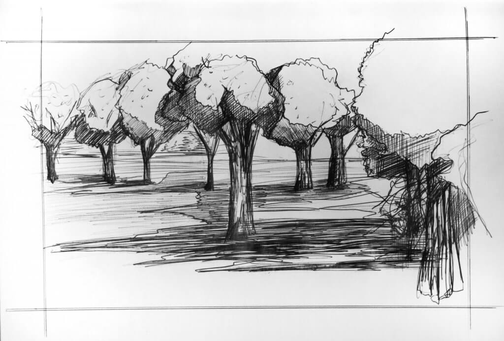
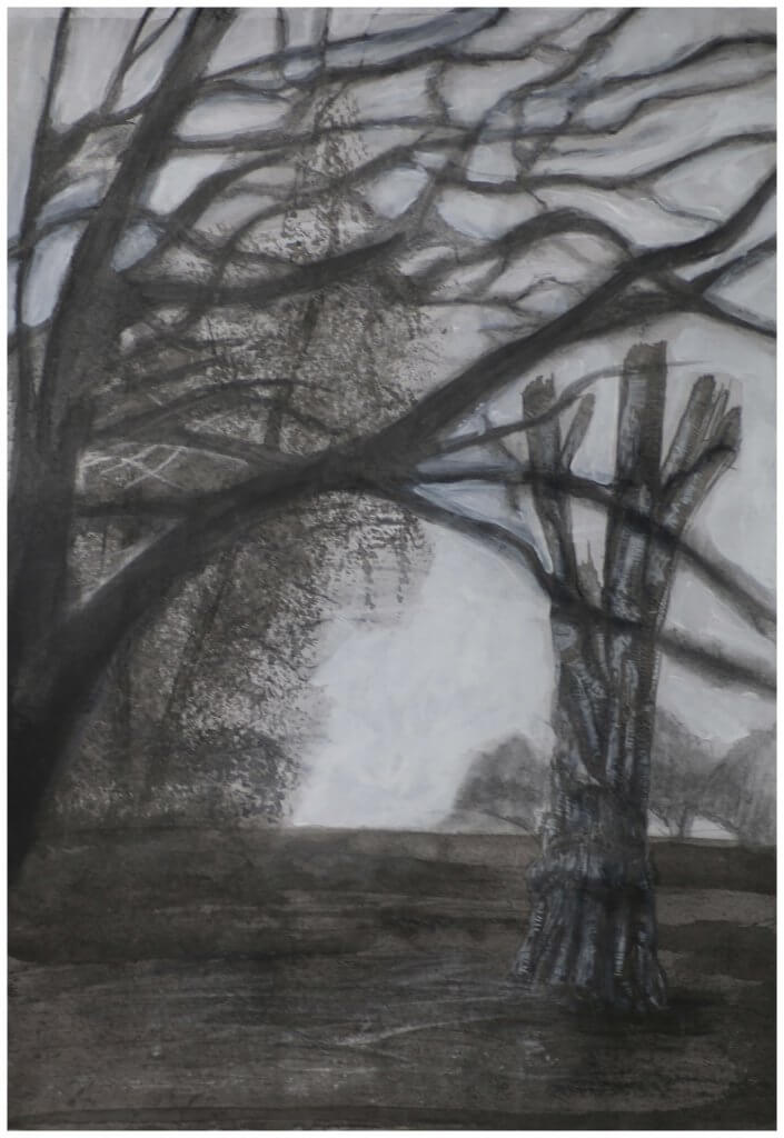
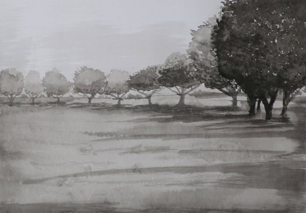
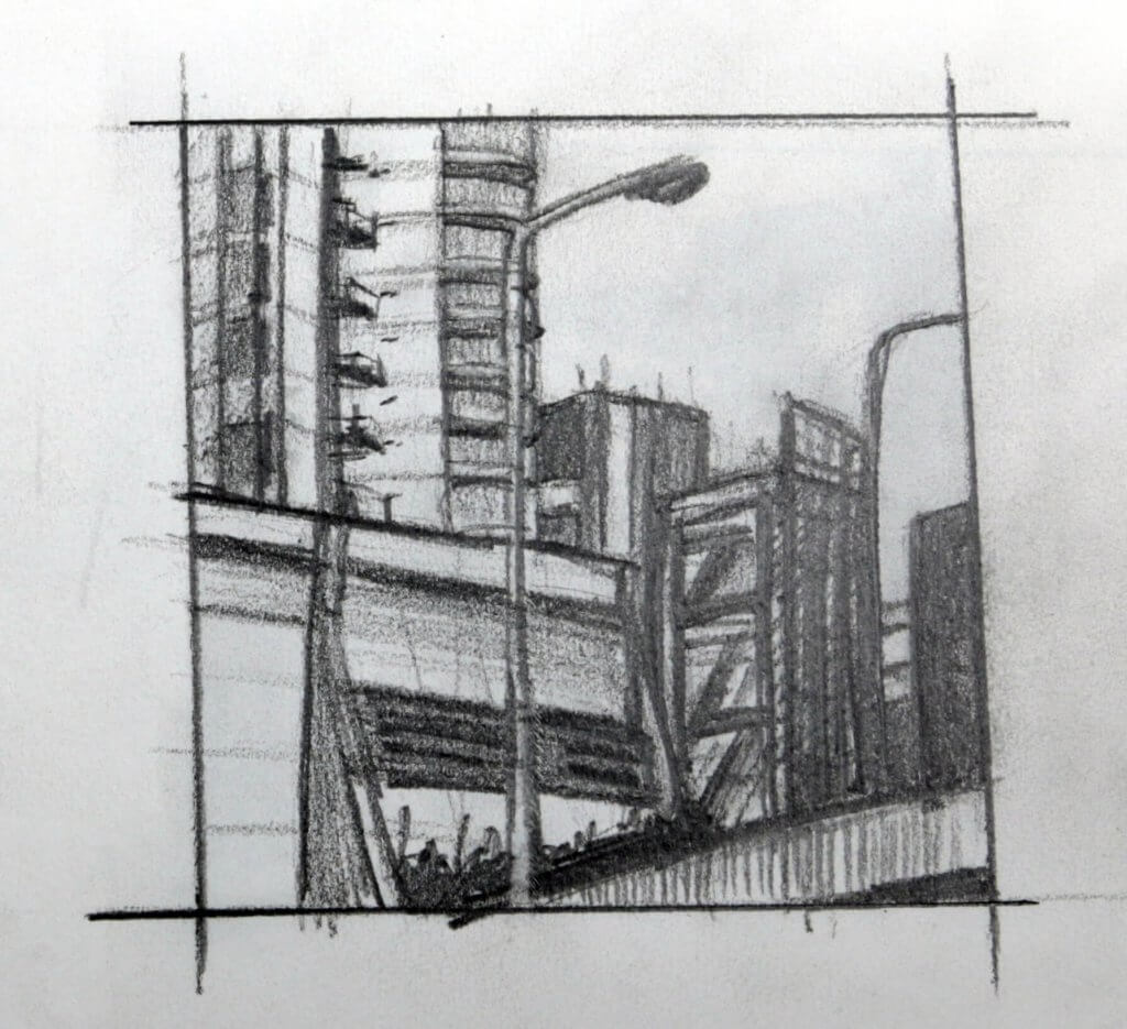
This exercise was to familiarize and understand the structure of trees. I ventured out to a nearby forest with paper, a wooden board a selection of graphite sticks and pencils, also a flask as it was cold and very windy.

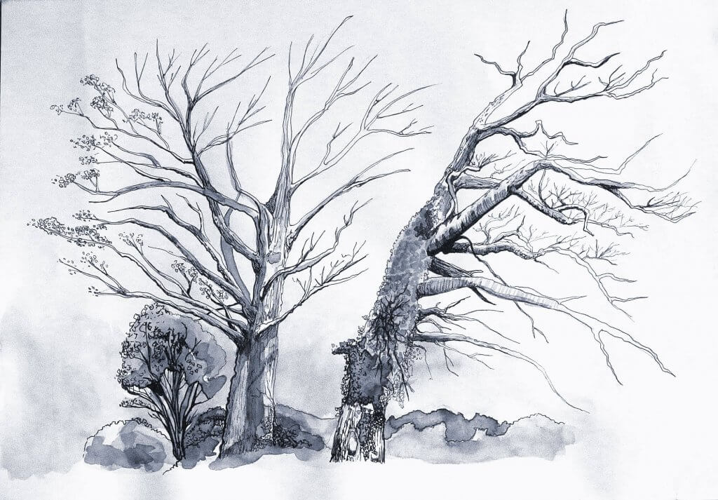
I positioned myself on a picnic table that was situated among some trees that were a good distance away, I wanted to try and capture the whole shape of the tree as well as its individual parts, the branches, the small vein like twigs and the collected leaves, although the leaves were starting to vacate. I started all my studies with a loose line to represent the trunk, my first attempt was with a graphite stick, I wanted to capture the trees essence, its basic shape and structure so a thicker less precise tool seemed to be a good choice to start.

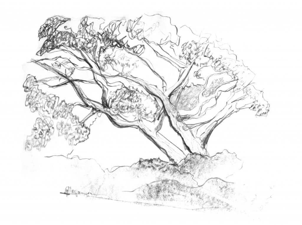
I initially used broad strokes outlining the main trunks, which seemed to have split into two. I then found the biggest branches and tried to follow them along with my eye and translate this into marks with the graphite stick. using the flat side to the sharp edge to create some variation in my line. It was important to not make these too smooth, the branches were irregular and gnarled, this was something wanted to capture, while the graphite was great for broad marks and getting a feel for the tree, I didn’t feel I was able to capture the texture in a controlled way, I moved onto pencils.

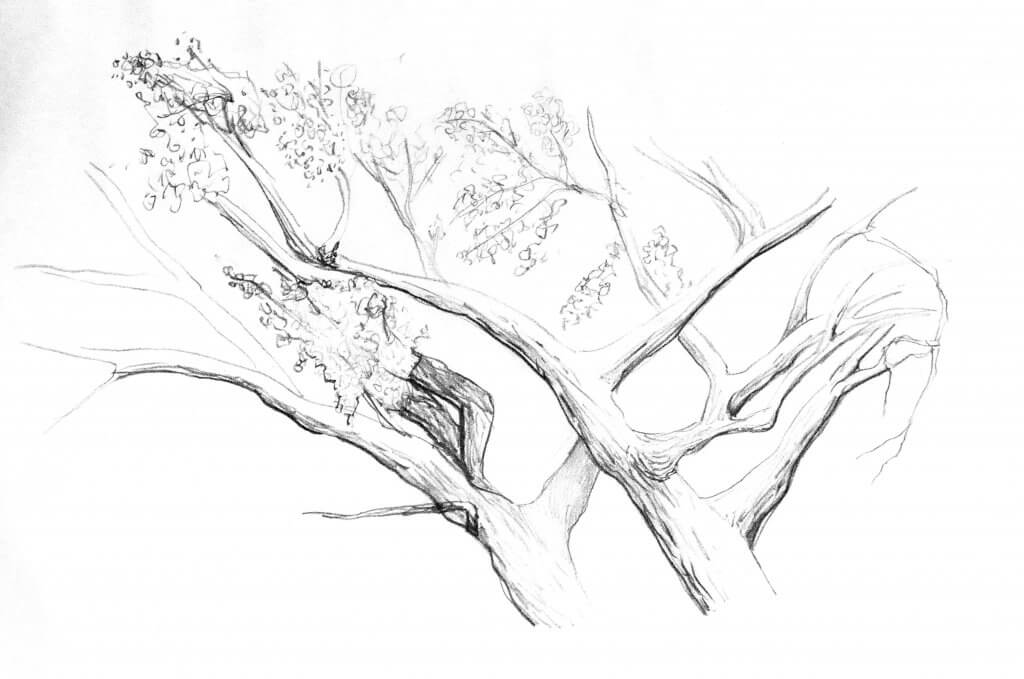
Giving me much more control, over line weight and tone, the pencil seemed to be a much more suitable tool. Drawing the same tree I focused more on the area that had the most interesting shapes, the point that the two main trunks crossed. My pencil was nice and sharp so I sketched the outline and tried to recreate the texture of the tree bark, as it blunted I tried to capture the way the light was reaching the top of the branches and excluding the bottom, I thickened the thin lines, running the dull edge over the thin sharpened pencil lines to achieve this.

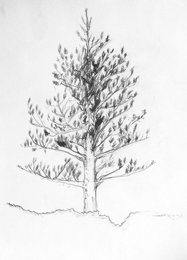
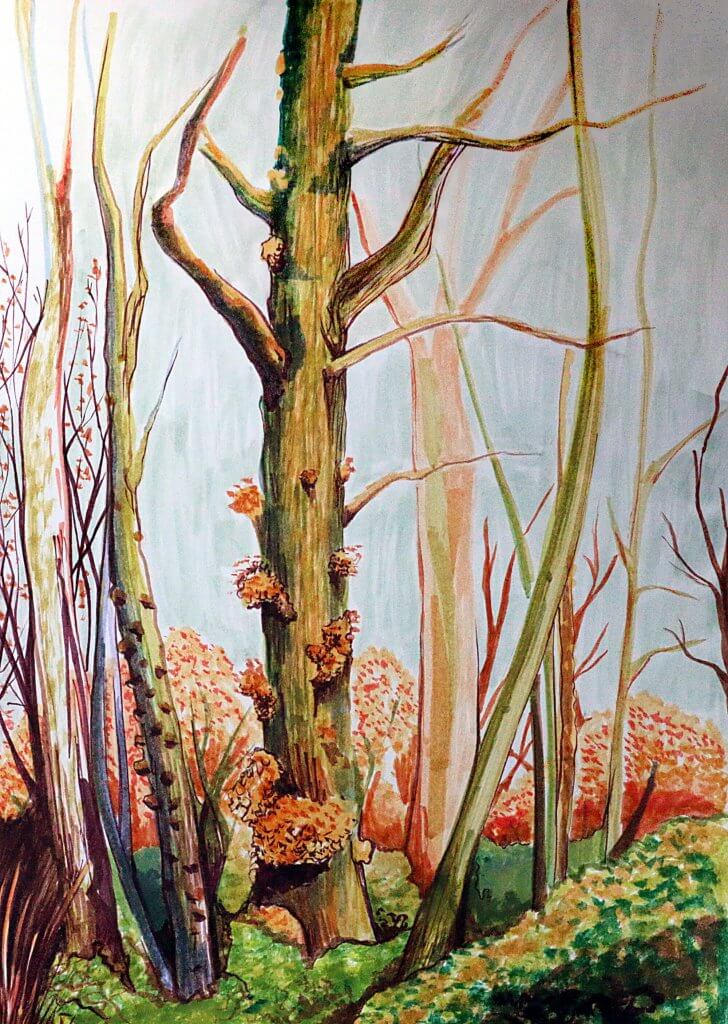
I had mainly been focused on the tapering branches, trying to capture their irregular outline and rendering their cylindrical shape, I wanted to try to quickly work up some leaves, there was some evergreens nearby so I re positioned myself and started to rough in the foliage. the shapes seemed to be made up of many feather like groups of pins, I didn’t fuss over precision, just ,ass, I tried to get a good rhythm going to fill out the tree. I attempted to make some areas more intense to try to show depth and structure. My resulting image didn’t really capture the density of the trees green pins as I’d hoped. it might have worked if used at a small scale but there was some information lost. I sharpened my pencil for another attempt at a more linear structured tree.

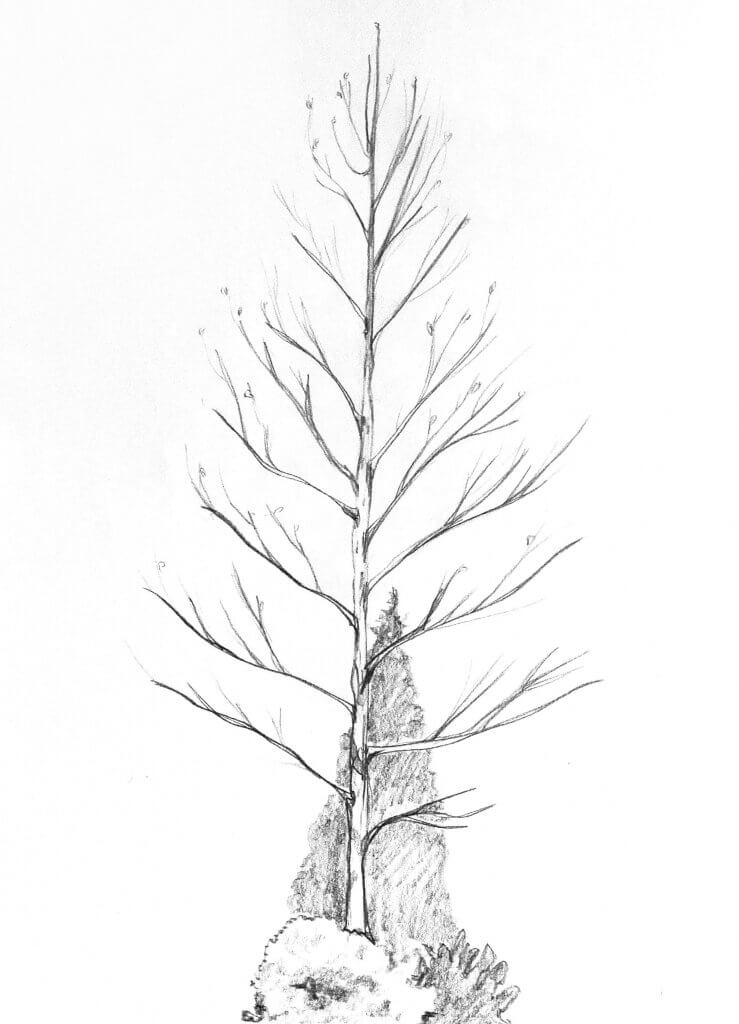
This tree was very easy to interpret, my biggest adversary so far had been the elements, when the wind is blowing hard, not only does it sting your eyes, make your ears hurt but also makes it quite a challenge to follow the intricate details of a tree. this tree was almost engineered in comparison, staggered angled branches, now stripped of all but a few leaves made an excellent subject to study. Drawing from my elbow I tried to make slow flowing marks, my goal was to also lessen my pressure towards the end of each branch, I had varying degrees of success doing, and sometimes I couldn’t resist a follow up stroke. I always started from trunk to the tip of the branch, I sketched in the few remaining leaves. Looking at these trees reminded me of biology text books, the inner workings of the lungs look very much like the trunks, branches and twigs of these trees, each branch giving birth to a smaller more resilient version of itself. It’s strange and almost poetic that these trees, having a similar appearance produce the very thing that our lungs crave.

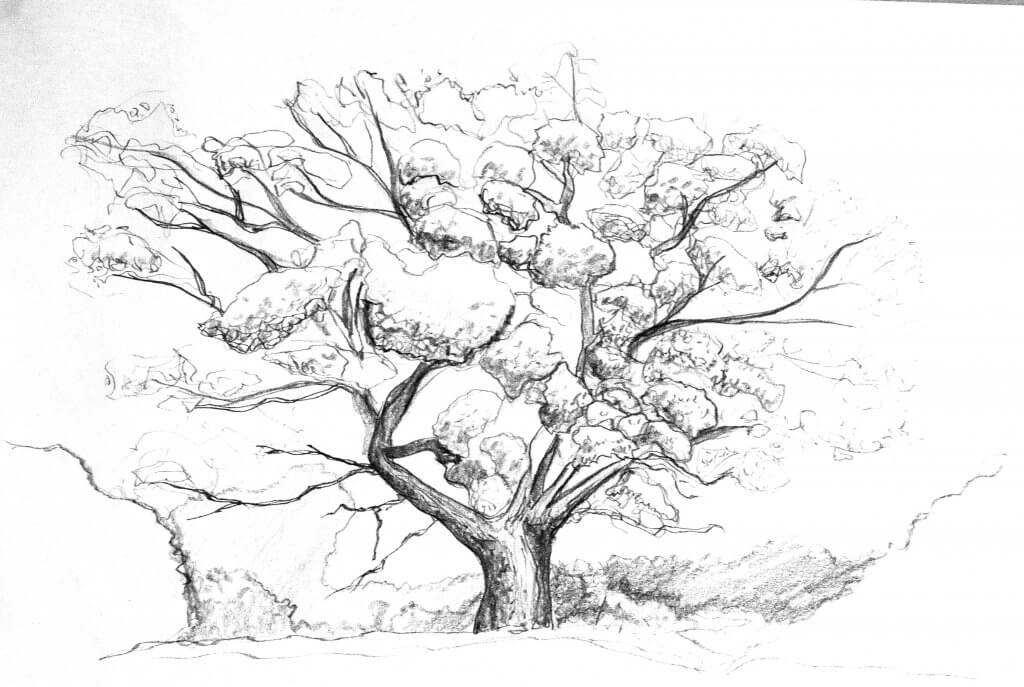
I was getting very cold and tired by now, I just wanted to have another go at that first tree that I tried to capture in graphite, it had a good amount of leaves and it seemed to be still from the wind for the most part. this time I wanted to draw the leaves as a series of collected masses, the result wasn’t too far away from a sorry looking stem of broccoli. I tried to twist my pencil as I drew, this gave me a good variation in line. the softened worn edge being replaced with a flat knife edge as I turned gave a random result, that was enough for today. I packed my things up and started walking back with my large 6mm thick board of MDF I used as a drawing board fighting the wind with every step.

Exercise 2: Larger observational study of an individual tree

While my study hear was of indeed two trees, I really liked the way both trees worked in tandem and made one larger shape, the trees never seemed to encroach others space even growing and leaning in or away so they never collide. Another thing I liked was the contrasting trunks, one was covered in ivy and foliage, the other smoother with a few remaining leaves.

I sketched the tree, taking care to observe the relationship each tree has with each other. I added blocks of tone lightly with my pencil, I planned to ink over all these lines, so I pressed as lightly as possible so I could remove all graphite. once my sketch was in place, I had my tonal values all decided, I photographed the area just in case I needed some more reference when it came to inking, I then moved on to the groundwork for the next exercise before leaving.

I prepare the paper for inking, using a putty rubber I gently dabbed the harder pencil marks away so the ink isn’t hindered when applied to the paper. I diluted some Indian ink and with a brush I laid out blocks of tone, I had a jar of clean water and added more water to create lighter tones, I layered up light to dark creating a leafy texture for the foliage which had attached itself to the trunk. Once the paper was dry, I used a 01 waterproof fine-liner to start adding lines building them from thick to thin. I also added in some tree bark textures, creating broken lines though the length of the trunk, and circular movements around the branches to describe the rounded shapes. I made a second pass with an 03 marker to tidy and stray lines and block in any very dark areas.

I was happy with the outcome, the diluted ink gave a good amount of texture, the whole image has a very cold and winter feel to it which seemed to suit the sparsely covered tree.

Exercise 3: Study of several trees

I had previously sketched this on day 2 of my field sketches, again I had photographed the scene for reference, this came to be very useful when adding color. I wanted to try to make this image quite vibrant, I decided that some brush tipped pens would add some string instant color and my set had some really nice exaggerated autumnal hues.

I dulled the drawing with the putty rubber and looked among my brush pens for suitable colors. I didn’t want to use any black ink, I found a dark purple that was almost brown, this would be my darkest tone, each tree had a distinct color so I tried to work in blocks of hue and applied the appropriate tones in each colors range. Each tree had a different color or texture, or even for some decoration such as fungus or leaves.

I really enjoyed this exercise, adding color really brought the scene to life. The brush pens were capable of delivering all sorts of marks from thin lines to by bold strokes, the nice thing about pressing hard was the strokes become broken where the ink ran dry towards the end. I’m pleased I resisted adding line work to the image,especially where the distant trees start to look faded and pale, almost misty.

Research point: Landscapes

Katsushika Hokusai

I have seen Hokusai’s wave many times before, I have included it here although technically that may be classed as a seascape, its sharpness and vibrancy has always stood out, when you look a little deeper you can see, he translates the ordinary landscape into his own bold colour saturated world. His most used medium is paint and wood block prints. I really enjoy the way his images are almost layered and layed flat on each other until it reaches the horizon, I could almost imagine the images moving in a parallax motion. The level of depth and distinct style means I can look at each part and really study each part of the image, everything rendered in great detail, even the objects that have been placed far away from the viewer, tell a little story or supply a narrative. Hokusai was born in 1760 and died in 1849, but while we can see these works or old and even ancient, the style wouldn’t be out of place in a magazine, comic book or film poster. The wave always seems so fresh, its no coincidence the image has been parodied and celebrated in popular culture and art.

*

John Constable

Born in Suffolk and focusing on the Essex and Suffolk areas of east England, John Constable was primarily a landscape artist. His color palette is always the first thing that impresses upon me, muted browns and greens, often partnered with blue grey turbulent skys. Swirling clouds painted with such intense movements it borders on violent. I really cant say I get a happy feeling from his work, although reading about him he clearly loved his surrounding areas. In his wikipedia entry it states that he wrote to his friend John Fisher in 1821, “I should paint my own places best”, and “painting is but another word for feeling”. I wanted to include him in my research as he really does produce a mood, and it doesn’t have to be a happy one for the viewer. I can remember my Nan having a similar picture in her house although this looked more like a dutch scene. And it had a very eerie quality to it, with its muted colors and frozen scene depicting rural life below an ominous sky. You cant deny the craft and artistry that has went into his work, the textures he creates alone are inspiring to any creative person.

*

David Hockney

David Hockney is the only contemporary artist I studied for this research point, as I write this he is alive and 83 years old, he shows little signs of slowing down, most prolific in the 60’s he still creates art having an exhibition as recently as 2019. He has also made a transition from paint to digital art, producing works on apple devices and Photoshop. His work is always vibrant and ranges from almost abstract shapes to highly detailed. The world must always looks like a really interesting place through Hockney’s trademark round glasses.

*

Exercise 1: Cloud formation and tone

After my research of landscapes and seeing John Constables depiction of clouds, I was rather looking forward to this exercise. My first sketch I tried to outline the shape of the cloud,the sharp lines gave some good definition but felt a little too rigid, I softened up the graphite on my paper, taking a piece of kitchen towel, I worked the medium deep into the papers tooth, I then took a putty rubber and lifted out the lightest areas of cloud. I also used a plastic eraser, to really rub away the marks although this was less accurate. I liked working in reverse taking away the graphite to lighten up my drawing. I tried this approach in my next drawings, trying to use less definite marks.


I decided that my next attempt would have no linear values, I used the edge of my graphite stick across the paper and worked this in with the now heavily graphite infused paper towel, the medium already in the kitchen towels fibres seemed to help it glide but also now served as a drawing tool in its own right. once I had the clouds in place I went about a second layer of tone, now adding darker areas in sweeping movements, trying to get as much kinetic energy in the image as I could. I was hapy with this approach and felt I had a good cloud making method, I repeated the process again and came up with the following image. I really went for a higher contrast this time, I quite liked the result and it certainly has that dark ominous mood I was interested in capturing.

Exercise 2: Sketchbook walk

I took my sketch book to the local park, the park has quite wide flat fields and leads off to extensive forests. It is a very cold day with a flat porcelain sky, clouds are not distinguishable but I’m sure they are there, hidden under the barrier of humidity. The light is soft but bright, creating diffused shadows over the flat green areas of grass.
The exercise states that I cannot use a rubber, I decided to deny myself temptation of correcting a wayward mark or poorly executed choice and work in ink, I’ve quite enjoyed the feel of papermate’s flexigrip ultra retractable Biro’s in the past so I opened two up and checked they had enough ink to complete the drawings, I took two in case one failed on me.
Both pens in fact did end up giving me some issues, I don’t know if it was the cold weather but the roller ball kept getting stuck and needed some scribbling to get the ink flowing.

My first drawing I made very fast marks throwing loose lines all over the page, I wanted to establish a composition, my focal point was to be the tree on the far right as there was a good deal of detail on the trunk, it also had a dead looking tree or bush in front of it, leaving behind a twisted mess of twigs and branches matted and knotted and fixed on the trunk. In the end the focal point was actually the bit that I neglected, I started to focus on the shadow under the trees and the ground. The light was a lot softer than the way I chose to depict it in this image, the pale sky and the humidity diffusing the light would have been easier to depict with a medium with a better range of tone, such as graphite or chalk pastel, I could have used precise hatching to create subtle variations but I didn’t feel his would work with the looser approach I started the drawing with.


I found another bench and found a view, the treeline created a strong horizontal line, the path framed by trees of different colour and shape, the shadows were apparent on the floor, I tried to treat these with a little more subtlety this time, defining the tonal differences with individual lines and only using an outline when I wanted a harder shadow. I liked this view as the trees were all quite different., I tried to take a different approach with each one. I am working quite loose and fast and I’m not too sure if maybe I am taking it a step beyond where I can achieve an acceptable result. I will try to slow it down a little on the next one.


Whilst sitting on the bench I spotted another interesting view, I spun round and looked for a focal point, I thought the tree stump was quite interesting and would break up the textures created by the foliage and the rougher barks on the tree. I started again by adding in some key marks to work out my composition. Working slower now I looked at the darker areas and tried to define and separate the tree trunk from the other objects, I wanted the trunk to have deep and solid sinuous roots but really stand out, I kept the trunk as light as possible while retaining some strong contrast, I also used the fallen branch in the same way hoping it would add a marker to guide the eye towards the bottom of the image.


The final image, I tried to approach with all the observations and lessons learned from the previous drawings, the light and shadow on the grass I approached with hatching. I wanted to show a variety of different shaped trees. I framed the church building with lighter tones, I felt that would be the main focal point.
I enjoyed the exercise, despite the technical hitch of the pens not working as well as I’d have liked and the cold weather making it quite unpleasant to work in, making my hands numb and less responsive.

Exercise 2: Foreground, middle ground, background

As the title suggests, this exercise is all about establishing a fore, middle and background. I took that very same approach in my previous image, I thought this time I would attempt something that while still covers off the learning in this exercise diverges slightly from the guidelines.

I wanted to try to use the middle ground as the focal point, obscuring the focus from the fore ground to suggest depth, the technical challenge here was trying to recreate the blurred depth of field, like you would get if you was using a camera with a large aperture.

I layed out a horizon with some diluted ink, allowing it to dry and settle in pools, wanted a ground like texture and this seemed to work nicely on other attempts with this medium.

Again I blocked in the tree in the background with a fan brush soaked in diluted ink, I didn’t want this to be to bold and dark, I wanted it to appear distant and misty.

next I worked with a large graphite stick the blurred foreground branches, i worked it into the paper, I didn’t want any had edges or clarity, this was to be a blurred soft focus. It didn’t really work, it lacked structure and fidelity, it wasn’t immediately obvious we was looking through tree branches, I contemplated starting over but wanted to have a think about why it was failing or I was destined to recreate a mistake ion the future.

I squinted and blurred my eyes. looked at photos that used the shallow depth of field technique and decided that i needed to tighten up the shapes, I had distorted them too much. I fetched some white acyrylic paint and thought it would be worth a salvage attempt, even if it was just to experiment. The paint went on and muddied a little, the graphite stick I had used was the water soluble variety, it was not a totally awful result as the moisture in the paint mixed with the graphite it took on a new life.

The final image, isn’t what I quite had in mind, but I wasn’t too opposed to the end result, my attempt to fix the drawing had given it an almost double image or ghosted effect, a little like when you look at something cross eyed.

I felt I had learnt some good lessons from the exercise, even one or too that ended up as a bit of a surprise. I was ready to call the image complete and move on.

Exercise 2: Angular perspective

I had trouble, thinking of a suitable building I could visit and as we are in lockdown due to covid-19 I opted to draw a stack of books as the exercise suggested.
I set up a stack of books and a small chocolate box, I offset a box on top of this. My viewpoint was close to the subject and elevated above, this seemed to skew the squareness of the box.

The vanishing points was indeed quite far off the paper, I do know of a technique to overcome this issue, although I didn’t use it in this example. I felt the exercise went fairly well, a building would have been required a lot more accuracy, and offered more of a challenge, the books can have curved lines and wont look off, where as a buildings structure needs to appear sound or it will look out of place.

I have seen some really nice drawings of buildings that have hand drawn lines, that aren’t straight, the understanding of perspective does seem to be key, even if you mean to distort or exaggerate angles in the final work, I will look to see if I can add some looser hand drawn line work in any upcoming drawings of buildings.

Exercise 3: Aerial or atmospheric perspective

Atmospheric perspective is something I do aim to use in my drawings, I didn’t know what it was called but I understood the technique. I used my pot of diluted ink for this exercise, I knew I could establish some silhouettes and then layer up the ink to convey depth. Adding a light wash over the entire page initially and letting that dry gave me a greyish canvas to work on, i then used some paper masking tape to add the horizon line, i carefully ripped it in half to make a rough edge and added in the ground, once the horizon was established I added in the row of trees, as they approached my viewpoint , I added in some ink that was less diluted, I did give the paper a few once overs with the hair dryer as I wanted some lines o remain hard edged, such as the foliage and ground shadows.

I enjoyed this exercise and was happy with the effect. I will try to recreate this effect with other techniques, I think a good challenge would be a hatching technique, where more careful choices would be needed to ensure the exercises success.

Exercise 1: Sketchbook of townscape drawings

This exercise seemed to be about extracting the most useful information when drawing on site. Due to covid-19 we are currently in an lockdown, I took some photographs and worked from them as a substitute to fieldwork, as I would have drawn faster and loosely I gave myself 10 minutes to complete each drawing. I didn’t want to get bogged down in details and thought after the previous timed exercise this might be a good way to approach. Each view has a linear and a tonal block study, drawn in a 10cm square area. my paper has a fairly rough tooth and this with the addition of using a 3B pencil made the drawings a little muddy and didn’t hold detail too well, as we was asked to work on a small scale I dont think that mattered, capturing the essence, form and shape was more important than accuracy and precision.