Research point: How do you approach being self-critical?

I do try to see weaknesses in my skills, I see great value in being self critical and improving. This has to be self motivated.
I compare my efforts to others, I find it helpful to critique the work of others, that way I see what they do that I don’t like to ensure I don’t do it myself.

I have a few friends that would be honest about my work, and have always welcomed the feedback, I don’t always agree with feedback, sometimes it can feel they have misunderstood what I was trying to do and I haven’t quite managed to carry out the task as per my intentions. This in itself can motivate a change, this is a positive action.

Sometimes friends/ family will offer praise, this sometimes can feel insincere, people with an emotional connection wont always be comfortable telling you their real opinion and what they think, so these criticism can often be easily dismissed even if they was sincere.

A fellow creatives opinion means something different, they have a different understanding of the process and view it from a different angle.

I believe all criticism is useful, providing you do something with it, and that will always be self motivated. They say the hardest person to please should be yourself, I think this is true but if I had to re write that message It would be,
If your efforts fall short be content and understand them, they was the best you could do, but know that next time you can do better having understood why you fell short. Thats not as catchy though.
Exercise: Too much or not enough information

This exercise asked for me to design two posters for an upcoming event, this could be a jumble sale, a local gig, concert or play, an exhibition or sporting fixture. Due to coronavirus there is not a lot happening at the moment, I googled local events and it took me to a listing for the London wildlife trust, they are asking for donations to protect rare insects, they have used a banner saying “Protect chalk grassland for rare species before it’s too late” this seemed like a good direction for the project albeit outside the suggested parameters as it offered a lot of information on the subject.

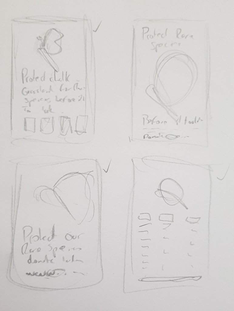
I did a few quick thumbnails to test how I might lay this out.

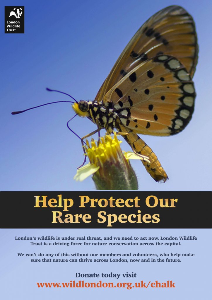
The above image is the minimal version, broken down simply I have;

  • An eye catching image
  • A contrasting short title
  • A small amount of text to explain the title
  • The URL for the site for donations and more info
  • the organisations logo

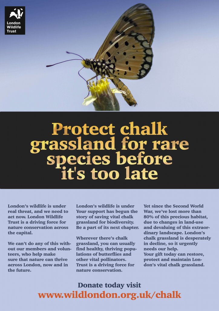
In this version I have;

  • The same image but smaller to accommodate the type
  • A longer title
  • 3 areas of text to qualify the titles message
  • The URL for the site for donations and more info
  • the organisations logo

Structurally both images are similar, I feel an image is necessary as is a title, both offer context to each other and draw the viewers eye. once the viewer is engaged they will be happy reading a small amount which leads them to an action , in this case visiting the website to either learn more or male a donation. The logo as long as it is memorable acts as a signpost so the viewer knows they are at the correct place.

I asked my partner which one she liked best, she actually liked the second version with all the extra information, I asked why and she said that one has more to learn from as there is more text. I think context is definitely a variable here. as a poster then the first one is best the second is more of a flyer or leaflet, this may not have been obvious when I presented the two options.