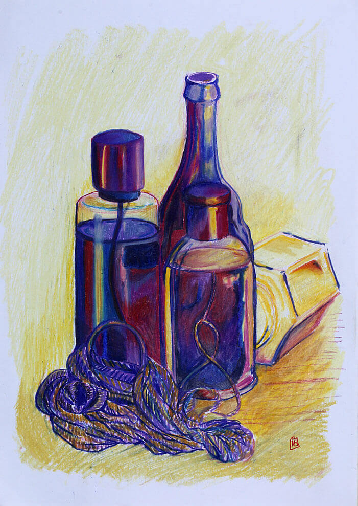
For this exercise I was asked to set up another still life, the aim was to introduce colour while still observing tonal values. All but one of the objects in my still life had a smooth reflective quality, the coarse string would need a different approach to the hard shapes being reflected. Whilst the glass bottles all had a colour I wasn’t so much focused on representing their true colours, I have a limited set of oil pastels and I thought using colour this way may be more interesting. The liquids inside offered smooth tonal; transitions and hard distorted shapes, I tried to use my yellows and oranges to represent the lighter tonal values and the purple blue hues to convey the darks. I was pleased I chose a palette that wasn’t true to the subjects, this took away the focus from trying to recreate the exact hues and saturation and focus on the tonal values. I also used to think that reflections in in glass or mirrored objects were quite daunting, but with all the glass items at my disposal its certainly something I’m more comfortable approaching now.
The coarse string, while it was affected by light was much more simple to separate, very little steps in between, I did try to break it up visually by adding a few colours next to each other, hoping that would give the feel of a rough coarse item.
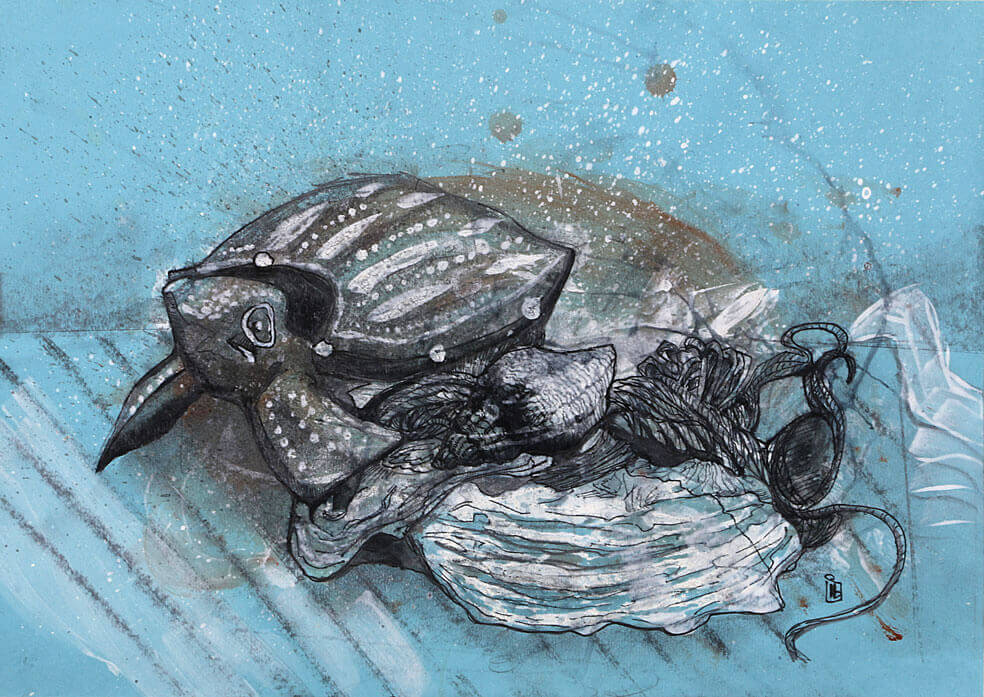
Working on blue paper I sketched an under drawing in graphite. I used a wax candle to seal the paper. I flicked white paint over the image, I wanted to add some texture and break up the flat blue of the paper. Next I added some brown paint, I thought this would sit well with the blue, the wooden turtle was brown in colour. I used a hair dryer and dried off the paint, the wax did its job and prevented the paint from penetrating the paper. this helped create the irregular but smoothened edges of the shell. Once the paper was totally dry I added a layer of ink, I used a permanent, water proof uni-pin fine-liner. building up line weights to try to describe the shape of the objects. Finally I picked out the remaining details and highlights in white. The end result is a space exploring turtle, I quite like the outcome though.
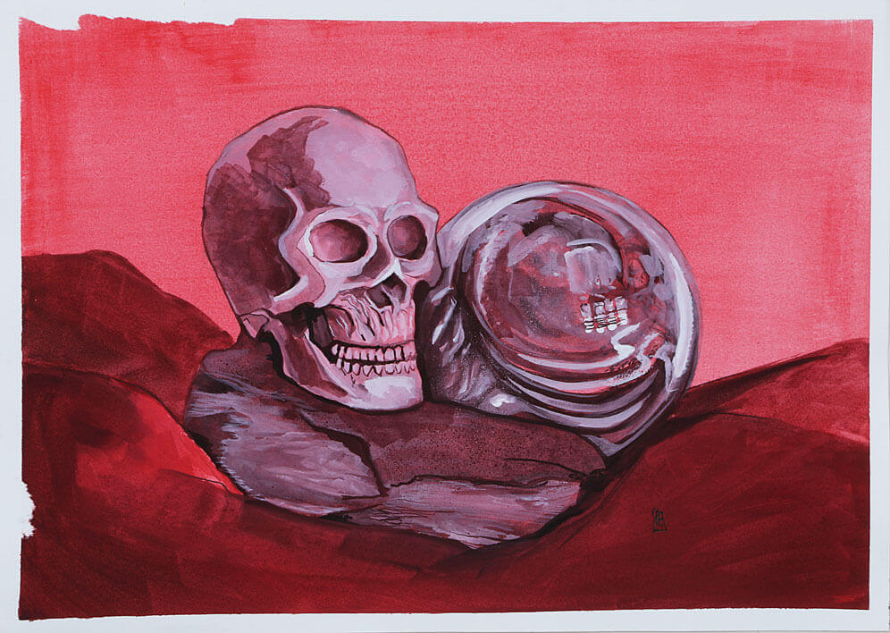
I assembled some items for the still life, a glass paper weight, a piece of blue slate and a resign skull I use for reference when drawing heads. Using a single red, a white and a black tube of Gouache paint I mixed three values, tinting the red with white and creating a shade with the black.
The three objects have three different qualities, the glass paper weight is transparent, and glossy, it picks up all the reflections from the room and the surrounding items in the still life, its shape distorts the reflections. the resin skull is quite dull and doesn’t reflect light as well, grey in colour shows up the shadows quite well and offers a lot of detail. The slate has a lot of texture and the ridges create some harsh changes in tone. The key to these tonal exercises seems to be some forward planning, observing the tonal values and then establishing a medium to make either lighter or darker. The dark cloth being the darkest in this still life and then the reflections off the glass paper weight picking up from a selection of all gave me a lot to study. I really enjoyed this exercise.
Using my previous 4 drawings I picked the viewpoint that offered the most interest. I decided a focal point and looked at the tonal values.
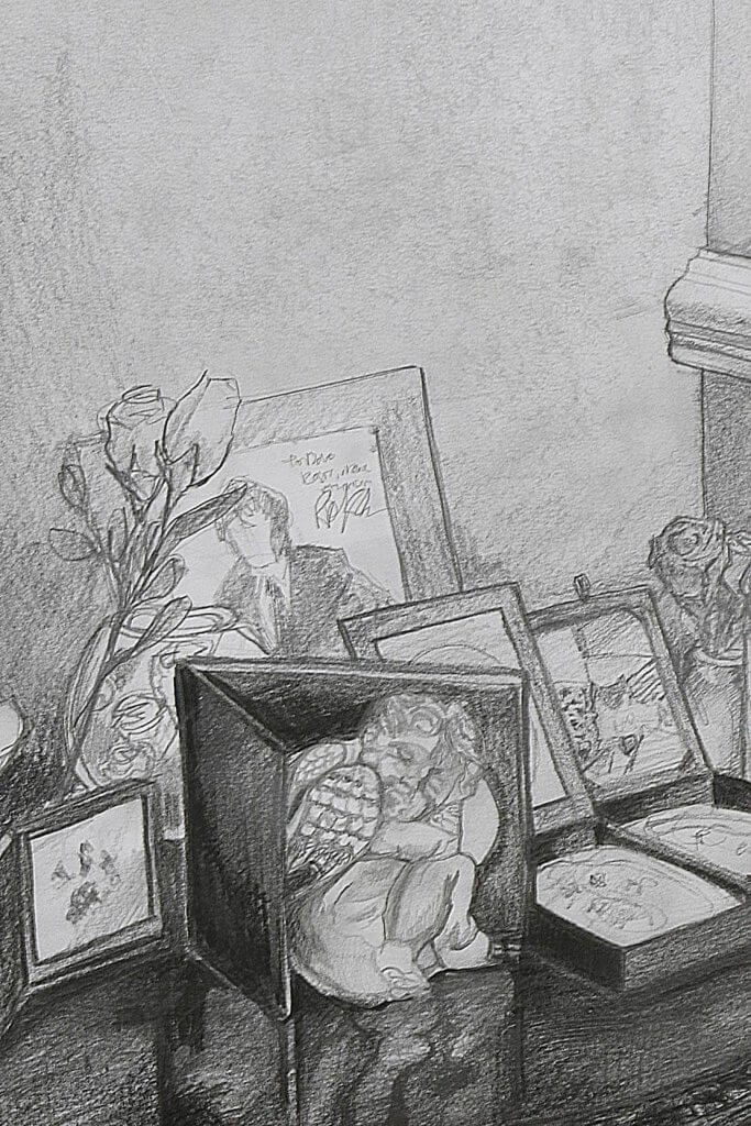
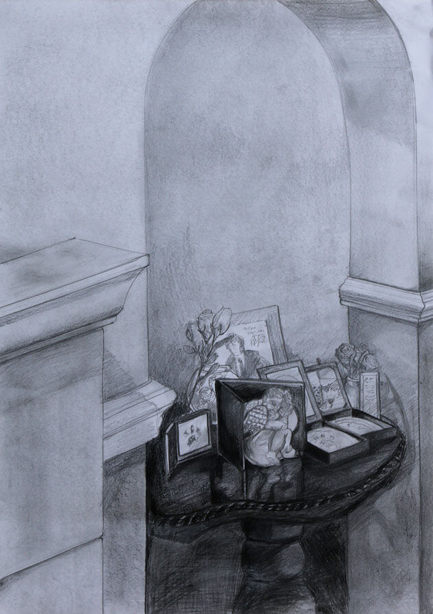
The white walls and fireplace are surrounded by the dark table, the table had a lot of objects on it. This table serves as a Memorial to my late father and our beloved pets that have passed. on the table is a silver cherub, its size and light tonal values made me think this would be a good focal point.
Using Graphite pencil, I blocked in the darkest parts and basic shapes, I don’t normally smudge pencils but as the walls are light and smooth I took too smudging in some hb pencil and then using a rubber I “lightened it up”
One thing I did notice is that my eraser soon become very slick and heavy soiled with graphite, this actually become a useful tool to block in large areas of lighter tone, used flat I followed the shapes of the walls and the archway, the graphite transferring from the eraser to the paper.
Studying the values in front of me I established my darkest tones was to be some of the black box frames on the table, the lightest would be some objects on the table and the wooden dado rail on the wall, these light shapes cutting through the darkened tones of the table helped draw the eye to the cherub.
The research I did just before this drawing did help me make some choices, for one I didn’t want to be too picky about the accuracy of my perspective, imperfect lines might add to the character of the drawing, and mine certainly wasn’t perfect or true to life, in the end after several attempts to get a straight line by hand I did use the edge of a metal pencil tin to get a clean line, the hand drawn ones I was making didn’t really look rough enough ti be intentional but wasn’t smooth enough to represent the solid structures of the fore place. The research also made me aware of how you can show something that at first seemingly mundane can have some secondary focal points that surround the main subject. I tried to do this with varying degrees of detail and contrast.
Overall I’m happy with the end result, and the lessons learnt. I chose graphite pencil as I thought it would allow me a good amount of detail, it is problematic to work with in a large format and I do not think my paper was up to the heavy layering of different grade pencils I used. It got to point where the graphite didn’t hold to the paper anymore, and it would almost “clump” in certain areas, it certainly added texture but it also shows every movement and mark I made with my pencil. I would benefit further from experimenting with different toothed paper and layering pencils to prevent this “effect” when trying to establish dark yet detailed tones.
The question of is it easier to suggest three dimensions on man-made or natural objects is a hard one, man made objects typically have precise structures, perfect angles and if portrayed incorrectly will look very much off to the viewer, but with that in mind the structure of a cube for example when drawn correctly lends itself very easily to be seen as a form in 3d space. There are many variables to consider but I would say overall that the man made objects generally are easier to portray as 3d.
I tried to draw___ to make my objects seem solid
Changing an arrangement of a composition would mostly always seem to change the approach to a drawing. The focal point will change and the relationship to the other items will also be altered the eye will be guided and settle on different parts and a different arrangement may also change the detail and the texture of the items.
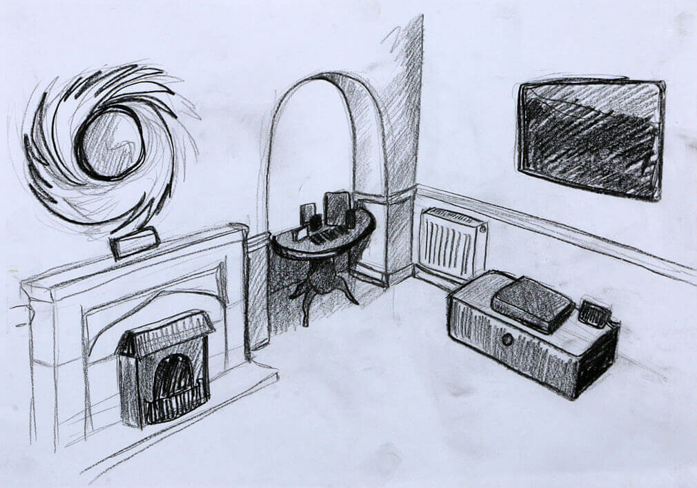
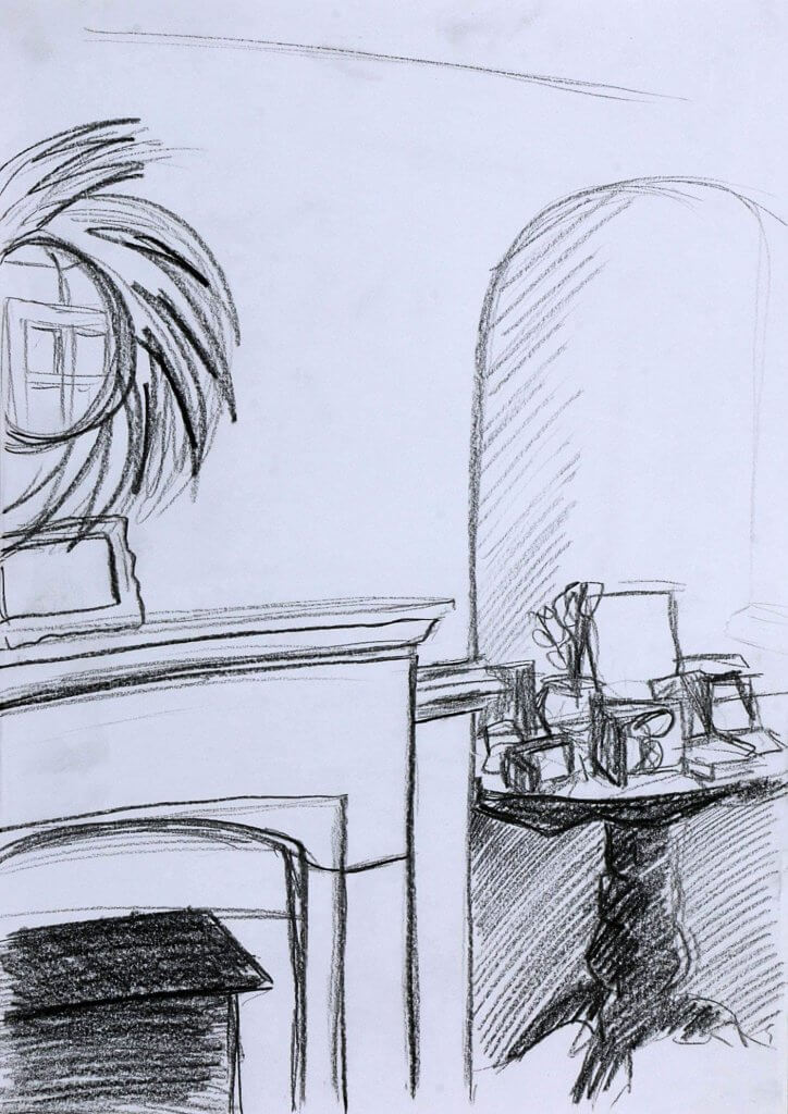
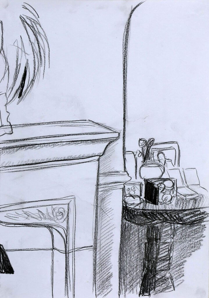
I completed 4 quick sketch studies of an interior, these were to be viewed from 4 different viewpoints, I chose an elevated one standon gon a small foot stool, one seated on a stool and closer, another from the floor from around the same distance as the previous and finally one seated on a stool but a little closer.
I chose a corner as I thought this would be intersting, some angles and foreshortening would be at play and so would a faor amnount of distortion, I actually feel like my first sketch I probably exaggerated a little, giving an almost fish eye effect.
The main thing the sketches seemed to suffer from was an interesting focal point, this actually got better the closer I sat to the subject, it seemed to have more emphasis and i tended to notice greater details and characteristics of my surroundings.
I also naturally moved to a position that offered more contrast, the final drawing was light around the edges and the focal point being the objects on the table. If I was to carry on and create a fourth drawing I think thats where my focus would be, I would pick an object on the table, probably the cherub in front of one of the frames and use its surroundings, the pale walls, the dark table and swirls from the mirror and create something a little more focused and specific.
Another thing I would consider is altering the angle of my viewpoint, not only vertically and horizontally but tilting this could have generated some lines which could have been diagonal for example and might have made the compositions a little more interesting for the viewer to explore with their eyes.
I used google to quickly scan through many images and stopping at ones that caught my interest.
Ethel Sands The Chintz Couch c.1910–11 Oil paint on board 465 x 385 mm
This one caught my eye, it is almost monochromatic, I liked it because the way it led me around the image, I started off on the square in the centre. This offered some good tonal contrast and then led me down the wall and over the chair, I was then directed up in a diagonal motion at the flowers. I think they are Lily’s, that offer the same contrasting tone but are detached from the main bulk. It’s actually a pretty flat depiction, the light flowing over the chair is giving depth as is the darkness under the table. When I chose my viewpoint for the previous exercise, I wanted to get a diagonal line or too in there to break up the rigid square shapes and forms, but the artist here has actually created an interesting diagonal by using the light.
Douglas Fox Pitt Interior with Maid c.1864–1922 Graphite, charcoal and watercolour on paper 412 × 483 mm
I enjoyed the use of colour and bold lines on this one, I suspect if this was left as a linear work it wouldn’t have been able to portray this amount of depth. The weight of line seems to be pretty consistent throughout the structural parts of the room, changing for little details such as the objects on the mantel piece. The warm walls against the cool purple and violets really offer a good amount of separation and create two plains. At first glance I thought the room had a walkthrough arch but this is in fact a reflection of the “maid” at the fire, and not figure at washing machine like I first saw. The angle of the mirror feels a little impossible, and gives that “fish eye” effect I noticed in my own sketch. The warmth reds on the cushion and throw seem to be leading my eye into the mirror, I believe that the figure and its reflection is the main focal point for the artwork, a diagonal trajectory across the image. the reflection being part of the focal point explains why some licence has been taken on the angles used. Maybe it was just more interesting that way.
Charles Joseph Grips A Domestic Interior c.1881 Oil on panel 380 x 300mm
This was another image that caught my eye, much for the same reasons as above. It was dark and at first quite flat, but it actually has loads to see and is very cleverly layered. the warm yellow silk sheet almost looks like a figure and is the first thing we see, as we look round we see many objects. when we eventually arrive at the back wall we see a bird cage and a sculpted relief of a head, I really liked all the details, it created a lot of interest, especially the little cat exploring and conquering the mountain of objects, and maybe even having a sweep of that broom.
Roy Lichenstein Interior with Waterlilies c.1991 Oil paint and acrylic paint on canvas 209 × 4553 × 65 mm
This was another image that I felt did a good job of displaying depth. The use of colour separate the fields of depth, as do the diagonal lines on the back wall they seem to pull the drawing into itself. The perspective lines aren’t perfect in places but do offer that 3d box feel, without losing any personality and character. The focus here does seem to be the pictures on the left wall as the title of the piece would suggest, although the other pictures hung on the wall also catch the eye quite effectively.
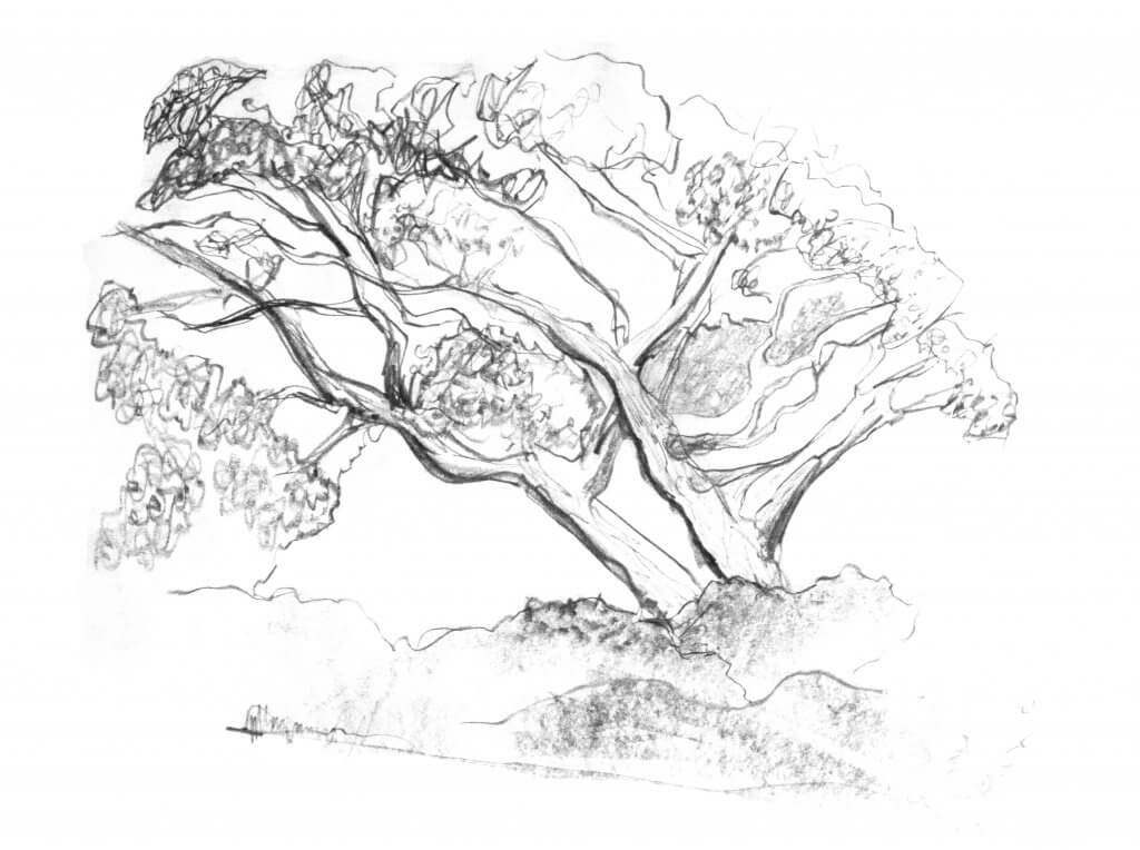
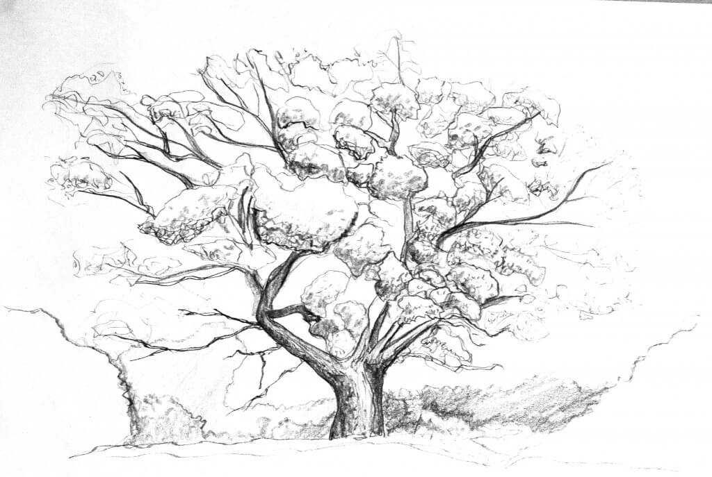
This exercise was to familiarize and understand the structure of trees. I ventured out to a nearby forest with paper, a wooden board a selection of graphite sticks and pencils, also a flask as it was cold and very windy.
I positioned myself on a picnic table that was situated among some trees that were a good distance away, I wanted to try and capture the whole shape of the tree as well as its individual parts, the branches, the small vein like twigs and the collected leaves, although the leaves were starting to vacate. I started all my studies with a loose line to represent the trunk, my first attempt was with a graphite stick, I wanted to capture the trees essence, its basic shape and structure so a thicker less precise tool seemed to be a good choice to start.
I initially used broad strokes outlining the main trunks, which seemed to have split into two. I then found the biggest branches and tried to follow them along with my eye and translate this into marks with the graphite stick. using the flat side to the sharp edge to create some variation in my line. It was important to not make these too smooth, the branches were irregular and gnarled, this was something wanted to capture, while the graphite was great for broad marks and getting a feel for the tree, I didn’t feel I was able to capture the texture in a controlled way, I moved onto pencils.
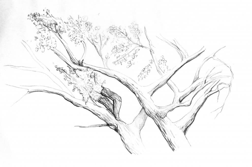
Giving me much more control, over line weight and tone, the pencil seemed to be a much more suitable tool. Drawing the same tree I focused more on the area that had the most interesting shapes, the point that the two main trunks crossed. My pencil was nice and sharp so I sketched the outline and tried to recreate the texture of the tree bark, as it blunted I tried to capture the way the light was reaching the top of the branches and excluding the bottom, I thickened the thin lines, running the dull edge over the thin sharpened pencil lines to achieve this.
I had mainly been focused on the tapering branches, trying to capture their irregular outline and rendering their cylindrical shape, I wanted to try to quickly work up some leaves, there was some evergreens nearby so I re positioned myself and started to rough in the foliage. the shapes seemed to be made up of many feather like groups of pins, I didn’t fuss over precision, just ,ass, I tried to get a good rhythm going to fill out the tree. I attempted to make some areas more intense to try to show depth and structure. My resulting image didn’t really capture the density of the trees green pins as I’d hoped. it might have worked if used at a small scale but there was some information lost. I sharpened my pencil for another attempt at a more linear structured tree.
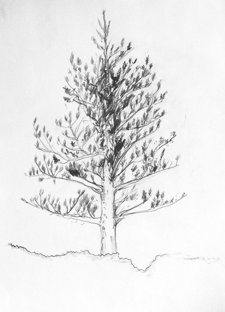
This tree was very easy to interpret, my biggest adversary so far had been the elements, when the wind is blowing hard, not only does it sting your eyes, make your ears hurt but also makes it quite a challenge to follow the intricate details of a tree. this tree was almost engineered in comparison, staggered angled branches, now stripped of all but a few leaves made an excellent subject to study. Drawing from my elbow I tried to make slow flowing marks, my goal was to also lessen my pressure towards the end of each branch, I had varying degrees of success doing, and sometimes I couldn’t resist a follow up stroke. I always started from trunk to the tip of the branch, I sketched in the few remaining leaves. Looking at these trees reminded me of biology text books, the inner workings of the lungs look very much like the trunks, branches and twigs of these trees, each branch giving birth to a smaller more resilient version of itself. It’s strange and almost poetic that these trees, having a similar appearance produce the very thing that our lungs crave.
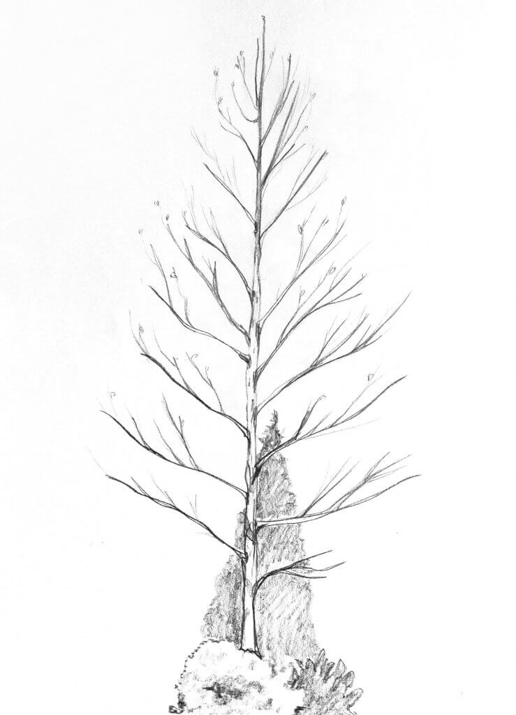
I was getting very cold and tired by now, I just wanted to have another go at that first tree that I tried to capture in graphite, it had a good amount of leaves and it seemed to be still from the wind for the most part. this time I wanted to draw the leaves as a series of collected masses, the result wasn’t too far away from a sorry looking stem of broccoli. I tried to twist my pencil as I drew, this gave me a good variation in line. the softened worn edge being replaced with a flat knife edge as I turned gave a random result, that was enough for today. I packed my things up and started walking back with my large 6mm thick board of MDF I used as a drawing board fighting the wind with every step.
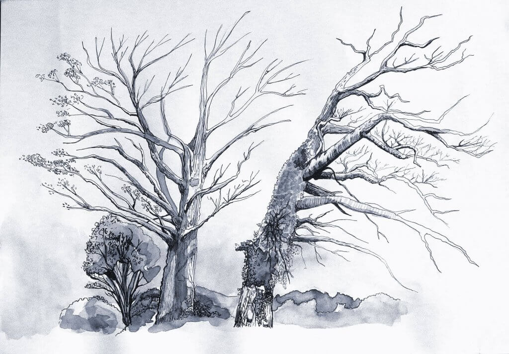
While my study hear was of indeed two trees, I really liked the way both trees worked in tandem and made one larger shape, the trees never seemed to encroach others space even growing and leaning in or away so they never collide. Another thing I liked was the contrasting trunks, one was covered in ivy and foliage, the other smoother with a few remaining leaves.
I sketched the tree, taking care to observe the relationship each tree has with each other. I added blocks of tone lightly with my pencil, I planned to ink over all these lines, so I pressed as lightly as possible so I could remove all graphite. once my sketch was in place, I had my tonal values all decided, I photographed the area just in case I needed some more reference when it came to inking, I then moved on to the groundwork for the next exercise before leaving.
I prepare the paper for inking, using a putty rubber I gently dabbed the harder pencil marks away so the ink isn’t hindered when applied to the paper. I diluted some Indian ink and with a brush I laid out blocks of tone, I had a jar of clean water and added more water to create lighter tones, I layered up light to dark creating a leafy texture for the foliage which had attached itself to the trunk. Once the paper was dry, I used a 01 waterproof fine-liner to start adding lines building them from thick to thin. I also added in some tree bark textures, creating broken lines though the length of the trunk, and circular movements around the branches to describe the rounded shapes. I made a second pass with an 03 marker to tidy and stray lines and block in any very dark areas.
I was happy with the outcome, the diluted ink gave a good amount of texture, the whole image has a very cold and winter feel to it which seemed to suit the sparsely covered tree.