Exercise 1: Temporary Drawings

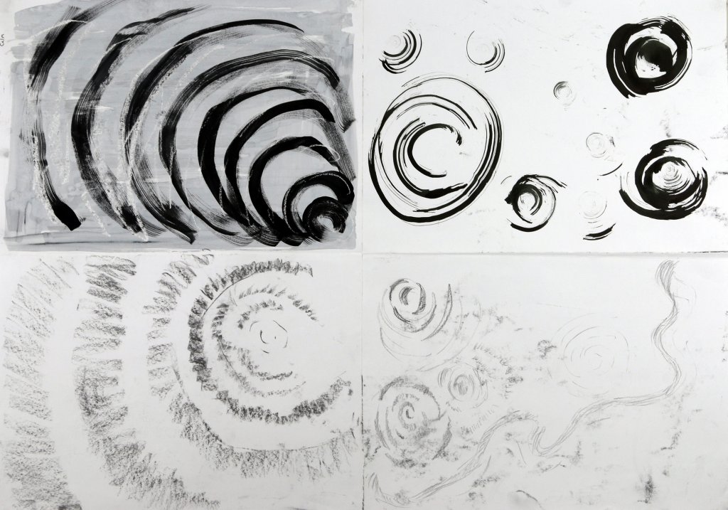
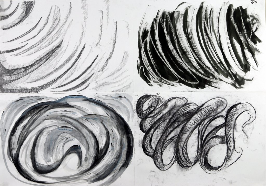
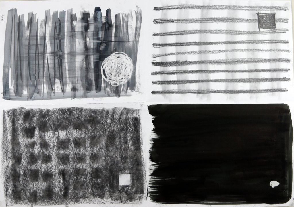
This exercise called for drawings to be made with improved mediums on a temporary canvas. I had a few ideas and I liked the idea of observing changes to the marks or shapes that I had made that would eventually become out of my control.

I would document these as photographs.

A cold hard stare

I poured some water about 3 cm’s deep into a glass pyrex dish, I then froze the water and using a wax carving tool, I scratched an image into the ice. I was hoping eventually the ice would melt and split off, I fear that that the ice was probably too thick for this, none the less the result was some interesting shapes on the pink paper that I laid the ice onto. The water soaked in and even the photography and rudimental lighting I had used to record this experiment made some interesting reflected shapes from the shiny ice. The eye was quite hard to make out in most of the images, but all In all It seemed to be a good enough experiment and one that if I decided to do again I could with a few changes realise my initial vision.

Patterns & puddles

Following on from my watery experiments and what I had liked most from the ice experiment, I decided to use a brush with water and see how this would change over time.

I swirled the brush trying to recreate ripples on some brown packaging cardboard, I saturated the brush trying to get the water to penetrate as much as possible. The effect created wasn’t ideal, as the water bled into the card very little remained of my intended lines and composition. I carried on photographing and observing the changes as the water dried. Ultimately this resulted in a damp mess.
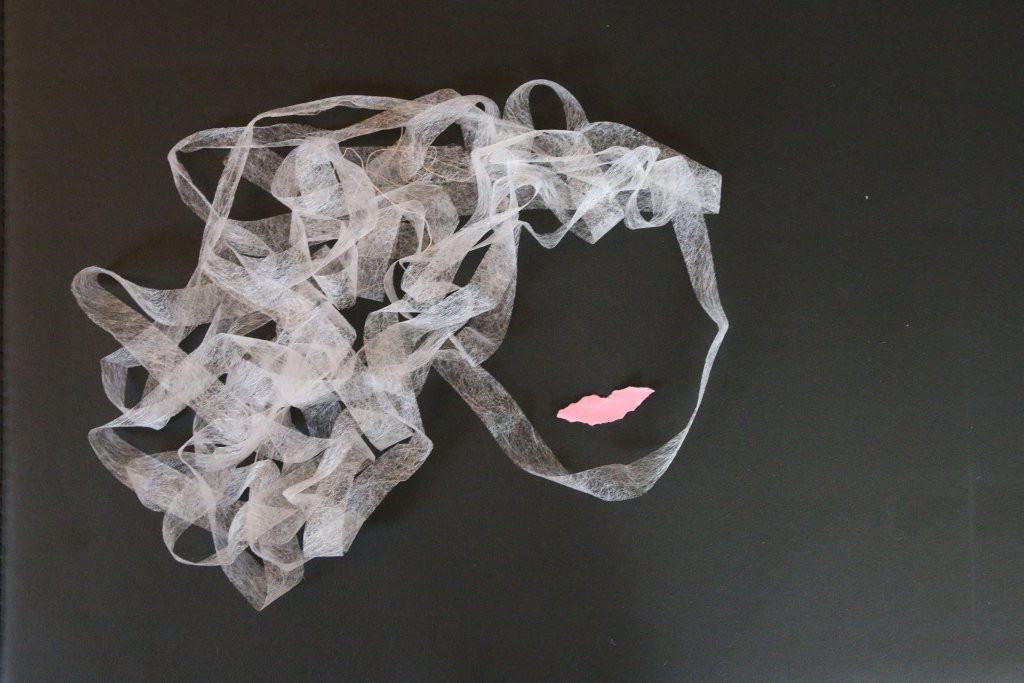
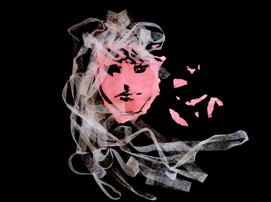
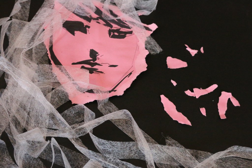
Hair Weave

The next image I thought I would take a more literal approach to my image making. I looked to raid my Mothers sewing and knitting boxes for some wool, I found instead some wonder web which I believe is some kind of Iron on glue material for hems, I pinched it and scarpered off.

I carefully unrolled the length of this fibrous material and laid it on a black plastic folio case to work on. I fashioned a face shape and some hair, tore and shaped some pink paper into lips I photographed with my camera but it did feel a little too abstract, for a further iteration I tore some paper and used a Pentel marker to scribble in a very quick face, I chose the large chisel tipped pen to make sure my efforts were permanent sporadic and bold. This pulled together more tightly as an image although it did stray slightly from the temporary aspect of the exercise. I liked the effect it had when photographed.

Exercise 1: Experimenting with expressive lines and marks

For this exercise, I was asked to use marks to express an emotion or feelings. This was an interesting task and involved more thought than I had first imagined as some emotions seemed to cross over, for example, angry marks can quite easily seem like excitable ones. This would easily be cleared up with colour choices or even a descriptive title, but the challenge here was to use a choice of line and shape in a way that would carry a message and emotions.

I chose 4 mediums to work in, Graphite pencil, black paint with water applied by brush, willow charcoal stick and finally Indian ink. I then divided the a1 sheet into 4 equal sections by folding the paper in half and half again.

I set about trying to capture emotion with my marks, I decided to keep the same 4 mediums so I could compare each page at the end.

The emotions I used were Anger, Calm, Joy and loneliness.

Anger

I wanted to use jagged shapes and opted for uncontrolled fast stabs and slashes, really bullying my drawing materials onto the paper. As I mentioned before this could be viewed as lively or excitable marks out of context but I carried on attacking the paper angrily.
This was by far the most textured of all the pieces created for this exercise, splashes short marks long marks dark and light warring for space on the page.

Anger
Anger

Calm

For calm, I needed to convey the peace and tranquillity that runs deep within this emotion. The shapes had to be soft, pulsing and light. I tried to capture the effect of rippling circles and imagined a warm bassy pulse accompanying my strokes. I tried not to saturate the ink on to the page and kept my pressure light with the graphites and charcoal this meant I could get more of a softer subtle grey tone. The ink I used undiluted and swirled with a texture scouring pad to make a collection of finer lines. I used a candle and drew invisibly to keep the white of the paper shining through the watery black paint, this wash gave a grey tone and with the addition of the white arches helped make the black marks less harsh.

Calm
Calm

Joy

For joy I wanted to convey a sense of rhythm, a flow almost like the feeling of flight. A solid lively stroke with plenty of action seemed to capture this. I wanted to get some variance in my tonal values going from deep blacks to the brightest white of the paper. I even tried to construct “tubular” shapes for the eye to follow across the image.

Joy
Joy

Loneliness

For this collection of images Kept it really simple. To create a feeling of isolation in a secluded environment I used a small focal point, I wanted this to be of high contrast, I didn’t want it to blend in or belong with any other elements in the images. I tried to add grid-like patterns to give it an imprisoned feel. The charcoal section uses square shapes in a uniform grid and makes a distinction from the other shapes, to try to create something un-relatable.

Lonely
Lonely

Exercise 1: Groups of objects

For this exercise I was asked to find a group of objects ad arrange a still life to draw, I wanted to explore line weight in this image, I was hoping I could vary my marks thickness and intensity to describe both light and the solidity of their structure.

I chose graphite pencils to do this as they offer a relativity consistent line weight when kept sharp an as they get duller produce a wider mark.

Using a softer approach I sketched in the form of the objects, trying to remain mindful of my light source and the surface I was trying to capture.
once I had the composition mapped out on my paper I worked in heavier lines under the under drawing, as in the exercise guidelines  tried to work through objects, this helped me to understand the objects form and shape, this was easier with the man made objects, such as the clock and artists hand as they was comprised of obvious shapes, the more organic items are harder to predict.
I tried to keep line weights thin where light would reflect, and conversely thick where they would not, these were really quite difficult rules to follow, I was still trying to capture shapes even with the aid of my loose under drawing. A more methodical and strict passes would probably be a better approach if I was to repeat this exercise, all in all I was happy with the outcome, while the drawing is still pretty rough around the edges and didn’t quite capture the lighting as  I had hoped. I feel I learnt a little about the importance of my approach, accuracy and structure rather than looseness and spontaneity, and how that relates to presentation of the resulting artwork.

Exercise 2: Observing shadow and using blocks of tone

This exercise was about observing and the blocking in of tonal values,
I wanted to capture the light interacting with the two different materials the objects are made of.
One was a metal jug, I tried to recreate the grain in the metal, I followed the contours to mimic the brushed steel. the jug was made of a dull porcelain, I didn’t want to put too much texture and grain on the jug, this was proving difficult, I decided to restart the drawing, the second drawing I would try to make the porcelain jug smoother, using a softer approach. while more successful in some areas I couldn’t quite get the look I had in my mind, the paper was too toothy and left too much texture when I blocked in the tine. I felt I had learnt enough form this exercise and moved on to the next with this in mind, the paper is always a consideration too and I would need to consider that to get the effect I was looking for in future drawings.

Exercise 3: creating shadow using lines and marks

This exercise was about creating shadows using lines and marks.
for the first experiments I picked some bananas as a subject.
they have a ridged form and the waxy exterior would reflect some good soft gradual light. 
Using Graphite, Biro, fineliner pen and brush and Ink, I worked up the four drawings, using hatched lines for the first three drawings and the edge of the brush to smear ink. I was comfortable drawing with the pencil, the fine liner and the biro the most, the brush was a little more complicated, I needed a softer touch and my loose experimental approach didn’t lend itself as well, at least not with the approach I was taking.

The second part of the exercise called for another drawing of 5 objects.

I actually started the next drawing (below) in graphite then after my initial drawing I thought it might be more effective in a softer medium, so I started a second drawing in brown conte crayon.
While both do demonstrate the shadows I observed, the second drawing feels more finished and brought to conclusion, I think that’s because the overall image is darker and has more contrast.
I kept my approach to this as simple and loose as I could. While looking at the objects I assigned them one of three values, light medium and dark, in this case the paper became the lightest value, once I established my tones I worked at building up my marks to create texture and tone.
the drawing tools I picked for the first drawings did seem to lend themselves to mark making, the conte crayon got a little muddy.

I feel the fine liner was my most satisfying drawing, it had a good range of tone and the line work looks interesting and angular.

I enjoyed this looser approach it really adds a lot of information of light and form very quickly, I can see this approach really helpful for rough pre sketches.


Exercise 4: Shadows and reflected light

This exercise called for 2 objects with reflective surfaces. I chose 2 decorative items, A glossy shell and small pot, they was both made of ceramics, both fairly light in colour an off white and a warm grey, the shell had more reflective qualities than the duller pot.

I really wanted to make the distinction between the two finishes, and the way the light would interact with each distinct surface.

the natural lighting was pretty soft, the room has flat white ceilings and walls, so a lot of the light falling on the objects had been bounced and diffused around the room, the ivory sheet was also serving as a reflector of sorts.   There was another light source from above, several ceiling spot lights, I had them on throughout to keep some consistency to the lighting.
there is also a set of glass doors next to the objects this provided more focused light pouring in from the right side.

I very gently worked in my blocks of tonal value, I ended up exaggerating some of the values especially the shell, I really wanted the objects to pop, some added contrast seemed just the way to achieve this.

Once I was happy with my composition and values, I tried to cut back in some details with the putty rubber, this helped somewhat, but when it came to the specular highlights where the spot lights reflected off of the ceramic shells glossy exterior I opted to use some white acrylic paint, the paint has no problem sitting on top of the drawing medium and creates a hard bright mark, perfect to describe the hard bright light that is reflected from a high gloss surface.

I was pleased with the outcome, I certainly used some artistic license by boosting the mid and dark tones of the subject, I feel this was of benefit. portraying reflections is something I have always been drawn to, the way images are distorted around an objects shape is a tough thing to get right, I have seen many technical drawings and airbrushed artwork that portrays surfaces such as chrome faultlessly. This was a simple introduction to light and how its reflected, if I had a more complex reflective object I would have undoubtedly learn a great deal more, but this will do for now.

Assignment 1

This assignment required me to collect objects that had some sentimental value, I looked around my family home to find anything that would resonate.

The camera belonged to my late father, he used to enjoy photography as a young man, he developed his own photographs in a makeshift darkroom.
After my younger sister was born the pictures seemed to get fewer and fewer, we do have some lovely pictures of Mum, my older brother and sister and I believe those were all taken on that manual camera.
No Memory cards back then of course, just the prints and negatives remain as a record of those times, we lost my older brother in a road traffic accident when I was three years old, I have only a couple of memories and they indeed may be false, generated from stories and the old photographs that this camera caught with a wink of his one big eye. It’s nice to think that this camera had captured some precious happy times, and while the images captured on the negative are reversed, swapping  light for darkness, the memories captured on the cellulose acetate or negative, are far from that, what a badly named part of the photographic process.

I picked up my first real acoustic guitar, this was given to me by my father, my father was always supportive of my creative endeavors and this guitar while certainly not being the high end of acoustic guitar price tags it was certainly a lot of money to me and a most appreciated and cherished gift, a guitar is more than wood lacquer and strings it really is a friend, someone to keep you company, a companion. Even the language used when naming the parts of the guitar are based on a living being, a body, a neck and a head, the chords have different voicings, it can tell a happy or a sad song or just be held while listening to music or watching a film. I even named her Prudence, not because she is careful or cautious, all the guitars I have owned since have been assigned names from girls from Beatles songs, Jude, Molly, and Rita. Maybe, if finances permit, one day I will cherish a Lucy.

The final part of my image is a black glossy piggy bank, this belonged to my older brother, I remember as a child it being an almost sacred object, I wouldn’t touch it, on the rare occasion I did it was heavy and smooth, a few coins remained inside, by brother had two dreams he wished to fulfil, he wanted his own judo dojo’s all over the country and a TVR sports car. This little collection of coins in this smiley little pig represents the determination and plans of an 11 year old boy who had his whole life figured out, a dream I know from the few stories I have been told about the spirit of this young man he would have exceeded again and again. Until it was taken from him by the carelessness of another.

My image represents the fragility of life and the fine fibers that hold them together. Past present and future.

I used Conte crayon, white pastel and acrylic paint for the brightest whites as in my last exercise.
The soft mediums when rubbed and worked into the paper do a good job of creating soft gradual tonal shifts, the tooth of the paper when applied directly with no smudge or smear allows for some nice textural effects. The money box is a little of both, some softer application around the dark areas and where the light hits sharper and brighter reflected light.

This image did get my emotions running quite high, it would be hard to understand why without any context but never the less I was happy with the outcome, there are a few bits I would change, the guitar neck ad floral decoration would benefit from some more accuracy. The areas I’m most happy with are the  difference in approach used with each material.

Assignment-1

Exercise 1: Detail & Tone

This exercise focused mainly on tonal values.  I chose half a red onion as it had a really dark exterior and also had a good amount of sheen to it, this partnered with a furrowed texture and a lighter interior would offer good opportunity to explore the visual differences of the onions surfaces. Using graded pencils I went to work sketching out my object.  Starting with a HB pencil I worked linearly to establish my shapes and composition, I very lightly started to pull out the contours of the onion, gently following the shape as if I was drawing a grid over the onion, being sure to follow the curves and grooves and trying to establish my darkest blocks of tone.

I switched to a 4H pencil to get some harder lines established, the 4H was nice and sharp and gave a good clear line, I started to mark my contoured lines with more pressure, it really exaggerated the peaks and troughs of the onions outer surface, I wanted to smooth this out a little, I went with the 4H’s opposite and selected the 4B.  Gently laying down some tones an interesting thing happened, the hardness of the 4H had given it a coating that seemed to prevent the 4B from covering over, as I tried to apply pressure another interesting effect occurred.

The Hardness of the pencil had left indentations on the paper, the soft 4B gave an almost brass rubbing effect, the 4H feathered lines started to show through retaining a texture but tonally the image was getting darker and more contrasty.   The interior of the onion while overall tonally lighter did offer some variation around the layers of onion, using the side of the 4H pencil I very softly added in a smooth gradient, around the ring of each layer, I then sharpened the 4H and added in some directional lines which all painted towards the centre, I wanted to show the roundness of the vegetable and this seemed a good way to do it.

The last steps was to make sure that the image was tonally balanced and sharp, using my three pencils I made a pass with the 4B to make the darkest tones darker, I then made another pass with the 4H and HB to sharpen up any soft areas that the 4B had created.  Overall I am happy with the results, I feel I managed to add a good amount of detail and texture to this image as well as varied  lines and  blocks of contrast to add some visual interest.

Compositionally, the drawing is quite an accurate record, it might have been a little more interesting to crop it closer and really zoom into the fibres of the onions flesh and focus on the wet almost sandy effect it makes when the light hits it. The abstract approach would have also meant it would likely be unidentifiable as an onion so maybe a wider shot could also be investigated as a halfway measure.

Exercise 1: Still life using line

I put together a still life trying to find objects that are round or curved, I found a plastic skull I use for reference some coiled line and some dried flowers from a bowl of pot pourri. I made for sketches to choose an interesting composition.

Using a dip pen and black Indian ink I started to sketch directly to the paper, it didn’t specify if I could or should do an under drawing. It certainly was a test of my mettle as I bravely made marks with no underlying suggestion of the composition. The dip pen is a tool that I’d love to invest more time in, it has an amazing variation of line weight but it also has a pretty steep learning curve, I did end up with an unwanted blob of ink and the odd smudge.

This was to be an exercise in texture pattern and shape using line only, I managed to resist blocking in black areas and tried to focus on line weight to describe depth and shadow. The drawing didn’t come out quite as I hoped, I want to try it again with a light under drawing to make sure my composition is a little more thought out, this time I will try a brush pen and really focus on the weight and direction of my line. I think the brush pen will be a little more intuitive for me even though it’s not my go to method to disperse ink, that would be a fine liner pen, so this exercise will be a valid introduction into brush markers.

I restarted the drawing this time using a soft pencil to gently outline the composition, I wanted to ensure I had some interesting tangents in my lines, and some of the items cutting through other shapes i’m hoping this should make a more interesting end result.

Once I was happy with the layout I gently rubbed the lines out so there is just a very faint guide to follow with my Pentel brush pen.

The brush pens main benefits is a continuous supply of ink with the wide range of line weight. The brush isn’t as firm or stiff as the metal nib of a dip pen so a lighter touch is definitely required to make the most of the potential range. Another consideration with the brush is direction, it does produce the best intentional line when pulled, a characteristic that doesn’t exist with a fine liner. I start by making very light strokes, and open the bristles of the brush with some pressure where i want to convey depth such as the plastic skulls eye sockets and nose, I also try to make the lines heavier around some of the pot pourri that is darker in colour with an attempt at ensuring the focal point is on the left side of the image. Overall I am much happier with this image, its seems less messy and a little more informed, although looking at the first attempt again there is some things I like about it, the texture for one seemed a bit more interesting.