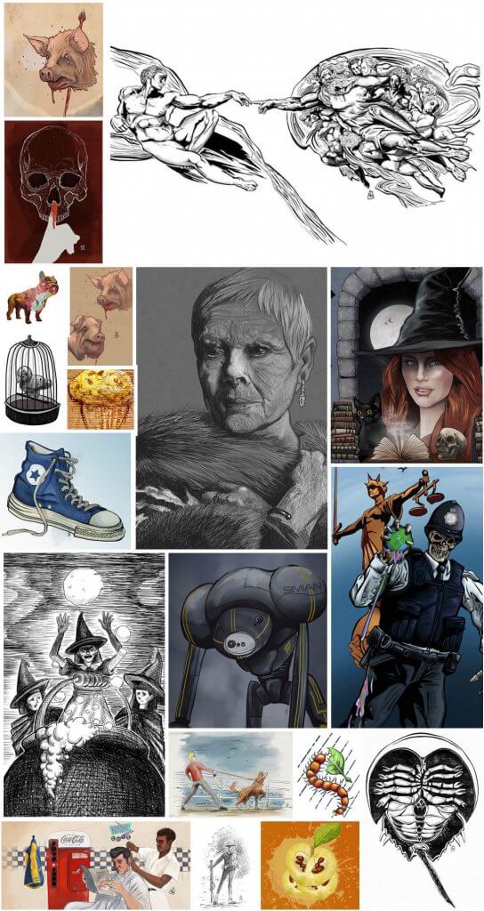
I was asked to collect together some pieces I had worked on for this course that I enjoyed these were then to be applied to my chosen area of authorial practice, a few pieces stood out to me and could be used outside of the context of the brief to appear abstract or quirky, I thought those would be well suited to The fashion Industry, in particular t-shirts.
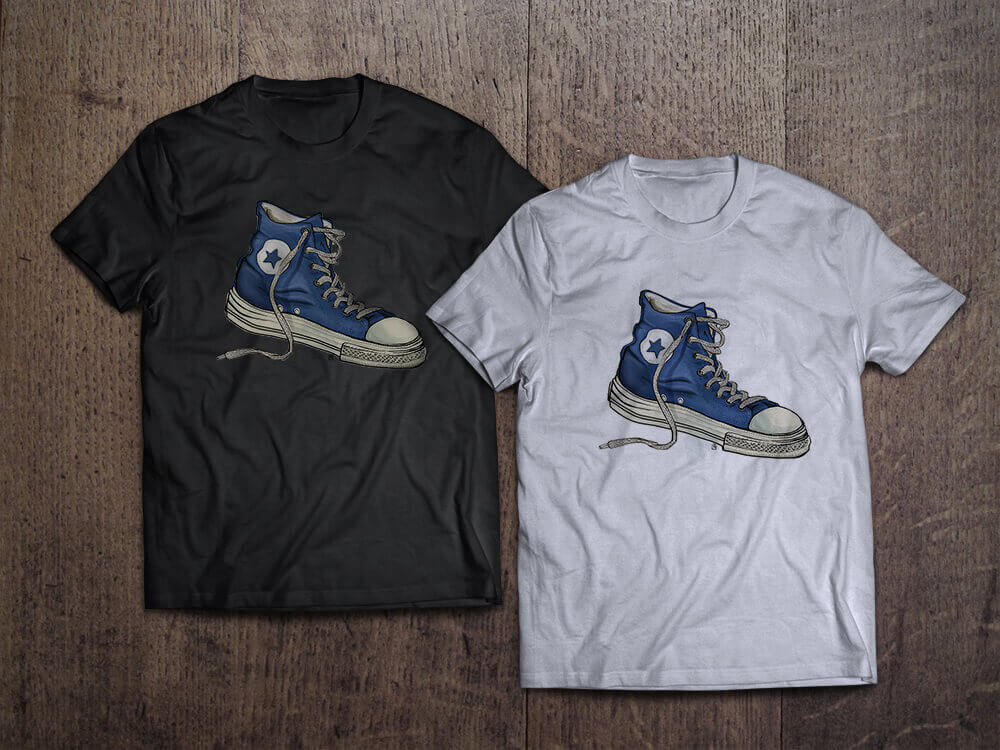
Below is the selection of the work I collected together. I felt there was a few that might work well, across different demographics.
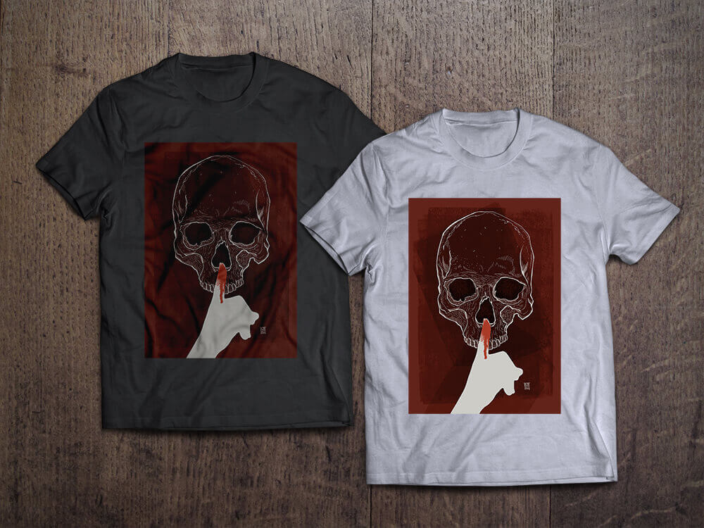
The “Shhhhh” t-shirt has a dark sinister feel, this could be used in the extreme sports industry, or music leaning towards hard rock and metal.
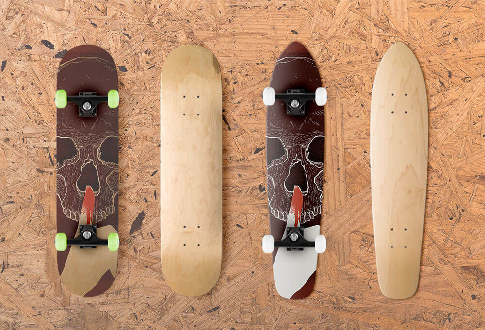
After seeing this design, It occurred to me they may even work well on a skateboard as below.
SHHHHH!
I really enjoyed how the images seemed to lend themselves to the t-shirts.
Shirts are a great from of expression, they can tell people that the wearer is a fan of a band/music, has a sense of humour, or even…
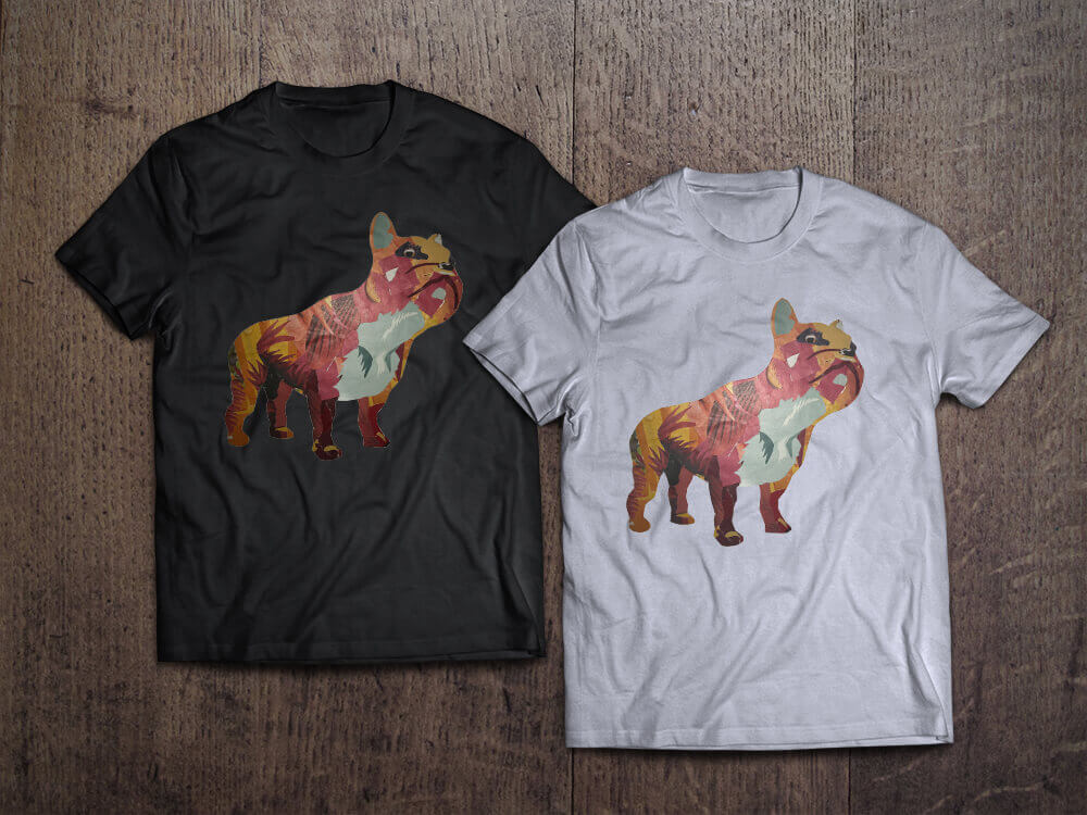
French Bull Dog T-shirt Design
…their love of dogs! I do think it takes the right image to work, seems to be a mixture of style and abstraction, for example the Illustration of Dame Judi Dench, probably wouldn’t have worked, but the bird in the cage may have done. It was hard choosing and settling on just one, so I did a few.
Seeing the t-shirts as a mock makes me think I may dust of my Red Bubble account and upload some of the suitable designs to it.
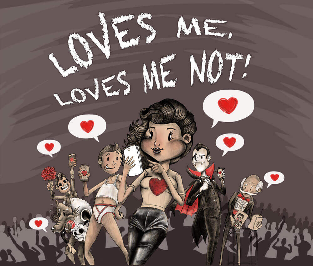
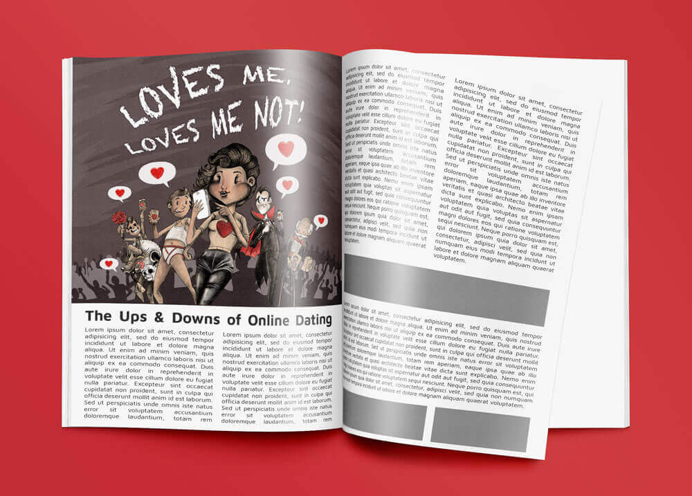
This was a good challenging exercise. From a list of headlines I had to produce artwork that interpreted the articles content, I chose “Loves me, loves me not!”.
After searching online I found an article that seemed to fit the phrase, it was about the pitfalls of online dating. I made some selections from the copy that would give an loose overview of the direction the written work was going, these are the phrases I extracted;
Online Dating is popular.
Love is a human need.
77% of people feel its important to have their smart phone with them at all times.
Online dating is the 2nd most popular way to meet a partner.
People lie on their profiles.
Scammers and players.
Can trial several people at a time as you will get to meet more people than conventional dating.
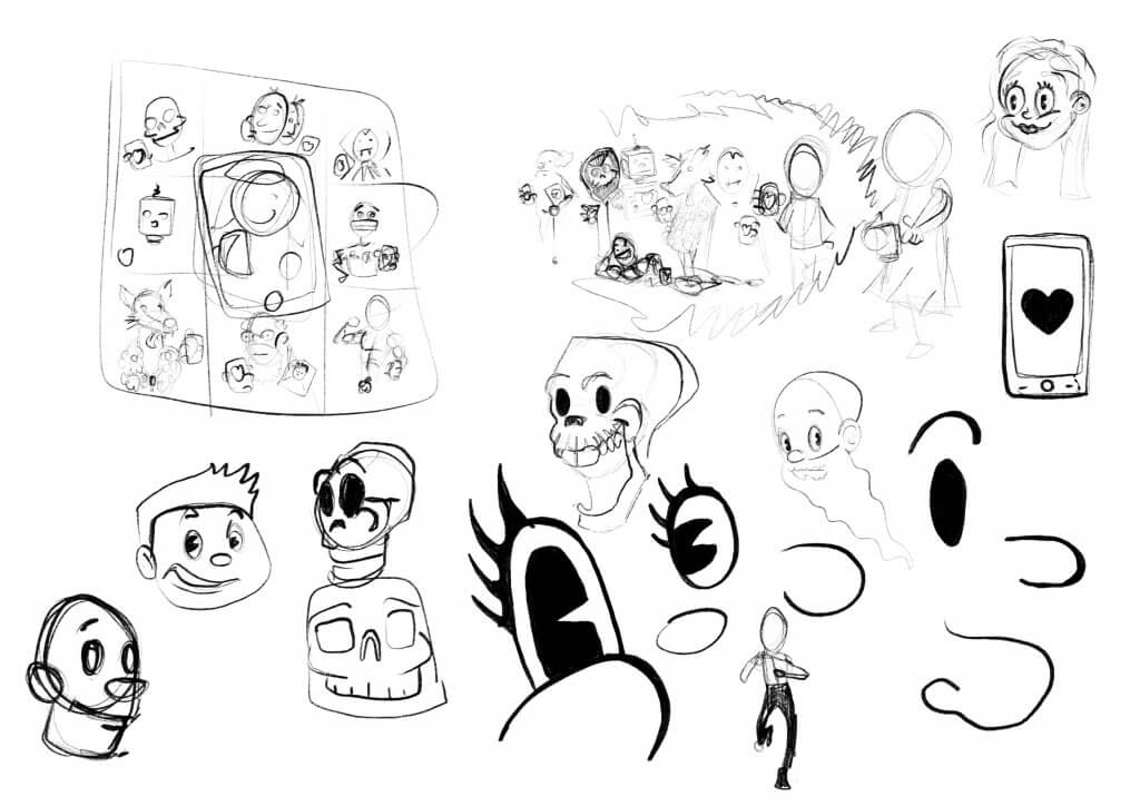
A few things stood out, from the keywords above, I did want to keep it light hearted, I liked the idea of exploring the different types of people you may meet online, and even the phrase “Love is a human need” felt like an opportunity to maybe add some non human characters. To keep it from being negative or depressing I decided I would style it almost like a comic strip or cartoon, due to the references to technology, online and smart phones etc I was thinking that a retro Betty Boop or Max Fleischer feel might be nice to juxtapose old and new. I did some loose sketches, in one I thought I may use a grid with the different characters in them on their phones using a dating app, another featured a cue of people lining up all inside a virtual world, that one was hard to make it look like they wasn’t actually there a tried to put the crowd in a radio wave style bubble, it didn’t really work.
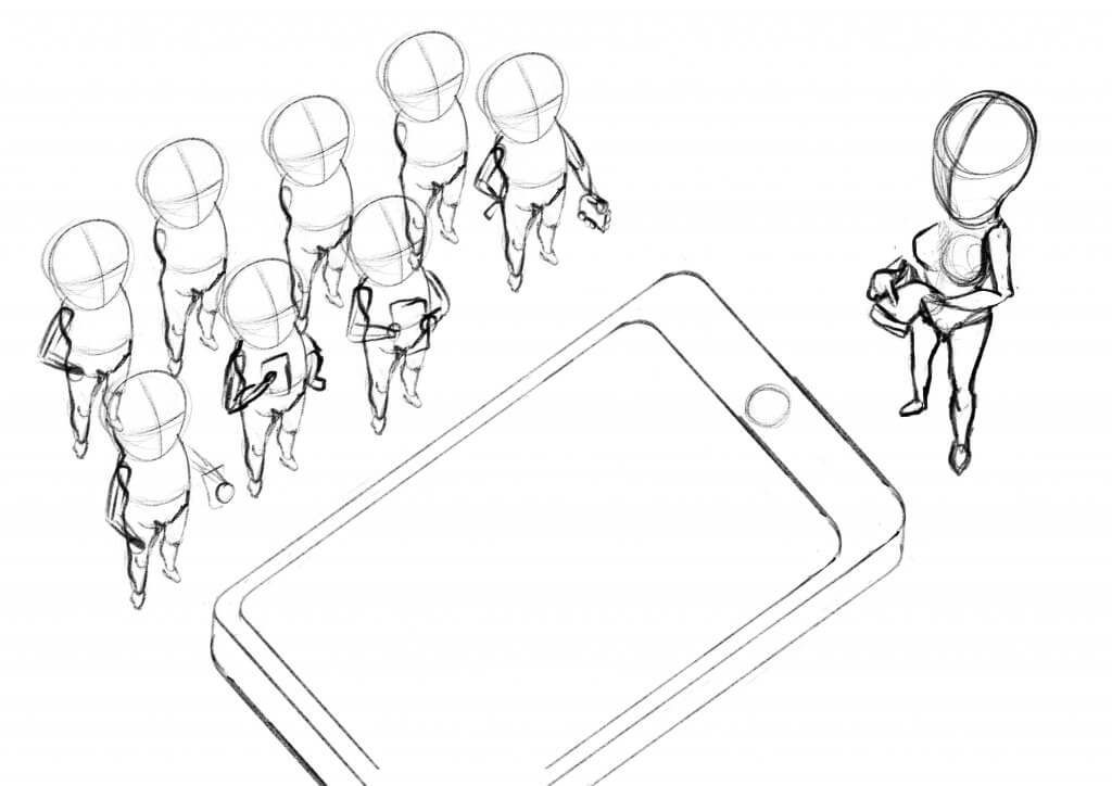
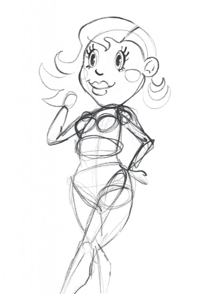
Another was a little more abstract a large smart phone on the floor with a heart would be the main feature and a young girl standing near a crowd of potential partners stand near by(image below), this was nice and striking but it didn’t really have enough scope to get over the different types of characters I wanted to show.
Wasn’t sure I’d be able to convey the characters as well with this angle
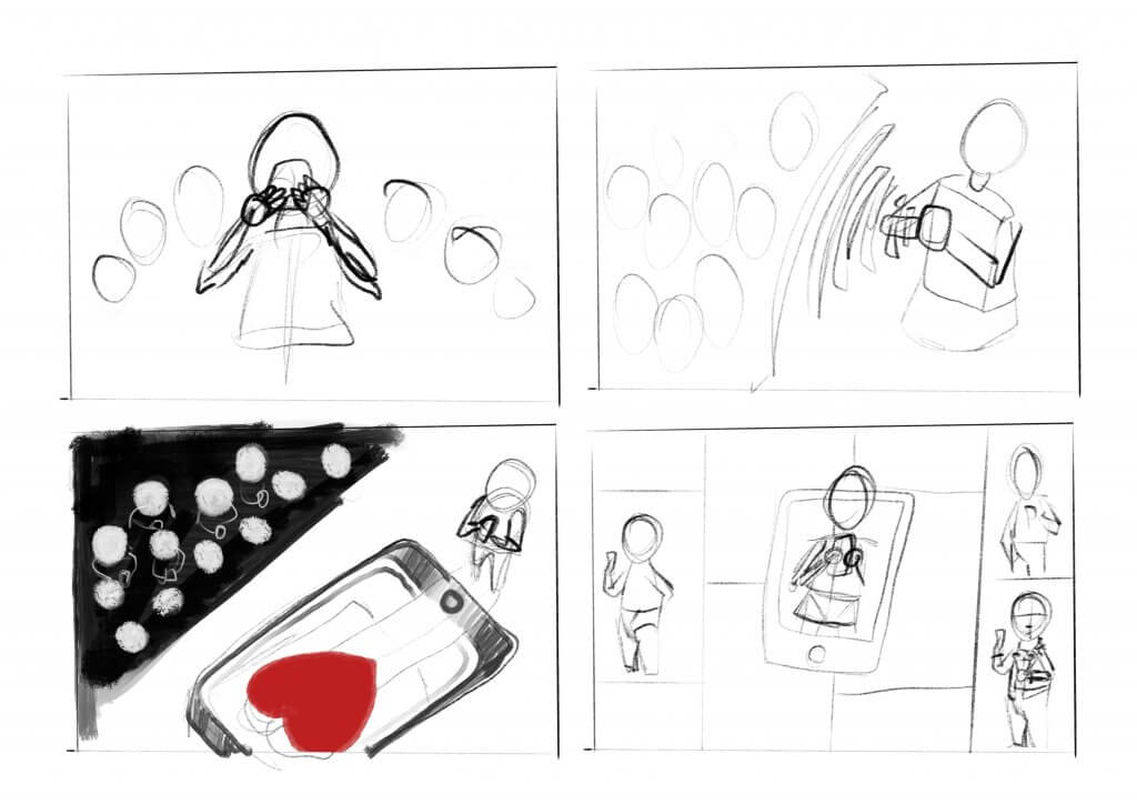
In the end I settled for something a little simpler which centered the main character and gave a crescent shape to the overall image, it seemed to have a better stamp and would be the best way to present the cast of colourful characters I wanted to show.
I did some research on some of the styles I want to cover, two contemporary Illustrators came to light, Mc Bess and Shawn Dickinson, they both have a vintage cartoon style, while their motivation and inspiration are from the same source their implementation is quite different, Shawn Dickinson has a very retro cartoon cell look while Mc Bess uses a lot of texture and grit to bring his mostly tonal drawings off the page.
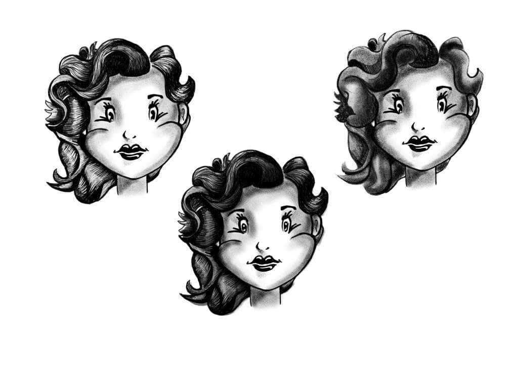
The main character was going to be a young girl with a 1930’s – 1950’s feel, a mixture of Betty Boop and Sandy from Grease with just a hint of Monroe, I had sketched out some possible styles and rules to keep it looking consistent, I liked the idea of making her face heart shaped and even managed to incorporate the two round shapes as cheeks. long cartoon eyelashes and he big curls in her hair finished off the look.
loose sketch of a retro cartoon gal
I experimented with some ideas on how to render the Characters, did I want it soft and smooth, a more hatched style in the end I opted for both, adding in the grit and noisy texture that I had enjoyed in the McBess style I had research ed, with some softer gradual tones also.
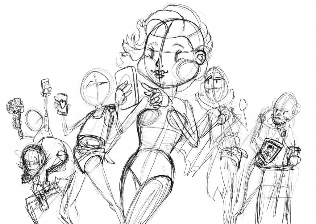
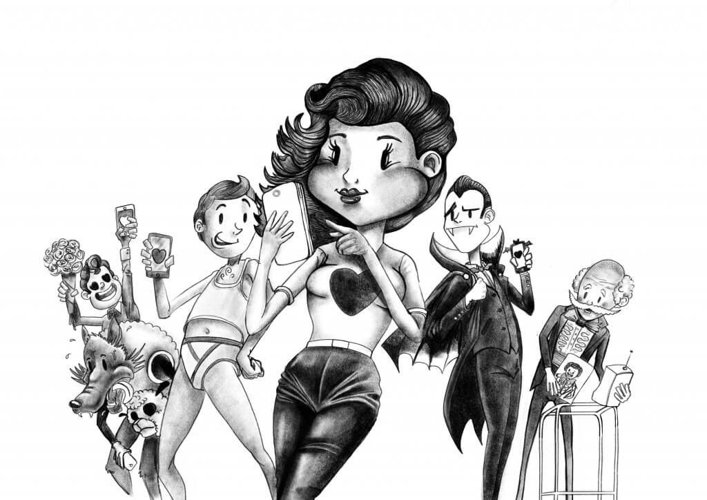
Next up was bringing the layout I’d settled on to life, I didn’t want to include too many secondary characters just a few either side. I used the key words to flesh out the different people, including some stereotypes, the characters left to right was;
A hopeless romantic who falls in love too easily.
A wolf in sheeps clothing.
An overconfident pest of a man after only one thing.
Our main hero, a single Juliet looking for her digital Romeo.
Count Dateula, a blood sucking vampire, who will break your heart and bleed you dry.
The ageing stud, he was a lady killer back in the day, and he is still using the same tired old photo to prove it.
Construction lines for the final pieceFinal rendered pencils
I worked tonally for the next step, rendering the shapes and textures. I knew i’d have to add some colour, I didn’t want anything too bright as I wanted to keep an old looking feel, I chose a muted palette contrasted by the bright red hearts.
I thought some red would set off nicely, I wanted to keep the colours quite mute to make the red pop.
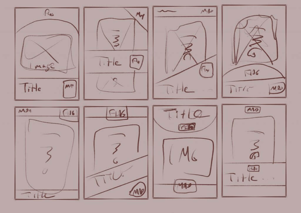
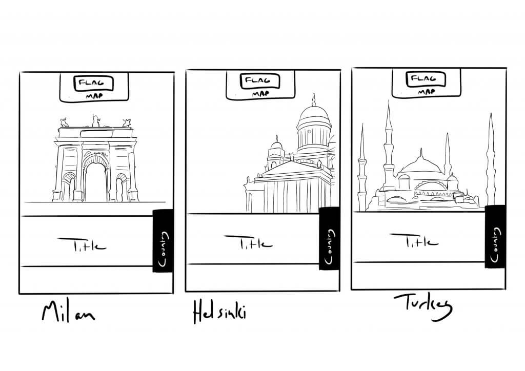
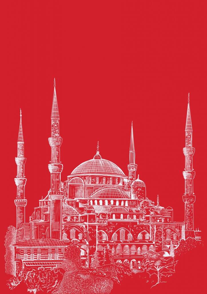
In this exercise, I was asked to produce artwork and a mock for a travel guide based on three locations, Istanbul, Helsinki and Milan. I did some research as I wanted to feature landmarks for the regions. I planned to do some stylised line art for the cover, each book would have the same style and information, instantly recognisable to the avid traveller.
Below was some layout ideas, I needed to include a country location, a region location and I thought a small map Icon would be a good touch.
I explored some layout ideas as I needed to make sure the overlayed information didn’t detract from the image and was consistently presently.
My initial sketch became the final artwork, I reversed the black lines and added used a red and white colour scheme to reflect the Turkish flag.
Final Artwork
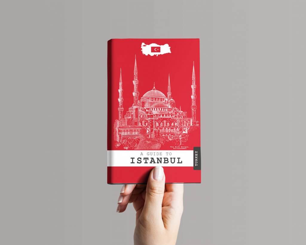
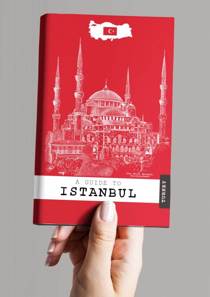
I mocked up my idea, I used a typewriter style type as it felt like a journal, the kind a traveller might keep to record his journey. The Brief did call for a handwritten type, I did try to recreate the simple stamped shapes with less accuracy and geometric precision but it didn’t really make much of a difference. I think If I was in charge of the lettering too for this project I would argue the case that its more practical to use fonts rather than handwritten type for future translated editions, consistency etc.
Travel Guide Mock
Overall I was pleased with the outcome, I would say it looks like an informative practical guide for the serious modern traveller, but still with fun and style so it would appeal to younger more casual explorers.
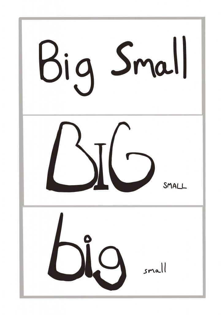
This exercise was to establish a relationship between words and their meaning visually. I was asked to write out the words normally and then using upper and lower case rewrite them to reflect their meaning.
Big & Small
with this one, I tried to almost get a worm’s eye view on the word big, tapering the image at the top to suggest reaching great heights. Small in this instance would only work in relation to the word “big” being displayed with it. as I played on the scale to achieve this difference.
big-small
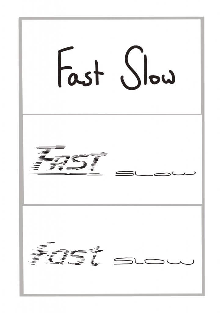
Fast & Slow
For these opposites, I tried to use cartoon speed lines to add some movement to the word fast, slow I tried to make squat and stuck to the ground, almost like its sliding along slowly.
fast-slow
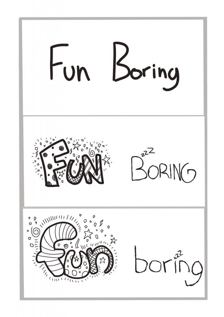
Fun & Boring
Loads of things going on here for the word fun, again the boring is a thin plain word, I also added some snooze “z’s” to give it a bored aesthetic.
fun-boring
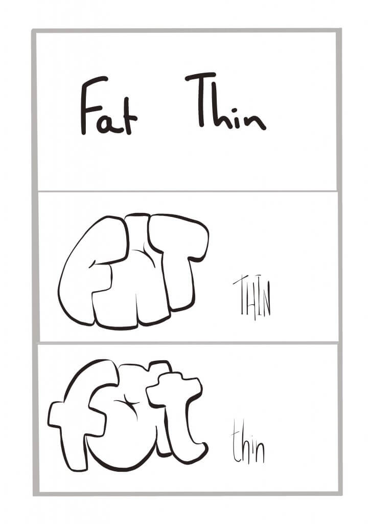
Fat & Thin
This called for some swollen bloated lettering, and some wire like thin characters to provide the opposite.
fat-thin
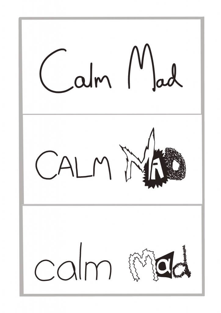
Calm & mad
I tried to use thin round shapes to portray calm, the opposite for the word mad, spikey rough edges inconsistent jumpy sizes and tonal differences to give a crazy look.
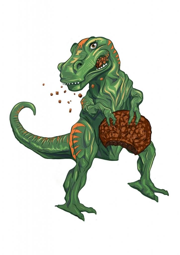
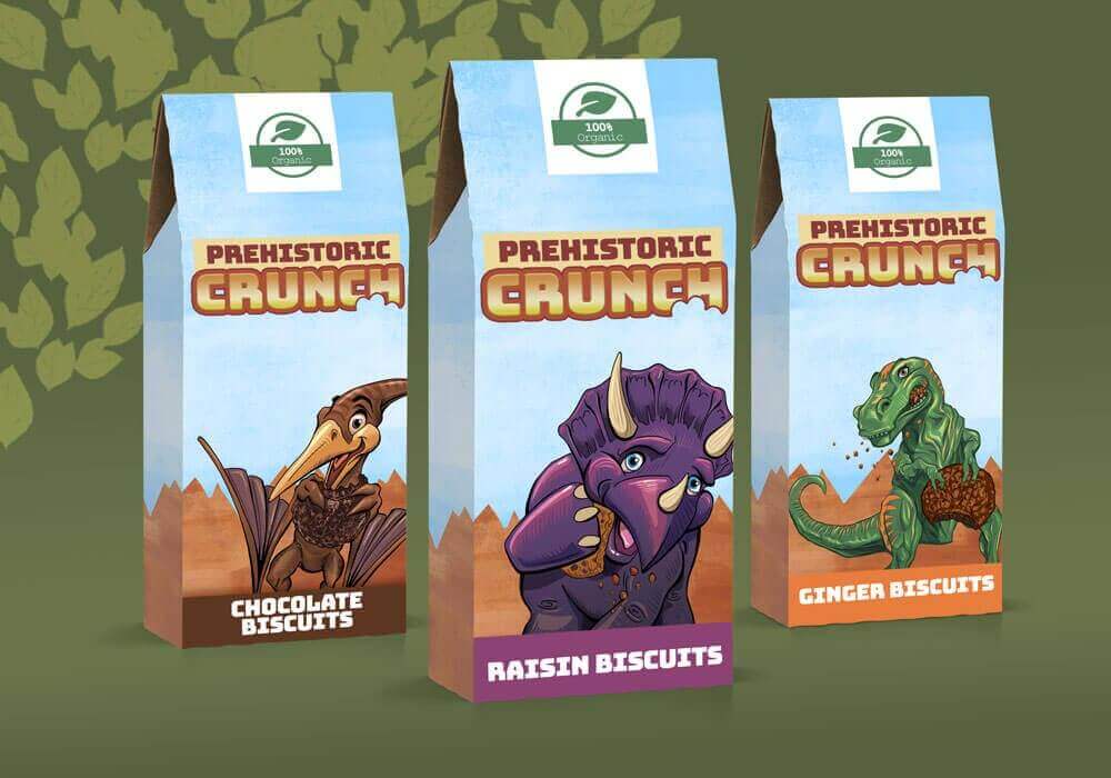
This brief called for some original artwork for packaging for organic biscuits aimed at children, this was to feature three extinct animals. My plan was to show some vibrant appealing characters the children will see and cry for when being pushed in a trolley or skidding up and down the aisles of the supermarket. When choosing the extinct animals I had to take into consideration the audience, kids wouldn’t necessarily make a distinction between an elephant and a mammoth, a big cat and a sabre-toothed tiger or a dodo and a toucan.
Dinosaurs seemed to be the best if not a little clichéd choice, they come in all different shapes and sizes, live on land, air and water and have a very wide appeal. I picked three of the more distinct ones and started to sketch out some shapes.
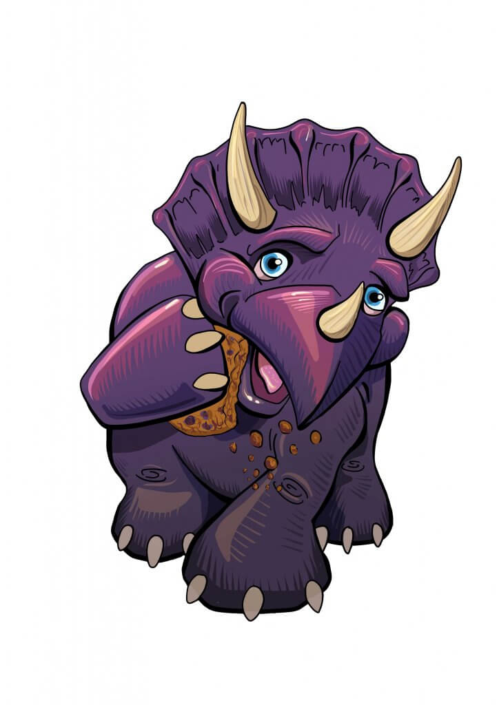
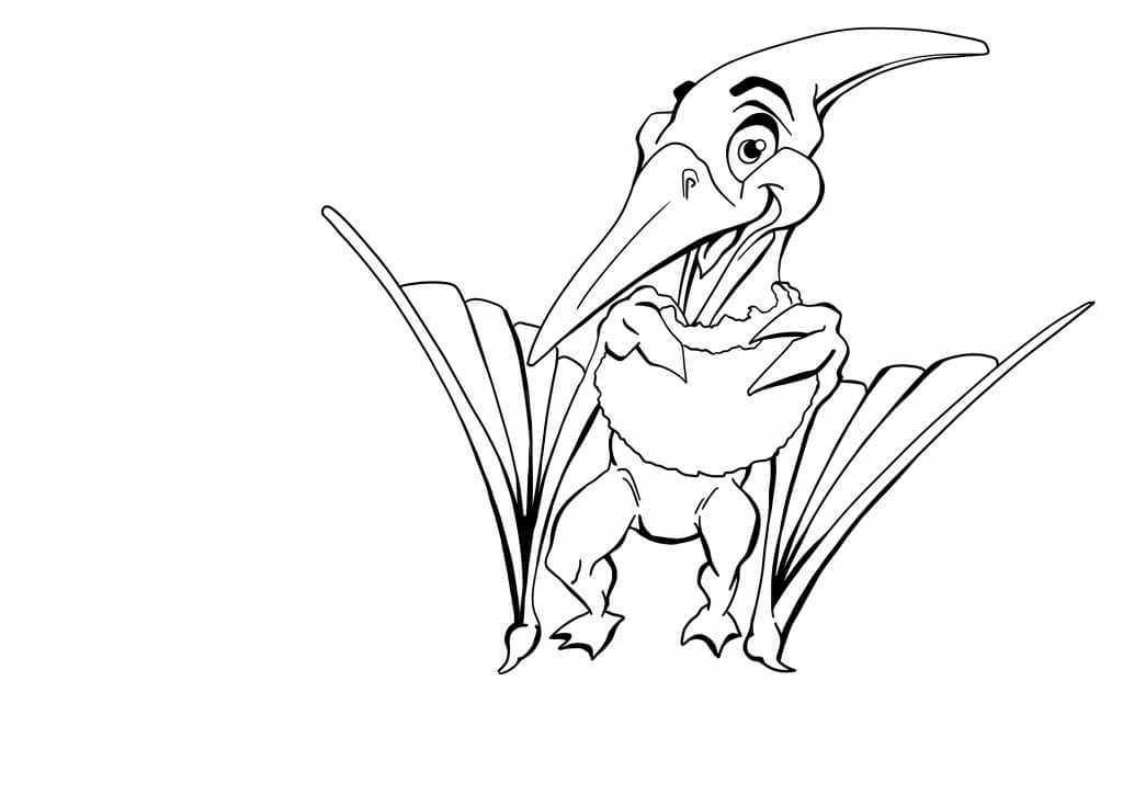
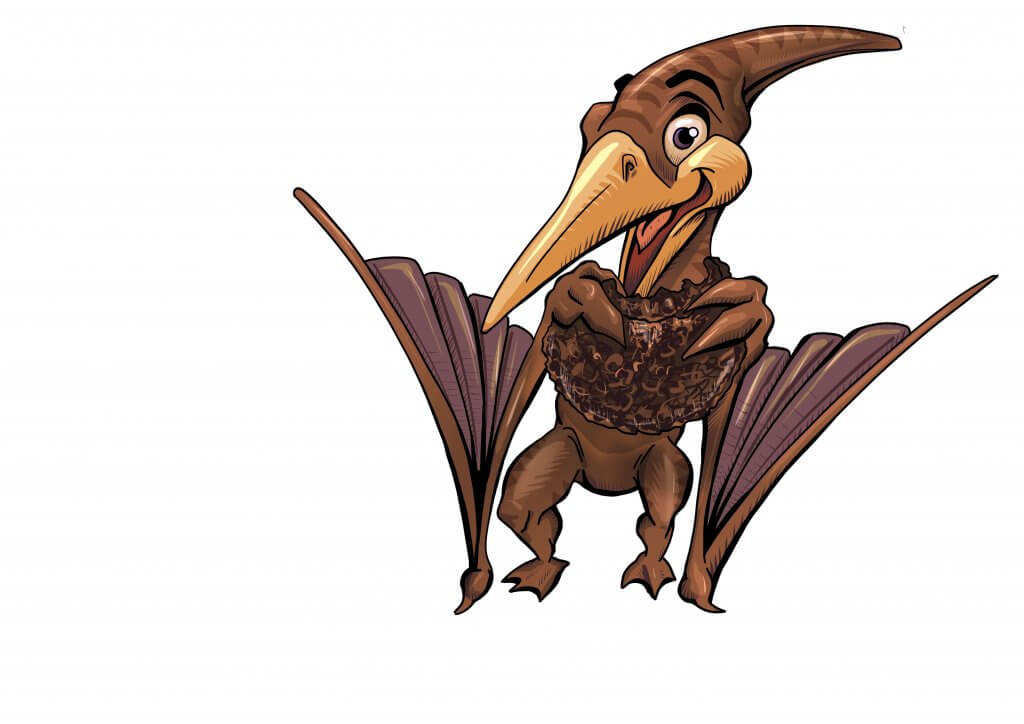
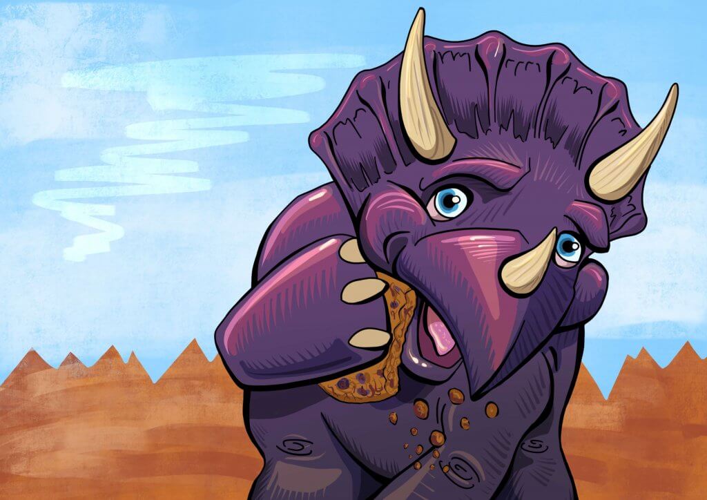
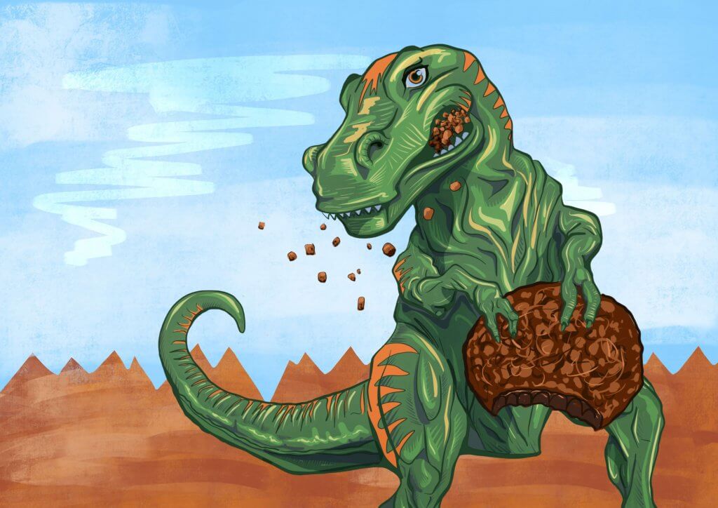
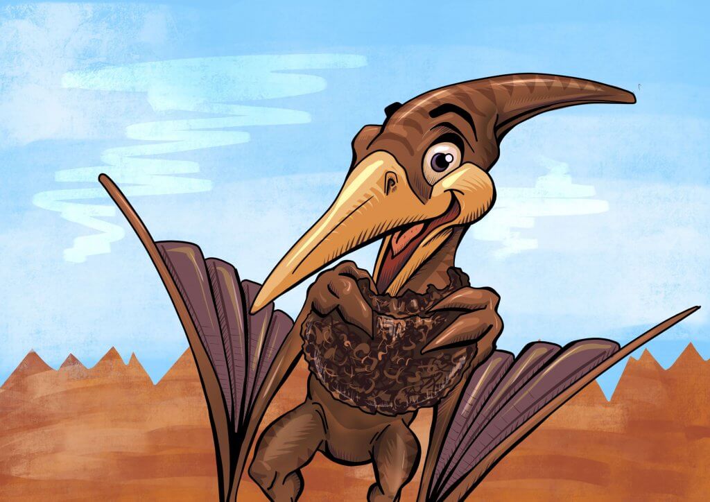
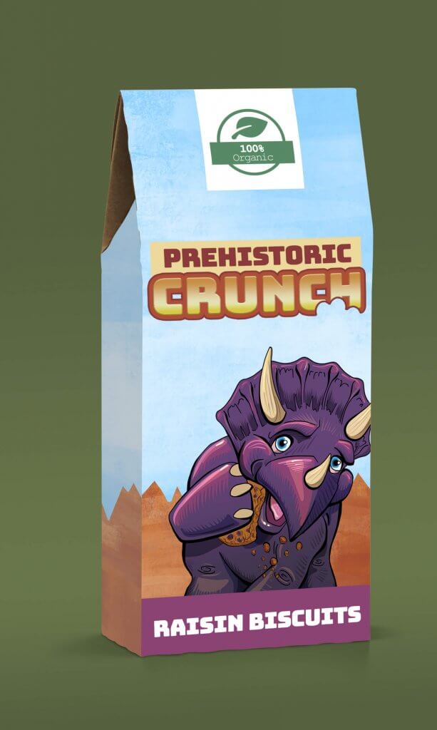
I kept in the back of my mind the flavours I needed to push and the colour schemes they may be, I also wanted to match the characters somewhat to the flavours. The strong powerful flavour of ginger was to become a fierce T-Rex, the raisin a small stout round fruit, would do well as a Triceratops and that left chocolate, an earthy muddy Pterodactyl would serve well here.
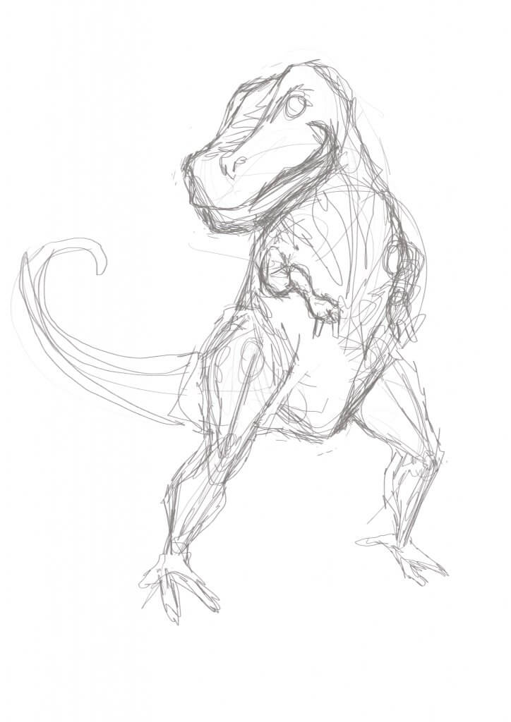
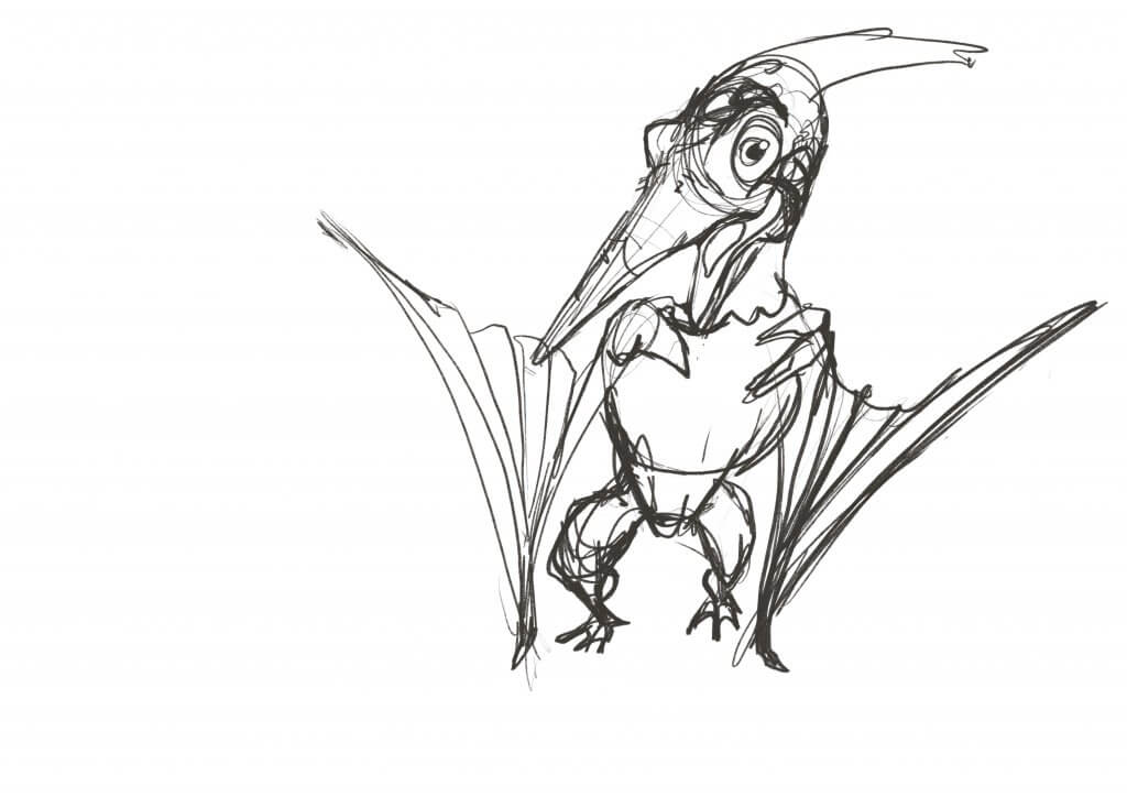
I’ve been trying to really develop a sense of weight, balance and shape in my characters, this time I took a different approach to these characters as I wanted to really try to get a sense of movement or even a high-end animation feel to it. I sketched out with some lively rough lines the pose I wanted, I made some adjustments where necessary, I was only interested in capturing the movement at this stage, thinking about how the characters would balance etc, I wanted to try to retain this as much as possible for the next step.
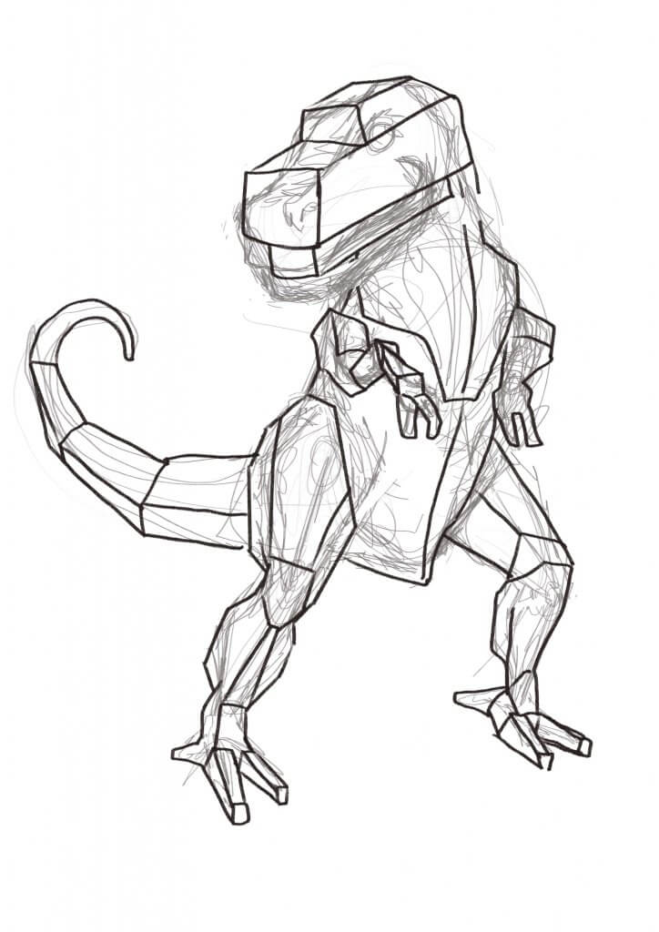
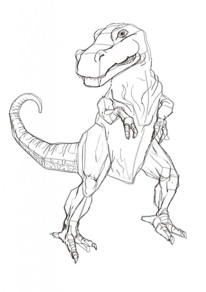
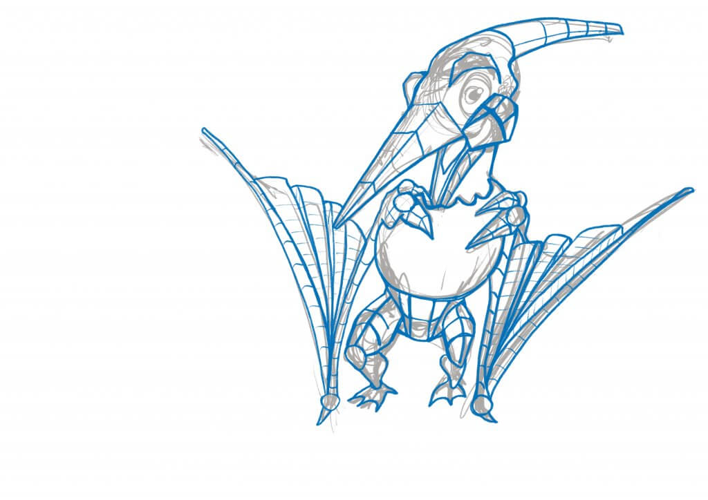
I would normally start off at this point, boxing in some shapes and add some depth and body to the anatomy, this in the past has made some pretty rigid characters, this time with the lively, loose under sketch it really helped to “animate” the character to life. I will take this approach in the future as while it added in an extra step added in so much more to the final image. I then went about the drawing in much the same way I normally would, I pencilled over the construction lines, then inked in the key lines and then coloured. I really liked this new workflow and will be making it a standard drawing practice from now on.
Loose sketch for the T-RexT-Rex construction linesT-Rex pencilsT-Rex, ginger biscuitTriceratops, raisin biscuitLoose Pencilling stage for the PterodactylConstruction stage for the PterodactylInking stage for the PterodactylPterodactyl, chocolate biscuit
The Packaging needed some common branding so it was recognised regardless of the flavour, I added in a simple cartoon background for the titles and the information to sit on. I also needed to add some messaging too as the brief called for Organic messaging as a selling point for the adult purchaser. As an Illustrator, I’m sure my job would finish at this point but I really wanted to see these crumbly prehistoric treats come to life in the mockup so no detail was spared.
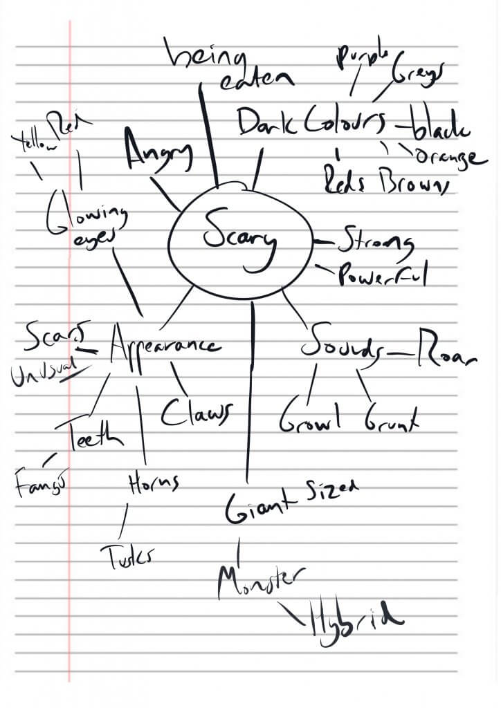
then I was asked to pick at least one word from a list, I chose journey and scary and apply it to an animal suitable to two of the age groups.
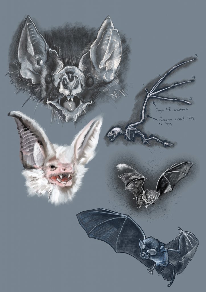
I chose established reader, the word scary and a bat as the animal, I also chose from the list, early reader, the word journey and a hedgehog and a tortoise as the animals.
I’m not sure that it’s easy to define an image type per age group, I found a lot of images could cross over to different ages, It seemed that the simpler an image was the younger the relevance to the age group would be, the opposite seemed to apply to the older age, the detailed or more stylistic approaches seemed to fir them better. This does seem to be quite a generalisation though. The simple geometry of something like hello kitty at a glance would seem to appeal to infants but they print her image on all sorts of adult T-shirts, rucksacks and even shot glasses, they seem to have a product that spans the age divides, I guess what this means is that you’d tend to develop and style ideas towards your target market, age groups may be a factor but not the most defining one for every context.
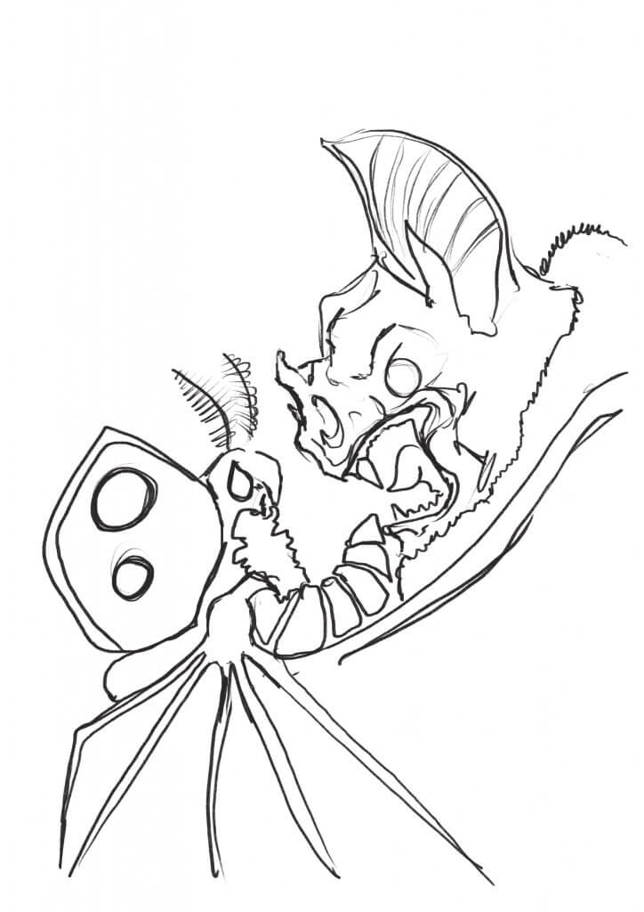
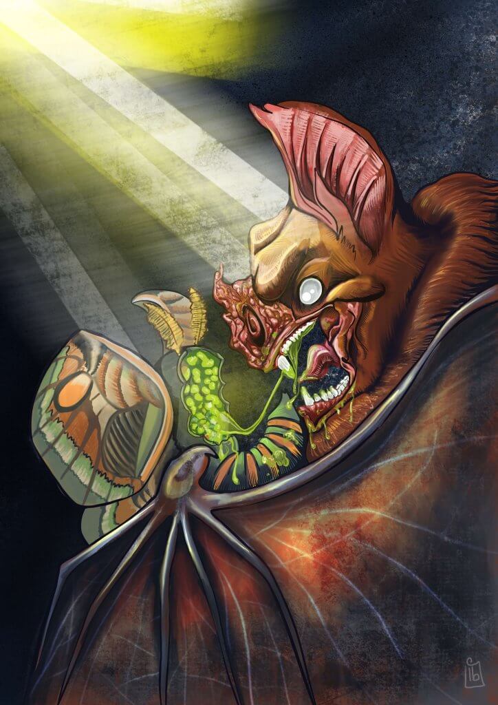
For the established readers and as per my findings I wanted to use a lot of detail and “realistic” stylised qualities for this image. I started out researching Bats and produced some visual studies, I wanted the final artwork to be grounded in reality as it would suit the age group quite better. This was a great help as it really did help for me to understand the anatomy and unusual facial characteristics of a bat.
I brainstormed the words scary and journey to try and get some ideas flowing for the content, In the animal kingdom the scariest thing must be to be hunted killed and then eaten, so I started to think about a bat and his pray, the moth. I wanted to make the bat look very menacing as it devours its prey. A little artistic licence would be needed to give the character some facial expression as I’m sure bats wouldn’t possess the muscles needed to express anger etc.
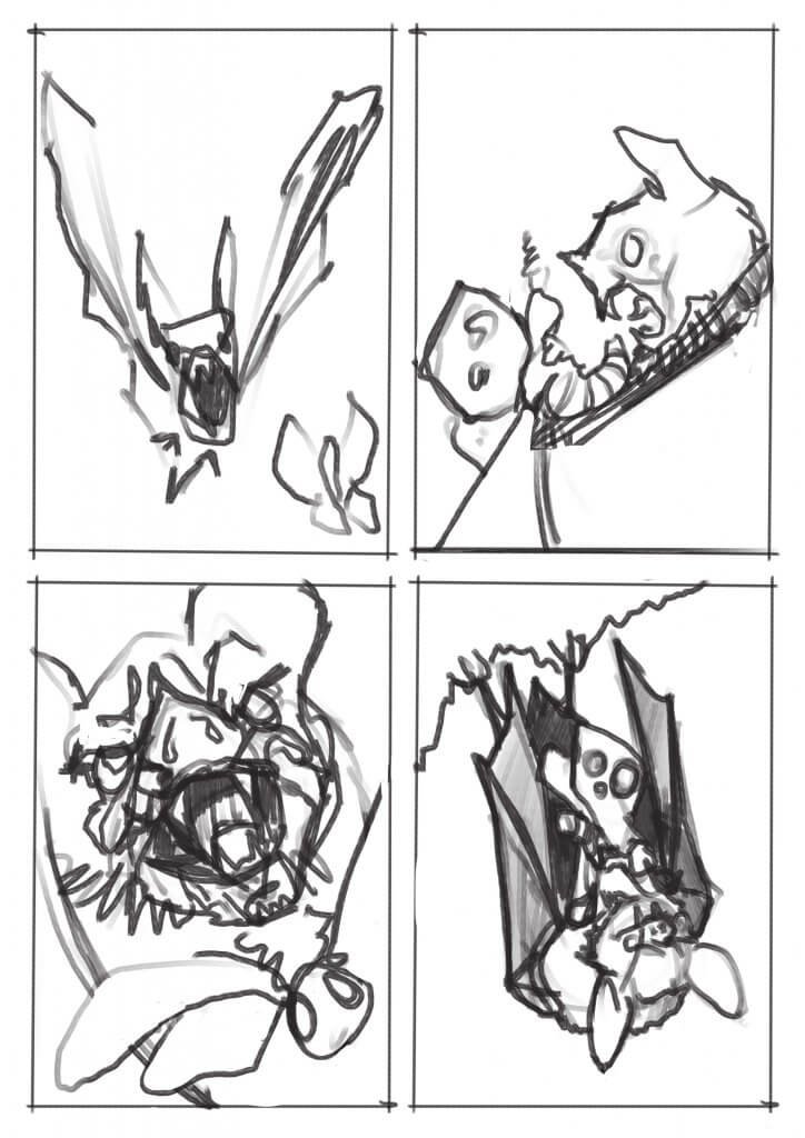
I created 4 visuals to try and arrive at a pleasing composition, one of the feeding characteristics of a bat is that they eat upside down, this wasn’t as exciting, it looked a little passive and at rest. I much preferred the side view with the bat looming over its prey, I went with that option.
The Midnight Feast -pencils
I was quite happy with the outcome, I liked the narrative and the atmosphere, the lighting added a good mood and I managed to get the translucency of the bat wings in there too.
For the early readers, I wanted to keep it simpler brighter with the focus really being on the reader being emotionally attached to the characters, I wanted the children to like them.
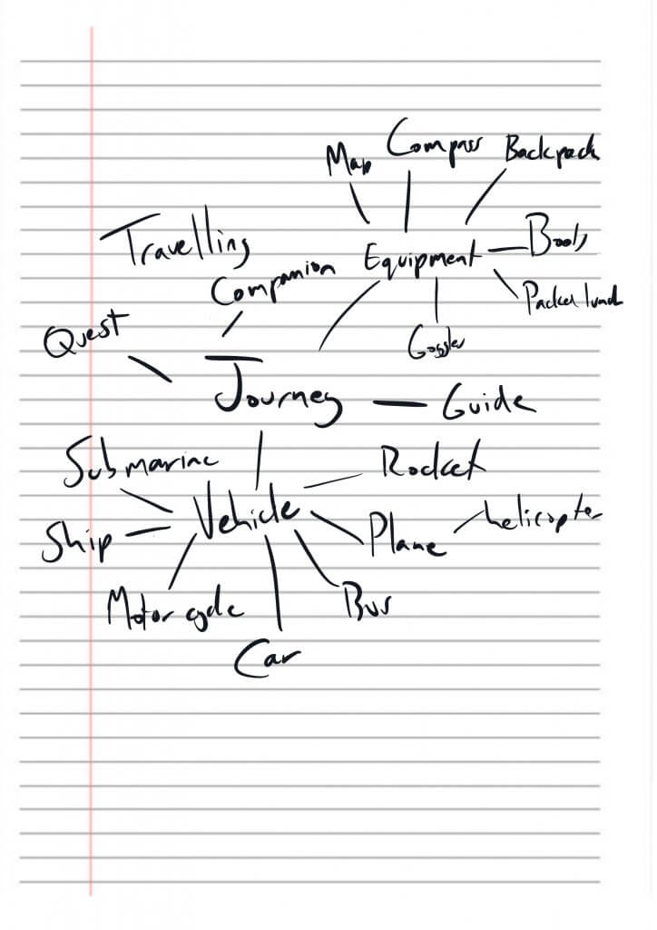
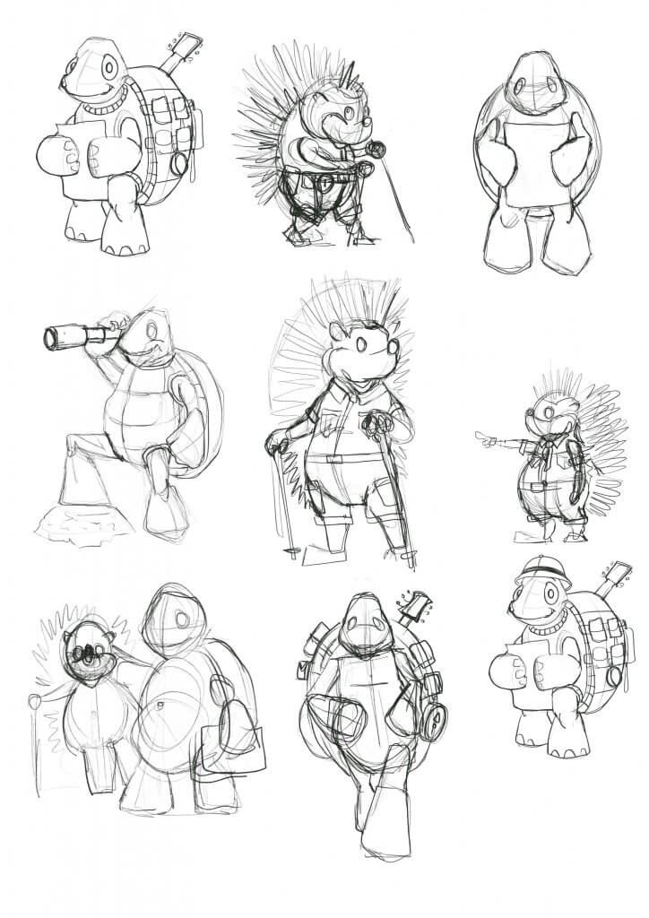
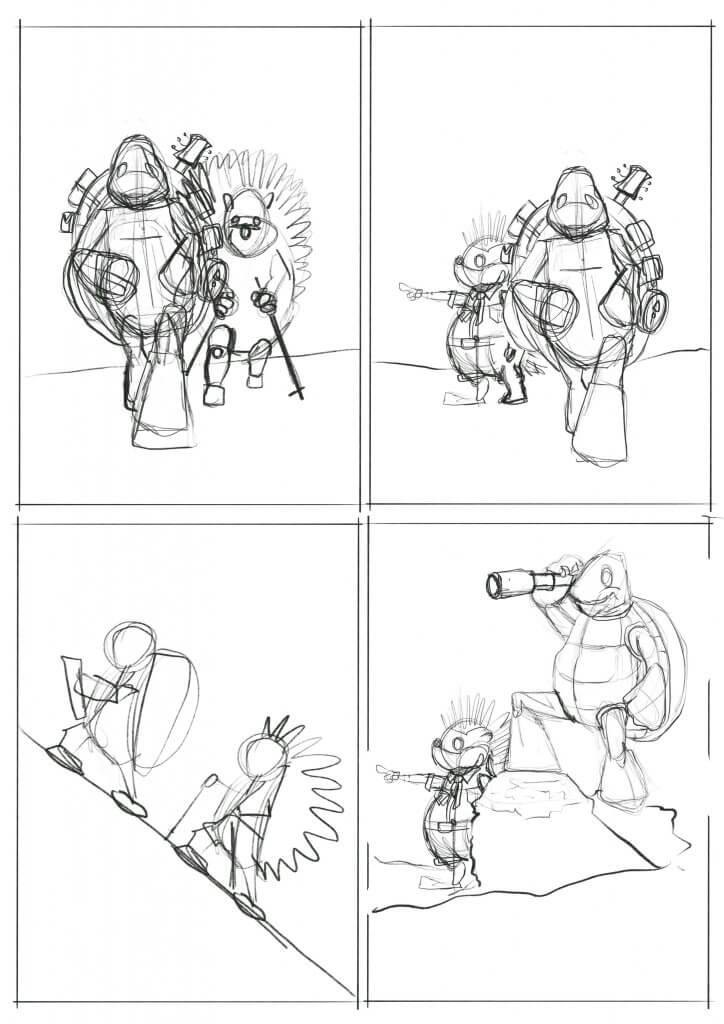
Within my brainstorming diagram, I mentioned including a travelling companion, I deliberately chose 2 animals that would find a long journey quite troublesome, I thought a hedgehog and a tortoise would be a good direction to take the exercise in.
Journey spider diagram
I worked up a loose character sheet, and once I felt like I knew the two characters I used the drawings to work up a few ideas.
Character StudiesJourney thumbnails
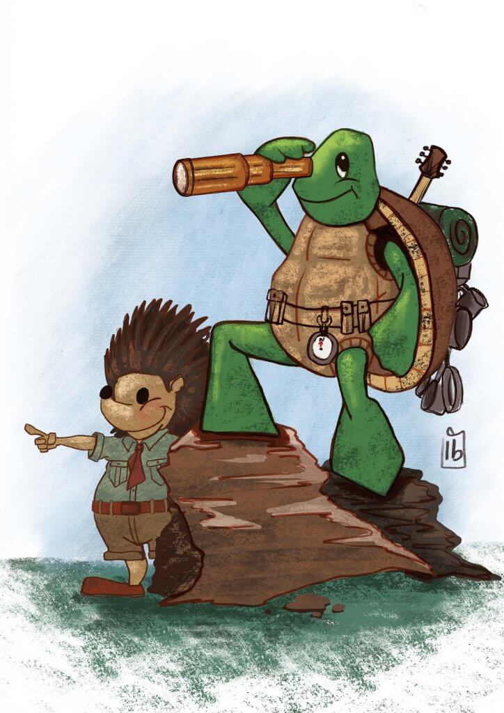
I chose the image where they are looking forward to the journey ahead.
I tried to give the artwork an almost drawn in crayon appearance to keep it light and simple as possible,
The Longest Journey
I really did enjoy this exercise, it really made me think about my approach an how my choices would affect the overall appeal of the image to the different groups I was aiming the artwork at. I also liked being able to breathe life into the characters I created, which is something I have been trying to work on lately, this exercise definitely helped.
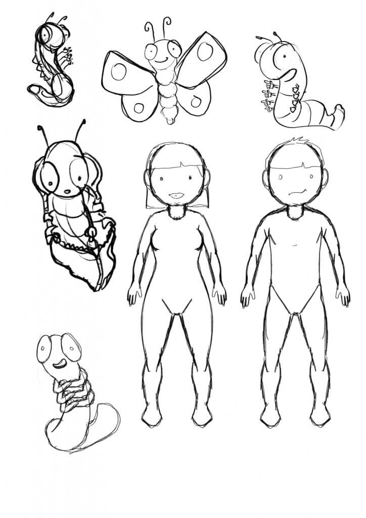
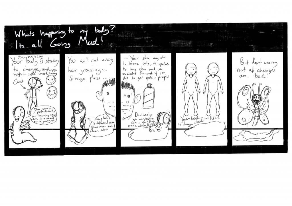
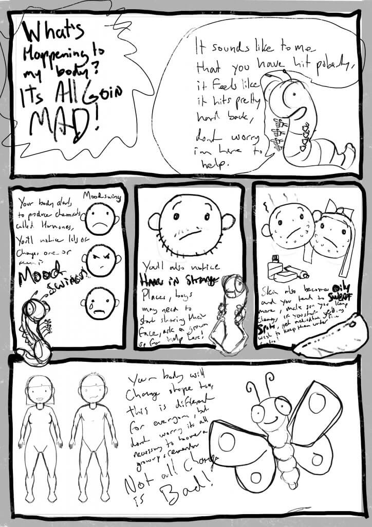
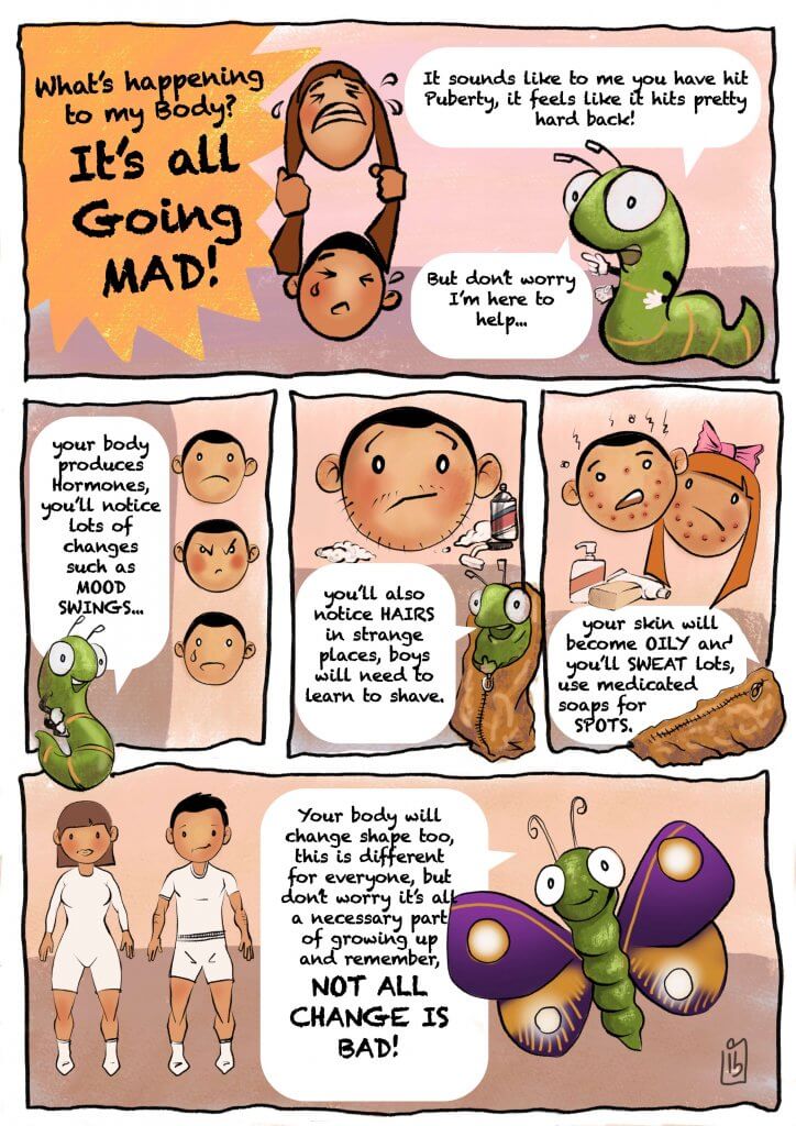
For this Exercise, I was asked to produce a strip of up to five frames explaining some of the aspects of puberty to youngsters. My Idea was to use a caterpillar as a metaphor for change, he would narrate through some of the points I wanted to cover off.
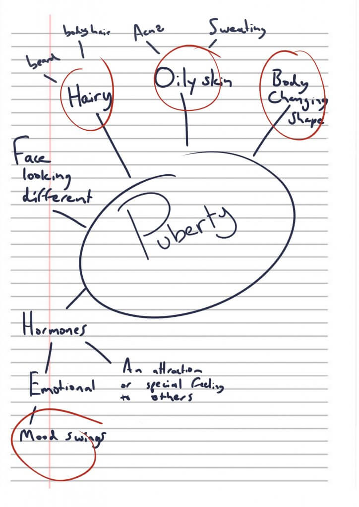
spider diagram
I started off with a spider diagram, going over some of the changes in puberty I didn’t want to include anything too heavy as I only had five frames to cover things off. I settled on the following points;
Mood Swings
Hair Growth
Oily Skin
Sweating
Spots
Body Shape
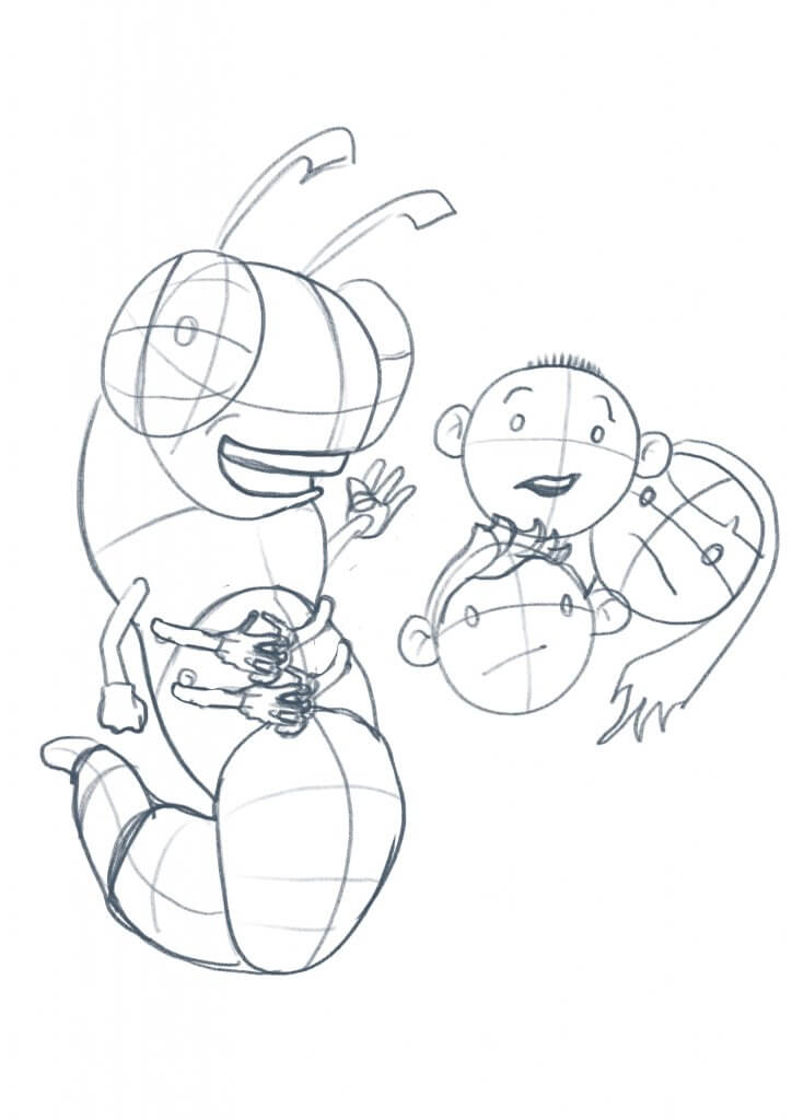
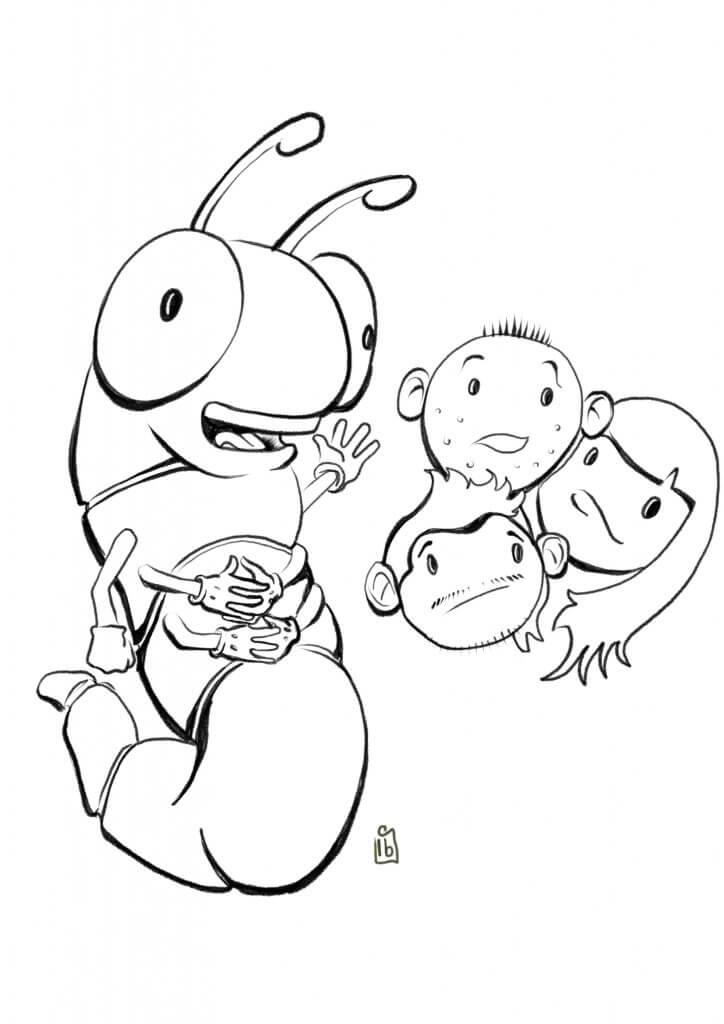
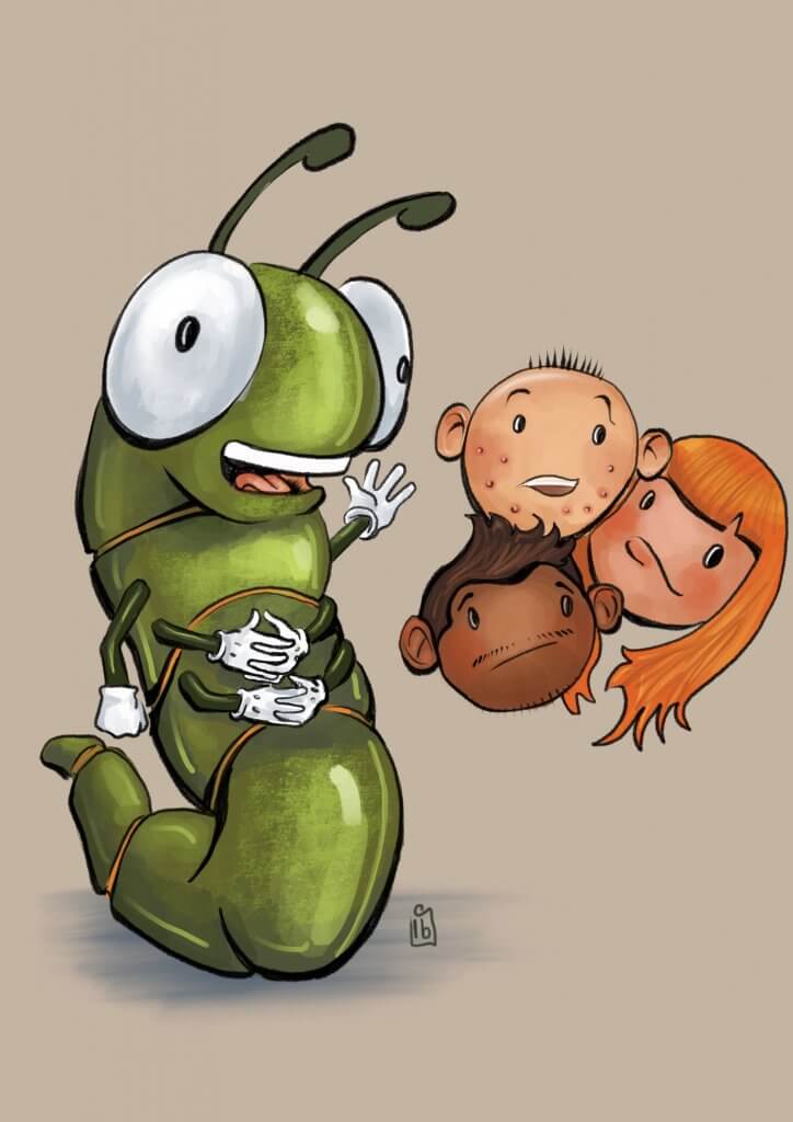
It was quite a challenge to get all the information on the sheet, with such a small space I had to be brief and to the point. I tried to make the drawings light-hearted as it is a delicate subject matter, going for a simple cartoon style.
I practised a few simple shapes for the characters, Keeping them simple but expressive. I also explored some different ideas for Layout, I imagined this to be a folded leaflet that opens out, a cover on the front and further info links and telephone details etc on the back.
explorative sketching
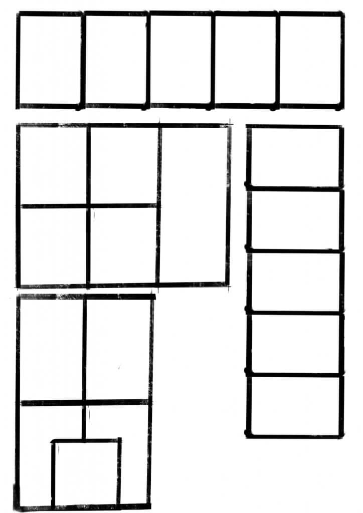
I also explored some possible layout ideas for the panels.
5 panel grid layout options
This was the first pass, I didn’t feel it had much of a flow,
failed attempt
I decided Id divide the five panels up with a large opening panel followed by three smaller panels in a row, and finishing on a large full-width panel.
rough pencils
I decided to trim the text down a little as it seemed to be a lot to fit in.
I’m a little undecided about how successful this exercise was, I wonder if I had made the tone a little too young for the content, I know on one hand young teens will likely still watch animated tv shows or even read comic strips, maybe if there was more humour in the artwork it may have helped set a context that a cartoon suits. On the other hand, it is a serious somewhat potentially embarrassing subject to convey at the best of times but maybe a 13 + year old would appreciate something a bit more formal that addresses them with an adult voice.
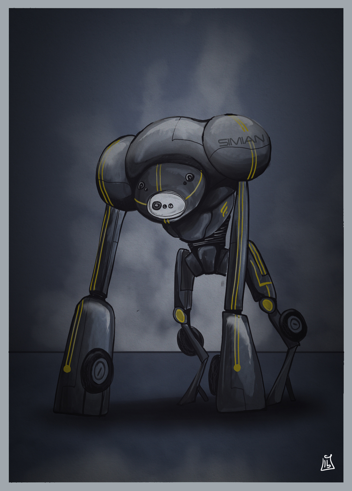
I read an article about a new Robot in development called the simian, it was designed to be a disaster recover and rescue robot. While the article was very interesting the robot didn’t really look very exciting, and in fact was visually more like a spider. I was determined to make mine have more presence and character.
I picked out the following key words:
Apelike
Robot
Disaster response
Headless
Seven cameras
Wheels
I went to work on the canvas (digital) and came up with an apelike shape while keeping it relatively headless. I would have experimented more but I was quite happy with the silhouette so continued working it up. I added in the detail such as the camera eyes and the wheels, I also added some high visibility stripes to ensure that the robot could be seen through dust and smoke etc.
It was good to just go with what was in my head from the key words, I did feel I was consciously making it different form the photo that accompanied the article.
Simian rescue robot
I enjoyed this exercise, it was quite like a concept art project, and really made me focus on bringing the image in my head to life on the canvas.
I have never used a written article this way, I would like to try this technique on some poetry.
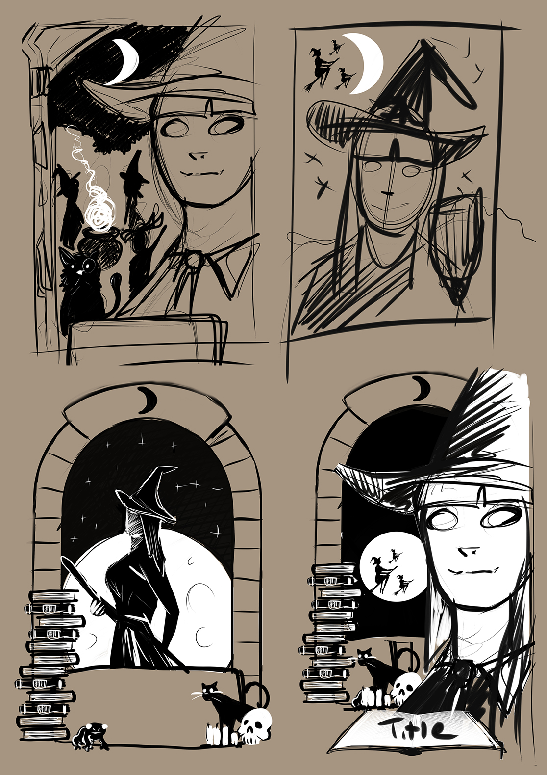
I was thinking it would be nice to use the witches again, the brief did say to use similar subject matter and it would be good to show the difference in presentation between the two illustrators. Drew Struzan had worked on some Harry Potter artwork so there was a good few examples of his approach to the subject matter. In the thumbnails I included cats and spell books, moon imagery etc, anything that can add little points of interest and detail to the piece. I really liked the window and decided to do a larger portrait as the main focal point and using other witch imagery to frame the character.
I liked the idea of a stone window as a frame so I went with the bottom right hand side image
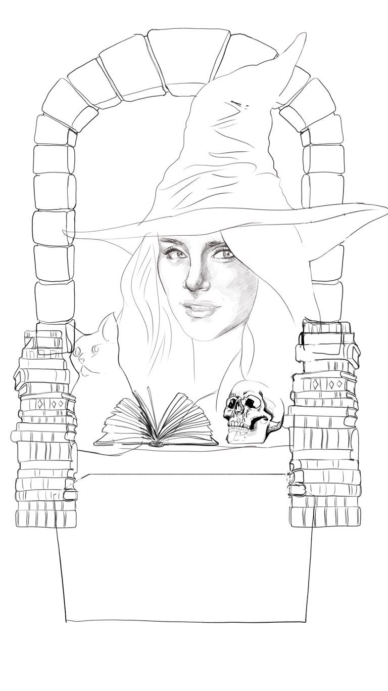
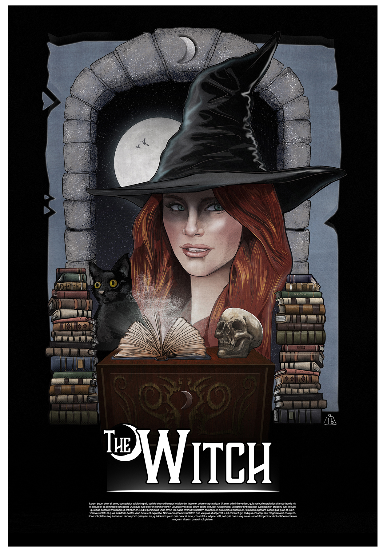
Using an image of Bryce Dallas Howard as reference I added the witches hat as she hasn’t as of yet played a witch to my knowledge so no photo exists. I produced the artwork in Photoshop starting with a simple sketch to work out the composition. It would have been great to use an airbrush and follow the techniques that Drew Struzan uses but I just didn’t have the necessary equipment.
Establishing a composition
I then added the texture around the window with a simulated spatter brush, I worked more detail in with a pencil brush then added the colour with a soft brush, it was quite good experimenting with the settings to get the desired effect. I also added some textures over the top to give it a painted rough look. Somewhere in between the colour and the detailed pencil work I lost the likeness a little, I was a bit disappointed with that but happy with the way the overall image turned out even though its not quite a Drew Struzan the composition seemed fitting and with a few more attempts I’m sure I could improve on it if i wanted. More Importantly and certainly something I’ve learned form this exercise is that I need to keep searching for my own style even if that means temporarily borrowing others.
Just to add some context I came up with a generic movie title and worked up a little logo.
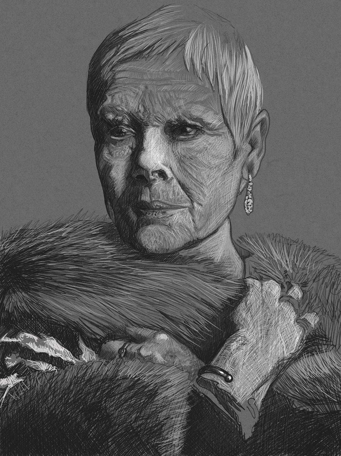
I decided to start again, this time really trying to carve out the features with the direction of my lines and try for more detail. I decided to use an older face, I found some good reference for Dame Judy Dench and I went about trying to improve on the last image. The key here was to keep it detailed with an abundance of texture and using short lines that follow contours. I still needed to keep the expression and mood of the photo even though I was in fact making up a lot of things that wasn’t present in the reference photography.
I was quite happy with the “Regal” feel to my Image
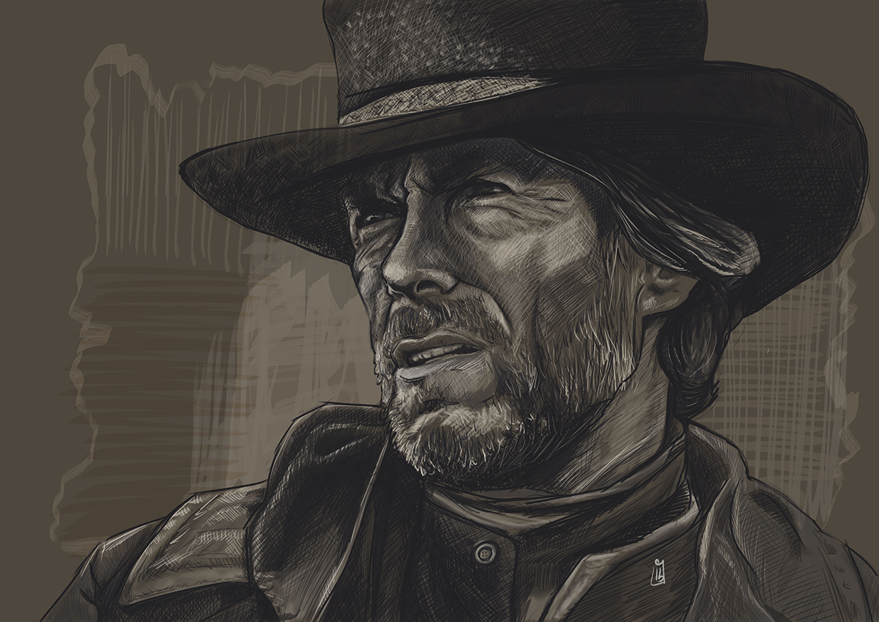
Was overall happy with this, has a stylistic look and the portrait is recognisable which would be essential for a film poster, I wanted to try one more time with a more heroic character.
I felt this came pretty close to a Drew Struzan style sketch
I was feeling confident I was ready to move onto a final piece and I had an idea how best to approach it. I really felt my drawing took a leap forward I was pleased with the outcome of all the work, still room for improvement but definite progress.